A place to wash hands with both soap and water is one of the simplest pieces of household infrastructure, yet the latest country observations show a very wide global gap. The World Bank indicator SH.STA.HYGN.ZS measures the share of people living in households that have a basic handwashing facility with soap and water available on the premises. The dataset used here contains 120 countries and areas. Its median is 71.9%, but values range from 3.49% to 100%, so the middle figure alone hides much of the difference between places.
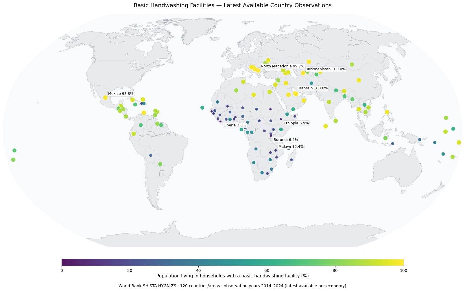
Table of Contents
What the indicator measures
The measure is about the presence of a handwashing facility and the availability of both water and soap at the household premises. The facility can be fixed or mobile. It may be a sink with running water, a container with a tap, a tippy-tap, or another place specifically used for handwashing. Soap can include bar or liquid soap, detergent, or soapy water. The essential point is that the basic materials and a designated facility are available where the household lives.
This is not a direct measure of how often people wash their hands, whether they use the recommended technique, whether water is available every hour of the day, or whether schools and health facilities have equivalent services. It is a household infrastructure indicator expressed as a percentage of the population. That distinction matters because availability creates the conditions for handwashing but does not, by itself, describe behavior or health outcomes.
The 120 observations span a very wide range
Across the 120 country and area observations, the mean is 62.0% and the median is 71.9%. The first quartile is 27.0% and the third quartile is 91.8%, which means even the middle half of the distribution stretches across roughly 65 percentage points. There are 33 observations at or above 90% and 54 at or above 80%. At the other end, 48 are below 50% and 27 are below 25%.
The map shows many high observations in parts of the Middle East, Central Asia, Europe, and Latin America, while a large number of low observations are concentrated in Sub-Saharan Africa. Those clusters are descriptive, not causal. Water networks, household income, housing conditions, urbanization, public services, survey coverage, and other factors may all be relevant, but this one indicator does not isolate the effect of any of them.
The highest observations are close to universal coverage
| Country or area | Share | Observation year |
|---|---|---|
| Bahrain | 100.00% | 2024 |
| Qatar | 100.00% | 2024 |
| Turkmenistan | 100.00% | 2024 |
| North Macedonia | 99.67% | 2024 |
| Montenegro | 99.24% | 2022 |
| Kazakhstan | 99.01% | 2019 |
| Mexico | 98.79% | 2024 |
| Aruba | 98.61% | 2024 |
Bahrain, Qatar, and Turkmenistan each record 100% in the latest observations included here. North Macedonia is at 99.67%, Montenegro at 99.24%, and Kazakhstan at 99.01%. Mexico and Aruba are also above 98%. These values indicate that basic handwashing facilities with soap and water are nearly universal according to the indicator definition, but they should not be interpreted as proof that handwashing behavior is universal or that water supply is uninterrupted in every household.
The table also illustrates why the year column should stay visible. Kazakhstan’s value is from 2019 and Montenegro’s from 2022, while many other high observations are from 2024. A high position in this latest-available dataset therefore means that the most recent reported observation is high; it is not a perfectly synchronized ranking measured on the same date everywhere.
The lowest observations reveal much larger infrastructure gaps
| Country or area | Share | Observation year |
|---|---|---|
| Liberia | 3.49% | 2024 |
| Ethiopia | 5.85% | 2024 |
| Burundi | 6.36% | 2023 |
| Sudan | 10.76% | 2024 |
| Benin | 12.86% | 2024 |
| Gambia, The | 12.96% | 2024 |
| Malawi | 15.40% | 2024 |
| Mozambique | 15.81% | 2024 |
Liberia has the lowest observation at 3.49%, followed by Ethiopia at 5.85% and Burundi at 6.36%. Sudan is at 10.76%, Benin and The Gambia are close to 13%, and Malawi and Mozambique are around 15–16%. At this end of the distribution, the gap is not merely a few percentage points: a large share of the population may be living in households without the basic facility-and-supplies combination captured by the indicator.
A low value should not be framed as a personal hygiene failure. The measure first asks whether the physical household conditions for handwashing are present. Interpreting why coverage is low requires additional information on water supply, poverty, housing, rural and urban conditions, public investment, and service delivery. The map identifies where the gap is large; it does not assign responsibility or establish a single cause.
Most observations are recent, but they are not all from 2024
Of the 120 observations, 91 are from 2024 and 4 are from 2023. A total of 109 are from 2020 or later, while the remainder are older. The earliest observation in the set is from 2014. The map should therefore be read as a latest-available comparison rather than a uniform 2024 snapshot.
This matters most when comparing countries with similar percentages. A value recorded several years earlier may predate changes in water infrastructure, household conditions, survey methods, or service programs. The map is strong for spotting large gaps and broad spatial patterns. It is weaker for claims about which country is currently ahead by a small margin or which policy produced a specific difference.
Why the median does not describe the size of the global gap
A median of 71.9% simply means that half of the observations are above that level and half are below it. It does not mean that most countries are clustered near 72%. The quartiles tell a more informative story: the 25th percentile is about 27.0%, while the 75th percentile is about 91.8%. The middle half of observations alone covers a very large range.
The fact that 33 observations are at or above 90% while 48 are below 50% also shows that the distribution contains two very different service realities. In many places the basic facility is close to universal. In many others, at least half of the population is outside the covered group. Looking at the upper and lower bands together is more useful than treating the global average as a typical national experience.
How to read the geographic pattern
A practical way to use the map is to begin with broad clusters and then check exceptions within the same region. Sub-Saharan Africa contains many of the lower observations, but countries within the region still vary substantially. The same is true in regions with generally high values. Regional proximity can suggest useful comparisons, yet neighboring countries can differ in infrastructure, settlement patterns, survey timing, and service delivery.
Small islands and compact territories can disappear visually in a conventional filled-country map. The map here uses country or area centroids with scaled circles so every verified observation can remain visible. Circle color and size encode the same percentage. Countries without a verified row are not treated as zero. Missing data and a measured 0% are different states and should never be merged.
What this indicator can and cannot tell you
The indicator is well suited to comparing the reach of a basic household handwashing environment. A high percentage means a large share of the population lives in households where a designated facility, soap, and water are available. A low percentage means the basic condition is absent for a larger share of the population. It can help identify service gaps and complement other household water, sanitation, and hygiene measures.
It cannot, by itself, explain infectious-disease rates, individual handwashing frequency, soap consumption, water quality, or the reliability of the water supply. Those outcomes require separate evidence. Even when handwashing-facility coverage and health outcomes move together, this dataset alone cannot establish the direction or size of a causal effect. Keeping the measurement boundary clear prevents an infrastructure indicator from being asked to answer a behavioral or medical question.
Handwashing, drinking water, and sanitation should be compared as separate services
Basic handwashing facilities are one part of the broader water, sanitation, and hygiene picture. A country can perform well on drinking-water access while still having gaps in household handwashing facilities, or it can have widespread handwashing facilities while facing separate sanitation challenges. These indicators are related but not interchangeable because each has its own service definition and denominator.
Using several measures together can provide a more complete view of household infrastructure. When drinking water, sanitation, and handwashing indicators all point in the same direction, they reinforce a broad picture of service coverage. When they diverge, the difference is informative: it can show which part of the service chain may deserve closer investigation rather than being hidden inside a single composite label.
Four checks before using the numbers
First, check the observation year for every country in a close comparison. Second, read the indicator definition so that household facility availability is not confused with observed behavior. Third, keep missing observations separate from measured low values. Fourth, avoid assigning a cause based only on the map. These four checks make the comparison more defensible and help preserve the difference between what the data directly measures and what would require additional evidence.
For change over time, one latest value is not enough. A trend analysis needs repeated observations for the same country, ideally with attention to survey comparability and changes in the underlying service environment. Places with rapidly expanding water and sanitation infrastructure can move substantially over a few years, so a latest-available map is best used as a starting point for deeper time-series work rather than as a substitute for it.
Source and scope
The figures come from the World Bank indicator “People with basic handwashing facilities including soap and water (% of population),” code SH.STA.HYGN.ZS. For each country or area, the latest non-empty observation in the verified dataset is used. The file contains 120 rows, the unit is percent of population, and actual observation years range from 2014 through 2024. Because 2024 is not available for every place, the article and map describe the values as latest available rather than labeling every observation as 2024.
Frequently Asked Questions
Does this indicator measure actual handwashing behavior?
No. It measures the share of people living in households where a basic handwashing facility with soap and water is available on the premises. It does not directly observe how often or how well people wash their hands.
Are all country values from 2024?
No. 91 of the 120 observations are from 2024, while the full observation-year range is 2014–2024. The dataset uses the latest available non-empty value for each country or area.
Are countries without data treated as 0%?
No. Missing data is not the same as a measured zero. Only the 120 countries and areas with verified observations are assigned values in this comparison.
Related Articles
Green Map creates custom-edited map images using open geographic data sources such as geoBoundaries, Natural Earth, OpenStreetMap, and government open data.
These maps are edited visual materials, not raw data files, and are provided for education, documents, presentations, and graphic reference.