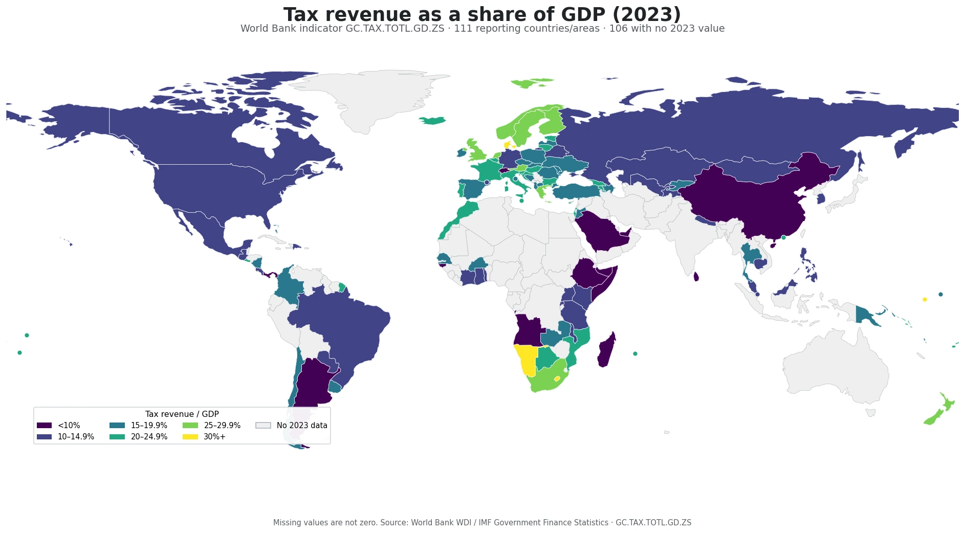
General taxes on goods and services account for very different shares of the value added generated by industry and services across economies. Using the latest non-empty World Bank observation for each economy produces a set of 157 countries and territories, with a median value of 9.6%. The key limitation is timing: these are not all observations from one common year, so the map is best read as a latest-available comparison rather than a synchronized annual snapshot.
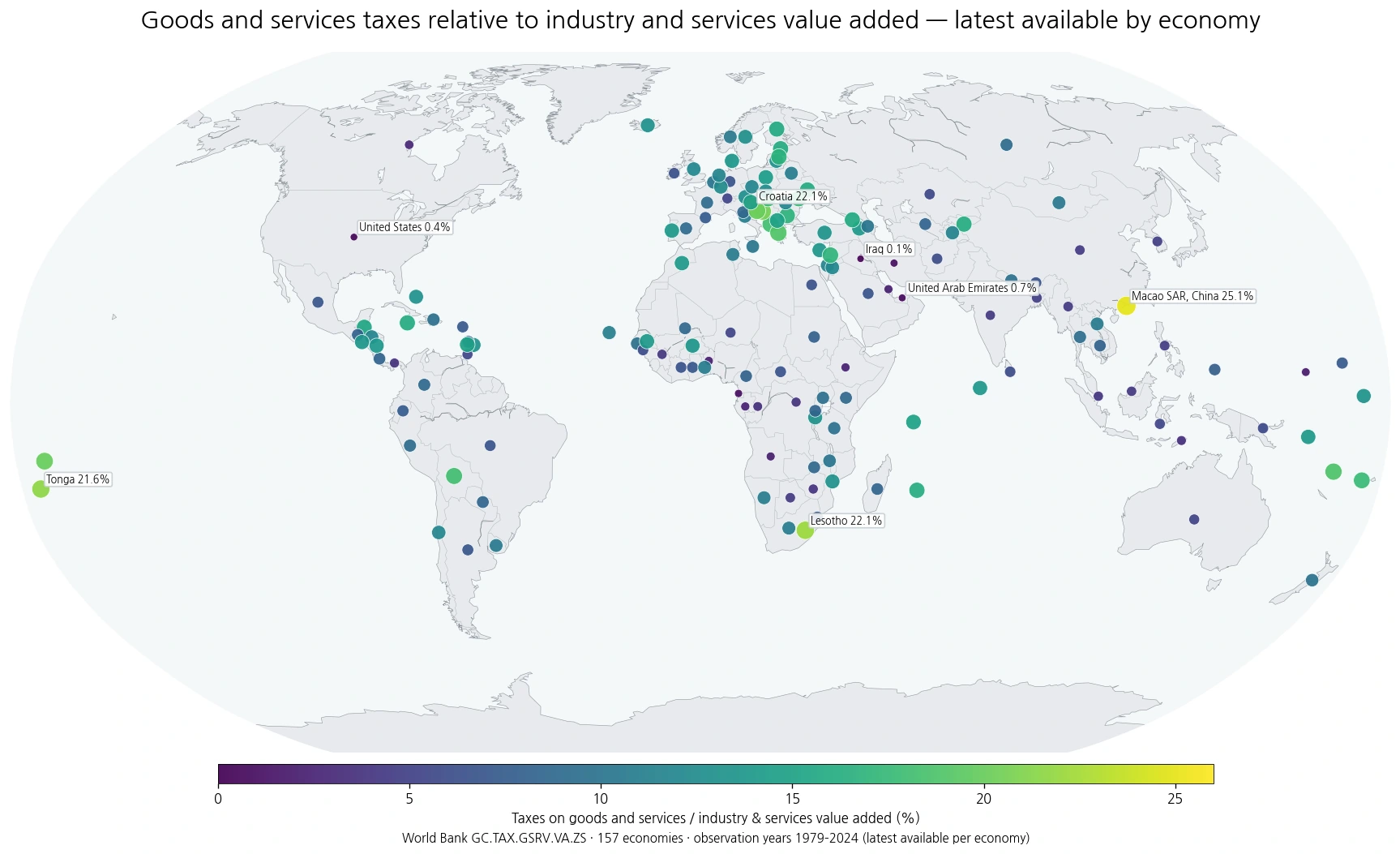
Table of Contents
What the indicator measures
The World Bank indicator covers general taxes on goods and services levied on the production, leasing, delivery, sale, purchase, or other change of ownership of a broad range of goods and on the provision of a broad range of services. The denominator is value added in industry and services, not total government revenue and not GDP.
That distinction matters. A high percentage says that these taxes are large relative to the measured value added of industry and services. It does not by itself prove that statutory tax rates are high or that households face a heavier overall tax burden. Tax bases, exemptions, collection systems, economic structure, and the size of informal activity can all affect the ratio.
The spread across economies is wide
Across the 157 observations, the mean is 10.1% and the median is 9.6%. The first quartile is 6.5% and the third quartile is 13.6%, showing a broad distribution. The highest value in the dataset is Macao SAR, China at 25.06% (2024), while the lowest is Iraq at 0.14% (2019).
Several high values appear in southeastern Europe and the Balkans, while a separate group of high observations is visible among Pacific island economies. At the low end, the United States and Canada sit well below the dataset median, and some Gulf economies also appear in the lower range. These geographic groupings describe where similar values occur; they do not establish a shared cause.
Economies with the highest ratios
| Economy | Share | Observation year |
|---|---|---|
| Macao SAR, China | 25.06% | 2024 |
| Croatia | 22.09% | 2023 |
| Lesotho | 22.08% | 2024 |
| Tonga | 21.60% | 2023 |
| Bosnia and Herzegovina | 20.60% | 2024 |
| Serbia | 20.07% | 2022 |
| Samoa | 19.92% | 2023 |
| Greece | 18.99% | 2024 |
The upper end includes Macao SAR, China; Croatia; Lesotho; Tonga; Bosnia and Herzegovina; Serbia; Samoa; and Greece. Because the measure is a ratio, a small economy can rank high without collecting more tax in absolute currency terms than a much larger economy. The denominator and the observation year need to stay visible when interpreting the ranking.
Economies with the lowest ratios
| Economy | Share | Observation year |
|---|---|---|
| Iraq | 0.14% | 2019 |
| United States | 0.41% | 2021 |
| United Arab Emirates | 0.65% | 2024 |
| Iran, Islamic Rep. | 0.94% | 2009 |
| Equatorial Guinea | 1.08% | 2022 |
| Micronesia, Fed. Sts. | 1.75% | 2020 |
| Angola | 2.19% | 2024 |
| Bahrain | 2.21% | 2020 |
The lowest observations include Iraq, the United States, the United Arab Emirates, Iran, Equatorial Guinea, Micronesia, Angola, and Bahrain. A low value should not be read as evidence that goods and services are untaxed. It only describes this specific tax measure relative to industry and services value added.
Observation years are not synchronized
Of the 157 economies, 84 have a 2024 observation and 24 have a 2023 observation. A total of 137 observations are from 2020 or later, while 20 are from 2019 or earlier. The oldest value in the set is from 1979. This makes the map useful for broad spatial comparison, but weaker for claims that depend on a common point in time.
For any close comparison between two economies, the observation year should be checked first. Older observations may predate tax reforms or major changes in economic structure, so they should not be treated as direct evidence of current policy.
Why this differs from a revenue-share tax measure
A related World Bank measure can express taxes on goods and services as a share of government revenue. That answers a fiscal-composition question: how much of government revenue comes from this tax category? The indicator used here answers a different question by comparing the tax amount with the value added produced by industry and services.
Because the denominators are different, the two measures can move differently and should not be merged into a single ranking. An economy can depend heavily on goods-and-services taxes within its revenue system without having an equally high ratio relative to industry and services value added, and vice versa.
How to read the map without over-interpreting it
A useful sequence is to identify broad high and low clusters, look for sharp differences between nearby economies, check the year attached to extreme values, and then compare the ratio with other tax indicators only if their definitions are compatible. The map is descriptive. It does not identify why a country has a particular value and should not be used as a stand-alone measure of tax burden or policy quality.
Why one ratio cannot describe an entire tax system
The indicator creates a common denominator for cross-country comparison, but tax systems differ in coverage and design. Some economies rely on broad consumption taxes, while others collect more through narrower levies or different tax categories. Two economies with similar ratios can therefore have very different statutory rates, exemptions, collection structures, and distributions of the tax burden.
The denominator can move as well. If industry and services value added expands faster than tax receipts, the ratio can fall even when nominal tax collections rise. If value added contracts, the ratio can increase without a policy change. For that reason, year-to-year movement in the ratio should be checked against both tax receipts and the underlying value-added measure before drawing a policy conclusion.
What to check for time-series use
This latest-available map is designed for spatial comparison, not for measuring a trend. To determine whether an economy has moved up or down over time, comparable observations from at least two years are needed. Any trend analysis should also consider tax reforms, economic cycles, changes in industry and services output, and possible revisions in statistical reporting.
Source and scope
The values come from the World Bank indicator Taxes on goods and services (% value added of industry and services), code GC.TAX.GSRV.VA.ZS. The dataset uses the latest available non-empty observation for each economy. Values are percentages, and 157 economies are represented on the map.
Frequently Asked Questions
Does a higher ratio mean the tax rate is higher?
Not necessarily. The indicator compares tax collections with industry and services value added. Statutory rates, exemptions, the tax base, collection systems, and economic structure can all affect the result.
Are all values from 2024?
No. 84 economies have a 2024 observation, but the dataset uses the latest available value for each economy, with observation years ranging from 1979 to 2024.
Is this the same as taxes on goods and services as a share of revenue?
No. A revenue-share measure uses government revenue as the denominator. This indicator uses value added in industry and services, so it answers a different question.
Related Articles
Green Map creates custom-edited map images using open geographic data sources such as geoBoundaries, Natural Earth, OpenStreetMap, and government open data. These maps are edited visual materials, not raw data files, and are provided for education, documents, presentations, and graphic reference.