The World Bank indicator SI.POV.LMIC measures the share of people living below $4.20 a day at 2021 purchasing-power-parity prices. The dataset used here contains the latest available observation for 171 economies, but the observation years range from 1992 to 2025. This is therefore a latest-available map, not a 2025 global poverty ranking.
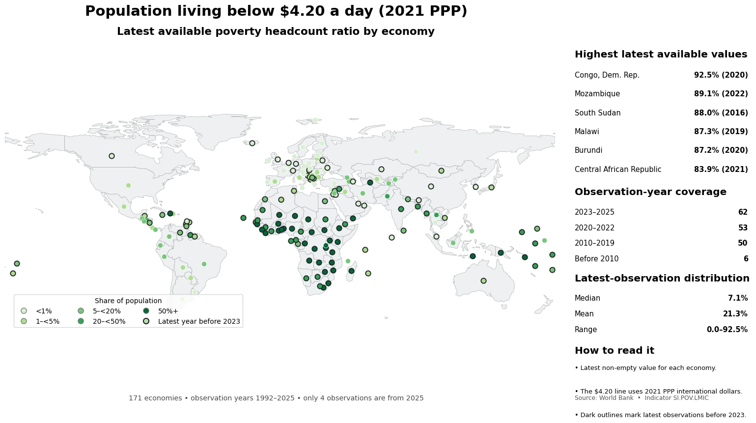
Table of Contents
What the $4.20-a-day line actually measures
The $4.20 threshold is not a current-market-exchange-rate amount of US dollars. It is expressed in 2021 PPP international dollars so that differences in price levels across economies are taken into account. A value of 25 percent means that about one quarter of the population in that survey or estimation year lived below this common international line.
The measure is also different from a national poverty rate based on a country’s own official poverty line. National lines can be designed for domestic policy and can use different baskets, methods and thresholds. SI.POV.LMIC is useful because it applies one international benchmark, but it does not replace country-specific poverty measures. It also measures the share below the line, not how far below the line households are; poverty gaps and multidimensional deprivation answer different questions.
Why the 171 latest observations are not a single-year ranking
Observation years are the central limitation. Of the 171 latest values, 62 are from 2023–2025, 53 are from 2020–2022, 50 are from 2010–2019 and six are from before 2010. Only four observations are from 2025. A dataset can be refreshed in 2025 while still carrying an older latest observation for many economies because household-survey schedules and data availability differ.
| Latest observation period | Economies |
|---|---|
| 2023–2025 | 62 |
| 2020–2022 | 53 |
| 2010–2019 | 50 |
| Before 2010 | 6 |
The map therefore keeps broad geographic coverage but gives observations before 2023 a dark outline. Two economies can have similarly dark colors while referring to very different years. That makes the map useful for locating high and low latest values, but a strict ranking, trend comparison or policy evaluation should align observation years much more closely.
The highest latest available values are concentrated in parts of Sub-Saharan Africa
The largest latest values in the supplied data are the Democratic Republic of the Congo at 92.5 percent in 2020, Mozambique at 89.1 percent in 2022, South Sudan at 88.0 percent in 2016, Malawi at 87.3 percent in 2019 and Burundi at 87.2 percent in 2020. The Central African Republic and Madagascar each record 83.9 percent in 2021, while Zambia records 81.4 percent in 2022.
| Economy | Latest share below $4.20/day | Observation year |
|---|---|---|
| Congo, Dem. Rep. | 92.5% | 2020 |
| Mozambique | 89.1% | 2022 |
| South Sudan | 88.0% | 2016 |
| Malawi | 87.3% | 2019 |
| Burundi | 87.2% | 2020 |
| Central African Republic | 83.9% | 2021 |
| Madagascar | 83.9% | 2021 |
| Zambia | 81.4% | 2022 |
Those values create a visible high-poverty cluster across parts of central, eastern and southern Africa. The geographic pattern is informative, but it is not proof of a single cause. Neighboring economies can have different survey years, economic conditions and measurement schedules. The map says where high latest values appear; it does not by itself explain why they are high or how quickly poverty is changing.
A same-year 2023 slice looks very different
Only 37 economies in this latest-observation dataset have a 2023 value. Within that same-year subset, the median is 0.8% and the simple mean is 3.91%. Rwanda is highest at 62.2 percent, followed by Guatemala at 17.6 percent, the Philippines at 16.9 percent, El Salvador at 8.6 percent and Iran at 7.5 percent. Cyprus, Czechia and Slovenia are reported at 0.0 percent, while Belgium, France, Ireland and Luxembourg are at 0.1 percent.
That 2023 subset should not be treated as a representative sample of the entire world. Its main value is methodological: once the year is held constant, the comparison set becomes much smaller. Across all 171 mixed-year latest observations, the median is 7.1 percent and the mean is 21.31 percent, but those summary statistics describe a mixed-year collection rather than global poverty in one specific year.
Recent observations also show wide variation within Asia and Latin America
Among 2024 observations, Pakistan records 47.9 percent, Honduras 23.5 percent, Lao PDR 22.5 percent, Comoros 18.0 percent, Tajikistan 16.9 percent, Colombia 14.7 percent and Peru 10.7 percent. The four 2025 observations are Indonesia at 16.4 percent, Ecuador at 8.4 percent, Uzbekistan at 4.0 percent and Costa Rica at 1.7 percent. Thailand is at 0.2 percent in 2024. These differences illustrate how widely the share below the international line can vary even among relatively recent observations.
Many European economies have latest values below 1 percent, producing a broad light-colored area on the map. A displayed value of 0.0 should still be read as an indicator value at the dataset’s reported precision, not as proof that literally no person lives below the threshold. Survey estimation and rounding matter at very low levels.
Three rules for reading the map
- Color represents each economy’s latest available poverty headcount ratio. Missing data are not converted to zero.
- Dark outlines identify latest observations earlier than 2023, so mixed-year values are not visually mistaken for one common year.
- $4.20 a day refers to 2021 PPP international dollars, not $4.20 converted at the current market exchange rate.
The indicator is useful for comparing poverty under one common international threshold, but it should be paired with national poverty lines, poverty gaps and other measures when the question changes. A high or low headcount ratio also does not establish a causal explanation. Analysis of growth, employment, prices, social protection or household structure requires additional data aligned to the relevant period.
Source: World Bank World Development Indicators, SI.POV.LMIC. The map uses each economy’s latest non-empty observation in the supplied series; observation years span 1992–2025.
Frequently Asked Questions
Is the $4.20-a-day poverty line the same as US$4.20 at today’s exchange rate?
No. It is expressed in 2021 PPP international dollars, which adjust for differences in price levels across economies. It should not be read as a simple current-exchange-rate dollar amount.
Why is this not a 2025 country poverty ranking?
The 171 latest observations span 1992–2025 and only four are from 2025. The map uses each economy’s latest available value; strict rankings should compare observations from the same or closely aligned years.
Does a reported 0.0% mean literally nobody is below the line?
Not necessarily. A 0.0 value is reported at the dataset’s displayed precision and can reflect rounding of a very small estimate. It should not be interpreted as proof of an absolute zero count.
Related Articles
Green Map creates custom-edited map images using open geographic data sources such as geoBoundaries, Natural Earth, OpenStreetMap, and government open data.
These maps are edited visual materials, not raw data files, and are provided for education, documents, presentations, and graphic reference.