World Bank indicator SP.POP.3539.MA.5Y measures males ages 35–39 as a percentage of the total male population. Across the 217 countries and areas in the 2025 dataset, values range from 3.29% to 17.37%. The median is 7.10% and the simple average is 7.19%. A value of 8% means that about eight of every 100 males are ages 35–39.
This is an age-structure indicator, not an employment or income measure. The size of a five-year male cohort can reflect birth-cohort size, survival, international migration and the relative size of younger and older male populations. For that reason, cross-country differences should be read as differences in population structure rather than as direct evidence of economic performance.
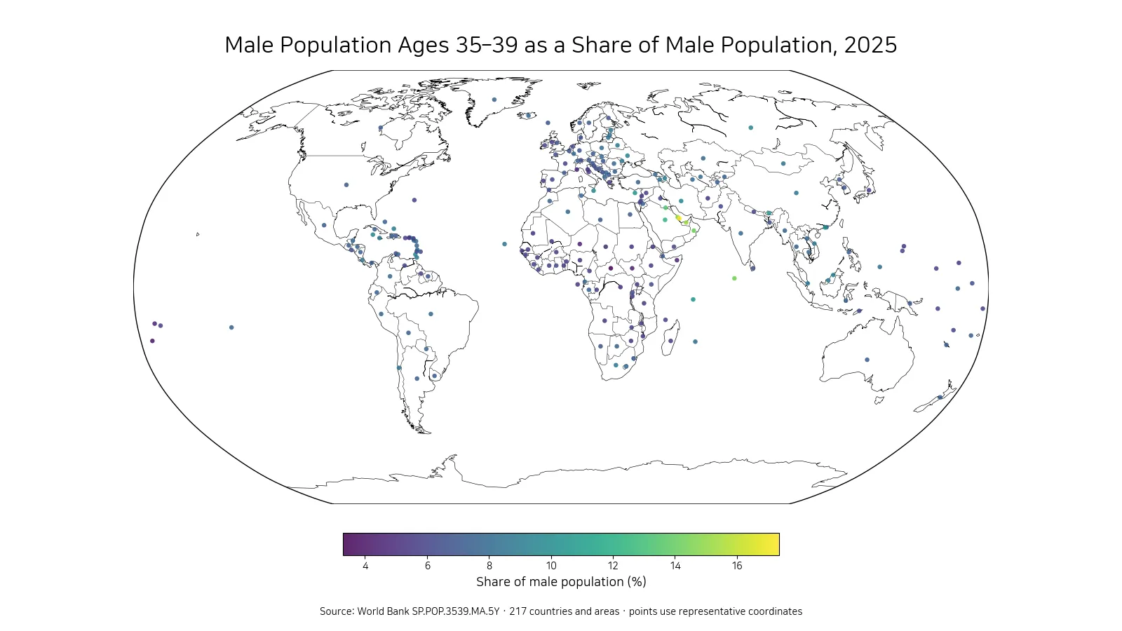
Table of Contents
Qatar, Bahrain and the United Arab Emirates form the highest group
Qatar records the highest 2025 value at 17.37%. Bahrain follows at 15.26%, the United Arab Emirates at 15.23%, the Maldives at 14.31% and Oman at 14.17%. Kuwait is at 13.38% and Saudi Arabia at 12.33%. Several Gulf economies therefore appear together near the top of the distribution, creating a clear geographic cluster on the map.
| Rank | Country or area | Male ages 35–39 share |
|---|---|---|
| 1 | Qatar | 17.37% |
| 2 | Bahrain | 15.26% |
| 3 | United Arab Emirates | 15.23% |
| 4 | Maldives | 14.31% |
| 5 | Oman | 14.17% |
| 6 | Kuwait | 13.38% |
| 7 | Saudi Arabia | 12.33% |
| 8 | Seychelles | 10.43% |
| 9 | Macao SAR, China | 10.35% |
| 10 | Cyprus | 10.26% |
The top value is well over twice the median of 7.10%. That gap shows why a single global central value cannot describe every national age structure. The dataset itself does not identify a single cause for the elevated shares. Migration and cohort size are possible demographic mechanisms, but distinguishing their contribution requires additional age-specific migration and population data.
The lowest shares are mostly in the 3% to 5% range
The Central African Republic has the lowest reported value at 3.29%. Tonga is at 4.05%, South Sudan at 4.28%, Niger at 4.59% and Samoa at 4.63%. Somalia, Monaco, St. Martin (French part), Chad and the Democratic Republic of the Congo also appear in the lowest 10. A low share does not necessarily mean the absolute number of men ages 35–39 is small; a large younger population can also make the percentage lower.
| Rank | Country or area | Male ages 35–39 share |
|---|---|---|
| 1 | Central African Republic | 3.29% |
| 2 | Tonga | 4.05% |
| 3 | South Sudan | 4.28% |
| 4 | Niger | 4.59% |
| 5 | Samoa | 4.63% |
| 6 | Somalia, Fed. Rep. | 4.71% |
| 7 | Monaco | 4.76% |
| 8 | St. Martin (French part) | 4.80% |
| 9 | Chad | 4.87% |
| 10 | Congo, Dem. Rep. | 4.91% |
The difference between the highest and lowest observations is about 14.08 percentage points. Because the measure is a percentage of each area’s own male population, large countries and small territories each contribute one observation to the cross-country distribution. Small populations can also show larger proportional swings when a single cohort is unusually large or small.
Half of reported values lie between about 6.00% and 7.80%
The first quartile is 6.00%, the median is 7.10%, and the third quartile is 7.80%. Half of the 217 observations therefore fall between about 6.00% and 7.80%. The mean of 7.19% is close to the median, but a small number of values above 12% extend the upper end of the distribution.
By broad bands, 11 observations are below 5%, 94 are from 5% to under 7%, 93 are from 7% to under 9%, 12 are from 9% to under 12%, and 7 are 12% or higher. Most reporting areas cluster in the middle bands, while a much smaller upper group stretches the overall range.
The Gulf stands out clearly on the world map
The strongest spatial pattern is the concentration of high values in and around the Arabian Peninsula. Qatar, Bahrain, the United Arab Emirates, Oman, Kuwait and Saudi Arabia all rank near the top. Lower values appear in several Sub-Saharan African countries and in some Pacific island reporting areas. These clusters are descriptive: the map shows where similar values occur, but it does not by itself establish why they occur.
The visualization uses representative points so that small countries and territories remain visible at world scale. The points are not population centers and do not show internal geographic variation. Each marker represents one country-or-area observation from the same 2025 World Bank indicator.
The age share should not be treated as a labor-market outcome
Men ages 35–39 are typically part of the working-age population, so the indicator can be useful context for labor-market analysis. However, it contains no information on employment status, unemployment, earnings, education or occupation. Two countries with the same 35–39 share can have very different participation rates and employment structures.
A labor-market interpretation therefore needs separate indicators such as employment-to-population ratios, labor-force participation, unemployment, sector composition and the overall working-age population. The denominator here is the male population only, which also means that the corresponding female age share may follow a different pattern.
Adjacent age groups help reveal whether the cohort is unusually large
A five-year age band is only one slice of the population pyramid. Comparing ages 30–34, 35–39 and 40–44 can show whether a country has a broad concentration across the thirties or a more isolated peak. That distinction is difficult to see from one indicator alone. Adjacent cohorts can therefore provide a better picture of the shape of the working-age population.
A single year also cannot establish the direction of change. Comparing the same indicator across earlier years would be needed to determine whether the 35–39 share has been rising or falling. This article is intentionally a 2025 cross-country snapshot rather than a time-series analysis.
All 217 rows contain numeric 2025 observations
Every row in the cleaned dataset contains a numeric 2025 value, so no missing observations were replaced with zero and no imputation was used in the rankings, average, median or quartiles. The summary statistics are calculated directly from the 217 supplied observations.
The row count is not equivalent to 217 sovereign states. World Bank country datasets also include territories and separately reported statistical areas. For that reason, the article uses “countries and areas” or “reporting units.” The simple mean gives each row equal weight and should not be interpreted as a population-weighted world share.
What the 2025 comparison shows most clearly
The most distinctive feature is the distance between the center of the distribution and the upper group. The median is 7.10%, while Qatar reaches 17.37% and both Bahrain and the United Arab Emirates exceed 15%. At the other end, the minimum is 3.29%. The relative size of the male 35–39 cohort therefore differs substantially across reporting areas.
A useful reading sequence is to start with the map for spatial clustering, use the high and low tables to identify the extremes, and then use quartiles to place individual countries within the overall distribution. For deeper demographic analysis, adjacent age groups and the comparable female indicator provide a more complete view than this single share alone.
Frequently Asked Questions
What does an 8% male ages 35–39 share mean?
It means males ages 35–39 account for about 8% of the total male population in that country or area. It is not a share of employed people or of the total population.
Which reporting areas have the highest and lowest 2025 values?
In the supplied dataset, Qatar is highest at 17.37% and the Central African Republic is lowest at 3.29%.
Were missing observations filled with zero?
No. All 217 rows contain numeric 2025 values, so no zero-filling or other imputation was required.
Related Articles
Green Map creates custom-edited map images using open geographic data sources such as geoBoundaries, Natural Earth, OpenStreetMap, and government open data.
These maps are edited visual materials, not raw data files, and are provided for education, documents, presentations, and graphic reference.