The share of males ages 60–64 varies substantially across reporting countries and areas in 2025. World Bank indicator SP.POP.6064.MA.5Y measures males ages 60–64 as a percentage of the total male population. Across all 217 observations in the supplied dataset, the values range from 1.06% to 8.63%. The median is 4.15% and the simple mean is 4.31%.
A value of 7% means that roughly seven of every 100 males in that reporting area are ages 60–64. It does not mean that 7% of the total population is in that age group, and it is not the same as the share age 65 or older. Because this is a narrow five-year cohort, the result can reflect past birth-cohort size, survival, migration and changes in the younger population that forms the denominator.
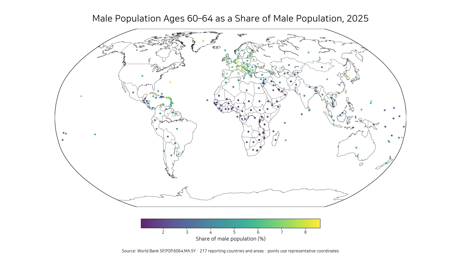
Table of Contents
The highest reported shares are around 8%
San Marino records the highest 2025 value at 8.63%. Hong Kong SAR, China follows at 8.51%, Bermuda at 8.17%, St. Martin (French part) at 8.00%, and Germany just below 8.00%. The upper group contains both small territories and larger economies. That mix is an important reminder that a five-year age share can be especially sensitive to the relative size of cohorts in small populations.
| Rank | Country or area | Male ages 60–64 share |
|---|---|---|
| 1 | San Marino | 8.63% |
| 2 | Hong Kong SAR, China | 8.51% |
| 3 | Bermuda | 8.17% |
| 4 | St. Martin (French part) | 8.00% |
| 5 | Germany | 8.00% |
| 6 | Korea, Rep. | 7.98% |
| 7 | Sint Maarten (Dutch part) | 7.85% |
| 8 | Greenland | 7.72% |
| 9 | Cuba | 7.66% |
| 10 | Isle of Man | 7.65% |
A high position in this table should not be treated as a complete ranking of population aging. It says that the male cohort currently ages 60–64 is large relative to the total male population. Overall aging also depends on the size of older cohorts, the younger population, longevity, migration and many other demographic factors. A country can have a high 60–64 share without occupying the same position on a measure such as the population age 65 and older.
At the low end, the share is close to 1%
Mozambique has the lowest reported value at 1.06%, followed by the Central African Republic at 1.19%, Uganda at 1.19%, Malawi at 1.23% and Zimbabwe at 1.25%. In these places, males ages 60–64 form a much smaller fraction of the male population than they do in the upper group.
| Rank | Country or area | Male ages 60–64 share |
|---|---|---|
| 1 | Mozambique | 1.06% |
| 2 | Central African Republic | 1.19% |
| 3 | Uganda | 1.19% |
| 4 | Malawi | 1.23% |
| 5 | Zimbabwe | 1.25% |
| 6 | Burundi | 1.26% |
| 7 | Mali | 1.28% |
| 8 | Tanzania | 1.30% |
| 9 | Zambia | 1.31% |
| 10 | Afghanistan | 1.33% |
The distance between the minimum and maximum is about 7.57 percentage points. The highest value is more than eight times the lowest. The indicator itself does not identify why the difference exists. A relatively young age structure, cohort size, migration and survival patterns can all change the denominator or the number of males reaching their early sixties.
Half of reported values lie between about 2.34% and 6.12%
The first quartile is 2.34%, the median is 4.15%, and the third quartile is 6.12%. Half of all reported country-or-area values therefore fall between approximately 2.34% and 6.12%. The mean of 4.31% sits fairly close to the median, while both very low and very high values remain visible at the ends of the distribution.
A simple set of bands shows the spread more clearly. 41 observations are below 2%, 65 are from 2% to under 4%, 53 are from 4% to under 6%, 54 are from 6% to under 8%, and 4 are 8% or higher. No single band describes the world as a whole; the middle is spread across several intervals.
The map shows broad regional clustering, but not a single regional rule
Higher values appear frequently across parts of Europe and some East Asian or high-income reporting areas, while many of the lowest values cluster in Sub-Saharan Africa. These spatial patterns are consistent with large differences in national age structures. Even so, countries within the same region can differ meaningfully, and a map cannot identify the demographic mechanism responsible for each value. Neighboring economies may have different birth histories, migration flows or survival profiles.
Small islands and territories are hard to see as filled polygons at world scale. The visual therefore uses representative geographic points for all 217 observations. This keeps small reporting areas visible, but the point location should not be interpreted as a population center or as subnational detail. The underlying statistic remains a country-or-area level value.
Ages 60–64 are not the same as the 65+ population
The cohort in this indicator sits immediately below the common 65+ threshold. For that reason, it can provide context about the group that will move into older-age categories over the next several years. It is not, however, a forecast. Future age structure depends on survival, migration and the sizes of adjacent cohorts. A proper projection requires age-specific demographic assumptions rather than simply moving today’s percentage forward.
The denominator is also male population only. Female age shares can differ because survival and migration patterns differ by sex. The rankings and summary statistics in this article should therefore not be generalized to the total population. A direct sex comparison would require the corresponding female indicator for the same year and source definition.
A large share is a demographic fact, not a direct measure of economic burden
It can be tempting to connect a large 60–64 cohort immediately to pensions, retirement or health spending, but this indicator does not contain those outcomes. People ages 60–64 have very different employment, retirement and health profiles across countries. Labor-force participation rules, pension eligibility, health status and household structures are separate dimensions that require separate datasets.
The safest interpretation is narrower: the indicator tells us how large one five-year male age group is relative to all males in 2025. It can help identify where the population near typical retirement ages is relatively large or small, but it does not by itself measure fiscal pressure, labor shortages, economic growth or the adequacy of social policy.
All 217 supplied rows have 2025 values
The cleaned dataset contains a numeric 2025 observation for every one of its 217 rows. No missing values were replaced with zero, and no imputation is used in the mean, median, quartiles or rankings. That makes the distribution internally straightforward to calculate from the supplied file.
The row count should not be read as 217 sovereign states. World Bank datasets include territories and separately reported statistical areas. This article therefore uses “countries and areas” or “reporting units” when describing coverage. Each row has equal weight in the simple distribution statistics regardless of population size, so the mean here is not a population-weighted world average.
How to use the indicator for deeper demographic comparison
A useful next step is to compare adjacent five-year age bands such as 55–59 and 65–69. If several neighboring cohorts are also large, the pattern may reflect a broader older age structure. If only one cohort is unusually large, it may reflect a particular birth cohort or migration history. Linking multiple age groups is more informative than trying to infer the full age pyramid from a single band.
The 2025 snapshot highlights a wide cross-country range: 8.63% at the top, 1.06% at the bottom and 4.15% at the median. The map provides the spatial overview, while the tables and quartiles show how far individual reporting areas sit from the center of the distribution. Together, these views make the indicator useful as a compact entry point into comparative population structure.
Frequently Asked Questions
What does a 7% value mean in this indicator?
It means males ages 60–64 make up about 7% of the total male population in that reporting country or area. It is not the share of the total population or the share age 65 and older.
Which reported areas have the highest and lowest 2025 values?
In the supplied dataset, San Marino is highest at 8.63% and Mozambique is lowest at 1.06%.
Were missing values treated as zero?
No. Missing values would not be zero-filled. In this 2025 cleaned dataset, all 217 supplied rows contain numeric values, so no imputation was needed.
Related Articles
Green Map creates custom-edited map images using open geographic data sources such as geoBoundaries, Natural Earth, OpenStreetMap, and government open data.
These maps are edited visual materials, not raw data files, and are provided for education, documents, presentations, and graphic reference.