Livingston County is one of the clearest agricultural landscapes in this Illinois map series. The 2025 land-cover summary assigns 89.81% of the county to agriculture, while the largest built concentration sits around Pontiac and smaller developed clusters appear around other communities. Four companion maps on this page separate the broad land-cover picture from forest and farmland, impervious surface, and mapped change from 1985 to 2025.
The four original JPG maps are available together in one download. Use the on-page images to compare patterns quickly, then use the JPG files for printing, reference work, or side-by-side review. These are land-cover maps: they classify what is covering the ground, not parcel ownership, zoning, or a legal right to develop a property.
Table of Contents
Start with the county-wide pattern: nearly nine-tenths agriculture
Across the general map, agriculture forms an almost continuous field of yellow inside the county boundary. Red developed areas interrupt that background around towns and along the road network, while forest, wetlands, and water occupy narrow or scattered pieces. The visual balance matters because a small creek corridor can be locally important even though its county-wide percentage is tiny compared with cropland.
The map summary gives agriculture 89.81%, developed cover 7.84%, forest 1.26%, wetlands 0.41%, and water 0.38%. Those numbers describe the dominant 2025 cover classes in the mapped area. They do not mean that every agricultural pixel is an actively planted field at every moment, nor that every developed pixel is completely paved. Annual NLCD groups the landscape into broad classes at raster scale.
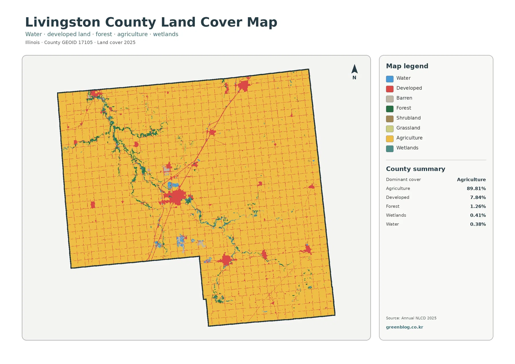
This general view is the best map for answering a first question: what kind of landscape dominates Livingston County? It also establishes the context for the other three images. A red patch that seems small here may become the main feature in the impervious map, while thin green and teal lines that are easy to miss become more obvious when cropland is visually simplified.
Livingston County planning documents also treat farmland as a defining county resource and list preservation of prime farmland among planning goals. That policy context should not be confused with the map classification itself. A planning designation is a legal or policy matter; the land-cover image is a remotely sensed description of surface cover. Used together, they explain why farmland is both visually dominant and locally significant without turning one dataset into the other.
Impervious surface reveals the built pattern hidden inside a farm county
The impervious-surface map changes the visual hierarchy completely. Most agricultural land becomes pale, while streets, rooftops, parking areas, and other hard surfaces appear in warmer shades. The densest cluster is around Pontiac near the middle of the county. A strong diagonal corridor extends away from that area along the Interstate 55 axis, with additional concentrations around Dwight and other towns.
The map reports a county mean impervious value of 2.26%. Only 1.01% of the mapped area falls in the 50%-or-greater impervious category, even though developed land covers 7.84% in the general map. The two statistics measure different things. A developed land-cover class can contain lawns, trees, drainage areas, and other non-paved surfaces, whereas the fractional impervious product estimates the share of a 30-meter pixel occupied by processed surfaces such as pavement, concrete, and rooftops.
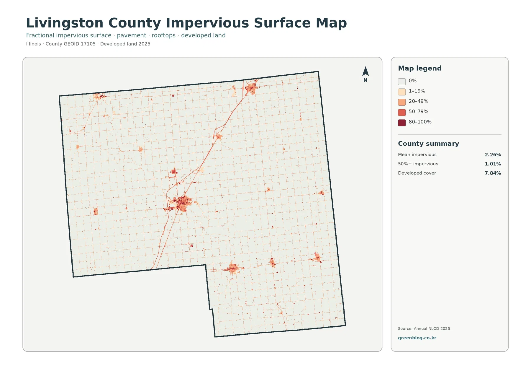
That distinction makes this map useful for comparing settlement form. Pontiac appears as a broad, relatively dense cluster rather than a single uniform block. Major roads remain visible as narrow lines through the countryside, and smaller communities appear as compact islands in a much lighter background. The map can support a watershed or planning discussion, but it cannot by itself tell you how much runoff a storm will produce or whether a particular parcel meets a development rule.
County planning material provides useful geographic context for the pattern. Pontiac, Dwight, and Fairbury are among the municipalities addressed in the comprehensive plan, and Interstate 55 is a major corridor through the Pontiac and Dwight areas. The map’s concentration of hard surface near those places is therefore easier to interpret when the image is read with verified place and transportation information rather than by guessing town names from color alone.
Mute the developed land and the river corridors become easier to follow
The forest-and-farmland map keeps the vast agricultural matrix but gives more attention to forest, wetlands, water, pasture or hay, and other open cover. Forest accounts for only 1.26% of the county, so there is no large continuous forest block dominating the image. Instead, green cover tends to occur in narrow bands and small patches, especially near drainage corridors that cut through cropland.
The Vermilion River is an important piece of that context. USGS maintains a stream-monitoring location on the Vermilion River at Pontiac, and Illinois watershed material identifies much of the Vermilion basin within Livingston County. On the map, the corridor through and around Pontiac is accompanied by green, teal, and blue cover that contrasts with surrounding fields. Tributary areas elsewhere in the county show similar narrow patterns.
The summary for this companion map repeats agriculture at 89.81% and forest at 1.26%, while water is 0.38% and wetlands are 0.41%. Grassland is 0.08% and shrubland 0.01%. Those last two categories are so small that they may be difficult to distinguish at page scale. They are still part of the legend, but the county-level story is much more clearly organized around cropland, developed places, and the thin network of wooded or wet cover near streams.
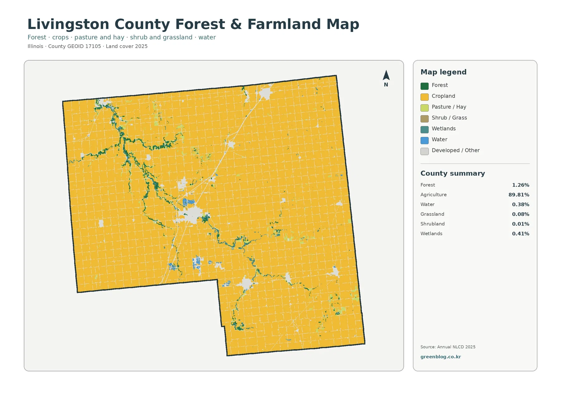
This image is particularly helpful when a broad land-cover map makes the county look almost uniformly agricultural. By reducing the visual weight of developed classes, it becomes easier to see that the farm landscape is crossed by drainage features and small wooded areas. That does not establish habitat quality, public access, or ownership. A green pixel represents mapped tree-dominated cover, not a guarantee that the site is protected forest or open to visitors.
The 1985–2025 map is a difference map, not a development history
The change map compares the 1985 and 2025 classifications and marks places where the class is different. Most of the county remains in the pale “no class difference” background, while developed transitions, agricultural loss, forest loss, wetland differences, and other class differences appear as scattered colored cells or small groups. The overall visual impression is localized change rather than a county-wide replacement of agriculture.
The map summary reports class difference across 3.73% of the county. It lists 0.82% as change to developed, 0.38% as agricultural loss, 0.03% as forest loss, and 2.47% as other difference. The map also warns that differences may include classification variation. That note is important: a color on this map is evidence that the two mapped classes differ, not proof of the exact date, cause, permit, or land transaction behind the difference.
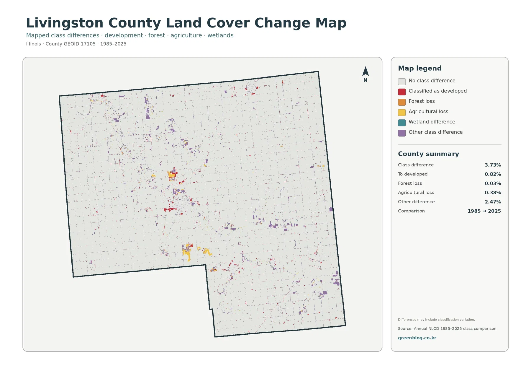
The red change class is easiest to notice near established developed areas and along some transportation corridors. Purple “other difference” cells are more dispersed. When a specific location matters, the better workflow is to identify it on the change map, check its current 2025 class on the general map, then compare the impervious map and, if needed, historical imagery or local records. That sequence keeps a classification difference from being mistaken for a complete local history.
Pontiac is the strongest built cluster, but it is not the whole county
Pontiac stands out on every map for a different reason. In the general land-cover image it is the largest red developed patch. In the impervious image the city contains the broadest concentration of higher percentages. In the forest-and-farmland view, waterways and small wooded areas cut through the surrounding agricultural setting. The change map then identifies selected places around the built area where the 1985 and 2025 classes differ.
Dwight, Fairbury, and several smaller communities produce their own developed signatures, but they remain compact compared with the agricultural background. This is why a county average can be misleading if read without a map: 7.84% developed cover is meaningful, yet most of that development is concentrated rather than evenly spread across every township. The map lets the reader see that distribution directly.
The road pattern reinforces the same point. A fine grid reaches across the rural area, while major routes form stronger lines connecting town clusters. The impervious map emphasizes those lines because paved surfaces are exactly what it is designed to measure. Still, the presence of a road and nearby development does not prove that one caused the other; the map shows spatial association, not a causal timeline.
What the percentages can—and cannot—tell you
The five main percentages on the 2025 land-cover map are useful for describing the county at a glance. Agriculture is overwhelmingly first, developed cover is a distant second, and forest, wetlands, and water each occupy a small share. They are not parcel statistics. The values come from classified raster cells, so a boundary that cuts through a 30-meter cell can be generalized, and a cell containing several surface types must still be summarized according to the product rules.
Annual NLCD Collection 1.2 is processed at 30-meter resolution. At that scale, a narrow tree line, ditch, farmstead, small pond, or road edge may share a pixel with the surrounding field. This is one reason the printed map should be used for regional comparison rather than surveyed boundary work. Zooming into the JPG can make pixels larger on screen, but it cannot create detail that was not present in the underlying classification.
The same caution applies to the impervious product. A value such as 20–49% describes the estimated fraction of a pixel covered by impervious material; it is not a building-coverage ratio from a zoning code. Likewise, a “developed” land-cover class does not tell you whether the property is residential, industrial, commercial, or legally buildable. Those questions require local planning, zoning, and parcel information.
Use the four maps as a comparison set
For agricultural context, begin with the general land-cover map and then switch to the forest-and-farmland version. The first tells you how dominant agriculture is at county scale; the second makes the narrow non-farm cover near streams easier to locate. This pairing is useful for classroom maps, county profiles, or background graphics where the goal is to explain landscape pattern rather than calculate field acreage.
For settlement and transportation context, the impervious map is the more revealing companion. It separates the broad developed class into a continuous percentage surface, which makes Pontiac, the Interstate 55 corridor, and smaller town centers easier to compare. A presentation can use the general map for context and the impervious map for a closer look without implying that impervious percentage is the same as population density or zoning intensity.
For historical screening, the change map should come last. It can point to areas worth examining, but its categories are much easier to interpret after you know the current landscape. A red change cell near Pontiac, for example, can be checked against the current developed pattern and the impervious map. A change cell near a stream can be compared with forest, wetland, and water cover before drawing any conclusion about what changed on the ground.
Environmental and watershed work can also benefit from the set. Forest, wetlands, and water form narrow features through the agricultural matrix, while built surfaces are concentrated around towns and roads. Placing those maps side by side can help frame questions about runoff, riparian cover, or land-cover context. Answering those questions quantitatively still requires hydrology, soils, rainfall, water-quality measurements, and site-specific data beyond these images.
Map files, printing, and practical reference use
The web images are convenient for reading this article, but the download is better when you need to save the maps, place them into another document, or print them together. The ZIP contains the four original JPG maps for the same county boundary, so legends and patterns can be compared without searching for separate files. Check each map title before use: the current land-cover and impervious views are based on 2025 mapping, while the change view compares 1985 with 2025.
When printing, a larger page can make small community clusters and streamside cover easier to distinguish, but print size does not increase the underlying spatial resolution. If your project depends on property lines, exact acreage, engineering design, or a legal determination, use the appropriate parcel, survey, or GIS source instead of measuring from this image. These maps work best as county-scale visual references.
Accuracy notes before using the maps
Annual land-cover products are classifications derived from remotely sensed information and supporting data. Mixed pixels occur where more than one surface type falls inside the same 30-meter cell, and class boundaries are generalized compared with what a person might see on the ground. Small features may disappear, merge with a neighboring class, or shift slightly between years as source imagery and classification results change.
The 2025 images also have a date limit. Construction, vegetation changes, drainage work, or other changes after the mapped year are not represented. The 1985–2025 difference image is not a year-by-year animation; it compares endpoints and should be treated as a screening layer. For a current site decision, verify recent aerial imagery and local records.
Finally, land cover is not land use law. A field classified as agriculture can still be subject to zoning, easements, ownership limits, conservation rules, or future plans that are invisible here. A developed pixel does not identify the legal use of the property. Keeping that distinction clear is especially important in Livingston County, where county planning documents discuss farmland protection and municipal growth as policy questions separate from the remote-sensing map.
Frequently Asked Questions
What is the dominant land cover in Livingston County, Illinois?
Agriculture is the dominant 2025 cover at 89.81% of the mapped county. Developed cover is 7.84%, followed by forest at 1.26%, wetlands at 0.41%, and water at 0.38%. The spatial pattern is as important as the totals: developed land clusters around towns, while forest and wet cover often follow narrow drainage corridors through the farm landscape.
Why does Pontiac stand out more strongly on the impervious map?
The impervious map estimates the share of each 30-meter pixel covered by hard or processed surfaces such as pavement, concrete, and rooftops. Pontiac contains the county’s largest concentration of developed land, so its street network and built-up areas produce a broader area of higher impervious values. The map does not show zoning intensity, property value, or legal development capacity.
Does every colored cell on the 1985–2025 change map represent a confirmed land conversion?
No. It means the mapped class differs between the two endpoint years. The map notes that classification variation can be part of the difference, and it does not record the specific cause or date of a change. Confirm a site with historical imagery, current land-cover layers, and local planning or permit records when the distinction matters.
Sources and reference material
The interpretation above uses the supplied Livingston County map summaries together with official Annual NLCD documentation and county-specific reference material. These links explain the classification system, impervious-surface product, local planning context, and the verified Vermilion River location at Pontiac.
- MRLC Annual NLCD Data — current Annual NLCD products, including the 2025 extension of Collection 1.2
- USGS Annual NLCD Land Cover Classification — definitions for the mapped land-cover classes
- USGS Annual NLCD Fractional Impervious Surface — explanation of impervious percentage at 30-meter pixel scale
- Livingston County Comprehensive Plan — county planning context, farmland preservation, and municipal growth areas
- USGS Vermilion River at Pontiac — official stream-monitoring location in Livingston County
Map File Information
The download contains four original JPG maps for Livingston County, Illinois: general land cover, forest and farmland, impervious surface and developed land, and mapped land-cover change from 1985 to 2025.
- Included Versions: Land cover / forest and farmland / impervious and developed land / land-cover change
Related Maps
- Adams County Illinois Land Cover Map
- Alexander County Illinois Land Cover Map
- Bond County Illinois Land Cover Map
Green Map creates custom-edited map images using open geographic data sources such as geoBoundaries, Natural Earth, OpenStreetMap, and government open data.
These maps are edited visual materials, not raw data files, and are provided for education, documents, presentations, and graphic reference.