Webster County in southwest Georgia is a rural county where the 2025 surface is divided mainly among forest, agriculture, and wetlands. The supplied Webster County Georgia Land Cover Map lists forest at 44.30%, agriculture at 24.51%, wetlands at 13.81%, grassland at 7.16%, and shrubland at 4.89%. Developed land is only 4.63% and open water 0.68%, so the countywide view is dominated by wooded and working-land colors rather than a broad urban footprint.
This page pairs four views of the same county: current land cover, forest and farmland, impervious surface and developed land, and a 1985–2025 endpoint comparison. The WebP versions can be read directly in the article, while the four original 2480 × 1754 JPG maps are available together in one ZIP below. Use the set to compare the wooded north with larger farm blocks in the south, locate the county’s compact hard-surface concentrations, or screen areas where the endpoint classification differs from 1985.
Table of Contents
A forest-and-farm county looks different from north to south
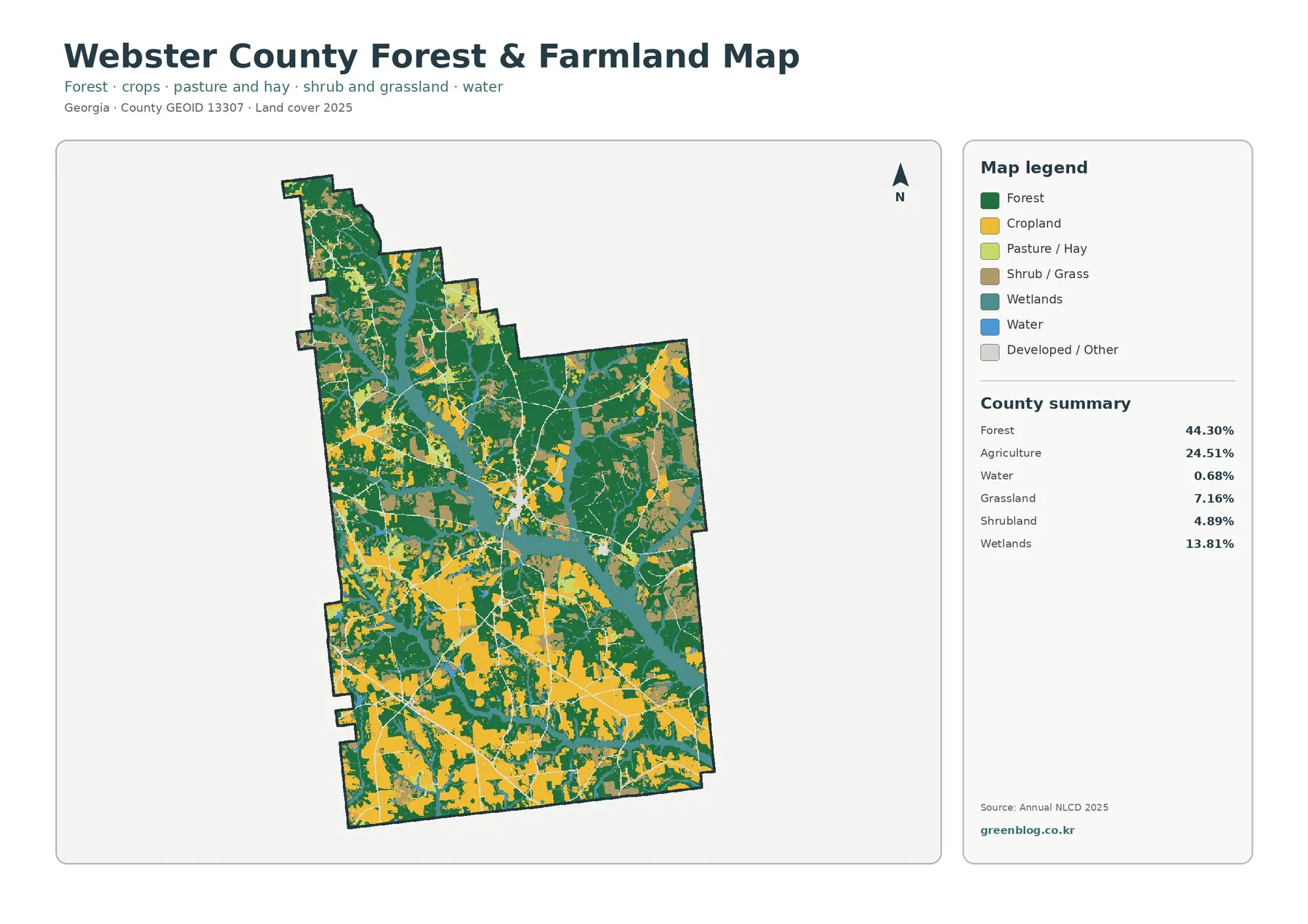
The forest-and-farmland view makes the county’s internal contrast easier to see than the full legend does. Large green forest blocks occupy much of the northern section and continue through the east-central part of the county. Yellow cropland is present there too, but it is more broken and often surrounded by wooded cover. Farther south, yellow fields become broader and more continuous, with forest remaining as sizeable blocks and strips between agricultural areas.
That pattern is consistent with Webster County’s own geographic description. The county government characterizes the north as rolling hills and valleys with large hardwood and pine tracts mixed with farmland, then describes the southern part as somewhat flatter and more open, with farmland and wooded tracts. The map does not contain elevation measurements, so it should not be used as a terrain map, but the change in forest-versus-cropland coverage from north to south gives useful visual context for that local description.
Agriculture accounts for 24.51% of the supplied 2025 summary. The UGA Extension office for Webster County discusses cotton, corn, and peanut production and reports local work on irrigation efficiency in row-crop fields. Those facts help explain why agriculture is an important part of the county’s landscape, but they should not be used to assign crop types to individual yellow polygons. The land-cover image identifies agriculture as a broad surface class; it does not distinguish cotton from corn, peanuts, or another crop.
The same map also separates pasture and hay from cropland and keeps shrub or grass areas distinct. This matters in the southern half, where open-looking land is not all assigned to the same class. A presentation about Webster County agriculture can therefore use this map to show that cultivated fields, pasture-like cover, forest, and wetlands coexist rather than treating every non-forest area as a field. The simplified legend makes those differences easier to explain without the extra developed-land classes in the general image.
The 2025 overview adds wetlands and compact developed areas to that rural pattern
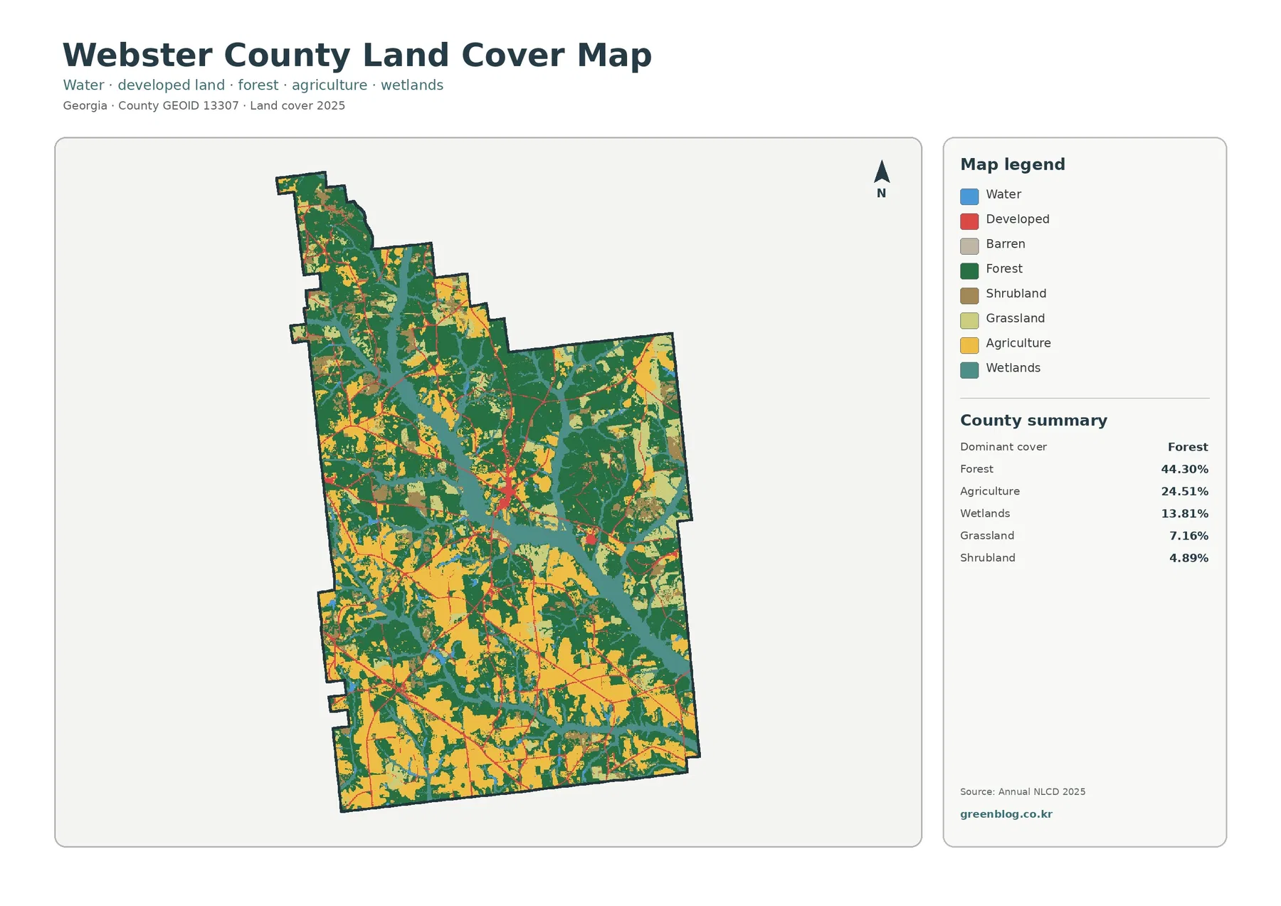
Forest is the dominant class at 44.30%, but the green area is not one uninterrupted mass. Agricultural openings, wetland bands, and narrow developed lines cut through it, especially from the center toward the north. The southern third looks more open because agriculture occupies larger connected patches. This means a single countywide percentage does not fully describe the landscape: the same 44.30% forest share feels much denser in the north than in the most farm-heavy southern areas.
Wetlands cover 13.81%, far more than the 0.68% mapped as open water. Teal wetland areas form irregular bands and branching patches through the county, often between forest and agriculture. Webster County’s history page notes that Kinchafoonee Creek flows through the county, but the supplied image does not label the creek or individual tributaries. For that reason, a particular teal band should not be named as Kinchafoonee Creek without a separate hydrography layer. The map is better used to show the broad extent of wet-surface classes.
Grassland at 7.16% and shrubland at 4.89% contribute another layer of variation. Small light-green and brown areas frequently appear along forest and agricultural edges. They can represent open vegetation or transitional cover, but the map does not tell the reader whether a specific patch is a managed pasture, a recently disturbed site, or another local land use. Land cover records what the surface was classified as, not why it looks that way or how the parcel is legally used.
Developed land is a relatively small 4.63%, with the strongest red concentration near the middle of the county and smaller clusters elsewhere. Webster County government offices and the courthouse are located in Preston, making that central community a useful reference point for understanding the main settlement concentration. The map itself does not print place names or municipal boundaries, however, so the developed colors should be read as surface cover rather than as an exact Preston boundary.
A 0.74% mean impervious share reveals how small the county’s hard-surface footprint is
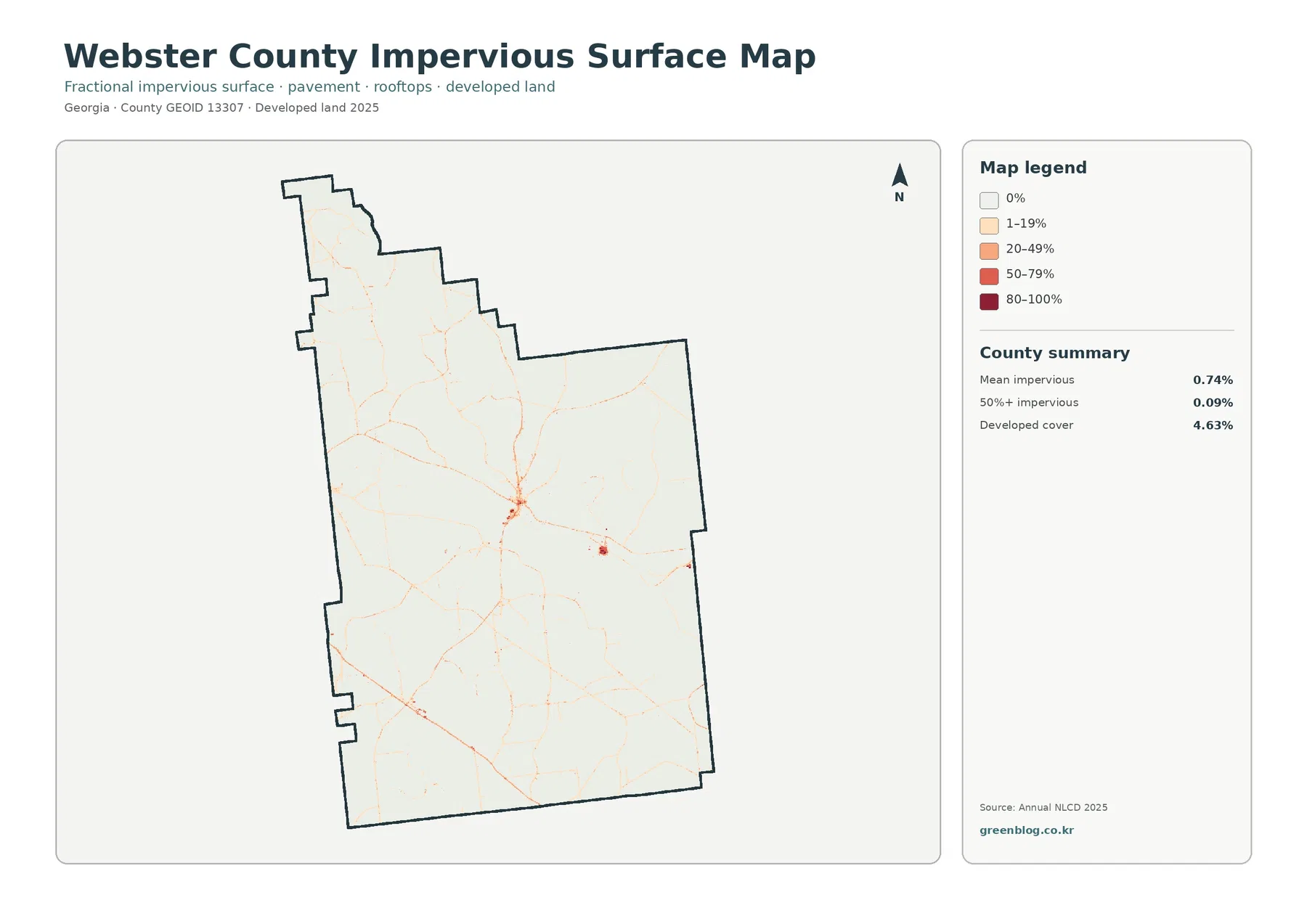
Impervious surface means ground covered by materials such as pavement, parking areas, and rooftops that do not readily absorb rainfall. The supplied county summary gives Webster County a mean impervious share of 0.74%, while only 0.09% of the county is mapped at 50% impervious or higher. These values are much lower than the 4.63% developed-land share because a developed land-cover cell can still contain lawns, trees, soil, and other permeable surfaces around buildings and roads.
The darkest hard-surface concentration occurs near the center, surrounded by lighter linear traces that extend outward. This is consistent with a compact rural service center rather than a continuous urbanized belt. Smaller spots appear east of the main cluster and in the southwest, but most of the county remains in the 0% or 1–19% impervious categories. The contrast is useful when explaining how a county can contain roads and settlements while still having a very low countywide hard-surface average.
Thin lines on this map can be used to discuss the general relationship between transportation corridors and built surfaces, but the image does not label road names. A reader should not identify a particular line as a specific highway solely from this graphic. At 30-meter source resolution, narrow roads can also occupy only part of a cell, and nearby vegetation may affect the fractional impervious value. The image is a county-scale intensity map, not a pavement inventory.
The 1985–2025 comparison is broad, with 38.14% of cells carrying a different endpoint class
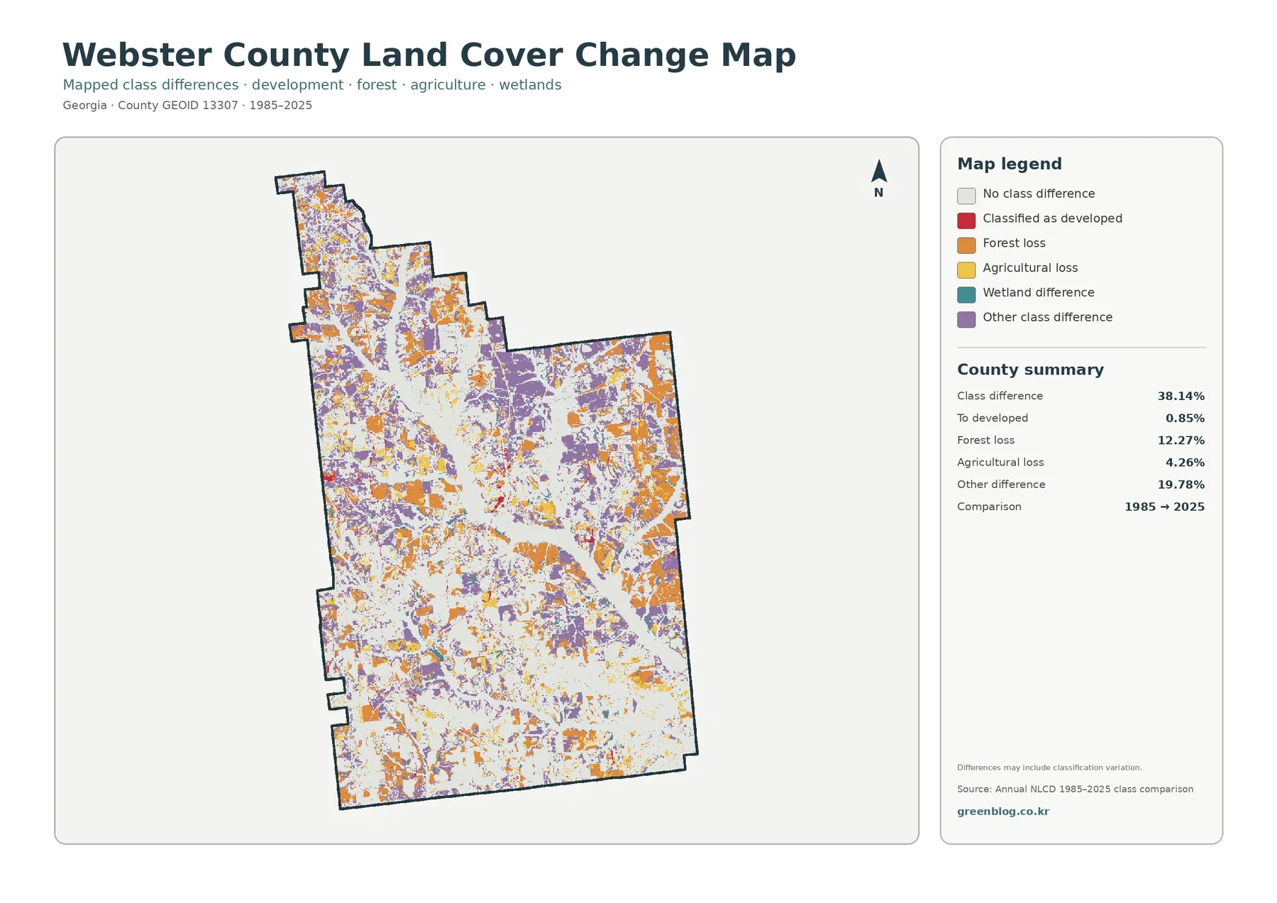
The change layer is visually much busier than the current-condition maps. The summary reports class differences across 38.14% of the county. Forest loss accounts for 12.27%, agricultural loss for 4.26%, cells classified as developed at the 2025 endpoint for 0.85%, and other class differences for 19.78%. A wetland-difference category is also shown in the legend, but the supplied summary does not print a separate percentage for it. The total therefore represents several kinds of endpoint difference, not one trend.
Orange forest-loss cells are distributed through the north, east, central area, and southern margins rather than being confined to one corner. Purple other-difference cells are even more widespread. Current forest can still be the largest 2025 class while many individual cells have a different endpoint classification than they had in 1985. Harvest and regrowth, transitions among vegetation classes, agricultural changes, disturbance, and classification variability are all possible contributors, but the two-date image does not establish a cause for any one patch.
Yellow agricultural-loss cells appear in many of the same mixed forest-and-farm areas that are visible on the current maps. Their 4.26% share should not be read as a direct measure of farms that closed or acreage removed from production. It means the endpoint class is no longer the same agricultural classification that was assigned in 1985. A site could have changed more than once during the forty-year interval, and the map does not show those intermediate steps.
Red developed-endpoint differences are relatively limited at 0.85% and are most noticeable around the county’s compact settlement areas and along a few linear patterns. Comparing this layer with the impervious map can help identify places that deserve closer examination, but it cannot tell the year a building or road appeared. Annual land-cover layers, historical aerial photographs, permits, or local records would be needed to establish timing and cause.
Use the maps for county-scale comparison, not parcel or regulatory decisions
Annual NLCD is based on raster cells that are about 30 meters on a side. A single cell can contain trees, a field edge, a ditch, grass, pavement, and part of a building, yet it still receives one dominant land-cover class in the categorical product. That is appropriate for comparing broad county patterns, but it is not fine enough to define a parcel boundary, measure a narrow road, or decide whether a small wet area is legally regulated.
Land cover should also be kept separate from zoning and ownership. A yellow agricultural cell does not prove that the parcel is legally zoned for agriculture, and a red developed cell does not identify residential, commercial, or industrial zoning. Teal wetland cover is likewise not a regulatory wetland determination. Property rights, building permission, wetland jurisdiction, flood risk, and other legal or engineering questions require current specialized data and often site-level review.
The current maps represent the supplied 2025 observation year. Later timber activity, vegetation recovery, crop rotation, construction, flooding, or water-level changes may not appear. The 1985–2025 layer is an endpoint comparison, not a continuous forty-year history. If a cell changed several times and returned to a class similar to its 1985 state, those intermediate events may be invisible in a simple start-versus-end map.
These limitations do not reduce the value of the set; they define its best use. The maps are well suited to a county profile, classroom explanation, environmental overview, or presentation where the goal is to compare forest, agriculture, wetlands, built surfaces, and broad endpoint differences. They can also help identify areas that warrant a closer look with higher-resolution imagery or official local records.
Select the JPG that matches the question instead of shrinking all four into one panel
The general 2025 map works best as the opening graphic because it shows the entire surface mix at once. Use the forest-and-farmland map when the discussion focuses on the wooded north, larger southern cropland blocks, pasture, and wetland contacts. The impervious map is the clearest choice for explaining the small Preston-centered hard-surface footprint. Put the 1985–2025 comparison later, after viewers understand the current classes, so its orange, purple, and red endpoint-difference colors are not mistaken for today’s land-cover categories.
Each original JPG measures 2480 × 1754 pixels. The supplied asset manifest does not mark these files as meeting an A3 high-resolution reference, so a large poster should be proofed before final printing. For ordinary screens, reports, lessons, and presentation slides, one full-size map followed by a second targeted comparison usually communicates more clearly than placing all four images in a small grid.
The download keeps all four originals together so the sequence can be adapted to the task. A farming discussion might pair the general view with forest and farmland. A settlement or runoff discussion might use the general map with impervious surface. A long-term landscape lesson can finish with the endpoint comparison while emphasizing that the 38.14% figure includes many types of class difference and should not be treated as a development percentage.
Frequently Asked Questions
What is the largest land-cover class in Webster County?
Forest is the largest class in the supplied 2025 summary at 44.30%, followed by agriculture at 24.51% and wetlands at 13.81%. Grassland accounts for 7.16%, shrubland 4.89%, developed land 4.63%, and open water 0.68%. The map places broad forest blocks in the north and larger agricultural areas across much of the south.
Why is developed land 4.63% while mean impervious cover is only 0.74%?
The two measures describe different things. A developed land-cover class can contain lawns, trees, soil, and other permeable surfaces around buildings and roads. Impervious cover isolates hard surfaces such as roofs, pavement, and parking areas, so the countywide mean can be much lower than the total developed-land share.
Does the 38.14% class difference mean that 38.14% of Webster County was developed?
No. Only 0.85% is listed as classified to developed at the 2025 endpoint. The 38.14% total also includes 12.27% forest loss, 4.26% agricultural loss, 19.78% other class differences, and the wetland-difference category shown on the map. Intermediate imagery and local records are needed to determine when and why a particular location changed.
Sources and Reference Data
- MRLC Annual NLCD Data – official access point for the 2025 land-cover and 1985–2025 comparison products used by this map set.
- USGS Annual NLCD Land Cover Classification – class definitions for forest, agriculture, wetlands, developed land, and other Annual NLCD categories.
- Webster County Georgia – Welcome – official local description of the county’s rolling, wooded north and somewhat flatter, more open farmland in the south.
- UGA Extension – Webster County – county-specific agricultural and irrigation context for local row-crop production.
- U.S. Census Bureau TIGER/Line Shapefiles – official county-boundary and administrative geography source.
Map File Information
The ZIP contains four original JPG maps for comparing Webster County's forest, farmland, wetlands, compact developed areas, hard surfaces, and 1985–2025 endpoint differences.
- Included Files: Use only the versions confirmed in the article and supplied images
- File Type: Use the confirmed download contents
- Intended Use: Printing, education, presentations, and map-based projects
Related Maps
- Appling County Georgia Land Cover Map
- Atkinson County Georgia Land Cover Map
- Bacon County Georgia Land Cover Map
Green Map creates custom-edited map images using open geographic data sources such as geoBoundaries, Natural Earth, OpenStreetMap, and government open data.
These maps are edited visual materials, not raw data files, and are provided for education, documents, presentations, and graphic reference.