Terrell County’s 2025 land-cover map is dominated by agriculture, which accounts for 42.78% of the county. Large farm-colored blocks spread across most of the map, while forest and wetlands divide those fields into smaller sections. A compact developed cluster stands out near the middle of the county, making the contrast between the Dawson area and the surrounding rural landscape easy to recognize.
This page compares four views: current land cover, forest and farmland, impervious surface with developed land, and mapped class differences from 1985 to 2025. WebP previews are shown in the article, and the four original JPG maps are available together in one ZIP download. The set is useful when you need to separate present-day land cover from hard-surface concentration and long-term classification change instead of treating them as the same measure.
Table of Contents
Agriculture covers 42.78%, but the fields are broken by wooded and wet corridors
The general 2025 map shows agriculture as the largest mapped category at 42.78%. Forest follows at 27.26%, wetlands at 18.01%, developed land at 5.80%, and grassland at 3.06%. The companion forest-and-farmland summary also lists shrubland at 2.61% and open water at 0.47%. Barren land appears in the legend, but no separate percentage is printed in the supplied summary, so no value has been inferred for it.
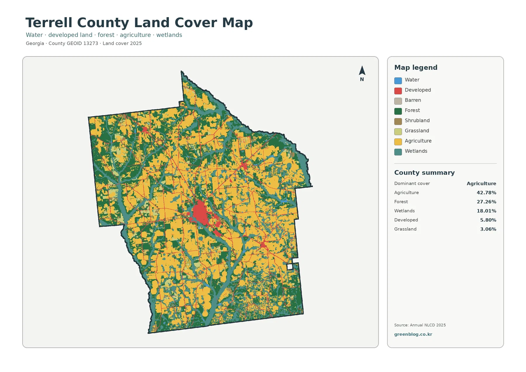
The yellow agricultural areas are not confined to one corner. Broad blocks appear in the west, south, center, and east, with narrower pieces reaching toward the northern extension of the county. Dark-green forest interrupts those fields in irregular belts, and teal wetlands follow winding shapes that cut through the farm landscape. This arrangement matters because a countywide percentage cannot show whether a cover type forms one continuous zone or many separate patches.
The central developed cluster is small compared with the agricultural area, yet it is visually prominent because it is much denser than the surrounding countryside. Thin developed lines extend away from that cluster, and smaller built patches appear elsewhere. The map does not label roads or municipal boundaries, so those narrow features should not be assigned to named highways from the image alone. A road or place-boundary layer is the right source when exact route names or city limits are needed.
| 2025 map summary | Share |
|---|---|
| Agriculture | 42.78% |
| Forest | 27.26% |
| Wetlands | 18.01% |
| Developed land | 5.80% |
| Grassland | 3.06% |
| Shrubland | 2.61% |
| Water | 0.47% |
The forest-and-farmland view makes Terrell County’s rural mosaic easier to follow
Simplifying the color scheme changes what is easiest to see. The forest-and-farmland map keeps cropland in yellow, forest in dark green, wetlands in teal, and water in blue while grouping developed and other surfaces into a pale neutral tone. Large farm blocks become especially clear across the western and southern portions of the county, but wooded strips repeatedly cut between them. Forest is therefore not simply a single outer border around farmland; it is woven through the working landscape.
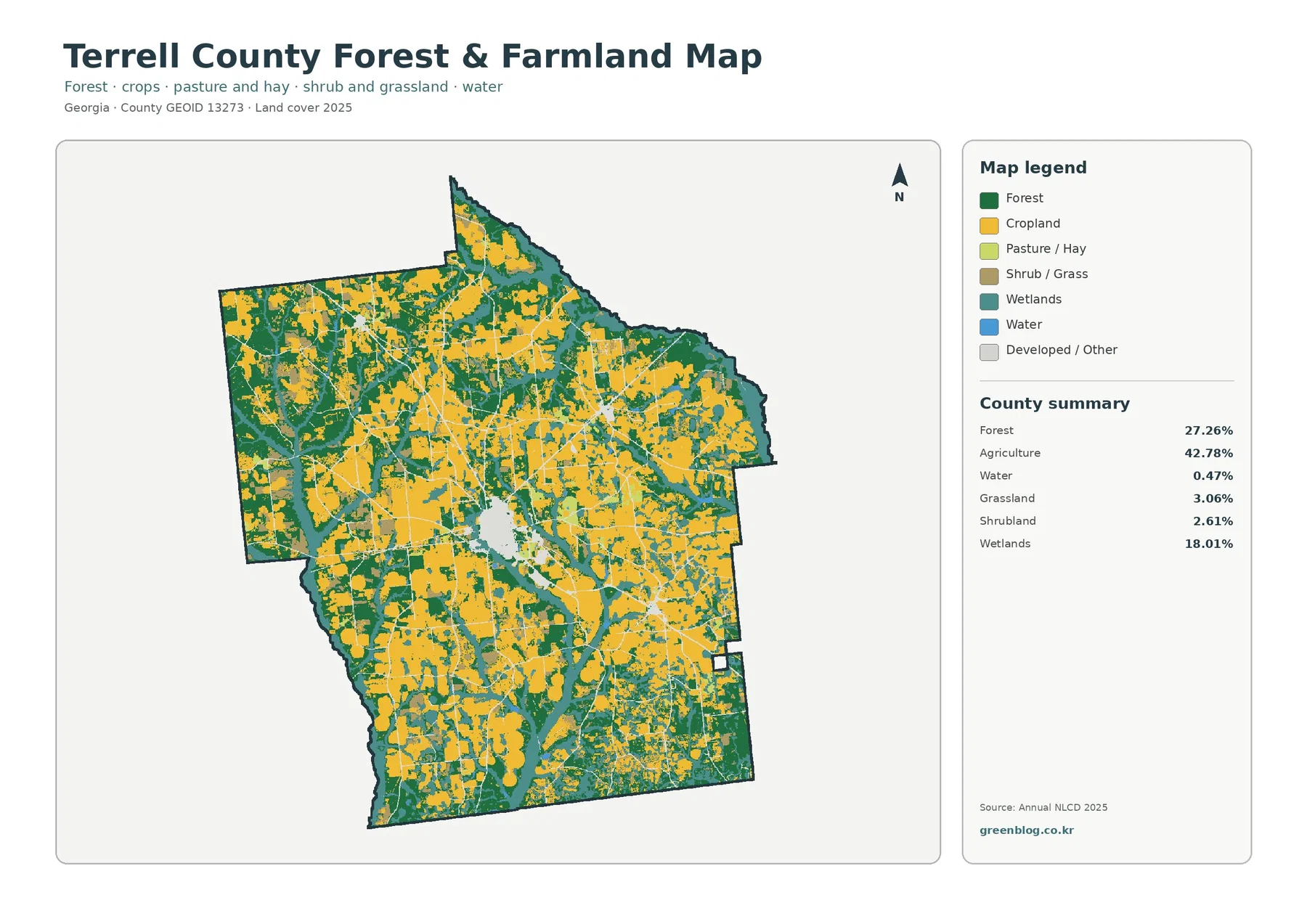
Wetlands deserve separate attention because their 18.01% share is far larger than the 0.47% mapped as open water. Teal wetland bands curve along the northern edge and through several interior corridors, with additional wet areas visible toward the east and west. Blue open-water cells are much less common. Calling all of this “water” would erase the distinction between vegetated wet ground and open water that the classification is designed to preserve.
Terrell County’s UGA Extension office provides research-based services that include soil and water testing and advice for production crops. Its commercial agriculture program also works with growers on crop varieties, budgets, insects, and diseases. Those local resources support the broader point that agriculture is an important part of the county’s landscape and community, but they do not turn the NLCD agricultural color into a crop-specific map. A yellow cell cannot tell you whether a particular field contains peanuts, cotton, corn, soybeans, or another crop.
The same caution applies to forest. A dark-green cell identifies mapped forest cover, not ownership, tree species, conservation status, or timber-management practice. At about 30-meter cell size, a field edge, tree line, narrow road, ditch, and small structure can all influence the classification in one location. This map works well for county-scale comparisons, but parcel boundaries and land-management decisions require more detailed sources.
Dawson forms the clearest hard-surface concentration in an otherwise lightly paved county
The impervious map measures surfaces such as rooftops, pavement, and parking areas that do not readily absorb water. Terrell County’s mean impervious value is 1.02%, and only 0.27% of the county is mapped with at least 50% impervious cover. Those numbers are much lower than the 5.80% developed-land share because a developed land-cover cell can still contain lawns, trees, soil, and other surfaces that allow water to soak in.
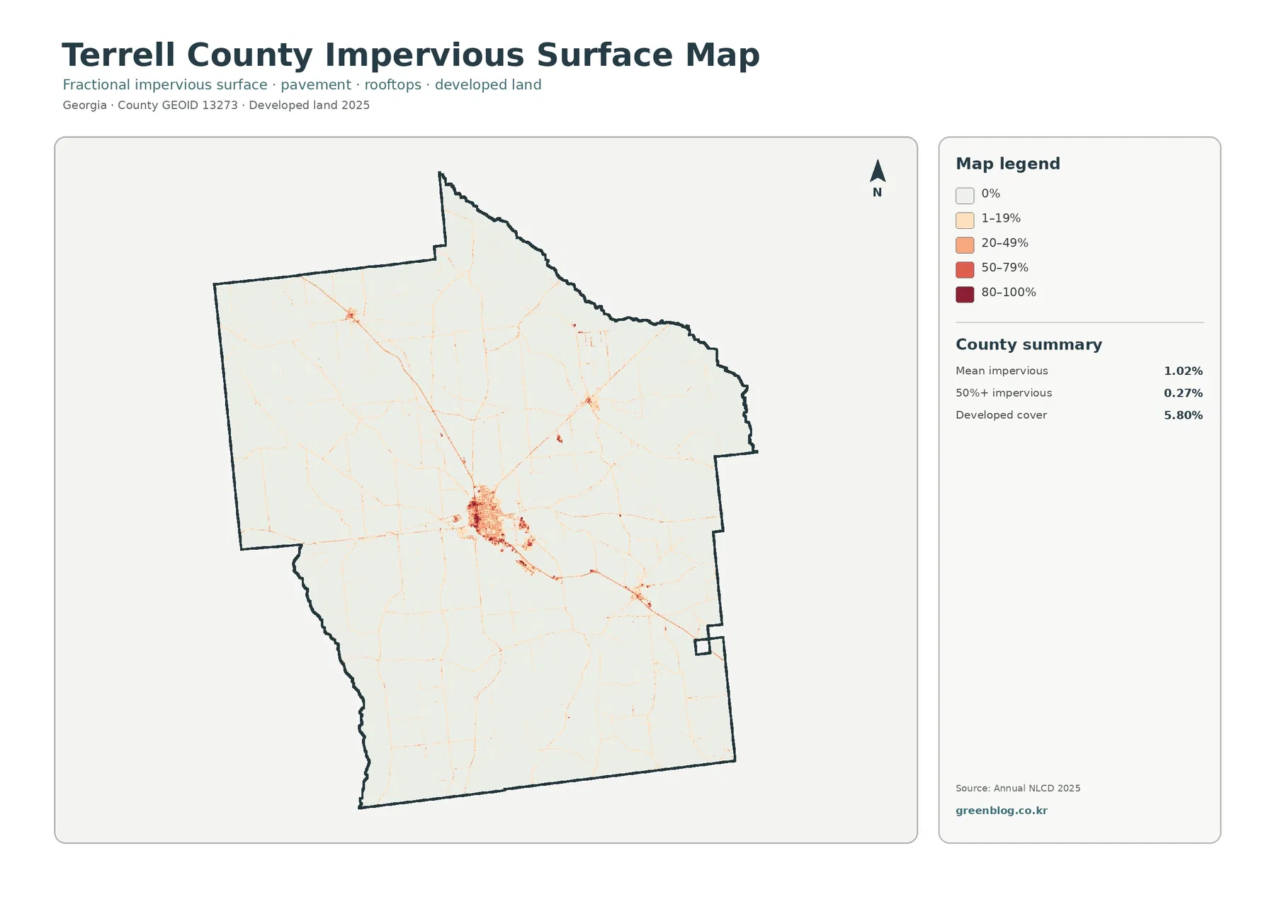
Most of the county is nearly white on this map, indicating zero or very low hard-surface percentages. The strongest orange and red cluster appears near the center, with narrow linear features extending in several directions. The Georgia Department of Community Affairs describes Dawson as the Terrell County seat and the county’s largest city, which provides useful context for identifying this central concentration. The supplied map does not draw a municipal boundary, so the colored cluster should be described as the Dawson area rather than treated as an exact city-limit outline.
DCA’s county planning material also covers Bronwood, Parrott, and Sasser. Small developed nodes appear away from the main cluster, but the land-cover image alone is not enough to match every node to one of those towns with confidence. For a city-by-city comparison, the map can be combined with Census TIGER/Line place boundaries. That extra step keeps the land-cover evidence separate from the administrative geography.
A county mean of 1.02% should not be read as though every place has roughly the same amount of pavement. Large farm, forest, and wetland areas contain many cells with little or no impervious surface, while the central settlement and narrow travel corridors contain much higher values. That uneven distribution is often more informative than the average alone when the goal is to discuss runoff, built intensity, or the contrast between town and countryside.
The 1985–2025 map shows 20.22% class difference, not 20.22% urbanization
The long-term comparison marks cells whose mapped class differs between 1985 and 2025. The county summary reports 20.22% total class difference. Agricultural loss is 6.83%, forest loss is 5.51%, other class difference is 5.80%, and 1.05% is classified as changed to developed. Wetland difference appears in the legend, but the supplied summary does not print a separate percentage for it, so the remaining share has not been calculated and labeled as wetland change.
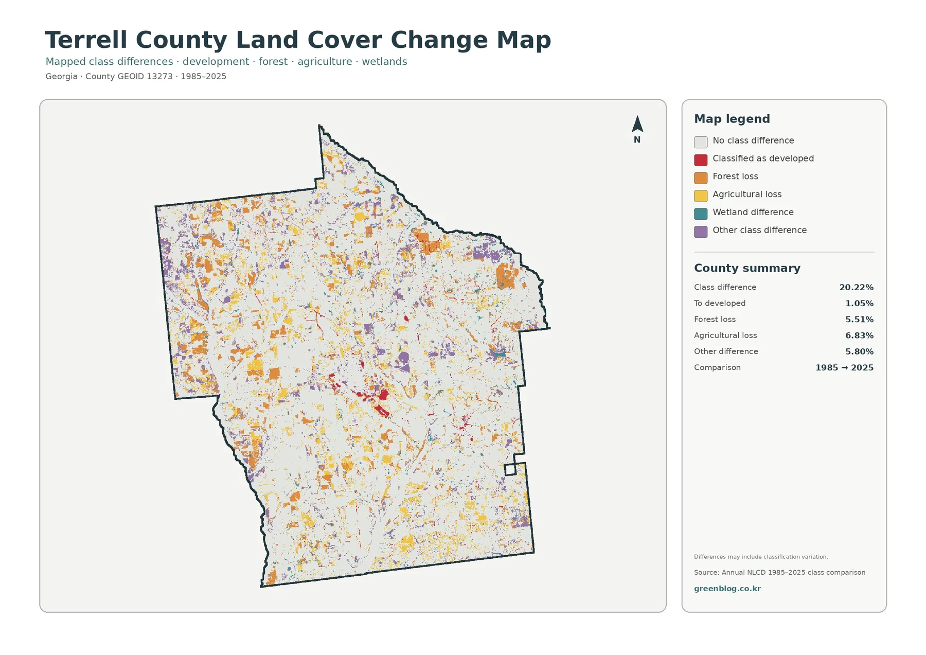
White areas with no class difference still cover most of the county. Yellow agricultural-loss and orange forest-loss patches are scattered widely, while purple other differences form smaller clusters and bands. Red changed-to-developed cells are more concentrated near the central developed area and along a few narrow lines, but they are not the dominant change category. This is why the total 20.22% should never be described as the share of the county that became developed.
Agricultural loss also does not mean farm output fell by 6.83%. It means that cells mapped as agricultural in the earlier comparison are mapped as another class in 2025. Fallow periods, crop rotation, grass or shrub cover, forest regrowth, development, and classification variation can all contribute to a different label. Production trends belong to agricultural statistics, not to a two-date land-cover change percentage.
The map includes an explicit warning that differences may include classification variation. Seasonal vegetation, moisture, image conditions, and classification methods can shift a cell from one class to another without representing a permanent land conversion. A more detailed investigation should compare intermediate Annual NLCD years, recent aerial imagery, and local records rather than treating every colored cell as a confirmed cause or event.
Choosing one map at a time keeps the main question clear
For a quick description of Terrell County today, the general land-cover map is the best starting point because it shows agriculture, forest, wetlands, development, grassland, shrubland, and water in one view. The forest-and-farmland version is better when the task is to compare the large agricultural blocks with wooded and wet corridors. Its simpler palette makes the rural pattern easier to read on a classroom screen or in a presentation.
The impervious map should be used when the question is about hard surfaces rather than land-cover labels. It highlights the Dawson-area concentration and the thin linear features that are difficult to isolate in the general map. The change map belongs in a different part of the discussion because it compares two dates. Keeping current cover, impervious intensity, and class difference in separate panels prevents percentages from one map being accidentally applied to another.
For local planning context, the DCA comprehensive-plan page can supply the names of Dawson, Bronwood, Parrott, and Sasser while Census boundary data can provide precise municipal outlines. For agricultural context, UGA Extension explains services and production topics relevant to local growers. These sources answer questions that the land-cover images cannot: they identify administrative places and agricultural activity, while the maps show how surface classes are distributed.
Comparisons with neighboring counties are also more useful when both percentages and map patterns are considered. Terrell County is notable not simply because agriculture is the largest class, but because the farm-dominant landscape is segmented by wooded and wet corridors and contains one especially strong central built cluster. That combination is more county-specific than a generic statement that the maps are useful for education or planning.
Download the four 2480×1754 JPG maps as one ZIP
The article previews use 1800-pixel WebP files. The download package contains the four original JPG maps: current land cover, forest and farmland, impervious surface with developed land, and 1985–2025 land-cover change. The asset manifest records each JPG at 2480×1754 pixels. Their matching county outline and consistent layout make them convenient for side-by-side use in reports, teaching materials, and regional comparisons.
The manifest does not mark these JPGs as meeting the package’s A3 high-resolution reference. They remain useful for normal documents and screen-based work, but a test print is sensible before producing a large poster. Fine impervious lines and small change-map cells will look coarser as the image is enlarged, so the legend should remain readable at the intended output size.
Keep the legend and year label whenever possible if a map is cropped for a slide. Red on the current land-cover map represents developed land in 2025, while red on the change map represents cells classified as changed to developed between 1985 and 2025. Removing the legend can make the 5.80% current developed share and the 1.05% changed-to-developed figure look interchangeable when they are not.
A practical presentation does not need all four maps on every slide. Use the forest-and-farmland image for the farm landscape, the impervious image for built intensity around Dawson, and the change map only when discussing the two-date comparison. Giving each map a specific job keeps the information readable and avoids repeating the same county description four times.
Thirty-meter cells are useful for county patterns, not parcel decisions
Annual NLCD is raster data, meaning the landscape is divided into square cells. At roughly 30 meters, one cell can contain more than one surface: a tree line beside a field, a narrow road, a ditch, a yard, or a small building. The final class summarizes that cell rather than drawing a surveyed boundary. That is why small parcels, narrow streams, and individual structures may not match the map exactly.
Land cover is also different from zoning and ownership. A cell mapped as agriculture does not prove that a parcel is legally zoned for agriculture, and a forest cell does not indicate public ownership or protected status. Wetland cover is not a substitute for a regulatory wetland delineation. Property, permitting, conservation, and development decisions require the official records and field methods that apply to those questions.
The current maps summarize 2025, while the change layer compares 1985 with 2025. Construction, clearing, regrowth, crop changes, storm effects, or other events after 2025 are not represented. When the present condition of a specific site matters, recent aerial photography and local records should be checked. At the county scale, however, the supplied maps clearly show a farm-dominant landscape, substantial forest and wetland corridors, and a compact hard-surface center around Dawson.
All percentages in this article come from the summaries printed on the supplied maps. No acreage, rank, or unlisted wetland-change percentage has been estimated from the remaining share. Keeping the discussion tied to those verified values makes the four-map set more useful as a reference and reduces the risk of turning a visual classification into a claim the source does not support.
Frequently Asked Questions
What is the largest 2025 land-cover class in Terrell County?
Agriculture is the largest at 42.78%. Forest accounts for 27.26%, wetlands 18.01%, developed land 5.80%, and grassland 3.06%; the forest-and-farmland summary also lists shrubland at 2.61% and water at 0.47%.
Why does the Dawson area stand out on the impervious map if the county mean is only 1.02%?
Hard surfaces are unevenly distributed. Most farm, forest, and wetland areas have little impervious cover, while higher values cluster around the central Dawson area and along narrow travel corridors. Only 0.27% of the county is mapped at 50% or more impervious cover.
Does the 20.22% class difference from 1985 to 2025 mean 20.22% of Terrell County became developed?
No. Only 1.05% is listed as changed to developed. The total also includes 6.83% agricultural loss, 5.51% forest loss, 5.80% other difference, and additional mapped differences that may include classification variation.
Related Maps
- Appling County Georgia Land Cover Map
- Atkinson County Georgia Land Cover Map
- Bacon County Georgia Land Cover Map
Sources and references
- MRLC Annual NLCD Data – official access point for the Annual NLCD data used for the supplied 2025 land-cover and impervious summaries.
- USGS Annual NLCD Land Cover Classification – explanation of the land-cover classes used by Annual NLCD.
- U.S. Census Bureau TIGER/Line Shapefiles – official boundary and geographic reference data useful for checking county, place, and road geography.
- UGA Extension Terrell County – county services including research-based information for production crops and soil and water testing.
- UGA Extension Terrell County Commercial Agriculture – local commercial agriculture support covering production decisions, budgets, varieties, insects, and diseases.
- Georgia DCA Terrell County Comprehensive Plan – official planning material for Terrell County and the cities of Bronwood, Dawson, Parrott, and Sasser.
Green Map creates custom-edited map images using open geographic data sources such as geoBoundaries, Natural Earth, OpenStreetMap, and government open data.
These maps are edited visual materials, not raw data files, and are provided for education, documents, presentations, and graphic reference.