Houston County has one of the clearer urban-to-rural contrasts in central Georgia: a broad developed area fills much of the north, forest and wetlands become more prominent toward the east, and large agricultural blocks spread across the south. This Houston County Georgia Land Cover Map set uses 2025 cover data to show where those surfaces occur and how the Warner Robins–Perry side of the county differs from the more wooded eastern landscape.
The page includes four views: current land cover, forest and farmland, impervious surface and developed land, and a 1985–2025 class-difference map. After reviewing the WebP previews, you can download the four original JPG maps together in one ZIP. They work well for county profiles, classroom comparison, presentations, and other projects that need a readable county-scale overview rather than parcel detail.
Table of Contents
A county split between a developed north and a greener east
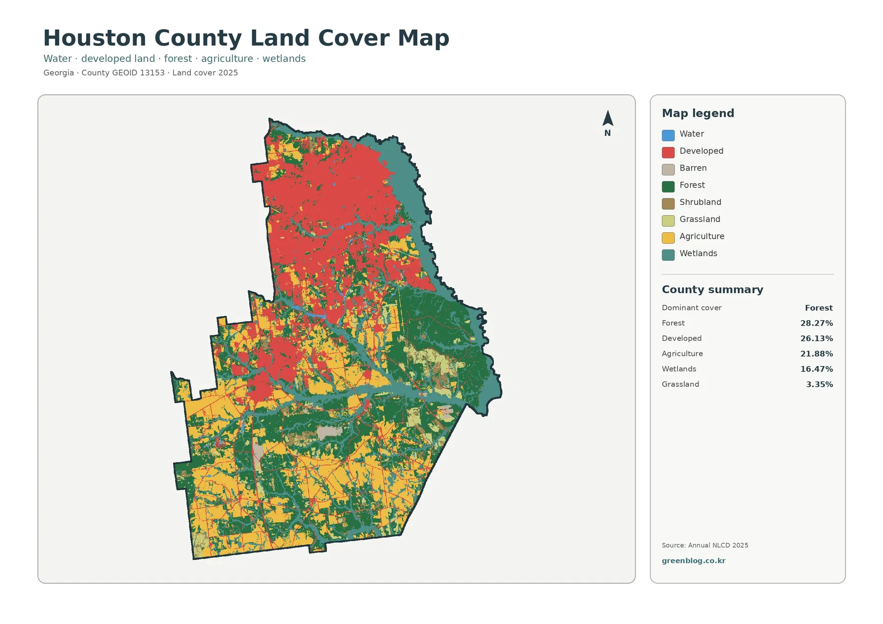
Forest is the largest class in the supplied 2025 summary at 28.27%, but developed cover follows closely at 26.13%. Agriculture accounts for 21.88% and wetlands for 16.47%, while grassland is 3.35%, shrubland 2.57%, and open water 0.69%. Those percentages describe a county without a single overwhelming surface type. More importantly, the classes are not evenly mixed: the map separates into large zones that look very different from one another.
The strongest developed concentration occupies the north and northwest. Red cover forms a broad, connected area with smaller pockets of forest, agriculture, and wetland embedded within it. Georgia’s Department of Community Affairs comprehensive plan treats Warner Robins, Centerville, and Perry as the county’s principal municipal areas and also identifies Robins Air Force Base as a major part of the county’s development context. The land-cover image does not draw city or installation boundaries, so the red area should not be treated as an administrative footprint, but that official context helps explain why the northern half looks so different from the rural south.
East of the main developed belt, the colors shift toward dark green forest and teal wetlands. A particularly broad wooded area appears in the east-central part of the county, and wetlands follow much of the irregular eastern edge. The DCA plan notes that the Ocmulgee River forms the county’s eastern boundary and that most of the Oaky Woods Wildlife Management Area lies in eastern Houston County. That local information is consistent with the greener eastern pattern, although the map itself does not show the river channel or the wildlife-management boundary precisely.
Southern Houston County has a different texture again. Large yellow agricultural blocks appear across the southwest and southern interior, broken by forest strips and wetland corridors. Development is present, but it is much less continuous than in the north. This makes the county useful for showing why a percentage alone cannot describe land cover: developed land and forest are close in total share, yet one is heavily concentrated in the north while the other becomes far more important in the east and in rural areas farther south.
Land cover is a description of the surface, not a zoning or ownership map. Annual NLCD classifies each cell by the predominant surface category visible in the source data. A developed cell can still contain lawns, trees, or bare soil, and an agricultural cell can include farm roads, small buildings, drainage features, or tree lines. The colors therefore should not be used to decide legal land use, property boundaries, building eligibility, or the exact edge of a farm.
Farmland expands south while forest and wetlands hold the eastern side
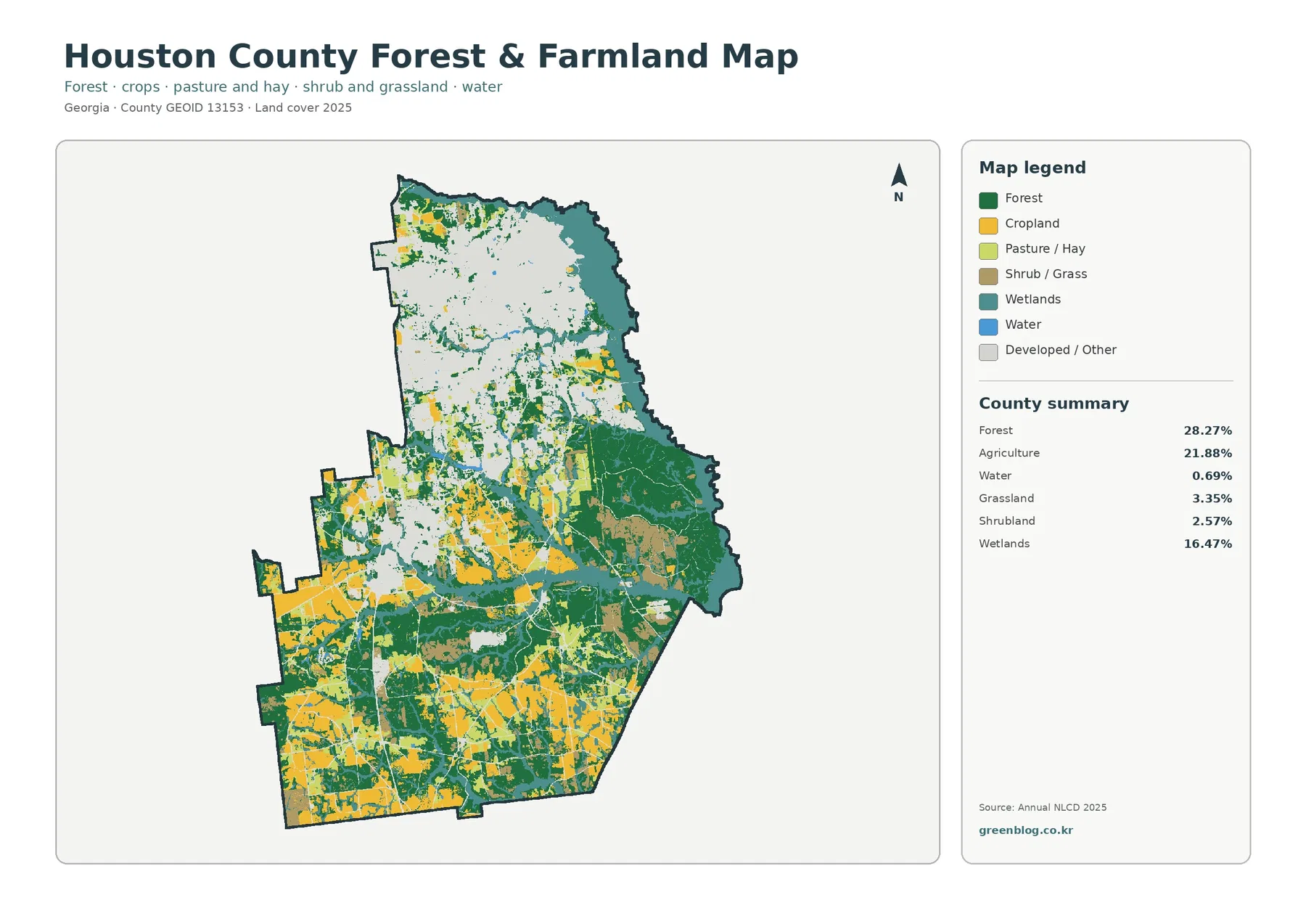
Removing most of the visual weight from developed land makes the rural pattern much easier to see. Agriculture, at 21.88%, forms broad blocks in the south and southwest and reappears in smaller patches through the central county. Forest, at 28.27%, is more widespread. It fills large areas of the east, surrounds many agricultural blocks farther south, and forms narrow connections through places where working land and natural cover meet.
The eastern side is notable because wetlands are not a minor accent. They cover 16.47% of the county, compared with only 0.69% for open water. The difference matters when reading the colors. Blue generally marks exposed water surfaces, while the wetland class can include vegetation and soils strongly influenced by water. A broad teal corridor therefore does not mean that the entire area is permanently underwater. Wetland jurisdiction, flood zones, and site drainage require newer and more specialized sources.
Houston County’s local agricultural context also supports a careful reading of the southern map. UGA Extension’s Houston County Agriculture and Natural Resources program describes row-crop work that includes cotton and peanut trials, along with farmer education and soil and water testing. That confirms an active agricultural setting, but the NLCD image does not identify individual crops. A yellow cell indicates an agricultural class in the supplied data, not a specific field owner or crop for the 2025 season.
For a presentation about rural land, the southern half is often more informative than the countywide percentages. Large agricultural blocks sit beside forest and wetland strips rather than forming one uninterrupted farming surface. Looking east, the balance reverses: forest and wetlands become the dominant visual elements, with agriculture appearing in smaller openings. The contrast helps a viewer understand how the same county can support a major urban center, active agriculture, and extensive natural cover at the same time.
Impervious cover pinpoints the hardest-surfaced parts of the county
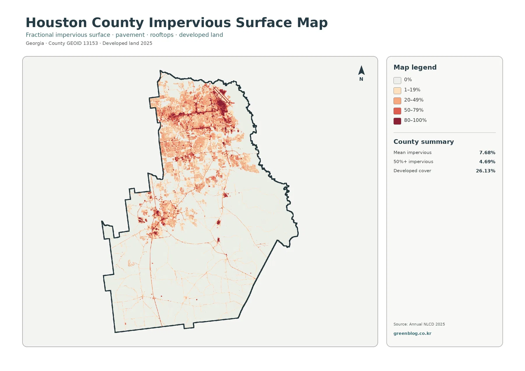
Impervious surface means roofs, paved roads, parking areas, and similar materials that do not readily absorb water. Houston County’s mean impervious value is 7.68%, and 4.69% of the county falls in cells that are at least 50% impervious. Both figures are much lower than the 26.13% developed-cover share because a developed land class can include grass, trees, soil, and landscaped open space as well as hard surfaces.
The map makes the northern urban concentration much sharper than the general land-cover image. Dark red and medium-red cells cluster across the north, with dense centers connected by lighter developed bands. The pattern broadly corresponds to the Warner Robins–Centerville urban area and the Robins Air Force Base context described in the county comprehensive plan. Because the image contains no street names or installation limits, it should be used to compare development intensity rather than to identify a particular property, runway boundary, access point, or municipal line.
A second hard-surface cluster appears farther south and west of the northern concentration, in the part of the county associated with Perry. Thin lines extend away from these developed centers and through otherwise lightly impervious areas. They can help show how built surfaces connect urban and rural parts of the county, but the image is not a road map. Without a transportation overlay, individual lines should not be assigned road names solely from their shape.
The eastern and southern parts of the county are much paler overall. Forest, wetlands, and farmland dominate there, so most cells contain little or no impervious surface. Small darker spots still appear around scattered development and along transportation corridors, but they do not form the large continuous mass found in the north. This contrast is useful for discussing where hard surfaces are concentrated, not for estimating flood risk. Runoff depends on rainfall, soils, slope, drainage, and water levels as well as impervious cover.
The 1985–2025 comparison records a large developed-class shift in the north
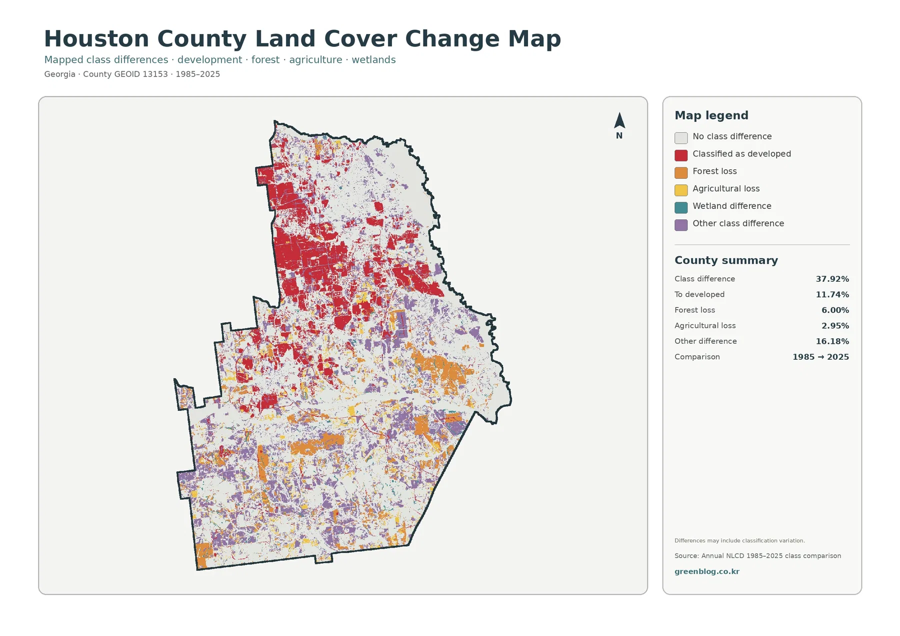
The endpoint comparison reports a total class difference of 37.92%. Within that total, 11.74% is classified as changing to developed, 6.00% as forest loss, 2.95% as agricultural loss, and 16.18% as other difference. Wetland difference is shown in the legend but no separate percentage is supplied, so it would be misleading to calculate the remainder and present it as an official wetland-change statistic.
Red developed-conversion cells are especially extensive across the north and northwest, where current developed and impervious cover are also strongest. Another group appears around the more southerly developed center. This is one of the clearest county-specific signals in the four-map set. It means those cells received a developed classification at the 2025 endpoint relative to the 1985 comparison, but it does not provide a construction date or prove that every red cell changed for the same reason.
Orange forest-loss cells and purple other-class differences are more scattered through the eastern and southern parts of the county. Yellow agricultural-loss areas appear in smaller patches. The word “loss” here is a class-to-class comparison: a cell that started as forest or agriculture in 1985 received another class in 2025. Logging, farming changes, construction, regrowth, storm effects, seasonal conditions, or classification variation cannot be separated from this single endpoint image without more evidence.
The safest way to use the change layer is to place it after the current-cover map. First identify where forest, agriculture, wetlands, and developed land are located in 2025. Then compare the same area on the change image. That sequence reduces the chance of mistaking a change color for the present land-cover class. The map also notes that differences may include classification variation, and an area that changed more than once between 1985 and 2025 could end in a class similar to its starting condition and appear unchanged in an endpoint comparison.
Choosing one map for a report, lesson, or county profile
For a general Houston County profile, start with the 2025 land-cover map. It is the only single image that makes the developed north, forested and wet eastern side, and agricultural south visible together. If the question is about working land and natural cover, the forest-and-farmland view removes much of the urban visual clutter. For a discussion of the built environment, the impervious map gives a more direct measure of hard surfaces than the broader developed-land class.
The maps become more useful when two related views are compared at the same location. In the north, compare developed cover with impervious intensity to show why a developed class is broader than roofs and pavement. In the east, compare the general map with the vegetation view to see how the 28.27% forest share and 16.47% wetland share occupy large adjoining areas. In the south, the farmland map makes the 21.88% agricultural share easier to interpret because field blocks can be seen against the surrounding forest strips.
Avoid shrinking all four maps into a single small graphic if the audience needs to read the legend or inspect the change pattern. One large primary map, followed by a second comparison image, is usually clearer. The change map in particular contains many small colored patches, so it benefits from the full JPG rather than a small screenshot. Keeping the original file also avoids the quality loss that can occur when an image is repeatedly resaved.
Scale, dates, and legal questions set the limits of the maps
Annual NLCD uses 30-meter raster cells, meaning the county is divided into squares and each square receives one predominant class. A single cell can contain a house, lawn, trees, a ditch, pavement, and bare soil, yet the map still simplifies it to one main category. Enlarging the JPG can make the legend and boundaries easier to read, but it cannot recover parcel-level detail that was never present in the source cells.
The current maps represent the supplied 2025 observation year. Construction, vegetation recovery, timber activity, crop conditions, flooding, or road work after that date may not appear. This matters most in rapidly changing developed areas. Houston County’s Planning and Zoning office handles official land-use and development rules, so zoning, permits, property decisions, and legal boundaries should be checked against current county records rather than inferred from NLCD colors.
Each original JPG is 2480 × 1754 pixels. That size works for web use, normal reports, and ordinary presentation slides, but the supplied package does not claim that the files meet an A3 high-resolution standard. If a large poster is required, make a test print before committing to the final layout. The maps are reference graphics, not survey, engineering, flood-insurance, wetland-jurisdiction, or site-development documents.
Frequently Asked Questions
Is developed land the largest cover class in Houston County?
No. Forest is the largest 2025 class at 28.27%, while developed cover is close behind at 26.13%. The developed class looks dominant on the map because it is concentrated in one large northern area. Agriculture still covers 21.88% and wetlands 16.47%, so the county as a whole is better described as a strong urban-rural mix than as a uniformly developed landscape.
Do the eastern forest and wetland colors show the exact Oaky Woods or Ocmulgee River boundaries?
No. The county comprehensive plan states that most of Oaky Woods Wildlife Management Area lies in eastern Houston County and that the Ocmulgee River forms the eastern county boundary, so those features provide useful geographic context. The land-cover image does not draw their official boundaries, however, and should not be used as a substitute for a wildlife-management, river, parcel, or regulatory map.
Does the 37.92% class difference mean that 37.92% of Houston County was developed?
No. The developed-conversion category is 11.74%. The total 37.92% also contains forest loss, agricultural loss, wetland difference, other class differences, and possible classification variation. It compares cell classes at the 1985 and 2025 endpoints rather than measuring all physical change or construction during every year in between.
Sources and Reference Data
- MRLC Annual NLCD Data – official data source for the supplied 2025 land-cover and 1985–2025 comparison views
- USGS Annual NLCD Land Cover Classification – definitions and documentation for forest, developed, agricultural, wetland, and related cover classes
- Georgia DCA – Houston County Comprehensive Plan – official planning material covering Houston County, Centerville, Perry, Warner Robins, Oaky Woods, the Ocmulgee River, and local development context
- UGA Extension – Houston County Agriculture & Natural Resources – county-specific agriculture and natural-resource programs, including row-crop work and soil and water testing
- Houston County Building Inspection, Planning & Zoning – official county information for zoning, development regulations, and planning matters
Map File Information
The ZIP contains four original Houston County JPG maps for comparing current cover, forest and farmland, impervious surfaces, and 1985–2025 class differences.
- Included Files: Use only the versions confirmed in the article and supplied images
- File Type: Use the confirmed download contents
- Intended Use: Printing, education, presentations, and map-based projects
Related Maps
- Appling County Georgia Land Cover Map
- Atkinson County Georgia Land Cover Map
- Bacon County Georgia Land Cover Map
Green Map creates custom-edited map images using open geographic data sources such as geoBoundaries, Natural Earth, OpenStreetMap, and government open data.
These maps are edited visual materials, not raw data files, and are provided for education, documents, presentations, and graphic reference.