The Putnam County Florida Land Cover Map is defined by a mix rather than a single overwhelming surface. Forest is the largest 2025 class at 34.45%, but wetlands account for another 23.34%, developed land 13.23%, water 10.41%, and agriculture 10.30%. Across the map, wooded areas are repeatedly interrupted by lakes, wet ground, farms, and settled areas, giving the county a much more varied appearance than the leading forest percentage suggests.
This page compares four views of the same county: 2025 land cover, forest and farmland, impervious surface and developed land, and a 1985–2025 class-difference map. The WebP images can be reviewed in the article, and the four original JPG maps are available together in one ZIP download below. They are useful for county profiles, classroom comparisons, presentations, and broad environmental reference.
Table of Contents
Forest leads the county total, but lakes and wetlands keep breaking up the green
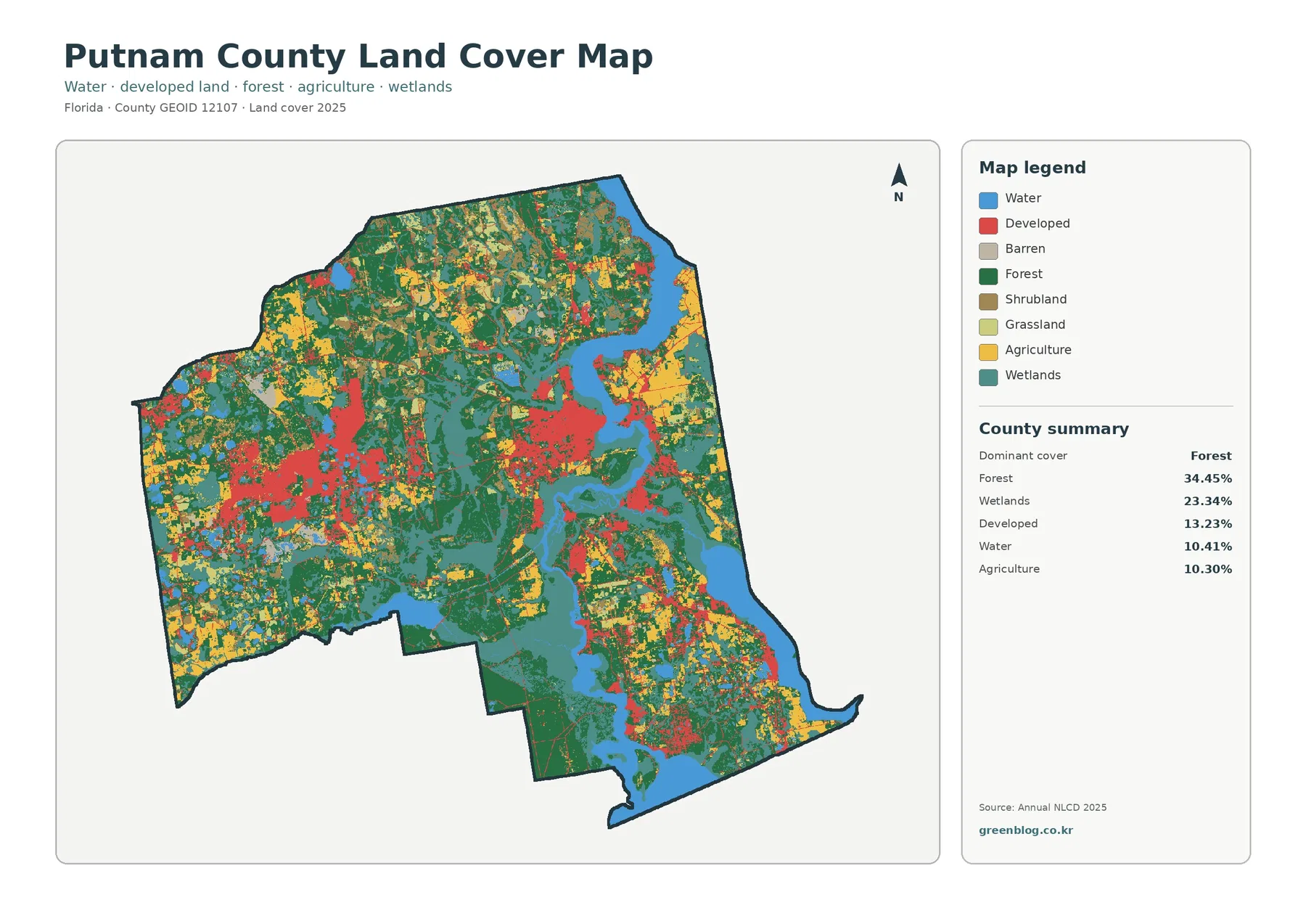
Dark green forest is widespread in the north, through the interior, and across parts of the south. At 34.45%, it is the county’s largest single class, yet it does not form one uninterrupted block. Blue water and teal wetlands divide the forest in many places, while red developed cover and yellow agricultural areas appear in several separate parts of the county. The resulting pattern is better described as a wooded, lake-rich interior with multiple settled and working-land areas than as a uniformly forested county.
Wetlands are the second-largest class at 23.34%. They are especially visible around the broad water features through the central and southern portions of the county and along parts of the eastern side, with smaller wet areas scattered farther west. Water itself accounts for 10.41%, a substantial share for a county-scale map. The contrast between open water and wetland matters: a wetland can contain vegetation and saturated ground without appearing as a blue open-water cell.
Developed land covers 13.23%. The most obvious concentration lies near the central-eastern part of the county, with additional developed areas in the west and southeast and thin traces connecting some of those areas. Agriculture is close behind at 10.30% but has a different layout. Yellow agricultural cover is more noticeable across portions of the north, east, and west, often meeting forest or wetland rather than forming one continuous farm district.
These categories describe the physical cover mapped at the surface; they are not zoning districts, ownership boundaries, or legal land-use designations. A developed cell can include lawns and trees as well as buildings and pavement, and an agricultural cell does not identify a particular farm parcel or crop. Putnam County’s official Planning and Zoning resources should be used when the question is what a property is legally allowed to support.
Putnam County’s lake network and the St. Johns River provide useful context for the mapped water
Putnam County’s conservation planning material describes roughly 260 lakes of 10 acres or more, with many lakes concentrated in the western and southeastern parts of the county. The St. Johns River Water Management District also places Putnam County on the St. Johns River as the river enters northeast Florida and widens substantially. That official background helps explain why water and wetland cover are such important parts of the countywide image.
The county’s St. Johns Paddling Trail page says the river runs about 60 miles through Putnam County and notes the Palatka crossing as well as the southern connection toward Lake George. Those facts are useful for regional orientation, but the land-cover image should not be treated as a labeled hydrography map. Blue cells identify open-water cover; they do not supply channel names, navigation limits, shoreline ownership, or regulatory boundaries.
The same distinction is important for wetlands. Teal areas often border large water features, but a mapped wetland cell is not automatically a jurisdictional wetland boundary, refuge boundary, or flood zone. Conversely, a small wet place may be generalized at this county scale. The map is strongest when used to compare broad surface patterns and to identify areas that deserve closer study with more specialized data.
The vegetation view separates a broad forest network from smaller working-land areas
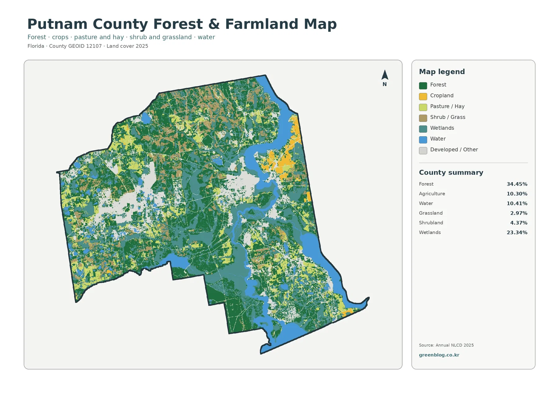
Removing the strong red developed class makes the 34.45% forest share easier to follow. Large wooded areas occupy much of the north and extend through the interior and south, although water and wetlands repeatedly cut through them. The western half also contains many forested areas, but they are mixed with other land-cover types. This is not a simple east-versus-west split; forest appears across most parts of the county in different shapes and sizes.
Agriculture accounts for 10.30%. It is most visible in several broader areas in the northeast and east, with additional blocks in the west and interior. Those yellow areas often sit next to forest, wetland, or developed cover, so the map does not support describing a single continuous agricultural belt. It is useful for locating working-land cover at the county scale, but it cannot tell the reader which crop is grown, whether a field is active in a particular season, or where one farm property ends.
Grassland is summarized at 2.97% and shrubland at 4.37%. These classes fill smaller transitions among forest, agriculture, wetland, and settled areas. Their countywide shares are modest, yet they help explain why some boundaries do not look clean or abrupt. A real landscape can contain mixed vegetation over short distances even when the raster map assigns each cell to one dominant class.
Only a small part of the county has strongly impervious surfaces
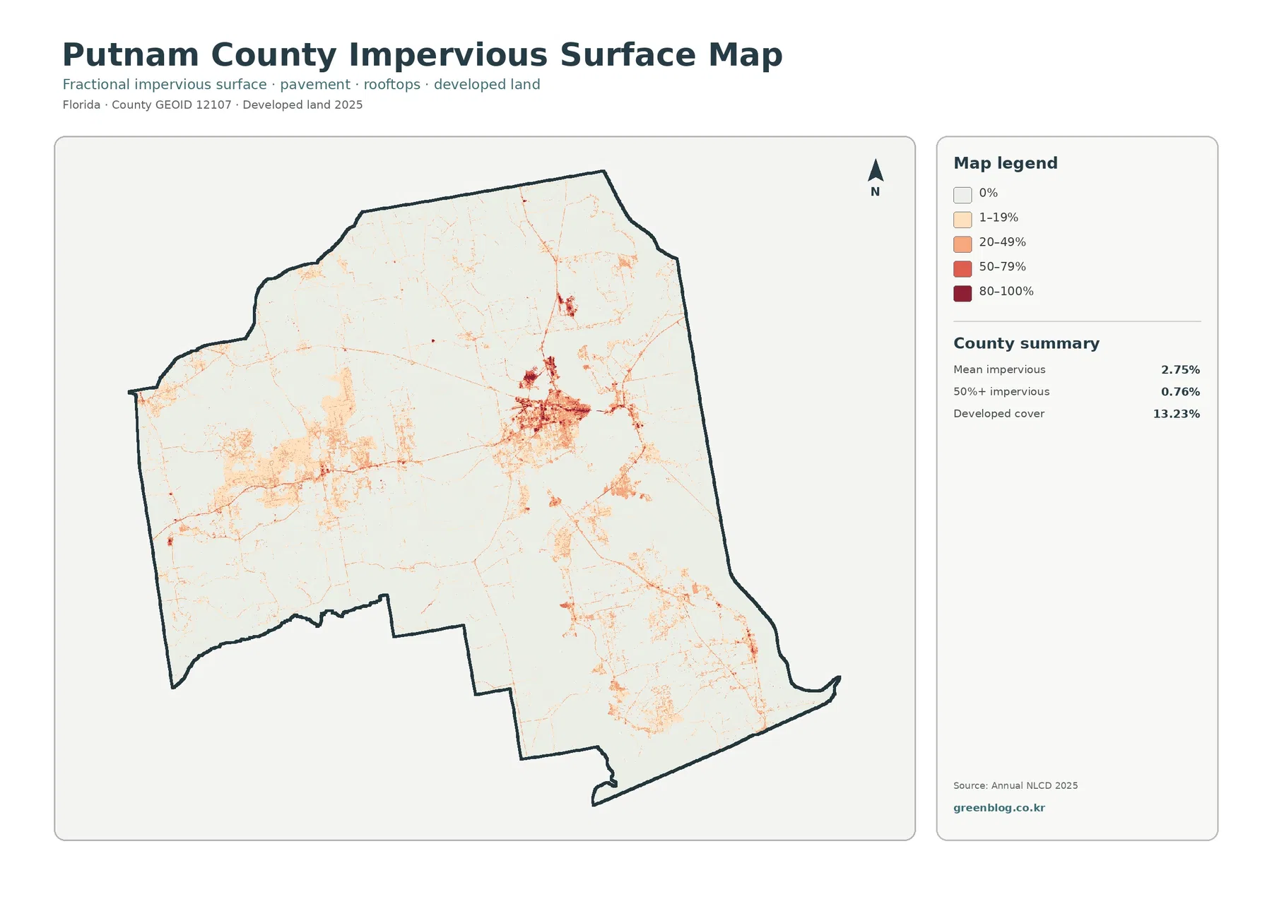
The impervious map tells a more concentrated story than the 13.23% developed-cover figure. Mean impervious cover is only 2.75%, and just 0.76% of the county is mapped at 50% or greater impervious surface. That difference is expected because a developed land-cover class can include permeable lawns, trees, and open ground along with buildings and paved surfaces.
The darkest values are centered in a compact developed area slightly east of the county’s middle. Narrower high-value traces extend outward, while weaker concentrations appear in the west and southeast. Most of the county remains near the light end of the scale. This makes the map useful for explaining where hard surfaces are concentrated even though developed land appears across a larger area on the general land-cover map.
Thin impervious lines may resemble roads, but this is not a transportation map. It does not identify route names, lanes, traffic, or pavement condition. Likewise, low impervious cover does not guarantee low flood risk. Rainfall, soils, drainage, elevation, wetlands, and connected waterways all influence how water moves through a landscape, so site-level drainage questions require other data.
The 1985–2025 comparison highlights forest differences more than any other named change category
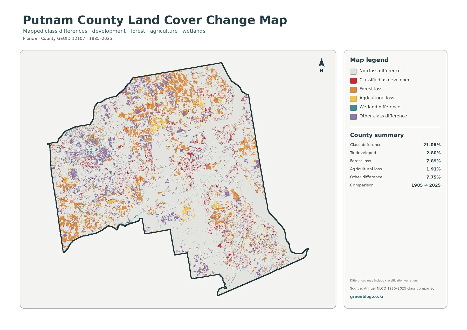
The two-date comparison reports a total class difference of 21.06%. That should not be translated into a claim that 21.06% of the county was physically transformed. The map itself warns that classification variation may be included. Different imagery, seasonal conditions, mixed cells, and classification rules can affect the result along with real land-cover change.
Forest loss is the largest named category in the summary at 7.89%. Orange is especially widespread across the north and west, with additional areas in the south. Cells classified to developed account for 2.80% and appear around present developed concentrations and several connecting areas. Agricultural loss is 1.91%, while other class difference is 7.75%. Wetland difference is shown in the legend, but the supplied summary does not provide a separate percentage for it, so an exact value should not be estimated from the colors.
This map is best used to choose places for follow-up rather than to assign a cause. A forest-loss cell could reflect clearing, harvesting, conversion, storm effects, regrowth cycles, or classification differences that require more evidence to distinguish. Intermediate-year imagery, local planning records, and additional land-cover data are the appropriate next step when a particular location matters.
Cross-checking the four maps prevents several common reading mistakes
The first useful comparison is forest versus water and wetland. Forest is the largest individual class, but wetlands and open water together occupy a major share of the county and repeatedly divide wooded areas. The general map reveals that countywide mixture, while the vegetation view makes the boundaries among forest, agriculture, wetland, and water easier to follow.
The second comparison is developed cover versus impervious surface. A 13.23% developed share can sound much more urban than the 2.75% mean impervious value suggests. Looking at both maps shows that development includes substantial permeable surface and that the hardest surfaces are concentrated in relatively small areas. This is a clearer description than calling every developed cell paved or urbanized.
The third comparison is current condition versus two-date difference. The 2025 maps answer what the latest supplied classification looks like. The change map answers where 1985 and 2025 classifications differ. A red change cell is therefore not simply another current developed class, and an orange forest-loss cell does not by itself state why the classification changed.
Large-format viewing helps with comparison, but it does not create parcel-level detail
Annual NLCD is a raster land-cover product designed for broad landscape analysis. Each cell is assigned a class even though the real ground within that cell may contain trees, grass, pavement, standing water, or other surfaces together. Edges around lakes, wetlands, roads, and developed areas are therefore generalized, particularly where several land-cover types meet over short distances.
The supplied original JPG maps are 2480×1754 pixels. They are convenient for screens, handouts, and many presentation layouts, but the package does not mark them as A3 300-dpi high-resolution originals. Enlarging the file can make small map colors easier to see, yet it does not add new source detail. Parcel lines, individual buildings, narrow channels, and precise regulatory boundaries require more detailed datasets.
The 2025 classification is also a dated observation. Development, vegetation management, farming, flooding, or other changes after that date may not appear. The 1985–2025 map is a comparison of two endpoints rather than a year-by-year history, so a place could change more than once between those years and finish in a class similar to the one it began with.
Choose the JPG that matches the question instead of crowding all four into one graphic
For a general county profile, the 2025 land-cover map is the most efficient starting point because it combines forest, wetland, water, agriculture, and development in one frame. Use the forest-and-farmland map when the focus is vegetation or working land. The impervious map is better for concentrated development intensity, and the 1985–2025 map is the right choice when the subject is where classifications differ across time.
Frequently Asked Questions
What is the largest land-cover class in Putnam County?
Forest is the largest 2025 class at 34.45%. Wetlands follow at 23.34%, then developed land at 13.23%, water at 10.41%, and agriculture at 10.30%. The map still looks highly mixed because lakes and wetlands repeatedly divide the forested areas.
Why is developed cover 13.23% when mean impervious cover is only 2.75%?
Developed land can include trees, lawns, and other permeable surfaces around homes, businesses, and roads. Impervious cover isolates hard surfaces such as rooftops, pavement, and parking areas, so its countywide average can be much lower than the broader developed-land share.
Does the 21.06% class difference mean that much of Putnam County was physically changed?
No. It is the share of cells classified differently in the 1985 and 2025 comparison. Real change may be part of the result, but classification variation can also be included, so specific causes should be checked with imagery and additional records.
Sources and Reference Data
- MRLC Annual NLCD Data — source information for the 2025 land-cover and 1985–2025 comparison products.
- USGS Annual NLCD Land Cover Classification — official definitions and background for forest, wetland, developed, agricultural, and other classes.
- Putnam County Conservation Element — official comprehensive-plan background on the county’s lakes and natural resources.
- Putnam County Planning & Zoning — official county information for zoning, the comprehensive plan, and property development questions that are separate from land-cover classification.
- Putnam County St. Johns Paddling Trail — county information on the St. Johns River reach, the Palatka bridge, and the Lake George area.
- St. Johns River Water Management District — official background on the St. Johns River and its passage through Putnam County.
Map File Information
The ZIP contains the four original JPG land-cover maps used in this Putnam County article.
- Included Files: Use only the versions confirmed in the article and supplied images
- File Type: Use the confirmed download contents
- Intended Use: Printing, education, presentations, and map-based projects
Related Maps
- Alachua County Florida Land Cover Map
- Baker County Florida Land Cover Map
- Bay County Florida Land Cover Map
Green Map creates custom-edited map images using open geographic data sources such as geoBoundaries, Natural Earth, OpenStreetMap, and government open data.
These maps are edited visual materials, not raw data files, and are provided for education, documents, presentations, and graphic reference.