Wetlands define the supplied 2025 Dixie County land-cover map. They account for 49.08% of the county, followed by forest at 24.89%. Developed land is much smaller at 7.35%, while grassland is 6.42%, agriculture 6.22%, shrubland 4.45%, and water 1.32%. The result is a county where wet and wooded surfaces dominate the broad view and developed land stands out mainly because it is concentrated.
Four related maps are included here: general 2025 land cover, forest and farmland, impervious surface and developed land, and a 1985–2025 class-difference view. The WebP versions can be compared directly in the article, while the four original JPG maps are available together in one ZIP download below. Each view answers a different question about area, concentration, hard surface, or long-term classification difference.
Table of Contents
Nearly half the county is mapped as wetland in the 2025 overview
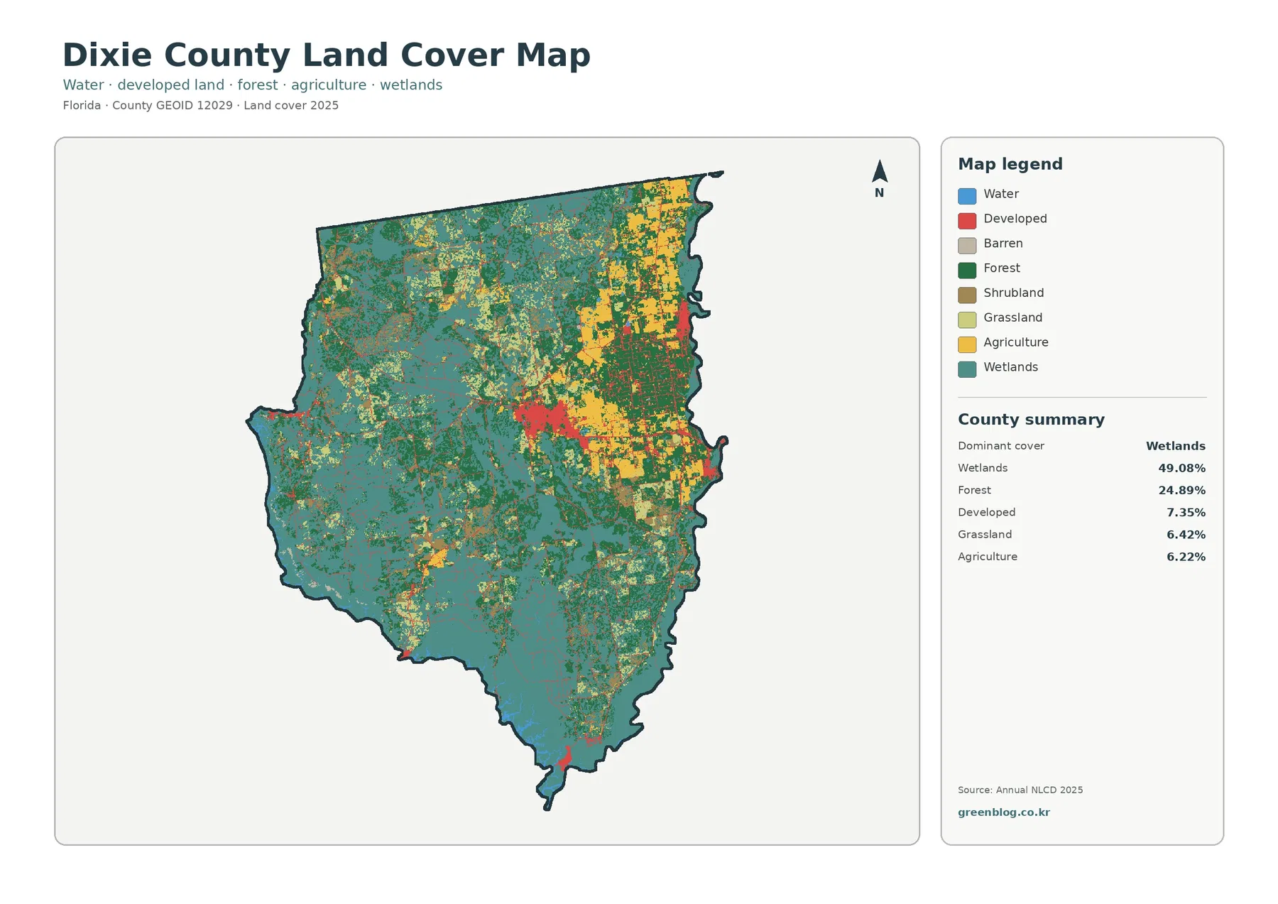
Wetland colors dominate the countywide view. Broad wet areas cover much of the west and south, and additional wetland patches continue through central and northern parts of the county. That distribution matches the 49.08% summary value and makes wetlands the clearest first feature to discuss when describing Dixie County from the supplied data.
Forest provides the second major surface at 24.89%. Dark green areas are especially noticeable in the north and east, with additional forest patches mixed among wetland areas elsewhere. Forest does not appear as a single isolated block. Instead, wooded and wet surfaces repeatedly meet, producing a pattern that is more useful to describe as a mixed natural landscape than as separate forest and wetland zones.
Developed land covers 7.35%, yet the red cluster near the middle of the county is easy to find because it is compact. Thin developed traces extend outward from that concentration, and smaller patches appear elsewhere. This is a useful example of why visual prominence and total area are not the same thing: a modest category can draw attention when it occupies a concentrated location.
Agriculture accounts for 6.22% and appears in noticeable blocks in the northeast, east, and parts of the center. Grassland at 6.42% and shrubland at 4.45% are more scattered. Water is only 1.32% in the county summary. Those figures should be read as mapped land-cover classes rather than legal land uses, ownership categories, or parcel boundaries.
Land cover describes what is physically covering the ground as classified from remotely sensed data. A developed cell may contain lawns or trees as well as buildings and pavement, and an agricultural cell does not identify a particular crop or property owner. At county scale, this land-cover view is useful for surface comparison, not zoning decisions or parcel-level site analysis.
The county’s river-and-coast setting gives useful context without replacing the map
Federal and state wildlife agencies describe Dixie County as a place where the Suwannee River, Steinhatchee River, and Gulf coast are central parts of the landscape. The U.S. Fish and Wildlife Service also highlights the Lower Suwannee area, while Florida wildlife information emphasizes extensive woods, rivers, and coastal habitats. That official context helps a reader understand why wet and wooded cover matters so much here.
Context, however, should not be turned into an unsupported one-to-one explanation of every colored patch. A wetland cell on this map is not automatically inside a refuge, and a forest cell is not automatically public conservation land. Land-cover classification and management boundaries answer different questions and should be compared only when an official boundary map is also available.
The difference between water and wetland is especially important in Dixie County. Open water is summarized at 1.32%, while wetlands occupy 49.08%. A wetland can contain vegetation and saturated or seasonally wet ground without appearing as open blue water. For watershed lessons, that distinction prevents the common mistake of treating only visible water bodies as the county’s aquatic environment.
The same caution applies near river and coastal settings. A land-cover map can show broad wetland and forest patterns, but it does not identify channel names, tidal limits, navigable waters, regulatory wetland boundaries, or flood zones. Those questions require separate hydrologic, survey, or regulatory sources.
Forest and farmland become easier to separate in the focused vegetation view
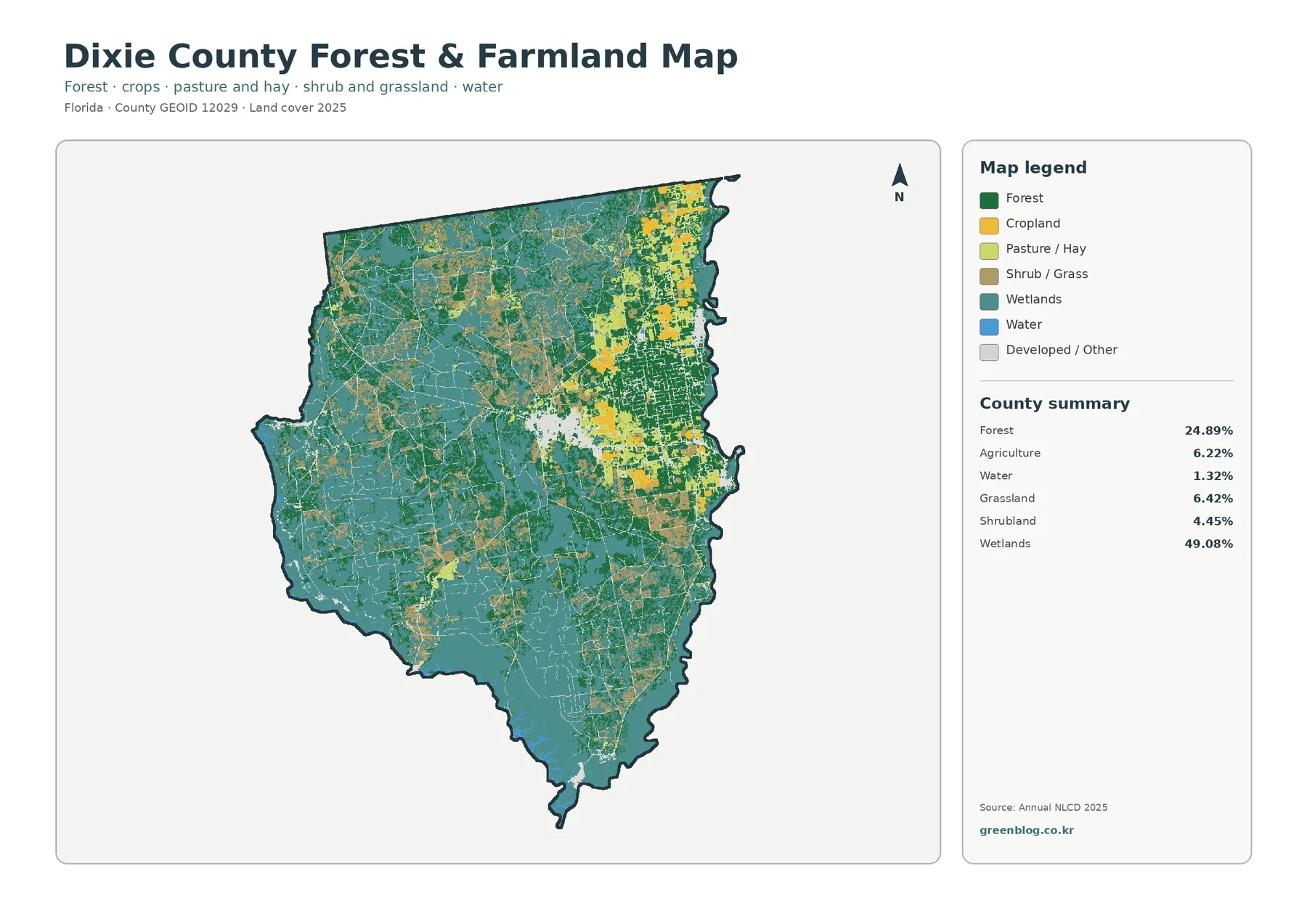
The forest-and-farmland view removes some of the visual competition from the general map. Forest at 24.89% becomes easier to follow through the north and east, while additional green patches occur among wetlands farther south and west. Seeing those areas with fewer competing developed colors makes the relationship between wooded and wet surfaces much clearer.
Agriculture remains a smaller component at 6.22%. The focused map separates cropland from pasture or hay visually, but the supplied county summary combines agriculture into one value. It would therefore be misleading to estimate exact cropland and pasture percentages from color alone. Use this view for location comparison rather than an invented statistical split.
Agricultural colors are most noticeable in the northeast and eastern half, with additional blocks near the center. Some shapes look rectangular or elongated, but those are classified raster patterns rather than surveyed farm parcels. Narrow roads, drainage features, tree lines, and mixed vegetation can be generalized into the surrounding cell pattern.
Grassland at 6.42% and shrubland at 4.45% help fill the transition between forest, agriculture, and wetlands. Small pieces can appear important when zoomed in, yet the map scale should remain in mind. A patch that looks sharply bounded on the image may contain mixed vegetation on the ground, especially near edges between categories.
Wetlands still dominate the focused view. Their 49.08% share means farmland is usually seen within a broader wet and wooded setting rather than as one continuous agricultural district. For presentations, this map is useful when the goal is to explain where working land occurs relative to the county’s much larger natural-cover classes.
Impervious cover is low overall and concentrated in a small core
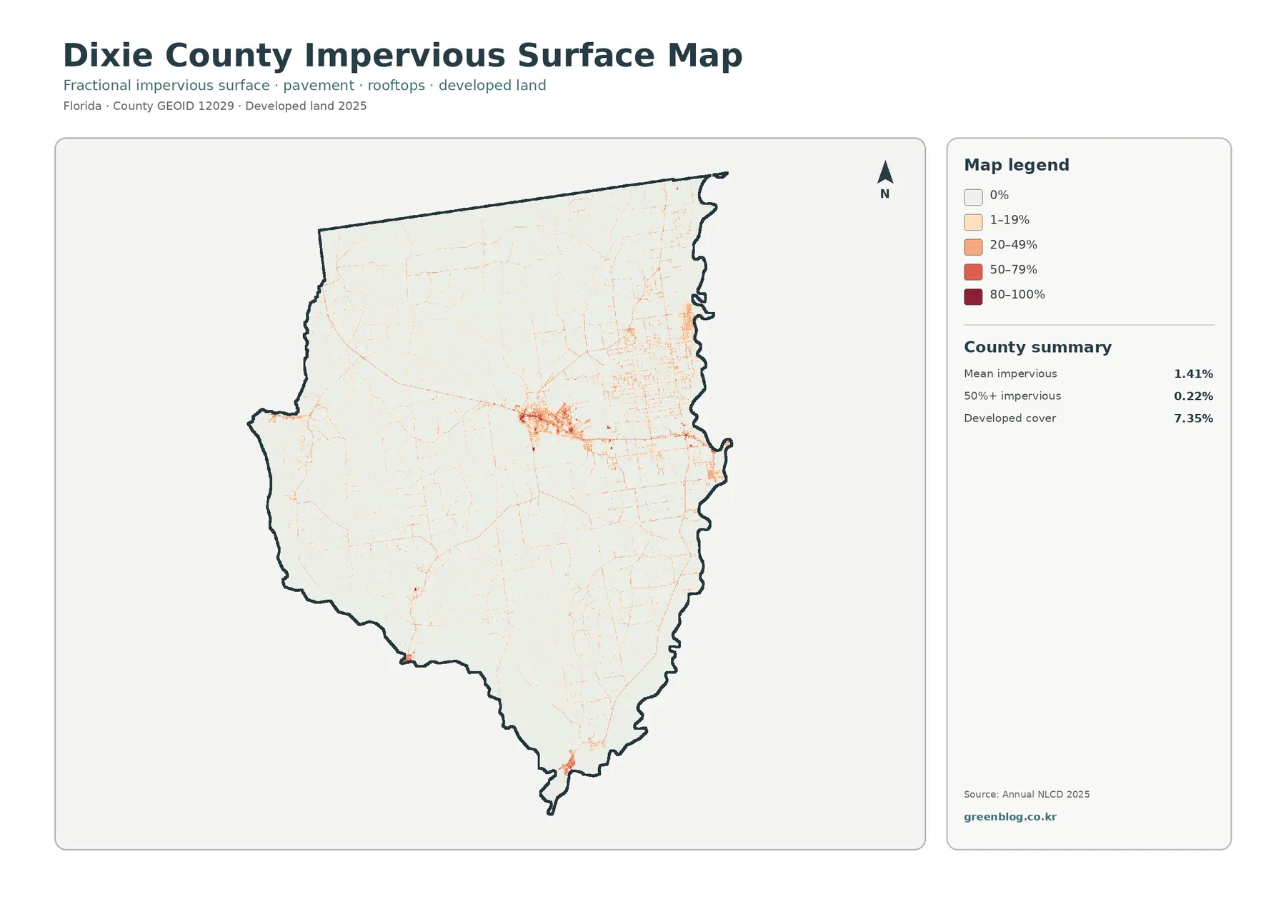
The impervious-surface map changes the visual story. Mean impervious cover is only 1.41%, and just 0.22% of the county is mapped at 50% or greater impervious surface. Those values are much lower than the 7.35% developed-cover share because developed land can include permeable lawns, trees, open ground, and other surfaces in the same classified cell.
The strongest hard-surface signal is concentrated near the central developed cluster. Thin lines extend from that core, while most of the county remains near the lightest end of the scale. Smaller isolated concentrations exist elsewhere, but there is no broad blanket of high-intensity impervious surface across the county.
Those narrow lines can resemble roads, but this is not a transportation map. It does not provide route names, lane counts, pavement condition, or traffic volume. Impervious percentage measures surface hardness only. Likewise, a low impervious value does not mean low flood risk because rainfall, elevation, soils, drainage, and wetland connections are separate factors.
Comparing 7.35% developed cover with a 1.41% mean impervious value is one of the clearest lessons in the map set. ‘Developed’ is a broader land-cover class, while impervious surface isolates the fraction occupied by roofs, pavement, parking areas, and similar hard materials. Keeping those definitions separate prevents an urbanized area from being treated as if every part of it were paved.
The 1985–2025 map marks class differences, not a simple measure of damage
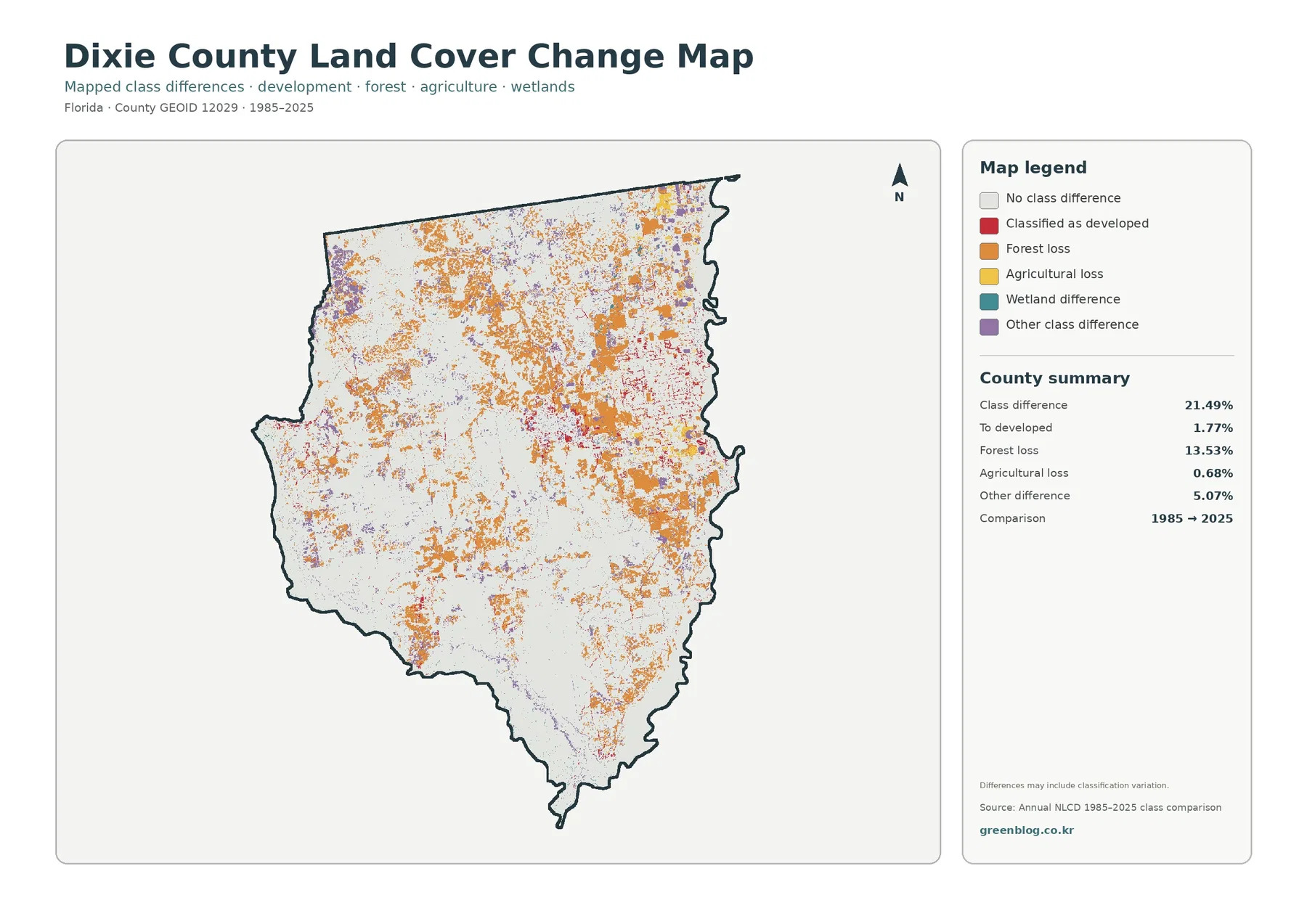
The two-date comparison reports a total class difference of 21.49%. That figure should not be rewritten as ‘21.49% of Dixie County was physically transformed.’ The map itself warns that classification variation may be included. A difference can reflect real change, but it can also be influenced by imagery, classification rules, seasonal conditions, or mixed pixels.
Forest loss is the largest highlighted category at 13.53%. Orange areas are widespread in the north, east, and central portions of the county, with several sizeable patches. Areas marked as forest difference show where the 1985 and 2025 classifications disagree, but they do not reveal whether the cause was harvesting, conversion, storm effects, regrowth cycles, hydrologic change, or another process.
Cells classified as developed account for 1.77% of the comparison. Red marks are most visible near the present developed concentration and along some connecting traces. That number is not the same as the current 7.35% developed-cover share. One describes the 2025 surface; the other identifies cells that fall into a highlighted change category between two years.
Agricultural loss is summarized at 0.68%, while other difference is 5.07%. The legend also includes wetland difference, but the supplied summary does not provide a separate wetland-difference percentage. It is appropriate to describe the visible category on the map, but not to calculate a precise value from the colored pixels without a verified statistic.
The comparison is most useful as a screening tool. Areas with dense orange, red, or purple marks can be selected for closer study and then checked against the current land-cover map, intermediate imagery, forestry records, or local planning information. Classification differences are mapped here, but cause, ownership, and responsibility are not established.
Three cross-map comparisons explain Dixie County better than a legend alone
The first comparison is broad natural cover versus compact development. Wetlands and forest together occupy most of the county in the supplied summary, while developed land is only 7.35% and is concentrated. That area contrast is obvious in the countywide view, while the impervious map shows that the hardest surfaces are even more restricted.
The second comparison is forest versus agriculture. Forest covers 24.89%, almost four times the 6.22% agricultural share. In the focused map, agricultural blocks are visible but remain embedded within a much larger wetland-and-forest setting. That relationship is more informative than simply listing two percentages because it shows where the smaller working-land patches occur.
The third comparison is developed cover versus hard surface. A 7.35% developed share might sound substantial when read alone, yet the mean impervious value is only 1.41% and the area at 50% or greater impervious cover is 0.22%. The difference shows why low-density developed cells should not be described as fully paved or urbanized.
Adding the change map introduces a fourth question: present condition versus two-date difference. The 2025 maps describe what the latest classification looks like, while the 1985–2025 map identifies where classifications disagree. Using both prevents a reader from treating a change symbol as if it were a current land-cover category.
Use the map set for county comparison, teaching, and presentation graphics
For a county profile, start with the general 2025 map. It combines the 49.08% wetland share, 24.89% forest share, smaller developed and agricultural classes, and the broad distribution of each category in one frame. It works well as the first slide or image when an audience needs to understand the overall landscape before looking at one topic.
For environmental education, ask students to compare wetlands with open water. The county summary makes the contrast striking: 49.08% wetlands versus 1.32% water. A second question can compare where forest and agriculture sit relative to those wet areas. These prompts turn the legend into a spatial exercise instead of a list of category names.
For development-related discussion, the impervious map is more informative than the general developed class alone. The central concentration can be compared with the very low countywide mean of 1.41%. This is useful for explaining that development intensity varies, but the map should not be used to decide zoning, building permission, drainage compliance, or parcel-level suitability.
For comparisons with other Florida counties, use the same year and classification system. Dixie County’s reference values are 49.08% wetlands, 24.89% forest, 7.35% developed land, 6.22% agriculture, and 1.41% mean impervious cover. Compare both percentages and spatial arrangement so that a concentrated small category is not mistaken for a countywide dominant class.
Scale, mixed pixels, and observation dates limit what a large print can prove
Annual NLCD represents the landscape with raster cells, each assigned a dominant class. A real cell can contain trees, standing water, pavement, grass, and bare ground at the same time, yet the land-cover map simplifies that mixture into one classification. Edges between wetlands, forest, roads, and fields are therefore especially sensitive to generalization.
Enlarging the JPG makes labels and small patterns easier to see, but it does not create new source detail. Narrow channels, tiny buildings, parcel lines, and thin vegetation strips may be generalized or missed. A county-scale map is useful for regional comparison, education, and presentation, but it is not a substitute for a survey or site inspection.
The 2025 map represents the supplied observation year. Development, vegetation recovery, logging, flooding, or agricultural changes after that date may not appear. The 1985–2025 comparison is also a two-date snapshot rather than a year-by-year history. A location could change more than once between those dates and still finish in a class similar to its starting class.
These limits do not make the maps less useful; they define the right use. The maps are strong for explaining broad county patterns, choosing areas for further study, comparing counties under the same classification system, and creating clear educational graphics. Legal boundaries, current site conditions, wetland jurisdiction, or property decisions require newer and more specialized sources.
What is included in the map download
The ZIP contains the four original JPG maps used for this article: 2025 land cover, forest and farmland, impervious surface and developed land, and 1985–2025 land-cover change. Keeping all four together is helpful when a presentation or lesson needs the same county viewed from several angles.
Choose the map that matches the question rather than shrinking all four into one crowded graphic. For overall composition, use the general view; the vegetation view is better for forest and working-land comparison, the impervious view for development intensity, and the change view for two-date classification differences. A second map can then be added when the audience needs a direct comparison.
Frequently Asked Questions
What is the largest land-cover class in Dixie County?
Wetlands are the largest class in the supplied 2025 summary at 49.08%, followed by forest at 24.89%. Developed land is 7.35%, grassland 6.42%, agriculture 6.22%, shrubland 4.45%, and water 1.32%. Wetland colors also occupy the broadest area in the countywide map.
Why is developed cover 7.35% while mean impervious cover is only 1.41%?
Developed land can include lawns, trees, open space, and other permeable surfaces along with buildings and pavement. Impervious cover isolates hard surfaces such as rooftops, roads, and parking areas. Because those measures describe different things, the countywide impervious average can be much lower than the developed-land share.
Does the 21.49% class difference mean that 21.49% of the county was physically changed?
No. It is the share of cells classified differently in the 1985 and 2025 comparison, and the map warns that classification variation may be included. The 13.53% forest-loss, 1.77% developed-conversion, and 0.68% agricultural-loss values are useful screening indicators, but specific causes require additional evidence.
Sources and Reference Data
- MRLC Annual NLCD Data – source data for the 2025 land-cover and 1985–2025 comparison views
- USGS Annual NLCD Land Cover Classification – definitions for wetland, forest, developed, agricultural, and other land-cover classes
- U.S. Census Bureau TIGER/Line Shapefiles – official county-boundary reference for Dixie County
- U.S. Fish & Wildlife Service – Dixie County, Florida – county natural-setting context for the Suwannee River, Steinhatchee River, and Gulf coast
- Florida Fish and Wildlife Conservation Commission – Explore Around the Bend – state wildlife and recreation context for Dixie County rivers, woods, and coastal habitats
Map File Information
The ZIP contains the four original JPG land-cover maps used in this Dixie County article.
- Included Files: Use only the versions confirmed in the article and supplied images
- File Type: Use the confirmed download contents
- Intended Use: Printing, education, presentations, and map-based projects
Related Maps
- Alachua County Florida Land Cover Map
- Baker County Florida Land Cover Map
- Bay County Florida Land Cover Map
Green Map creates custom-edited map images using open geographic data sources such as geoBoundaries, Natural Earth, OpenStreetMap, and government open data.
These maps are edited visual materials, not raw data files, and are provided for education, documents, presentations, and graphic reference.