Agriculture is the defining land-cover signal in DeSoto County in the supplied 2025 maps. The county summary assigns 61.55% of the area to agriculture, while wetlands account for 28.02%. Developed land is much smaller at 5.72%, followed by shrubland at 2.67% and forest at 1.31%. Water and grassland occupy only small shares, so the broad visual story is a working-land landscape broken up by extensive wet ground and a limited developed core.
This page includes four views of that same county: general 2025 land cover, forest and farmland, impervious surface and developed land, and a 1985–2025 class-difference map. The WebP versions are shown in the article for quick viewing, and the four original JPG maps are available together in one ZIP download below. Using the maps as a set makes it easier to separate area, concentration, surface hardness, and long-term classification differences.
Table of Contents
Start with the countywide pattern: farming is broad, wetlands are woven through it
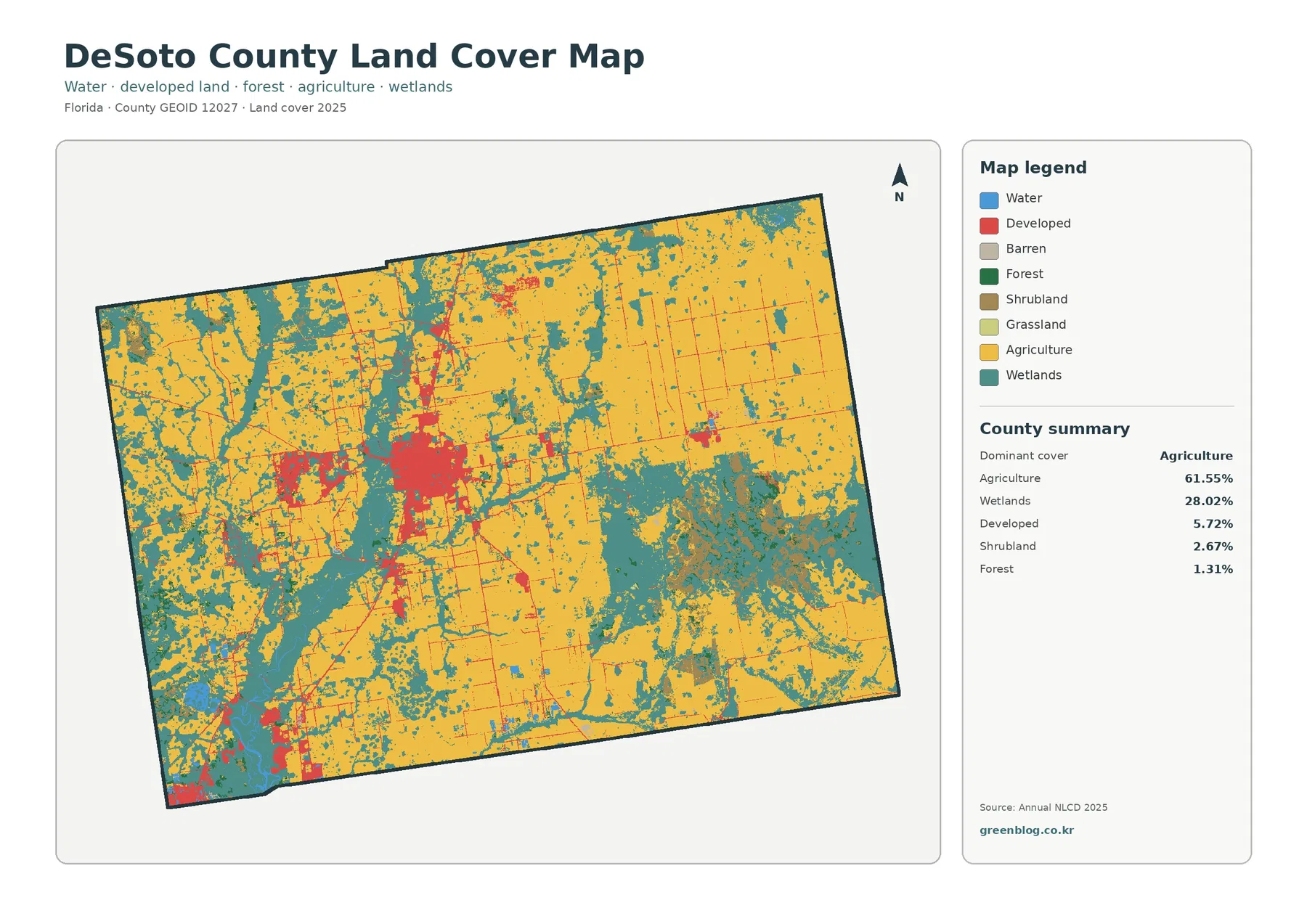
The general map is dominated by the agriculture color across the east, center, north, and large portions of the west. Instead of appearing as one isolated farming district, agricultural cover repeats across much of the county in broad blocks and irregular fields. That distribution fits the 61.55% summary value and gives the map a distinctly different appearance from counties where forest or development supplies the main background color.
Wetlands create the second major layer. At 28.02%, they are not confined to one corner. Large wetland patches appear in the southeast and western portions of the county, while narrower wetland traces pass between agricultural areas in the center and north. The result is a highly interrupted farming pattern: many agricultural blocks touch or sit close to wetland cover rather than forming one continuous dry-land sheet.
Developed land is only 5.72% of the total, yet it is easy to locate because much of it is clustered near the central part of the county. Smaller developed clusters also appear near the southwest edge and at scattered points elsewhere. This is a useful reminder that a category can occupy a modest share of total area but still stand out strongly when it is concentrated rather than evenly distributed.
Forest does not play the same role here that it does in many forest-heavy counties. The summary shows only 1.31% forest, and the green areas on the map are generally small or fragmented among agricultural and wetland cover. Shrubland is also limited at 2.67%, while water is 0.59% and grassland only 0.06%. A description centered on forest would therefore miss the dominant evidence in the supplied map.
Land cover describes what is physically covering the ground as classified from remotely sensed data. It is not the same thing as legal zoning, ownership, parcel boundaries, or permission to develop. A cell classified as agriculture may not identify a specific crop, and a developed cell does not tell you whether the land is residential, commercial, industrial, or transportation property. The colors are best used for county-scale surface patterns.
The forest-and-farmland view makes the agricultural mosaic easier to separate
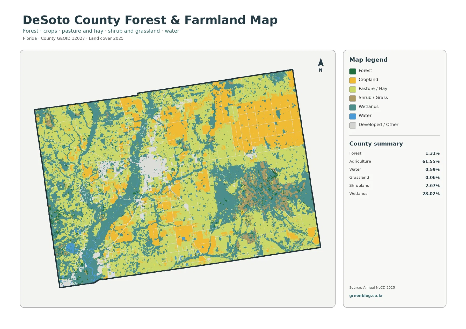
The forest-and-farmland map removes much of the visual competition from the general land-cover view. Agriculture still dominates, but the map separates agricultural-related colors so broad blocks of cropland and pasture or hay can be distinguished visually. The supplied county summary reports agriculture as one combined 61.55% category, so the image supports a visual comparison of those agricultural classes but does not provide separate percentages that should be invented from the colors.
Large agricultural areas are especially obvious through the eastern half of the county, with additional blocks through the center and west. Some have rectangular or elongated shapes, but those shapes should not be treated as exact farm-property boundaries. The land-cover grid simplifies the surface into classified cells, so a visible block may cross real parcels, contain narrow roads or drainage features, or combine several kinds of agricultural use that the summary does not name.
Wetlands remain visually important even after the map is simplified for forest and farmland. The 28.02% share appears as broad teal areas in the southeast and west and as thinner connections among farmed areas elsewhere. Looking at this map after the general map helps explain why the agricultural cover, although dominant, does not form one uninterrupted region. Wet ground repeatedly divides and borders the working-land pattern.
The small 1.31% forest share is also easier to understand in this focused view. Forest patches are present, but they generally do not make up long, continuous belts across the county. Many green areas appear as smaller pieces between agriculture and wetlands. For presentations, this is an important distinction: the title “forest and farmland” names the map layers, but the county itself is far more strongly characterized by agriculture and wetlands than by forest.
Shrubland at 2.67% and grassland at 0.06% should be read at the same county scale. Small patches can look significant when zoomed in, but narrow vegetation strips and mixed edges may be generalized by the source grid. The map is useful for comparing the broad arrangement of cultivated, pasture-like, wooded, wet, and developed surfaces; it is not a replacement for a field survey or parcel-level vegetation inventory.
Low average impervious cover reveals how compact the hardest surfaces are
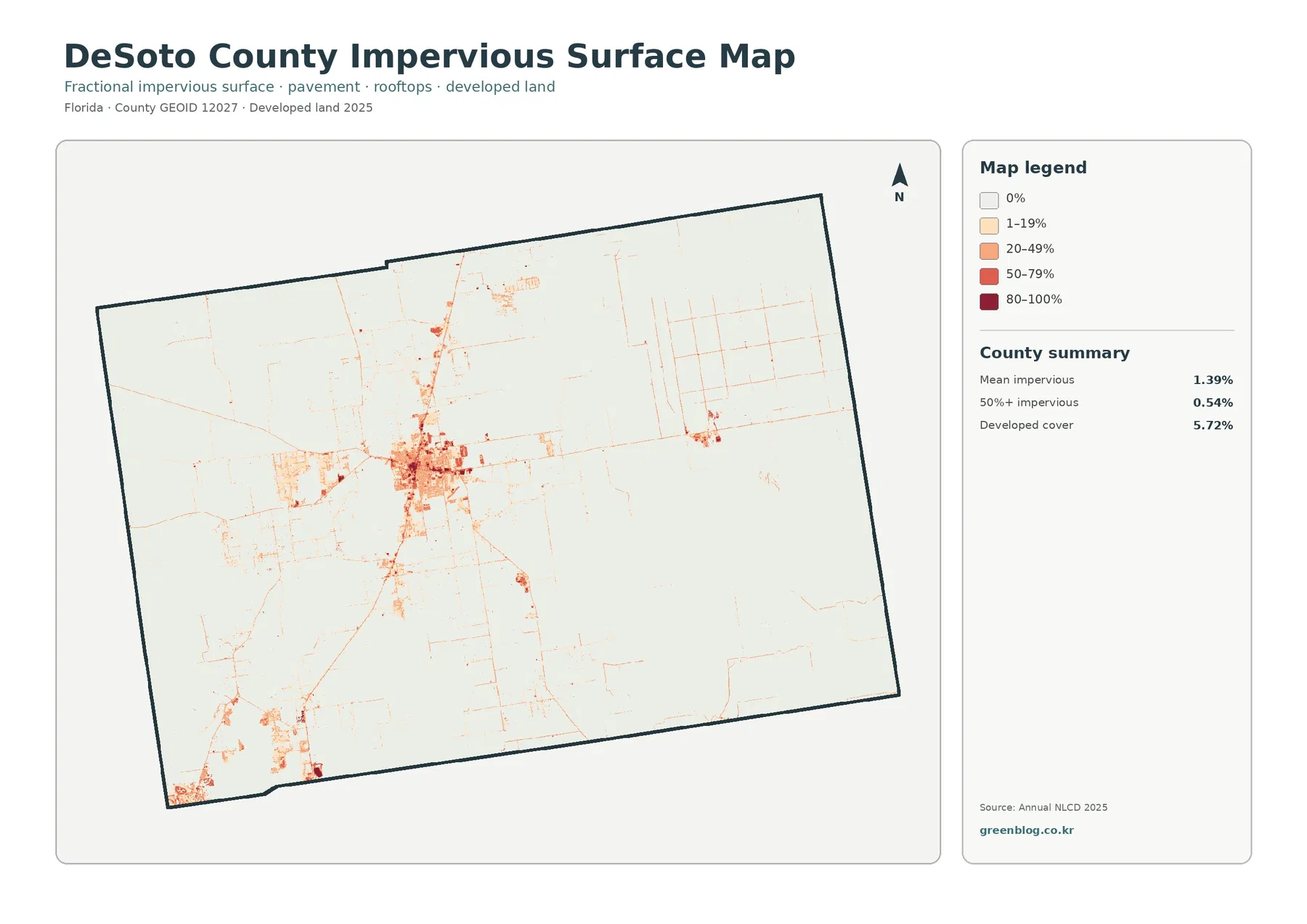
The impervious-surface map changes the visual emphasis completely. Most of the county becomes very pale because the mean impervious value is only 1.39%. Just 0.54% of the county is mapped with 50% or greater impervious cover, even though developed land totals 5.72%. That difference is expected because developed land can include lawns, trees, open space, and other surfaces that still allow water to enter the ground.
The strongest impervious signal is concentrated in the central developed cluster. From that core, thinner lines extend outward in several directions, while most agricultural and wetland areas remain close to the lightest end of the scale. Smaller concentrations occur near the southwest edge and at a few scattered locations, but the map does not show a broad, countywide blanket of high-intensity hard surface.
Those narrow linear marks may resemble a road network, but this is not a road map. The image does not identify route names, lane counts, pavement condition, traffic volume, or drainage structures. Impervious percentage is simply a surface measure. Likewise, a low impervious percentage does not prove that an area has low flood risk. Rainfall, elevation, soil, drainage, and wetland connections would need to be considered separately.
Comparing 5.72% developed cover with a 1.39% mean impervious value is one of the most useful lessons in this map set. “Developed” and “paved” are not interchangeable categories. A low-density developed cell can contain a building, driveway, lawn, trees, and bare ground at the same time, while the higher impervious classes isolate places where hard surfaces occupy a larger fraction of the cell.
Read the 1985–2025 map as class difference, not as a simple loss map
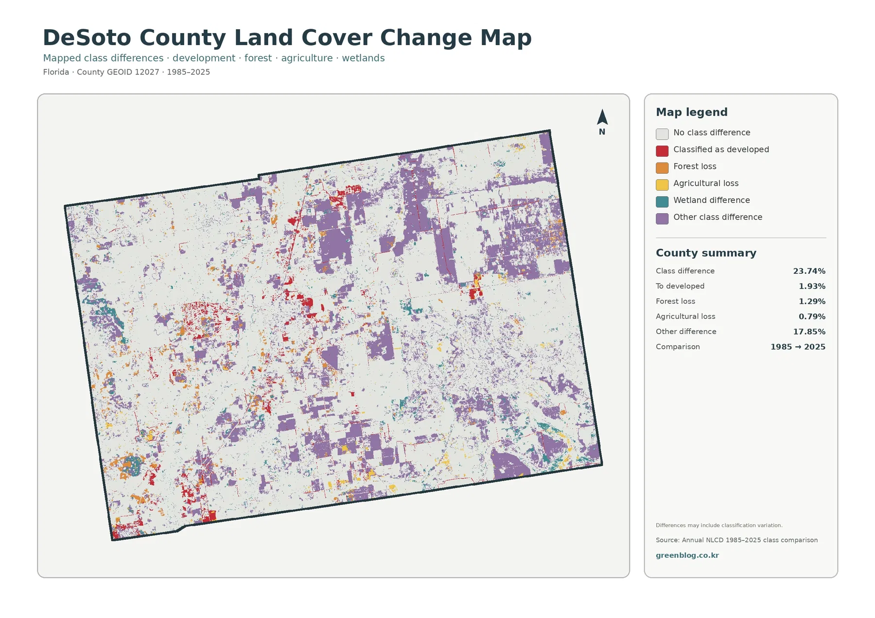
The 1985–2025 comparison reports a total class difference of 23.74%. That number should not be restated as “23.74% of DeSoto County was physically transformed.” It is the share of mapped cells whose classifications differ between the two comparison years. The note printed on the map explicitly warns that classification variation may be included, which is especially important when comparing data separated by four decades.
The map summary breaks out 1.93% classified as developed, 1.29% forest loss, 0.79% agricultural loss, and 17.85% other difference. Red developed-conversion marks are most noticeable near the central developed area and in smaller clusters toward the southwest. Forest-loss and agricultural-loss colors are more scattered. None of these percentages, by themselves, explains the reason a cell changed class.
The largest component is the 17.85% “other difference” category. Purple patches occur in several large blocks, including parts of the northeast, center, and south. Because that category is intentionally broad, it should not be assigned a single cause such as development, abandonment, or drainage. It can include transitions among classes that are not separately highlighted, as well as some differences associated with classification methods or conditions.
The change map becomes more informative when it is paired with the 2025 maps rather than viewed alone. Current development is compact and current impervious cover is low overall, while the class-difference map shows where the two historical classifications disagree. Those are related questions, but not identical ones. One map describes the present surface, and the other marks a two-date comparison.
Forest loss at 1.29% and agricultural loss at 0.79% also need careful wording. A two-date comparison does not show every event that occurred between 1985 and 2025. A location could have changed more than once and still end with a class that resembles the starting condition. For specific causes or dates, a longer image series or additional local records would be necessary.
Three comparisons explain the DeSoto County map set better than a list of colors
The first comparison is area versus concentration. Agriculture covers 61.55% and is spread broadly across the county, so it becomes the background rather than a single focal point. Developed land covers only 5.72%, but the central cluster is compact enough to attract attention immediately. The maps therefore show why total percentage and visual concentration answer different questions.
The second comparison is agriculture versus wetlands. Wetlands account for 28.02% and repeatedly cut into, border, or separate agricultural areas. That arrangement matters because a statement such as “the county is mostly agricultural” is true but incomplete. The supplied maps show a farm-dominated county in which wetland cover is also extensive and spatially intertwined with working lands.
The third comparison is developed cover versus impervious surface. The developed class is 5.72%, while the mean impervious surface is 1.39% and the area at 50% or more impervious is only 0.54%. This tells a more nuanced story than a single development percentage. Many developed cells contain substantial permeable ground, while only a small subset reaches the highest hard-surface classes.
Choose the map by the question you need to answer
For a quick county overview, begin with the general land-cover map. It shows the 61.55% agricultural share, the 28.02% wetland share, the small forest component, and the concentrated developed areas in one frame. It is the strongest first image for a classroom slide, county profile, or comparison in which the audience needs to understand the full composition before focusing on one topic.
Use the forest-and-farmland map when the question is how cultivated or pasture-like cover relates to wetlands and small forest patches. It visually separates agricultural classes more clearly, even though the county summary combines them into one agriculture percentage. That distinction makes the map useful for showing variety within working lands without claiming unsupported class percentages.
Use the impervious map when surface hardness and development intensity matter. The pale countywide background and darker central cluster make the 1.39% average easier to understand than the number alone. Save the 1985–2025 comparison for last when possible. Establishing the present-day pattern first helps prevent viewers from treating every historic class difference as a verified land-use event.
Scale, classification, and date limits matter when the maps are enlarged
Annual NLCD land cover is raster data: the landscape is divided into cells, and each cell receives a representative class or surface value. Real places are more complex. A cell can contain crops, grass, trees, drainage ditches, a road, and a building, yet the map still needs to summarize that cell. Mixed edges around wetlands, fields, and roads are therefore more generalized than a parcel or engineering map.
The 2025 maps summarize the supplied classification year. They do not automatically include development, vegetation changes, flooding, or farming changes that happened after that date. The 1985–2025 comparison is also a two-endpoint product. It does not document the sequence of changes within the forty-year interval, so it should not be used as a year-by-year history.
The downloadable JPG files let the legends and county patterns be viewed or printed more comfortably, but enlarging an image cannot create detail beyond the source classification. These maps are appropriate for county-scale education, presentation graphics, general environmental comparison, and map-based reference. Parcel ownership, wetland regulation, permits, building eligibility, or exact field boundaries require separate authoritative records.
Useful observation prompts for lessons, presentations, and county comparisons
A simple lesson can begin by asking students to identify the two largest colors before reading the summary. In DeSoto County, the answer should lead directly to agriculture at 61.55% and wetlands at 28.02%. A second question can ask why the 5.72% developed class still stands out so clearly. That opens a discussion about the difference between a widespread category and a compact cluster.
For an agriculture-focused presentation, show the general map and the forest-and-farmland map side by side. The first establishes the countywide percentage, while the second separates cropland and pasture or hay visually and reveals how often those areas touch wetlands. The goal is not to estimate new percentages from color, but to connect the supplied total to the spatial arrangement visible in the map.
For comparisons with other Florida counties, keep the year and classification system consistent. DeSoto County can be described with a compact benchmark set: 61.55% agriculture, 28.02% wetlands, 5.72% developed land, 1.31% forest, and 1.39% mean impervious surface. The more revealing comparison, however, is often spatial: whether agriculture forms large blocks, whether wetlands divide them, and whether development is compact or dispersed.
Frequently Asked Questions
What is the largest land-cover category in DeSoto County?
Agriculture is the largest category in the supplied 2025 summary at 61.55%. Wetlands are second at 28.02%, followed by developed land at 5.72%, shrubland at 2.67%, and forest at 1.31%. The map reflects those numbers visually: agricultural cover is widespread, while wetlands repeatedly interrupt and border it across the county.
Why is developed land 5.72% while mean impervious surface is only 1.39%?
Developed land can include lawns, trees, open areas, and other permeable surfaces along with buildings and roads. Impervious surface measures the harder part of that landscape, such as pavement and rooftops. That is why the county can have 5.72% developed cover but a much lower 1.39% mean impervious value and only 0.54% of its area at 50% or more impervious.
Does the 23.74% class difference mean that nearly one quarter of the county was physically changed?
No. The 23.74% figure is the share of cells classified differently in the 1985 and 2025 comparison. The map itself warns that classification variation may be included. The listed 1.93% developed conversion, 1.29% forest loss, and 0.79% agricultural loss are useful indicators of mapped differences, but specific causes require additional evidence.
Sources and Reference Data
- MRLC Annual NLCD Data – official Annual NLCD data used for current land-cover mapping and long-term comparison
- USGS Annual NLCD Land Cover Classification – definitions for the mapped land-cover classes
- U.S. Census Bureau TIGER/Line Shapefiles – official geographic boundary source used for DeSoto County
Map File Information
The four original JPG maps used on this page are provided together in one ZIP file for DeSoto County, Florida.
- Included Files: Use only the versions confirmed in the article and supplied images
- File Type: Use the confirmed download contents
- Intended Use: Printing, education, presentations, and map-based projects
Related Maps
- Alachua County Florida Land Cover Map
- Baker County Florida Land Cover Map
- Bay County Florida Land Cover Map
Green Map creates custom-edited map images using open geographic data sources such as geoBoundaries, Natural Earth, OpenStreetMap, and government open data.
These maps are edited visual materials, not raw data files, and are provided for education, documents, presentations, and graphic reference.