Charlotte County, Florida combines a heavily developed Gulf-side population corridor with one of the largest wetland shares in this map series. In the supplied 2025 summary, wetlands account for 43.93 percent of the county, while developed cover reaches 22.42 percent and agriculture 19.55 percent. Those three classes create a strong contrast between the Charlotte Harbor side of the county and the broad interior.
Four matching maps are provided here: 2025 land cover, forest and farmland, impervious surface and developed land, and mapped class differences between 1985 and 2025. The four original JPG files can be downloaded together in one ZIP below, while the sections that follow explain where the main patterns occur and how to read them without treating land cover as zoning or a parcel survey.
Table of Contents
A county where wetlands, development, and agriculture all occupy major shares
Wetlands are the largest mapped class at 43.93 percent, but Charlotte County is not simply a wetland-dominated county with a small settlement footprint. Developed cover represents 22.42 percent and agriculture 19.55 percent. Water adds another 6.26 percent, while shrubland is 3.45 percent and forest only 3.36 percent. The combination of extensive wetlands with substantial development and agriculture is more informative than any one percentage by itself.
The map places most of the broad developed cover on the western side around the Charlotte Harbor area. Large wetland blocks dominate much of the center and extend into the south and east, while agriculture becomes especially conspicuous across the northern and eastern interior. These patterns meet along sharp edges in several places, so the county does not divide neatly into a single urban half and a single rural half.
Charlotte County planning documents identify U.S. 41, S.R. 776, U.S. 17, C.R. 775, C.R. 771, and Burnt Store Road as important corridors for urban or suburban development and redevelopment. That official planning context helps explain why linear and clustered developed surfaces appear across the western half of the impervious map. The land-cover map, however, shows association rather than cause and does not identify the legal land-use designation of individual properties.
The coastal setting adds another layer. Florida State Parks describes Charlotte Harbor Preserve State Park as protecting more than 100 miles of shoreline in Charlotte and Lee counties and notes mangrove forests, marshes, scrub habitats, pine flatwoods, and shallow waters. These named habitats provide useful regional context for the intricate water and wetland pattern near the harbor, although the map on this page does not draw the park boundary itself.
Start with the 2025 map to see the west-to-interior contrast
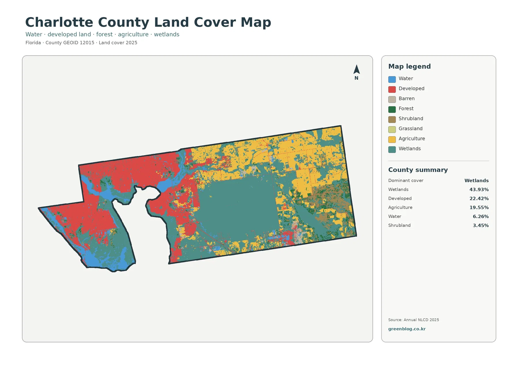
The general land-cover map gives the clearest county-wide overview. Red developed areas cover a broad portion of the west, including the complex shoreline around Charlotte Harbor. The pattern is much larger than a single town center: developed cells form connected neighborhoods and corridors across the western side before thinning toward the interior.
A very different pattern occupies the center. Teal wetlands form one of the largest continuous areas on the map and continue as smaller corridors and patches toward the north, south, and east. The 43.93 percent figure therefore reflects both broad interior wetland blocks and more fragmented wet areas near other cover types. Wetlands are not limited to the immediate shoreline.
Agriculture is strongest in the northern and eastern interior. Yellow field blocks are often large enough to stand out clearly against surrounding wetlands, and some form regular shapes that contrast with the more irregular natural-cover boundaries. At 19.55 percent, agriculture is nearly as extensive as developed cover, but the two classes occupy very different parts of the county.
Open water accounts for 6.26 percent in the supplied summary and is visually important because Charlotte Harbor creates a large internal coastal opening along the west. Water should not be merged with wetlands when interpreting the map. Blue areas represent open water, while teal wetland cells represent vegetated or otherwise wet land-cover classes. That distinction is essential for any coastal or watershed discussion.
Impervious surfaces reveal where the developed footprint is most intense
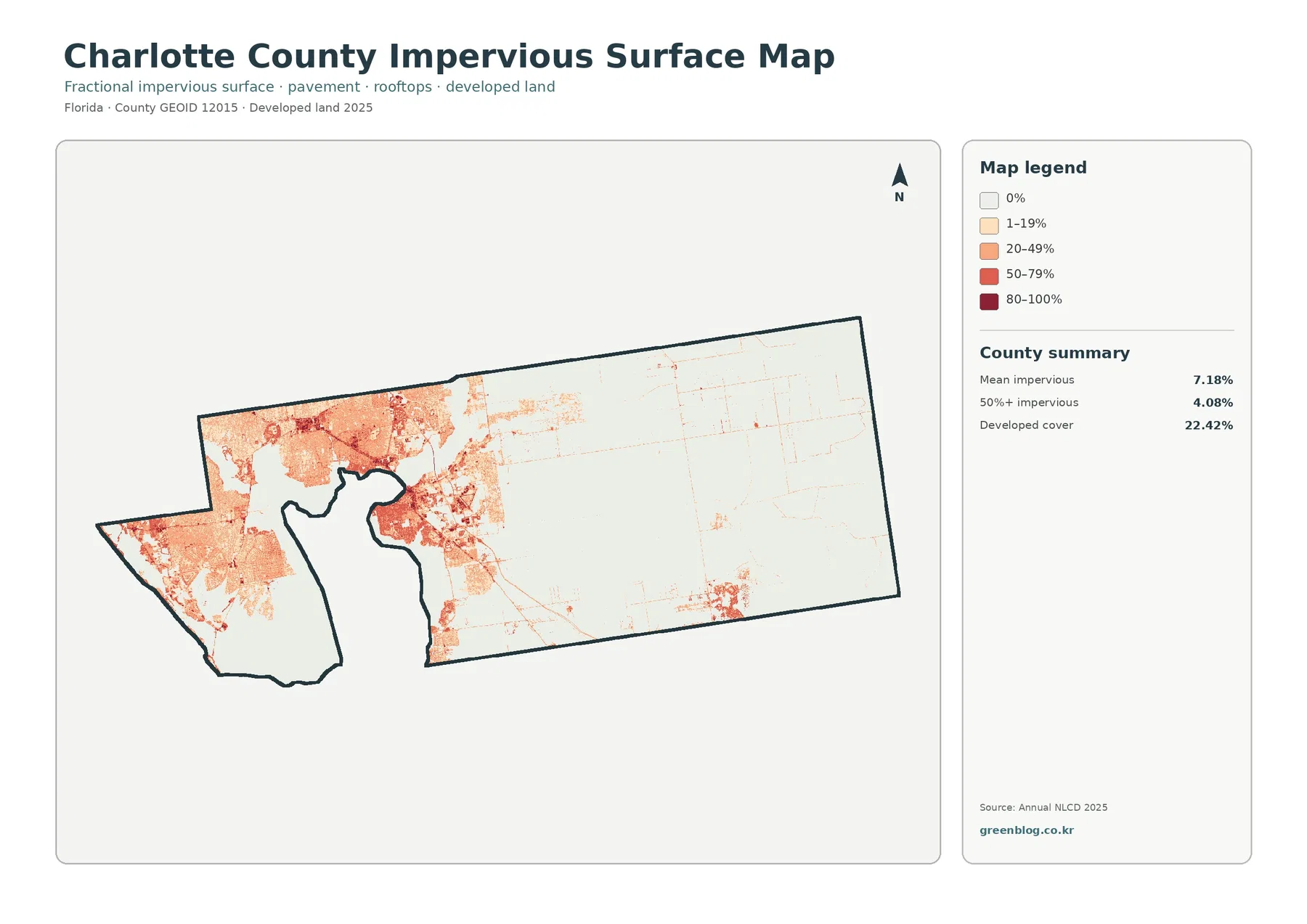
Impervious surface means pavement, rooftops, parking areas, and other surfaces that allow relatively little water to soak directly into the ground. The county-wide mean is 7.18 percent, and 4.08 percent of the mapped area is at least 50 percent impervious. Those values are different from the 22.42 percent developed-cover figure because a developed land-cover class can still contain lawns, trees, open ground, and other pervious surfaces.
The western concentration is unmistakable. Orange and red values spread through the main coastal settlement area, with stronger patches linked by lighter developed zones and road-like traces. Farther east, the map becomes pale over much of the large wetland and agricultural interior, indicating far lower impervious intensity.
County planning materials describe U.S. 41 and S.R. 776, along with several other major roads, as locations where urban and suburban development occurs. The Charlotte Harbor Community Revitalization Plan also focuses on redevelopment near U.S. 41 and the Peace River. These sources give useful geographic context for the western developed pattern, but the raster map cannot identify a specific street, business, roof, or parcel boundary.
For environmental comparison, the map is especially useful when placed beside the general land-cover view. High impervious concentrations sit relatively close to harbor water and wetland areas in parts of the west, while the county interior has broad low-impervious zones. That spatial relationship can guide questions for further study, but it does not by itself prove an effect on flooding, runoff, or water quality. Those topics require hydrologic and engineering data.
Agriculture is extensive; forest is a comparatively small mapped class
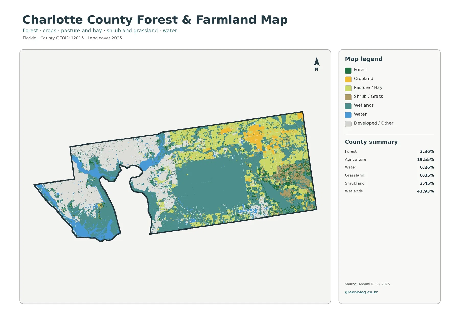
The forest-and-farmland map changes the emphasis by stripping away some of the visual competition from the full legend. Agriculture remains prominent at 19.55 percent, especially in the north and east. Forest, in contrast, is only 3.36 percent, appearing as scattered green patches rather than one broad forest belt.
The agricultural blocks do not form a continuous blanket. Large wetlands interrupt them, and narrow wet corridors or irregular natural areas separate many field groups. This is important for readers who might otherwise see the high agriculture percentage and assume that the eastern interior is uniformly cultivated. The actual pattern is a patchwork of working land and wetland cover.
Shrubland accounts for 3.45 percent, while grassland is only 0.05 percent in the supplied summary. These classes should not be casually combined with agriculture. Shrub or grass cover can represent open vegetation that is not cropland, and the map does not identify a crop type, farm ownership, grazing status, or legal agricultural designation.
Charlotte County Natural Resources states that the county reviews development for potential effects on soil, water, vegetation communities, and listed wildlife and also manages environmental lands. That official role is useful context for a county with extensive wetland cover, but a teal or green pixel on this map does not mean that the land is county-owned, protected, or subject to a particular conservation restriction.
For a close reading, start with the largest yellow agricultural blocks in the north and east and trace where they stop against teal wetlands. Then compare the small green forest patches and the shoreline water areas. That sequence makes the map easier to interpret because it highlights the major contrast first and uses the smaller classes to explain transitions rather than treating every legend item as equally important.
What the 1985–2025 comparison actually records
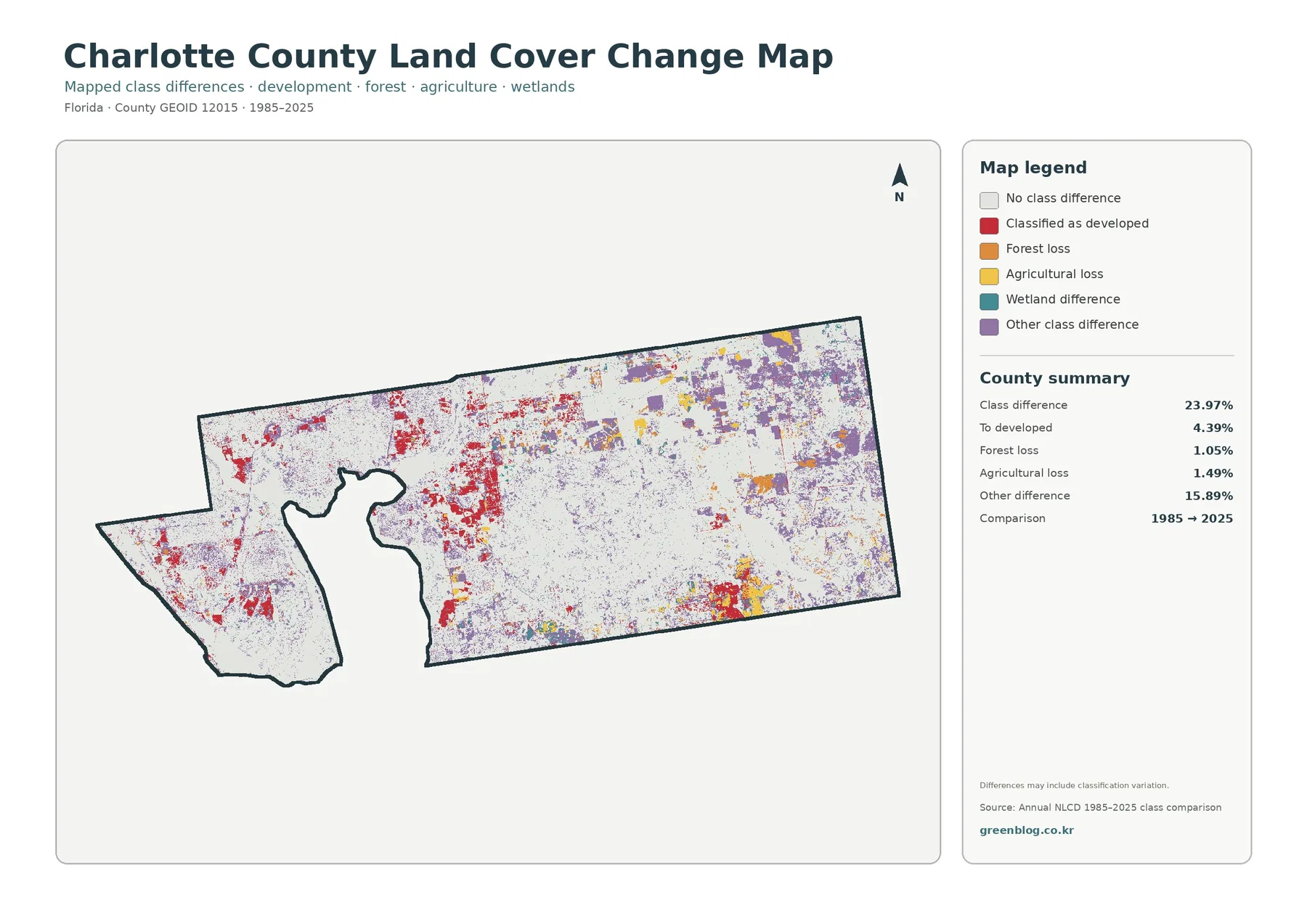
The change map reports a total class difference of 23.97 percent between 1985 and 2025. This is a comparison of mapped classifications at two endpoints. It is not a statement that 23.97 percent of the county underwent a verified physical transformation. The map itself warns that differences may include classification variation, which is particularly important in wet coastal landscapes and along mixed land-cover edges.
Conversion to developed is listed at 4.39 percent. Red patches appear in and around the established western developed area, but they also occur at several interior and southeastern locations. Looking at those red areas beside the 2025 impervious map helps separate places that are now strongly built from places that may have changed class without becoming highly impervious.
Forest loss is 1.05 percent and agricultural loss 1.49 percent. Both are smaller than the 15.89 percent labeled as other difference. Purple other-difference cells are widespread in the eastern and northeastern interior and also appear as scattered patches elsewhere. Because that category combines multiple kinds of class disagreement, it should not be interpreted as one single land-change process.
The agricultural-loss color is most meaningful when checked against the current agricultural blocks in the forest-and-farmland map. A colored cell can tell you that the endpoint classifications differ, but it cannot explain whether the reason was development, abandonment, wet conditions, vegetation succession, a temporary agricultural cycle, or classification uncertainty. Historical imagery or local records are necessary for that level of explanation.
A practical way to read the map is to begin with the large white areas showing no class difference, then isolate red conversion-to-developed cells, and finally examine the much broader purple other-difference pattern. This order keeps the visually noisy map from turning into a list of colors and makes it easier to identify locations that deserve closer investigation.
Charlotte Harbor wetlands are only part of the county-wide wetland story
The harbor naturally draws attention because it creates a large water opening within the western side of the county and is bordered by extensive natural areas. Florida State Parks describes mangrove-fringed shallow water, marshes, scrub, and pine flatwoods within the Charlotte Harbor Preserve. Those habitats are consistent with the complex coastal mosaic visible in the maps.
Yet the largest wetland block in the land-cover map extends well inland. Broad teal areas cover much of the center and continue toward the south and east, where they meet agricultural land rather than open harbor water. This distinction matters: a 43.93 percent wetland share cannot be understood only as a coastal fringe around Charlotte Harbor.
The interior wetland-agriculture boundary is one of the most distinctive patterns in the package. Some farm blocks have straight or regular edges, while adjacent wetland boundaries are much more irregular. The contrast is visually useful for county-scale interpretation, but it is not a property-line map and should not be used to decide whether a particular parcel contains a legally regulated wetland.
For permitting, flood-risk, conservation, or land-development decisions, readers should use the county’s dedicated planning, coastal, floodplain, wetlands, and future-land-use resources. The land-cover maps here are better suited to broad comparison, environmental education, and identifying areas that merit a more detailed official review.
Four different questions, four useful map choices
Choose the full 2025 land-cover map when the goal is to explain Charlotte County in one image. It shows the developed western side, Charlotte Harbor water, the large interior wetland block, and the northern and eastern agricultural areas together. It is also the easiest map for introducing the county before moving to a specialized comparison.
Use the impervious map when the question is about the intensity of built surfaces rather than the broader developed class. It makes the 7.18 percent mean impervious value spatially meaningful and shows why the 4.08 percent area above 50 percent impervious is concentrated rather than evenly distributed.
The forest-and-farmland view is best for working-land and natural-cover comparisons. Agriculture is a major class, forest is relatively small, and wetlands repeatedly interrupt or border agricultural blocks. That combination makes the simplified map especially useful for rural-landscape lessons or comparisons with Florida counties where forest is much more dominant.
Select the 1985–2025 map when you want to locate potential long-term differences. Its strongest message is not a single loss number but the distribution of conversion-to-developed and other class differences across the county. Treat those colors as prompts for follow-up research rather than final explanations of why a location changed.
Land cover is not the same thing as land use, zoning, or ownership
Land cover describes the physical surface category assigned to a location: wetland, water, agriculture, forest, shrubland, developed cover, and related classes. Land use describes how people use land. Zoning and future-land-use designations are legal planning tools, and ownership identifies property interests. These categories can overlap, but none can be substituted for another.
Annual NLCD products are raster datasets. In plain language, the county is divided into many small grid cells and each cell is assigned a representative classification or impervious value. A real-world edge can contain road, lawn, tree canopy, water, and bare ground within a short distance, so one mapped cell may simplify what is actually a mixed surface.
That generalization is appropriate for county-wide mapping but not for surveying individual parcels. Small ponds, narrow canals, individual buildings, thin roads, and small wetland features may be simplified or absorbed into nearby classes. Zooming farther into the image does not create more source detail than the underlying raster classification contains.
Time matters as well. The 2025 maps represent the supplied 2025 classification and may not reflect construction, land management, storms, vegetation shifts, or agricultural changes that happened later. The 1985–2025 comparison also uses two endpoints, so it cannot show every intermediate change that may have occurred during four decades.
Using the map set for presentations, lessons, and county comparisons
A presentation can begin with the general land-cover map, move to the impervious view to explain the western development concentration, then switch to the forest-and-farmland map for the agricultural interior. The change map works well at the end because it raises a different question: where do the 1985 and 2025 classifications disagree? Keeping that question separate prevents current land cover and historical change from being mixed together.
For classroom use, the percentages create useful map-reading exercises. Students can locate the 43.93 percent wetland share, compare it with 22.42 percent developed cover and 19.55 percent agriculture, and then explain why 6.26 percent open water looks geographically important despite occupying a smaller share. Charlotte Harbor makes the difference between open water and wetland especially easy to discuss.
County-to-county comparisons should use maps from the same year and classification system. Charlotte County offers several strong comparison points: wetlands are the largest class, developed cover is substantial and concentrated in the west, agriculture is prominent in the interior, forest is only 3.36 percent, and mean imperviousness is 7.18 percent. These characteristics differ sharply from heavily forested inland counties or fully urbanized coastal counties.
For printing, use the original JPG files from the ZIP rather than relying on the on-page preview. Each map includes its title, legend, and county summary, which makes the set practical for handouts and slides. The maps are still county-scale thematic products, so they should remain reference graphics rather than substitutes for engineering plans, parcel maps, or regulatory wetland delineations.
Frequently Asked Questions
Why do wetlands matter so much in the Charlotte County map?
Wetlands are the largest supplied 2025 class at 43.93 percent. They are extensive around parts of the Charlotte Harbor setting, but the map also shows a very large inland wetland block across the center and additional wet areas toward the south and east. The county therefore has both coastal and interior wetland patterns.
Which map best shows the developed western side of Charlotte County?
The impervious-surface map gives the clearest view of development intensity. Mean imperviousness is 7.18 percent, 4.08 percent of the area is at least 50 percent impervious, and the strongest values cluster in the west. Pair it with the general land-cover map to compare those surfaces with the broader 22.42 percent developed-cover class.
Does a 23.97 percent class difference mean that nearly one quarter of the county definitely changed on the ground?
No. The value means that the 1985 and 2025 mapped classifications differ in 23.97 percent of the compared cells. Some differences can represent actual land-cover change, while others can reflect classification variation or endpoint conditions. The change map is best used to identify locations for follow-up with dated imagery or authoritative local records.
Map File Information
Download the four original JPG maps used for this Charlotte County land-cover guide in a single ZIP file.
- Included Files: Use only the versions confirmed in the article and supplied images
- File Type: Use the confirmed download contents
- Intended Use: Printing, education, presentations, and map-based projects
Related Maps
- Alachua County Florida Land Cover Map
- Baker County Florida Land Cover Map
- Bay County Florida Land Cover Map
Sources and references
- MRLC Annual NLCD Data – Annual NLCD land-cover and related datasets
- USGS Annual NLCD Land Cover Classification – official class definitions and documentation
- U.S. Census Bureau TIGER/Line Shapefiles – county boundary reference
- Charlotte County Natural Resources – county environmental-resource management and local natural-resource context
- Charlotte County Comprehensive Planning – official development-corridor and planning context
- Charlotte Harbor Preserve State Park – official shoreline, wetland, mangrove, scrub, and pine-flatwoods context
Green Map creates custom-edited map images using open geographic data sources such as geoBoundaries, Natural Earth, OpenStreetMap, and government open data.
These maps are edited visual materials, not raw data files, and are provided for education, documents, presentations, and graphic reference.