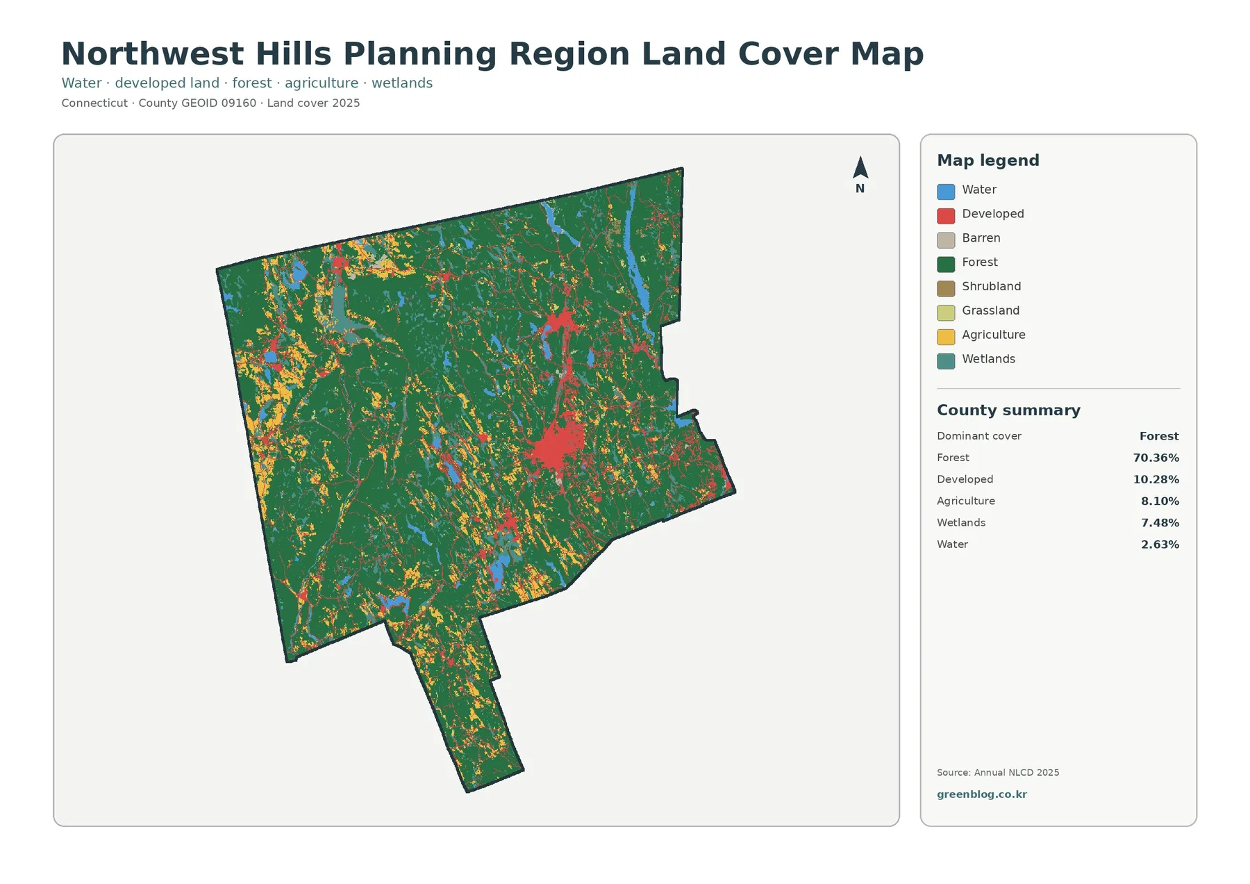
Northwest Hills Planning Region is dominated by forest rather than built land. In the 2025 summary, forest accounts for 70.36% of the region, followed by developed land at 10.28%, agriculture at 8.10%, wetlands at 7.48%, and water at 2.63%. The four maps on this page separate those themes so you can compare the current land-cover pattern, forest and farmland, impervious surfaces, and mapped differences between 1985 and 2025 without treating them as the same kind of information.
The WebP images are intended for on-page viewing, while all four original JPG maps are available together in one ZIP download. Use the general map for a broad regional picture, the forest-and-farmland version for rural landscape patterns, the impervious map for pavement and rooftops, and the change map when you want to locate cells that were classified differently at the two comparison dates. Land cover describes what is on the ground surface; it does not determine ownership, zoning, development rights, or legal wetland boundaries.
Table of Contents
A forest-first landscape with smaller developed and agricultural areas
The most important fact in the 2025 map is not a single town or road but the scale of the forest cover. Green occupies most of the mapped boundary, with large connected areas extending across the north, west, center, and the southern extension of the region. At 70.36%, forest is several times larger than any other class in the county-equivalent summary. Developed and agricultural colors therefore tend to appear as clusters, narrow bands, or smaller openings inside a much larger wooded landscape rather than as a continuous urban or farm plain.
Northwest Hills Planning Region is made up of 21 municipalities. The Northwest Hills Council of Governments lists Barkhamsted, Burlington, Canaan, Colebrook, Cornwall, Goshen, Harwinton, Hartland, Kent, Litchfield, Morris, New Hartford, Norfolk, North Canaan, Roxbury, Salisbury, Sharon, Torrington, Warren, Washington, and Winchester as member towns. The supplied land-cover map does not draw or label those municipal boundaries, so its percentages should be read as regional values. A patch of color should not be assigned to a particular town unless a separate boundary map is used.
Developed land covers 10.28% of the region. The strongest red concentration appears in the east-central part of the map, while smaller developed areas occur elsewhere as compact clusters and thin connections. NHCOG’s regional planning documents identify Downtown Torrington as the principal regional center and describe Torrington, Winchester, and Litchfield as a more developed core within an otherwise rural region. That official planning context helps explain why development is not evenly distributed, but the land-cover image by itself is not detailed enough to identify every red patch by municipality.
Agriculture accounts for 8.10%. Yellow agricultural areas are especially noticeable in parts of the west and southwest, but they also appear in smaller pieces across the center and north. Wetlands make up 7.48% and are scattered through the wooded landscape, often as narrow or irregular shapes rather than one large block. Water is 2.63%, visible in several elongated and compact blue areas. Together, these classes show why a single statewide description of ‘rural Connecticut’ is not very useful here: forest is dominant, but farming, water, wetlands, and settlement all occupy distinct parts of the region.
Why the forest-and-farmland map is useful
The forest-and-farmland version reduces the visual competition from developed and miscellaneous classes. Forest remains dark green, while cropland, pasture or hay, shrub and grassland, wetlands, and water can be compared against it more clearly. This makes the large connected wooded areas easier to follow from one side of the region to the other. Agricultural cover appears as a mix of larger patches and smaller openings, not as a single continuous belt. For classroom use or a regional landscape overview, this simplified view is often easier to explain than the full land-cover legend.
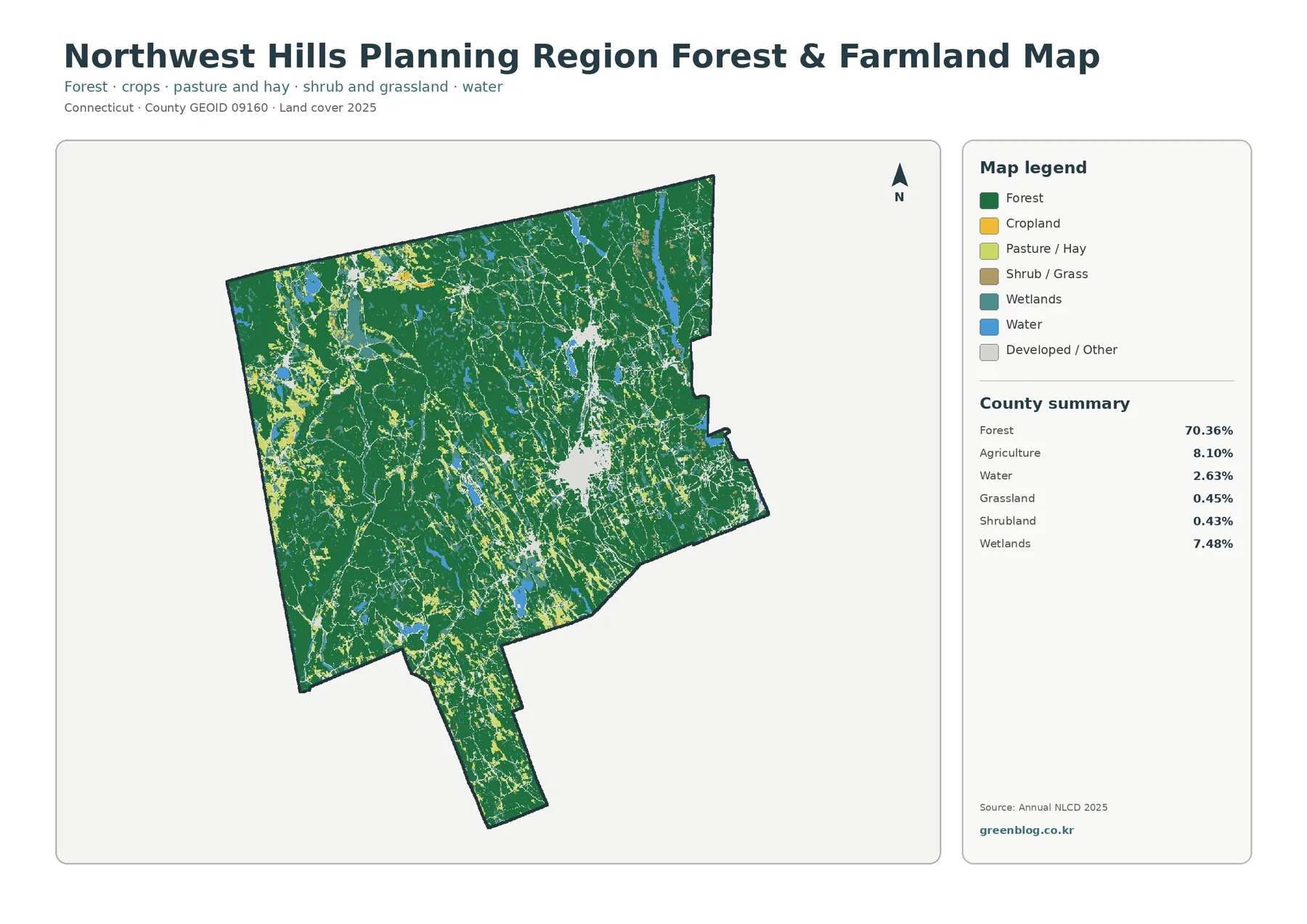
The summary on this map gives forest at 70.36%, agriculture at 8.10%, water at 2.63%, grassland at 0.45%, shrubland at 0.43%, and wetlands at 7.48%. Because grassland and shrubland are each below one percent, they can be visually prominent in a local area without forming a large share of the region as a whole. Forest behaves differently: its large percentage is reinforced by the way broad green areas connect across the map. Percentage and location need to be considered together, especially when comparing a rare class that is locally concentrated with a common class that is regionally extensive.
NHCOG’s Regional Plan of Conservation and Development gives additional context for that pattern. Its conservation policy work identifies large ‘core forest’ areas and priority farm fields as resources of regional concern. The policy map described in that plan is not the same dataset as the 2025 land-cover image on this page, and the criteria are different, so the two should not be merged numerically. What the plan does establish is that large forests and productive farmland are important features of Northwest Hills planning, which makes the forest-and-farmland map a useful visual companion for broad regional discussion.
Agricultural color on this map should not be interpreted as a legal farm district or a parcel-level inventory. A cell classified as agriculture describes the observed surface category used in the land-cover dataset. It does not tell you who owns the land, what crop is being grown, whether the soil is considered prime farmland, or whether a conservation restriction applies. The same caution applies to forest: green does not distinguish state forest, municipal land, land-trust property, and private woodland.
Impervious cover is low across the region, but not everywhere
Impervious surface means hard cover such as rooftops, paved roads, and parking areas where water does not readily soak into the ground. The 2025 regional mean is 1.64%, and cells with at least 50% impervious cover account for 0.78% of the mapped area. Both values are low compared with the 10.28% developed-land share because developed classes can include lawns, trees, and other permeable surfaces around buildings and roads. The two measures answer related but different questions.
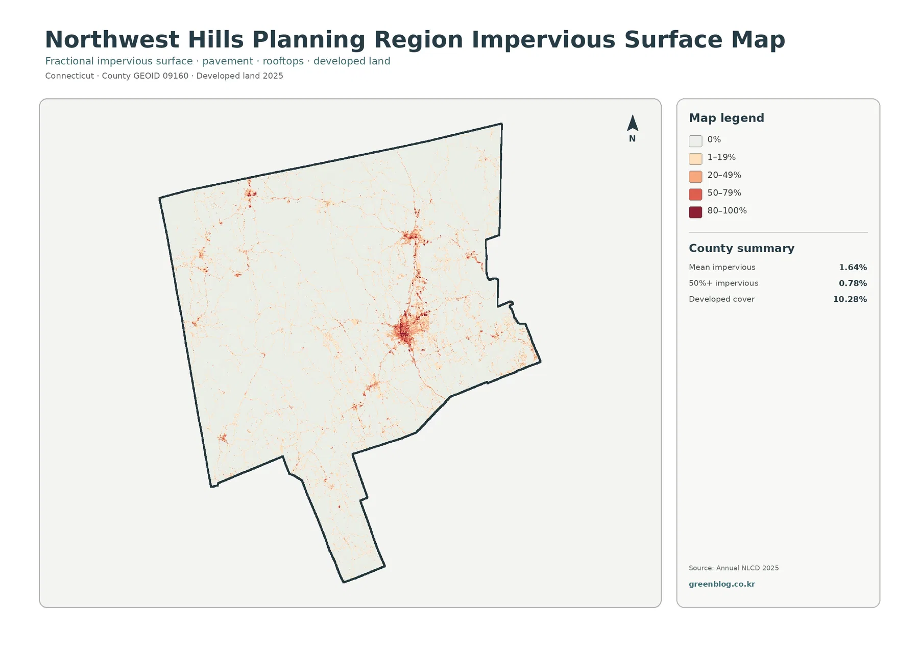
Most of the impervious map is very light, which is consistent with a region where forest occupies more than seventy percent of the surface. The darkest cluster lies in the east-central developed area, with smaller concentrations at other settlement centers. Thin lines and scattered points connect some of these clusters, reflecting the way roads and built surfaces occupy much less area than the surrounding woods. Comparing this map with the general land-cover map is useful because a place can be classified as developed without being dominated by pavement.
A regional mean of 1.64% should not be used as a stormwater or flood-risk rating for every community. A small built center can have much higher local impervious cover while still contributing little to a large regional average. Runoff also depends on rainfall, slope, soil, drainage infrastructure, and distance to streams, among other factors. The map is therefore best used to locate broad concentrations of hard surface before consulting watershed, engineering, or municipal data for a more specific question.
What the 1985–2025 change map actually measures
The change map compares land-cover classifications at two dates rather than simply showing how much land is developed today. It reports a total class difference of 6.89% between 1985 and 2025. Of the mapped area, 1.48% is categorized as change to developed, 1.31% as forest loss, 0.24% as agricultural loss, and 3.64% as other class difference. Most of the region remains in the no-class-difference background, while colored change cells are scattered in small patches. Red change is somewhat more concentrated around the larger developed area visible in the current map.
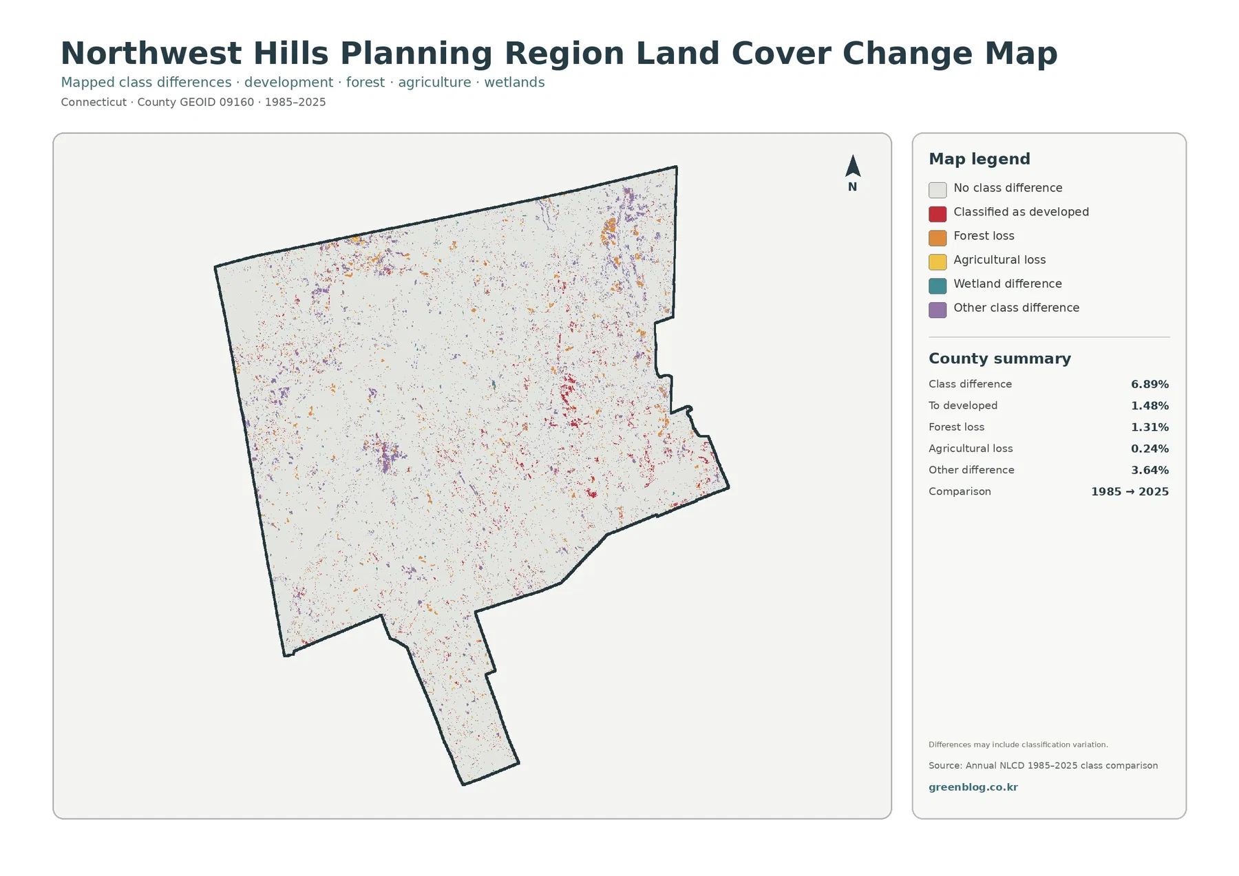
The 1.48% ‘to developed’ figure is not another way to state the current 10.28% developed share. The current value includes all land classified as developed in 2025, including areas that were already developed at the earlier comparison date. The change value isolates cells whose classification moved toward developed between the two dates. Keeping those two ideas separate prevents a common mistake in which a change percentage is presented as if it were the total amount of present-day development.
Forest loss at 1.31% and agricultural loss at 0.24% also need cautious wording. The map notes that differences may include classification variation. Satellite observations, mixed surface types within a grid cell, and classification methods can create differences that do not correspond neatly to a documented clearing, construction project, or farm conversion. A colored cell is a useful place to start an investigation, not proof of a specific event. Historical aerial photography and local records are better tools for confirming what happened at a particular site.
For a long-term project, a practical workflow is to use the change map first to locate clusters of interest, then compare those same locations with the 2025 general map. That tells you both that the classification differs and what the current class is. A third step can bring in aerial imagery, parcel history, forest data, or municipal planning records. This sequence is especially important in a heavily forested region, where a relatively small mapped change can have very different meanings depending on whether it occurs in a large contiguous woodland, near a village center, or beside agricultural land.
Regional planning context: rural land, Torrington, farms, and water resources
The visual pattern aligns with the broad land-use description in NHCOG planning documents. The region is described as predominantly rural, with town and village centers surrounded by lower-density development and large areas of natural or agricultural land. The same planning work identifies a stronger developed core around Torrington, Winchester, and Litchfield and a smaller hub around North Canaan. Those statements do not convert the land-cover map into a municipal planning map, but they provide a useful real-world frame for the clustered red areas and extensive green background.
NHCOG’s conservation planning also emphasizes water resources, large forest blocks, and priority farmland. On the supplied map, water and wetlands together form a smaller share than forest but appear repeatedly across the region. Blue water bodies and teal wetland cells interrupt or border the wooded areas in many places. These colors are useful for regional environmental education or an initial watershed discussion, but they are not substitutes for mapped stream names, wetland jurisdiction, drinking-water watershed boundaries, or floodplain data.
The planning-region identity matters when comparing this map with older Connecticut county material. The U.S. Census Bureau currently treats Northwest Hills Planning Region as a county-equivalent with county code 160 and GEOID 09160. That boundary should not simply be assumed to match an older Litchfield County dataset. If a historic table, map, or GIS layer uses the former county structure, check its date and geographic code before comparing percentages with the 2025 Northwest Hills figures on this page.
Choosing among the four map files
Start with the general land-cover map when you need one image that summarizes the region. It puts forest, developed land, agriculture, wetlands, water, and smaller classes in the same legend, so it is the best orientation map. Choose the forest-and-farmland version when the question is about rural character, wooded continuity, agricultural openings, or the relationship between farms and surrounding natural cover. Because other categories are muted, those patterns are easier to see.
Use the impervious-surface map for built intensity rather than simple developed-versus-undeveloped classification. Its 0%, 1–19%, 20–49%, 50–79%, and 80–100% categories show where hard surfaces are concentrated. The change map serves a different purpose again: it is for locating classification differences across time. Pairing the 1985–2025 comparison with the 2025 map is usually better than reading it alone because current condition and historical difference are separate pieces of information.
For a presentation, one effective sequence is the general map first, followed by either the forest-and-farmland or impervious map depending on the topic, and then the change map last. In an environmental class, the 70.36% forest share and 7.48% wetland share provide a clear regional starting point. In a planning discussion, comparing 10.28% developed land with a 1.64% mean impervious surface shows why developed classification and hard-surface coverage should not be treated as interchangeable.
Downloading and using the original JPG maps
The ZIP download contains four JPG files: the general land-cover map, forest and farmland map, impervious and developed-land map, and the 1985–2025 land-cover change map. Each image includes its legend and regional summary, so it can stand on its own in a document or slide as long as the text remains readable. Preserve the original aspect ratio when resizing. If several maps are placed on one page, make them large enough that the legend categories and percentages can still be distinguished.
When citing the files, include the date context. The current land-cover and impervious maps use 2025 data, while the change map compares 1985 with 2025. Also make clear that the percentages refer to Northwest Hills Planning Region as a whole. A regional percentage should not be quoted as a value for Torrington, Salisbury, Kent, or another municipality without a separate town-level calculation.
Limits to keep in mind when zooming in
Land-cover products such as Annual NLCD classify the surface using gridded remote-sensing data. Real landscapes are more complicated than a single class per grid cell: a small area can contain tree canopy, lawn, pavement, a roof, bare soil, and water at the same time. The map simplifies that mixture into a classification or an impervious percentage. Zooming closer does not turn the image into a parcel survey, and narrow roads, forest edges, small wetlands, or farm boundaries can look more generalized than they do on the ground.
The observation date is another limitation. The current maps are based on 2025 land-cover information, and the change product compares 1985 with 2025. Clearing, construction, vegetation recovery, farm changes, or other events after the observation period may not be represented. For a current site-specific question, recent aerial imagery and municipal GIS are more appropriate. For a region-wide comparison of the main cover types, the four maps are a useful starting set.
Finally, do not use these categories as legal land-use designations. Forest color does not prove that land is protected. Agricultural color does not establish a farm-preservation status or soil rating. Wetland color is not a regulatory wetland boundary, and developed color does not indicate that additional development is allowed. Ownership, zoning, permitting, and conservation status require the relevant state or municipal records.
Frequently Asked Questions
Does 70.36% forest mean that 70.36% of the region is protected land?
No. The figure is the share classified as forest in the 2025 land-cover data. It does not identify ownership, conservation easements, public forest, or legal protection, so protection status requires a separate official source.
Why is developed land 10.28% while mean impervious cover is only 1.64%?
Developed classes can include lawns, trees, and other permeable surfaces around buildings and roads. Impervious cover measures hard surfaces such as rooftops, pavement, and parking areas, so the two percentages describe different characteristics.
Does the 6.89% class difference mean exactly 6.89% of the land physically changed from 1985 to 2025?
Not necessarily. The map compares classifications at two dates and notes that differences can include classification variation. Use aerial imagery or local records to confirm the cause and timing of a change at a specific location.
Map File Information
The ZIP contains four JPG maps: general land cover, forest and farmland, impervious and developed land, and the 1985–2025 land-cover change comparison.
- Included Files: 4 JPG maps
Related Maps
- Capitol Planning Region Connecticut Land Cover Map
- Greater Bridgeport Planning Region Connecticut Land Cover Map
- Lower Connecticut River Valley Planning Region Connecticut Land Cover Map
Sources and References
- MRLC Annual NLCD Data – source context for the 2025 land-cover and impervious products
- USGS Annual NLCD Land Cover Classification – land-cover class definitions and methodology context
- U.S. Census Bureau TIGER/Line Shapefiles – county-equivalent boundary reference
- Northwest Hills Council of Governments Work Program – the 21 member municipalities and regional organization
- NHCOG Regional Plan of Conservation and Development – regional context for forests, farmland, water resources, and growth centers
- Connecticut OPM Planning Regions Overview – Connecticut planning-region framework
Green Map creates custom-edited map images using open geographic data sources such as geoBoundaries, Natural Earth, OpenStreetMap, and government open data.
These maps are edited visual materials, not raw data files, and are provided for education, documents, presentations, and graphic reference.