South Central Connecticut Planning Region combines a heavily developed shoreline and urban core with broad forest patches farther inland. The 2025 summary on the supplied map assigns 49.55% of the region to developed cover and 35.20% to forest, followed by wetlands at 8.75%, agriculture at 3.00%, and water at 2.54%. The four maps on this page separate those patterns into current land cover, forest and farmland, impervious surface, and mapped change from 1985 to 2025.
The WebP images are intended for quick viewing on the page, while the four original JPG maps are available together in one ZIP download. They can be used for classroom work, presentations, regional comparisons, or as a visual starting point for environmental research. Land cover describes what is physically covering the ground; it does not establish zoning, ownership, conservation status, or whether a parcel can be developed.
Table of Contents
A coastal planning region with fifteen different municipalities
The current Census county-equivalent is identified on the maps as GEOID 09170. South Central Regional Council of Governments, or SCRCOG, lists fifteen member municipalities: Bethany, Branford, East Haven, Guilford, Hamden, Madison, Meriden, Milford, New Haven, North Branford, North Haven, Orange, Wallingford, West Haven, and Woodbridge. SCRCOG describes New Haven as centrally located on Long Island Sound, with the region extending from Milford in the west to Madison in the east and north to Meriden.
That geography helps explain why a single regional percentage can contain very different local landscapes. The southwest and the area around the central coast are dominated by developed colors on the supplied map, while larger forest blocks appear toward the eastern and inland portions. A developed band also extends north through the long upper part of the planning-region outline. Because municipal boundaries and road labels are not drawn on these land-cover images, the map should be read as a regional pattern rather than as a town-by-town inventory.
The 2025 land-cover map: development leads, but forest remains extensive
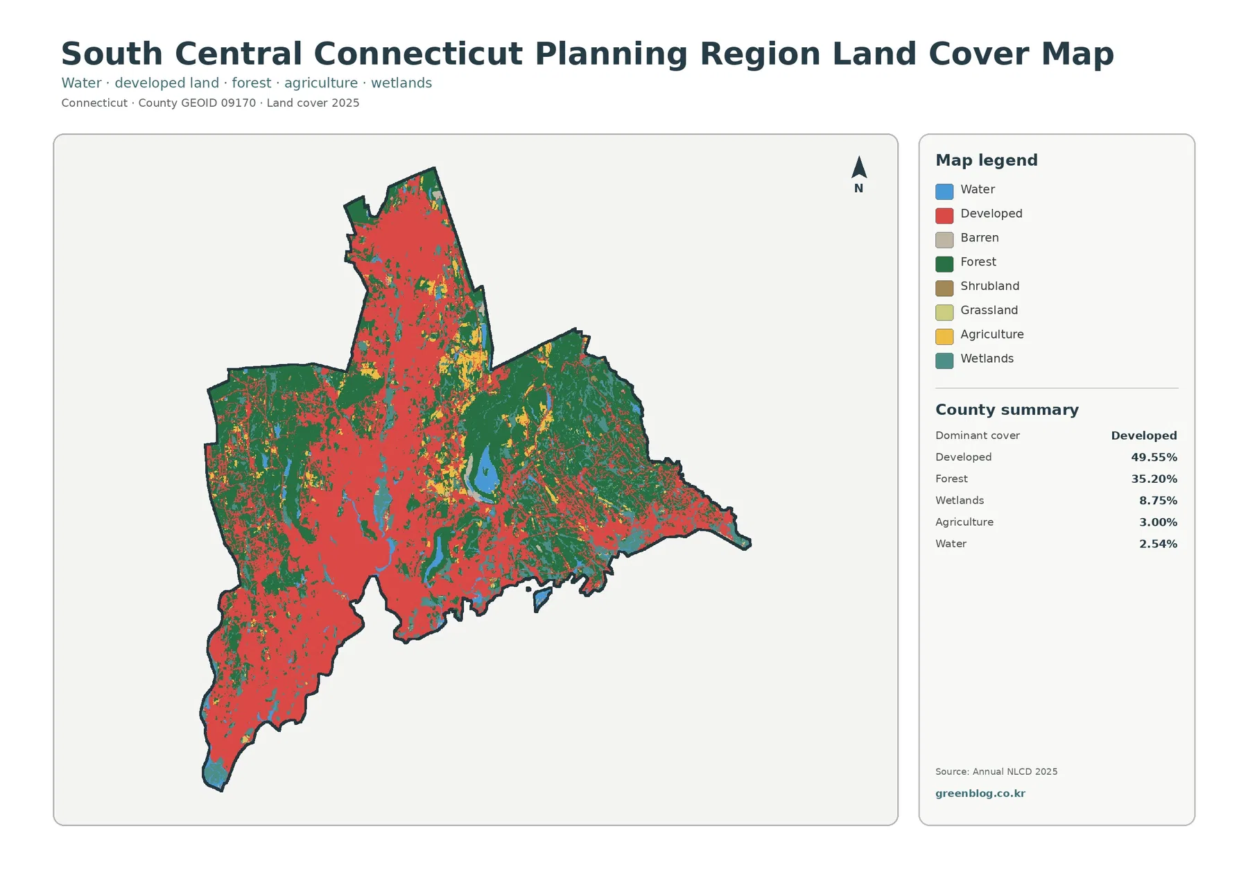
Developed land is the dominant mapped class at 49.55%. Red areas occupy much of the southwest, the central shoreline, and a north-running concentration through the middle of the region. They are not continuous everywhere, however. Forest covers 35.20%, creating large green areas on the east side and substantial patches elsewhere. The region therefore does not read as a solid urban surface; developed and forested landscapes alternate at a scale that is easy to see even before zooming in.
Wetlands account for 8.75% and appear as teal patches and narrow features distributed through both forested and developed surroundings. Agriculture is 3.00%, shown in smaller yellow areas, while water is 2.54% and includes the southern coastal edge as well as inland water bodies. The legend also includes barren, shrubland, and grassland classes, but the supplied general-map summary does not provide separate percentages for all of them. It would be misleading to invent exact shares that are not printed on the source map.
The map is especially useful for comparing broad surface cover, not legal land use. A green pixel indicates land classified as forest cover; it does not tell the reader whether that land is publicly owned, protected, or privately managed. Likewise, a red developed class is not a zoning designation. For questions about allowable uses or parcel restrictions, municipal planning and zoning sources are the appropriate reference.
Impervious surface reveals where the developed landscape is most intense
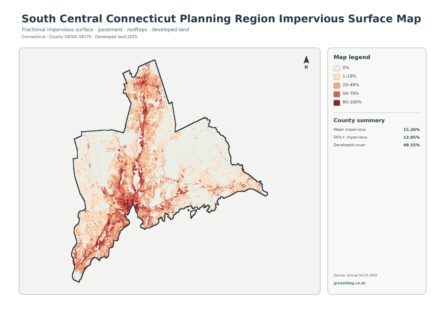
The impervious map answers a different question from the developed-land class. The regional mean is 15.26%, and 12.05% of the region is mapped at 50% or more impervious surface. Impervious cover refers to hard surfaces such as rooftops, streets, parking areas, and other materials that do not readily absorb water. Developed land can also contain lawns, trees, landscaped ground, and other permeable surfaces, which is why the 49.55% developed-cover figure is much larger than the mean impervious percentage.
Darker tones concentrate strongly in the southwest and around the central coastal urban area. A pronounced north-running concentration is also visible, with additional smaller clusters elsewhere. SCRCOG planning material identifies the I-95 and I-91 corridor as an important regional transportation structure, but the supplied impervious map does not draw highway lines. It is reasonable to compare the official transportation context with the visible concentration, yet the map alone cannot prove that any one road caused a particular development pattern.
For watershed or environmental education, impervious cover can help illustrate how built surfaces vary across the region. It should not be treated as a direct flood or water-quality map. Drainage systems, soil, slope, rainfall, stream connections, and local infrastructure all affect runoff. The most defensible use is to describe where hard surfaces are more or less concentrated and then combine that information with other datasets when a specific environmental question is being studied.
Forest, farmland, wetlands, and water stand out when development is muted
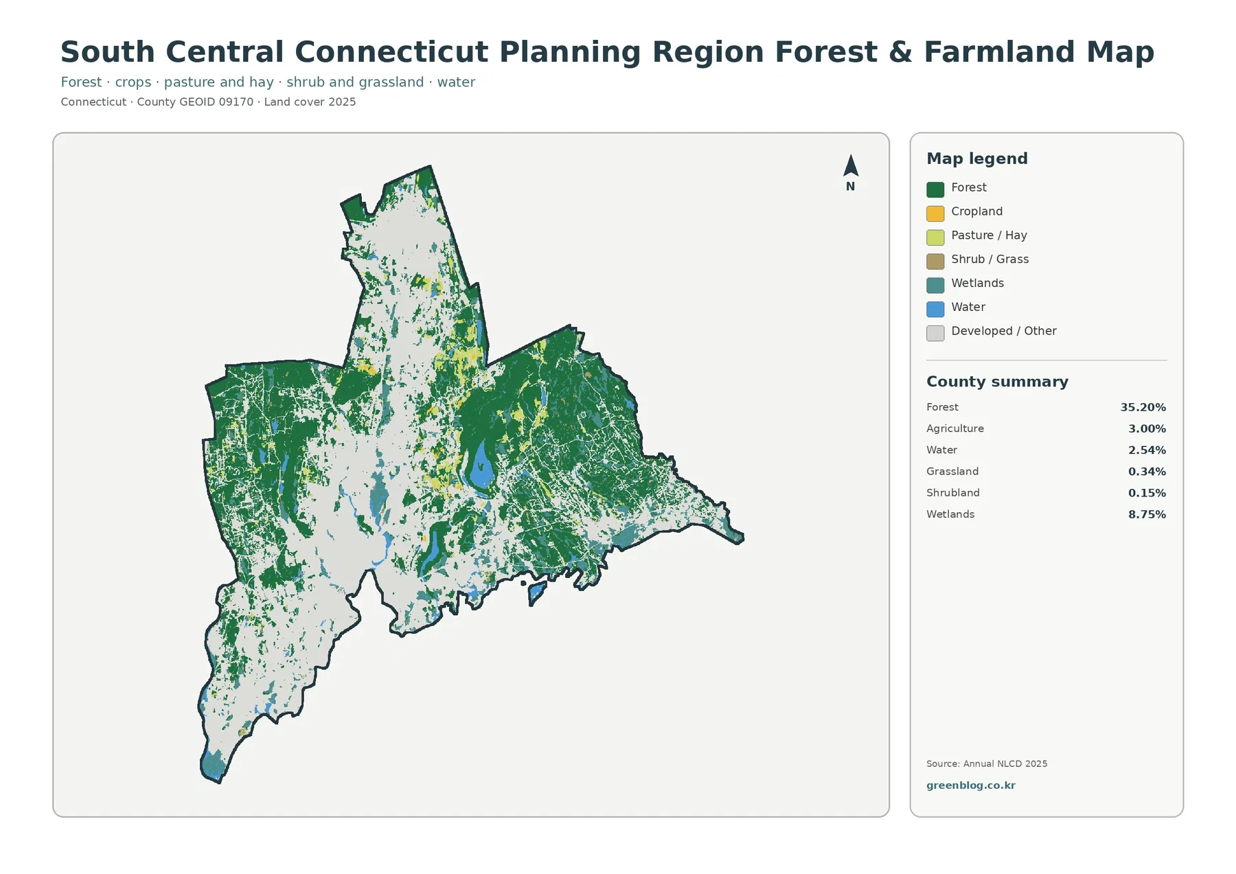
Removing the strong developed color makes the natural and agricultural pattern easier to follow. Forest remains the largest highlighted class at 35.20%, with broad green coverage in the east and additional blocks to the west and north. Agriculture is only 3.00% of the regional total, so cropland and pasture appear as scattered openings rather than a single farm belt. The map summary also reports grassland at 0.34% and shrubland at 0.15%, both minor shares at the regional scale.
Wetlands, at 8.75%, are much more prominent than agriculture and occur throughout the map as teal patches and narrow zones. Water is 2.54%. Along the southern boundary, the Long Island Sound setting makes the coastal relationship visually clear, while inland water appears within forest and developed areas. This view is useful when a reader wants to compare forest continuity, open agricultural areas, wetlands, and water without the visual weight of the red developed class.
These categories still represent classified surface cover rather than regulatory boundaries. A wetland-colored cell is not a substitute for a legally delineated wetland, and an agricultural cell does not identify a preserved-farmland parcel or a particular crop. Small fields, wetland edges, lawns, and wooded margins can also be mixed within the underlying raster grid, so the map is best suited to regional-scale comparison.
What changed between 1985 and 2025
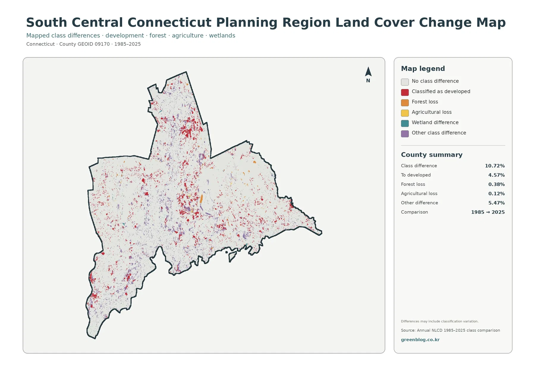
The change map reports class differences across 10.72% of the planning region. Areas mapped as changing to developed account for 4.57%, forest loss for 0.38%, and agricultural loss for 0.12%. Another 5.47% is grouped as other class difference. Most of the map remains in the no-class-difference category, so the graphic should not be read as evidence that the entire region transformed during the forty-year comparison.
Red change marks occur in many small patches, with visible concentrations near the central, southwest, and northern developed areas. Other change colors are more scattered. The map itself warns that differences may include classification variation. That qualification matters because comparing two classified products can reflect both real land-cover change and differences in how a pixel was assigned. Historical aerial imagery, local planning records, or project documents are needed before assigning a cause to a specific spot.
Using the four maps together instead of treating them as duplicates
For a first look, the general land-cover map gives the clearest regional balance: nearly half developed, a little over one-third forest, and smaller shares of wetlands, agriculture, and water. The forest-and-farmland view is better when the goal is to see natural and open-land patterns without the developed class dominating the page. The impervious map then distinguishes broad developed cover from the much harder surfaces of roofs and pavement.
The change map belongs at the end of that sequence because it does not describe present-day cover. A red change location does not simply mean ‘developed land now’; it marks a difference between the 1985 and 2025 classifications that falls into the developed category. Placing the 2025 map beside the change map helps keep current condition and historical comparison separate. This is also a useful presentation technique for students or readers who are new to land-cover data.
The maps support regional planning context, environmental education, watershed discussions, habitat comparisons, and presentation graphics, but each use has a different evidence threshold. A classroom comparison may only need the regional percentages and visible patterns. A site-specific environmental decision requires finer-scale data and field or regulatory information. Matching the map to the question prevents a regional visualization from being asked to provide parcel-level certainty.
Download the four JPG maps and keep the dates with the figures
The downloadable ZIP contains the four original JPG maps shown in the article: general land cover, forest and farmland, impervious and developed land, and the 1985–2025 land-cover change map. Each file includes its own legend and regional summary, which makes the set practical for reports, teaching materials, slide decks, and offline reference. Keeping the legend visible is important because similar-looking colors answer different questions from one map to another.
When citing a map or adding it to a presentation, note that the current land-cover and impervious products are labeled 2025, while the change map compares 1985 with 2025. The percentages apply to South Central Connecticut Planning Region as a whole. They should not be copied as statistics for New Haven, Meriden, Milford, Madison, or any other individual municipality without a separate boundary-based calculation.
Scale, classification, and boundary limits to remember
Annual NLCD-style land-cover products classify the landscape as raster cells. On the ground, a cell can contain a mix of trees, lawn, pavement, rooftops, water, or wet ground, especially along edges. The final map simplifies that mixture into a class or an impervious percentage. Zooming in therefore does not turn the image into a parcel survey. Narrow streams, small wetlands, tiny fields, and complicated urban edges may need higher-resolution local data.
Time is another limitation. The current maps represent the supplied 2025 classification, and the change graphic compares 1985 with 2025. Construction, vegetation change, wetland alteration, or other events after the observation period may not appear. The county-equivalent boundary also matters: GEOID 09170 refers to the present planning-region unit, not a historical county boundary that can automatically be substituted in older datasets.
Finally, physical cover and legal status must remain separate. Forest does not automatically mean protected open space, developed cover does not grant development rights, and mapped wetlands do not replace an official wetland delineation. Ownership, zoning, permitting, conservation restrictions, and regulatory decisions should be checked through Connecticut and the relevant municipality.
Frequently Asked Questions
Does 49.55% developed cover mean that half the region is pavement and buildings?
No. Developed land can include lawns, trees, and other permeable surfaces within built-up areas. The separate impervious-surface map reports a regional mean of 15.26%, so developed cover and hard-surface cover should not be treated as the same measure.
Is the 10.72% class difference from 1985 to 2025 an exact measure of real-world land conversion?
Not necessarily. It is the share where the two mapped classifications differ. The change map notes that classification variation may be included, so a specific change should be checked against historical imagery or local records before a cause is assigned.
Can these percentages be used for an individual municipality such as New Haven or Meriden?
No. The supplied summary applies to South Central Connecticut Planning Region as a whole. Municipality-level statistics require a separate calculation using the relevant municipal boundary or an official local dataset.
Map File Information
Download four original JPG maps in one ZIP: 2025 land cover, forest and farmland, impervious/developed land, and 1985–2025 land-cover change.
- Included Files: Four JPG maps
Related Maps
- Capitol Planning Region Connecticut Land Cover Map
- Connecticut Northwest Hills Planning Region Land Cover Map
- Greater Bridgeport Planning Region Connecticut Land Cover Map
Sources and References
- MRLC Annual NLCD Data – source family for current land-cover and impervious-surface products
- USGS Annual NLCD Land Cover Classification – class definitions and interpretation guidance
- U.S. Census Bureau TIGER/Line Shapefiles – planning-region county-equivalent boundary reference
- South Central Regional Council of Governments About Us – regional extent and fifteen-member overview
- SCRCOG Municipalities & CEOs – current member municipality list
- SCRCOG GIS/Mapping Resources – regional planning and mapping resources
Green Map creates custom-edited map images using open geographic data sources such as geoBoundaries, Natural Earth, OpenStreetMap, and government open data.
These maps are edited visual materials, not raw data files, and are provided for education, documents, presentations, and graphic reference.