Southeastern Connecticut Planning Region combines a heavily wooded interior with a shoreline where developed land, water, and wetlands become much more visible. The 2025 map summary lists forest as the dominant cover at 51.95 percent. Developed land accounts for 22.61 percent, wetlands 12.63 percent, agriculture 7.28 percent, and water 3.86 percent. Those numbers are useful as a regional overview, but the maps add an important detail: development is concentrated in several coastal and inland clusters rather than spread evenly across the entire region.
This page provides four map views for the same planning region: general land cover, forest and farmland, impervious surface with developed land, and mapped land-cover change from 1985 to 2025. WebP versions are placed in the article for quick viewing, while the original JPG maps are packaged together in one downloadable ZIP. They can be used for classroom work, presentations, broad environmental comparisons, watershed discussions, and regional planning context. Land cover describes what is physically covering the ground; it does not identify zoning, ownership, property lines, or whether land can legally be developed.
Table of Contents
Why the region cannot be described as simply urban or rural
The U.S. Census Bureau recognizes Southeastern Connecticut Planning Region as a current county-equivalent, and the supplied maps carry GEOID 09180. The Southeastern Connecticut Council of Governments, or SCCOG, serves 22 municipalities and describes a region that includes the southeastern shoreline, Mystic, and a mix of urban, suburban, and rural settings. That variety is visible in the land-cover pattern. Broad forest blocks dominate much of the interior, yet developed cover becomes conspicuous along the southern edge and around several inland centers.
Forest covering 51.95 percent does not mean the region is a single continuous woodland. Roads, settlements, fields, wetlands, and water break the green areas into sections, especially near the coast and through the central part of the map. At the same time, developed land at 22.61 percent is not a uniform urban sheet. Many developed patches are separated by forest or other natural cover. Reading both percentages together gives a more accurate picture than focusing on either one alone.
Wetlands are another major part of the regional pattern. At 12.63 percent, they occupy a larger share than agriculture. The teal areas occur in many sizes and are distributed through forested interior landscapes as well as closer to water and the coast. Agriculture, shown at 7.28 percent, appears as smaller and more scattered blocks. This combination of forest, wetlands, fields, water, and development is one reason a single land-cover map is useful before looking at more specialized views.
Start with the 2025 land-cover map for the broadest comparison
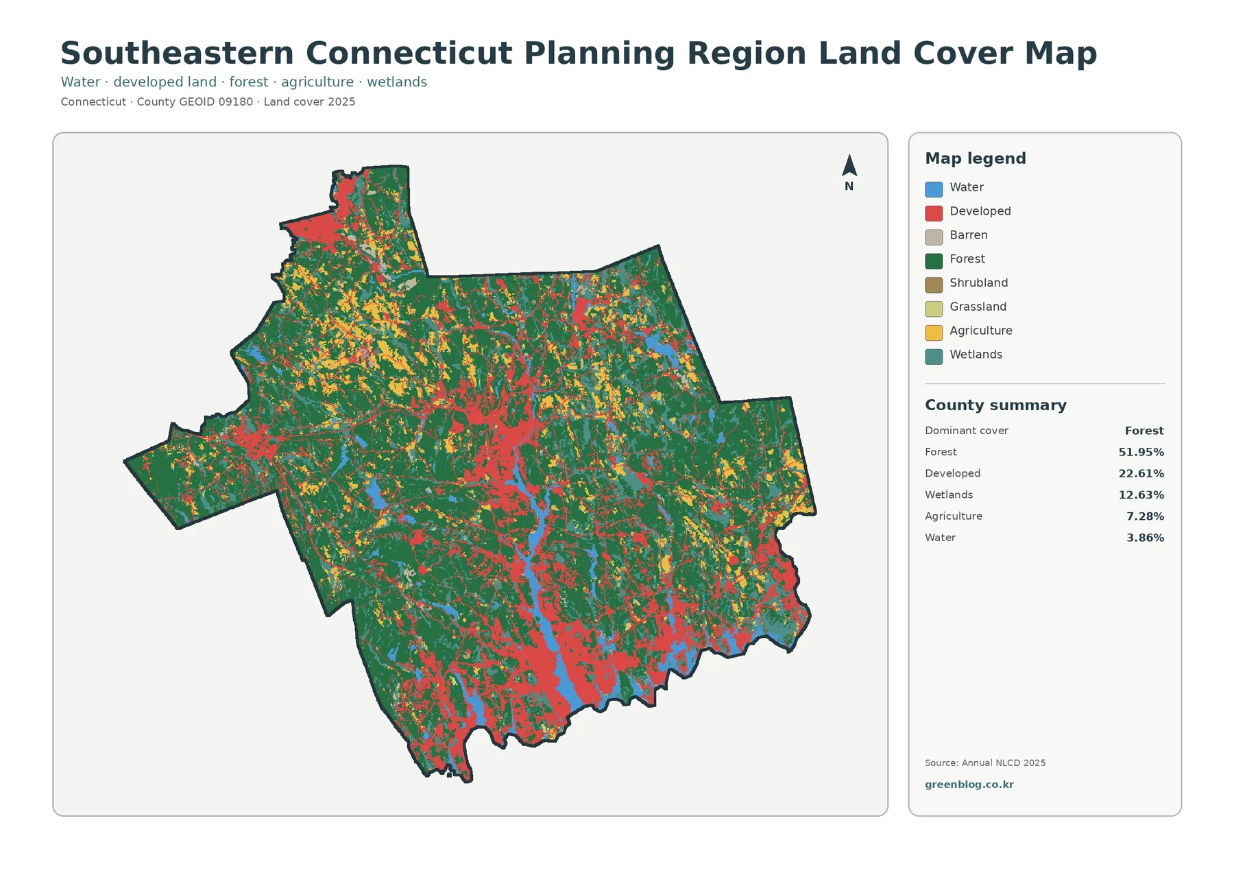
The general map is the best place to compare the five leading cover types at once. Forest is the dominant class at 51.95 percent, while developed land makes up 22.61 percent. Wetlands contribute 12.63 percent, agriculture 7.28 percent, and water 3.86 percent. Barren land, shrubland, and grassland are included in the legend but are not among the largest summary categories, so they have less influence on the region-wide appearance.
Developed cover is most visually prominent along the southern portion of the region and in several central or inland concentrations. Forest remains much more continuous across wide sections of the north, east, and west. The boundary between these two patterns is not sharp. Wooded patches remain near developed areas, and smaller development traces extend through otherwise forested country. The shoreline also contains a mixture rather than a simple band of one cover type, with water, wetlands, forest, and development all appearing near one another.
This map should be treated as a regional classification rather than a parcel map. Annual NLCD-style products divide the landscape into raster cells, which are small grid squares assigned a representative land-cover class. A cell near a forest edge, neighborhood, narrow wetland, or road may contain more than one real surface. That mixed condition is simplified by the classification. Enlarging the map therefore helps with viewing but does not create survey-level property boundaries or legal land-use information.
The impervious map separates developed cover from hard surfaces
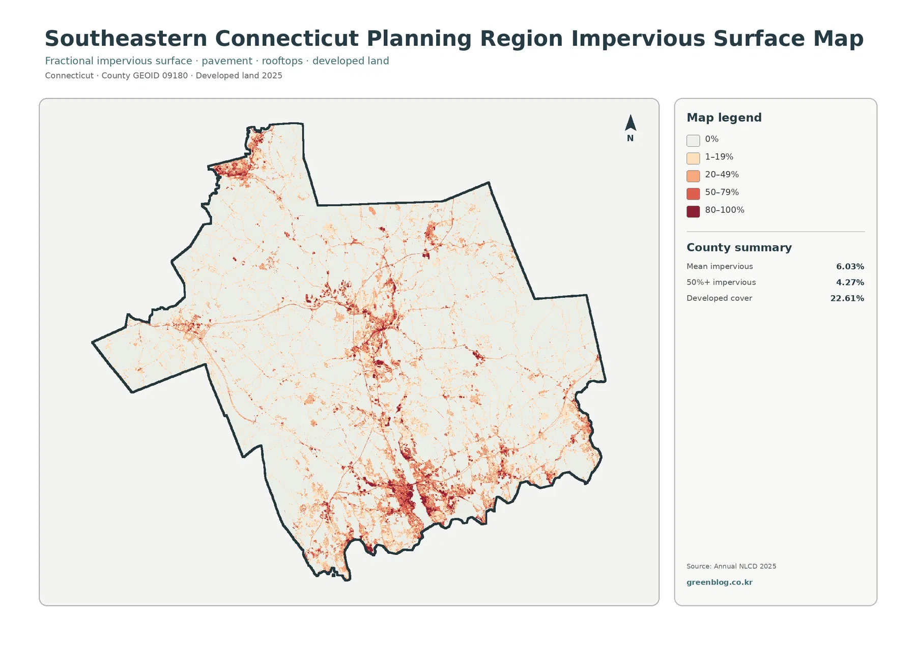
The regional mean impervious surface is 6.03 percent, and areas with at least 50 percent impervious cover account for 4.27 percent of the planning region. These values are much lower than the 22.61 percent developed-land share because the two measures answer different questions. Developed classes can include lawns, planted trees, soil, and other permeable surfaces around buildings and roads. Impervious surface focuses on rooftops, pavement, parking areas, and similar surfaces that do not readily absorb water.
The strongest impervious concentrations appear near the southern shoreline and in several dense clusters farther inland. Thin lines and smaller nodes connect some of those concentrations, while much of the wooded interior remains pale. This makes the map especially useful when a general developed-land class is too broad. It shows where the hard-surface component of development is relatively intense without implying that every developed cell is fully paved.
Impervious cover is often used in watershed discussions because rainfall behaves differently on pavement and rooftops than on forest soil or fields. Even so, the 6.03 percent regional mean is not a flood-risk score and does not by itself measure water quality. Slope, drainage infrastructure, soil, rainfall, stream connections, and local topography also matter. The map is best used as one layer in a larger environmental analysis rather than as a stand-alone prediction of runoff or flooding.
Forest and farmland become easier to compare when development is muted
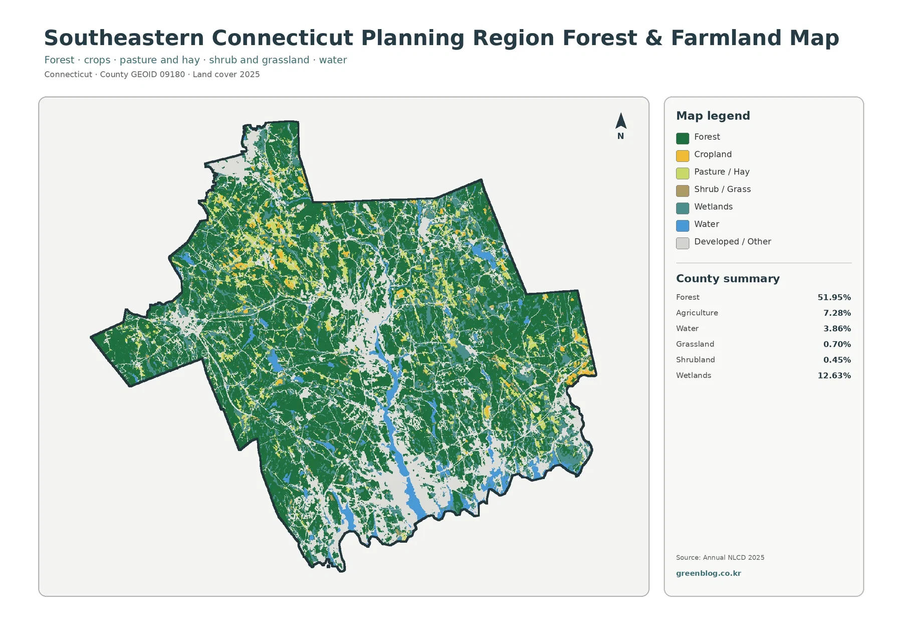
The forest-and-farmland view pushes developed and other cover into the background so natural and agricultural classes are easier to follow. Forest still accounts for 51.95 percent and forms the largest connected areas. Agriculture at 7.28 percent is distributed in smaller patches through the interior rather than one broad agricultural plain. Wetlands at 12.63 percent remain conspicuous because they thread through many wooded areas and occur near water as well.
The map summary also lists grassland at 0.70 percent and shrubland at 0.45 percent. Those classes are minor at the regional scale, but they help explain some open areas that are neither cropland nor forest. Water covers 3.86 percent and includes both coastal and inland water surfaces. Because the map groups several natural and open-cover classes together, it is useful for habitat comparisons, school projects, and presentations that need to distinguish woodland from fields and wetlands without the visual weight of developed land.
Agricultural classification should not be confused with preserved farmland or a parcel’s legal use. Likewise, a mapped wetland is not automatically the same as a legally regulated wetland boundary. These maps summarize remotely sensed surface cover. Questions about conservation restrictions, inland-wetland regulation, parcel ownership, or farming status require municipal or state records with finer boundaries and different legal definitions.
What the 1985–2025 change map does and does not say
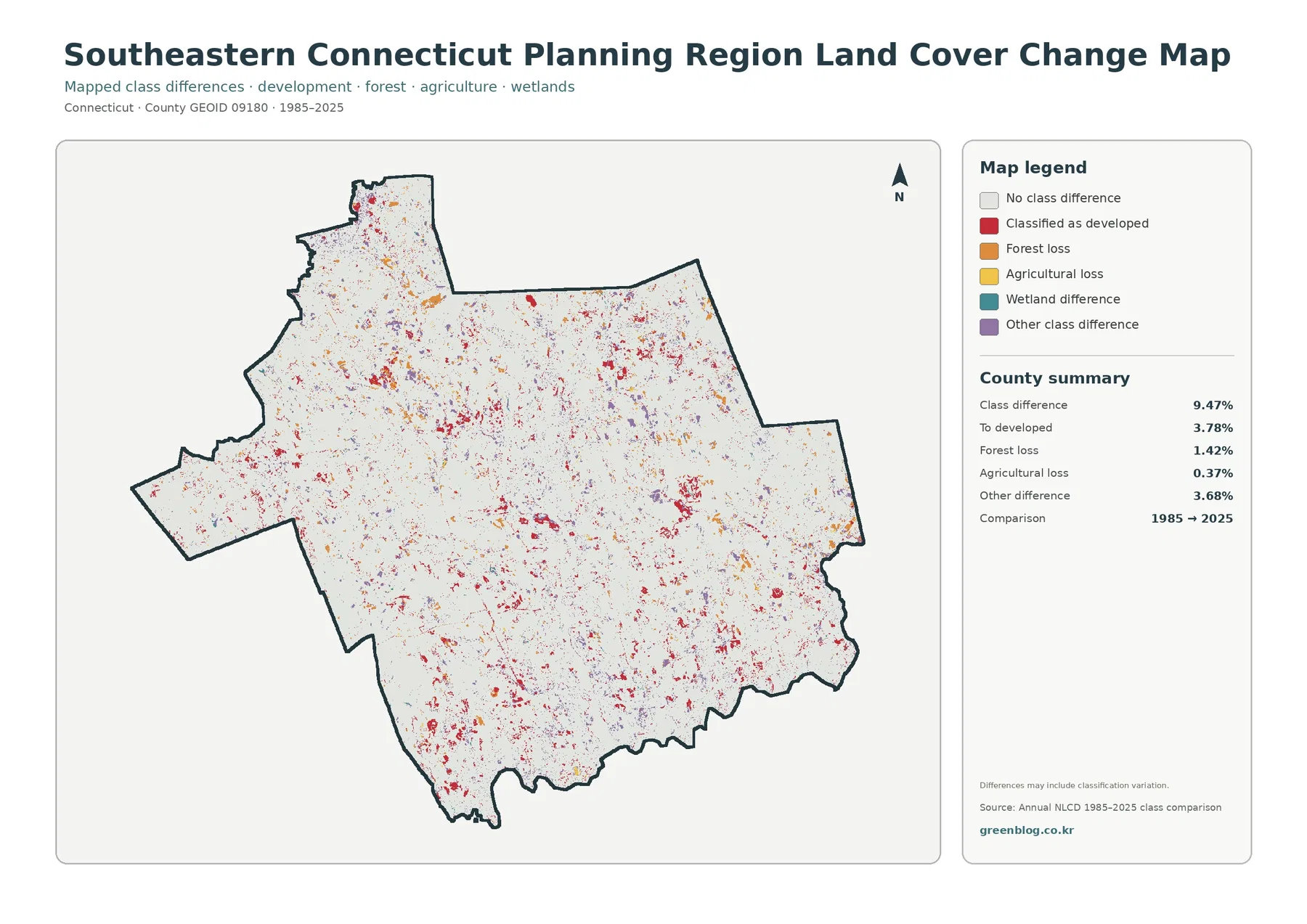
The change map reports a class difference across 9.47 percent of the planning region between 1985 and 2025. Of that total, 3.78 percent is shown as areas classified as developed in the later comparison, 1.42 percent as forest loss, 0.37 percent as agricultural loss, and 3.68 percent as other class differences. Most of the map remains in the no-class-difference category, which is important context when interpreting the colored change patches.
Change marks are scattered rather than confined to one part of the region. Red areas appear around several developed concentrations, while forest-loss marks are generally smaller and dispersed. Agricultural-loss marks occupy a still smaller share. The pattern is useful for identifying places that deserve a closer historical look, but it does not explain why a change occurred. A red patch could reflect different kinds of development, and the map alone cannot identify a specific project, road, building type, or policy decision.
The map itself warns that differences may include classification variation. That means 9.47 percent should not be quoted as a simple development rate or a precise measure of physical conversion. Historical aerial imagery, local planning files, construction records, and older environmental datasets are needed to confirm what happened at a particular site. The change layer works best as a screening and comparison tool: it highlights where two mapped classifications differ, then points the reader toward more detailed evidence.
A practical order for using all four maps
For a quick regional overview, begin with the general 2025 map and note how forest, development, wetlands, agriculture, and water divide the region. Move next to the impervious map if the question is about the intensity of built surfaces. Its 6.03 percent mean and 4.27 percent share above the 50-percent threshold give a different view of development than the 22.61 percent developed-land class. This sequence prevents a common mistake: treating all developed land as pavement or buildings.
Use the forest-and-farmland map when the focus shifts to woodland continuity, open land, wetlands, or agricultural patches. It removes much of the visual distraction from developed classes and makes the 51.95 percent forest share easier to understand spatially. Add the change map last when the goal is to compare current conditions with a longer-term classification difference. Keeping the present-day maps beside the change layer helps separate places that are developed today from places that actually show a mapped difference between 1985 and 2025.
SCCOG describes southeastern Connecticut as a region with shoreline destinations, urban and suburban centers, rural communities, transportation connections, and significant natural-resource concerns. The supplied maps support that broad regional description without assigning exact land-cover percentages to individual municipalities. Because municipal boundaries are not drawn on these map images, the planning-region totals should never be copied into statistics for Norwich, New London, Groton, Stonington, or any other member municipality.
Download the four original JPG maps
The download package contains four original JPG files: the general 2025 land-cover map, the forest-and-farmland map, the impervious-surface and developed-land map, and the 1985–2025 land-cover-change map. Each file includes its own legend and summary panel, so the maps can be used separately in documents or presentations. When citing a map, include both the place name and the year or comparison period so readers know whether they are looking at current cover or historical class differences.
For printing and slide design, keep the original aspect ratio and leave enough space for the legend to remain readable. Small wetland patches and change marks can disappear visually if several maps are reduced too much on one page. The summary values belong to the entire Southeastern Connecticut Planning Region, not to a single town or parcel. Finer questions about a neighborhood, property, zoning district, or regulated wetland should be answered with local GIS layers and official land records.
Limits to remember before using the maps for detailed decisions
Regional land-cover products are designed for consistent comparison across large areas, not for legal boundary work. Narrow roads, small streams, small wetlands, yard trees, buildings, and other features can share a single raster cell. Classification reduces that mixed surface to a representative class or, for impervious products, a fractional value. A larger display size may make the pixels easier to see, but it does not increase the underlying spatial detail.
The time reference matters as well. The three current-condition views use 2025 classifications, while the change map compares 1985 with 2025. Construction, forest disturbance, regrowth, shoreline work, or wetland change after 2025 may not appear. A forest class does not mean the land is protected, and developed cover does not indicate additional development rights. Zoning, ownership, building permission, conservation easements, and regulatory wetland boundaries all require separate official sources.
Frequently Asked Questions
Does 51.95% forest mean more than half of the region is protected open space?
No. The percentage is a 2025 land-cover classification for surfaces mapped as forest. It does not identify ownership, conservation status, development rights, or legal protection. Those questions require separate municipal, state, or property records.
Why is developed land 22.61% while mean impervious cover is only 6.03%?
Developed classes can include lawns, trees, soil, and other permeable surfaces around buildings and roads. Impervious cover measures hard surfaces such as rooftops and pavement, so the regional mean can be much lower than the total developed-land share.
Is the 9.47% class difference from 1985 to 2025 the region’s development rate?
No. It is the share where the two mapped classifications differ. Areas classified as developed account for 3.78 percent of the comparison, and the map notes that some differences may reflect classification variation. Site-specific causes need historical imagery and local records.
Sources and reference material
- MRLC Annual NLCD Data – source context for land cover and impervious-surface data
- USGS Annual NLCD Land Cover Classification – land-cover class definitions and interpretation
- U.S. Census Bureau TIGER/Line Shapefiles – county-equivalent and Planning Region boundary reference
- Southeastern Connecticut Council of Governments regional overview – regional context and the 22-municipality service area
- SCCOG Regional Plan of Conservation and Development – planning and natural-resource context
Map File Information
Download the map files associated with this page for reference, printing, and compatible visual projects.
- Included Files: Use only the versions confirmed in the article and supplied images
- File Type: Use the confirmed download contents
- Intended Use: Printing, education, presentations, and map-based projects
Related Maps
Green Map creates custom-edited map images using open geographic data sources such as geoBoundaries, Natural Earth, OpenStreetMap, and government open data.
These maps are edited visual materials, not raw data files, and are provided for education, documents, presentations, and graphic reference.