Placer County stretches from the lower, more urbanized western side of the county across the Sierra Nevada to Lake Tahoe. That long east-west reach produces a land-cover pattern that changes sharply within one boundary: developed, agricultural, and grass-covered land is prominent in the west, while forest expands across the middle and east before the county reaches the large blue surface of Lake Tahoe. The four maps on this page separate those patterns into current cover, forest and farmland, impervious surface, and 1985–2025 class differences.
The WebP images are page previews, and the four original JPG map images are available together in the download section below. They can be used separately for print, classroom comparison, or presentation work. Land cover describes what physically covers the ground at the mapped scale; it does not establish zoning, parcel ownership, allowable development, or a legal land-use designation.
Table of Contents
One county, two very different land-cover settings
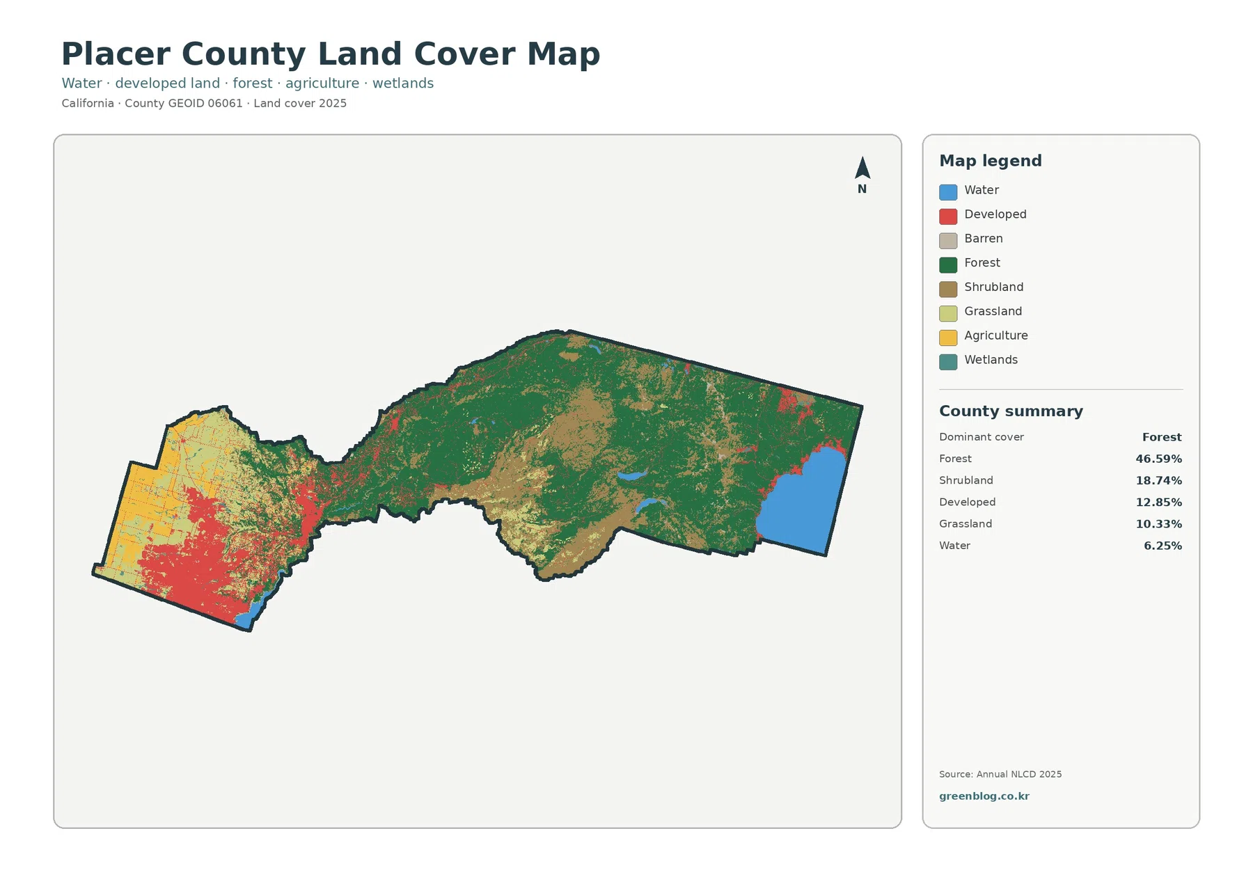
Forest is the dominant 2025 class at 46.59%. Shrubland accounts for 18.74%, developed cover 12.85%, grassland 10.33%, and water 6.25%. The forest-and-farmland summary also reports 4.19% agriculture and 0.67% wetlands. Those countywide numbers are useful, but they hide a striking geographic split. Most of the large developed and agricultural blocks sit in the west, while forest becomes the main color through the central and eastern portions of the county.
Placer County’s own planning and hazard information describes a similar west-to-east physical transition. Broad, relatively flat valley floors in the southwest give way to foothills and then to high Sierra terrain farther east. The land-cover map does not prove that elevation alone controls every class, but the mapped shift follows the same general direction. That makes Placer County especially useful for comparing how one countywide percentage can contain several very different local landscapes.
The center of the county is not simply a solid forest block. Green forest cells are interrupted by broad shrub and grass patches, small water bodies, and scattered developed areas. Near the western foothill transition, the colors become especially mixed as the large urban field breaks apart and vegetation cover becomes more continuous. Farther east, forest again dominates much of the land surrounding the larger water bodies and North Lake Tahoe area.
Western Placer concentrates the county’s hardest surfaces
The impervious-surface map makes the western concentration of development more obvious than the general map does. Mean imperviousness is only 4.29% countywide, and 3.60% of the county is mapped at 50% impervious or higher. The darkest red and orange cells, however, form a broad cluster in the southwest and west. That cluster sits within the same part of Placer County that official county materials identify with communities such as Roseville, Rocklin, and Lincoln and the more urbanized western region.
Developed cover and impervious surface should not be treated as interchangeable measurements. The 12.85% developed class can include lawns, trees, soil, and other permeable ground within developed settings, while the impervious layer estimates harder surfaces such as pavement and rooftops. The difference between 12.85% developed land and a 4.29% mean impervious value is therefore informative rather than contradictory. It shows that the county’s developed footprint contains a mixture of hard and soft surfaces.
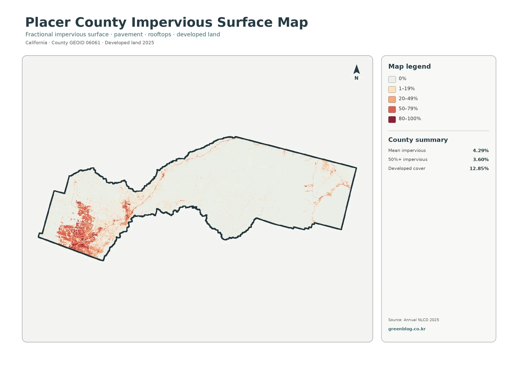
Smaller impervious clusters appear farther east, but they are separated by extensive low-value terrain. The pattern follows developed nodes and corridors rather than forming one continuous urban field across the county. By the time the map reaches the high-country side, most of the background is nearly white, with only limited pockets around developed places. This contrast is easier to see on the impervious layer than on the general land-cover map because forest, shrub, and grass are visually suppressed.
Imperviousness is useful for describing surface intensity, but it is not a flood map or drainage model. A dark cell can indicate a high share of hard surface without revealing slope, storm-drain capacity, soil, rainfall, or proximity to a channel. Those other factors matter for runoff and flood questions. The map is best used to locate broad areas of concentrated hard surface before consulting more specialized hydrology or engineering information.
Lake Tahoe makes the 6.25% water share visually unmistakable
Water accounts for 6.25% of the mapped county. The large blue block at the eastern edge is the most obvious reason: Placer County reaches the northwestern part of Lake Tahoe. The county’s official Lake Tahoe information describes North Lake Tahoe as a major part of eastern Placer and notes the high mountain setting around the lake. On the land-cover map, that water surface creates a strong endpoint to the long band of forested terrain that crosses the county.
Lake Tahoe is not the only mapped water. Smaller blue bodies are scattered through the central and eastern forest, and another visible water area appears at the far southwest near the Folsom Lake side of the county. These smaller features matter when comparing local settings even though they contribute less to the countywide percentage than Lake Tahoe. Water near the western developed landscape is surrounded by a very different mix of cover than water embedded in the Sierra forest.
The eastern developed areas also look different from western Placer. Instead of a broad red urban mass, developed cells appear as smaller pockets among forest and water. County information about North Lake Tahoe describes several communities and travel corridors in this high-country setting. The land-cover map does not label those communities, but the pattern is consistent with a landscape where developed areas are spatially limited by a much larger forest-and-lake background.
Forest and farmland separate more cleanly when development is muted
The forest-and-farmland view is particularly helpful in the western third of Placer County. Developed and other cover is reduced to a neutral background, allowing the 4.19% agricultural class to stand out as yellow patches among grass, shrub, and remaining forest. Agriculture is not spread evenly across the county. Most of the visible agricultural cover is concentrated in the west, while the central and eastern landscape is overwhelmingly forest, shrub, and grass with scattered water.
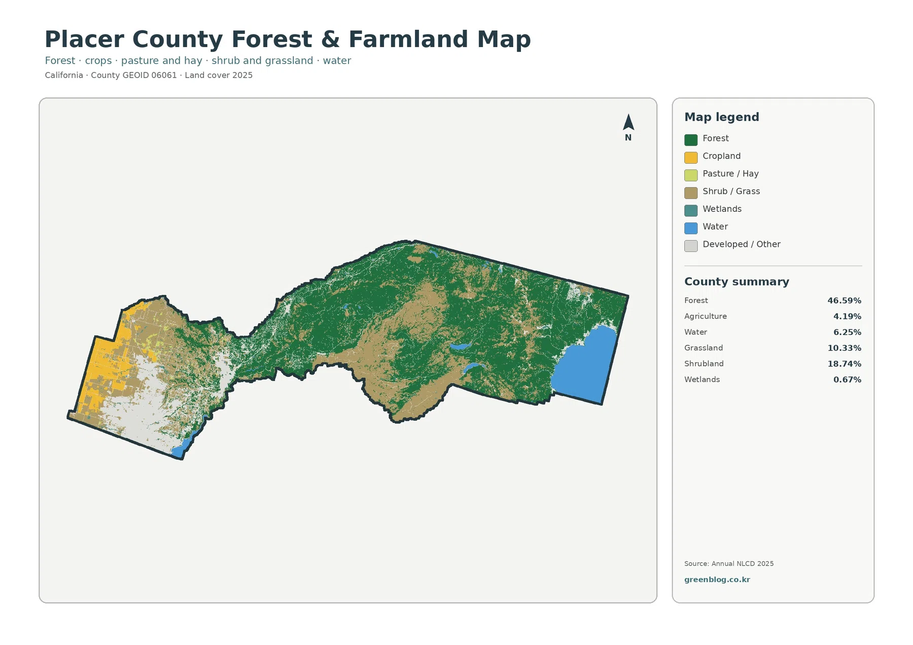
Official Placer County agriculture pages provide useful context for that western pattern. The county supports farms and ranches and has programs that address agriculture, open space, and conservation. Those administrative and economic descriptions should not be substituted for the NLCD class. A yellow agricultural cell indicates mapped surface cover in 2025; it does not by itself identify the crop, ownership, zoning, a Williamson Act contract, or long-term agricultural status.
The forest class needs the same caution. Green cells show tree-dominated land cover at the dataset scale, not a specific forest owner, park, or protected boundary. Placer County has extensive public and private forest landscapes, open-space programs, and recreation areas, but the finished land-cover map is not an administrative overlay. It is most useful for comparing where tree cover is broad, where shrub and grass interrupt it, and how that pattern changes toward the western valley.
Grassland at 10.33% and shrubland at 18.74% help explain why the middle of the county is not uniformly green. Brown and light-green patches become substantial in several central and southern mountain areas. Those classes create transitions between dense forest, open western cover, and water. Reading them as part of the landscape rather than as leftovers makes the general map much easier to understand.
The 1985–2025 comparison is dominated by forest-class differences
The change map reports a total class difference of 26.51% between the 1985 and 2025 endpoints. The summary identifies 11.19% as forest loss, 6.60% as classified to developed, 1.54% as agricultural loss, and 7.07% as other class difference. Wetland difference also appears as a legend category. These values describe differences between endpoint classifications; they do not say that 26.51% of the county underwent one confirmed physical transformation.
Orange forest-loss cells are especially prominent in the central part of the county, including one large area south of the main east-west axis and numerous smaller patches farther east. That pattern deserves attention because current forest cover is still the dominant class at 46.59%. The two numbers answer different questions: 46.59% describes current forest cover, while 11.19% identifies cells whose endpoint classification moved away from forest in the supplied comparison.
Western Placer shows a different change signal. Red cells classified to developed form large clusters near the existing western developed area, while yellow agricultural-loss cells appear in some nearby sections. Large white areas are mixed with those colors, indicating places where the broad endpoint class did not differ. The map therefore separates long-established developed cover from areas whose class changed toward developed by 2025, although it does not provide an exact construction year.
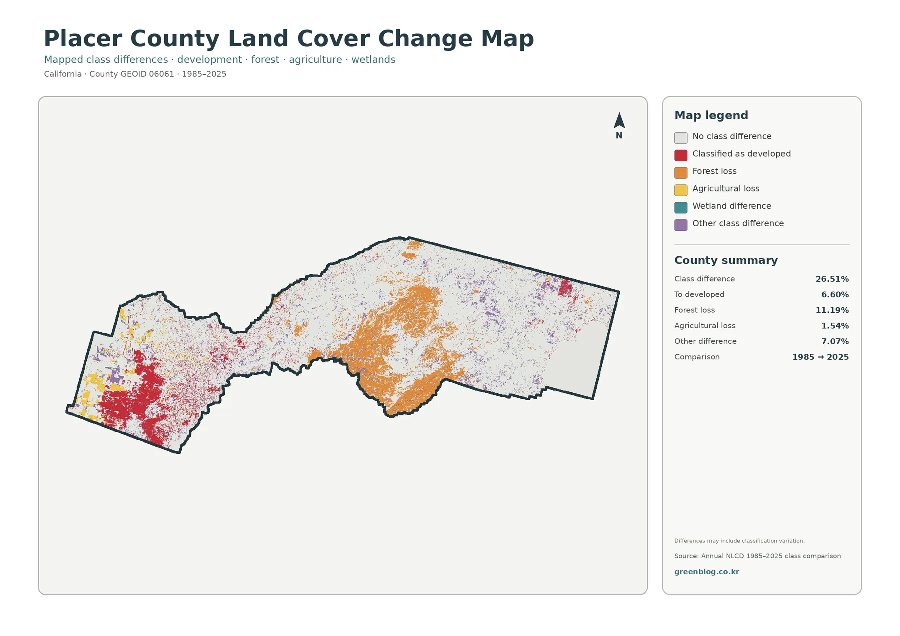
The map itself warns that classification variation can be included in the differences. Image conditions, seasonal vegetation, mixed pixels, and classification decisions can change the label assigned to some cells. Real forest disturbance or development can also be present, but a colored cell does not identify the cause. Fire, timber activity, development, vegetation succession, or other processes require additional evidence before they can be assigned to a specific patch.
White areas should also be interpreted carefully. A white cell means the broad class is the same at the two selected endpoints, not that the surface was unchanged every year between 1985 and 2025. A temporary disturbance may have occurred and later returned to the same general class. Anyone studying timing should use intermediate Annual NLCD years, aerial imagery, or local records rather than relying on the two-endpoint summary alone.
Choosing the right Placer County map for a specific question
For a broad county portrait, the general land-cover map is the strongest starting point because it shows the complete west-to-east shift in one view. It makes the western developed-and-agricultural landscape, central forest and shrub mosaic, eastern mountain forest, and Lake Tahoe water visible at the same time. That overview is especially valuable in Placer County because a single countywide percentage can otherwise hide the distance between its urban west and high-country east.
If the topic is agriculture or forest, move to the simplified forest-and-farmland map. It makes the western agricultural patches easier to distinguish and shows how quickly forest becomes dominant across the central county. For urban-surface questions, the impervious map is more direct than the developed class because it estimates the concentration of hard surface. A presentation about western growth could pair the general and impervious views without needing the other two.
The change map should be used when the question explicitly involves time. It is not a better version of the current map; it answers a different question about endpoint classification. A red current-developed cell may remain white on the change map if it was already developed at both endpoints. An orange forest-loss cell may sit in a region that is still mostly forest today. Keeping those distinctions clear prevents the most common misreading of the four-map set.
The original JPG files also make side-by-side comparison practical. A classroom exercise can compare western and eastern cover on the general map, then test the same locations on the forest and impervious views. A planning or environmental presentation can use the change map only to identify areas that deserve follow-up. When detailed conclusions are needed, the next step should be raw data, higher-resolution imagery, or official local mapping rather than enlarging the finished JPG beyond its intended reference scale.
Map file information and JPG download
The download contains four separate JPG images for Placer County: general land cover, forest and farmland, impervious surface and developed land, and the 1985–2025 land-cover change comparison. The page previews make it easy to decide which map is useful before saving the full set. Once downloaded, the images can be kept together for comparison or used individually in documents and presentations.
Keep the legend and year visible when a map is reused. The current-cover views are based on the supplied 2025 classification, while the change map compares 1985 with 2025. Removing the date can make a later reader assume the image represents a different release or a different comparison period. The JPGs are finished reference graphics rather than raw raster layers, so pixel-level analysis should begin with the official data sources listed below.
Scale, mixed pixels, and legal land-use limits
Annual NLCD products describe land cover with raster cells. At the 30-meter scale used by these products, a single cell may contain several real-world features, such as a roof, a street, trees, and grass. The mapped class or impervious value summarizes that cell. This matters along western development edges, narrow mountain roads, small water bodies, and the Lake Tahoe shoreline, where the real transition can be more detailed than the finished county image suggests.
Mixed pixels also affect change interpretation. A cell on the boundary between forest and shrubland may receive different labels in two years even when the ground transition is gradual. Small isolated change patches should therefore be checked against intermediate years or higher-resolution imagery. The countywide maps are designed to show broad patterns consistently, not to document every small physical change.
Legal land use is outside the scope of the four maps. Agricultural cover does not prove agricultural zoning, forest does not define public ownership or protected land, and developed cover does not show what can legally be built on a parcel. Placer County maintains separate GIS, planning, zoning, and conservation resources for those questions. Treating land cover as a surface classification first keeps the maps useful without assigning them a legal meaning they do not have.
Frequently Asked Questions
Why does Placer County show 46.59% forest when the western part looks heavily developed and agricultural?
The percentage covers the entire county, including the large central and eastern Sierra landscape. Western Placer contains the most extensive developed and agricultural cover, but forest expands across a much larger area farther east. The county’s long shape makes the average easy to misread if only the western communities are familiar. The general map shows why the countywide forest percentage can be high even though the west looks very different.
What does the 4.29% mean impervious value add to the 12.85% developed-cover figure?
Developed cover is a broad land-cover class that can include permeable surfaces such as lawns and trees within developed settings. Impervious surface estimates the harder share made up of pavement, roofs, and similar materials. The 4.29% countywide mean therefore describes surface intensity, while 12.85% describes the broader developed footprint. Comparing the two is especially useful in western Placer, where developed cover is concentrated.
Does 11.19% forest loss on the 1985–2025 map prove that the same share of forest was permanently removed?
No. The value identifies cells whose endpoint classification moved from forest to another mapped class in the supplied comparison. Real disturbance may be included, but classification variation, mixed pixels, imagery conditions, and later vegetation change can also affect the result. The map is best used to locate areas for follow-up with intermediate NLCD years, aerial imagery, fire history, or forest-management records.
Sources and reference material
These official sources provide the land-cover classification background, county boundary reference, and local context for Placer County’s agriculture, open space, and Lake Tahoe region. Administrative maps and policies answer different questions from a land-cover raster, so they should be used as complementary references rather than treated as the same dataset.
- MRLC Annual NLCD Data — annual land-cover and related data products
- USGS Annual NLCD Land Cover Classification — land-cover classes and legend documentation
- U.S. Census Bureau TIGER/Line Shapefiles — county boundary reference data
- Placer County Environment & Agriculture — official local agriculture, open-space, and environmental resources
- Placer County About Lake Tahoe — official North Lake Tahoe and eastern-county context
Map File Information
The ZIP includes all four original JPG land-cover maps for Placer County, California.
- File Type: ZIP containing four JPG files
Related Maps
- Alameda County California Land Cover Map
- Alpine County California Land Cover Map
- Amador County California Land Cover Map
Green Map creates custom-edited map images using open geographic data sources such as geoBoundaries, Natural Earth, OpenStreetMap, and government open data.
These maps are edited visual materials, not raw data files, and are provided for education, documents, presentations, and graphic reference.