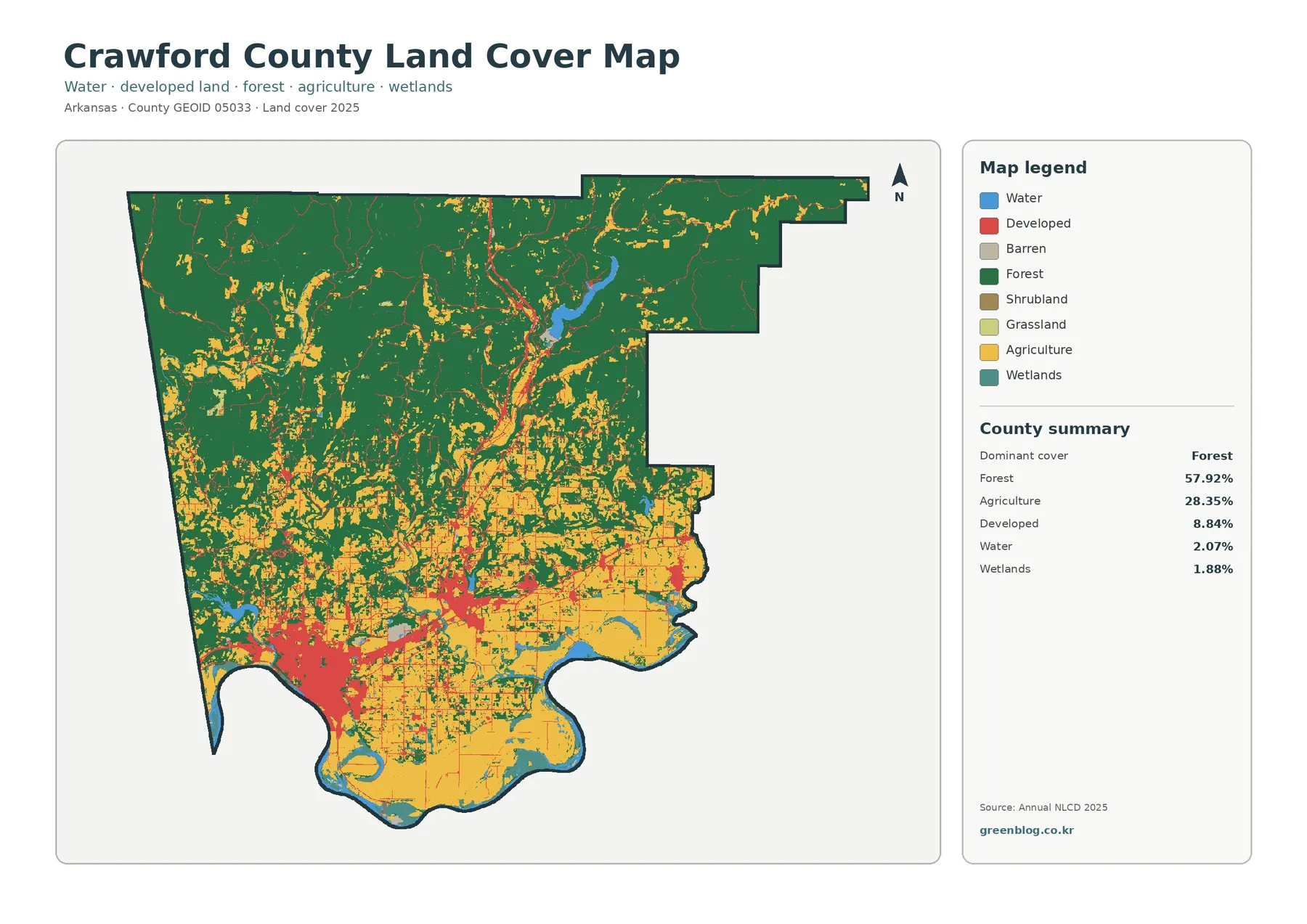
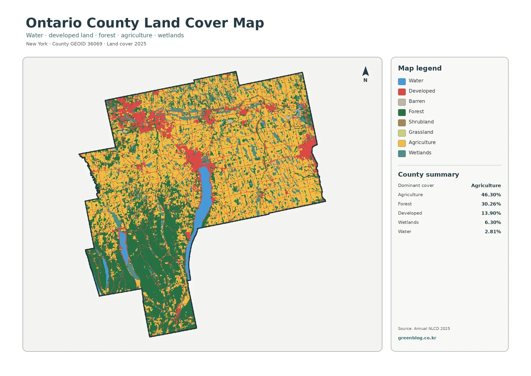
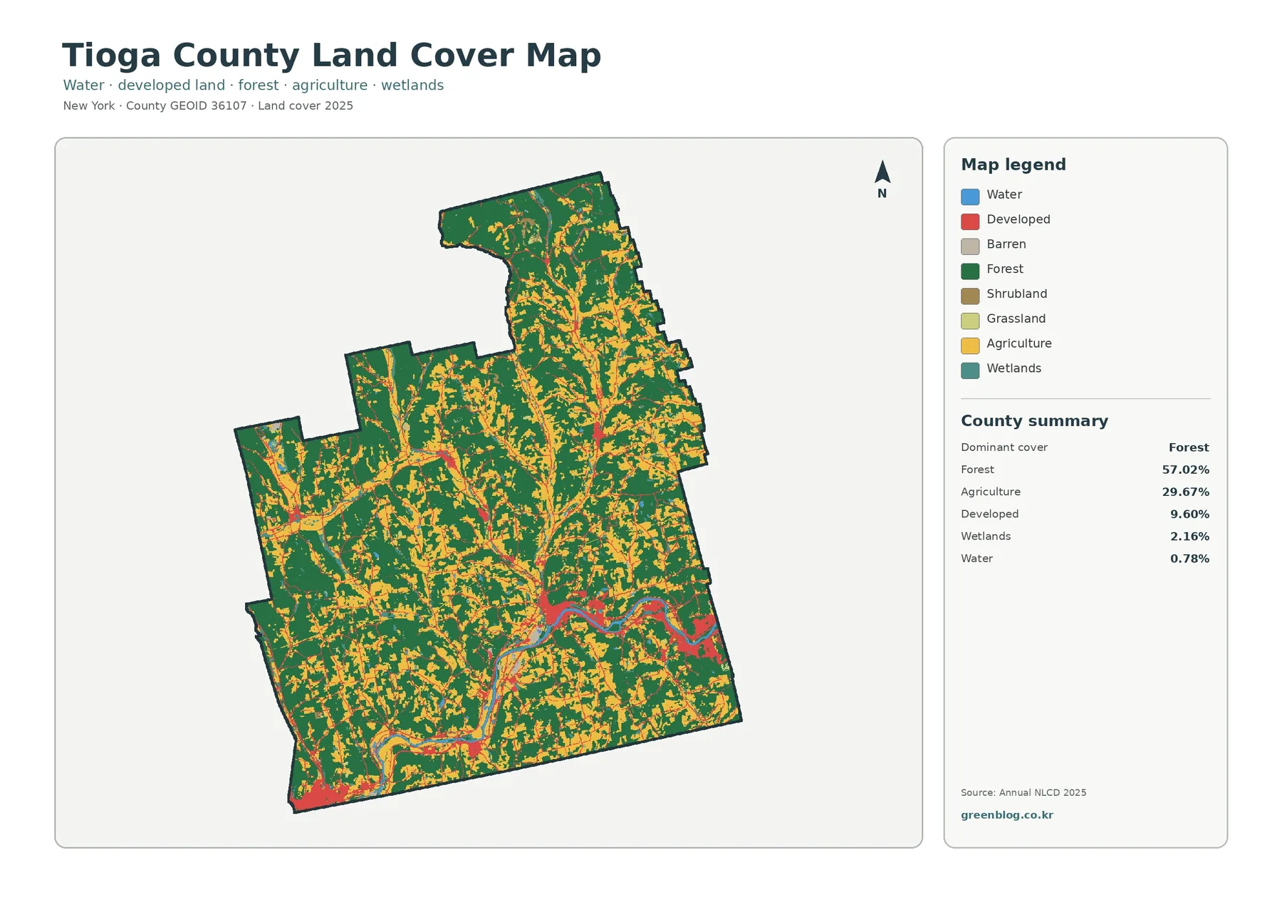
The Cleburne County Arkansas Land Cover Map set makes one feature impossible to miss: a large reservoir is embedded in a mostly forested Ozark landscape. In the 2025 summary, forest accounts for 58.92% of the county, followed by agriculture at 21.61%, developed land at 8.17%, water at 6.58%, shrubland at 2.14%, grassland at 1.75%, and wetlands at 0.46%. Greers Ferry Lake occupies a broad central-western area, while wooded land extends around the lake and across much of the north and east.
Four map views are included on this page: overall land cover, forest and farmland, impervious surface and developed land, and a 1985–2025 class-difference map. The original four JPG files are available together in one download near the end of the article. They are useful for classroom comparison, county-scale reference, presentations, and preliminary environmental review when the goal is to compare patterns rather than make parcel-level decisions.
Table of Contents
A Forest County Shaped by a Large Reservoir
The general 2025 map is dominated by dark green forest. Large wooded blocks cover the northern part of the county, continue along much of the eastern side, and wrap around many of the coves and arms of Greers Ferry Lake. Agriculture appears in yellow as smaller and more fragmented areas, especially south of the reservoir and across several eastern openings. Red developed land is concentrated rather than widespread, with the most obvious cluster near the south side of the lake.
This pattern fits the county’s broader physical setting. The Association of Arkansas Counties describes Cleburne County as mountainous in the north and rugged to rolling in the south. The U.S. Army Corps of Engineers places Greers Ferry Lake in the Ozark Mountains of north-central Arkansas. Those descriptions provide useful context for a map where continuous forest is common and agricultural land is broken into separate clearings instead of forming one broad plain.
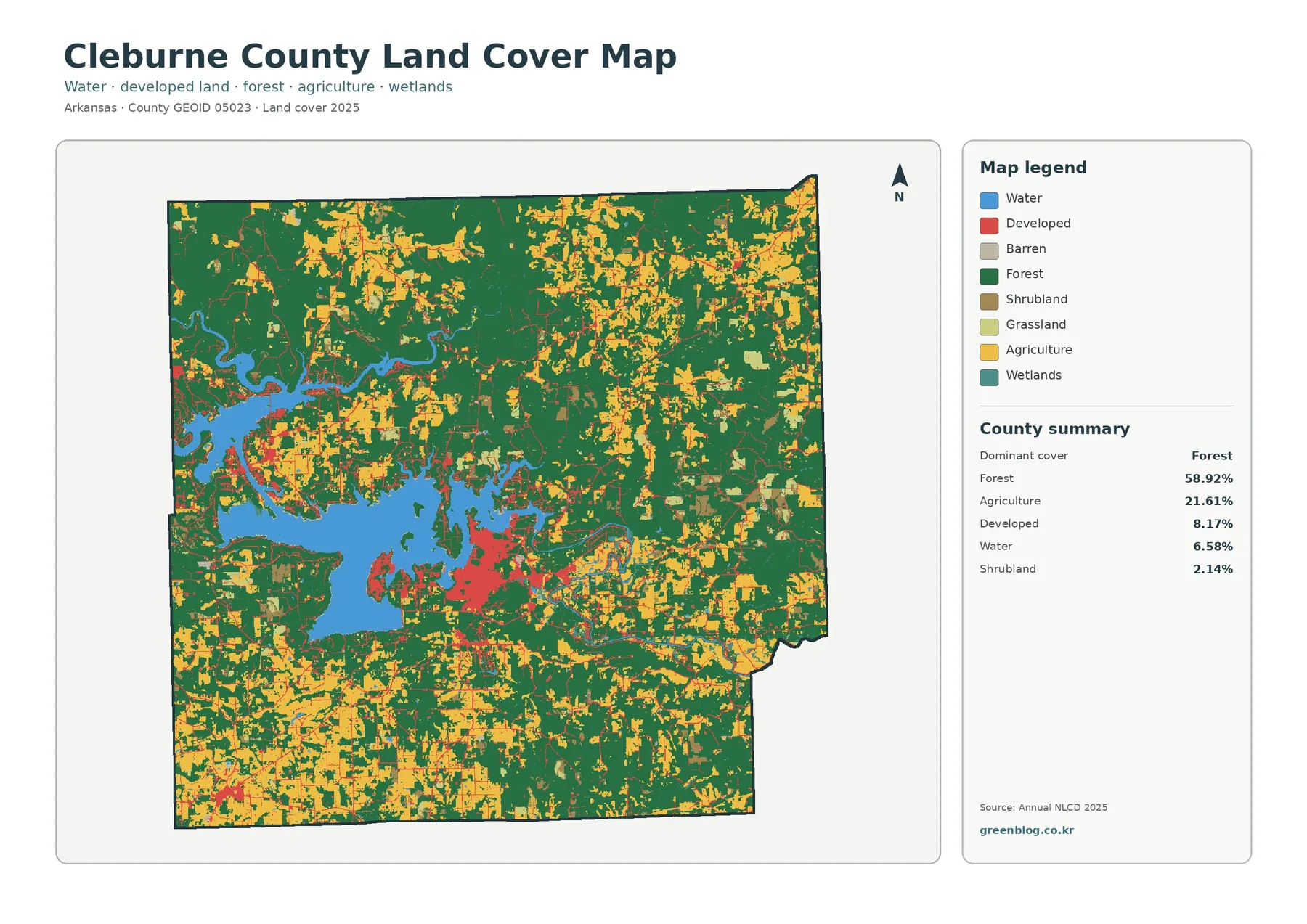
Land cover should not be confused with zoning or legal land use. The map classifies the surface observed by the dataset into broad categories such as forest, agriculture, water, wetlands, and developed land. A yellow area is not proof that every parcel is actively farmed, and a red area does not define a municipal boundary. The map works best as a county-scale picture of what covers the ground, with parcel ownership, zoning, permits, and property boundaries checked in separate authoritative records.
Greers Ferry Lake Breaks the Landscape into Distinct Edges
Water is only 6.58% of the county by area, yet it has a much stronger visual presence because most of it is concentrated in Greers Ferry Lake. The broad blue reservoir and its branching coves divide nearby land into peninsulas, narrow shore zones, and separated blocks. Much of that shoreline meets forest directly. The result is very different from a county where the same amount of water might be spread among many narrow streams and small ponds.
The Corps of Engineers identifies Greers Ferry Dam on the Little Red River a short distance northeast of Heber Springs. It also describes public land around the reservoir as an important buffer for water quality and wildlife habitat. That management context helps explain why the forested shoreline deserves attention when reading the land-cover map. The map itself, however, does not draw Corps property boundaries, recreation zones, or private parcels, so those questions require the agency’s own management maps.
Forest and Farmland Reveal the Upland Openings
Removing most of the developed classes makes the second view easier to read. Forest remains the overwhelming background, while agricultural land appears as yellow and light-green patches among the wooded areas. Larger agricultural concentrations occur south of the reservoir and in parts of the east, with smaller openings scattered through the north. The pattern suggests a county where agriculture occupies selected valleys and gentler terrain rather than replacing forest across the entire landscape.
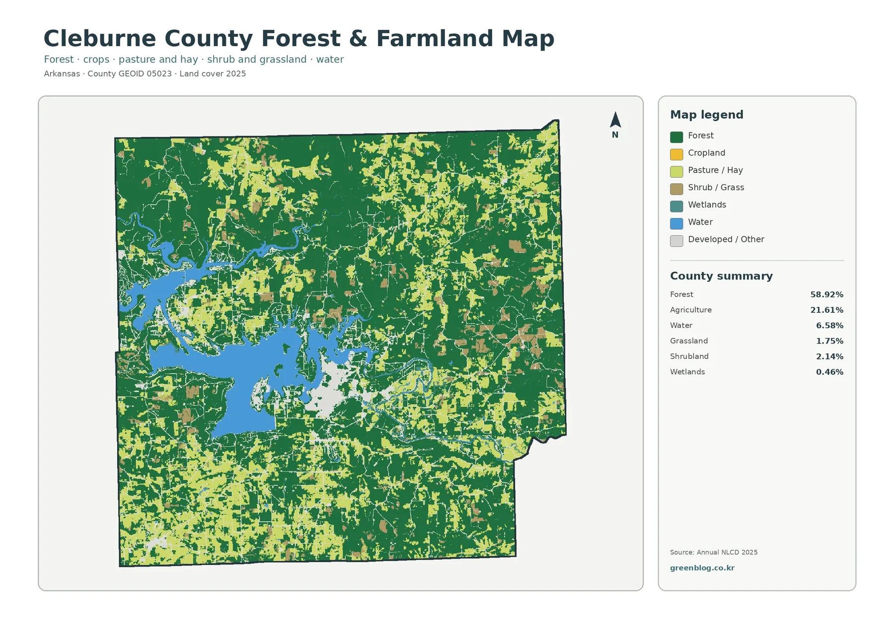
The University of Arkansas System Cooperative Extension Service lists forage and livestock production, soil and hay testing, weed and brush control, and related agricultural services for Cleburne County. Those programs confirm that agriculture and grazing are active parts of the local landscape, but they do not turn every mapped agricultural pixel into a known farm operation. The land-cover image classifies surface appearance at a broad scale; crop type, stocking rate, ownership, and management practices must be checked with agricultural records or field information.
Heber Springs Stands Out on the Impervious Surface Map
Impervious surface means pavement, rooftops, parking lots, and other surfaces that do not readily absorb rainfall. Cleburne County’s 2025 mean impervious value is 1.69%, while 0.80% of the county is mapped at 50% impervious or higher. Those numbers are small compared with a highly urban county, and the image reflects that difference: most of the county remains pale, with stronger values confined to compact clusters and thin road corridors.
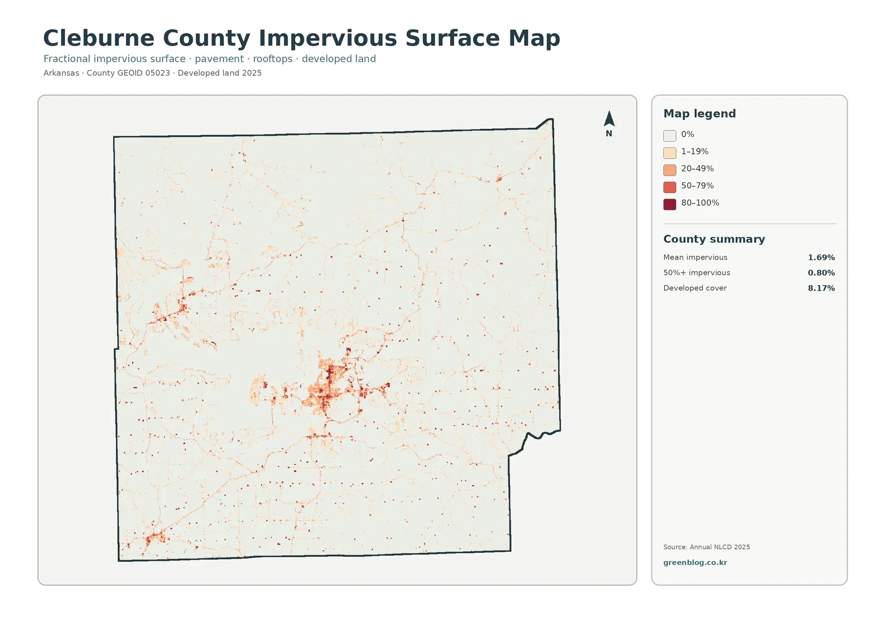
The strongest impervious cluster lies south of the main reservoir in the Heber Springs area. Smaller clusters and road-linked patterns appear elsewhere in the county. Cleburne County’s official site lists Heber Springs along with Concord, Greers Ferry, Higden, Fairfield Bay, and Quitman among its towns. Comparing those locations with a road or municipal map can help identify the developed clusters more precisely, because this impervious map intentionally emphasizes surface coverage rather than place labels.
The 1985–2025 Map Records Class Differences, Not a Single Story
The change view reports a class difference across 25.80% of the county between 1985 and 2025. Within that total, 3.04% is mapped as “to developed,” 6.68% as forest loss, 1.62% as agricultural loss, and 14.39% as other class difference. Orange and purple areas are scattered widely, while red developed-change pixels are more concentrated around settled areas and roads. The pattern is broad enough that a single countywide explanation would oversimplify it.
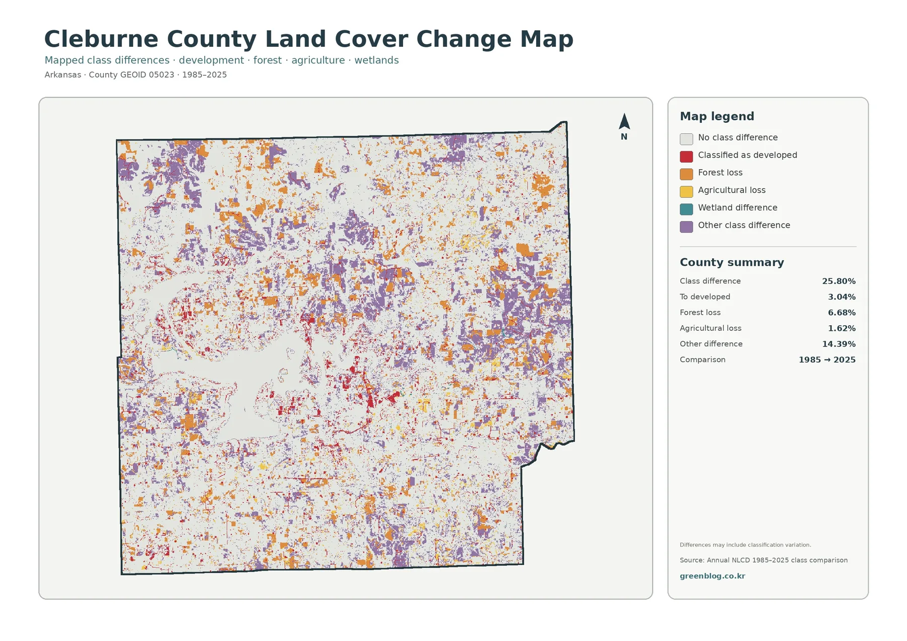
It would be incorrect to read 25.80% as the share of Cleburne County that became developed. The developed category is only one part of the total. The rest includes changes among forest, agriculture, wetlands, and other classes, plus classification variation noted on the map itself. A cell can receive a different label in two years because the surface changed, because a mixed pixel was classified differently, or because the source observations and processing differed.
The 6.68% forest-loss category also needs careful wording. It identifies cells that were forest in the earlier comparison and another class in the later one; it is not automatically an acreage of logging, subdivision construction, or permanent deforestation. The two-date map does not show every event between 1985 and 2025. A location could have changed more than once during that period. Annual NLCD layers, historical aerial imagery, and local records are better tools for investigating a specific site.
How to Use the Four Maps Together
A useful reading sequence begins with the overall map. It establishes the dominant forest cover, the scale of Greers Ferry Lake, and the scattered agricultural and developed areas. The forest-and-farmland view then removes much of the visual clutter and makes rural openings easier to compare. After that, the impervious map isolates towns and roads, and the 1985–2025 comparison adds a time dimension without confusing past class differences with current land cover.
For a lake-focused study, start by tracing the reservoir edge and noting where forest directly meets water. Move to the impervious map to locate the most developed shoreline areas, then compare the same locations on the change map. This does not establish cause and effect, but it helps organize questions for a more detailed investigation. For an agriculture-focused lesson, begin with the 21.61% countywide share and then ask students why those areas appear in separate patches rather than one continuous belt.
Download the Four Original JPG Maps
The WebP images on the page are previews for quick viewing. The download archive contains four original JPG files covering the same Cleburne County boundary: 2025 land cover, forest and farmland, impervious surface and developed land, and the 1985–2025 class-difference map. Each JPG is 2480 × 1754 pixels. These are the original source-resolution files supplied in the package, so they should not be described as enlarged A3 high-resolution products.
Classification, Scale, and Date Limitations
Raster land-cover data generalizes the landscape into grid cells. A single cell may contain more than one surface, such as trees beside a road or a house beside a lawn. The classification assigns a category or value based on the underlying method, so the colored boundary may not match a fence, parcel line, or shoreline exactly. Narrow streams, small structures, and thin road corridors are especially likely to be influenced by nearby cover.
The 2025 maps represent the dataset’s observation and processing for that year. New construction, vegetation change, timber activity, storm damage, agricultural conversion, or restoration after that observation may not appear. The change map compares 1985 with 2025 and does not describe the sequence of events between those dates. Current planning or regulatory work should therefore use newer local records and site-specific information whenever available.
Frequently Asked Questions
What is the largest land-cover class in Cleburne County?
Forest is the largest 2025 class at 58.92%. Agriculture follows at 21.61%, developed land at 8.17%, and water at 6.58%. The forest is especially extensive around Greers Ferry Lake and across much of the northern and eastern parts of the county.
Why is developed land 8.17% when mean impervious surface is only 1.69%?
Developed land can include a mix of buildings, roads, lawns, landscaped ground, and other surfaces. Impervious percentage measures the hard surfaces within those areas. A neighborhood can therefore be classified as developed even when much of each cell remains grass, trees, or other permeable cover.
Does the 25.80% class difference mean one quarter of the county was developed?
No. The 25.80% value includes all mapped class differences between 1985 and 2025. Only 3.04% is listed as “to developed.” The total also includes 6.68% forest loss, 1.62% agricultural loss, 14.39% other difference, and other mapped change categories. Classification variation may be part of the comparison as well.
Map File Information
The ZIP contains four original JPG maps for Cleburne County: overall land cover, forest and farmland, impervious/developed land, and 1985–2025 land-cover class differences.
- Included Files: Four original JPG maps
- Printable Size: 2480 × 1754 pixels each
Related Maps
- Arkansas County Arkansas Land Cover Map
- Ashley County Arkansas Land Cover Map
- Baxter County Arkansas Land Cover Map
Sources and Reference Material
- MRLC Annual NLCD Data – land-cover datasets and year-based access
- USGS Annual NLCD Land Cover Classification – class definitions and interpretation guidance
- University of Arkansas System Cooperative Extension Service – Cleburne County Programs – county agriculture, forage, livestock, and land-management programs
- Official Cleburne County, Arkansas Website – local towns, government, and county reference information
- U.S. Army Corps of Engineers – Greers Ferry Lake Natural Resources – reservoir and surrounding public-land management context
Green Map creates custom-edited map images using open geographic data sources such as geoBoundaries, Natural Earth, OpenStreetMap, and government open data.
These maps are edited visual materials, not raw data files, and are provided for education, documents, presentations, and graphic reference.