Morgan County, Alabama has a 2025 land-cover pattern in which agriculture and forest are both major parts of the landscape, yet they are arranged very differently across the county. Agriculture accounts for 37.66 percent and forest for 33.46 percent. Developed cover reaches 17.24 percent and is especially concentrated in the northwest, while large forest blocks become more prominent toward the eastern and southeastern portions of the county.
This page pairs four views of the same county: general land cover, forest and farmland, impervious surface and developed land, and mapped class differences from 1985 to 2025. The WebP images are convenient on-page previews. A single download below contains the four matching original JPG maps at 2480×1754 pixels for printing, classroom work, presentations, and county-to-county comparison.
Table of Contents
A 2025 landscape shared by farms, forest, and a sizable developed area
Agriculture ranks first in the 2025 county summary at 37.66 percent, but the pattern is not one continuous agricultural zone. Yellow agricultural cover spreads through much of the west, center, and southwest, often interrupted by forest, wetlands, or developed cells. Forest follows closely at 33.46 percent. Its largest connected-looking areas are more noticeable in the eastern half and southeast, where dark green occupies broad sections rather than the finer mix seen around the central part of the county.
| Reference | Annual NLCD 2025 |
|---|---|
| Agriculture | 37.66% |
| Forest | 33.46% |
| Developed | 17.24% |
| Wetlands | 6.93% |
| Water | 2.61% |
| Shrubland | 0.96% |
| Grassland | 0.93% |
| Mean impervious | 4.74% |
| 50%+ impervious | 3.13% |
| 1985→2025 class difference | 20.39% |
Developed cover is the third major category at 17.24 percent, a comparatively large share beside the two rural classes. The strongest red concentration occupies the northwestern portion of the county, and a second substantial cluster appears farther south and east of it in the west-central area. Thin red lines and smaller patches extend well beyond those concentrations. The image does not label individual streets, so those linear features should be treated as mapped developed cover rather than assigned road names from appearance alone.
Wetlands cover 6.93 percent and open water 2.61 percent. Both matter most when the northern edge and the smaller interior water-related patches are examined closely. Blue water follows long sections of the northern boundary, while teal wetland cover appears beside that water and in irregular pockets farther inland. Keeping the two classes separate is useful because open water and wetland vegetation represent different surface conditions, even when they occur next to one another.
Why the northwest and east look so different on the general map
The general land-cover view makes the county-wide contrast easiest to see. The northwest contains a broad developed concentration with agricultural land around and between many red areas. Moving toward the center, the map becomes more mixed: fields, forest, developed cover, wetlands, and water appear in smaller pieces. The eastern portion changes again, with forest taking up larger connected-looking areas and developed cover becoming more scattered. That west-to-east contrast gives the page a useful geographic frame before the more specialized maps are considered.
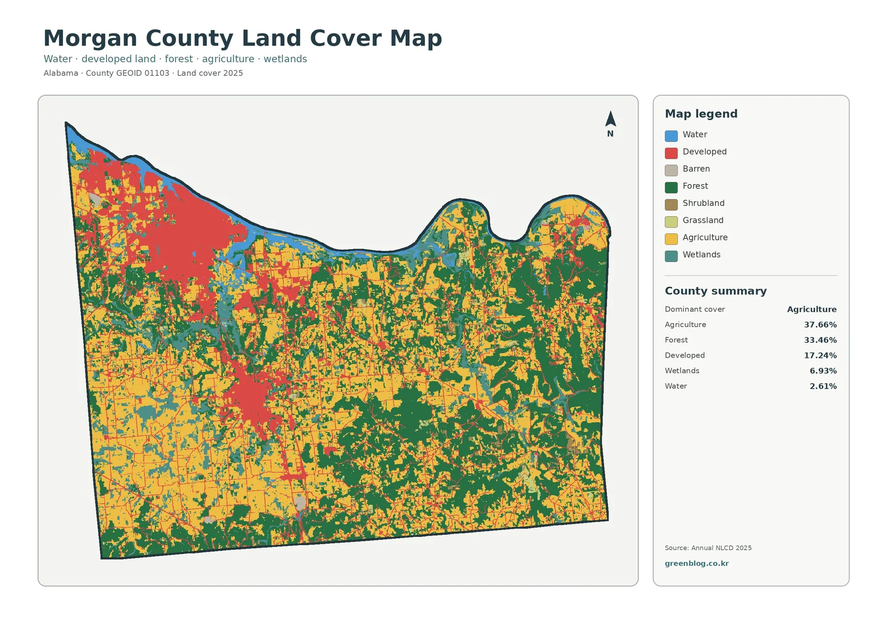
The northern water and wetland pattern adds another layer to that contrast. Long blue sections sit against the county boundary, while teal wetland areas broaden around several nearby locations and occur farther inland as well. Morgan County Commission describes the Flint Creek Canoe Trail as a way to experience Wheeler National Wildlife Refuge by water, providing useful local context for the county’s northern water-oriented landscape. That source does not define the pixels on this map, so refuge boundaries should not be inferred from the land-cover colors.
Barren, shrub, and grass classes are present in the legend but occupy much less of the map than agriculture, forest, development, wetlands, and water. Small patches can disappear visually when the map is viewed at a reduced size. For that reason, the legend should stay visible when the map is printed or placed in a presentation. The overall view is best for broad distribution; it is not intended to identify a crop type, a forest owner, a parcel line, or a zoning designation.
Separating the farm-and-forest pattern from the developed background
The forest-and-farmland map makes rural cover easier to compare because developed and other surfaces are pushed into a light background. The western half contains many large agricultural areas, and agriculture also reaches through central and southern parts of the county. Forest becomes more dominant in the east and southeast, where dark green areas are larger and more continuous. In the central zone, neither category forms a simple block; fields and wooded areas repeatedly meet, creating a fine-grained patchwork.
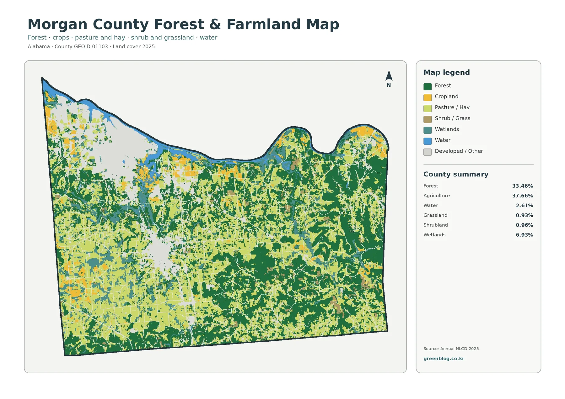
The legend distinguishes cropland from pasture and hay, even though the county summary reports agriculture as one combined 37.66 percent category. That distinction helps readers notice that not every yellow or light agricultural area represents the same type of managed ground. Exact percentages for cropland and pasture are not provided in the package, so they should not be calculated from the preview. Grassland at 0.93 percent and shrubland at 0.96 percent are also small but visible in scattered places.
Alabama Cooperative Extension System operates a Morgan County Extension Office in Hartselle and provides local agriculture and natural-resources services. That is relevant context for understanding why farm and natural-resource maps may be useful locally, but it is separate from the Annual NLCD classification itself. The 37.66 percent agriculture figure and the mapped locations come from the supplied 2025 land-cover product, not from Extension program records or farm-property boundaries.
Wetlands remain important in this simplified view because they interrupt both farm and forest cover in several areas. Teal patches are especially noticeable near the northern side and through parts of the central and western county. This is useful when the map is used for environmental education: a rural area that looks generally agricultural at first glance can contain wetland and wooded sections that change its local surface pattern. The map does not identify regulatory wetlands or the legal extent of any protected area.
Impervious surfaces reveal how concentrated development really is
Impervious surface means pavement, rooftops, parking areas, and other surfaces that shed water rather than allowing it to soak easily into the ground. Morgan County has a mean impervious value of 4.74 percent, while 3.13 percent of the county falls in cells with at least 50 percent impervious surface. Those numbers are much lower than the 17.24 percent developed-cover share because a developed cell may still contain lawns, trees, bare soil, or other permeable surfaces.
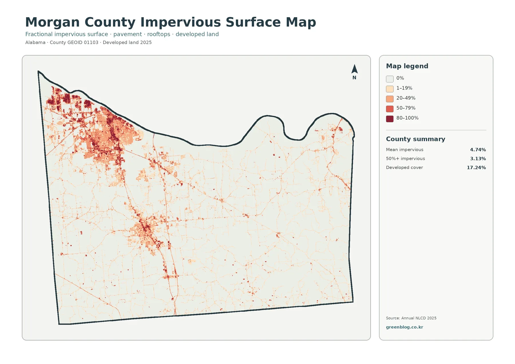
The map’s darkest red tones are heavily concentrated in the northwest. A second, smaller but still obvious cluster lies in the west-central part of the county, while the east and south contain mostly thin lines and small isolated spots. Morgan County Commission’s official site places the county courthouse in Decatur, and the Alabama Extension office is in Hartselle. Those local references help orient the reader to the county’s principal developed areas, but the map itself does not label individual buildings or streets, so no specific pixel should be assigned to a named facility.
The uneven distribution is more informative than the county average alone. A mean of 4.74 percent could be misunderstood as a uniform condition, yet the image shows large low-impervious areas beside compact concentrations of very high values. The eastern forested areas are generally pale, while the northwest contains many 50–79 and 80–100 percent cells. For stormwater or drainage studies, this can be a useful screening view, but actual runoff calculations require rainfall, soils, terrain, drainage infrastructure, and current engineering data.
It is also important not to treat the impervious map as a population-density map. A large roof, parking complex, roadway, or industrial surface can create high impervious values without representing a residential neighborhood. Conversely, low-density developed areas can appear in the general developed class while remaining relatively light on the impervious map. Looking at both maps together gives a more accurate picture of how broad developed cover differs from the hardest built surfaces.
Reading the 20.39% class difference from 1985 to 2025
The long-term comparison marks cells whose classified land-cover category differs between 1985 and 2025. The county summary reports an overall class difference of 20.39 percent. Within that total, 4.58 percent is mapped as a change to developed cover, 4.47 percent as forest loss, and 1.59 percent as agricultural loss. Another 9.29 percent falls into the “other difference” summary, and the legend also includes a separate wetland-difference color. The total therefore represents several kinds of class change, not a single development statistic.
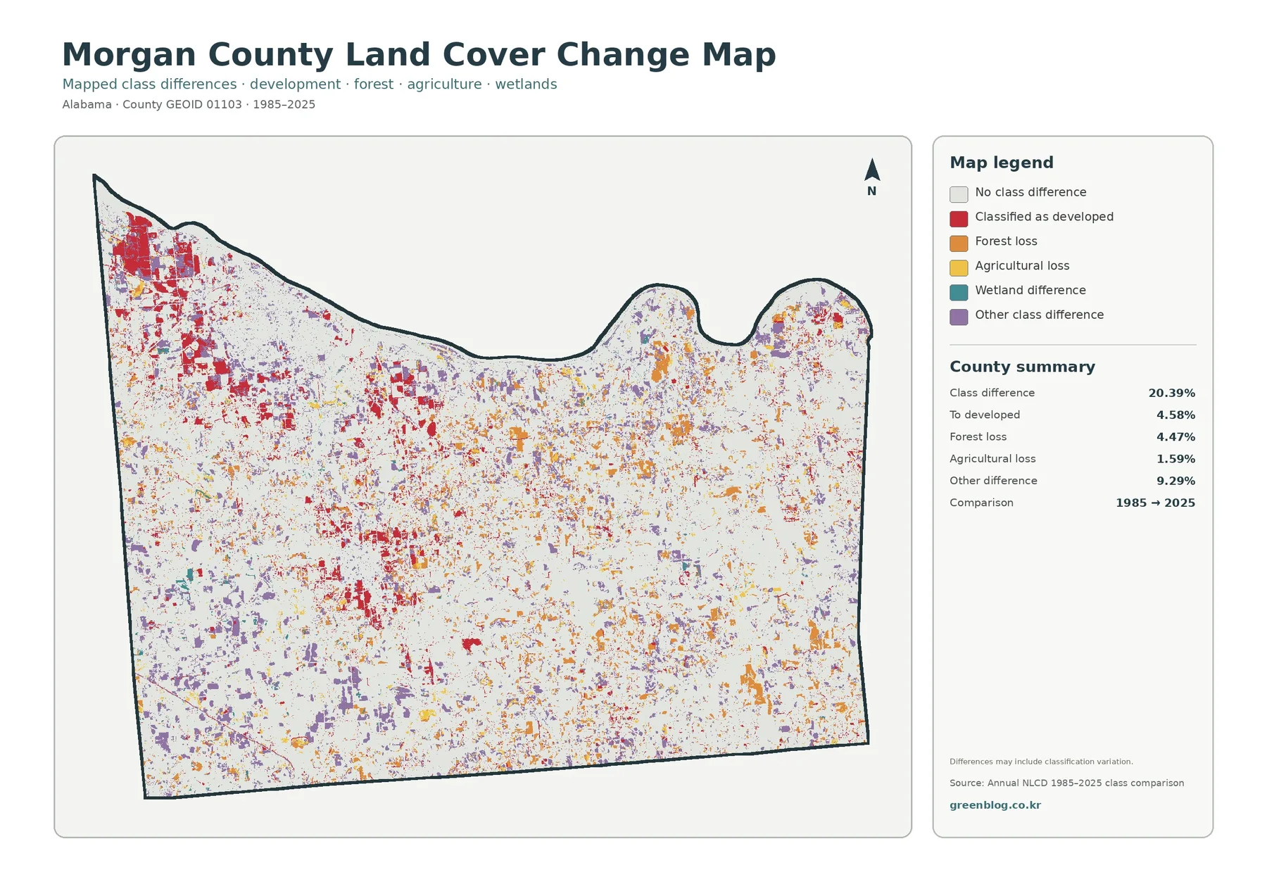
Red change cells are most prominent in the northwest and appear in multiple clusters elsewhere, including the west-central area. Orange forest-loss and yellow agricultural-loss cells are more dispersed across the county, including portions of the east and south. Purple “other difference” cells are scattered widely rather than forming one obvious zone. The spatial mixture argues against explaining the entire map with one event or one land-use story. It identifies places where the classifications differ and indicates the type of difference shown by the legend.
A two-date map cannot show the complete path between those dates. A cell may have changed more than once between 1985 and 2025, and that sequence is not visible here. Classification methods, sensor conditions, vegetation state, and mixed pixels can also contribute to differences. The map itself notes that differences may include classification variation. When a specific site or year matters, intermediate imagery and local records should be checked before drawing a conclusion about when or why the change occurred.
This distinction is especially important for the 4.58 percent “to developed” value. It is reasonable to say that those cells are classified as developed in the later comparison, but the map does not establish which project, road, neighborhood, or economic decision produced the change. Likewise, forest loss does not automatically mean permanent clearing, and agricultural loss does not identify a particular crop or farm closure. The map is a county-scale comparison tool rather than a historical causal record.
Using the four-map set for different tasks
A reader who needs a quick county overview should begin with the general 2025 map. It places agriculture, forest, development, wetlands, and water in one frame and makes the northwest-versus-east contrast immediately visible. The forest-and-farmland map is better when rural cover is the topic because it reduces the visual weight of developed land. The impervious map should be used when hard surfaces matter, and the change map belongs in a separate comparison step because it describes differences between dates rather than current cover alone.
- County overview: compare 37.66% agriculture, 33.46% forest, 17.24% developed cover, wetlands, and water in one view.
- Rural landscape: examine where broad western and central agricultural areas meet the larger eastern and southeastern forest blocks.
- Built-surface concentration: use the 4.74% mean impervious value together with the strong northwest and west-central clusters.
- Water-related cover: keep 6.93% wetlands separate from 2.61% open water when explaining the northern edge and inland patches.
- Long-term comparison: distinguish the 20.39% overall class difference from the 4.58% specifically mapped to developed cover.
For classroom use, two maps at a time are often more effective than four tiny panels. A lesson on agriculture and forest can pair the general map with the rural-cover view. A lesson on urban surfaces can compare the general developed class with the impervious map. A change lesson works best when students first understand the 2025 distribution, then add the 1985–2025 comparison. This sequence keeps current conditions and historical class differences from being confused.
County-to-county comparison also works best when the same reference year and similar products are used. Comparing Morgan County’s 2025 values with a much older map from another county would mix geographic differences with time differences. Percentages should be paired with map shape as well. Two counties can have similar developed percentages while one has a compact urban cluster and another has many small settlements. Morgan County’s 17.24 percent developed share is notable partly because the northwest concentration is so visually distinct.
What the colors can and cannot tell you
Land cover describes what physically covers the ground: forest, agriculture, water, wetland, developed surface, and related classes. Land use is a different concept describing how people use land for purposes such as housing, commerce, industry, farming, or recreation. A developed-colored cell is therefore not proof that a parcel is commercially zoned, and an agricultural cell does not define a farm property or an agricultural zoning district. Ownership, permits, zoning, and parcel boundaries must be checked in the appropriate local records.
Annual NLCD is a raster product, meaning the landscape is represented as a grid of cells. At roughly 30-meter scale, one cell can include several real-world features, such as a field edge, trees, a driveway, and a small building. The classification assigns a representative value, so fine boundaries can look stepped or simplified. These mixed pixels are a normal limitation of county-scale land-cover mapping and are one reason the maps should not be used as surveys or parcel-level inventories.
The 2025 map is a snapshot tied to its observation and processing period. Construction, harvest, crop rotation, restoration, flooding, or vegetation changes after that time may not appear. Anyone using the map for a current site decision should compare it with recent aerial imagery and task-specific records. The same caution applies to the change map: it is useful for locating broad differences, but it does not substitute for a dated sequence of imagery when the timing of a change matters.
Colors should always be kept with the legend. Forest and wetland tones can look similar on a small screen, while tiny shrub or grass patches may be easy to miss. Printing the entire map with its legend, county outline, and north arrow preserves the information needed to interpret it later. Enlarging the original JPG improves readability of labels and small color patches, but it does not create finer ground detail than the underlying raster classification contains.
Download the four original JPG maps
The ZIP below contains four original JPG files corresponding to the previews on this page: the 2025 general land-cover map, forest-and-farmland map, impervious-surface/developed-land map, and 1985–2025 class-difference map. Each JPG is 2480×1754 pixels. Because all four use the same county outline, a reader can switch between them and compare the same location without first reorienting to a different map frame.
For print or presentation work, keep the legend in the exported frame so the colors remain meaningful when the image is separated from this page. The general map works well as the reference image, and the specialized maps can then be added as needed. A presentation about development may need only the general and impervious views, while an environmental lesson may benefit more from the forest-and-farmland map alongside the water and wetland classes visible in the general view.
The JPGs are larger than the on-page WebP previews, making legend text and small color patches easier to inspect. They are still representations of the same underlying classification rather than new higher-detail source data. If the map is being used in a report or redistributed for another purpose, check the applicable source-data terms and cite the original data providers. For site-specific decisions, pair these county-scale images with current local information rather than relying on the downloaded map alone.
Frequently Asked Questions
What is the largest land-cover category in Morgan County in 2025?
Agriculture is the largest summarized category at 37.66 percent, followed closely by forest at 33.46 percent. Agriculture is widespread across the west and center, while larger forest blocks are especially noticeable in the eastern and southeastern parts of the county.
Why is developed cover 17.24% while mean impervious surface is only 4.74%?
A developed land-cover cell can include lawns, trees, soil, and other permeable ground in addition to buildings and pavement. Impervious surface measures the hard surfaces within those areas more directly, so its county-wide mean can be much lower than the broader developed-cover percentage.
Does the 20.39% class difference mean 20.39% of the county was developed?
No. Only 4.58 percent is summarized as change to developed cover. The overall 20.39 percent also includes 4.47 percent forest loss, 1.59 percent agricultural loss, 9.29 percent other class difference, and the wetland-difference category shown in the legend.
What is included in the downloadable ZIP?
The ZIP contains four 2480×1754-pixel JPG files: general 2025 land cover, forest and farmland, impervious surface and developed land, and the 1985–2025 class-difference map. The article uses lighter WebP versions for faster on-page viewing.
Map File Information
Morgan County Land Cover – 4 Original JPG Maps
- Included Files: Use only the versions confirmed in the article and supplied images
- File Type: Use the confirmed download contents
- Intended Use: Printing, education, presentations, and map-based projects
Related Maps
- Autauga County Alabama Land Cover Map
- Baldwin County Alabama Land Cover Map
- Barbour County Alabama Land Cover Map
Sources and reference links
The percentages and change values in this article come from the supplied Annual NLCD 2025 and 1985–2025 comparison maps. MRLC and USGS provide the official Annual NLCD data and classification documentation, while the U.S. Census Bureau provides the TIGER/Line boundary resources used for geographic reference. Morgan County Commission and Alabama Cooperative Extension System provide local county context. Those local links supplement the map discussion; they do not replace the Annual NLCD classification as the source of the mapped values.
- MRLC Annual NLCD Data
- USGS Annual NLCD Land Cover Classification
- U.S. Census Bureau TIGER/Line Shapefiles
- Alabama Cooperative Extension System – Morgan County Extension Office
- Morgan County Commission – Official County Website
Green Map creates custom-edited map images using open geographic data sources such as geoBoundaries, Natural Earth, OpenStreetMap, and government open data.
These maps are edited visual materials, not raw data files, and are provided for education, documents, presentations, and graphic reference.