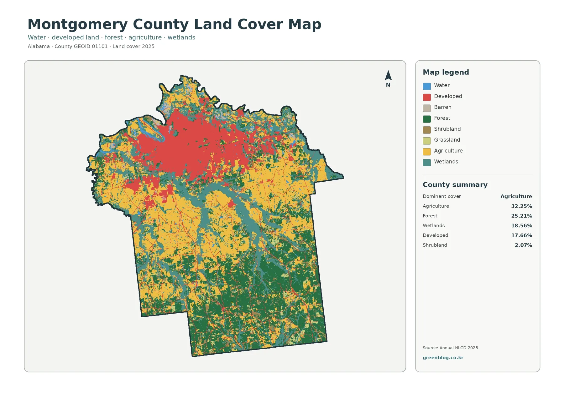
Montgomery County Alabama Land Cover Map readers can see one of the clearest urban-to-rural contrasts in this four-map set. The 2025 land-cover summary places agriculture first at 32.25%, followed by forest at 25.21%, wetlands at 18.56%, and developed land at 17.66%. Those percentages are spread very differently across the county: a broad developed concentration occupies the north, while farms, woods, and branching wet areas become much more prominent farther south.
The page pairs that current snapshot with a forest-and-farmland view, a fractional impervious-surface map, and a 1985–2025 change map. The four original JPG maps are available together in one ZIP after the map explanations, which makes the set useful for printing, classroom work, regional comparison, and presentation graphics. These are land-cover maps, not zoning or parcel maps; they classify what covers the ground rather than who owns a property or what a parcel is legally permitted to contain.
Table of Contents
A county with a dense northern footprint and a mixed rural south
The northern part of the county is visually dominant because developed cover is packed into a large, connected area around Montgomery. Red developed pixels spread broadly across the upper portion of the map, then break apart quickly near the edge of the urban footprint. South of that transition, yellow agricultural cover and green forest become the main colors. Wetlands continue through both settings, often as narrow or branching features rather than one solid block.
Agriculture is the largest single class, but the map does not look like a single continuous farm belt. Agricultural cover appears in sizable patches across the west, center, and east, with wooded tracts and wetland corridors interrupting it. Forest behaves differently. It becomes especially extensive across the southern and southeastern part of the county, where green areas connect over larger distances and mix with fields rather than with dense urban cover.
Wetlands account for 18.56% in the supplied summary, a substantial share that is easy to underestimate when looking only at the largest color patches. Teal wetland areas trace many drainage features and low-lying corridors, including visible networks through the central and southern county. Water itself is much smaller at 2.03% in the forest-and-farmland summary, so the wetland layer adds important context around streams and water bodies that would otherwise occupy relatively little space on the page.
Reading the 2025 cover classes without turning the map into a land-use plan
The general land-cover map works best as a countywide overview. Agriculture at 32.25% and forest at 25.21% together make up well over half of the mapped area, while wetlands add another 18.56%. Developed cover is smaller in percentage terms, yet its concentration in the north makes it look unusually prominent. This is a useful reminder that an area percentage and a visual footprint answer different questions: one measures how much of the county is assigned to a class, while the other reveals whether that class is clustered or dispersed.
Developed land on this map should not be read as a zoning category. A developed pixel can represent a broad mix of built and landscaped surfaces associated with homes, streets, businesses, institutions, or other human-made environments. The map does not separate residential from commercial land, and it does not show parcel ownership. Montgomery County maintains a separate GIS and cadastral mapping program for parcel-related questions, while the City of Montgomery maintains planning and land-use information for zoning and development review.
Smaller cover classes still matter when they occur at transitions. Shrubland is 2.07% in the supplied county summary, and the forest-and-farmland view lists grassland at 1.55%. These values are modest at the county scale, but small patches can mark edges between woods, fields, wetlands, and developed areas. The legend is therefore most useful when read in groups—built cover, tree cover, agricultural/open cover, wet cover, and water—before trying to interpret every isolated pixel.
Forest and farmland become easier to compare after the urban area is simplified
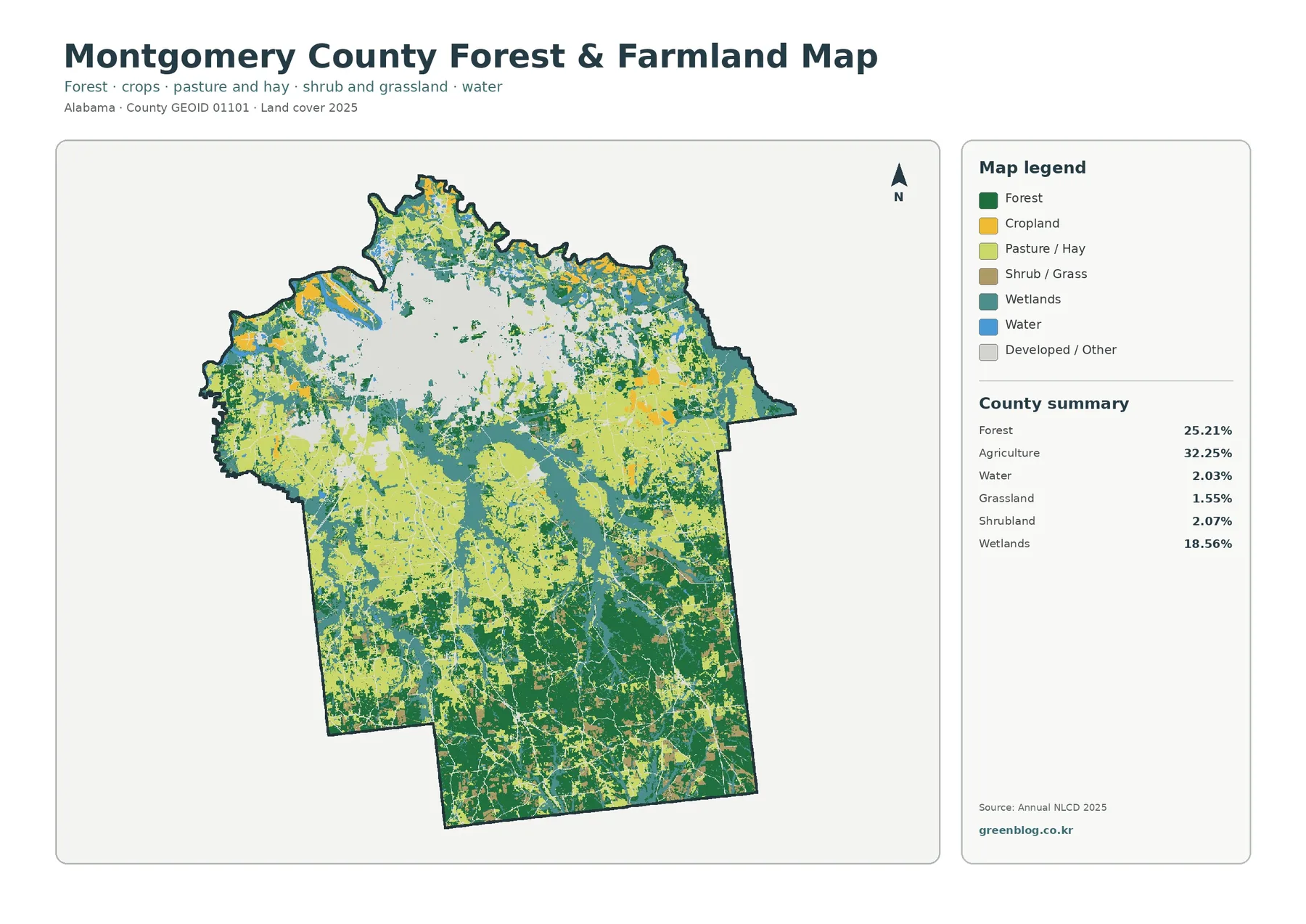
The forest-and-farmland map reduces much of the northern urban area to a neutral developed/other category. That change makes the rural pattern easier to see. Across the southern half, forest, cropland, pasture or hay, wetlands, and small amounts of shrub or grass form a patchwork rather than broad uniform zones. Darker forest areas connect across large parts of the south, while agricultural colors fill many flatter-looking openings between them.
The map summary repeats the countywide agriculture value of 32.25% and forest at 25.21%, and it also reports wetlands at 18.56%, water at 2.03%, shrubland at 2.07%, and grassland at 1.55%. Those numbers should be treated as cover classifications, not as farm acreage, timber inventory, or ownership statistics. An agricultural pixel says that agricultural cover is the mapped surface class; it does not identify a crop, a producer, a property line, or a legal land-use designation.
For local follow-up, the Alabama Cooperative Extension System maintains a Montgomery County office and lists specialists in areas that include agronomic crops, animal science and forages, forestry, wildlife, and natural resources. That kind of county-specific reference can help a reader move from a visual pattern to a more focused question about farming, vegetation, or natural-resource management. It should not be used to retroactively assign a specific land use to any colored pixel on the map.
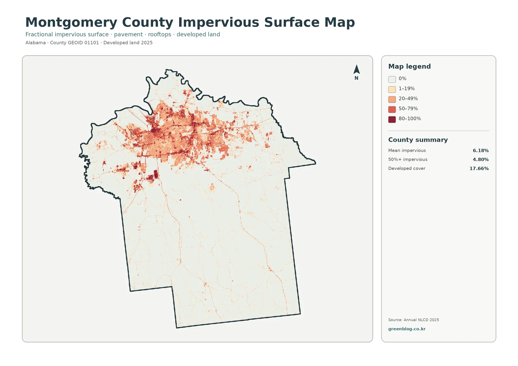
Impervious surface isolates the built footprint more sharply
The impervious-surface map strips away most of the land-cover palette and asks a narrower question: where are surfaces such as pavement and rooftops concentrated? The answer is unmistakably the northern urban area. Darker reds and oranges form a broad cluster there, while most of the county to the south is pale. Thin lines and scattered small patches extend away from the main cluster, but they do not form another comparable concentration.
The supplied summary reports a mean impervious value of 6.18% for the county. Areas at 50% impervious or greater account for 4.80%, while developed cover on the general map is 17.66%. The difference is expected because a developed land-cover class can include lawns, trees, open space, and lower-density built areas in addition to hard surfaces. A place can therefore be classified as developed without having a majority of its 30-meter cell covered by pavement or roof.
This map is useful for comparing the intensity of the built surface, but it is not a flood-risk or stormwater model. High imperviousness can be relevant to runoff questions, yet runoff also depends on rainfall, soils, slope, drainage infrastructure, and the location of streams and floodplains. The safe reading here is limited to what is visible: hard surfaces are strongly concentrated in the north and appear in much narrower corridors and small clusters through the rural portions of the county.
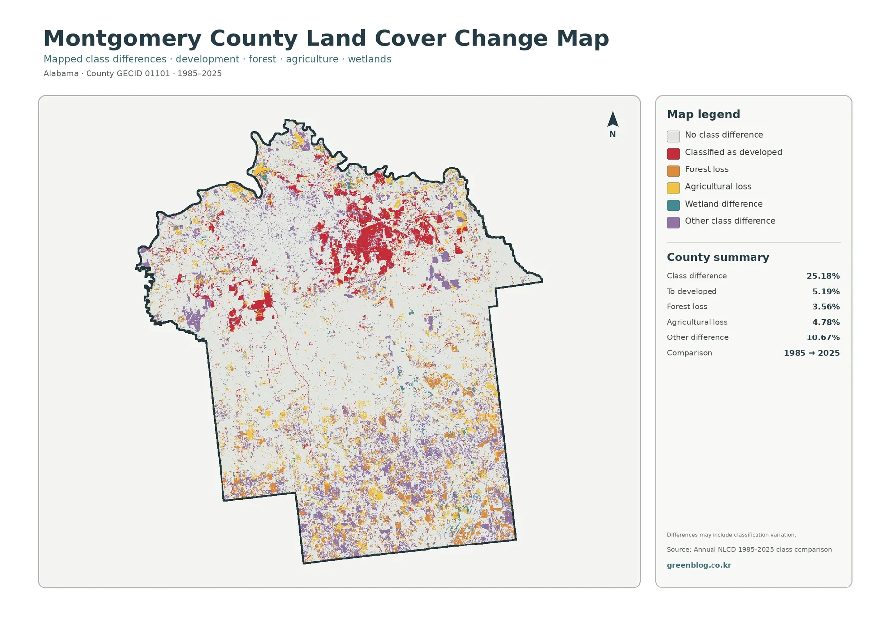
The 1985–2025 map adds history, but classification differences need context
The change map compares mapped classes in 1985 and 2025 rather than simply highlighting the darkest parts of the current map. Its county summary marks 25.18% as a class difference. Within that total, 5.19% is classified as change to developed, 3.56% as forest loss, 4.78% as agricultural loss, and 10.67% as other difference. These categories provide a useful way to locate change, but they should not be added to unrelated statistics or treated as a direct measure of economic development.
Red change-to-developed areas are most concentrated around the northern urban footprint and appear in additional patches to the west and center. Farther south, colored differences are more fragmented. Forest-loss, agricultural-loss, wetland-difference, and other-difference colors are interspersed rather than arranged in one simple north-to-south sequence. The pattern supports a description of multiple types of change occurring across the county, with the strongest developed transition near the existing urban concentration.
The map itself warns that some differences may include classification variation. That caution matters because Annual NLCD is a raster product at 30-meter spatial resolution. Each cell is assigned a representative class, so a cell containing trees, grass, pavement, and a building cannot display every component separately. Boundary cells and mixed landscapes are especially likely to simplify what exists on the ground. For that reason, the 25.18% class-difference figure should not be described as 25.18% of the county having been physically disturbed.
Choose the map according to the question, not just the color scheme
For a general reference page, the 2025 land-cover map is the best starting point because it keeps agriculture, forest, wetlands, developed land, and water in one view. The forest-and-farmland map is better when the topic is the rural landscape south of the city because it reduces the visual weight of the developed area and separates several vegetation and agricultural categories. Using both side by side makes it easier to explain why agriculture can lead the county total while forest still dominates many individual southern areas.
For an urban-versus-rural comparison, the impervious map is usually the clearest graphic. The northern concentration is immediately visible, and the pale southern background keeps the comparison simple. For a time-series discussion, the change map should be paired with the current cover map. A change color tells the reader that a class differs between the two mapped years, while the current map explains what the surrounding landscape looks like in 2025.
The set can support classroom exercises, regional planning context, environmental education, watershed discussion, habitat comparison, and presentation graphics as long as the limits are stated. It is particularly useful for asking county-scale questions such as where built cover is concentrated, whether farms and forests occupy separate or mixed areas, and where wetlands repeatedly appear between other classes. It is not precise enough for parcel decisions, engineering measurements, legal boundaries, or site-level environmental determinations.
Download the four original JPG maps
The WebP figures in the Montgomery County Alabama Land Cover Map article are optimized previews. The download ZIP contains four original JPG maps corresponding to the current land-cover view, forest-and-farmland view, impervious/developed-surface view, and 1985–2025 change view. Use the ZIP when you need a larger image for printing or when you want the full set available offline. The archive contains map images rather than raw GIS rasters, shapefiles, parcel data, or a zoning database.
Limits that matter before using the maps for a project
Annual NLCD products are raster based and use 30-meter cells. At that scale, a narrow stream, a single building, a small pond, or a thin strip of trees may occupy only part of a cell or may be generalized into a neighboring class. The maps are excellent for seeing broad patterns across Montgomery County, but they are not surveys. Measurements of a property line or a small site should come from an appropriate parcel, survey, engineering, or local GIS source.
Date is another limitation. The current maps represent the 2025 classification supplied with this package, while the change map compares 1985 with 2025. Development or vegetation change after the 2025 observation period may not appear. Anyone working on a current site-specific question should check recent aerial imagery and local records rather than assuming the map is a live view of conditions on the ground.
Finally, the Montgomery County Alabama Land Cover Map must be kept separate from land-use and parcel records. The City of Montgomery planning program handles zoning, subdivision, development review, and related land-use questions, while Montgomery County GIS maintains cadastral and parcel-oriented data. Those systems can answer questions this map cannot. The land-cover set is most useful when the question is simply what broad surface types are mapped, where they cluster, and how those patterns differ between the urban north and the more rural south.
Frequently Asked Questions
What is the largest land-cover class in Montgomery County?
Agriculture is the largest class in the supplied 2025 summary at 32.25%. Forest follows at 25.21%, wetlands at 18.56%, and developed land at 17.66%. The classes are distributed differently, with developed cover heavily concentrated in the north and agriculture spread across much more of the county.
Is the impervious-surface map the same as the developed-land map?
No. Developed land is a broad land-cover class, while the impervious map estimates the share of a cell covered by hard surfaces such as pavement and rooftops. The supplied summary gives a mean impervious value of 6.18% and shows 4.80% of the county at 50% impervious or greater.
What is included in the download ZIP?
The ZIP contains four original JPG maps: the 2025 land-cover map, forest-and-farmland map, impervious/developed-land map, and the 1985–2025 land-cover-change map. The WebP images in the article are previews; the archive is the convenient way to download the full JPG set together.
Map File Information
Download all four original JPG map views in one ZIP file.
- Included Files: Use only the versions confirmed in the article and supplied images
- File Type: Use the confirmed download contents
- Intended Use: Printing, education, presentations, and map-based projects
Related Maps
- Autauga County Alabama Land Cover Map
- Baldwin County Alabama Land Cover Map
- Barbour County Alabama Land Cover Map
Sources and further reference
The following official sources provide the dataset background, boundary information, and local context used to interpret the map set. They are also the right starting points when a question moves beyond broad land cover into parcels, planning, agriculture, forestry, or other county-specific topics.
- MRLC Annual NLCD Data – access to Annual NLCD products and related data
- USGS Annual NLCD Land Cover Classification – official explanation of the land-cover classes
- U.S. Census Bureau TIGER/Line Shapefiles – county boundary data
- Alabama Cooperative Extension System – Montgomery County – local agriculture, forestry, wildlife, and natural-resource extension information
- Montgomery County GIS and Cadastral Mapping – county GIS and parcel-oriented mapping information
- City of Montgomery Planning – official planning and land-use information for the city
Green Map creates custom-edited map images using open geographic data sources such as geoBoundaries, Natural Earth, OpenStreetMap, and government open data.
These maps are edited visual materials, not raw data files, and are provided for education, documents, presentations, and graphic reference.