The Marion County Alabama Land Cover Map presents a northwest Alabama county where forest is the dominant 2025 surface cover, but it is not an unbroken block of woods. Agricultural patches, small developed centers, shrub and grass cover, wetlands, and water appear throughout the county, creating a pattern that is easier to understand when the four supplied maps are read together rather than as separate illustrations.
This page includes a general land-cover view, a forest-and-farmland map, a fractional impervious-surface map, and a 1985–2025 comparison. The WebP images are intended for on-page reference. The four original 2480 × 1754 JPG maps can be downloaded together later on the page for reports, classroom use, presentations, or other county-scale reference work.
Table of Contents
Start with the forest-dominant 2025 pattern
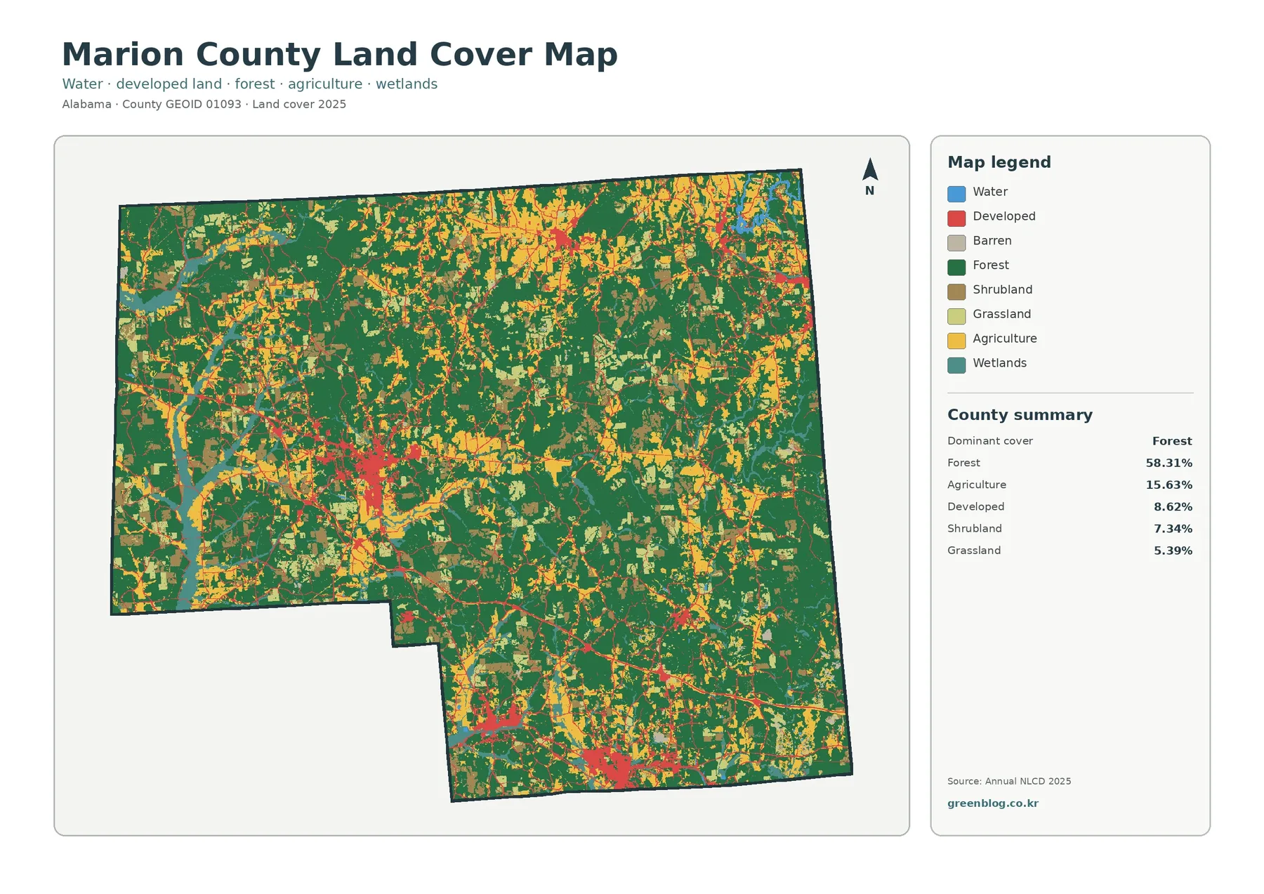
Forest accounts for 58.31 percent of Marion County in the supplied 2025 summary, making it the largest mapped class by a wide margin. Agriculture represents 15.63 percent, developed land 8.62 percent, shrubland 7.34 percent, and grassland 5.39 percent. The companion forest-and-farmland summary also lists wetlands at 4.03 percent and water at 0.40 percent. Those numbers describe area, but the map adds the more useful question of where each class occurs.
Dark green forest spreads across much of the western, central, and southeastern parts of the county. Agricultural colors appear more often as patches and bands, with broad concentrations in portions of the north and northeast and smaller areas elsewhere. Developed cover is much less extensive than forest, yet it is easy to notice because it forms compact clusters and narrow connections within the greener background. Shrub and grass classes add another layer of variation, especially where the forest pattern is less continuous.
Land cover should not be read as zoning, ownership, or a statement about what a property may legally be used for. Annual NLCD classifies the surface that is predominant in mapped cells. A forest-colored location is not automatically public forest, an agricultural cell is not a surveyed farm boundary, and a developed cell does not identify a particular residential or commercial use. The map is most reliable when used for countywide pattern recognition rather than parcel-level decisions.
Development is spread among several centers rather than one large urban footprint
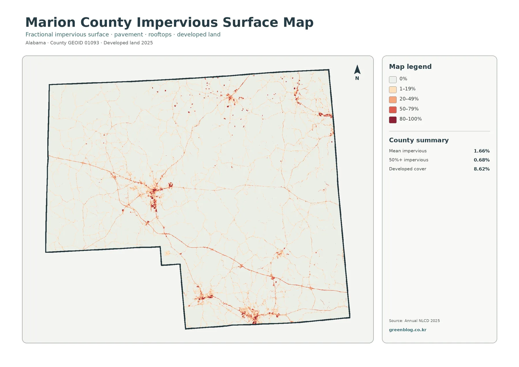
The impervious-surface map strips away most of the land-cover colors and makes roads, rooftops, parking areas, and other hard surfaces much easier to see. Mean imperviousness is 1.66 percent across the county, while only 0.68 percent of the county is mapped at 50 percent impervious or greater. Developed land covers 8.62 percent in the general classification. These values are not supposed to match: a developed land-cover cell can still contain lawns, trees, bare soil, or other surfaces that allow some water to infiltrate.
A strong cluster appears west of the county center, with other noticeable concentrations in the southern and southeastern portions and toward the northeast. Thin reddish lines connect and extend away from those clusters. The overall effect is a network of developed places set inside a mostly low-impervious landscape, not a broad continuous metropolitan area. That distinction is difficult to see from the percentage alone but becomes obvious on the map.
Trusted county references identify Hamilton as the county seat and largest city, with Guin, Winfield, and Hackleburg among the other significant population centers. They also identify U.S. 43, U.S. 78, and U.S. 278 as major highways. Because the impervious map itself does not label towns or road numbers, a thin red line should not be assigned to a particular highway without checking another reference map. Still, the known settlement and transportation pattern provides useful orientation when comparing the hard-surface clusters.
This view is useful when the question is not simply “how much developed land exists?” but “where are the more intensely built surfaces concentrated?” It can support a general discussion of settlement pattern, transportation corridors, or how developed centers interrupt otherwise forested land. It should not be used to calculate a driveway, size a drainage structure, determine flood exposure, or measure a building footprint. Those tasks need higher-resolution and site-specific data.
Farmland appears as patches and bands within a largely wooded county
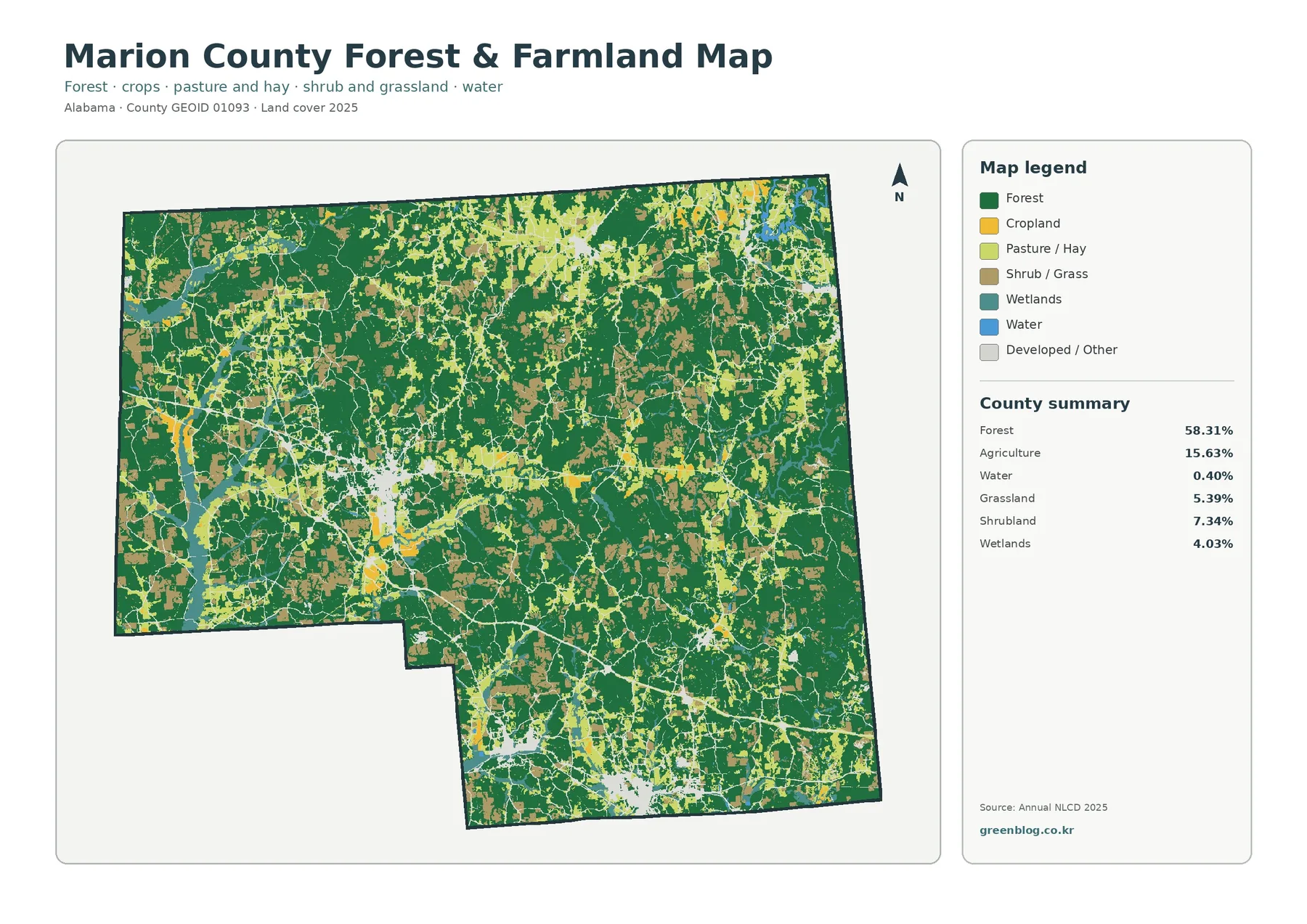
The forest-and-farmland view is the best map for separating Marion County’s agricultural pattern from the much larger forest area. Forest remains visually dominant, but cropland, pasture or hay, and shrub or grass cover become easier to distinguish. Instead of a single agricultural zone, the map shows many separate patches, some fairly broad and others narrow or irregular, embedded within wooded land.
Agricultural cover is especially noticeable across parts of the northern half, though it also appears through the center and south. Forest tends to form larger connected areas around these patches. That arrangement matters because a simple county percentage can make 15.63 percent agriculture sound like one concentrated block. The map shows a different reality: agricultural surfaces are distributed through a county where wooded cover remains the main landscape component.
The 2022 Census of Agriculture provides a useful local comparison without being the same dataset. USDA reports 612 farms and 112,612 acres of land in farms in Marion County. Within that farm land it reports 28,546 acres of cropland, 28,830 acres of pastureland, and 47,793 acres of woodland. Those categories describe land in agricultural operations; they are not interchangeable with Annual NLCD land-cover classes. The figures are valuable because they show that woodland can be part of farm holdings and that “farm land” is broader than the yellow agricultural pixels on the map.
Wetlands account for 4.03 percent in the supplied summary and water for 0.40 percent. The blue water class occupies only small areas compared with forest, while wetlands appear in scattered green-blue patches. A small countywide percentage does not mean these features are unimportant. It simply means they occupy less mapped area. Local references identify Upper Bear Creek Reservoir and Marion County Public Fishing Lake as notable water features, but this land-cover map does not label those features or define legal shoreline and wetland boundaries.
Small water shares still matter when reading the landscape
Water is one of the smallest classes in the county summary, yet water and wetland locations can provide important context for nearby forest and agricultural cover. A reservoir or stream corridor can be locally significant even when it occupies only a small fraction of a 743-square-mile county. This is why the map should be read at more than one level: percentages describe countywide area, while the image shows where small but meaningful features occur.
The same caution applies to wetlands. A cell classified as wetland by a land-cover product is not automatically a regulatory wetland determination. Property-level wetland boundaries, permit requirements, and conservation decisions depend on current agency information and, when necessary, field work. On a generalized raster map, narrow channels, wooded wet areas, roads, and adjacent uplands can also be mixed within the same neighborhood of cells.
For a classroom or watershed discussion, the land-cover map can be paired with a separate hydrography map to see how forest, farms, and developed places relate to named water features. For permitting, engineering, or land transactions, it should remain a background reference only. That difference between broad environmental context and legal or technical delineation is one of the most important limits of any county-scale land-cover map.
The 1985–2025 comparison records class differences, not a single story of change
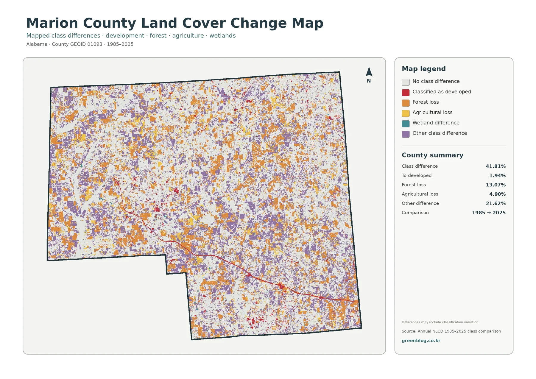
The long-term map compares land-cover classifications at the 1985 and 2025 endpoints. Its summary reports a class difference across 41.81 percent of the county. Within the listed categories, 1.94 percent is mapped as changing to developed, 13.07 percent as forest loss, 4.90 percent as agricultural loss, and 21.62 percent as other class difference. The legend also includes wetland difference. None of these values should be treated as a direct measure of zoning change, property conversion, or economic development.
Orange forest-loss cells and purple other-difference cells are spread widely across the county. Red change-to-developed areas are much smaller and more localized, often appearing as dots, clusters, or narrow traces. Large white areas indicate no class difference between the two endpoints. Because the colored cells are distributed rather than confined to one edge of the county, the map does not support a simple statement such as “all change moved in one direction.”
The map itself warns that differences may include classification variation. Remote-sensing products can assign a different class because the observed surface truly changed, but differences can also be influenced by imagery, mixed pixels, seasonal conditions, or changes in the classification process. For that reason, a colored cell is best treated as a place to investigate rather than proof of a particular event. A parcel-scale claim should be checked with source data, aerial photographs, local records, or field evidence.
An endpoint comparison also leaves out the sequence between 1985 and 2025. Forest could have been harvested and regrown, a field could have changed management several times, or a temporary disturbance could have occurred between the two dates without appearing as a final difference. The map is strong for showing where the endpoints disagree across the county; it is not a year-by-year history of every land-cover transition.
Why farm statistics and land-cover statistics should not be merged
Marion County offers a good example of why two credible datasets can use different categories without contradicting each other. Annual NLCD asks what surface cover is predominant in a mapped cell. The Census of Agriculture asks about land associated with farm operations and how that land is used. A farm can contain woodland, pasture, cropland, buildings, ponds, and other surfaces. As a result, USDA “land in farms” should not be converted into an NLCD agricultural percentage.
Using the datasets side by side is still valuable. The land-cover map shows where the agricultural colors are located among the forests, while the USDA profile confirms that agriculture is a substantial local activity and that woodland is common within farm holdings. The two sources therefore answer different questions that complement each other: one is a map of surface cover, and the other is a statistical description of agricultural operations.
This distinction also helps avoid a common error when presenting the map. A yellow agricultural pixel does not identify a particular farm, crop, owner, or parcel. Likewise, a green forest pixel does not mean the land is outside agricultural management. When the purpose is teaching or public communication, stating those limits directly makes the map more useful because readers know what conclusions are safe to draw.
A practical way to use all four maps together
Begin with the general 2025 map when you need an overview. It establishes forest as the largest class and shows how agriculture, development, shrubland, grassland, wetlands, and water are distributed around it. This is the most useful first image for a county profile or presentation because the reader can see several land-cover types at once without switching between specialized views.
Move to the forest-and-farmland map when the discussion turns to rural land. Its simplified grouping makes agricultural patches easier to compare with wooded areas and also keeps pasture, shrub or grass cover, wetlands, and water visible. A teacher can use it to discuss how a county may be heavily forested while still containing a meaningful agricultural landscape. A researcher can use it as a quick orientation before consulting more detailed datasets.
Use the impervious map for settlement and built-surface questions. It reveals the compact centers and connecting lines that are easy to miss among the many colors of the general map. Placed beside the forest map, it shows that most intense hard-surface areas occupy a small portion of the county even though developed land is visible in several communities. This side-by-side comparison is more informative than describing the 8.62 percent developed share by itself.
Finish with the change map when the subject involves time. Once the 2025 pattern is understood, the orange, red, purple, and other change colors have a clear reference point. Use them to locate broad areas where endpoint classes differ, then consult annual source layers or independent imagery if the exact history matters. This sequence keeps the change map from being mistaken for a direct record of every land-use event.
Scale, classification, and property-level limits
Annual NLCD is a raster-based science product designed for consistent mapping across large areas. Raster data divide the landscape into cells and assign values to those cells. Real places are more complicated: a single local area can contain trees, a house, pavement, lawn, a ditch, and a small field. When a county map is enlarged beyond its intended level of detail, cell edges can look more exact than the underlying classification really is.
USGS describes the land-cover product as the predominant thematic surface-cover class for the mapping year. That is a useful definition because it separates land cover from legal land use. The map can tell a reader that a location is mapped as forest or developed cover, but it cannot say whether construction is permitted, who owns the land, what zoning district applies, or where a surveyed property line lies. Those questions require the responsible local or state records.
The 2025 classification is also a dated snapshot rather than a live map. New construction, timber harvest, vegetation recovery, or agricultural changes after the mapped period may not be represented. If current conditions are critical, compare the land-cover product with recent aerial imagery or local GIS. If the goal is countywide comparison, however, the consistency of a standardized national classification is a major advantage.
Finally, area share and local importance are different concepts. Water covers only 0.40 percent in the summary, yet individual reservoirs and streams can be important recreation and environmental features. Developed land covers 8.62 percent, but those areas contain many of the county’s homes, businesses, roads, and public services. Percentages answer how much area is mapped in each class; they do not rank the social, ecological, or economic importance of those classes.
Download the four original Marion County land-cover JPG maps
The ZIP below contains the same four map themes shown on this page as original JPG files: general land cover, forest and farmland, impervious/developed land, and the 1985–2025 change comparison. Each image is 2480 × 1754 pixels. The package preserves the supplied original size rather than enlarging it to claim A3 high-resolution status, so very large prints should be proofed first to make sure legend text remains comfortable to read.
Frequently Asked Questions
What is the largest 2025 land-cover class in Marion County?
Forest is the largest class at 58.31 percent. Agriculture accounts for 15.63 percent and developed land for 8.62 percent, followed by shrubland and grassland. These are countywide surface-cover classifications, not ownership or zoning percentages.
Why is mean imperviousness only 1.66 percent when developed land is 8.62 percent?
Developed land can include lawns, trees, bare ground, and other permeable surfaces along with roofs and pavement. The impervious map measures the hard-surface fraction, so its countywide mean is expected to be lower than the developed land-cover share.
Does the 41.81 percent 1985–2025 class difference prove that all of that land physically changed?
No. The map compares endpoint classifications and explicitly notes that some differences may include classification variation. Site-specific change should be verified with source layers, aerial imagery, records, or field evidence before drawing a firm conclusion.
What is included in the download ZIP?
The archive contains four original 2480 × 1754 JPG files: general land cover, forest and farmland, impervious/developed land, and the 1985–2025 land-cover change map. It does not include GIS layers, parcel boundaries, or editable source data.
Map File Information
The ZIP contains the four original JPG maps described on this Marion County land-cover page.
- Included Files: general land cover, forest & farmland, impervious/developed land, and land-cover change maps
- Printable Size: 2480 × 1754 pixels each
Related Maps
- Autauga County Alabama Land Cover Map
- Baldwin County Alabama Land Cover Map
- Barbour County Alabama Land Cover Map
Sources and reference material
Percentages and change categories come from the four supplied Annual NLCD-based Marion County maps. County settlement, transportation, water, and agricultural context was checked against the public sources below. Statistics from different systems are kept separate rather than treated as directly equivalent measures.
- MRLC Annual NLCD Data — Annual NLCD products and access to the 1985–2025 series
- USGS Annual NLCD Land Cover Classification — class definitions, interpretation, and product caveats
- U.S. Census Bureau TIGER/Line Shapefiles — county boundary data documentation
- USDA 2022 Census of Agriculture: Marion County — farms, land in farms, cropland, pastureland, and woodland statistics
- Encyclopedia of Alabama: Marion County — Hamilton, other population centers, major highways, and local water features
Green Map creates custom-edited map images using open geographic data sources such as geoBoundaries, Natural Earth, OpenStreetMap, and government open data.
These maps are edited visual materials, not raw data files, and are provided for education, documents, presentations, and graphic reference.