Baldwin County has a land-cover pattern shaped as much by water and wetlands as by forest, farming, and developed areas. The 2025 summary identifies forest as the largest single class at 31.40%, while wetlands account for another 28.68%. Agriculture and developed land become more prominent across the southern half, and broad water and wetland areas frame much of the county’s western and southern edges. Four map views on this page separate those patterns so they can be compared without turning the article into a technical GIS report.
The four original JPG maps are available together in one download. Use the general land-cover map for a countywide overview, the forest-and-farmland map for rural cover, the impervious-surface map for hard developed surfaces, and the 1985–2025 comparison for mapped class differences over time. Each view answers a different practical question, but none should be treated as a parcel survey, zoning map, or statement of property ownership.
Table of Contents
Start with Baldwin County’s water-and-wetland setting
The county summary makes the scale of the natural cover clear. Forest represents 31.40% of the mapped area, wetlands 28.68%, agriculture 14.68%, developed cover 12.02%, and water 5.00%. Those percentages do not describe where each class occurs, so the spatial pattern matters just as much as the totals. A large share of the western side is tied to water and wetland cover, forest is widespread through the north and interior, and the southern half contains a more intricate mixture of agriculture, development, forest, wetland, and open water.
Baldwin County’s own natural-resources material identifies wetlands, streams, and forests as important county resources and lists local watershed studies. County stormwater documents also describe a setting bordered by Mobile Bay and the Mobile-Tensaw system on the west, Perdido waters on the east, and the Gulf of Mexico to the south. Those references provide useful geographic context for the broad wetland and water zones visible along the map edges. They do not change the map classes; they simply help explain what kind of landscape the colors occupy.
This is also why a single “dominant cover” label can be misleading if read too quickly. Forest ranks first, but wetlands are only a few percentage points behind it. Agriculture and developed cover together make up another substantial share, especially in the southern part of the county. Baldwin County therefore works best as a comparison of several large cover systems rather than as a place summarized by one land-cover type.
The general 2025 map shows a county of sharp transitions
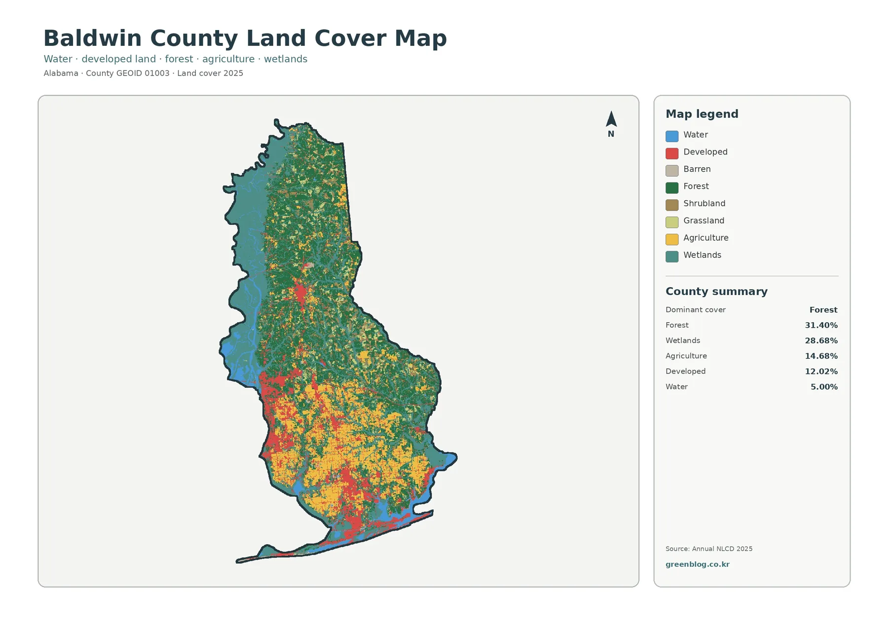
On the general map, dark green forest covers broad areas of the north and central interior. Teal wetland cover is especially strong along the western side and returns around coastal and low-lying southern areas. Yellow agriculture becomes much more frequent through the south-central and southern interior, while red developed areas form larger clusters and connecting strands in the same half of the county. Water is not just a small isolated class here; blue areas help define the county’s edge and interrupt the land-cover pattern in several places.
The southern half is visually busier than the north because several classes occur close together. Agriculture can sit beside forest, developed land can break into agricultural and wooded areas, and wetlands appear near water as well as within low-lying inland zones. That mixture is useful for readers comparing rural and developed landscapes because the map does not present development as a single solid urban block. It shows a patchwork, with natural and working-land cover still present between many developed areas.
The western side has a different character. Large water and wetland zones occupy the edge, reducing the amount of continuous dry land and creating irregular boundaries. When the county is viewed at full extent, these areas are easy to underestimate because the southern development colors attract attention first. Looking at the legend and the percentage summary together corrects that impression: wetlands alone cover more than twice the share of developed land.
Land cover is not the same as zoning
A land-cover classification describes what appears on the surface—forest, water, cropland, wetland, developed cover, and similar classes. Zoning is a legal system that regulates permitted uses and development standards. Baldwin County’s Planning & Zoning department describes zoning in those legal terms, so the colors in this article should not be used to decide whether a parcel can be built on, subdivided, farmed, or used commercially. The maps are landscape summaries, not land-use permissions.
Forest and farmland become easier to compare in the second view
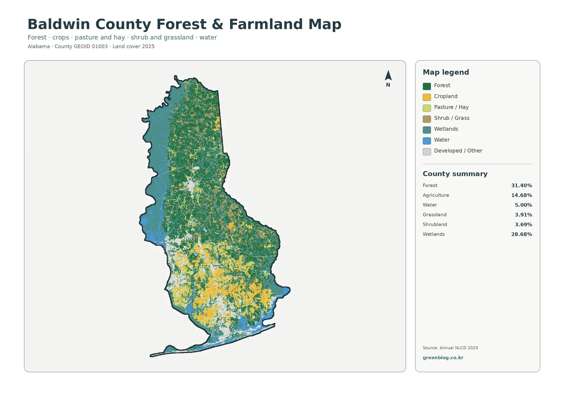
The forest-and-farmland map removes some of the visual competition from the full legend and makes the rural pattern easier to follow. Forest remains 31.40% of the county. Agriculture is 14.68%, while grassland is 3.91% and shrubland 3.69%. Wetlands still occupy 28.68% and water 5.00%, so the map never becomes a simple two-color comparison. Instead, it shows how wooded land, working land, open vegetation, and wet areas share the county.
Forest forms the broadest connected cover through the north and much of the central interior. Cropland and pasture become more frequent farther south, where yellow and light-green patches spread across a wider area. The boundary between forest and agriculture is rarely clean. Small wooded blocks remain inside farming areas, agricultural openings appear within larger green zones, and wetland cover interrupts both. That pattern is more useful than a simple north-versus-south label because it reflects the mixed landscape visible on the map.
The southern agricultural area also sits beside a large amount of developed or other cover. The lighter neutral class becomes prominent in the southwest, south-central interior, and near the coast, while forest and farmland remain interspersed around it. For classroom use, this is a good example of why “rural” does not mean one uniform cover type. Farms, forests, roads, buildings, ponds, and wetlands can all occur within the same broad rural district.
The map is best read at county scale. A farm boundary may include tree lines, buildings, roads, drainage features, and small water bodies, while a forest tract may contain clearings or narrow corridors. Raster classification groups the landscape into cells, so edges are generalized and mixed pixels can occur where more than one surface type falls inside a cell. That is acceptable for regional comparison, but it is not precise enough for parcel acreage, legal boundaries, or site design.
Impervious surface pinpoints where hard development is concentrated
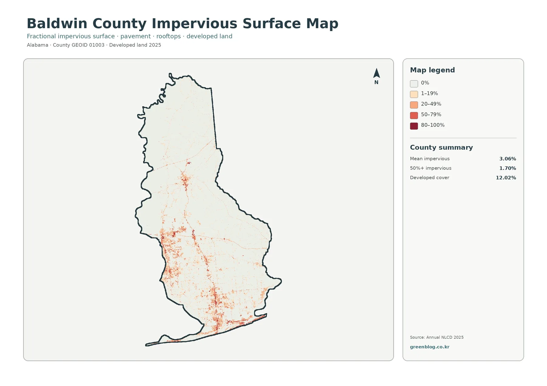
Impervious surface means ground cover such as pavement and rooftops that does not readily absorb rainfall. The Baldwin County summary reports a mean impervious value of 3.06%, with 1.70% of the mapped area at 50% or greater imperviousness. Developed cover is 12.02%. Those numbers are different because a developed land-cover class can contain lawns, trees, bare soil, and other pervious surfaces along with roads and buildings, whereas the impervious layer estimates the hard-surface fraction more directly.
The map makes the concentration pattern obvious. Most of the northern county remains near the lowest impervious category, while stronger orange and red values cluster in the southwest, the south-central area, and along parts of the southern coast. Thin linear traces extend between larger concentrations. They are consistent with developed transportation and settlement corridors, but the image by itself does not prove that a particular road caused nearby development. It only shows that hard surfaces and development occur in the same general places.
Comparing this layer with the general land-cover map helps separate two questions. The red developed class tells you where developed land is classified, while the impervious map shows how much of the surface is actually hard within each mapped cell. A low-density residential area can therefore appear as developed without reaching the darkest impervious category. Conversely, a commercial or highly paved site can stand out strongly even though it occupies a small part of the county.
This distinction is especially useful in a county where water and wetlands are prominent. Baldwin County maintains stormwater programs and watershed studies, and impervious cover is a useful educational layer when discussing runoff, drainage, and the contrast between natural and developed surfaces. It should not be substituted for engineering models, flood maps, or permit records, but it provides a clear visual starting point for deciding where more detailed information may be needed.
The 1985–2025 map highlights class differences, not a simple damage total
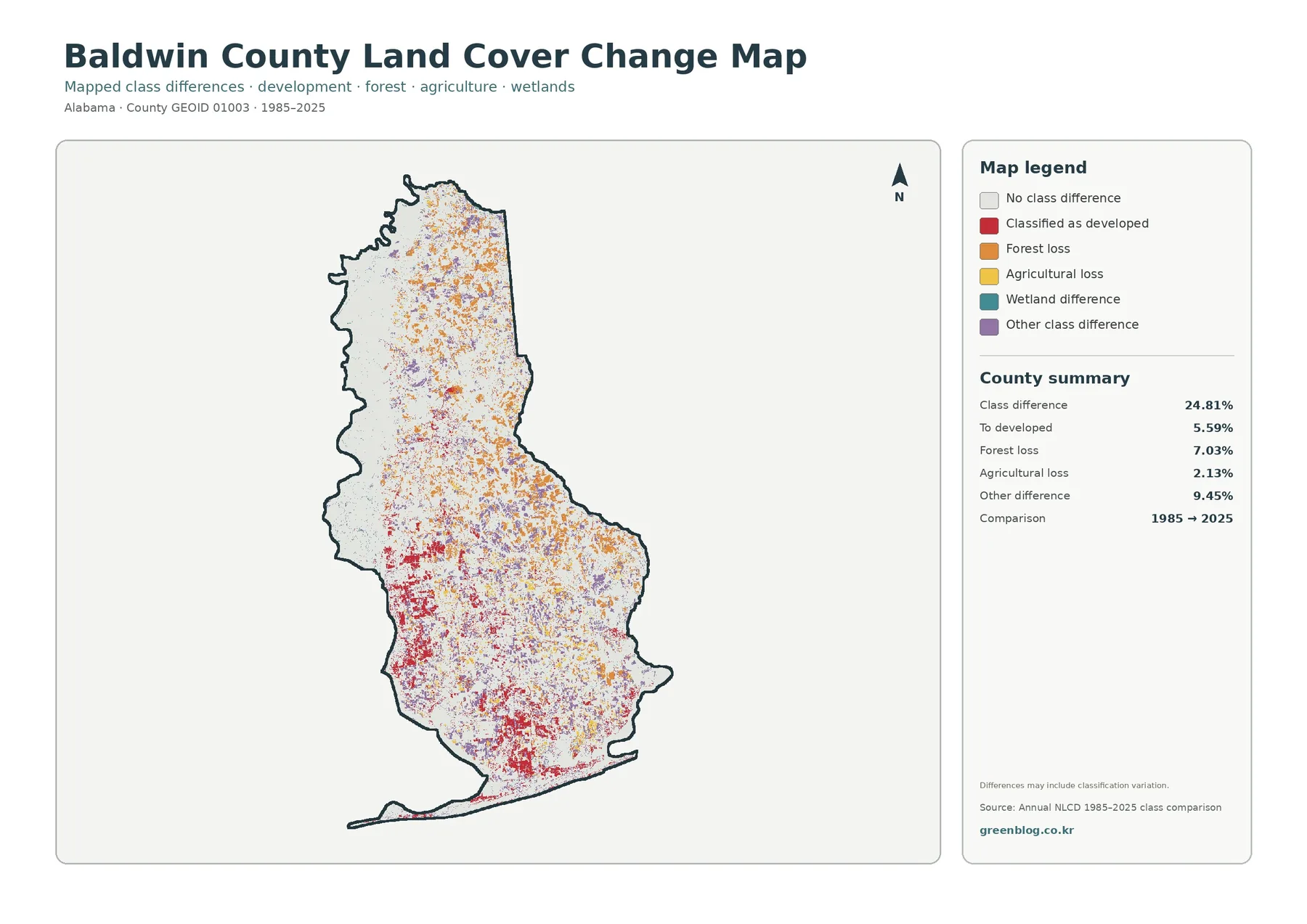
The long-term comparison reports class differences across 24.81% of the mapped county. Within the summary, 5.59% is categorized as “to developed,” 7.03% as forest loss, 2.13% as agricultural loss, and 9.45% as other difference. The map compares 1985 with 2025, so it is a useful locator for places where the classification changed. It is not a statement that 24.81% of the county was destroyed, urbanized, or converted by one process.
Red “classified as developed” changes are most noticeable in the southern and southwestern parts of the county, with additional clusters through the south-central interior. Orange forest-loss cells are more widely scattered and appear through parts of the north, center, and east. Purple other differences occur across a broad area, while wetland differences appear in selected low-lying and water-adjacent zones. Large pale areas remain without a mapped class difference in this comparison.
The map itself warns that differences may include classification variation. That caveat matters. Satellite imagery, observation timing, mixed pixels, and changes in classification methods can all affect whether a cell receives the same class in two years. Some colored cells may represent real landscape change; others may partly reflect how the surface was classified. A strong interpretation therefore uses the change map to identify locations for follow-up rather than treating every colored cell as a confirmed land-use event.
For a better reading, compare the change layer with the 2025 maps. A current developed cluster with nearby red change cells suggests an area worth checking with planning, population, permit, or historical imagery records. Forest-loss cells beside current agriculture or development can also be investigated, but the map alone cannot tell you why the class changed. The same caution applies to wetland differences, where water level, vegetation condition, and classification boundaries can complicate a simple before-and-after story.
How to use and download the four Baldwin County maps
Each map is strongest when used for a specific task. The general land-cover map is the quickest choice for a report that needs the whole county in one view. The forest-and-farmland version works better when the question is about wooded cover, working land, and open vegetation. The impervious map is useful for explaining hard developed surfaces, while the change map is the best entry point for a historical comparison. Using two views together often reveals more than adding extra labels to a single crowded map.
For environmental education, start with the percentage summary and ask where the largest classes actually occur. For a presentation about development, pair the developed class with the impervious layer so the audience can see the difference between a developed classification and hard-surface intensity. For a watershed lesson, compare wetlands and water with nearby developed areas without claiming that proximity alone proves a hydrologic impact. The maps support questions and comparisons; detailed conclusions require the appropriate local data.
The download archive contains the four original JPG maps described on this page. It is useful when you need a larger image for a slide, printed reference sheet, classroom handout, or offline comparison. Keep the source information with the image when you reuse it so the map year and classification context are not separated from the graphic.
Reading limits to keep in mind
These maps are generalized county-scale classifications. Small roads, narrow streams, building footprints, and property edges can be smaller than the mapping cells or mixed with surrounding cover. The 2025 maps represent the mapped condition for that dataset, not every change that happened afterward. The historical layer compares two classified dates and carries its own classification uncertainty. For legal, engineering, floodplain, or parcel decisions, use the current records from the agency responsible for that subject.
Color area and visual prominence can also be deceptive. A compact high-impervious cluster may look dramatic while covering a small share of the county, and a broad wetland zone may seem quieter because it uses a less intense color even though it represents 28.68% of the total. Always pair the legend with the county summary and view the entire county before drawing a conclusion from one enlarged corner.
Frequently Asked Questions
Is this land-cover map the same as a zoning or future land-use map?
No. Land cover classifies the physical surface, such as forest, water, cropland, wetland, or developed cover. Zoning and future land-use plans address legal or policy questions about how land may be used. The land-cover maps on this page do not show parcel ownership, zoning permissions, setbacks, or development approvals.
Why is developed cover 12.02% when mean impervious surface is only 3.06%?
A developed land-cover class can include both hard and soft surfaces. A residential cell may contain a house and street but also lawn, trees, and other ground that can absorb water. The impervious layer estimates the fraction occupied by hard surfaces such as pavement and rooftops, so its countywide mean can be much lower than the total developed-cover share.
Does every colored cell on the 1985–2025 change map represent confirmed construction or habitat loss?
No. The layer compares classifications between two dates, and the map notes that some differences may include classification variation. The colors are useful for locating areas to investigate, but a confirmed explanation may require historical imagery, permits, forestry records, agricultural information, or field observations.
Map File Information
Baldwin County land-cover JPG download
- Included Files: Use only the versions confirmed in the article and supplied images
- File Type: Use the confirmed download contents
- Intended Use: Printing, education, presentations, and map-based projects
Related Maps
Sources and reference links
Map percentages and comparison values come from the Baldwin County images supplied with this article. The following official sources provide the land-cover classification background, county boundary data, and local natural-resource context used to explain the maps.
- MRLC Annual NLCD Data – official access point for Annual NLCD products.
- USGS Annual NLCD Land Cover Classification – definitions and background for land-cover classes.
- U.S. Census Bureau TIGER/Line Shapefiles – official geographic boundary resources.
- Baldwin County Natural Resources – county information on wetlands, streams, forests, water monitoring, and watershed studies.
Green Map creates custom-edited map images using open geographic data sources such as geoBoundaries, Natural Earth, OpenStreetMap, and government open data.
These maps are edited visual materials, not raw data files, and are provided for education, documents, presentations, and graphic reference.