Schenectady County has a compact outline, but its land-cover pattern changes sharply from east to west. The urbanized surface around the City of Schenectady forms the strongest developed concentration, while the western and southwestern parts of the county contain broad forest and farm areas. The Mohawk River cuts across the northern-central portion of the county and provides an easy geographic reference when comparing those landscapes. In the 2025 summary, forest accounts for 43.54% of mapped cover, developed land 29.21%, agriculture 17.94%, wetlands 7.08%, and water 1.62%.
This page brings together four related views of the county: general 2025 land cover, forest and farmland, impervious surface, and a 1985–2025 class-difference map. The original four JPG maps are available in one download after the previews. They work well for printing, classroom exercises, presentations, and county comparisons because each view emphasizes a different question. Land cover describes what physically covers the ground; it does not define parcel ownership, zoning, permitted development, or legal wetland boundaries.
Table of Contents
The Mohawk River separates and connects the county’s main cover patterns
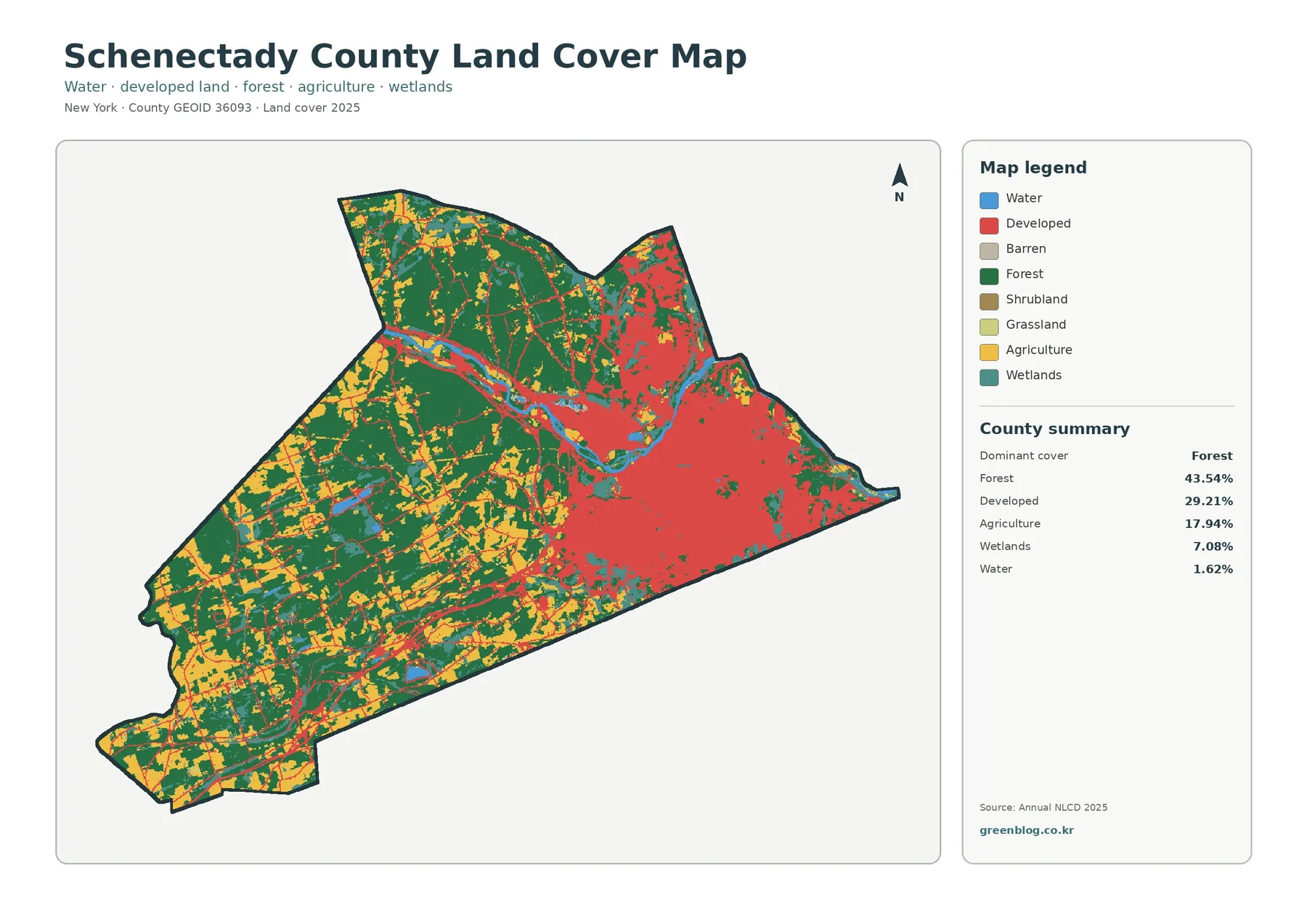
The general map is easiest to read by starting in the east. A large developed area occupies the City of Schenectady and adjoining settled parts of the county, creating a broad red surface that is much more continuous than development farther west. This concentration explains why developed cover reaches 29.21% even though large rural areas remain. The countywide percentage is useful, but the location is more revealing: most of the developed surface is clustered rather than spread evenly across the county.
Forest is the largest class at 43.54%. Its strongest continuity appears west and southwest of the main urban area, with additional broad forest north and northwest of the Mohawk. The city side still contains green patches, yet they are broken into smaller pieces by streets, buildings, lawns, and other developed surfaces. A county summary can therefore sound more uniformly forested than the map actually looks. The western half carries much more of the continuous forest pattern than the eastern urban core.
Agricultural cover reaches 17.94%, making it a substantial part of the landscape rather than a minor residual class. Yellow fields are especially visible through the western and southwestern portions of the county, where they alternate with forest in a patchwork. Farmland becomes less continuous near the denser eastern development. Schenectady County’s own municipality descriptions call Princetown a farm-friendly rural residential community and describe Rotterdam as a place that includes active farmland and rural areas as well as suburban and more urban neighborhoods.
Wetlands account for 7.08%. They do not form one single belt; instead, teal areas appear beside water, within wooded sections, and among rural land-cover patches. That distribution matters when the map is used for environmental education because it shows that wet ground is part of several different landscape settings. Annual NLCD wetland classes are generalized remote-sensing categories, however. They should not be substituted for regulatory wetland mapping when a property, permit, or legal boundary is involved.
Water is listed at 1.62%, with the Mohawk River providing the most obvious linear feature. Smaller water bodies also appear inside the county. The New York State Department of Environmental Conservation lists multiple Mohawk River/Barge Canal access sites in Schenectady County, including locations at Freemans Bridge, Lock 7 Park, Aqueduct Park, Rotterdam Kiwanis Park, and Lock 9 State Canal Park. Those references confirm the river’s local importance, but this land-cover map does not measure flow, depth, flood probability, or water quality.
Once those five classes are located, the county’s overall structure becomes straightforward. East of the large rural blocks, developed surfaces dominate the visual field. Moving west, forest and agriculture take over and wetlands remain scattered between them. The Mohawk River crosses those contrasting settings instead of belonging to only one. This broad pattern is the reference frame for the other three maps, each of which removes some visual competition and makes one part of the landscape easier to examine.
Forest and farmland reveal a rural west that the urban map can hide
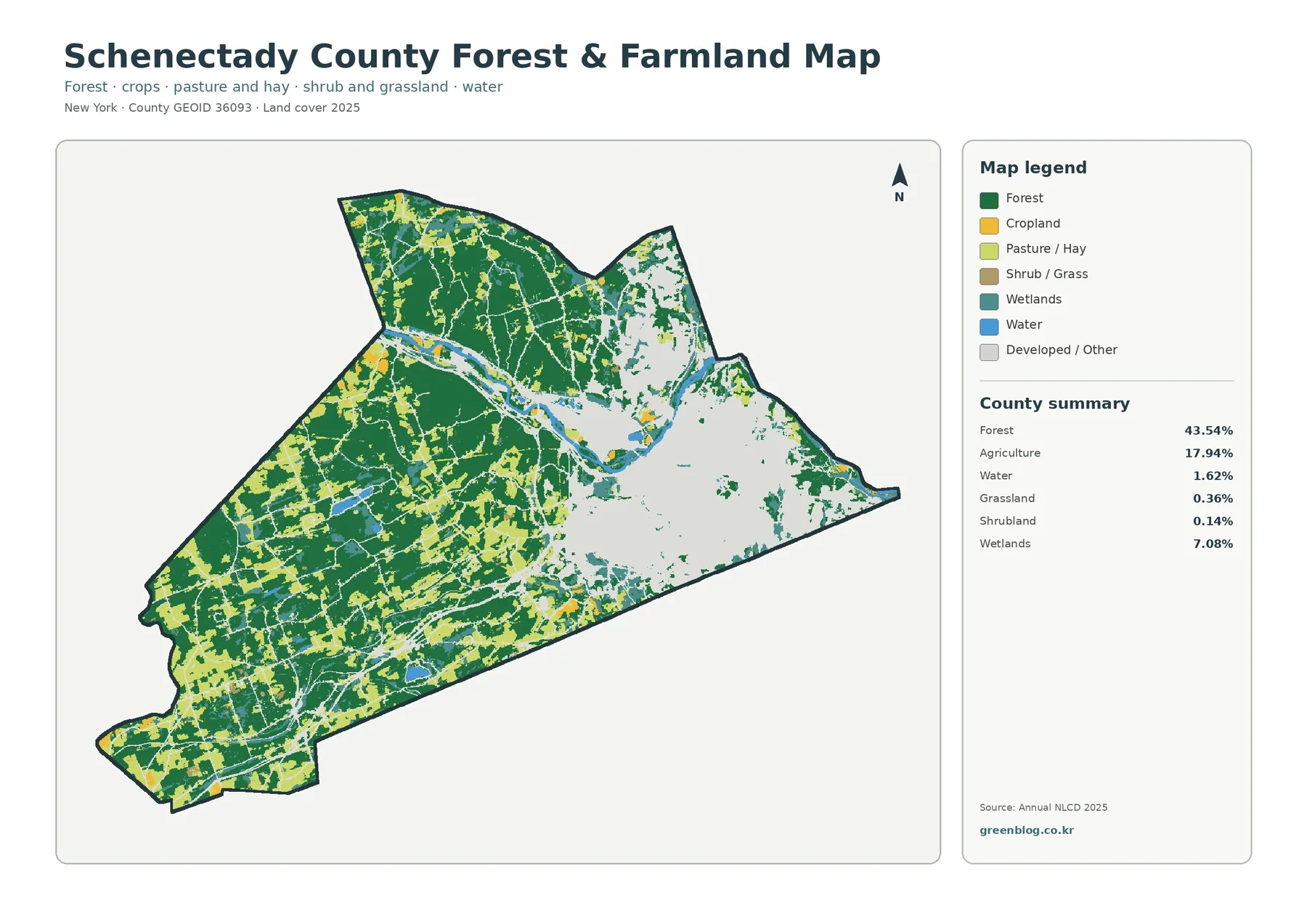
With most developed and other surfaces faded, the western side of Schenectady County becomes much easier to understand. Forest forms large connected masses, while agricultural cover appears as many field-shaped openings rather than one single agricultural block. The result is a mixed rural landscape where farms and woods repeatedly meet. This is a different visual story from the general land-cover map, where the red urban surface in the east naturally draws attention first.
The 43.54% forest share includes both large rural blocks and smaller wooded patches in more settled areas. It does not tell the reader who owns the land or whether the woods are protected. Schenectady County separately manages named preserves such as Plotter Kill Preserve in Rotterdam, Indian Kill Preserve in Glenville, and the County Forest. The county’s nature-preserve page identifies these as specific public resources, which is a useful reminder that the green NLCD class is much broader than the boundary of any park or preserve.
Agriculture is particularly important for reading the southwest and west. At 17.94%, it is large enough to shape the county’s overall appearance, not merely fill a few isolated fields. Many yellow patches sit immediately beside forest, making the transition between working land and wooded land visible. These mapped agricultural cells should not be treated as parcel ownership records or agricultural-district boundaries. They simply describe surface cover at the mapping scale and observation year.
The map also retains wetlands and water, which prevents forest and farm patterns from being viewed in isolation. Narrow wet areas and small water features interrupt both green and yellow regions. Along the Mohawk corridor, those classes provide context for low-lying and river-adjacent surfaces. In a classroom, the map can be used to ask why a countywide percentage alone cannot explain landscape arrangement: two places can have similar forest shares but very different forest continuity, field size, and proximity to water.
Grassland accounts for 0.36% and shrubland 0.14% in the county summary. Those small classes are not major drivers of the countywide pattern, yet they can appear along transitions between forest, agriculture, and developed land. Because these areas are often narrow or fragmented, the roughly 30-meter raster scale matters. A single grid cell can contain more than one real surface, so small patches are better interpreted as generalized cover than as survey-quality boundaries.
For rural-landscape work, this map is usually more useful than the general map. It makes it possible to compare the continuity of western woods, the size and spacing of farm areas, and the locations where wetlands and water break up those surfaces. Those observations can support environmental education, open-space discussion, agricultural landscape studies, or a county comparison. Legal land management decisions still require current parcel, conservation, and planning records from the appropriate agencies.
Impervious cover pinpoints the hardest built surfaces in the east
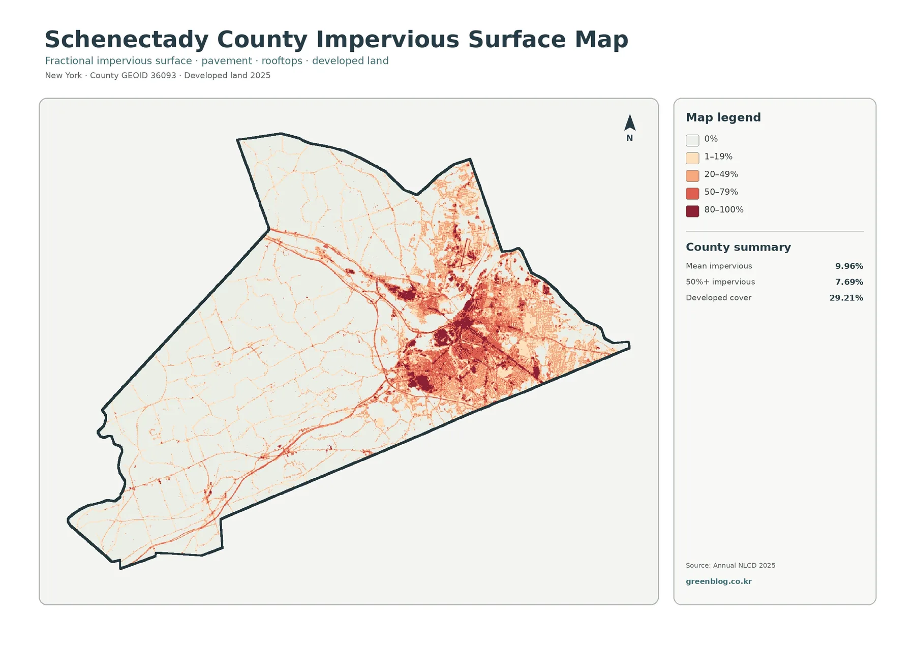
Impervious surface means pavement, rooftops, parking areas, and similar materials that do not readily absorb rainfall. The countywide mean is 9.96%, while 7.69% of the mapped area falls in cells with 50% or more impervious cover. Those values are lower than the 29.21% developed-land share because a developed land-cover class can also contain trees, lawns, soil, and other permeable surfaces. The two layers answer related but different questions.
The darkest impervious concentrations form a compact cluster around the City of Schenectady and adjacent eastern neighborhoods. High values extend along major built corridors and appear as both broad areas and narrow lines. North and northeast of the river, additional developed networks are visible, but the pattern thins toward the rural west. The map therefore converts the broad “developed” class into a more detailed picture of how much hard surface is actually present within those developed areas.
Road-like lines extend away from the eastern core into areas that otherwise have low impervious percentages. These linear patterns are useful for orientation, but the map should not be used to claim that a road caused a particular development pattern. It only shows that hard surfaces occur along the same corridors. A causal explanation would require planning records, historical imagery, transportation data, and dates for individual projects.
Western Schenectady County is dominated by the lowest impervious classes, although small towns, road junctions, driveways, and buildings still create thin or scattered colored features. This contrast is one of the clearest lessons in the four-map set. A county can have a developed share near thirty percent while still containing large areas with very little hard surface. The impervious layer shows where that difference occurs rather than reducing the whole county to a single average.
Impervious cover is often discussed in stormwater or watershed work, but the interpretation should stay within what this map supports. A higher hard-surface percentage means less exposed ground is available for direct infiltration at that location. It does not, by itself, calculate flooding, sewer capacity, stream condition, or heat exposure. Those subjects depend on rainfall, slope, drainage infrastructure, soils, vegetation, hydrology, and other datasets that are not included here.
Schenectady County’s Economic Development and Planning Department describes work involving transportation planning, environmental review, riverfront revitalization, groundwater protection, natural-resource inventories, and GIS. The impervious map can serve as a quick visual background before reading those more specialized local materials. It is not a replacement for county planning maps, but it helps a reader identify where the built surface is concentrated and where the transition to rural land becomes apparent.
The 1985–2025 layer is a map of class differences, not a list of causes
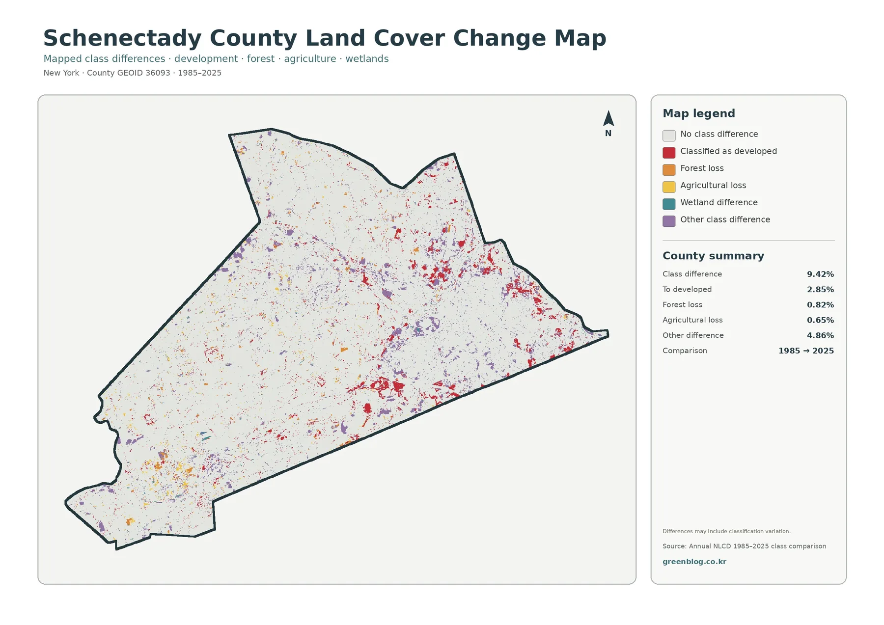
For the long-term view, the 1985 and 2025 classifications are matched cell by cell and the differing locations are highlighted. A total of 9.42% of the county is marked as having a class difference. The summary separately reports 2.85% classified to developed, 0.82% forest loss, 0.65% agricultural loss, and 4.86% other class difference. These figures should not be described as a complete record of real-world land-use decisions because changes in imagery, classification, mixed pixels, and edge placement can also contribute to differences between two dates.
Red cells classified to developed are most noticeable around the eastern built-up area, along parts of the Mohawk corridor, and in scattered clusters farther from the urban core. Some coincide visually with places that also have stronger impervious cover today. That overlap makes them good candidates for closer study, but it does not establish why the class changed. Historical aerial photographs, municipal records, or dated project information would be needed before assigning a cause to a specific cluster.
Forest-loss cells account for 0.82% and are scattered rather than concentrated in one enormous block. Some occur near developed edges, while others appear around rural forest boundaries. At a 30-meter scale, the edge of a forest is exactly where a mixed cell can change classification because a small shift in vegetation, field use, road width, or imagery can alter the dominant signal. Large connected areas generally deserve more attention than isolated single-cell differences when screening for possible landscape change.
Agricultural loss is listed at 0.65%. Small yellow change marks appear in rural areas where current farm cover is also present, but the map does not say that every agricultural loss became urban development. A cell could move into another vegetation class or be affected by classification differences. The separate red “to developed” category helps keep these ideas distinct. For farm-history research, the best approach is to use the change layer to identify locations and then compare them with agricultural records and historical imagery.
The 4.86% other-difference category is the largest single item in the change summary. That value alone warns against treating the map as a simple development map. Wetland differences and other class transitions are also represented in the legend, and small marks occur throughout the county. A balanced interpretation needs to consider all of those categories instead of focusing only on the most visually striking red cells.
A practical workflow is to begin with the 2025 land-cover map, locate the current surface, and then check the same place on the change map. If a difference is present, the next step is outside this four-map set: find historical imagery or an official record that can explain what happened. This order separates observation from explanation and makes the map useful as a screening tool without turning classification differences into unsupported claims.
Local preserves, planning, and the Mohawk corridor add context without changing the map
The Mohawk River is more than a convenient blue line for orientation. New York State DEC lists numerous public access sites along the river and Barge Canal within Schenectady County, confirming that the water corridor is an important local feature. On the land-cover maps, that corridor passes through developed, forested, and wetland settings. The spatial relationship is visible; water quality, flood behavior, and recreation demand are not measured by the land-cover layer and should be researched separately.
County-managed preserves offer another useful comparison. Plotter Kill Preserve is listed by Schenectady County as a 650-acre preserve in Rotterdam, while Indian Kill Preserve in Glenville and the County Forest are also part of the county’s nature and historic preserve system. These official sites occupy real forested landscapes, but they do not define all of the green area on the NLCD map. Forest cover is a physical surface class, whereas preserve status is a legal and administrative designation.
The rural side of the map also matches the county’s descriptions of its municipalities. Princetown is presented as a rural residential community with small family farms, and Rotterdam is described as ranging from urban and suburban neighborhoods to farmland and rural riverfront areas. Those statements do not provide numerical land-cover percentages, but they give trustworthy local context for the west-to-east contrast visible in the maps.
Schenectady County’s planning department also maintains GIS resources and works on natural-resource inventories, agricultural preservation, groundwater protection, land-use review, and riverfront development. A reader interested in policy can use these land-cover maps to identify broad areas first and then move to the county’s official GIS or planning materials for parcel-level and regulatory information. Keeping those roles separate prevents a generalized environmental map from being mistaken for a zoning or property map.
A simple way to choose among the four Schenectady County maps
Use the general land-cover map when the goal is a quick county profile. It combines the five major cover groups and makes the east-west contrast immediately visible. The forest percentage of 43.54% is the largest headline number, but the 29.21% developed share and 17.94% agricultural share are essential for understanding why the county does not look uniformly wooded. The Mohawk River provides a stable reference line for moving between map themes.
Choose the forest-and-farmland view for natural-resource lessons, agricultural landscape comparison, or open-space discussion. It reduces the visual weight of developed surfaces and gives the rural west more detail. A class or report can compare large forest blocks, field-shaped agricultural patches, wetland interruptions, and water features without the eastern urban area dominating every first impression.
Choose the impervious map when the question is about the concentration of hard surfaces. It is especially effective for demonstrating why developed land is not the same as pavement. The dark eastern cluster can be compared with the light rural west, while the mean 9.96% and the 7.69% area above 50% impervious cover provide summary values. For flooding, stormwater infrastructure, or heat analysis, additional specialized datasets are still necessary.
Choose the 1985–2025 change map only when time is part of the question. It is most informative beside the current map rather than on its own. The 9.42% class-difference value can be broken into mapped change categories and investigated further. This makes the layer suitable for a research assignment in which students first identify a change location and then test possible explanations with historical imagery or official records.
Taken together, the four maps are useful for comparing Schenectady County with other New York counties. A strong comparison looks beyond percentages and asks where each class is located, whether forest is continuous or fragmented, whether farms form broad blocks or small patches, and whether impervious surface forms one dense center or several separate clusters. Schenectady County’s strong urban-rural contrast makes those questions easy to illustrate.
Get the Schenectady County four-map JPG set
The Schenectady County ZIP is organized as four separate original JPGs. One covers 2025 land cover, another isolates forest and farmland, a third maps impervious/developed surface, and the last compares 1985 with 2025. Each file includes its own legend and county summary, so it can be opened independently without relying on the web preview. The set is practical for printing, presentation slides, worksheets, map comparison, and reference graphics.
Match the file to the question. Use general land cover for the overall county, forest and farmland for rural and natural cover, impervious surface for hard-built intensity, and the change layer for differences between the two comparison years. Keeping the four maps together makes it much easier to move between current condition, landscape emphasis, built-surface density, and long-term class change at the same location.
Scale, date, and classification limits to keep in mind
Annual NLCD is raster data. The landscape is divided into grid cells, and each cell receives a representative class or value. At roughly 30 meters, one cell may include trees, lawn, pavement, rooftops, field edges, or water at the same time. The maps are therefore designed for broad spatial patterns, not for surveying a parcel, measuring a property line, or locating a narrow feature with legal precision.
When several real surfaces fall inside one raster cell, analysts often call it a mixed pixel. Mixed pixels are common along the edge of Schenectady’s urban area, beside the Mohawk River, around wetlands, and where forest meets farmland. A narrow road or stream may occupy only part of a cell. This is why small patches can appear slightly wider, narrower, or more fragmented than they do in high-resolution aerial imagery.
The observation year matters as much as the spatial scale. The current land-cover and impervious maps use the 2025 data identified in the package, while the comparison layer uses 1985 and 2025. Construction, vegetation growth, field changes, or other surface changes after 2025 are not represented. The two-date map also cannot show the exact sequence of events during the forty years between its endpoints.
None of the maps establishes legal land use. A forest cell is not automatically a public preserve; an agricultural cell is not automatically inside an agricultural district; developed cover does not distinguish residential from commercial or industrial zoning; and a wetland cell is not a regulatory wetland delineation. Property, zoning, permit, tax, and conservation decisions require current official records from Schenectady County, its municipalities, or the relevant state agency.
Countywide statistics are summaries, not neighborhood descriptions. A mean impervious value of 9.96% does not mean every municipality is ten percent paved, and a forest share of 43.54% does not mean every town has the same forest proportion. Schenectady County has strong internal contrasts, which is why the map and the number must be read together. The statistic tells how much is mapped; the image tells where that mapped cover occurs.
The change layer needs one additional caution. A class difference can reflect a real landscape change, but it can also be influenced by image conditions, classification decisions, or mixed cells. A responsible interpretation identifies a location first and verifies the cause second. That distinction is especially important when the map is used in a report, where a colored cell can otherwise be mistaken for direct evidence of a particular development event or environmental impact.
Frequently Asked Questions
Which 2025 land-cover class occupies the largest share of Schenectady County?
Forest is the largest 2025 class at 43.54%. It is most continuous in the western and southwestern parts of the county, while the eastern side contains a much larger concentration of developed land around the City of Schenectady and nearby communities.
Why is developed cover 29.21% but mean impervious cover 9.96%?
Developed land-cover cells can include permeable surfaces such as lawns, trees, and soil in addition to buildings and pavement. The impervious layer measures the hard-surface share more directly. Because the two layers measure different aspects of development, the impervious mean is expected to be lower than the developed-land percentage.
Does the 9.42% change value mean that all of that area was developed?
No. The 9.42% figure covers all mapped class differences between 1985 and 2025. Change to developed is reported separately at 2.85%, while forest loss, agricultural loss, wetland differences, and other class differences account for additional areas. Classification variation can also contribute to the total.
Can these maps be used to check zoning or property boundaries?
No. They are generalized land-cover maps intended for countywide visual analysis. They do not show ownership, tax parcels, zoning districts, building rights, or legal wetland boundaries. For those questions, use the current official GIS, assessor, planning, or regulatory records for the exact property and municipality.
Map File Information
The four Schenectady County originals are bundled together so the urban Mohawk corridor, rural forest and farms, hard-surface intensity, and long-term class differences can be compared without downloading files separately.
- Included Files: general land cover, forest/farmland, impervious/developed land, and land-cover change maps
- File Type: ZIP containing four original JPG maps
- Intended Use: printing, classroom use, presentations, county comparison, and map-based reference work
Related Maps
- Albany County Land Cover Map
- Allegany County New York Land Cover Map
- Bronx County New York Land Cover Map
Sources and Reference Material
- MRLC Annual NLCD Data – official access to Annual NLCD land-cover and impervious-surface datasets
- USGS Annual NLCD Land Cover Classification – official descriptions of Annual NLCD land-cover classes
- Schenectady County Economic Development and Planning – official county planning, GIS, environmental review, natural-resource, and agricultural preservation information
- Schenectady County Nature Preserves & Bike Trail – official information on Plotter Kill Preserve, Indian Kill Preserve, County Forest, and the Mohawk-Hudson trail
- NYSDEC Mohawk River/Barge Canal – official river and public-access context for the Schenectady County section of the Mohawk corridor
Green Map creates custom-edited map images using open geographic data sources such as geoBoundaries, Natural Earth, OpenStreetMap, and government open data.
These maps are edited visual materials, not raw data files, and are provided for education, documents, presentations, and graphic reference.