Oneida County in central New York has a land-cover pattern that changes noticeably from its wooded north to the more mixed agricultural and developed areas farther south. This page brings together four views of that pattern: 2025 land cover, forest and farmland, impervious surface, and mapped class changes from 1985 to 2025.
You can inspect each map on the page and download the four original JPG maps together in one ZIP file. The set works well for classroom reference, county-wide comparison, presentations, and anyone who wants a clearer picture of where forests, farms, wetlands, water, and developed surfaces are concentrated.
Table of Contents
The county-wide pattern at a glance
Forest is the largest mapped cover in the 2025 summary, accounting for 44.34% of Oneida County. Agriculture follows at 26.24%, while wetlands make up 12.61%, developed land 12.29%, and water 3.49%. Those totals are useful, but the map adds an important second layer of information: the categories are not spread evenly. Large wooded blocks dominate much of the north and west, while agricultural land becomes more frequent through the center and south. Developed land forms stronger clusters around the county’s main urban areas instead of appearing as a continuous blanket.
Oneida Lake creates a strong water feature along the southwestern edge of the county, while smaller lakes, wet areas, and drainage features appear farther north and through the central portion. The developed pattern is especially visible around Utica in the southeast and Rome closer to the center-west. Narrower developed lines also connect settlements and transportation corridors. The maps show this spatial association, but they do not prove that any single road or facility caused nearby development.
Agriculture is also important in the county’s planning context. Oneida County maintains agricultural district and farmland-protection resources, and its recent agricultural strategy treats farmland preservation as a continuing local priority. That makes the broad agricultural belt visible on the maps meaningful for understanding the county at a regional scale. At the same time, land cover should not be confused with zoning, property ownership, or legal land use. A pixel classified as agriculture describes the surface cover detected by the dataset, not the parcel’s legal status.
Reading the 2025 land cover map
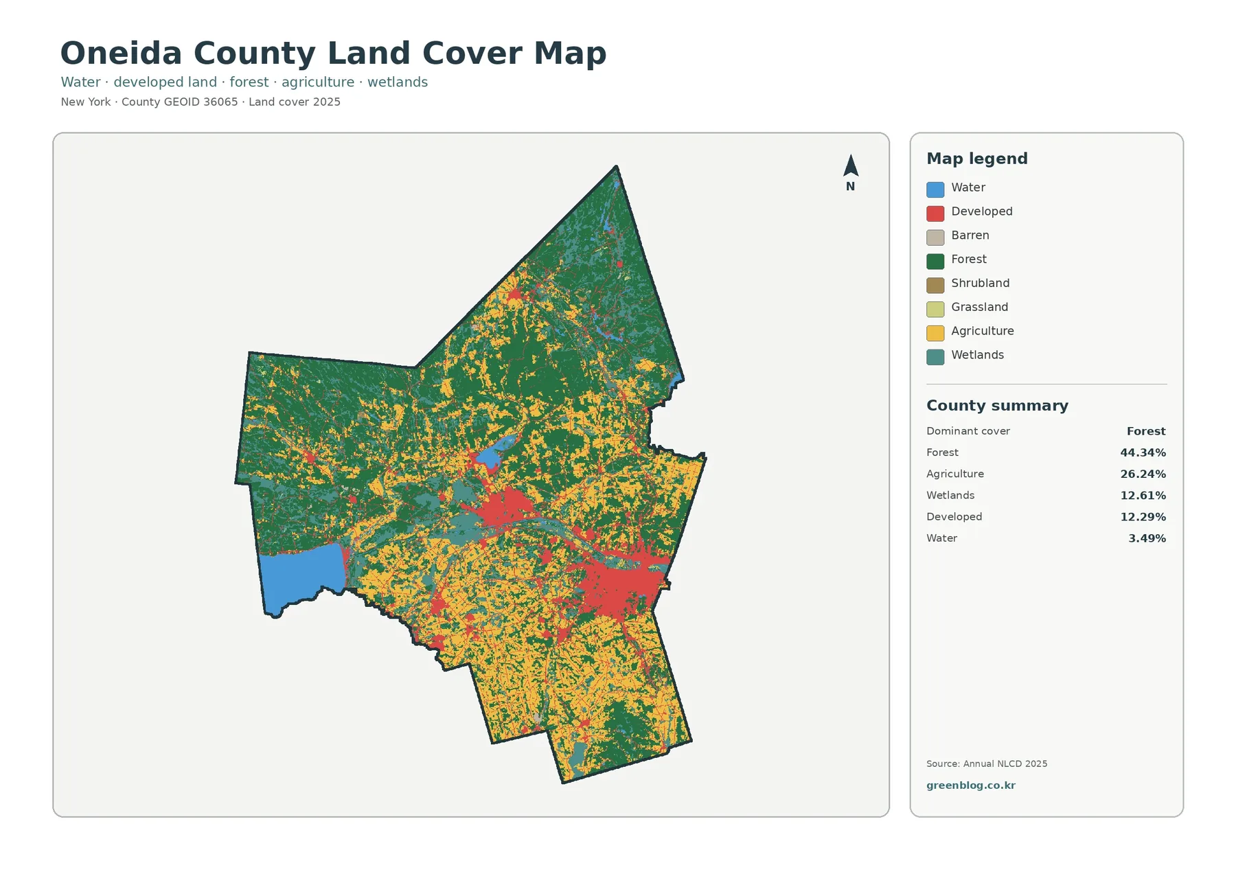
The main land cover map is the best starting point because every major class is visible at once. Dark green forest forms broad, connected areas in the northern part of the county and remains extensive in the west. Yellow agricultural areas are more common across the central and southern sections, where they often appear as a patchwork rather than one continuous block. Red developed land becomes much stronger around Utica and Rome, with smaller concentrations around other settlements. This contrast makes it easy to see why a single county-wide percentage cannot describe the entire landscape.
Wetlands deserve separate attention because they account for 12.61% of the mapped area. They appear as teal patches in a number of northern and central locations and around water-rich low areas. Wetland does not simply mean open water. It can include land that stays saturated or is seasonally wet, so it is useful to distinguish the teal wetland class from the blue water class. Water is only 3.49% in the county summary, yet Oneida Lake occupies enough visible area to become one of the strongest landmarks on the map.
This map is designed for regional comparison rather than parcel-level decisions. It can help answer broad questions such as where forest remains continuous, where agricultural and developed cover intermingle, and how water and wetlands fit into the county’s overall surface pattern. It cannot tell a reader whether a specific parcel is zoned for farming, protected from development, or suitable for a particular project. Those questions require local zoning, parcel, planning, and field information.
Where forest and farmland meet
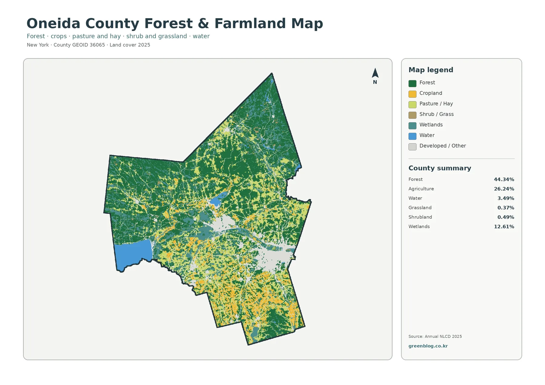
The forest-and-farmland view removes much of the visual competition from urban classes, so the county’s rural pattern becomes easier to read. Forest, at 44.34%, continues in large blocks through the north and west. Agriculture, at 26.24%, is much more frequent from the central part of the county toward the south. The two categories do not meet along one simple dividing line. Instead, farmed areas, wooded tracts, wet areas, and other open cover weave together, especially through the middle of the county.
The map summary also lists grassland at 0.37% and shrubland at 0.49%. Those classes are small in total area, but they help explain some of the transitional patches between larger forests and cultivated land. For a teacher or student, this view is useful when the question is not “what is every land-cover class?” but rather “where is the county more wooded and where is farming more common?” The simplified palette makes that comparison faster without changing the underlying county boundary.
Oneida County’s official agriculture page provides agricultural district maps and farmland-planning material, and the county’s 2025–2030 agricultural strategy emphasizes protecting productive farmland. That context supports the importance of the agricultural pattern visible here, but the map itself should still be read as a land-cover classification. Annual NLCD is based on remotely sensed information and classification methods. It is excellent for county-wide patterns, yet it is not a substitute for a farm boundary survey or a current parcel database.
Impervious surfaces highlight Utica and Rome
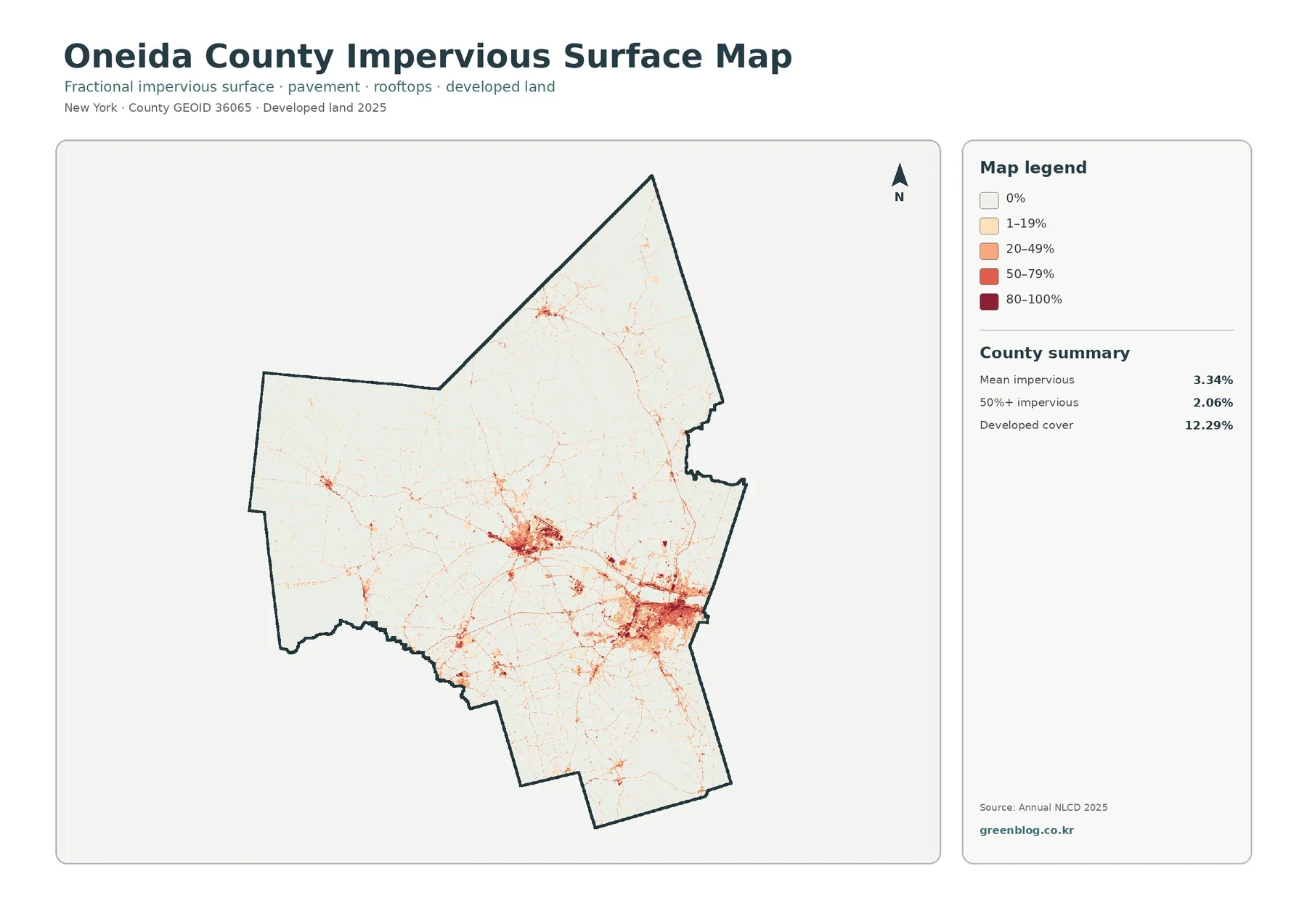
An impervious surface is a surface such as pavement or a roof that allows little rainfall to soak directly into the ground. The county-wide mean impervious value on this map is 3.34%, and 2.06% of the mapped area has impervious cover of 50% or more. Developed cover on the general land-cover map is higher, at 12.29%, because a developed class can include lawns, trees, bare ground, and other surfaces that are not themselves impervious. The two measures therefore describe related but different parts of the built landscape.
The darkest concentrations appear around Utica in the southeast and around Rome farther west. From those clusters, thinner lines extend along transportation and settlement corridors, while most of the northern county remains very light. Smaller centers are visible elsewhere, but they are less extensive than the Utica and Rome concentrations. This map makes the contrast between the largely wooded north and the more intensely built southern urban areas especially easy to see because most undeveloped land fades into the background.
Impervious mapping can be a helpful starting point for discussions about runoff and the built environment, but this image is not a flood-risk or stormwater-capacity map. Oneida County’s planning program separately works with watershed planning, floodplain management, groundwater and surface-water mapping, and nonpoint-source protection. Readers who need to make a water-management or site-specific decision should use those planning resources and current engineering information rather than treating impervious percentage alone as a final answer.
What changed between 1985 and 2025?
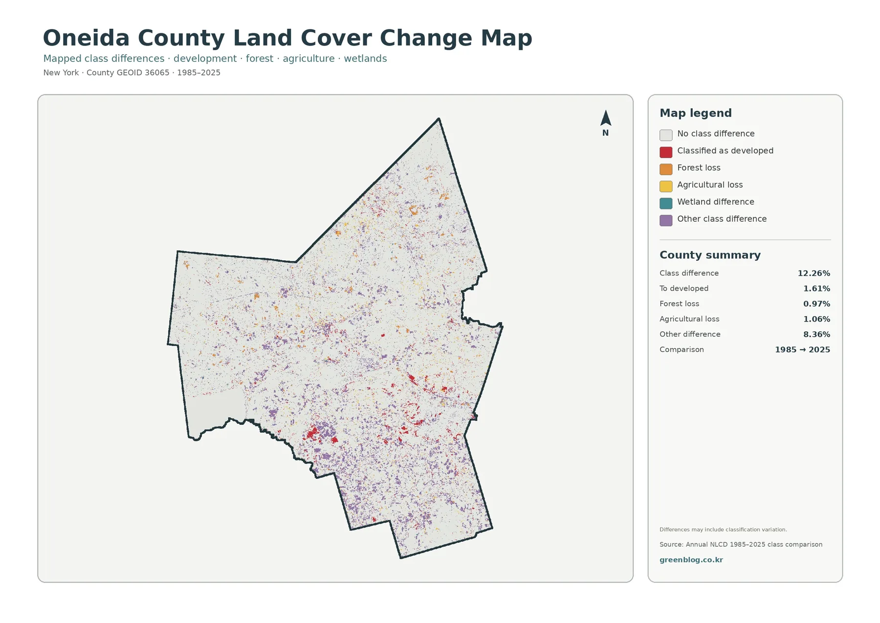
The change map reports a class difference across 12.26% of the county between the two comparison years. Of that area, 1.61% is mapped as change to developed land, 0.97% as forest loss, and 1.06% as agricultural loss. “Other difference” accounts for 8.36%, which is much larger than any single named loss category. Large areas remain uncolored, meaning the assigned class did not differ between the two mapped dates.
Red development-change cells are more noticeable in the southern half of the county and around established developed concentrations. Orange, yellow, purple, and other difference colors are more scattered. A colored cell does not identify the exact reason for a change. Residential construction, vegetation management, agricultural conversion, wetland variation, restoration, or classification differences may all be possible depending on location. The map itself notes that differences can include classification variation, so it should not be used to assign a cause without supporting records.
Long-period comparisons also require some caution because remote-sensing products can be affected by sensor characteristics, classification methods, season, and the resolution of the source data. A single isolated patch is less persuasive than a broad, repeated pattern. The strongest use of this map is therefore exploratory: identify areas where mapped classes differ, compare those locations with the 2025 land-cover and impervious maps, and then consult more detailed local or historical sources if a specific change matters.
Choosing the right map for your purpose
Use the general land-cover map when you need the broadest overview. It keeps forest, agriculture, developed land, wetlands, and water visible at the same time, so it works well for a first look at the county. Choose the forest-and-farmland map when the rural landscape is the main subject. The impervious map is the clearest choice for comparing heavily paved or built surfaces, and the 1985–2025 change map is best when the question is where mapped classifications differ over time.
For a presentation, the maps can be arranged as a short visual sequence. Start with the 2025 totals—44.34% forest and 26.24% agriculture—then use the simplified forest-and-farmland map to show where those categories dominate. Follow with the impervious map to focus attention on Utica, Rome, and smaller developed corridors. Finish with the change map to separate the present-day pattern from the longer historical comparison. This order gives each image a distinct purpose instead of repeating the same explanation four times.
The set can also support field-trip planning, local research, and classroom exercises. A rural-landscape project might compare the wooded north with agricultural areas farther south. A built-environment exercise can begin with high-impervious clusters and then examine local imagery or street information. A water-focused project can start with Oneida Lake and wetland areas on the general map before moving to county watershed resources. In each case, the maps work best as a regional guide that helps narrow a question rather than as a parcel-level authority.
Important limits when reading land-cover data
Land cover describes what is physically covering the ground, while land use describes how people use land. The two concepts overlap, but they are not interchangeable. A developed land-cover class can still contain grass and trees. An agricultural class does not automatically match an agricultural zoning district, tax assessment, or protected-farmland boundary. Keeping that distinction in mind prevents the map from being used for questions it was not designed to answer.
Percentages are also most useful at the county scale. Individual pixels can contain mixed surfaces, and classification boundaries may not line up perfectly with what a person would draw from a current aerial image. The 1985–2025 comparison shows two mapped dates rather than a continuous annual history. If a decision depends on the present condition of a specific site, pair these maps with current local GIS, aerial imagery, parcel information, and field verification.
Download the Oneida County land-cover JPG set
The download contains four original JPG files: the 2025 land-cover map, the forest-and-farmland map, the impervious/developed-land map, and the 1985–2025 land-cover change map. The WebP images on this page are reduced for convenient viewing, so the JPG versions are the better choice when you want to print, place a map in a document, or zoom in more closely during a presentation.
Each JPG is 2480×1754 pixels. The package identifies these files as the original available resolution but does not mark them as meeting its A3 high-resolution reference, so very large-format printing should be tested before final use. For ordinary documents, classroom handouts, presentations, and on-screen comparison, the layout provides a clear county boundary, legend, summary figures, and enough visual detail to compare the main patterns.
Frequently Asked Questions
What is the largest land-cover class in Oneida County?
Forest is the largest 2025 class at 44.34%, followed by agriculture at 26.24%. Wetlands account for 12.61%, developed land 12.29%, and water 3.49%.
Why is mean impervious cover lower than developed land?
Impervious cover measures surfaces such as pavement and rooftops, while developed land can also include lawns, trees, soil, and other surfaces that still allow some water to soak in.
What files are included in the download?
The ZIP contains four original JPG maps: 2025 land cover, forest and farmland, impervious/developed land, and 1985–2025 land-cover change.
Map File Information
Oneida County Land Cover Maps
- Included Files: Use only the versions confirmed in the article and supplied images
- File Type: Use the confirmed download contents
- Intended Use: Printing, education, presentations, and map-based projects
Related Maps
- Albany County Land Cover Map
- Allegany County New York Land Cover Map
- Bronx County New York Land Cover Map
Sources and references
- MRLC Annual NLCD Data – annual land-cover datasets and downloads used for broad land-cover comparison.
- USGS Annual NLCD Land Cover Classification – descriptions of the land-cover classes and classification system.
- U.S. Census Bureau TIGER/Line Shapefiles – official geographic boundary data.
- Oneida County Agriculture – county agricultural district and farmland-planning resources.
- Oneida County Environment & Water – county information on watershed, floodplain, groundwater, surface-water, and environmental planning.
Green Map creates custom-edited map images using open geographic data sources such as geoBoundaries, Natural Earth, OpenStreetMap, and government open data.
These maps are edited visual materials, not raw data files, and are provided for education, documents, presentations, and graphic reference.