Niagara County has a land-cover pattern that is easy to recognize once the four maps are viewed together. Farmland covers much of the northern, central, and eastern county, while the strongest concentration of developed land sits along the western side and in a separate cluster around Lockport. Wetlands and forest break up the agricultural landscape, and major water features give the county several distinct edges and interior reference points.
This page includes a general land-cover map, a forest-and-farmland view, an impervious-surface map, and a 1985–2025 change map. The four original JPG maps are available in one download for printing, classroom work, presentations, and county-to-county comparison. Land cover describes what is physically covering the ground in satellite-based classification; it is not a zoning map, ownership map, or legal land-use record.
Table of Contents
A county split between broad farmland and concentrated development
The 2025 summary identifies agriculture as the dominant class at 48.32 percent. Developed land accounts for 20.87 percent, wetlands for 15.21 percent, forest for 12.86 percent, and water for 2.06 percent. Those numbers describe a county where farming remains the largest mapped surface, but they do not suggest a uniform rural landscape. The western edge is visually different from most of the interior, and smaller pockets of forest and wetland repeatedly interrupt the large agricultural blocks.
Development is most prominent in the west and southwest, where the Niagara Falls area and nearby communities form a broad urbanized zone. Lockport appears as another distinct concentration near the center of the county. Away from these centers, development becomes thinner and often follows the road network as narrow lines or small nodes. Farmland is much more continuous across the north-central and eastern areas, although wooded tracts and wetlands remain visible between fields.
Niagara County’s official planning material adds useful geographic context. The county includes the Niagara River, Lake Ontario shoreline, the Erie/Barge Canal, Tonawanda Creek, Eighteen Mile Creek, the Niagara Power Project Reservoir, and numerous wetlands and stream corridors. These planning resources are not the same thing as a land-cover classification, but they help explain why water and wetland patterns matter when interpreting the map. The county’s agricultural protection plan likewise documents the importance of farmland and agricultural soils in local planning.
Reading the 2025 land-cover pattern
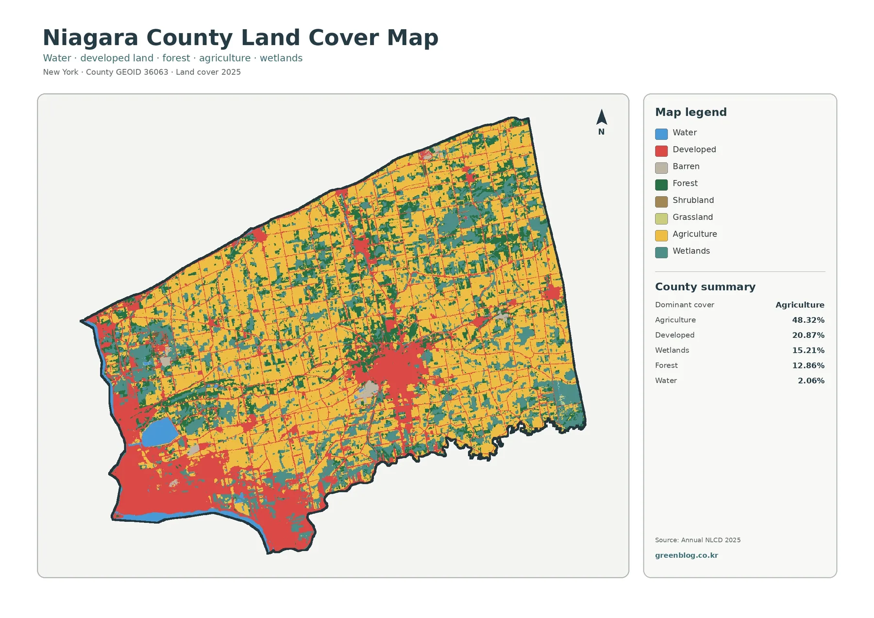
The general map is the best place to start because it keeps the major classes on one page. Large agricultural areas form the background across much of the county. Forest is less continuous and appears in scattered tracts, while wetlands form broader patches in several southern and eastern areas. Developed land becomes dominant toward the western urban zone and stands out again around Lockport. Water occupies a smaller share overall, yet the river, reservoir, and other water bodies provide strong landmarks for locating nearby land-cover classes.
Agriculture at 48.32 percent is nearly half of the mapped county, but the map shows why a percentage alone is not enough. Fields are not one unbroken block. Wooded areas, wet ground, roads, settlement clusters, and water features divide them into many shapes. This makes the map useful for comparing a predominantly agricultural interior with the more developed west without reducing either part of the county to a single class.
Wetlands deserve particular attention because their 15.21 percent share is larger than the forest share. They appear as meaningful landscape features rather than a minor fringe category. In several places they sit beside forest or water, while elsewhere they occupy gaps within agricultural areas. The map can therefore support a first look at where wet environments are concentrated, but it should not be used as a regulatory wetland boundary. Official wetland mapping and site-specific review are required for that purpose.
Water represents 2.06 percent of the mapped surface. That percentage may look modest, but water has an outsized value for orientation. The western river boundary, larger inland water features, and smaller channels help a reader connect the land-cover colors to recognizable parts of Niagara County. When studying a watershed or riparian corridor, the most useful approach is to locate the water first and then examine the adjacent wetland, forest, agricultural, and developed classes.
Where forest remains within the farm landscape
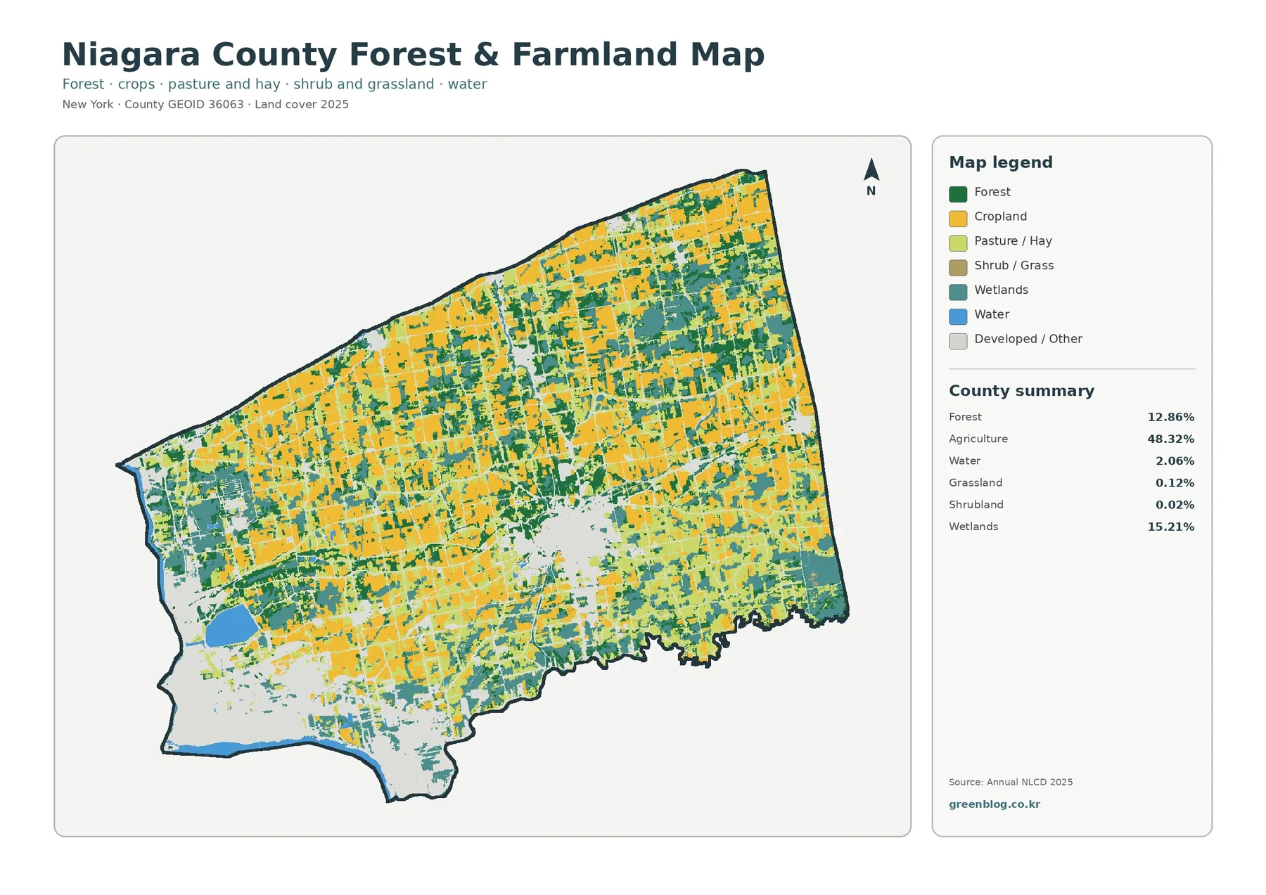
The forest-and-farmland version simplifies the visual competition among classes and makes the 48.32 percent agricultural share especially clear. Broad crop and pasture areas dominate much of the map, but forest at 12.86 percent still appears throughout the county in numerous tracts. It is not confined to one corner. Wooded patches are mixed through farm country and become more noticeable near some wetland-rich and less-developed areas.
Wetlands remain visible at 15.21 percent, which is important when comparing open land with tree cover. A break in farmland is not automatically forest. In some areas the interruption is wetland, water, or developed land instead. Grassland is listed at 0.12 percent and shrubland at 0.02 percent, so neither is a major countywide class in this map. Their small shares are better treated as local features than as defining parts of the county pattern.
This map is useful for environmental education and broad habitat comparison because it separates two of the most familiar land-cover types without hiding the wetlands and water around them. It can also help a reader identify where a large agricultural zone approaches a wooded tract. It cannot tell whether a particular field is actively farmed in a given season, whether a forest parcel is protected, or whether a property belongs to an agricultural district. Those questions require different records.
That distinction matters in Niagara County because official agricultural planning uses parcel information, soil quality, development pressure, and other criteria that are outside this map’s purpose. Satellite classification asks what the surface looks like at the observation date. Land-use and farmland-protection programs ask different legal, economic, and planning questions. Using the two types of information together can be valuable, but their percentages should not be treated as interchangeable.
Impervious surfaces reveal the urban centers and road network
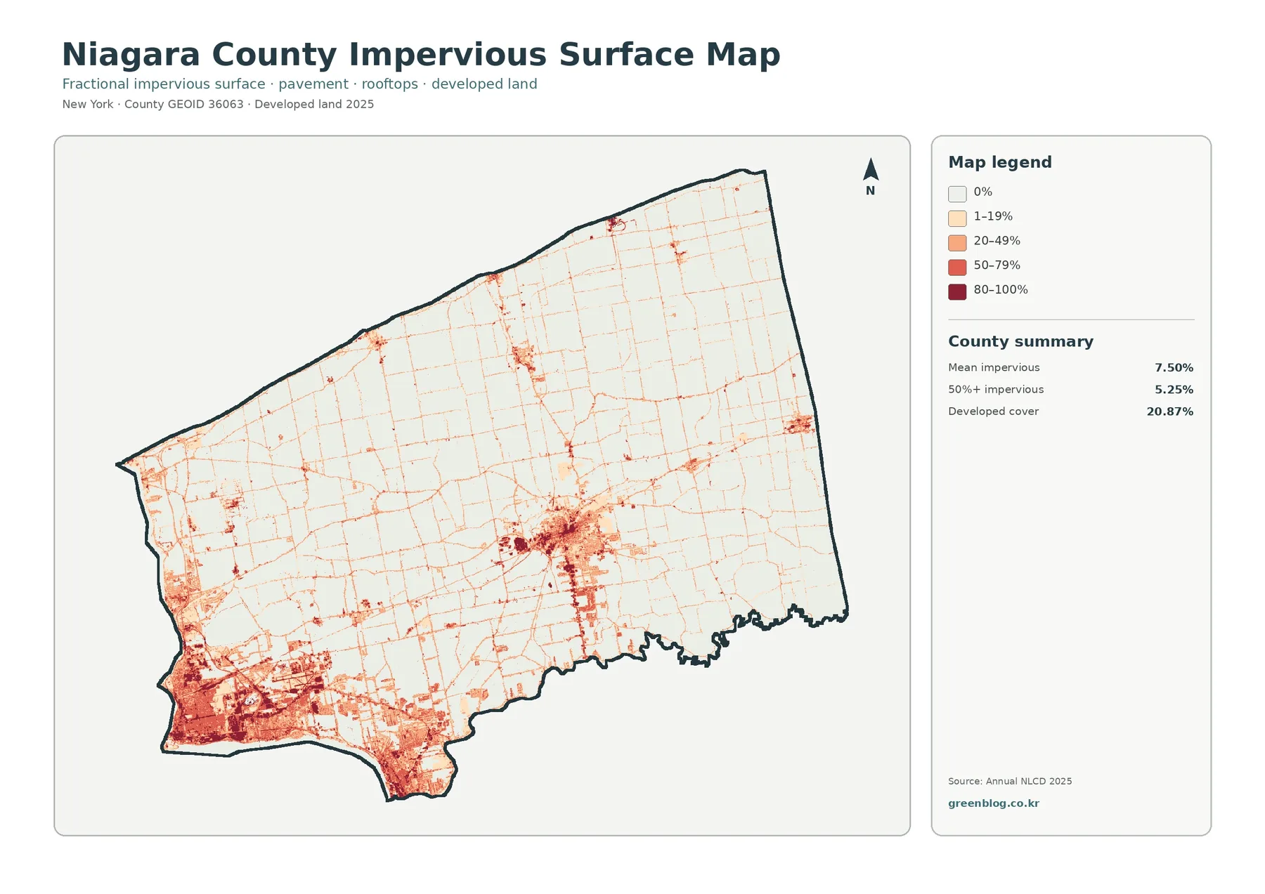
An impervious surface is a roof, paved road, parking area, or similar surface that does not readily absorb rainfall. The county summary gives a mean impervious value of 7.50 percent and shows 5.25 percent of the county in the 50-percent-or-higher impervious range. The developed land-cover share is 20.87 percent, which is a different measure. A developed cell can still contain lawns, trees, or other permeable surfaces, so the two percentages should not be expected to match.
The darkest impervious concentrations are in the west and southwest, with another prominent center around Lockport. Outside those areas, the road grid appears as fine lines extending through the agricultural interior. Small towns and intersections create compact spots of higher density. This makes the impervious map more detailed than the general developed-land class: instead of simply asking where development exists, it shows where built surfaces are especially concentrated.
For watershed lessons or planning context, that difference is useful. Higher impervious cover can be one factor affecting runoff, but this map alone does not measure flood risk, drainage performance, stream condition, or water quality. Those questions require rainfall, elevation, soils, stormwater infrastructure, and hydrologic data. The safest use of the map is to identify places where hard surfaces are relatively dense and then combine that observation with the appropriate specialized information.
The map also provides a quick way to compare settlement form within the county. The western urban area forms a broad mass, Lockport forms a tighter inland center, and rural roads remain narrow against a mostly light background. A classroom or presentation can use this contrast to explain why “developed land” is not one uniform surface. Urban cores, suburban neighborhoods, industrial areas, and rural roads can all be developed while containing very different amounts of impervious cover.
What changed between 1985 and 2025
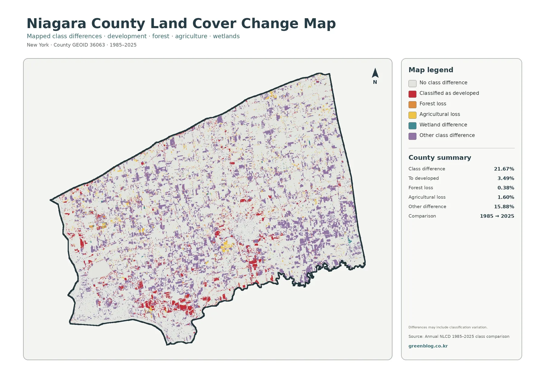
The change map compares land-cover classifications from 1985 and 2025. Its summary reports a class difference for 21.67 percent of the county. Cells classified as changing to developed account for 3.49 percent, forest loss for 0.38 percent, agricultural loss for 1.60 percent, and other differences for 15.88 percent. These values describe differences between two mapped classifications. They should not be read as a direct accounting of acres physically converted for a single cause.
Mapped changes to developed land are most noticeable near existing developed areas in the west, southwest, and around the central urban cluster. Other class differences are more widely scattered. The result is not a simple west-to-east progression or one continuous expansion front. Instead, the map contains many small changes mixed with larger concentrations, which is why comparing a selected location against the current 2025 map is more informative than reading the change colors by themselves.
A long comparison period also introduces interpretation limits. Satellite sensors, source imagery, classification methods, and landscape conditions can differ between dates. A raster cell represents a generalized area, and one cell may contain several real surfaces. When the dominant surface changes slightly, the recorded class can change even though the site did not undergo a dramatic transformation. Small features may also be missed because they occupy less than a full cell.
For that reason, the change map works best as a screening and comparison tool. It can help identify places worth examining with historical aerial photography, local planning records, or field observations. It is less suitable as final evidence for a property-level change claim. If a project depends on a specific year or parcel, use a source created for that level of detail rather than relying solely on the countywide raster comparison.
How to compare all four Niagara County maps
A practical reading sequence starts with the general map. Pick a recognizable part of the county and note whether agriculture, development, forest, wetland, or water dominates. Move to the forest-and-farmland map to simplify the natural and agricultural pattern. Then check the impervious map to see whether developed areas contain dense built surfaces or relatively open development. Finish with the change map to see whether the same location was classified differently between 1985 and 2025.
The western side provides a clear example. Development occupies a large area on the general map, but the impervious view separates the densest built sections from lighter developed surroundings and road corridors. In the agricultural interior, the forest-and-farmland map makes field continuity easier to see while preserving wooded and wetland interruptions. The change map can then show whether selected cells within those landscapes differ from their 1985 classification.
For a lesson or report, two maps may be more effective than four at once. Pair the general map with the forest-and-farmland map to discuss rural landscape structure. Pair the impervious map with the change map to discuss the location of built surfaces and long-term classification differences. For water-related questions, begin with the general map, identify rivers, reservoir areas, and wetlands, and then add official hydrology or wetland layers if precise boundaries are needed.
County-to-county comparison is another useful application because the four maps use a consistent visual approach. Niagara County’s large agricultural share, substantial wetland share, and concentrated western development create a different balance from a highly urban county or a heavily forested Adirondack county. Comparing maps built from the same kind of source data makes those broad contrasts easier to discuss, provided the observation years and classification schemes are kept consistent.
Download the original JPG map set
The download archive contains the original JPG versions of the general land-cover map, forest-and-farmland map, impervious-surface map, and land-cover-change map. They are useful when a larger image is needed for printing, a slide deck, a worksheet, or a side-by-side county comparison. Each file can be opened separately, so there is no need to extract information from a combined screenshot.
Use the JPGs as county-scale reference graphics rather than parcel surveys. Enlarging an image does not add new ground detail beyond the source classification. If a project concerns a property line, wetland permit, zoning designation, floodplain, or engineering decision, consult the responsible agency and the dataset designed for that purpose.
Scale, classification, and other limits
Annual NLCD products classify the landscape as raster cells. In plain terms, the map is built from a grid, and each cell receives a land-cover class based on the source data and classification process. A cell can contain more than one real-world surface. A field edge with trees and a road, for example, may still be assigned one dominant class. This generalization is necessary for consistent regional and national mapping but limits property-level interpretation.
Observation date matters as well. The current map represents 2025 classification, while the change map compares 1985 with 2025. Construction, vegetation management, farming decisions, wetland conditions, or other local changes occurring after the mapped date will not appear immediately. A current aerial image or local record may therefore be a better choice when the question concerns a very recent change.
Finally, land cover should not be confused with land use. A satellite classification may identify vegetation, crops, water, wetland, or developed cover, while a planning map may categorize parcels as residential, agricultural, commercial, conservation, or another legal or administrative use. Both can describe the same place from different perspectives, but their categories and percentages answer different questions.
Useful ways to apply these maps
- Compare the broad agricultural interior with the more developed western part of Niagara County.
- Show students how forest and wetlands remain embedded within a farm-dominated landscape.
- Compare developed land with the density of roofs, roads, and pavement shown by impervious cover.
- Locate 1985–2025 classification differences before checking historical imagery or local records.
- Build a consistent visual comparison with other New York county land-cover maps.
Niagara County is especially useful for these comparisons because several landscape types are strongly represented in one place. Large farming areas, a major developed zone, wetland complexes, forest patches, river and lake settings, and an inland urban center can all be examined without changing county boundaries. The maps make those contrasts visible, while the source notes and limitations help keep the interpretation at the appropriate scale.
Frequently Asked Questions
What is the largest land-cover class in Niagara County?
Agriculture is the largest class in the 2025 summary at 48.32 percent. Developed land is 20.87 percent, wetlands 15.21 percent, forest 12.86 percent, and water 2.06 percent. These are land-cover classifications rather than legal land-use percentages.
Why is developed land different from impervious surface?
Developed land is a broader land-cover category. Impervious surface measures the presence of hard surfaces such as roofs and pavement. A developed neighborhood can include lawns and trees, so it may be mapped as developed without being highly impervious everywhere.
Does the 21.67 percent change value mean that one fifth of the county was physically rebuilt?
No. It means that 21.67 percent of mapped cells have a different class in the 1985 and 2025 comparison. Some differences represent real landscape change, while classification and source-data differences can also affect the result.
Can I use this map to determine zoning or whether a parcel can be developed?
No. The maps describe county-scale land cover and do not provide zoning, ownership, parcel boundaries, building permissions, or regulatory wetland determinations. Use local government and agency records for those decisions.
Map File Information
Niagara County Land Cover Map Files
- Included Files: Use only the versions confirmed in the article and supplied images
- File Type: Use the confirmed download contents
- Intended Use: Printing, education, presentations, and map-based projects
Related Maps
- Albany County Land Cover Map
- Allegany County New York Land Cover Map
- Bronx County New York Land Cover Map
Sources and references
- MRLC Annual NLCD Data — source portal for Annual NLCD land-cover products
- USGS Annual NLCD Land Cover Classification — classification background and class descriptions
- U.S. Census Bureau TIGER/Line Shapefiles — county boundary data
- Niagara County Agricultural & Farmland Protection Plan — county-specific agricultural and farmland-planning context
- Niagara County Land Use & Environment Plan — county-specific water, wetland, natural-resource, and land-use context
Green Map creates custom-edited map images using open geographic data sources such as geoBoundaries, Natural Earth, OpenStreetMap, and government open data.
These maps are edited visual materials, not raw data files, and are provided for education, documents, presentations, and graphic reference.