A country can emit a large amount of carbon dioxide yet still have a moderate value on this indicator, while a smaller economy can record a high percentage with much lower absolute emissions. The reason is the denominator. The World Bank series Adjusted savings: carbon dioxide damage (% of GNI) converts selected CO₂ emissions into a monetary damage estimate and then compares that estimate with gross national income (GNI). It is therefore a measure of the estimated carbon-damage burden relative to national income, not a conventional emissions ranking.
The latest non-empty extract contains 204 economies. It is close to a common-year dataset, but not quite: 186 observations, or 91.2%, are dated 2021, while 18 economies retain their latest available value from 1985 through 2020. That difference matters. A chart of all 204 rows is useful for seeing each economy’s last available value, but it should not be presented as a single-year world ranking. For direct comparisons, this article uses the 186 observations that share the 2021 year field.
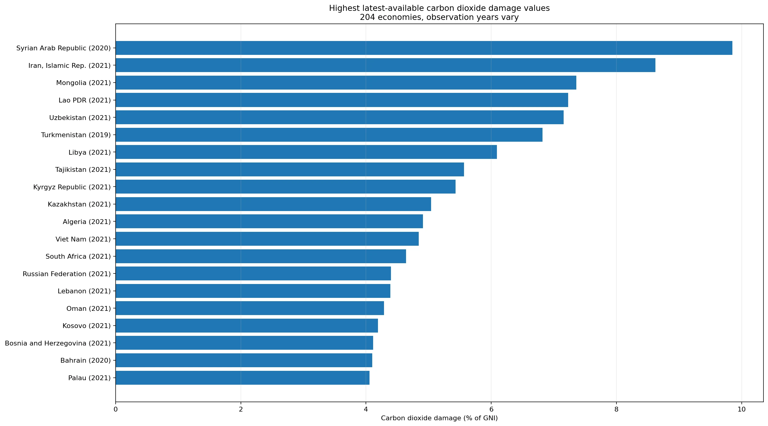
Table of Contents
Most latest observations are from 2021, but 18 economies have an older year
The year distribution is unusually concentrated. In addition to the 186 observations from 2021, five are from 2020 and five from 2019. The remaining eight are scattered across 2018, 2015, 2014, 2011, 2007, 2000 and 1985. American Samoa has the oldest latest-available value, dated 1985. French Polynesia and New Caledonia are dated 2000, Greenland 2007 and Eritrea 2011. These are valid observations for their stated years, but they are not substitutes for 2021 values.
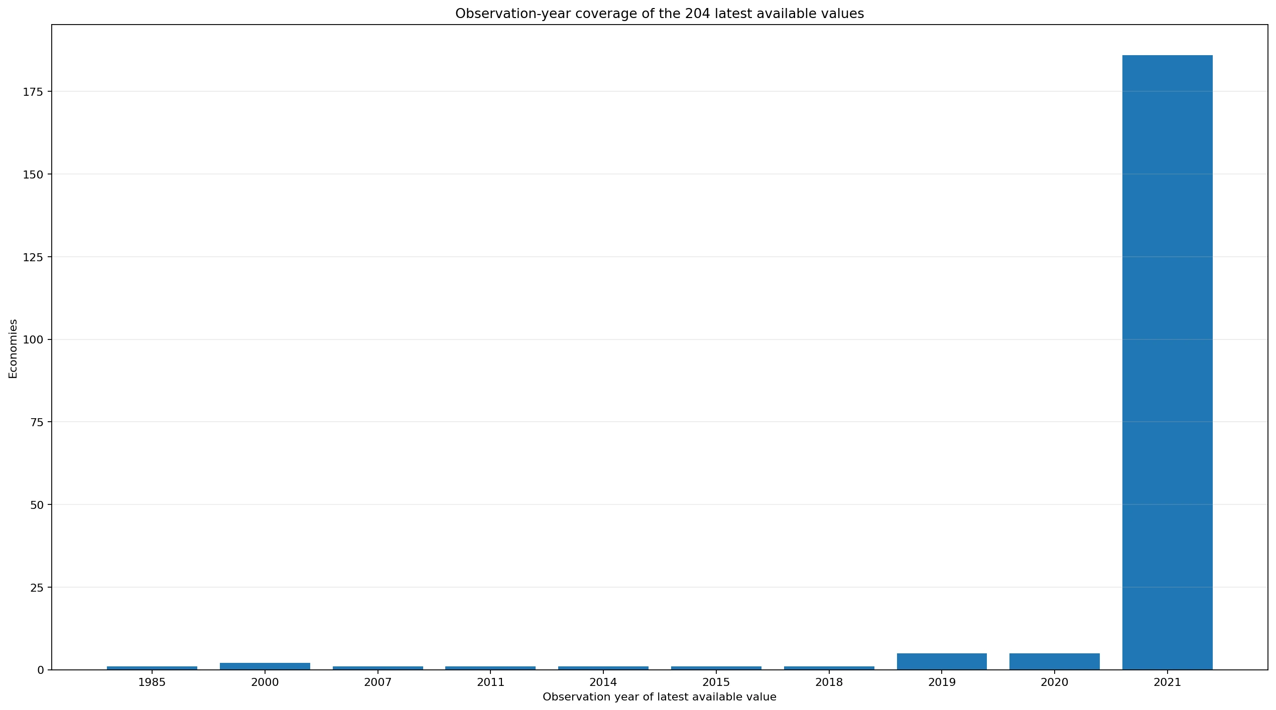
The mixed-year issue changes how the apparent leaders should be described. Syrian Arab Republic has the highest value in the 204-row latest-available set at 9.85%, but its observation is from 2020. Turkmenistan is also among the high latest values at 6.82%, with a 2019 observation. Once the comparison is restricted to 2021, the ordering changes. Keeping the observation year beside the value prevents an older data point from being mistaken for a current or same-year result.
Iran has the highest value in the 2021 same-year subset
Among the 186 economies with a 2021 observation, Iran, Islamic Rep. records the highest carbon-dioxide-damage share at 8.62% of GNI. Mongolia follows at 7.36%, Lao PDR at 7.23% and Uzbekistan at 7.16%. Libya is at 6.09%, followed by Tajikistan at 5.57%, Kyrgyz Republic at 5.43% and Kazakhstan at 5.04%. Eight economies in total are at or above 5% in the 2021 subset.
Those percentages should not be read as observed losses equal to a stated share of national income. They are outputs of the World Bank’s valuation method. A high ratio can arise from a large CO₂ damage estimate, a relatively small GNI denominator, or both. The indicator is therefore especially useful for asking how large the modeled carbon damage is compared with the scale of income in each economy. It is less suitable for answering which country emits the most tonnes of CO₂.
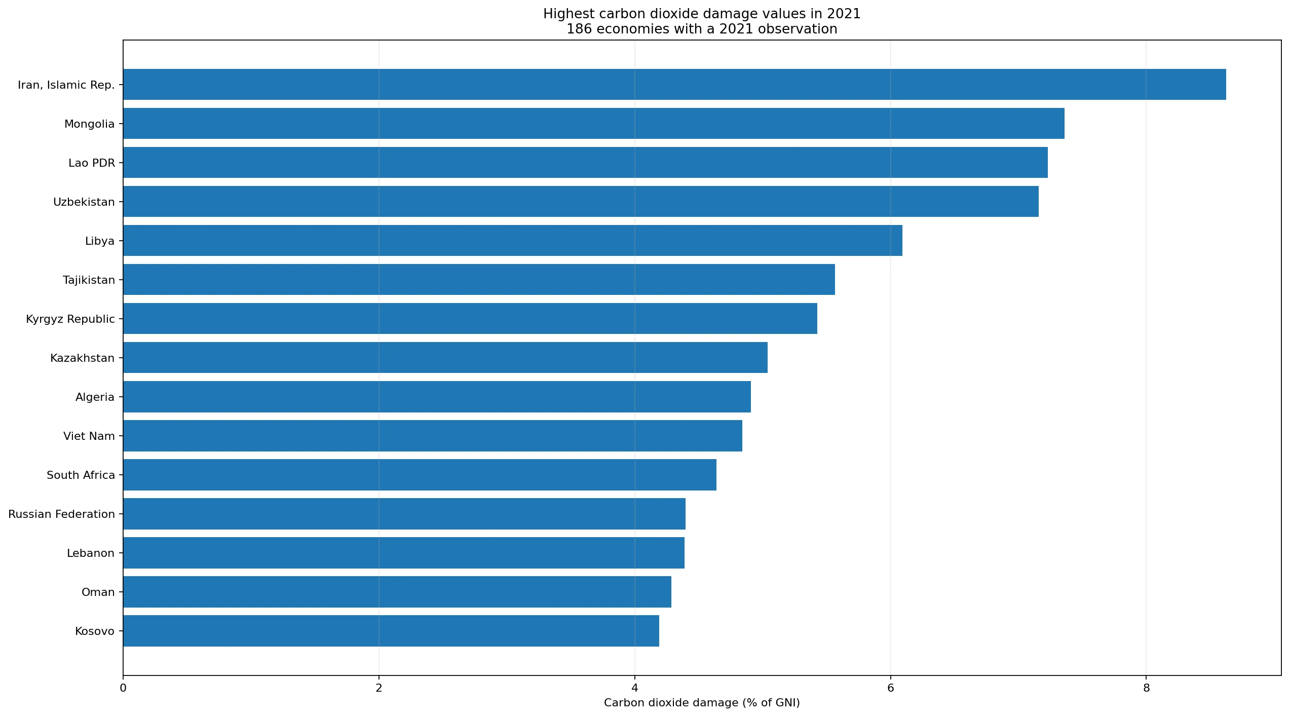
| Economy | 2021 value |
|---|---|
| Iran, Islamic Rep. | 8.62% |
| Mongolia | 7.36% |
| Lao PDR | 7.23% |
| Uzbekistan | 7.16% |
| Libya | 6.09% |
| Tajikistan | 5.57% |
| Kyrgyz Republic | 5.43% |
| Kazakhstan | 5.04% |
| Algeria | 4.91% |
| Viet Nam | 4.84% |
The 2021 median is 1.30%, while the mean is higher at 1.82%
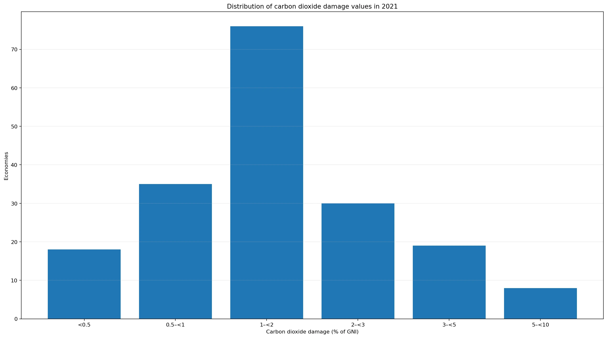
The center of the 2021 distribution is far below the largest observations. The median is approximately 1.30% and the arithmetic mean is about 1.82%. The first quartile is roughly 0.90% and the third quartile 2.32%. The mean exceeds the median because a relatively small group of high values stretches the upper tail. In other words, the typical economy in this same-year sample is much closer to 1% than to the 5–9% range seen at the top.
Simple bands make the shape clearer. Eighteen economies are below 0.5%; 35 are from 0.5% to below 1%; 76 are from 1% to below 2%; 30 are from 2% to below 3%; 19 are from 3% to below 5%; and eight are from 5% to below 10%. Combining the first three groups, 129 of 186 economies—about 69%—are below 2%. The distribution is therefore concentrated in the lower ranges rather than evenly spread across the full scale.
What the World Bank means by carbon dioxide damage
The official World Bank metadata defines this series as the cost of damage associated with carbon dioxide emissions from fossil-fuel use and the manufacture of cement. The methodology described for the indicator applies a monetary damage value of US$40 per tonne of CO₂, stated as the unit damage in 2017 US dollars for CO₂ emitted in 2020, and multiplies it by the number of tonnes emitted. The resulting damage estimate is then expressed as a percentage of GNI. The full definition is available in the World Bank DataBank metadata.
This definition is narrower than many readers may expect from the word “damage.” It does not add up every flood, drought, heatwave, health event or infrastructure loss observed inside a country. Nor does it represent every greenhouse gas. It is a standardized monetary valuation attached to a defined set of CO₂ emissions. That makes the indicator comparable within its accounting framework, but it also means the number should not be described as a country’s measured climate-disaster bill.
Why the GNI denominator changes the ranking
GNI measures income earned by residents of an economy, including the effect of primary income received from and paid abroad. Because the carbon-damage estimate is divided by GNI, two economies with the same modeled damage amount can have very different percentages. A larger income base lowers the ratio, while a smaller income base raises it. The indicator therefore combines an environmental numerator with an economic denominator.
This explains why the ranking does not mirror lists of total CO₂ emissions. Very large economies can produce substantial emissions but also have very large GNI. Smaller or more energy-intensive economies can rank higher on the percentage even when their absolute emissions are far below those of the largest emitters. For a complete picture, the ratio can be read alongside total CO₂ emissions, emissions per person and emissions per unit of GDP, each of which answers a different question.
The indicator is a component of adjusted savings, not the adjusted-savings rate itself
The phrase “adjusted savings” in the indicator name can create another misunderstanding. The carbon-dioxide-damage series is one environmental damage component used in the broader adjusted net savings framework. Adjusted net savings starts from national saving and makes several additions and deductions, including education expenditure, depletion of natural resources and pollution damage. The CO₂ item is therefore one adjustment, not the final adjusted-savings balance.
A country with a high carbon-damage share could still have other positive or negative components that materially change its overall adjusted net savings. Conversely, a low carbon-damage share does not by itself establish that the country is saving enough for long-term sustainability. Readers interested in the full savings measure should consult the complete adjusted net savings series rather than treating NY.ADJ.DCO2.GN.ZS as a summary sustainability score.
The 204-row latest-value list is useful, but it is not a 2021 ranking
When all latest available values are sorted together, Syrian Arab Republic appears first at 9.85% for 2020, followed by Iran at 8.62% for 2021, Mongolia at 7.36%, Lao PDR at 7.23% and Uzbekistan at 7.16%. Turkmenistan’s 6.82% value is dated 2019. The chart of latest values deliberately places the observation year beside each economy so that the mixed timing is visible instead of hidden.
This distinction is more than a technical footnote. The numerator can change with fuel use, industrial activity and emissions, while the GNI denominator changes with the economy. A one- or two-year difference can matter, especially around large economic or energy shocks. Much older observations need even more caution. The last available value for American Samoa is from 1985, for example, so it should be treated as a historical last observation rather than evidence of the economy’s present position.
A low percentage is not automatically a climate-policy score
At the lower end of the 2021 subset, Puerto Rico (US) is at 0.08%, Switzerland 0.20%, Sweden 0.22%, Iceland 0.26% and Congo, Dem. Rep. 0.27%. These low ratios can arise for different reasons. An economy may have a relatively low level of fossil-fuel and cement CO₂ emissions, a high GNI denominator, a lower-carbon electricity system, a different industrial structure, or some combination of those factors.
For that reason, the indicator should not be turned into a simple league table of climate-policy quality. It does not measure every greenhouse gas, land-use emissions, policy ambition, adaptation, renewable-energy deployment or future transition plans. A country can have a low ratio for structural reasons that are not the result of current policy, while another can be reducing emissions rapidly but still have a high ratio because of its inherited energy and industrial system.
A trend question requires the full time series, not one latest observation
The dataset used here contains one latest non-empty row per economy. It can describe the cross-country distribution, but it cannot tell whether an individual country’s ratio is rising or falling. A trend analysis would require the full annual series so that changes in CO₂ emissions and GNI can be observed through time. It would also be important to check whether the indicator’s valuation method is consistent across the period being compared.
This is particularly important for the 18 economies whose latest value predates 2021. An old last observation should not be projected forward. If the goal is to assess a country’s current carbon-damage burden, the most recent emissions, national-income and energy data should be checked alongside the World Bank series. The latest-value extract is a strong starting point for comparison, but it is not a forecast or an estimate for missing years.
A practical way to read the numbers without over-interpreting them
Five checks make this indicator much easier to use. First, confirm the observation year before comparing two economies. Second, use the 2021 subset for the cleanest same-year cross-country comparison in this extract. Third, remember that the ratio is influenced by both the modeled CO₂ damage and GNI. Fourth, treat the monetary damage as a standardized valuation rather than an observed national loss account. Fifth, distinguish this carbon-damage component from the broader adjusted net savings measure.
With those limits in place, the indicator provides a useful economic perspective on carbon emissions. The 2021 median of 1.30% offers a reference point for the middle of the distribution, while the eight economies at 5% or above show where the modeled burden is especially large relative to national income. The measure becomes most informative when combined with emissions, energy and income indicators rather than used as a standalone verdict on environmental performance.
Frequently Asked Questions
What does a carbon dioxide damage value of 2% of GNI mean?
It means the World Bank’s standardized monetary estimate of carbon dioxide damage is equivalent to about 2% of that economy’s gross national income. It is not a measured disaster-loss rate or the share of income physically lost.
Can all 204 latest values be ranked as if they were from 2021?
No. Although 186 observations are dated 2021, 18 economies retain an earlier latest value from 1985–2020. Same-year comparisons should use the 186 observations that actually share the 2021 year field.
Does a higher percentage always mean higher total CO2 emissions?
No. The indicator divides a modeled carbon-damage amount by GNI, so both emissions-related damage and the size of national income affect the ratio. It does not reproduce a ranking of total tonnes emitted.
Related Articles
Green Map creates custom-edited map images using open geographic data sources such as geoBoundaries, Natural Earth, OpenStreetMap, and government open data. These maps are edited visual materials, not raw data files, and are provided for education, documents, presentations, and graphic reference.