A country comparison of net forest depletion relative to gross national income (GNI) looks very different from a map of forest-cover loss. The World Bank indicator Adjusted savings: net forest depletion (% of GNI) (NY.ADJ.DFOR.GN.ZS) values the amount by which roundwood harvest exceeds natural growth using unit resource rents, then expresses that value as a share of GNI. The map therefore compares the economic value of net forest resource depletion with the size of each economy; it does not show the percentage of forest area that disappeared.
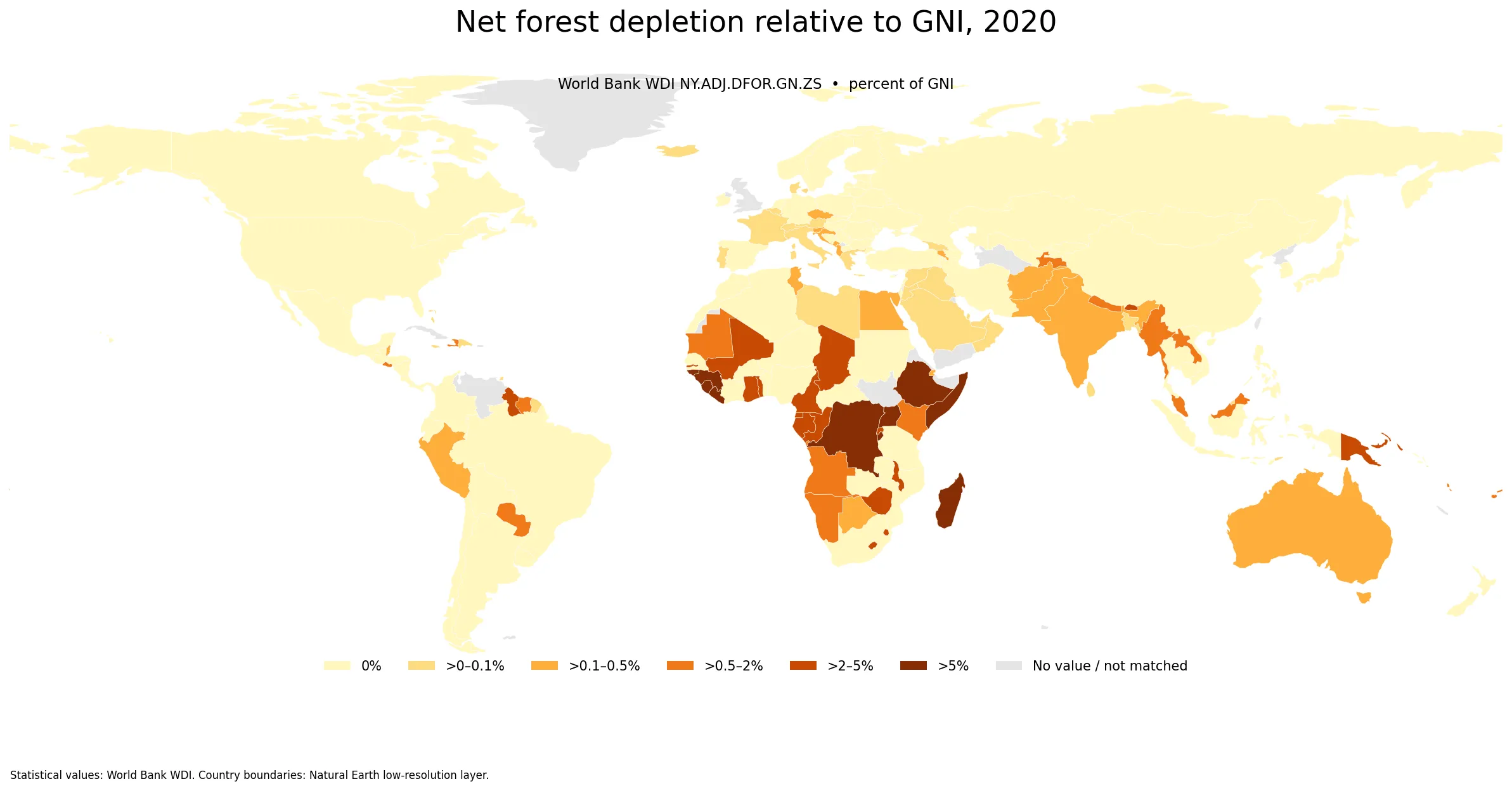
Table of Contents
This is not a forest-area-loss rate
The distinction is central to interpreting the map. World Bank metadata defines net forest depletion as the product of unit resource rents and the amount by which roundwood harvest exceeds natural growth. Because the result is then divided by GNI, the indicator combines a physical resource-flow concept with an economic valuation and an economy-size denominator. Two countries with similar forest-area change can therefore have very different values in this series.
A reported value of 0% also does not prove that there was no logging, deforestation, degradation, or forest-area decline. The indicator captures a narrower concept: the economic value assigned to harvest in excess of natural growth. Questions about forest-cover change, primary forest, degradation, biodiversity, carbon, or protected land require other indicators.
The 2020 distribution is extremely skewed
After regional and income-group aggregates are excluded, the World Bank country/economy master contains 217 rows. A numeric 2020 observation is available for 174 of them. Across those 174 observations, the simple unweighted mean is 1.03% of GNI, while the median is only 0.009%. The first quartile is 0.0% and the third quartile is about 0.47%. The large gap between the mean and median shows how strongly a relatively small group of high observations pulls the average upward.
Among the 174 numeric observations, 71 are reported at 0% and 103 are above zero. 36 exceed 1% of GNI, 10 exceed 5%, and only 5 exceed 10%. A single global-looking average therefore hides the most important feature of the distribution: many very low values and a small upper tail with much larger ratios.
Liberia and Burundi record the highest 2020 values
Liberia has the highest observation in the supplied 2020 table at 18.39% of GNI. Burundi follows at 13.77%, Somalia at 11.52%, Guinea-Bissau at 10.96%, and the Democratic Republic of the Congo at 10.20%. All ten of the highest observations are above 5%.
| Country or economy | Net forest depletion, 2020 (% of GNI) |
|---|---|
| Liberia | 18.39% |
| Burundi | 13.77% |
| Somalia, Fed. Rep. | 11.52% |
| Guinea-Bissau | 10.96% |
| Congo, Dem. Rep. | 10.20% |
| Uganda | 8.52% |
| Sierra Leone | 7.48% |
| Madagascar | 5.78% |
| Ethiopia | 5.44% |
| Guinea | 5.32% |
These values should not be rewritten as a ranking of countries that physically lost the most forest. The numerator is an economically valued depletion measure and the denominator is GNI. A country with a small economy can record a high ratio without having the world’s largest absolute forest loss, while a large economy can record a small ratio even when forestry activity is substantial.
Why so many economies are reported at 0%
Brazil, Canada, the United States, China, Indonesia, the Russian Federation, Japan, Germany, and Korea are all reported at 0% in this 2020 dataset, while India is about 0.19%. That pattern is not an environmental scorecard in which zero automatically means “no forest problem.” It reflects the particular net-depletion formula used by the indicator.
Zero observations must also be kept separate from missing observations. The dataset preserves 43 source-missing rows rather than replacing them with zero. The 71 zeros cited above are actual numeric observations in the source table. A gray or unmapped area on the figure therefore should not be interpreted as a reported zero.
High values cluster in Africa, but this dataset does not establish the causes
The upper part of the 2020 ranking is dominated by African economies: Liberia, Burundi, Somalia, Guinea-Bissau, the Democratic Republic of the Congo, Uganda, Sierra Leone, Madagascar, Ethiopia, and Guinea make up the top ten. The Republic of the Congo is at 4.20%, Ghana 3.76%, Gabon 3.49%, and Cameroon 2.76%. The geographic concentration is visible on the map, but the indicator alone cannot tell us why those values are high.
The series does not identify whether the underlying pressure came from legal commercial logging, informal harvesting, land conversion, policy changes, demographic pressure, export demand, or another process. Country-specific explanation requires additional evidence on forest-area change, roundwood production and trade, land-use conversion, forest governance, protected areas, and regeneration. The map is best used to identify where follow-up research is most valuable.
What the GNI denominator adds—and what it does not
Expressing depletion as a share of GNI makes the economic significance of the resource loss easier to compare across economies of very different sizes. An absolute dollar measure can be dominated by large economies; the ratio instead asks how large the valued depletion is relative to national income. That makes the series useful in the broader adjusted-savings framework, where depletion of natural assets is considered alongside economic saving and other adjustments.
The ratio still does not measure hectares of forest lost, carbon emissions, biodiversity damage, ecosystem fragmentation, community impacts, or the quality of remaining forest. It can also move because the GNI denominator changes. A high or low value is therefore a signal to investigate, not a one-number judgment about forest condition or policy quality.
Why the comparison fixes every observation to 2020
The World Bank series spans multiple years, but the latest observation is not available in the same year for every economy. The collection rule for this package avoids mixing different “latest” years and selected 2020 as the common comparison year under its coverage rule. This article should therefore be read as a same-year 2020 comparison, not as a map of each economy’s newest available forest-depletion estimate.
All rankings, quartiles, the mean, and the median are calculated from the 174 numeric observations for that single year. The remaining 43 rows stay missing. The simplified low-resolution world boundary layer does not contain a directly matchable polygon for every small island or separately reported economy, so the number of colored polygons can be lower than the number of observations used in the statistics.
Source and how to read the map
The statistical source is World Bank World Development Indicators series NY.ADJ.DFOR.GN.ZS. World Bank metadata describes the series as annual and defines net forest depletion from unit resource rents and roundwood harvest in excess of natural growth. To make the strongly skewed distribution readable, the map uses bands of 0%, above 0–0.1%, above 0.1–0.5%, above 0.5–2%, above 2–5%, and above 5% of GNI.
For physical land context, compare this indicator with a forest-area-share map rather than treating the two as substitutes. A country can have a high forest-area share and a 0% net-depletion ratio, or a lower forest share and a relatively large depletion value relative to GNI. They answer different questions and are most informative when read together.
Frequently Asked Questions
Is net forest depletion the same as the forest-area-loss rate?
No. World Bank NY.ADJ.DFOR.GN.ZS values roundwood harvest in excess of natural growth using unit resource rents and expresses the result as a share of GNI. It is not the percentage of forest area lost.
Does a reported 0% mean there was no logging or deforestation?
No. A 0% observation refers to this specific net-depletion valuation. It does not prove that logging, degradation, or forest-area decline was absent, and missing observations were not converted to zero.
Why does the comparison use 2020?
The package uses a same-year coverage rule rather than mixing each economy’s latest available year, and 2020 was selected as the common comparison year. All rankings and summary statistics therefore use 2020 observations.
Does a high value prove that a country has poor forest policy?
No. The indicator combines an economically valued depletion measure with GNI. Explaining a high value requires additional evidence on forest change, timber production and trade, land conversion, protection, governance, and other country-specific factors.
Related Articles
- Global Forest Area Share Map – 2023 Country Comparison
- Global Terrestrial Protected Areas Map – 2025 Country Comparison
- Global Agricultural Land Share Map – 2023 Country Comparison
Green Map creates custom-edited map images using open geographic data sources such as geoBoundaries, Natural Earth, OpenStreetMap, and government open data. These maps are edited visual materials, not raw data files, and are provided for education, documents, presentations, and graphic reference.