In the World Bank data for 2021, machinery and transport equipment accounted for very different shares of manufacturing value added across reporting economies. This indicator does not measure the absolute size of a machinery industry, the number of vehicles produced, or the value of exports. Instead, it asks a narrower structural question: within manufacturing value added, how large was the contribution associated with machinery and transport equipment industries? Of 217 countries and separately reported economies in the comparison file, 103 had an observed value for 2021 and 114 were source-missing. Missing observations are kept as missing rather than converted to zero.
Across the 103 observed economies, the median was 14.57% and the arithmetic mean was 17.86%. The first quartile was 4.75% and the third quartile was 28.55%, so the middle half of observations already covered a wide range. Twenty-two economies were above 30%, six were above 40%, and 38 were below 10%. Hong Kong SAR, China was an exceptional outlier at 132.20%, while Singapore was 61.48%. Because such extreme values can pull the mean upward, the median is useful for describing a more typical position in the distribution.
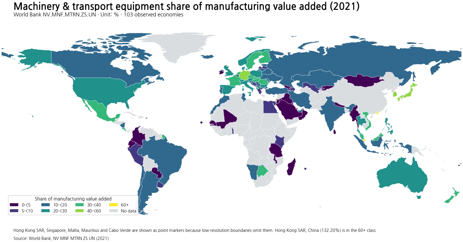
Table of Contents
What the indicator actually measures
The World Bank series NV.MNF.MTRN.ZS.UN is titled “Machinery and transport equipment (% of value added in manufacturing).” Its numerator is value added generated by machinery and transport equipment industries classified in ISIC Revision 3 divisions 29–35, while the denominator is value added for manufacturing as a whole. Value added is not gross sales or gross output. It represents the contribution created after subtracting the intermediate goods and services used in production from total output. This distinction matters because a country can have a large manufacturing sector but a relatively modest share in machinery and transport equipment, or a smaller manufacturing base in which those industries account for a large internal share.
The measure therefore works best as an indicator of manufacturing composition. It should not be read as a direct ranking of industrial power, productivity, technological sophistication, export competitiveness, or employment. Those questions require other statistics. It is also a single-year comparison. The 2021 share can be affected by temporary production interruptions, changes in intermediate input costs, shifts in demand, unusually strong or weak performance in another manufacturing branch, and accounting outcomes at the industry level. A one-year map can reveal structure at that point in time, but it cannot establish a long-term trend by itself.
The highest shares were concentrated in a diverse group of manufacturing economies
The largest 2021 value was Hong Kong SAR, China at 132.20%, followed by Singapore at 61.48%. Korea, Rep. recorded 48.23%, Israel 47.00%, Japan 44.22%, and Germany 42.08%. These were the six observations above 40%. Botswana, Albania, New Zealand, and the Slovak Republic completed the top ten, all between roughly 35% and 40%. The countries in this group do not share one identical industrial model. What they share in this dataset is simply that machinery and transport equipment contributed a comparatively large portion of manufacturing value added in 2021.
| Rank | Country or economy | Share (%) |
|---|---|---|
| 1 | Hong Kong SAR, China | 132.20 |
| 2 | Singapore | 61.48 |
| 3 | Korea, Rep. | 48.23 |
| 4 | Israel | 47.00 |
| 5 | Japan | 44.22 |
| 6 | Germany | 42.08 |
| 7 | Botswana | 39.66 |
| 8 | Albania | 38.52 |
| 9 | New Zealand | 38.48 |
| 10 | Slovak Republic | 35.34 |
The map also shows a band of relatively high values across several parts of Europe and East or Southeast Asia. Czechia was 35.15% and Hungary 32.13%. Malaysia was 30.69% and Viet Nam 30.26%. Mexico reached 30.98% and Costa Rica 33.14%, illustrating that high shares were not confined to one region. The United States was 24.49%, Australia 20.02%, and India 17.90%. These comparisons are ratios within each economy’s own manufacturing sector, not comparisons of the absolute amount of machinery value added. A country with a 20% share can still produce much more machinery in monetary terms than a much smaller economy with a 40% share.
Low shares describe composition, not the absence of manufacturing
At the lower end, Puerto Rico (US) had an observed value of 0.00%, followed by Myanmar at 0.14%, Ireland at 0.21%, Malawi at 0.32%, and Madagascar at 0.91%. The Kyrgyz Republic was 0.99%, Nepal 1.02%, Mongolia 1.38%, Paraguay 1.54%, and Iraq 1.61%. These figures should not be translated into statements that machinery manufacturing is literally nonexistent. A low ratio can arise because other manufacturing industries contribute a much larger portion of the denominator. Food processing, chemicals, pharmaceuticals, textiles, metals, and other manufacturing activities can all alter the internal composition of total manufacturing value added.
| Rank from lowest | Country or economy | Share (%) |
|---|---|---|
| 1 | Puerto Rico (US) | 0.00 |
| 2 | Myanmar | 0.14 |
| 3 | Ireland | 0.21 |
| 4 | Malawi | 0.32 |
| 5 | Madagascar | 0.91 |
| 6 | Kyrgyz Republic | 0.99 |
| 7 | Nepal | 1.02 |
| 8 | Mongolia | 1.38 |
| 9 | Paraguay | 1.54 |
| 10 | Iraq | 1.61 |
Ireland is a useful reminder of why the denominator matters. An economy can have substantial manufacturing activity and still appear near the bottom of this specific series because value added is concentrated in other branches. Botswana provides the opposite kind of example: its 39.66% places it near the top of the ratio distribution, but that does not imply that the absolute scale of its machinery and transport equipment sector exceeds that of large industrial economies. The indicator is about composition within manufacturing. Keeping that denominator in view prevents both high and low values from being misinterpreted.
Why a value can exceed 100%
Hong Kong SAR, China’s 132.20% deserves special attention because percentages above 100 can look impossible if the statistic is treated like a physical share. This ratio is built from value added, however, and detailed industry value added can be negative in some circumstances when intermediate consumption exceeds output. If negative contributions from other manufacturing branches reduce the total manufacturing denominator, a positive machinery-and-transport-equipment subtotal can exceed that total. A value above 100 therefore should not automatically be truncated to 100 or discarded as an error. The original observation is retained here. To prevent the outlier from flattening the visual differences among other countries, the map groups all values of 60% or more into its highest color class while the exact numbers remain in the text and tables.
An observed zero must also be separated from a missing value. Puerto Rico’s 0.00% is an actual observation in the file. By contrast, 114 economies have no 2021 value, including several economically important countries. Treating all missing records as zero would change the mean, ranks, and geographic pattern and would create information the source did not provide. For this reason, all descriptive statistics in this article use only the 103 observations with data_status marked OK, and the map shows source-missing economies in gray rather than as the lowest class.
Regional clusters exist, but neighboring economies can differ sharply
The spatial pattern highlights several clusters without producing a simple continent-by-continent story. Japan was 44.22% and several Central European manufacturing economies were above 30%, including the Slovak Republic, Czechia, and Hungary. In Southeast Asia, Singapore was 61.48%, Malaysia 30.69%, and Viet Nam 30.26%, while Myanmar was only 0.14%. This is a large contrast within one broad region. In the Americas, Mexico and Costa Rica both exceeded 30%, the United States was in the mid-20s, and Paraguay was below 2%. The ratios therefore reflect national manufacturing composition more than broad geographic proximity alone.
Africa is also highly heterogeneous in this dataset. Botswana’s 39.66% is one of the highest observations, while Malawi and Madagascar were below 1%. That spread is a reason to avoid statements such as “one continent has high machinery intensity and another has low intensity.” Country-level industry structure, the weight of specific manufacturing branches, and the denominator can produce very different ratios within the same region. A map is useful for spotting clusters and exceptions, but explaining them would require more detailed information on automotive assembly, electrical machinery, general machinery, transport equipment, supply-chain roles, and the size of the wider manufacturing sector.
Three common interpretation mistakes
The first mistake is turning the percentage into a competitiveness score. A high share means that these industries accounted for a large fraction of manufacturing value added; it does not by itself prove higher productivity, innovation, wages, export performance, or economic resilience. The second mistake is comparing absolute industrial size from the ratio. The denominator differs enormously across countries, so a high percentage in a small manufacturing economy may represent a smaller monetary amount than a moderate percentage in a very large one. The third mistake is treating the 2021 observation as a permanent industrial characteristic. Manufacturing composition can shift from year to year, especially around major supply disruptions or sector-specific booms and contractions.
The indicator becomes more informative when paired carefully with complementary statistics. Manufacturing value added as a share of GDP can show how important manufacturing is to the economy overall, while this series shows how important machinery and transport equipment are inside manufacturing. Export composition can add a trade dimension, and manufacturing employment can add a labor dimension. Those measures should not be mechanically merged, however, because they can use different classification systems, years, and coverage rules. The defining conditions here are the 2021 comparison year, the ISIC Rev. 3 industry grouping, the value-added denominator, and the preservation of missing observations.
What the 2021 comparison shows
The central finding is wide structural variation. The median observed share was 14.57%, but values ranged from 0.00% to 132.20%. More than one fifth of the observed economies were above 30%, while more than one third were below 10%. The upper part of the distribution included manufacturing economies from East Asia, Europe, the Americas, and Africa, and the lower part also crossed regions. This is not a map that can be reduced to a single geographic divide. It is better read as a snapshot of how differently manufacturing value added was composed across reporting economies in 2021.
Coverage is the main limitation. Only 103 of 217 countries and separately reported economies had an observation for the comparison year, leaving 114 source-missing. The absence of a value does not imply a zero share, and the resulting map is not a complete ranking of every manufacturing economy in the world. Even with that limitation, the observed set is broad enough to reveal substantial variation and several meaningful clusters. Reading the map together with the median, the tails of the distribution, and the accounting definition gives a much more accurate picture than interpreting the color alone.
Frequently Asked Questions
Does a high machinery and transport equipment share mean manufacturing is more competitive?
No. The indicator describes the composition of manufacturing value added. It does not directly measure productivity, technology, export competitiveness, employment, or the absolute size of manufacturing.
Is a value above 100% necessarily an error?
Not necessarily. Detailed industry value added can be negative. If negative contributions in other manufacturing branches reduce the total manufacturing denominator, a positive subsector subtotal can exceed the total.
Should the 114 economies without a 2021 observation be treated as 0%?
No. A source-missing value is different from an observed zero. Replacing missing observations with zero would distort averages, rankings, and the geographic pattern.
Related Articles
Green Map creates custom-edited map images using open geographic data sources such as geoBoundaries, Natural Earth, OpenStreetMap, and government open data. These maps are edited visual materials, not raw data files, and are provided for education, documents, presentations, and graphic reference.