The share of electricity generated from renewable sources varies dramatically across countries and territories. Using the World Bank indicator EG.ELC.RNEW.ZS and keeping the latest non-empty observation for each economy, the dataset contains 209 observations. Their mean is 35.1%, while the median is 23.4%. That difference matters: a group of very high observations near 90–100% pulls the average upward, so the mean alone does not describe what a typical economy looks like.
This analysis focuses on the shape of the distribution, the distance between high- and low-share systems, and a crucial data-quality detail: not every economy has an observation from the same year. Most values are from 2021, but five are older. For that reason, this is best read as a comparison of the latest available observations rather than a strict one-year league table.
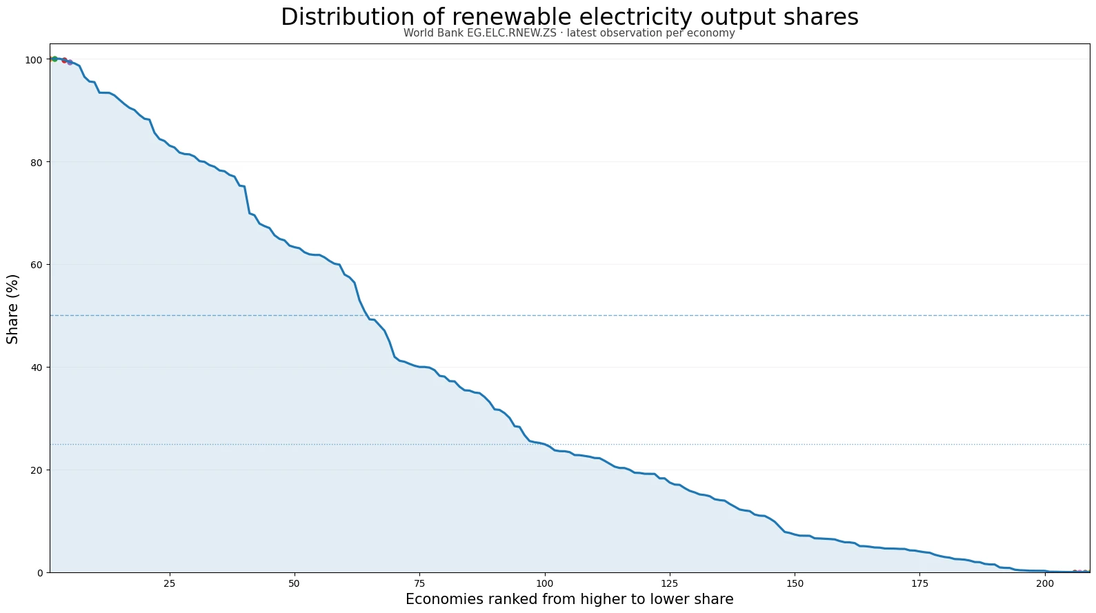
Table of Contents
What the indicator measures
Renewable electricity output (% of total electricity output) measures the percentage of electricity generation that comes from renewable power sources in a given observation year. A value of 80% means that roughly four fifths of electricity output in that economy came from renewable sources during that year. A value of 5% means renewables supplied only a small part of electricity generation.
The indicator is about the composition of electricity production, not the size of the electricity system. It does not tell us how many terawatt-hours were generated, how much renewable capacity was installed, how many people had access to electricity, or what households paid for power. It is also different from the renewable share of total final energy consumption, which covers energy used beyond the power sector. Those distinctions are essential when comparing energy transitions.
How wide is the global distribution?
Across all 209 latest observations, the mean renewable share is 35.1% and the median is 23.4%. The 25th percentile is 6.4% and the 75th percentile is 61.9%, so the middle half of observations spans roughly 6.4% to 61.9%. The full dataset stretches from 0% to 100%, showing that the composition of electricity output differs enormously across the economies represented.
The threshold counts make the spread easier to see. There are 18 observations at or above 90%, 40 at or above 75%, and 64 at or above 50%. Another 35 fall between 25% and 49.9%, while 46 are between 10% and 24.9%. There are 61 observations above 0% but below 10%, plus 3 recorded at exactly 0%. This is not a tightly clustered distribution; it contains substantial groups at both low and high levels.
The highest latest observations
Bhutan has a 2021 observation of 100.0%, the highest value in the dataset. Paraguay and Iceland are also almost entirely renewable in their latest recorded observations, but their latest years are 2012 and 2016, respectively. Lesotho, Costa Rica, and Norway are above 99% in 2021. Because the table mixes observation years for a small number of economies, the year column should be read together with the percentage rather than ignored.
| Economy | Observation year | Renewable electricity share |
|---|---|---|
| Bhutan | 2021 | 100.0% |
| Paraguay | 2012 | 100.0% |
| Iceland | 2016 | 100.0% |
| Lesotho | 2021 | 99.8% |
| Costa Rica | 2021 | 99.4% |
| Norway | 2021 | 99.1% |
| Albania | 2011 | 98.6% |
| Central African Republic | 2021 | 96.5% |
Several of these very high shares can describe electricity systems that are structurally very different from one another. The indicator does not separate hydro, wind, solar, geothermal, or biomass in this table, and it does not explain why a country reached a particular share. Explaining those differences requires generation-by-source data, resource conditions, infrastructure information, and policy history that are outside the scope of this single indicator.
The lowest latest observations
At the low end, Comoros, Gibraltar, and Sint Maarten are recorded at 0% in their latest observations. Turkmenistan, Brunei Darussalam, Libya, Bahrain, Saudi Arabia, Trinidad and Tobago, and several others remain below 1%. These values show the renewable share of electricity output at the recorded date; they should not be interpreted as a complete assessment of the broader energy economy.
| Economy | Observation year | Renewable electricity share |
|---|---|---|
| Comoros | 2021 | 0.00% |
| Gibraltar | 2015 | 0.00% |
| Sint Maarten (Dutch part) | 2021 | 0.00% |
| Turkmenistan | 2021 | 0.01% |
| Brunei Darussalam | 2021 | 0.02% |
| Libya | 2021 | 0.02% |
| Bahrain | 2021 | 0.04% |
| Saudi Arabia | 2021 | 0.07% |
Low renewable shares can coexist with very different electricity systems, so the indicator should not be used by itself to infer fuel dependence, emissions intensity, reliability, or policy ambition. For example, another low-carbon source such as nuclear power can materially affect emissions without appearing in the renewable numerator. Likewise, an economy with a high renewable percentage may still have a small electricity system in absolute terms.
Why the observation year is part of the result
The dataset is built from the most recent non-empty World Bank observation available for each economy. Of the 209 rows, 204 are from 2021. The remaining five observations are from 2011, 2012, 2015, 2016, and 2020. That means a headline such as “209 economies in 2021” would be inaccurate even though 2021 dominates the data.
This vintage difference matters most when interpreting exact rankings. Paraguay’s 99.997% value is from 2012, Iceland’s 99.994% value is from 2016, Albania’s 98.611% value is from 2011, Ethiopia’s 95.434% value is from 2020, and Gibraltar’s 0% value is from 2015. A rank that mixes those dates is useful for seeing the range of the latest available evidence, but it is not the same thing as a synchronized 2021 ranking.
What the median says that the average does not
The median of 23.4% means half of the observations are below that level and half are above it. The mean is much higher at 35.1%, reflecting the long upper portion of the distribution where dozens of economies have shares above 75% and some approach 100%. For readers looking for a single central reference point, the median is therefore less influenced by the highest observations.
Only 64 of 209 observations—about 30.6%—are at or above 50%. Meanwhile, 64 are below 10%. Seeing both figures together prevents the global picture from being reduced to a few prominent high-renewable examples. The dataset contains a broad continuum rather than one dominant global level.
How to use this indicator without over-interpreting it
First, compare percentages with the observation year visible. If a same-year comparison is required, filter to the 204 observations from 2021 and leave the five older values out of the ranking. Second, pair the percentage with absolute renewable generation when scale matters. A small power system at 100% and a large system at 40% can have completely different amounts of renewable electricity output.
Third, keep electricity and total energy separate. Transport fuels and direct heat use are not captured by this electricity-output percentage. Fourth, use time-series data to discuss progress or decline. A single latest observation cannot show whether an economy has recently accelerated, stalled, or moved backward. Fifth, bring in generation-by-source data when the technology mix matters, because this aggregate renewable indicator does not distinguish among renewable technologies.
A practical reading of the latest data
The most useful conclusion is not that one economy has “won” and another has “lost.” The data show how differently electricity systems are composed at their latest reported observation. At one end are systems where renewables account for nearly all electricity output; at the other are systems where the measured share is near zero. Between them sits a large middle group, including many observations between 10% and 75%.
For the full 209-observation dataset, 18 are at least 90%, 64 are at least 50%, and 64 are below 10%. The median is 23.4%. Those simple distribution statistics are more informative than a long rank alone because they show how common different levels are.
Source and interpretation notes
The underlying source is the World Bank indicator EG.ELC.RNEW.ZS, “Renewable electricity output (% of total electricity output).” The comparison uses the latest non-empty observation available for each economy. Percentages are presented as reported observations rather than modelled estimates created for this article.
When reusing the figures, keep the unit, the observation year, and the distinction between electricity output and total energy consumption attached to the number. Those three pieces of context prevent most common misreadings of the indicator.
Frequently Asked Questions
What does renewable electricity output share measure?
It is the percentage of total electricity output generated from renewable sources in the observation year. It does not measure absolute renewable generation or total final energy use.
Are all 209 observations from 2021?
No. 204 observations are from 2021, while five latest available values are from 2011, 2012, 2015, 2016 and 2020.
What are the median and mean renewable shares?
The median is about 23.4% and the mean is about 35.1% across the 209 latest observations.
Related Articles
Green Map creates custom-edited map images using open geographic data sources such as geoBoundaries, Natural Earth, OpenStreetMap, and government open data. These maps are edited visual materials, not raw data files, and are provided for education, documents, presentations, and graphic reference.