Women ages 30–34 account for very different shares of the female population across countries and areas in 2025. Among 217 World Bank observations for SP.POP.3034.FE.5Y, Qatar is highest at 12.72%, while the Marshall Islands is lowest at 4.01%. The global median across the reporting units is 6.98%. The range is wide for a single five-year age band.
The denominator matters. This indicator is not the number of women ages 30–34 and it is not their share of the total population. It is the percentage of the female population that falls within ages 30–34. A small country can therefore have a high share while containing far fewer women in this age group than a much larger country with a lower percentage.
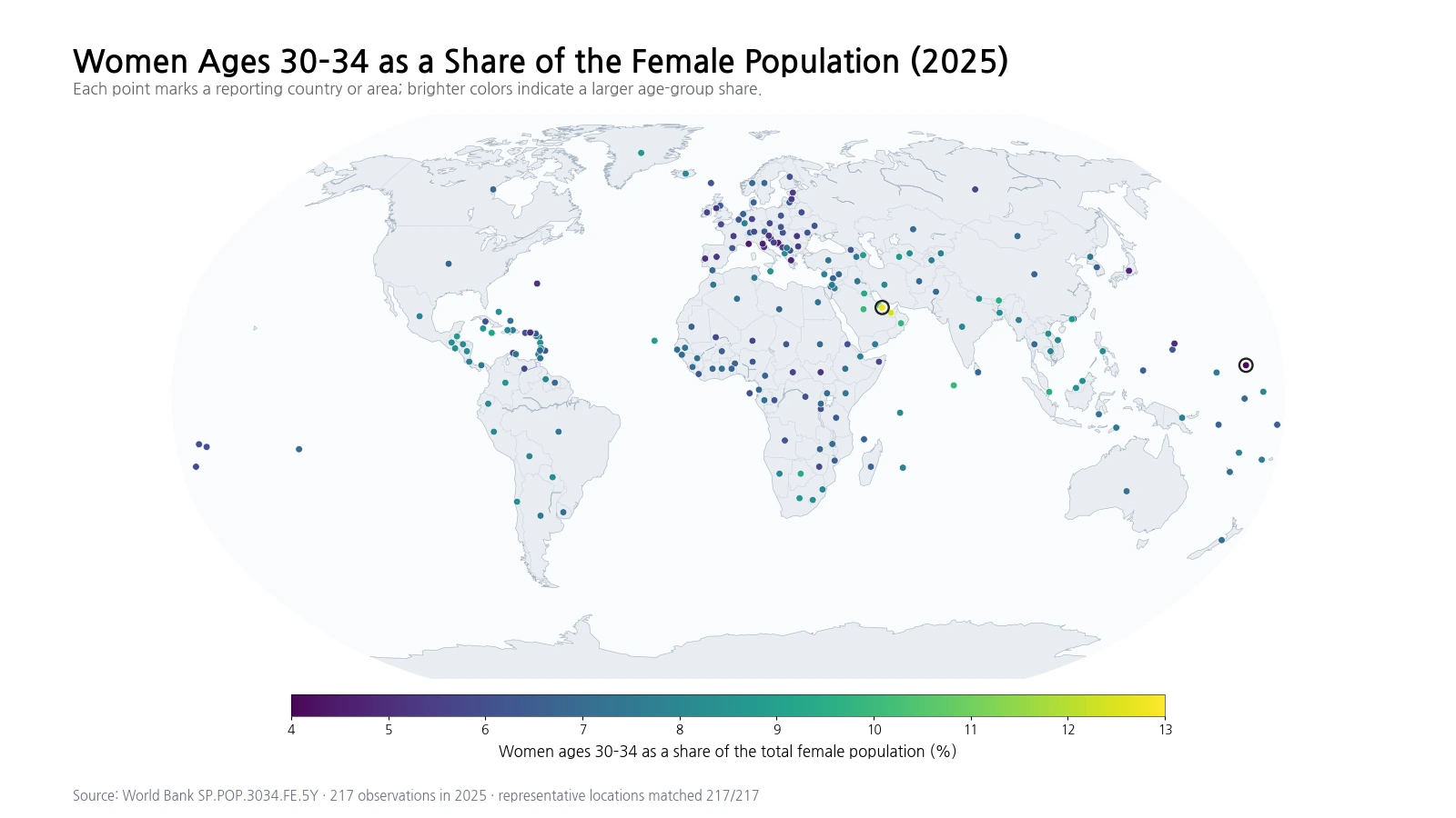
Table of Contents
The clearest high-share cluster is in the Gulf
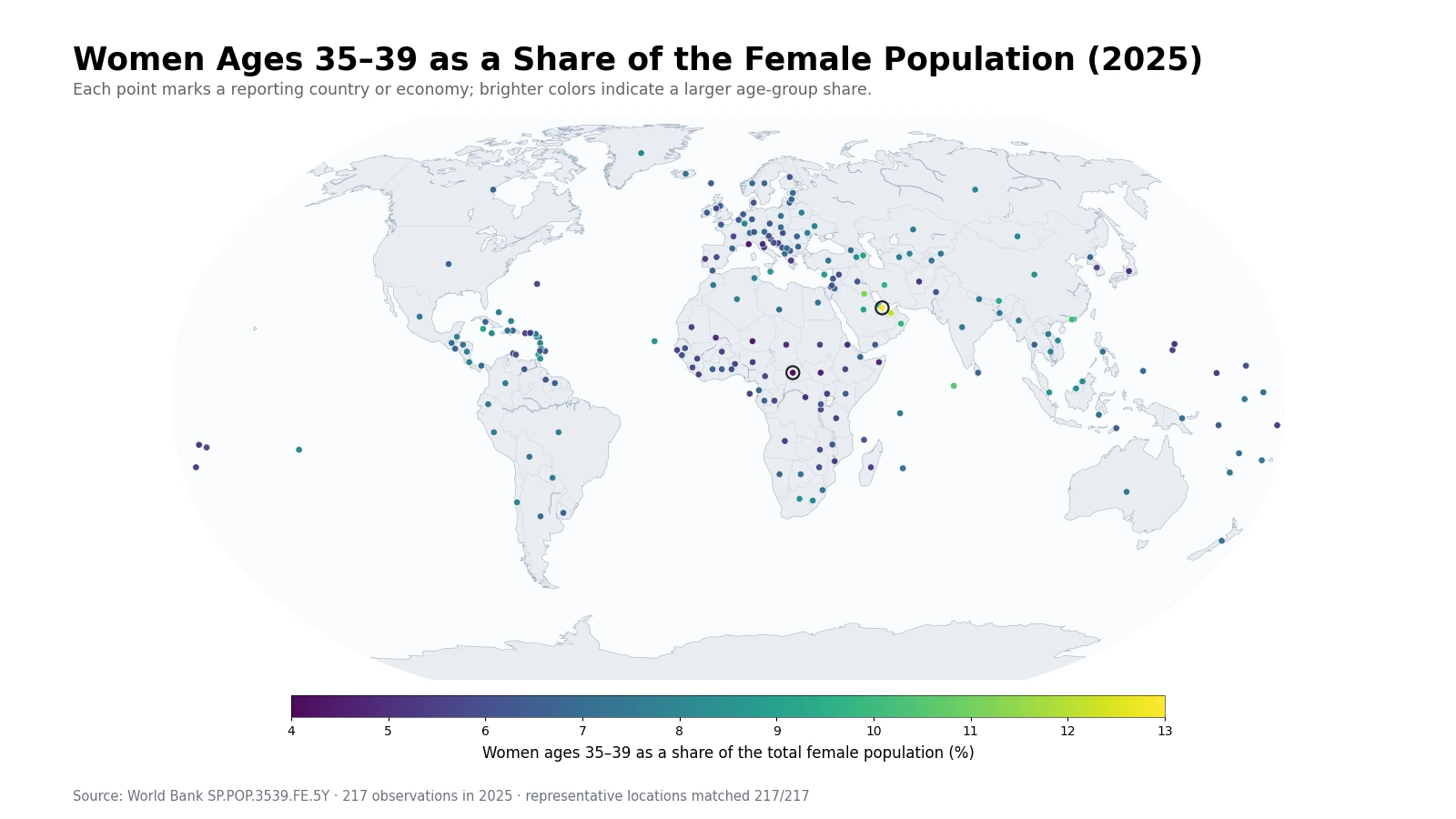
The top of the distribution has a strong geographic pattern. Qatar records 12.72% and the United Arab Emirates 12.35%, followed by Bahrain at 10.47%, Saudi Arabia at 10.01%, Oman at 9.89%, and Kuwait at 9.39%. Several neighboring Gulf economies therefore appear together among the highest values. The Maldives, Bhutan, Singapore, and Botswana also rank high, showing that elevated shares are not exclusive to one region.
The map shows this Gulf concentration clearly, but the indicator by itself does not identify a single cause. A cohort share reflects the size of the group when it was born, survival over time, migration, and the size of every other female age group in the denominator. In places with substantial labor migration, migration can affect both the numerator and denominator, but this series does not measure migration flows directly.
Other relatively high observations include Jamaica, Macao SAR, China, Azerbaijan, Belize, and Cabo Verde. Their presence outside the Gulf is a reminder that similar percentages can emerge from different demographic histories. The current share is a description of age structure, not a diagnosis of why that structure formed.
Low shares appear in several very different demographic settings
The Marshall Islands has the lowest value at 4.01%, followed by St. Martin (French part) at 4.26%, Monaco at 4.42%, Bosnia and Herzegovina at 4.44%, Japan at 4.70%, Greece at 4.72%, and San Marino at 4.74%. The Northern Mariana Islands, Portugal, and Croatia also fall near the bottom of the ranking.
These low shares should not be treated as one demographic category. In Japan, Greece, Portugal, and other older populations, larger middle-aged and older groups can reduce the relative weight of women in their early thirties. In small island or territory populations, relatively modest cohort or migration changes can produce larger percentage movements. Identical percentages can therefore sit on top of very different population pyramids.
The gap between the highest and lowest observations is 8.71 percentage points
The difference between the maximum and minimum is 8.71 percentage points. Qatar’s share is about 3.2 times the Marshall Islands value. That is a substantial contrast for one five-year age interval and highlights how differently the female population can be distributed by age.
| High rank | Country or area | Share | Low rank | Country or area | Share |
|---|---|---|---|---|---|
| 1 | Qatar | 12.72% | 1 | Marshall Islands | 4.01% |
| 2 | United Arab Emirates | 12.35% | 2 | St. Martin (French part) | 4.26% |
| 3 | Bahrain | 10.47% | 3 | Monaco | 4.42% |
| 4 | Saudi Arabia | 10.01% | 4 | Bosnia and Herzegovina | 4.44% |
| 5 | Oman | 9.89% | 5 | Japan | 4.70% |
| 6 | Maldives | 9.88% | 6 | Greece | 4.72% |
| 7 | Bhutan | 9.57% | 7 | San Marino | 4.74% |
| 8 | Singapore | 9.51% | 8 | Northern Mariana Islands | 4.92% |
| 9 | Botswana | 9.40% | 9 | Portugal | 5.03% |
| 10 | Kuwait | 9.39% | 10 | Croatia | 5.14% |
This table is not a ranking of the number of women ages 30–34. A high percentage in a smaller economy can correspond to a much smaller absolute population than a lower percentage in a large country. The series is most useful for comparing the shape of the female age distribution.
The median is 6.98%, with half the observations between 6.27% and 7.87%
The unweighted mean is 7.07% and the median is 6.98%. The first quartile is 6.27% and the third quartile is 7.87%, placing the middle half of observations within a fairly compact band. A small number of observations above 10% extend the upper end of the distribution.
| Share band | Observation count | Share of observations |
|---|---|---|
| Below 5% | 8 | 3.7% |
| 5% to under 6% | 32 | 14.7% |
| 6% to under 7% | 71 | 32.7% |
| 7% to under 8% | 55 | 25.3% |
| 8% to under 9% | 40 | 18.4% |
| 9% to under 10% | 7 | 3.2% |
| 10% or more | 4 | 1.8% |
Most reporting units fall in the broad middle rather than at the extremes. This matters when reading the map: the brightest and darkest markers attract attention, but they are not the most common outcomes. The table and quartiles provide a better sense of where a typical observation lies.
The 30–34 share is not a direct measure of births or migration
Women who are ages 30–34 in 2025 were generally born in the early to mid-1990s. Their current share reflects the original cohort size, but decades of survival and migration also matter. The denominator changes at the same time because every other female age group is evolving. The result is a useful age-structure measure but not a direct proxy for fertility, birth counts, or migration rates.
For example, the number of women ages 30–34 could stay roughly stable while their share declines if younger or older female age groups grow faster. The reverse can also happen: the absolute number can fall while the percentage rises if the rest of the female population contracts more quickly. Percentage and headcount should therefore be kept conceptually separate.
Adjacent age bands reveal whether the cohort is a local bulge
Comparing ages 25–29, 30–34, 35–39, and 40–44 can show whether a country has a broad concentration across several adult age groups or a more isolated cohort bulge. A single five-year band cannot describe the full population pyramid. Adjacent groups are particularly useful because they help distinguish a smooth age profile from an abrupt cohort difference.
Sex-specific indicators also need to stay separate from total-population measures. A 7% share among women does not mean that ages 30–34 account for 7% of the entire population. Differences in sex ratios and migration can make the female and male age structures diverge.
The map is strongest for clusters; the tables are better for exact values
All 217 reporting units are plotted at representative geographic points. This approach keeps small islands and territories visible, although markers can overlap in dense parts of Europe, the Caribbean, and the western Pacific. Every observation remains separate in the statistical calculations even where points overlap visually.
The Gulf cluster is the most obvious high-share pattern on the map. Low observations, by contrast, appear in a more geographically mixed set of places. The spatial pattern is useful for identifying where to look more closely, but it does not establish the demographic mechanism behind the values. Country-level population pyramids and time series are needed for causal interpretation.
A 2025 cross-section cannot tell whether the share is rising or falling
Every value in this comparison is from 2025. That makes the dataset suitable for a consistent cross-country snapshot, but it does not reveal direction of change. Determining whether the 30–34 share is increasing or decreasing requires multiple years of the same series.
Even in a time series, movements in the percentage need careful interpretation because both the numerator and denominator can change. A rise in the share does not necessarily mean more women ages 30–34 in absolute terms, and a decline does not necessarily mean fewer. Pairing the percentage with headcounts can prevent that mistake.
How to read the source and the map
World Bank series SP.POP.3034.FE.5Y reports women ages 30–34 as a percentage of the female population. This comparison uses 217 country and area observations for 2025, with no missing source values. Aggregate region and income-group rows are not part of the country-and-area comparison.
The map, rankings, quartiles, and distribution bands all use the same 217 values. No missing observations were filled with zeros and no older-year values were substituted. The map is best read together with the exact percentages because point color provides spatial context while tables preserve numerical precision.
Frequently Asked Questions
What does a 7% share for women ages 30–34 mean?
It means about 7 out of every 100 women in that country or area are ages 30–34. It does not mean 7% of the total population.
Does a higher share mean there are more women ages 30–34 in absolute numbers?
Not necessarily. The indicator is a percentage of the female population, so a small country can have a high share but far fewer women in this age group than a large country.
Can the 2025 value show whether the share is rising?
No. It is a one-year cross-section. A trend requires comparing the same indicator across multiple years.
Related Maps
Green Map creates custom-edited map images using open geographic data sources such as geoBoundaries, Natural Earth, OpenStreetMap, and government open data.
These maps are edited visual materials, not raw data files, and are provided for education, documents, presentations, and graphic reference.