In 2023, current health expenditure per person varied by more than two orders of magnitude across the countries and separately reported areas with data. The World Bank table used here contains 192 non-missing observations from the same year. The median is 1,088.70 current international dollars per person, while the simple mean is 2,097.25. Sudan is at the low end with 28.26, and the United States is at the high end with 13,473.19. These figures describe the average amount of current health resources used per resident after a purchasing-power adjustment; they are not the amount every individual paid for care.
The series is Current health expenditure per capita, PPP (current international $), World Bank code SH.XPD.CHEX.PP.CD. Its underlying source is the WHO Global Health Expenditure Database. Current health expenditure focuses on health goods and services consumed during the year rather than capital investment such as buildings and major equipment. That makes the indicator useful for comparing the scale of annual health-system resources, but it does not by itself measure quality, access, financial protection, or outcomes.
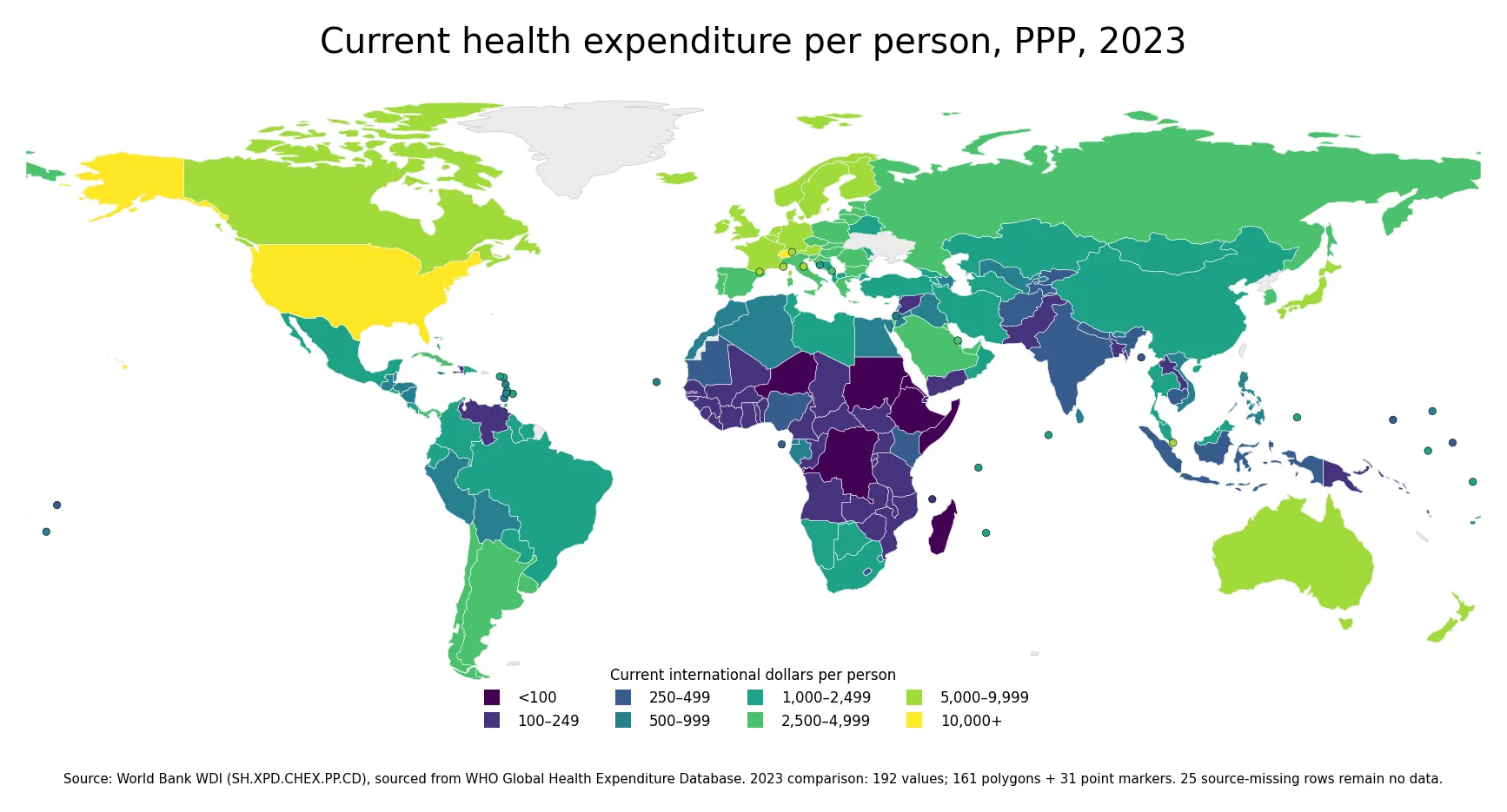
Table of Contents
PPP makes the cross-country comparison different from a market-exchange-rate dollar comparison
Purchasing power parity, or PPP, converts currencies to a common unit while accounting for differences in price levels. The World Bank describes PPPs as both currency converters and spatial price indexes. An international dollar is intended to buy a comparable amount of goods and services in a country as one U.S. dollar buys in the United States. For cross-country resource comparisons, this reduces some of the distortion that can arise when local spending is converted using market exchange rates alone.
That distinction matters for health care because wages, clinical services, pharmaceuticals, and other inputs can have very different local prices. A country can purchase a substantial volume of services with an amount that looks small after conversion at the market exchange rate. PPP conversion is designed to make the purchasing-power comparison more meaningful. It still does not make health systems identical, and it does not adjust for differences in quality, treatment mix, disease burden, or how efficiently resources are used.
The distribution is strongly right-skewed
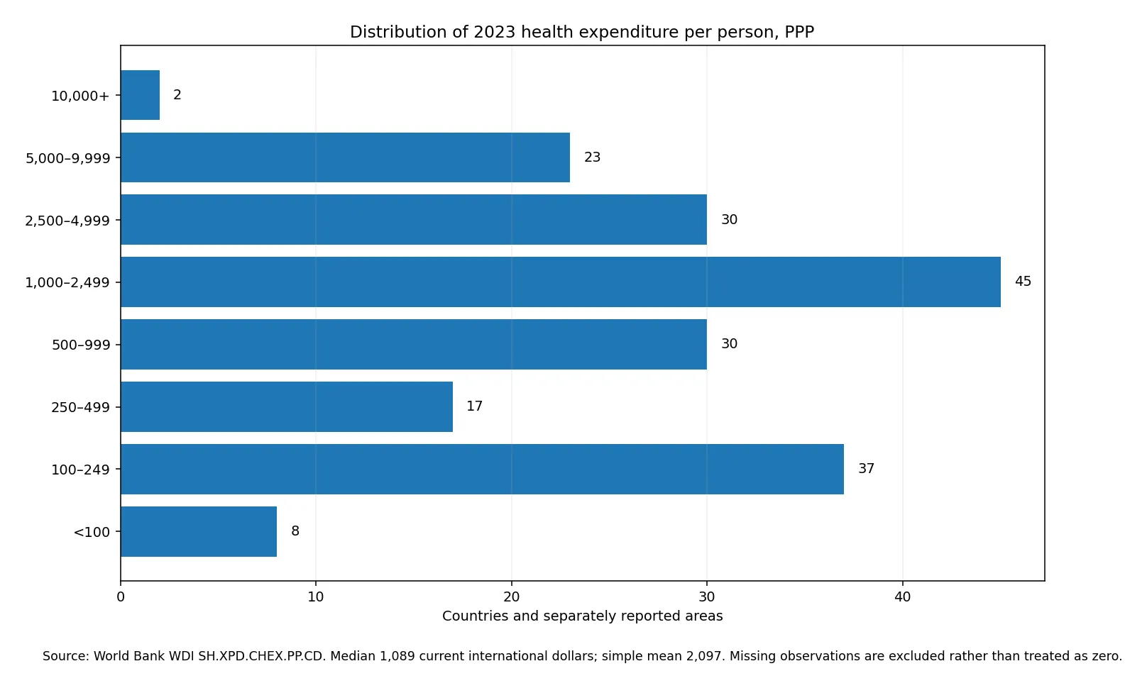
The first quartile of the 192 observations is 297.07 current international dollars, the median is 1,088.70, and the third quartile is 2,923.38. Half of the observations therefore fall between roughly 297 and 2,923. The simple mean of 2,097.25 is almost twice the median because a smaller group of very high-spending observations stretches the upper tail.
| 2023 current health expenditure per person, PPP | Countries and separately reported areas |
|---|---|
| Below 100 | 8 |
| 100 to 249 | 37 |
| 250 to 499 | 17 |
| 500 to 999 | 30 |
| 1,000 to 2,499 | 45 |
| 2,500 to 4,999 | 30 |
| 5,000 to 9,999 | 23 |
| 10,000 or more | 2 |
The largest band is 1,000 to 2,499 current international dollars, with 45 observations. Another 37 fall between 100 and 249, while 23 are in the 5,000 to 9,999 band. Only two observations exceed 10,000. Because the distribution is so uneven, the mean is not a good description of a typical country by itself; the median, quartiles, and map bands provide a more balanced picture.
The upper end is concentrated in the United States and several European health systems
The United States records the highest value at 13,473.19 current international dollars per person. Switzerland follows at 10,601.93. Monaco is 9,797.17, Liechtenstein 9,795.16, and Norway 9,523.31. Luxembourg, Germany, Ireland, Austria, and the Netherlands are all above 7,700. Western and northern Europe therefore form a visible high-spending cluster on the map, although the countries are not identical and should not be treated as one system.
Among other large European economies, France is 6,719.08, the United Kingdom 6,364.92, Spain 4,934.95, and Italy 4,865.98. Geographic clustering is descriptive rather than causal. Income, prices, age structure, use of services, financing arrangements, provider payment, and the mix of care can all influence current health expenditure, and this one indicator cannot identify which factor explains a particular country.
Many of the lowest values are in Sub-Saharan Africa, but the region is not uniform
Sudan has the lowest observation at 28.26 current international dollars per person. Somalia is 52.07, the Democratic Republic of the Congo 57.76, Madagascar 62.84, and Niger 76.49. Ethiopia, Eritrea, and The Gambia are also below 100. These figures mean that the measured volume of current health expenditure per resident is small in PPP terms; they do not show what an individual patient paid or what a particular treatment costs.
At the same time, there is substantial variation within Africa. South Africa is 1,353.75, Botswana 1,309.50, and Namibia 1,068.45. Egypt is 904.67, Algeria 732.00, and Morocco 606.04. Kenya and Nigeria are around 274 and 260 respectively, while Rwanda is 177.01. The map is most useful when it reveals these within-region differences instead of encouraging a single continental label.
The Americas and Asia span several spending bands as well
In the Americas, the United States and Canada are far above most of the region at 13,473.19 and 7,355.36 current international dollars. Chile is 3,337.44, Argentina 3,089.31, Brazil 2,070.44, Colombia 1,708.73, Mexico 1,367.99, and Peru 956.48. The geographic pattern is therefore not simply a north-versus-south split; countries within Latin America occupy several different bands.
Asia is similarly varied. Japan is 5,365.08, the United Arab Emirates 3,727.12, Saudi Arabia 3,475.06, and Qatar 2,900.58. China is 1,486.88 and Thailand 1,066.75, while Viet Nam is 689.55, Indonesia 416.59, and India 346.25. Those contrasts show why a global map is useful, but they should not be turned into a ranking of health-system quality.
Higher spending is an input measure, not a performance score
Per-capita current health expenditure is primarily a resource indicator. A higher value can reflect more services, higher input prices, an older population, greater use of care, more expensive technologies, or some combination of these factors. It can coexist with inefficiency or unequal access. A lower value can reflect fewer available resources, but it does not automatically tell us how efficiently those resources are used or how health outcomes compare.
Questions about household burden require different measures. Out-of-pocket expenditure per person isolates direct household payments, while the out-of-pocket share of current health expenditure describes the financing mix. Domestic private and government health expenditure indicators answer still other questions. Reading these measures together is more informative than asking a single spending amount to summarize an entire health system.
Twenty-five source-missing rows remain no data
The source table has 217 country and separately reported area rows for 2023, but 25 contain no value. They are excluded from the mean, median, ranking, and band counts and are not converted to zero. A missing observation means the source does not provide a value in this comparison; it does not mean that no health spending occurred.
Of the 192 valid values, 161 can be attached directly to country polygons in the low-resolution world boundary used for the map. The remaining 31 small or separately reported areas are represented by points with the same spending bands. This keeps small island states and city-sized economies visible without inventing polygon coverage that the boundary file does not contain.
PPP and current U.S. dollars answer different questions
The market-exchange-rate version of per-capita current health expenditure is useful when the question is the amount expressed in current U.S. dollars. The PPP version used here is better suited to comparing purchasing power across countries because it controls for broad price-level differences. Neither measure is universally superior: the useful choice depends on whether the analysis is about international purchasing power or nominal currency amounts.
Current international dollars are also not a constant-price time series. This article uses a synchronized 2023 cross-section, which is why the map is designed for geographic comparison. For long-run changes, a constant-price or otherwise inflation-adjusted series is more appropriate. Comparing current PPP values across distant years as if they were real growth would mix changes in spending with changes in prices and PPP conversion factors.
Data source and interpretation
The statistical series is World Bank WDI SH.XPD.CHEX.PP.CD, which cites the WHO Global Health Expenditure Database as its source. The WHO indicator view for current health expenditure per capita in PPP international dollars uses current health expenditure divided by population and expressed in PPP terms. The World Bank also explains the meaning of an international dollar as a unit designed to represent comparable purchasing power across countries.
The mean and median reported here are unweighted summaries of the 192 non-missing country and area observations, not a population-weighted world spending level. The figures also do not represent an individual bill. The World Bank live indicator page is updated over time and may display newer years after this fixed 2023 comparison. Keeping one common year avoids mixing different observation periods into a single geographic ranking.
Frequently Asked Questions
What does current health expenditure per capita in PPP terms measure?
It is current health expenditure divided by population and converted to purchasing-power-parity international dollars. It is an average resource measure, not an individual medical bill.
What is the 2023 median across the available observations?
The median across the 192 non-missing countries and separately reported areas is about 1,088.70 current international dollars per person. The simple mean is about 2,097.25.
Does higher spending mean a better health system?
No. The indicator measures the scale of current health resources per person, not quality, access, efficiency, financial protection, or health outcomes.
Were missing values treated as zero?
No. Twenty-five of the 217 source rows have no value. They are excluded from the statistics and remain no data on the map.
Related Articles
These Green Map comparisons help separate the overall amount of health spending from the way that spending is financed.
- Out-of-Pocket Health Spending per Capita by Country
- Domestic Private Health Expenditure per Capita by Country (2023)
- Government Health Spending as a Share of GDP (2023)
Green Map creates custom-edited map images using open geographic data sources such as geoBoundaries, Natural Earth, OpenStreetMap, and government open data.
These maps are edited visual materials, not raw data files, and are provided for education, documents, presentations, and graphic reference.