Living in an urban area does not automatically mean that every resident has access to electricity. World Bank indicator EG.ELC.ACCS.UR.ZS measures the share of the urban population with access to electricity. The latest-observation dataset used here contains 214 countries and separately reported areas. 213 observations are from 2024; Kosovo is the one exception, with its latest non-empty value dated 1999 and reported at 100%.
Focusing only on the 213 observations from 2024, the median is 100% and the simple unweighted mean is 95.1%. 154 observations are at or above 99%, including 135 reported at exactly 100.0%. The distribution therefore sits very close to universal urban access across much of the world, yet a substantial lower tail remains. South Sudan is at 22.8% and the Central African Republic at 38.8%, showing that an urban location does not eliminate the electricity-access gap everywhere.
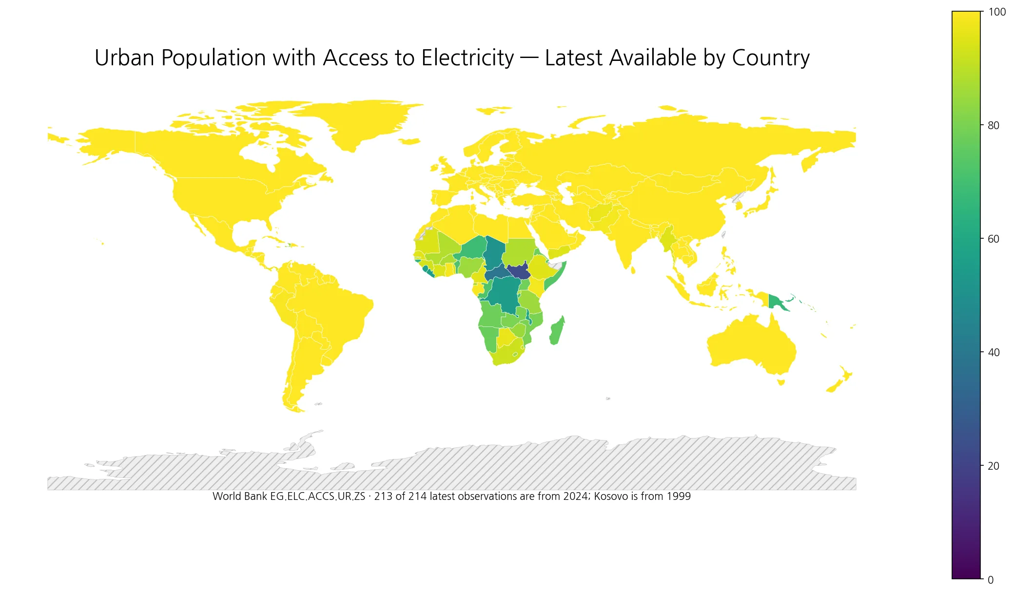
Table of Contents
What the urban electricity access indicator measures
The official series name is Access to electricity, urban (% of urban population). Its denominator is the urban population, not the total population. It asks a narrow but important question: among people living in areas classified as urban, what percentage has access to electricity? Rural residents are outside the denominator, so this number should not be assumed to equal a country’s total-population electricity access rate.
World Bank metadata describes the series as annual and reports the unit as a percentage share of the urban population. The series is connected to the Global Electrification Database and the Tracking SDG 7 framework, with nationally representative household surveys and, in some cases, censuses among the major evidence sources. The indicator is not a measure of electricity generation, installed capacity, electricity consumption per person, tariffs, outage frequency, or power quality. A reported 100% means the access rate is reported at 100% under this indicator; it does not certify every other dimension of electricity service.
154 of 213 2024 observations are at 99% or above
The 2024 distribution is strongly concentrated near the ceiling. Of the 213 same-year observations, 154 are between 99% and 100%, representing 72.3% of the set. Another 24 lie from 90% to below 99%, and 20 are from 75% to below 90%. Thirteen fall between 50% and below 75%, while only two are below 50%. This ceiling-heavy shape explains why the median is 100% even though several countries still have much lower urban access.
| 2024 urban electricity access | Countries/areas | Share of 213 |
|---|---|---|
| Below 50% | 2 | 0.9% |
| 50–<75% | 13 | 6.1% |
| 75–<90% | 20 | 9.4% |
| 90–<99% | 24 | 11.3% |
| 99–100% | 154 | 72.3% |
The 95.1% mean is a simple unweighted average across country and area observations. It is not the statement that 95.1% of the world’s urban population has access to electricity. A large country and a small separately reported island each contribute one observation to this calculation. A population-weighted global figure requires urban population weights or an appropriate official aggregate. The unweighted mean is useful here because the purpose is to describe the distribution of country-level observations.
Where is urban electricity access lowest in 2024?
South Sudan has the lowest reported 2024 urban-access value at 22.8%, followed by the Central African Republic at 38.8%. Chad is at 51.0%, the Democratic Republic of the Congo at 55.0%, Liberia at 55.5%, Sierra Leone at 56.4%, and Malawi at 59.5%. Fourteen of the fifteen lowest observations are African countries; Papua New Guinea, at 66.8%, is the only non-African country in that bottom-fifteen group.
| Country or area | Urban electricity access, 2024 |
|---|---|
| South Sudan | 22.8% |
| Central African Republic | 38.8% |
| Chad | 51.0% |
| Congo, Dem. Rep. | 55.0% |
| Liberia | 55.5% |
| Sierra Leone | 56.4% |
| Malawi | 59.5% |
| Guinea-Bissau | 65.6% |
| Papua New Guinea | 66.8% |
| Niger | 69.1% |
| Burundi | 70.0% |
| Benin | 71.6% |
| Congo, Rep. | 72.0% |
| Somalia, Fed. Rep. | 73.4% |
| Djibouti | 74.9% |
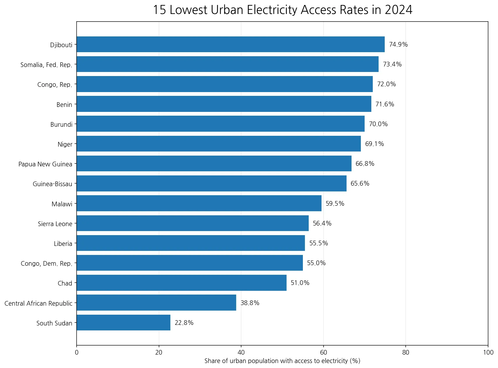
The ranking identifies where the measured gap is largest, but it does not explain the cause. This dataset does not contain transmission-network coverage, generation capacity, household income, electricity prices, distributed solar deployment, conflict indicators, utility finances, or administrative capacity. Those factors may matter in country-specific research, but the access percentage alone cannot assign causal responsibility. A visible geographic cluster is an observation to investigate, not proof of one shared mechanism.
Major economies occupy both the ceiling group and the remaining-gap group
South Korea, the United States, China, Japan, India, and Indonesia are all reported at 100.0% for the urban population in 2024. Brazil and Mexico are at 99.9%, Bangladesh at 99.5%, and Pakistan at 98.4%. Ethiopia is at 95.1%, South Africa at 92.4%, Nigeria at 85.5%, and Uganda at 78.3%. The comparison shows that population size or economic size alone does not determine the urban-access value, and countries within the same broad region can occupy different parts of the scale.
| Country | Urban electricity access, 2024 |
|---|---|
| Korea, Rep. | 100.0% |
| United States | 100.0% |
| China | 100.0% |
| Japan | 100.0% |
| India | 100.0% |
| Indonesia | 100.0% |
| Brazil | 99.9% |
| Mexico | 99.9% |
| Bangladesh | 99.5% |
| Pakistan | 98.4% |
| Ethiopia | 95.1% |
| South Africa | 92.4% |
| Nigeria | 85.5% |
| Uganda | 78.3% |
Very small differences near the ceiling should not be turned into an overly precise ranking. A value of 99.9% and a reported 100.0% both indicate near-universal access at the scale and precision of this indicator. The more informative contrast is often between those ceiling values and the countries still below 90%, 75%, or 50%. At lower access levels, the percentage of urban residents without access can remain large enough to make the gap visually and statistically clear.
Urban access is not the same as total-population electricity access
The urban series uses only urban residents in the denominator. Total electricity access combines urban and rural populations, so the two indicators answer different questions. A country can have nearly universal urban access and still have a lower national rate if rural access lags. Where both urban and rural access are high, the total and urban numbers may be much closer. Measuring the actual urban-rural gap requires matching the separate urban, rural, and total series for a common year.
This distinction matters for search intent and policy interpretation. Someone studying city infrastructure needs an urban-specific measure because a national figure can hide urban conditions behind the rural share of the population. Someone assessing national living conditions should not use the urban rate alone because that would exclude rural residents. The urban map therefore complements rather than replaces a total-population electricity access map.
A reported 100% does not mean perfect reliability, affordability, or quality
Access is only one dimension of electricity service. This indicator does not report how many hours per day power is available, how often outages occur, whether voltage quality is stable, whether tariffs are affordable for households, or how much electricity residents actually consume. Countries can therefore share the same reported 100% access value while having very different electricity systems, generation mixes, costs, reliability outcomes, and levels of consumption.
The reverse caution also matters. A lower access percentage does not by itself prove that a country lacks generation capacity. The final-access gap can involve transmission, distribution, household connections, off-grid solutions, settlement patterns, affordability, or other factors. Because these mechanisms are not separated in the supplied indicator, the safest interpretation is descriptive: the percentage tells us the measured access outcome, while deeper explanations require additional evidence.
When most countries are near 100%, focus the map on the remaining gap
A world choropleth is dominated by the 99–100% group because so many observations cluster at the top. That makes the map useful for locating large remaining gaps rather than for distinguishing 99.4% from 100.0% with visual precision. The accompanying bottom-fifteen chart therefore adds an important second view. It makes the low-access tail legible even when most of the world map appears in the highest band.
Cartographic visibility also differs from statistical coverage. Small islands and separately reported areas can have valid observations without appearing as distinct polygons in a low-resolution world boundary layer. A gray or visually absent location should not automatically be interpreted as 0%. Statistical summaries use the numeric rows in the source table, while the map is a simplified device for seeing broad spatial patterns.
Kosovo’s 1999 value must not be treated as a 2024 observation
The latest-observation file contains 214 numeric rows, but only 213 are dated 2024. Kosovo’s latest retained non-empty value is 100.0% from 1999. Calling the full 214-row file a same-year 2024 comparison would therefore be inaccurate. In this article, the map represents the latest available observation set, while the mean, median, distribution bands, threshold counts, and low-value ranking are calculated from the 213 rows actually dated 2024.
This is a useful example of the difference between a latest-available dataset and a same-year dataset. Latest-available collection maximizes coverage, but it can mix observation years. A common-year comparison improves time alignment but can exclude places without that year’s value. Here the exception is unusually limited—one row—so explicitly flagging it and using the 2024 subset for the core statistics preserves both coverage and clarity.
Urban electricity access is different from urbanization and clean cooking access
The urbanization rate measures the share of a country’s total population living in areas classified as urban. This electricity indicator starts after that classification and asks what share of the urban population has electricity access. A highly urbanized country does not automatically have a high urban electricity-access rate, and a causal relationship between the two cannot be inferred from either indicator alone. Testing their relationship requires joining compatible country and year data.
Urban clean cooking access answers another separate question. A household can have access to electricity without using electricity as its primary cooking method, and clean cooking can be supplied through fuels and technologies such as LPG, natural gas, biogas, or other qualifying options. Electricity access and clean cooking access are both useful infrastructure indicators, but they should not be treated as interchangeable measures.
Data source and calculation method
The numeric values come from World Bank World Development Indicators series EG.ELC.ACCS.UR.ZS. The official metadata defines the indicator as the percentage of the urban population with access to electricity. The World Bank WDI metadata glossary identifies the series as annual, gives the unit as a percentage share of urban population, and describes its connection to the Global Electrification Database and Tracking SDG 7 evidence system.
All means, medians, distribution bands, threshold counts, and rankings in this article were calculated directly from the supplied country-level observations. The 2024 statistics use only the 213 rows explicitly dated 2024; Kosovo’s 1999 value is not silently treated as current. The map joins ISO-3 country codes to a low-resolution world boundary layer, which means some small islands or separately reported areas can remain statistically present without a clearly visible polygon. Missing values were not converted to zero and no older value was relabeled as 2024.
The most useful questions to ask with this map
This map is well suited to questions such as: Which countries still have low electricity access even within urban populations? Which observations remain below 90% or 75%? How does an urban-only result differ conceptually from a total-population access map? It is less useful for ranking countries that are already clustered between 99% and 100%, because tiny differences near the ceiling do not reveal broader service quality.
A deeper follow-up can combine the urban access series with rural access, total access, urban population share, reliability, electricity prices, generation mix, and other country-specific infrastructure indicators. The key is to keep denominators and observation years aligned. Rather than asking one map to explain the entire power system, use this indicator for the question it measures directly: whether urban residents are reported as having access to electricity.
Frequently Asked Questions
What does urban electricity access measure?
It measures the percentage of the population living in urban areas that has access to electricity. The World Bank indicator code is EG.ELC.ACCS.UR.ZS.
Which country has the lowest reported urban electricity access in 2024?
In the supplied 2024 observations, South Sudan is lowest at 22.8%, followed by the Central African Republic at 38.8%.
Does 100% urban electricity access mean there are no outages?
No. The indicator measures access, not outage frequency, affordability, voltage quality, hours of supply, or other dimensions of service reliability.
Are all 214 latest observations from 2024?
No. 213 are dated 2024. Kosovo's latest retained non-empty observation is from 1999, so the core same-year statistics use the 213 observations from 2024.
Related Articles
These Green Map articles provide the closest context for comparing urban electricity access with total electricity access, another urban infrastructure indicator, and the share of the population living in urban areas.
- Global Electricity Access Map – 2024 Population Access by Country
- How Widely Can Urban Residents Use Clean Cooking Fuels and Technologies? 2023 World Map
- Global Urbanization Rate Map – Urban Population by Country in 2025
Green Map creates custom-edited map images using open geographic data sources such as geoBoundaries, Natural Earth, OpenStreetMap, and government open data.
These maps are edited visual materials, not raw data files, and are provided for education, documents, presentations, and graphic reference.