Perry County is agricultural at first glance, but the 2025 land-cover map becomes much more varied once the central and southern parts of the county are examined closely. Agriculture accounts for 65.82% of the mapped area, followed by forest at 17.10%, developed land at 8.87%, wetlands at 5.07%, and water at 2.49%. Large farm blocks dominate much of the north and east, while woodland, wetland, water, and two conspicuous developed clusters interrupt that broad agricultural background.
The four map views on this page are meant to be compared rather than treated as four copies of the same information. The general map shows the full 2025 cover mix, the forest-and-farmland view simplifies the agricultural and natural pattern, the impervious-surface map isolates harder built surfaces, and the change map compares class differences between 1985 and 2025. The four original JPG maps are available in one download near the end of the article; the WebP images in the body are the on-page previews.
Table of Contents
The built pattern is concentrated, not spread evenly across the county
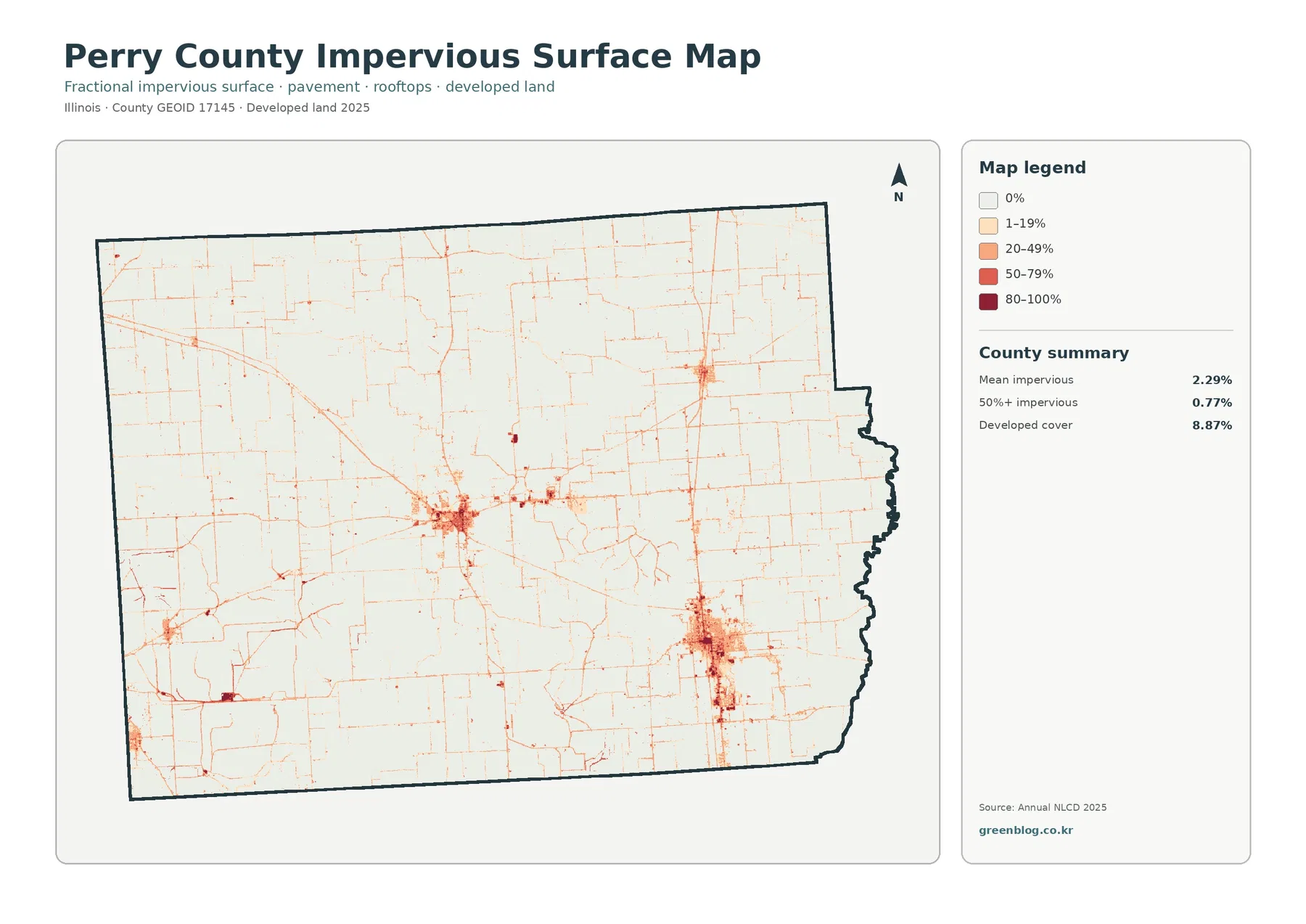
The impervious map strips away most of the land-cover colors, which makes the settlement pattern easier to see. The countywide mean impervious value is 2.29%, and only 0.77% of the county falls in the 50%-or-more impervious category. Those percentages are small compared with the 8.87% developed-land share, yet the dark areas form clear centers. One large cluster sits west of the county’s middle, and another occupies the southeastern part of the map. Smaller nodes and narrow road traces connect to those larger concentrations.
Developed land and impervious surface measure related but different things. A place can be classified as developed land while still containing grass, trees, bare soil, or other permeable surfaces. The impervious layer instead estimates the fraction covered by harder surfaces such as pavement and rooftops. That distinction explains why the developed share is 8.87% while the countywide mean impervious value is only 2.29%. It also explains why the centers of the two built clusters appear darker than their broader developed edges.
Thin lines of low impervious cover extend well beyond the two main clusters. They create a connected road-like network across the agricultural portions of the county and are especially visible where several lines converge at the larger built areas. The map supports a statement that roads and developed surfaces occupy the same corridors; it does not establish that one caused the other. For local transportation or development history, a different source would be needed.
The map also helps separate a compact built core from the much larger rural setting. Most of the county remains in the 0% or 1–19% impervious classes, even though developed features are present in many places. For a presentation about the overall rural character of Perry County, that contrast is more useful than simply listing the 8.87% developed figure. The darkest surface classes are concentrated in a small part of the county rather than forming a continuous urban sheet.
The 2025 cover map reveals a farm landscape broken by wooded and wet pockets
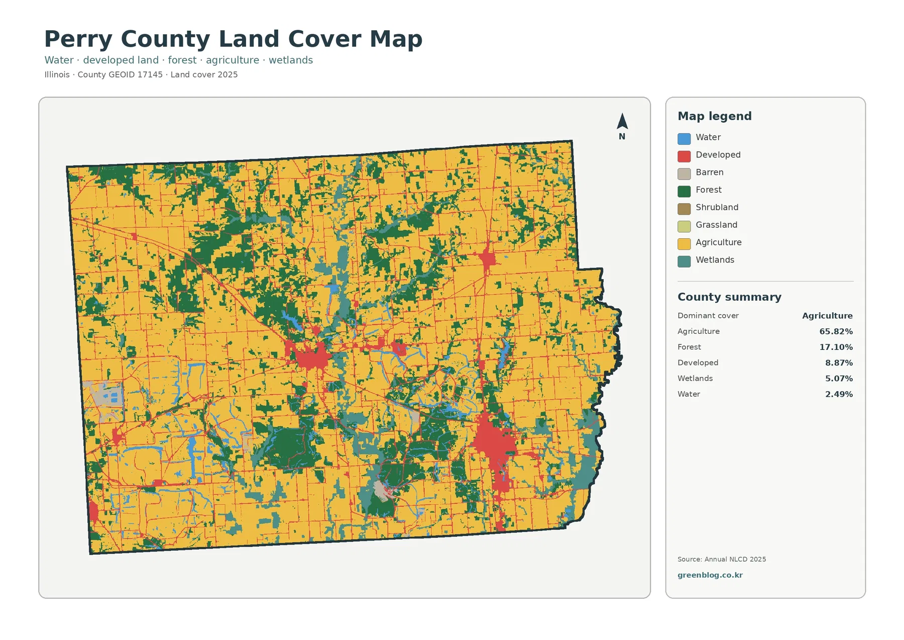
Agriculture is the dominant class at 65.82%, and large yellow areas fill much of the north, northeast, east, and southwest. In those places, the pattern is comparatively simple: broad agricultural blocks are crossed by a rectilinear network of narrow developed lines and scattered patches of trees. Moving toward the middle and south changes the picture. Forest, wetlands, and water break the farm cover into smaller pieces, so the county becomes visually more complex even though agriculture remains the largest class overall.
Forest covers 17.10% of the county. Some woodland forms broad patches, including a substantial area in the northwest, while other forest follows irregular bands through the central and southern portions of the map. These strips do not form a neat grid like the surrounding agricultural blocks. They widen, narrow, branch, and wrap around water or wetland areas, making the forest pattern one of the easiest ways to distinguish the more complex interior and southern landscape from the simpler farm areas farther north and east.
Wetlands account for 5.07% and water for 2.49%. Their combined footprint is smaller than agriculture or forest, but their location gives them a strong visual role. Several elongated water bodies appear near the county’s center, while wetland colors become more frequent around central and southern water-and-forest complexes. The southwestern part of the map also contains a mix of water, wetlands, agriculture, and smaller woodland patches. This is why percentage alone does not fully describe what a cover class contributes to the map.
The developed class creates a different kind of interruption. The central-western and southeastern clusters are much larger than the many small road and settlement traces scattered elsewhere. A smaller built concentration also appears in the northeast. Reading these areas together with the impervious map shows that a developed polygon can contain a mixture of hard and soft surfaces, while the highest impervious percentages occupy a smaller core inside the broader developed footprint.
Forest and farmland separate the simpler north from a more intricate central-southern pattern
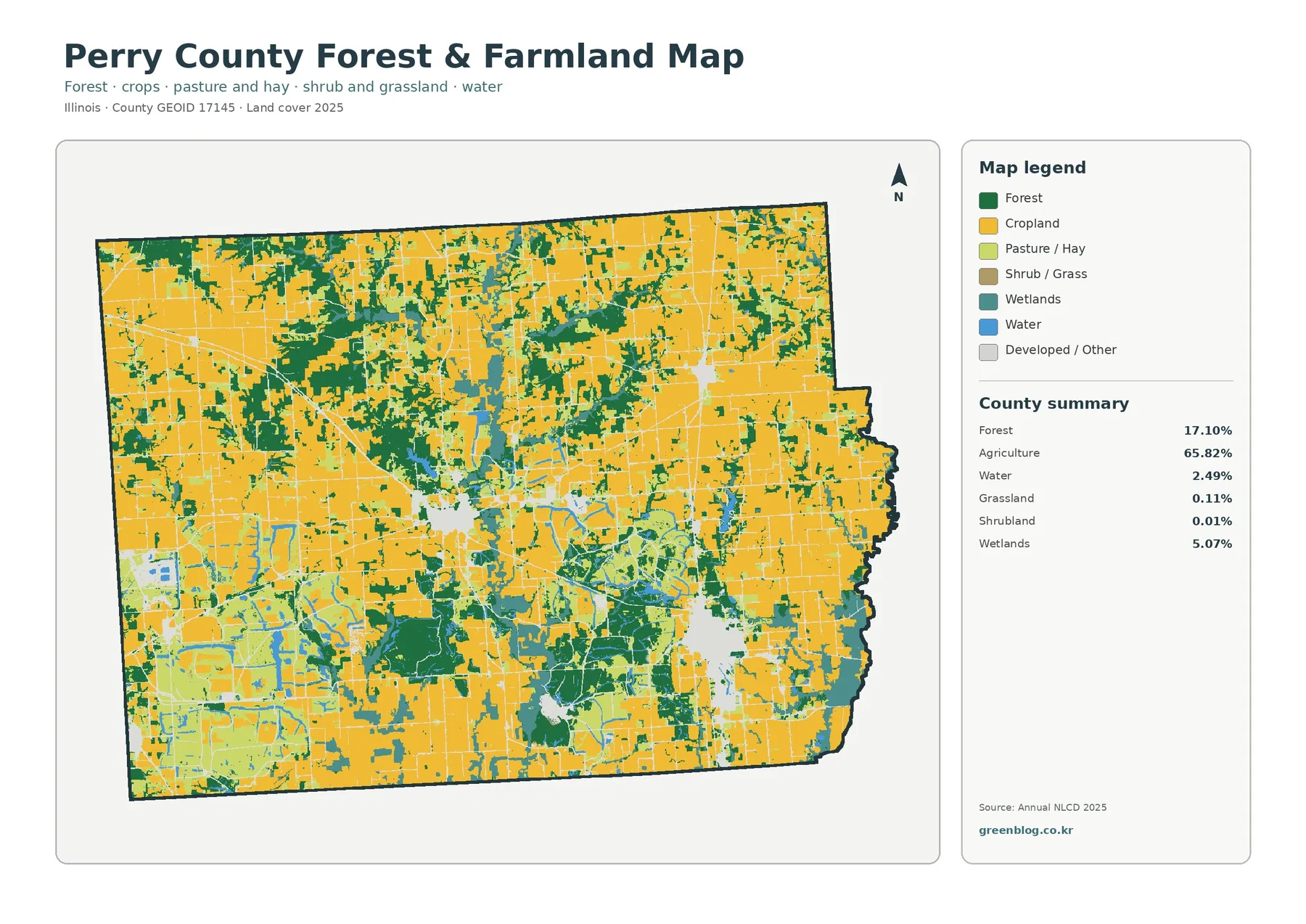
The forest-and-farmland map removes some of the visual competition from developed classes, so the agricultural structure becomes easier to follow. Cropland forms the dominant background, matching the 65.82% agriculture total. Forest occupies 17.10%, while wetlands at 5.07% and water at 2.49% remain important in the central and southern portions. Grassland is only 0.11% and shrubland 0.01%, so those minor classes should not be treated as defining features of the countywide pattern.
The northwest woodland patch is especially easy to see in this view because it sits inside a broad agricultural setting. Farther south, forest becomes less like one compact block and more like a collection of branching or connected bands. The central water bodies and wet areas interrupt those bands again, producing a three-way boundary among agriculture, woodland, and wet cover. This local complexity is lost if the county is summarized only by the single statement that nearly two-thirds of its area is agricultural.
In the south, farmland is still present, but it is divided into smaller units by forest and wetland colors. The map’s southern edge contains several broader green patches, and the southwestern quarter mixes agriculture with water, wetlands, and woodland more frequently than the northern part of the county. For a classroom or presentation, this view is useful when the goal is to show that a farm-dominated county can still contain a substantial and spatially organized natural-cover network.
This is a land-cover map, not a parcel-use or ownership map. “Agriculture” describes the mapped surface class; it does not identify a specific crop, farm operator, zoning district, or legal land use. Likewise, “forest” does not mean that every green area is public land, a protected reserve, or a single continuous forest property. Parcel boundaries, ownership, zoning, and regulatory status require separate records.
The 14.41% class difference needs to be separated into several kinds of change
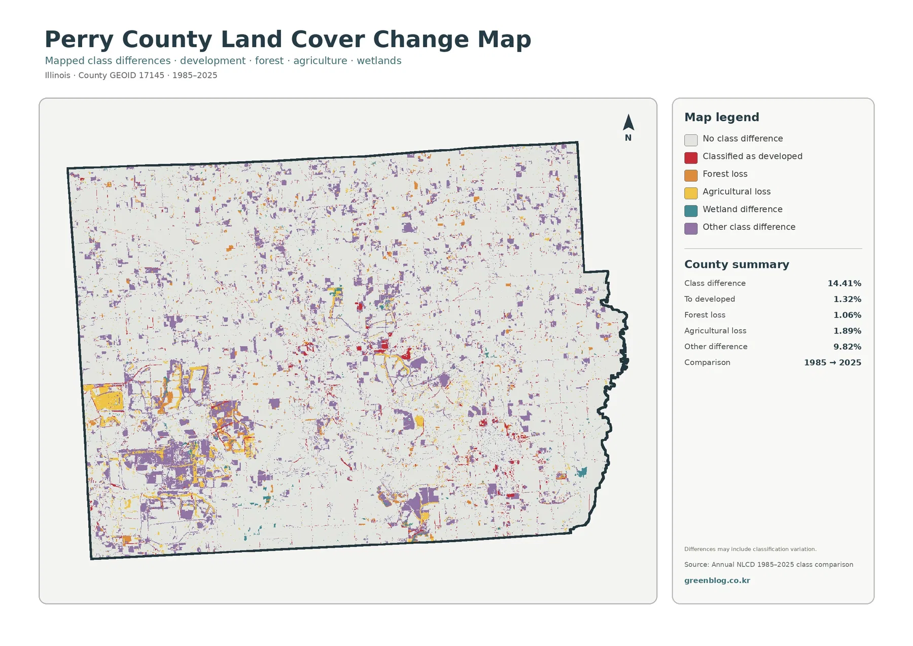
The change map reports class differences across 14.41% of the county between 1985 and 2025. That total is not equivalent to 14.41% new development. The summary separates 1.32% classified as developed, 1.06% forest loss, 1.89% agricultural loss, and 9.82% other class difference. The “other” category is by far the largest of the listed components, so any interpretation that turns the full class-difference value into one land-use story would overstate what the map actually shows.
Purple other-class differences are scattered across much of Perry County. Some are tiny, isolated patches, while larger concentrations occur in parts of the southwest and central area. Red developed-class differences appear near the main built clusters and along several smaller corridors. Orange forest-loss and yellow agricultural-loss patches are dispersed as well. The map is most useful when those colors are checked against the current 2025 cover map rather than read on their own.
The figure itself includes an important note: mapped differences may include classification variation. That warning matters because a shift at a class boundary may reflect differences in how a pixel was categorized rather than a simple, direct conversion of the land on the ground. Small edge changes around forests, wetlands, water, and agriculture therefore should not automatically be described as clearing, drainage, construction, or abandonment without another source that documents the actual event.
For a long-term overview, the change map still adds value. It directs attention to places where the 1985 and 2025 classifications are not the same and lets the reader ask a more specific follow-up question. For parcel-level history, permitting, ownership, or exact timing, however, it is only a starting point. Historical imagery, local land records, or other time-specific datasets would be needed before drawing a stronger conclusion.
A practical way to compare the four maps without mixing their meanings
Start with the general 2025 map when the question is “what covers Perry County now?” It provides the countywide proportions and shows where the major classes sit relative to one another. Next, use the forest-and-farmland view when the question is specifically about the boundary between agricultural cover and natural cover. Its simpler palette makes broad farm blocks, woodland patches, wet areas, and water easier to compare than they are in the full legend.
Move to the impervious map only when surface hardness or development intensity matters. A red developed area on the general map is not the same thing as an 80–100% impervious surface. The impervious layer narrows the focus to pavement, rooftops, and other hard surfaces, revealing where the most built-up cores sit inside the larger developed footprint. In Perry County, this distinction is especially visible in the two main developed clusters.
Use the change map last if the goal is to compare 1985 with 2025. It does not replace the current map, because its colors describe differences rather than current cover. A purple pixel, for example, is not a present-day land-cover class. It indicates an “other class difference” between the comparison years. Keeping that distinction clear prevents a common mistake in which current conditions and historical differences are treated as the same variable.
Comparing one location across all four maps can be more informative than placing four small maps on a single slide. The central-western developed cluster, for instance, appears as a broad developed area on the full map, a pale interruption in the forest-and-farmland view, a concentrated impervious core on the hard-surface map, and a mixture of changed and unchanged pixels on the historical comparison. Each image adds a different part of the explanation.
Printing and reference use: keep the legend readable and the claims within the map’s limits
The four JPG files are each 2480×1754 pixels, and the asset manifest says the original resolution is preserved. It does not mark the images as meeting the package’s A3 high-resolution reference. For that reason, a large-format print should be tested at the intended size instead of being described as guaranteed A3-quality output. Enlarging the file also does not create new parcel, road-name, or land-cover detail that was absent from the source.
For a printed handout, the full land-cover map works well as the overview page because the legend and county summary stay together. A second page can then focus on the question being discussed: forest and farmland for the rural-natural contrast, impervious surface for built intensity, or the 1985–2025 map for classification differences. This approach preserves readable symbols and avoids shrinking the small change-map patches until they merge visually.
The maps can support county introductions, classroom comparisons, presentation graphics, and preliminary visual review. They are not a substitute for parcel surveys, zoning maps, flood maps, wetland jurisdiction determinations, ownership records, or development-permit data. The mapped classes show surface cover, and the change layer shows class differences. Keeping those purposes separate is more useful than trying to make one set of images answer legal or site-specific questions it was not designed to answer.
Names of individual lakes, roads, neighborhoods, or facilities are not printed on these four map views. A reader can describe the location and shape of visible water, woodland, developed clusters, or road-like impervious lines, but identifying an unlabeled feature by name would require another verified reference. This article therefore stays with the patterns, percentages, and locations that are visible in the supplied maps rather than assigning names to unlabeled features.
Frequently Asked Questions
What is the largest land-cover class in Perry County?
Agriculture is the largest 2025 class at 65.82%. Forest follows at 17.10%, developed land at 8.87%, wetlands at 5.07%, and water at 2.49%. The agricultural share is dominant countywide, but the central and southern parts contain enough forest, wetlands, and water to create a much more broken pattern than the broad farm areas in the north and east.
Why does the impervious map look much lighter than the developed-land map?
Developed land is a land-cover class, while impervious surface measures the fraction of hard surfaces such as pavement and rooftops. Perry County has 8.87% developed cover, but its mean impervious value is 2.29%, and only 0.77% of the county is mapped at 50% or more impervious. The darkest values are concentrated in the cores of the two main developed clusters rather than across every developed pixel.
Does the 14.41% class difference mean that 14.41% of Perry County was developed after 1985?
No. The 14.41% total includes several categories. The map summary lists 1.32% classified as developed, 1.06% forest loss, 1.89% agricultural loss, and 9.82% other class difference. The map also warns that classification variation may be included, so the full total should not be treated as a direct measure of development or land-use conversion.
Map File Information
The download combines four original JPG maps of Perry County: 2025 land cover, forest and farmland, impervious surface and developed land, and mapped class differences from 1985 to 2025.
- Included Files: Map files described in this article
- File Type: JPG maps packaged in a ZIP archive
- Intended Use: Printing, education, presentations, and map-based projects
Related Maps
- Adams County Illinois Land Cover Map
- Alexander County Illinois Land Cover Map
- Bond County Illinois Land Cover Map
Sources
- MRLC Annual NLCD Data
- USGS Annual NLCD Land Cover Classification
- U.S. Census Bureau TIGER/Line Shapefiles
Green Map creates custom-edited map images using open geographic data sources such as geoBoundaries, Natural Earth, OpenStreetMap, and government open data. These maps are edited visual materials, not raw data files, and are provided for education, documents, presentations, and graphic reference.