LaSalle County is overwhelmingly agricultural on the 2025 land-cover map, but the county is not a uniform block of cropland. Agriculture accounts for 79.35% of the mapped area, while the Illinois River cuts across the county through a band of water, woods, wetlands, and developed places. The four maps on this page separate those patterns so the broad farm landscape, river corridors, built surfaces, and long-term class differences can be compared without forcing everything into one view.
The four original JPG maps are available together in one download farther down the page. They include the general 2025 land-cover map, a forest-and-farmland view, a fractional impervious-surface map, and a 1985–2025 land-cover difference map. The set works well when a single county map is not enough to answer both “what covers the land now?” and “where are developed or changing areas concentrated?”
Table of Contents
A county of farm fields interrupted by rivers, towns, and wooded corridors
The broadest pattern is simple: cultivated land dominates both the northern and southern parts of the county. On the general map, the agricultural class forms a nearly continuous field of color outside the river corridors and urban clusters. The 79.35% county summary confirms what the image suggests visually. Rather than treating agriculture as one item in a long legend, it makes more sense to use it as the baseline and then look for the places where water, forest, wetlands, and development break that baseline.
Developed cover is the second-largest summarized class at 10.64%. It appears as several separate clusters instead of one continuous metropolitan area. LaSalle County materials identify Ottawa, LaSalle, Peru, Streator, and Mendota as major cities, and the map likewise shows multiple developed concentrations scattered through a much larger rural landscape. Smaller linear and patchy developed areas extend away from the larger clusters, producing a different pattern from the solid agricultural blocks around them.
Water covers 1.36% and wetlands 0.89%, small shares in the county summary but highly visible because they are concentrated. The Illinois River creates the strongest east-west feature across the middle of the map. County planning documents also identify the Fox River entering from the northeast and meeting the Illinois River at Ottawa, while the Vermilion River enters from the south. Those tributary corridors help explain why wooded and wetland patches extend well beyond the main river channel.
What the 2025 land-cover map reveals at a glance
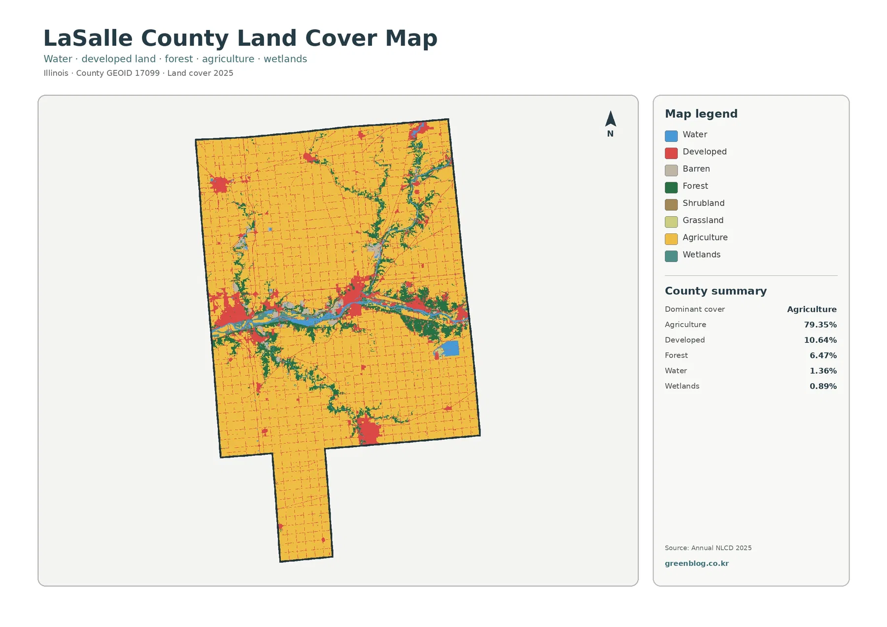
This is the best map for seeing all major cover types at the same time. Its summary lists agriculture at 79.35%, developed land at 10.64%, forest at 6.47%, water at 1.36%, and wetlands at 0.89%. The legend also separates smaller classes such as grassland, shrubland, and barren cover. The percentages matter, but their placement matters just as much: forest and water occupy relatively little area yet form long, connected-looking bands that stand out against the agricultural matrix.
Forest is not spread evenly across the county. Dark green patches repeatedly follow the Illinois River and branching drainage corridors. The northeastern part of the county shows another branching concentration of natural cover, and southern tributary valleys carry narrow wooded bands through otherwise open farm country. This pattern makes the forest percentage easier to interpret. A 6.47% share can still be geographically important when much of it is concentrated along waterways rather than scattered randomly.
The river corridor contains some of the most complex color changes on the map. Water, forest, wetlands, agriculture, and developed land can occur within a short distance of one another. That proximity should not be turned into an unsupported cause-and-effect claim. A land-cover map describes the surface that was classified, not why a town developed in a particular place or why one tract remained wooded. Historical, zoning, economic, or engineering explanations require other sources.
The county’s 2023 comprehensive plan treats the Illinois River and its tributaries, forests, wetlands, parks, and other green spaces as important natural resources. That official context is useful when reading the map because it confirms that the wooded river corridors are not merely decorative slivers on the image. They are part of a broader network of waterways and natural areas that the county specifically discusses in planning documents.
Forest and farmland become clearer when developed areas are de-emphasized
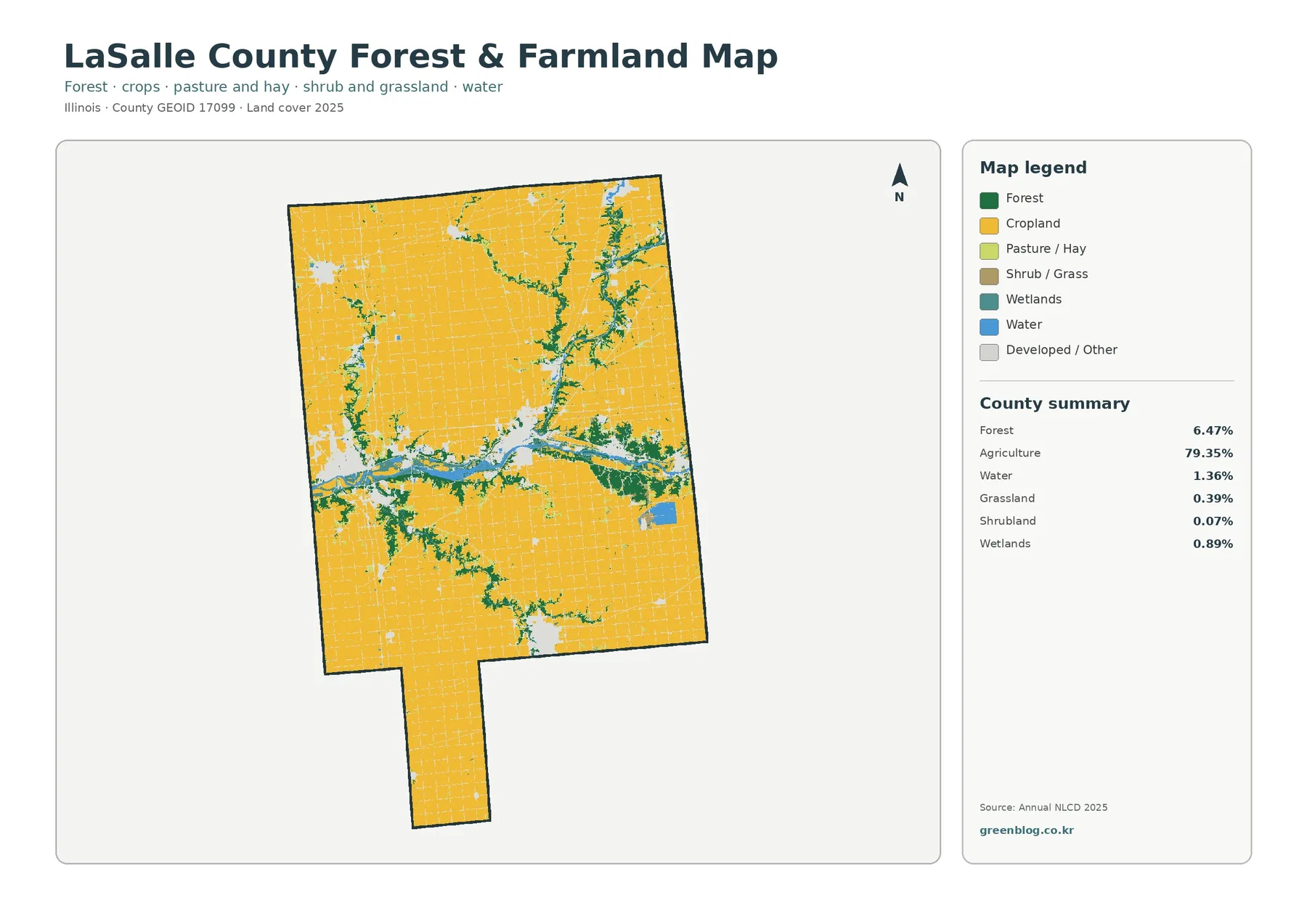
The forest-and-farmland map removes some of the visual competition created by the developed classes. Cropland becomes the dominant field, while forest, water, wetlands, pasture or hay, and shrub or grass stand out as exceptions. Agriculture still accounts for 79.35%, forest for 6.47%, water for 1.36%, wetlands for 0.89%, grassland for 0.39%, and shrubland for 0.07% in the map summary. The result is a cleaner picture of how natural cover threads through working farmland.
The strongest contrast lies along the Illinois River, where blue water and dark forest cut across the agricultural interior. Wooded areas also branch away from the main river along tributaries. In the northeast and in parts of the south, these green corridors break up the otherwise regular agricultural pattern. This view is especially useful for comparing the continuity of cropland with the much narrower but more connected-looking riparian woods.
Grassland and shrubland are minor classes in the county summary, so LaSalle County should not be described as a grass-dominated or shrub-dominated landscape. The open appearance of much of the county comes primarily from cultivated agriculture. Wetlands are also limited in percentage and tend to appear near water corridors rather than as one large wetland block. That distribution matches the county comprehensive plan’s discussion of remaining wetlands being concentrated largely in riparian and bottomland settings.
Starved Rock provides an important local counterpoint to the broad farm pattern. Illinois Department of Natural Resources material describes the preserve’s deep canyons, sandstone cliffs, and upland forest communities. The countywide map does not draw the park boundary or trail system, but it does show why the eastern Illinois River corridor should not be interpreted as ordinary cropland. Detailed recreation or habitat questions should still be checked against the official park and preserve maps.
Impervious surface separates a rural road grid from denser built clusters
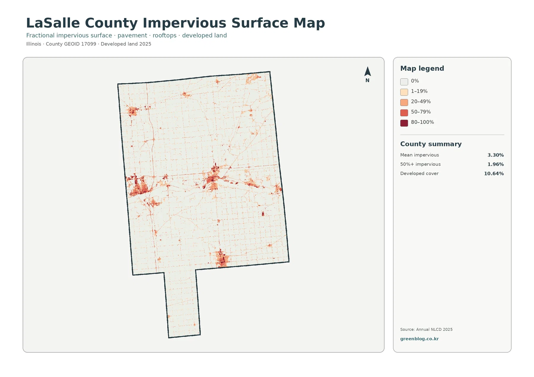
Impervious surface means pavement, rooftops, parking areas, and other artificial surfaces that do not readily absorb water. This map does not simply label a cell as developed or undeveloped. It groups the mapped fraction of impervious surface into 0%, 1–19%, 20–49%, 50–79%, and 80–100%. The countywide mean is 3.30%, while 1.96% of the county is summarized as having at least 50% impervious surface. Developed cover, by comparison, is 10.64%.
That difference between 10.64% developed cover and 3.30% mean imperviousness is important. A developed land-cover class can include lower-density settings where lawns, trees, or other permeable surfaces are mixed with buildings and roads. Fractional impervious data shows how much of a cell is actually covered by artificial surface. Using both maps prevents a common mistake: treating every developed-colored area as if it were fully paved or built over.
The impervious map shows a fine network of low values running through the rural landscape and stronger clusters around several towns. The densest patches are separated by large areas with little impervious cover, reinforcing the county’s farm-dominated character. This is one of the most useful maps for presentations about the difference between a county’s total developed footprint and the smaller areas where hard surfaces are concentrated.
Ottawa is a useful example of why this distinction can matter in local research. The City of Ottawa identifies special flood-hazard areas along the Fox River and Illinois River. The impervious map on this page is not a flood map and should never substitute for official floodplain information, but it can help a reader see where built surfaces and major waterways are close enough to justify consulting more specialized drainage or hazard maps.
The 1985–2025 map shows limited but locally concentrated class differences
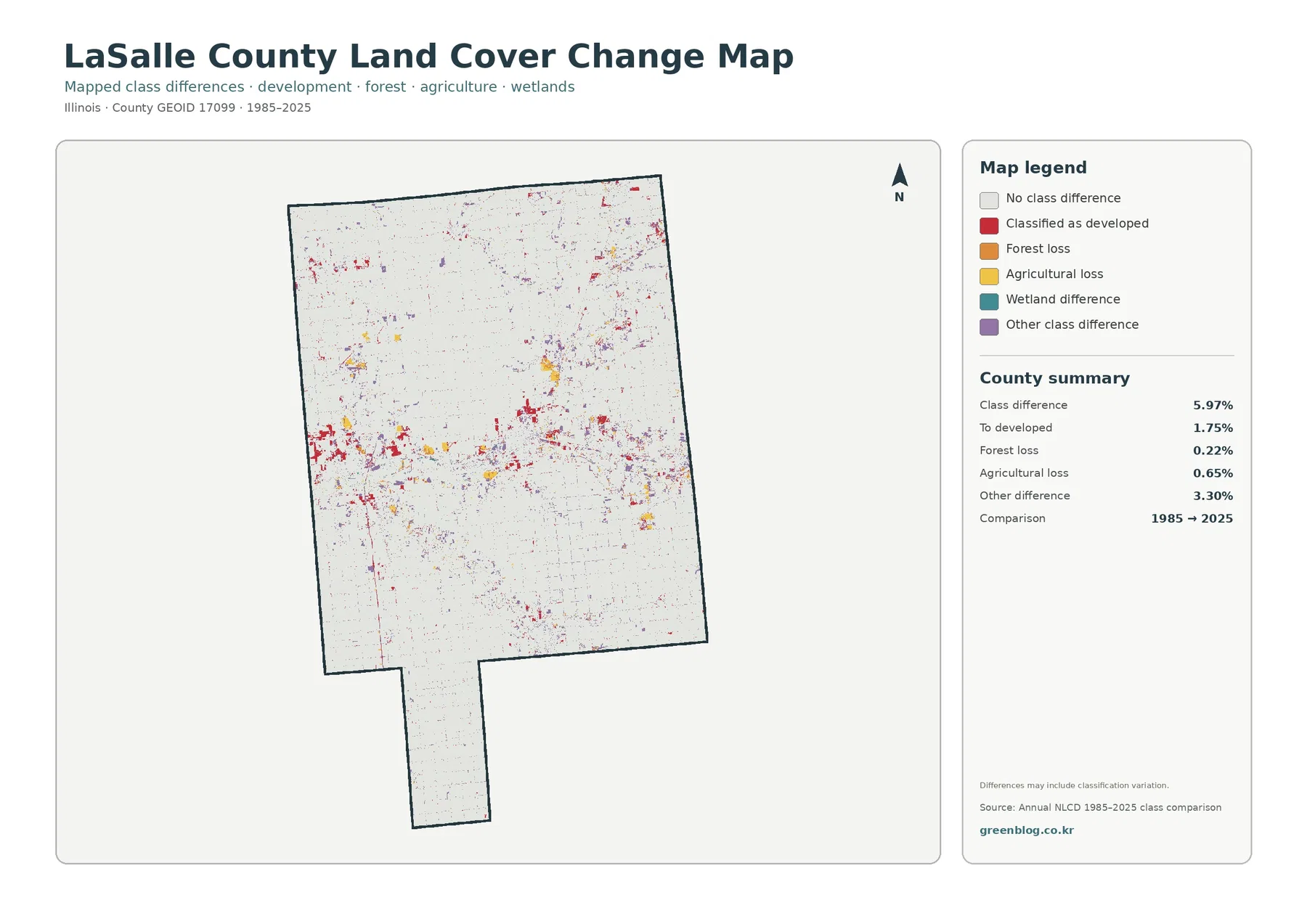
The long-term comparison is visually much lighter than the 2025 land-cover map because most of the county has no mapped class difference in the summary comparison. Overall class difference is 5.97%. Areas classified to developed account for 1.75%, agricultural loss for 0.65%, forest loss for 0.22%, and other class differences for 3.30%. The comparison period printed on the map is 1985 to 2025.
Change patches are more noticeable around the Illinois River corridor and around several developed clusters, while the large agricultural interiors remain comparatively quiet. Small marks also appear across rural areas, but they are generally dispersed rather than forming a countywide block of change. The map therefore works best as a locator: it points to places where classifications differ between the two endpoints and invites a closer look at those places.
The 1.75% “to developed” value is not the same thing as an official acreage of rezoned or newly permitted development. It represents mapped land-cover classification differences. Likewise, the 0.65% agricultural-loss and 0.22% forest-loss values should not be treated as parcel-level land-use records. A field can change classification for reasons that require more evidence, and classification methods themselves can contribute to some differences. The map explicitly warns that differences may include classification variation.
For a local project, the safest workflow is to use the change map to identify a cluster, then compare that area with dated aerial imagery, county planning records, or other official datasets. This avoids assigning a cause from color alone. The map can tell you that the 1985 and 2025 classes differ in a location; it cannot by itself tell you whether the difference came from a subdivision, a quarry, channel movement, vegetation succession, restoration, or a classification correction.
Reading the Illinois, Fox, and Vermilion river corridors across all four maps
LaSalle County’s river network provides a useful way to connect the four map views. County planning material describes the Fox River as entering from the northeast and joining the Illinois River at Ottawa. It also identifies the Vermilion River entering from the south, along with smaller tributaries. On the general land-cover map, these corridors combine water with forest and wetland colors. On the forest-and-farmland map, the same corridors become stronger green interruptions in the cropland.
The impervious view adds a different question: where do built surfaces cluster near those waterways? The strongest values appear in towns and along parts of the central river corridor, but the map still leaves broad agricultural areas with very low imperviousness. The change map then adds a time dimension by showing where endpoint classifications differ. Reading the maps in this sequence helps separate three ideas that are easy to mix up: current cover, intensity of hard surface, and change between two dates.
No single color should be used to infer legal land use. A yellow agricultural cell does not provide ownership, zoning, crop type, or development rights. A red developed cell does not identify a parcel boundary or building footprint. A green forest cell does not tell you whether the land is public, private, protected, harvested, or managed for recreation. Those questions require cadastral, zoning, ownership, or resource-management data from the appropriate agency.
Resolution, mixed pixels, and other limits that matter at county scale
Annual NLCD is a raster product derived from satellite imagery at 30-meter resolution. A raster divides the landscape into a grid and assigns information to each cell. That is appropriate for county-scale pattern analysis, but it also means narrow tree lines, small ponds, individual buildings, and mixed edges can be generalized. A cell near a road, field, and wooded stream may represent only the dominant or modeled condition rather than every feature inside that square.
Mixed pixels are especially important along the Illinois River and in town edges, where water, vegetation, roads, buildings, and open land can occur close together. The map is designed to show broad surface-cover patterns, not survey-grade boundaries. If a project depends on the exact edge of a wetland, a parcel line, a building, or a floodplain, readers should move to the specialized official dataset made for that purpose.
The comparison map adds another limitation: endpoint differences combine real landscape change with the realities of classification. Annual products are designed for consistent long-term monitoring, but imagery, models, and validation methods can improve over time. Small isolated pixels deserve more caution than broad, coherent patterns. This is why the map’s own note about classification variation is important and why the countywide summary should be treated as mapped class difference rather than a legal or accounting statistic.
Choosing the right map for a class, report, or local reference
Start with the general land-cover map when the audience needs the whole county in one picture. It quickly establishes the 79.35% agricultural majority and shows where developed land, forest, water, and wetlands interrupt that pattern. For a lesson about watersheds or habitat corridors, move next to the forest-and-farmland map because the wooded river networks are easier to follow when developed classes are visually reduced.
Use the impervious map when the question is about the concentration of pavement and structures rather than the broader developed classification. It is particularly helpful for explaining why a rural county can have visible towns and road networks while still maintaining a low countywide mean impervious value. For a historical comparison, finish with the 1985–2025 change map and emphasize that it identifies class differences, not their causes.
For print or presentation work, the downloadable JPG set keeps the four views together. A clear sequence is to show the general map first, then one specialized map that answers the main question, and finally the change map only if time is relevant. Placing all four at equal size can also work well for side-by-side comparison because the county boundary stays consistent while the legend and mapped variable change.
Frequently Asked Questions
What is the dominant land cover in LaSalle County?
Agriculture is the dominant 2025 class at 79.35%. Developed land is 10.64% and forest is 6.47%, while water and wetlands account for 1.36% and 0.89% respectively. The map also makes clear that the smaller forest and water shares are concentrated along river corridors, so they remain visually prominent despite their lower percentages.
Which map is best for following the wooded river corridors?
The forest-and-farmland map is the clearest choice because it emphasizes cropland, forest, water, and wetlands. The Illinois River forms the main east-west break in the agricultural landscape, while tributary corridors extend into the northeast and south. The general land-cover map is useful alongside it when you also need to see developed areas.
Does the 5.97% class difference mean 5.97% of the county was legally converted to a new land use?
No. The 5.97% figure is the mapped class difference between the 1985 and 2025 endpoints in this comparison. It is not a zoning, permit, ownership, or parcel statistic. The map should be used to locate areas of potential interest, with local records or other dated imagery used to determine what actually happened on the ground.
Sources and reference material
The mapped percentages and map-specific descriptions above come from the four supplied Annual NLCD-based LaSalle County maps. The official links below provide the dataset documentation, county planning context, and boundary or natural-resource references used to interpret the maps.
- MRLC Annual NLCD — annual land-cover and land-change product information
- U.S. Geological Survey: Annual NLCD spatial resolution — 30-meter raster resolution
- LaSalle County Planning — comprehensive plan and natural-resource planning documents
- Illinois DNR: Starved Rock Nature Preserve — local canyon and forest context
- U.S. Census Bureau TIGER/Line Shapefiles — county boundary data
Map File Information
The download contains the four original JPG maps used for this page: land cover, forest and farmland, impervious surface and developed land, and mapped land-cover change from 1985 to 2025.
- Included Files: General land cover, forest and farmland, impervious/developed surface, and land-cover change maps
- File Type: Four original JPG map files bundled in one ZIP archive
- Intended Use: Printing, education, presentations, and map-based projects
Related Maps
- Adams County Illinois Land Cover Map
- Alexander County Illinois Land Cover Map
- Bond County Illinois Land Cover Map
Green Map creates custom-edited map images using open geographic data sources such as geoBoundaries, Natural Earth, OpenStreetMap, and government open data. These maps are edited visual materials, not raw data files, and are provided for education, documents, presentations, and graphic reference.