Arizona’s population pattern is defined less by an even statewide spread than by a few strong urban concentrations. On the 2024 American Community Survey maps, the Phoenix metropolitan area forms the broadest and most intense cluster, Tucson stands out as a second major center, and smaller concentrations appear around Yuma and Flagstaff. At the county level, Maricopa dominates both total population and average density, but the 2010–2020 change map adds another layer: Pinal, Greenlee, and Yavapai also recorded notable percentage growth, while La Paz, Apache, and Cochise declined.
The maps on this page measure different things, so they are most useful when read together. Census-tract density shows where residents are concentrated within counties. The city map compares the total population of census places. A separate county map compares total county population, while another summarizes average density by county. Finally, the 2010–2020 map measures percentage change between two decennial censuses rather than a 2024 estimate. Keeping those measures separate makes the geography of Arizona’s population much easier to understand.
Table of Contents
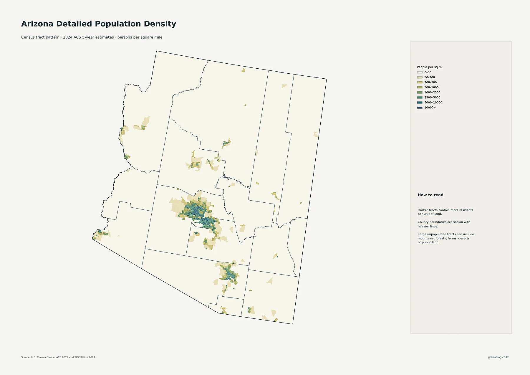
Phoenix forms the broadest high-density cluster on the detailed map
The first map uses 2024 ACS 5-year estimates at the census-tract level. Its legend measures people per square mile, ranging from 0–50 at the low end to 10,000 or more at the high end. Darker tracts contain more residents per unit of land. County boundaries are drawn with heavier lines, making it possible to compare local settlement patterns with the larger administrative geography.
The strongest pattern is in south-central Arizona. Dense tracts spread across a wide part of Maricopa County rather than appearing as a single isolated dot. The concentration extends through Phoenix and the surrounding urban belt that includes Mesa, Gilbert, Chandler, Glendale, Scottsdale, Peoria, Tempe, Surprise, Goodyear, and other communities. South of that cluster, Tucson produces a second clear concentration in Pima County. Yuma in the southwest and Flagstaff in the north appear as smaller but distinct population centers.
Large portions of northern, northeastern, and western Arizona remain in the lightest density classes. That does not mean those counties are empty; it means that their residents are spread over much larger areas and that dense settlement is limited to smaller pockets. For a reader trying to see where people actually live inside a large county, this tract map is more informative than a single countywide average.
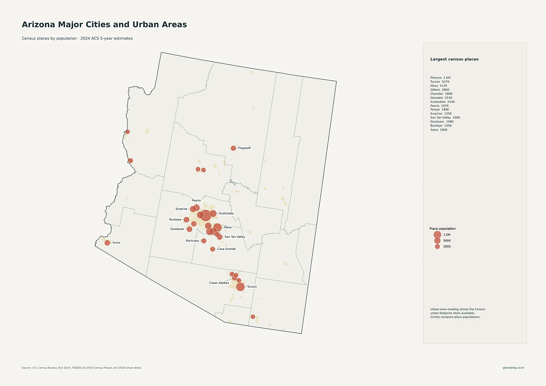
The city map shows why the Phoenix area dominates the statewide pattern
The second map compares 2024 ACS populations for census places using proportional circles. The circles represent total place population, not population density. Phoenix is the largest place at about 1.64 million residents. Tucson follows at roughly 547,000, while Mesa has about 512,000. Gilbert and Chandler are each close to 280,000, Glendale is about 253,000, and Scottsdale is about 244,000.
What matters visually is how many of the largest circles are located in the same part of the state. Around Phoenix, large places sit close together across the metropolitan area: Mesa and Gilbert to the east, Chandler and Tempe to the southeast, Glendale and Peoria to the west and northwest, plus Surprise, Goodyear, Buckeye, and other growing communities. San Tan Valley, shown at about 109,000 residents, extends the concentration toward northern Pinal County.
Tucson is the largest urban center outside the Phoenix region and creates a separate cluster in southern Arizona. Yuma, with about 100,000 residents, anchors the southwest, while Flagstaff, at roughly 76,000, stands out in the north. The map combines 2024 ACS place populations with Census urban-area shading derived from 2020 geography, so the population circles and the urban footprint should not be treated as measurements from the same year.
County totals reveal the scale of Maricopa’s population lead
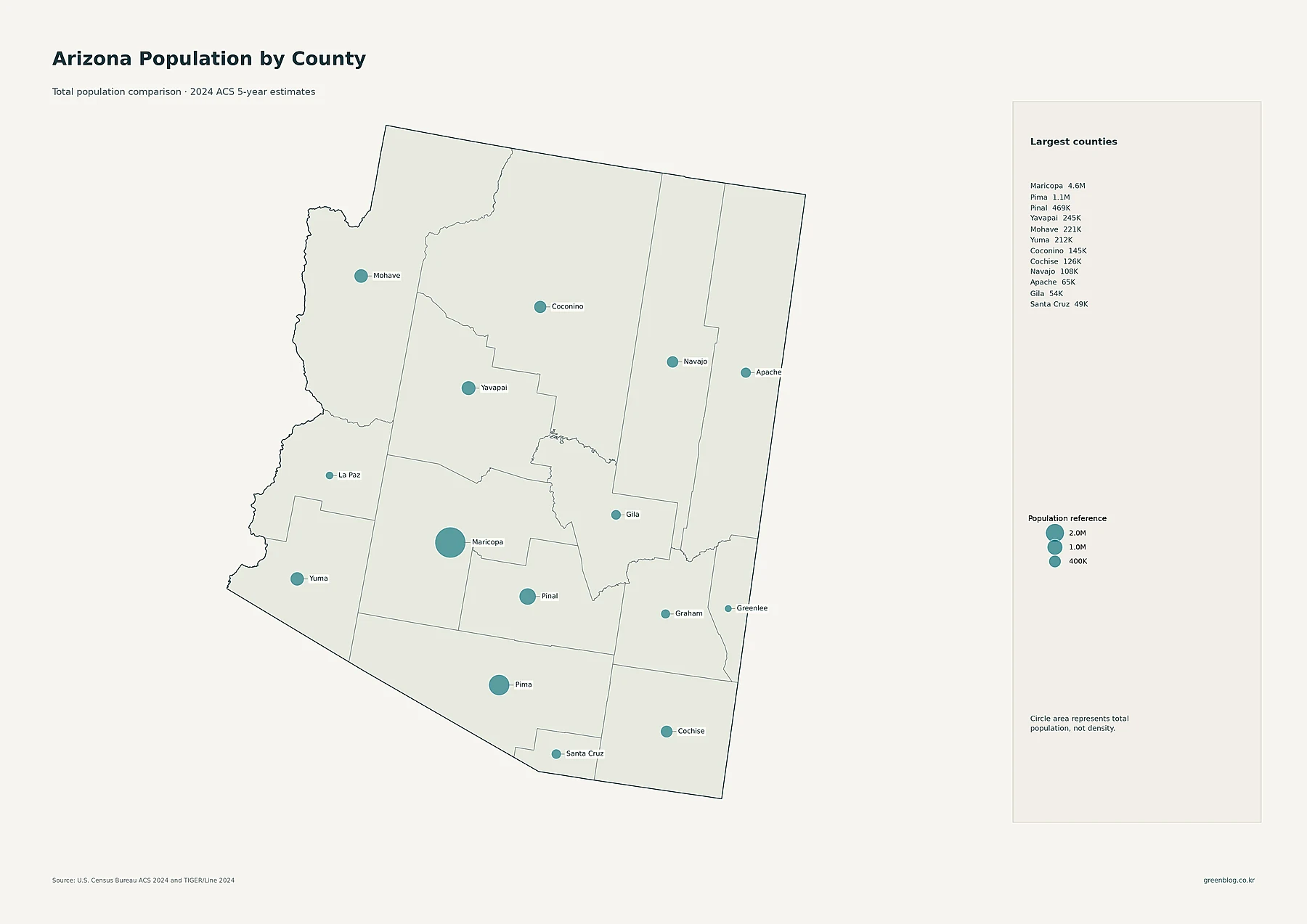
The third map switches from places to counties. Circle area represents total 2024 population, and the legend explicitly notes that it is not a density measure. Maricopa County has an estimated 4,559,748 residents, far more than any other county in the state. Pima County is second at 1,060,490. Pinal follows at 469,006, then Yavapai at 245,480, Mohave at 220,517, and Yuma at 211,741.
This map helps separate geographic size from population size. Coconino covers a very large area in northern Arizona but has an estimated population of about 144,508. By contrast, Maricopa occupies a smaller share of the state’s land yet contains the Phoenix region and by far the largest county population. Apache, Navajo, and Cochise also cover substantial territory without approaching the population totals found in the two main metropolitan counties.
| County | 2024 estimated population | Density per sq mi |
|---|---|---|
| Maricopa | 4,559,748 | 495.5 |
| Pima | 1,060,490 | 115.4 |
| Pinal | 469,006 | 87.4 |
| Yavapai | 245,480 | 30.2 |
| Mohave | 220,517 | 16.5 |
| Yuma | 211,741 | 38.4 |
From 2010 to 2020, growth and decline followed different county patterns
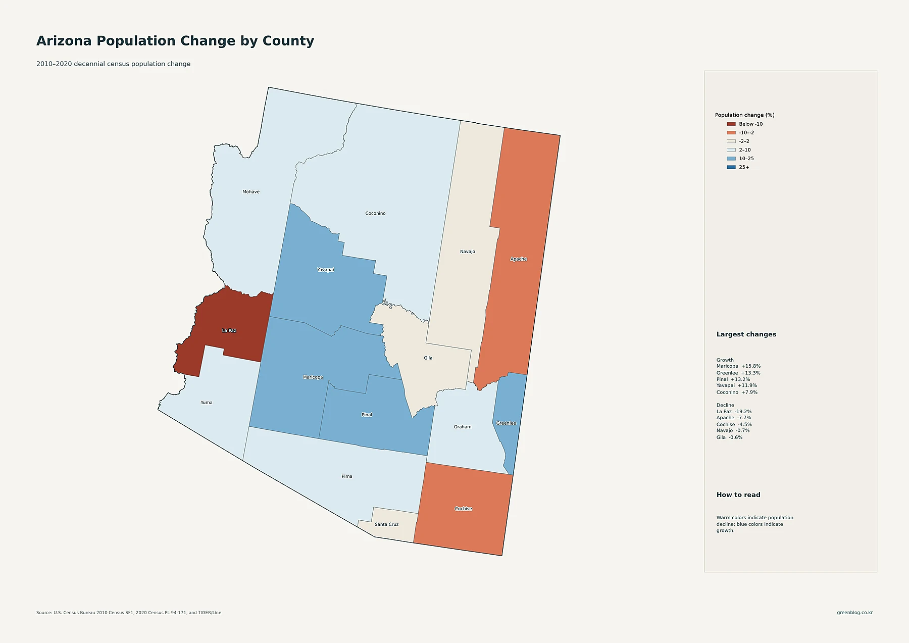
The fourth map is based on decennial census change, not the 2024 ACS estimates. Blue shades indicate population growth from 2010 to 2020, while warm shades indicate decline. Maricopa increased from 3,817,117 residents in 2010 to 4,420,568 in 2020, a gain of about 15.8 percent. Greenlee grew by about 13.3 percent, Pinal by 13.2 percent, and Yavapai by 11.9 percent. Coconino, Mohave, Pima, Yuma, and Graham also gained population, though at lower rates.
La Paz shows the largest percentage decline in the supplied county data, falling from 20,489 to 16,557 residents, or about 19.2 percent. Apache declined by about 7.7 percent and Cochise by about 4.5 percent. Navajo and Gila were close to flat but slightly negative. Santa Cruz was also nearly flat, with a small increase of about 0.5 percent.
A percentage-change map needs careful interpretation. A small county can post a high percentage change from a relatively small absolute gain or loss, while a populous county can add far more people without necessarily having the highest percentage. The map also does not explain why a county grew or declined. It is best used to identify the direction and scale of change, then paired with other official data if the causes are important.
County density puts the Phoenix concentration into a statewide scale
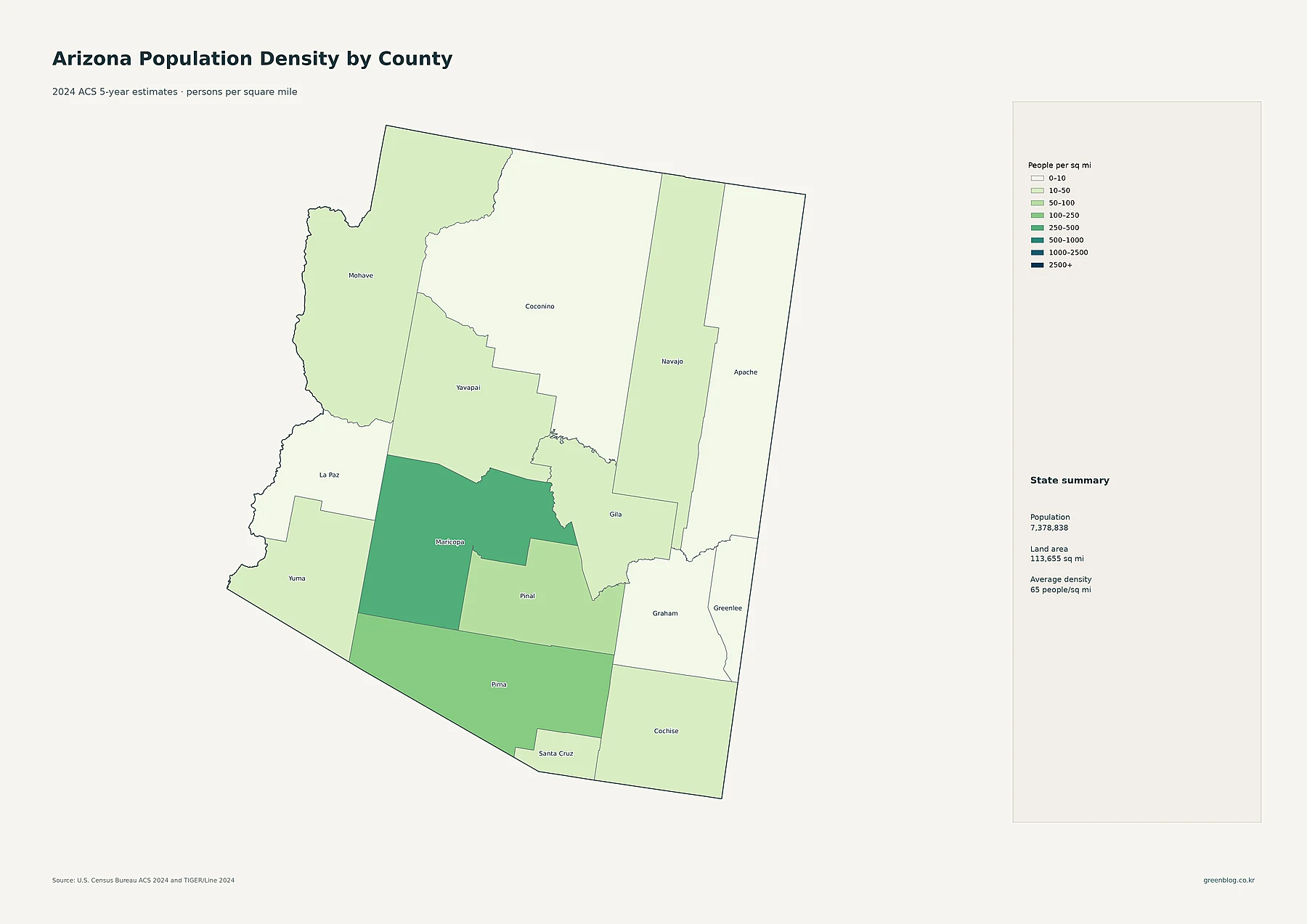
The fifth map summarizes 2024 ACS population density by county in people per square mile. Maricopa is the clear leader at about 495.5 people per square mile. Pima is second at about 115.4, and Pinal is third at about 87.4. Santa Cruz and Yuma are both near 40, while Yavapai is around 30.2. At the low end, Apache is about 5.8, Greenlee about 5.1, and La Paz about 3.7 people per square mile.
The state summary printed on the map lists a 2024 estimated population of 7,378,838, a land area of 113,655 square miles, and an average statewide density of about 65 people per square mile. That statewide average is useful, but it hides the sharp internal contrast. Maricopa is many times denser than most counties, while large northern and eastern counties fall into much lower classes.
County averages also smooth over local variation. Coconino County, for example, averages only about 7.8 people per square mile, yet the detailed tract map still shows a distinct concentration around Flagstaff. The same principle applies elsewhere: a county can be sparsely populated overall while containing a compact city or town with much higher local density. This is why the detailed map and county map answer complementary questions.
Three distinctions make these Arizona population maps easier to use
First, total population and density are not the same measure. A large circle on the city or county population map means that the place contains many residents. A dark area on a density map means many residents live within a given unit of land. Second, countywide density can conceal dense neighborhoods or cities inside an otherwise sparse county. The tract map is the better choice when the exact location of settlement matters.
Third, the 2010–2020 change map describes a decade of movement, not the current 2024 population level. Maricopa happens to rank high on both current size and decade growth, but that is not true for every county. Greenlee has a small current population yet a relatively high 2010–2020 percentage increase. La Paz is small in current population and also recorded the largest percentage decline in the supplied decade comparison. Reading the measures separately prevents a large share of the common mistakes that arise when population maps are compared.
Download the Arizona population map collection
Arizona population map collection
The download includes the detailed census-tract density map, major cities and urban areas, county population totals, 2010–2020 county change, and county population density.
Frequently asked questions
Where is Arizona’s largest population concentration?
The 2024 ACS maps show the strongest concentration in and around Phoenix. Maricopa County contains the largest county population, and the census-tract map shows the broadest continuous area of higher-density tracts in the Phoenix metropolitan region.
Does the large Maricopa circle mean population density?
No. On the county population map, circle size represents total population. Density is shown on a separate county map, where Maricopa also ranks highest at about 495.5 people per square mile.
Are all five maps based on 2024 data?
No. The density, city, and county population maps use 2024 ACS 5-year estimates. The population-change map compares the 2010 and 2020 decennial censuses, so its period must be read separately.
Related Maps
Sources
- U.S. Census Bureau — American Community Survey (ACS): 2024 ACS 5-year population and density estimates
- U.S. Census Bureau — TIGER/Line Shapefiles: 2024 county, census tract, and census place geography
- U.S. Census Bureau — Decennial Census: 2010 and 2020 county populations used for the change comparison
Values in the maps and table come from the supplied Census-based project data. Some values are rounded for readability. Because the package combines 2024 estimates with a 2010–2020 change layer, check the year printed on each map before using a number in another context.
Green Map creates custom-edited map images using open geographic data sources such as geoBoundaries, Natural Earth, OpenStreetMap, and government open data. These maps are edited visual materials, not raw data files, and are provided for education, documents, presentations, and graphic reference.