The World Bank indicator Revenue, excluding grants (% of GDP) compares government revenue excluding grants with the size of the economy. It is useful because it puts revenue on a common GDP scale, making cross-country differences easier to see than a table of nominal currency amounts. The dataset used here contains the latest non-empty observation for 162 economies, not a single synchronized year. Eighty-nine economies have a 2024 observation, while the rest have earlier latest values. That distinction matters: the map is a strong overview of the most recently available international pattern, but it should not be described as a 162-country ranking for 2024.
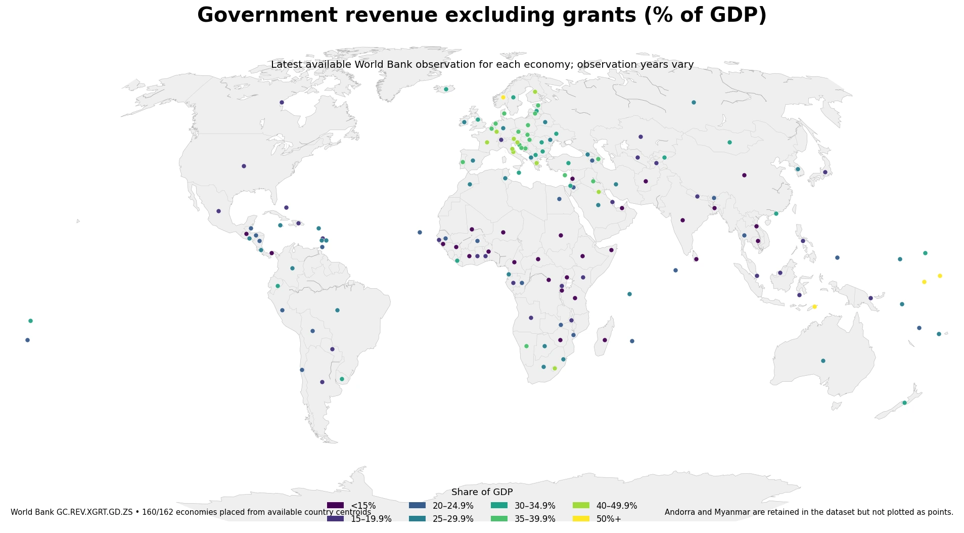
Table of Contents
What the indicator measures
The numerator is revenue excluding grants, and the denominator is GDP. The World Bank description defines revenue as an increase in net worth resulting from a transaction, with grants excluded from this measure. A value of 30% therefore means that the reported revenue measure for that observation year is equivalent to about 30% of GDP. It does not mean that households or companies face a 30% tax rate. Government revenue can include multiple categories, and the ratio is not a personal tax-rate statistic.
The indicator is also different from a budget balance. A fiscal balance requires both revenue and expenditure, while this measure shows only the revenue side. It does not tell us directly whether a government ran a deficit, how large public spending was, how much debt was outstanding, or whether public services were effective. Those questions require separate indicators. The ratio can also move because GDP changes: even if revenue is fairly stable, a larger or smaller denominator can alter the percentage.
Values above 100% require especially careful interpretation. Nauru records 115.55% in 2024 in this dataset. That means the reported revenue measure is larger than annual GDP for that observation; it does not mean that a 115% tax rate was imposed. Very high ratios can occur in unusual economic or revenue structures, especially in small economies, and this dataset alone cannot identify the causal explanation.
How the 162 latest observations are distributed
Across all 162 latest available observations, the median is 25.15%. The first quartile is 16.90%, the third quartile is 31.58%, and the 90th percentile is 39.29%. The mean is 25.91%, close to the median, but the upper tail contains several unusually high observations. For that reason, a median and distribution bands are more informative than relying only on the arithmetic average.
The value bands used in the map contain 29 economies below 15%, 28 from 15% to 19.9%, 23 from 20% to 24.9%, 31 from 25% to 29.9%, 20 from 30% to 34.9%, 17 from 35% to 39.9%, 10 from 40% to 49.9%, and four at 50% or more. The largest group is the 25–29.9% band, but no single band dominates the dataset. Government revenue relative to GDP is spread across a broad range.
The map shows a visible concentration of higher values across many European economies, while a number of economies in Africa and South Asia appear in lower bands. That broad pattern is not universal. There are high and low observations inside the same geographic areas, so continent-level descriptions should not be treated as explanations. Fiscal institutions, the economic base, revenue composition, reporting circumstances, and the observation year can all differ. The map is best used to identify clusters and exceptions that merit deeper country-level investigation.
What changes when the comparison is limited to 2024
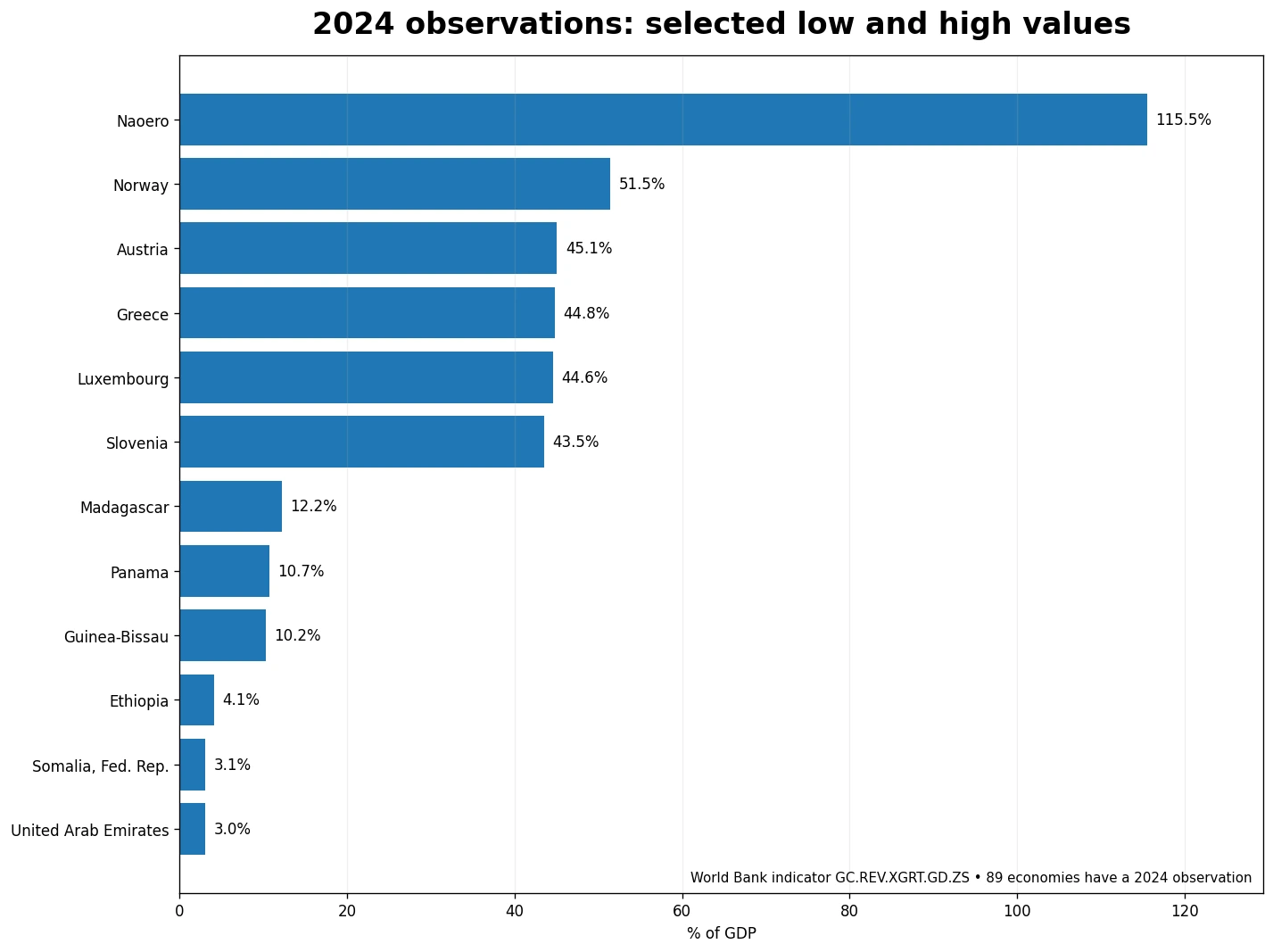
A cleaner same-year comparison is possible for the 89 economies that actually report a 2024 value. Among those observations, Nauru is 115.55%, Norway 51.45%, Austria 45.07%, Greece 44.76%, and Luxembourg 44.59%. At the low end, the United Arab Emirates is 3.03%, Somalia 3.09%, Ethiopia 4.07%, Guinea-Bissau 10.25%, and Panama 10.70%. These are not the top and bottom values from a uniform 162-economy 2024 dataset; they are the extremes within the 89 economies for which 2024 is available.
| Economy | Observation year | Share of GDP | Position |
|---|---|---|---|
| Nauru | 2024 | 115.55% | High |
| Norway | 2024 | 51.45% | High |
| Austria | 2024 | 45.07% | High |
| Greece | 2024 | 44.76% | High |
| Luxembourg | 2024 | 44.59% | High |
| United Arab Emirates | 2024 | 3.03% | Low |
| Somalia | 2024 | 3.09% | Low |
| Ethiopia | 2024 | 4.07% | Low |
| Guinea-Bissau | 2024 | 10.25% | Low |
| Panama | 2024 | 10.70% | Low |
Nauru is a clear outlier in the 2024 subset. Its 115.55% value is about 64.10 percentage points above Norway, the second-highest 2024 observation in the table. A fully continuous color scale extending to the maximum would compress differences among the much larger group of economies between roughly 15% and 40%. The map therefore uses value bands. The banding changes only the visual classification, not the underlying observations; exact percentages remain the values reported in the source dataset.
Large differences can appear across neighboring economies
Geographic proximity does not guarantee similar revenue-to-GDP ratios. In 2024 Austria records 45.07%, while neighboring Switzerland records 17.04%, a gap of about 28.03 percentage points. The United Arab Emirates is 3.03% compared with 26.77% in neighboring Saudi Arabia, a difference of about 23.74 points. Costa Rica records 27.42% and Panama 10.70%, a gap of roughly 16.72 points.
Other 2024 examples show the same pattern. China is 14.93% and neighboring Mongolia 31.61%, a difference of about 16.68 percentage points. Guatemala is 12.78% and El Salvador 27.26%, a gap of about 14.48 points. These contrasts are important because they show that a smooth regional narrative can hide substantial national differences. A map is useful precisely because it makes these abrupt changes visible.
The indicator does not, however, explain why those gaps exist. It does not provide a decomposition of taxes, social contributions, other revenue categories, resource-related receipts, policy changes, or institutional arrangements. A neighboring-country difference can be stated from the data, but attributing that difference to a particular policy or economic structure would require additional official fiscal statistics.
The biggest limitation is unequal data freshness
Of the 162 latest available observations, 89 are from 2024. Another 50 are from 2020 through 2023, 12 are from 2010 through 2019, and 11 are from before 2010. Most observations are therefore relatively recent, but a meaningful minority are not. Any cross-country reading of the complete map should keep that age difference visible.
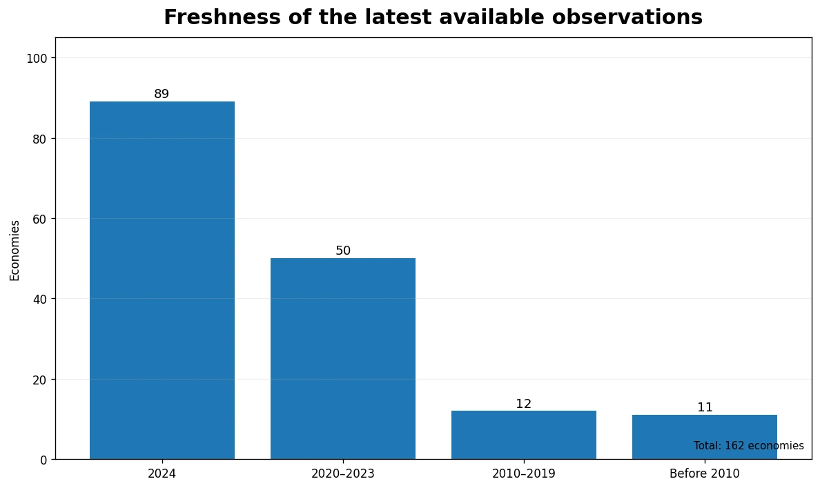
Some examples make the issue concrete. Kuwait has a latest available value of 43.76%, but the observation year is 1998. Guinea has 8.26% from 1992, and Benin has 12.93% from 1979. Those observations can still be useful for historical coverage or for understanding where current reporting is missing, but they should not be presented as current 2024 conditions. By contrast, comparisons among economies that all have 2024 observations avoid this particular timing problem.
A practical way to read the dataset is to separate two tasks. First, use the full map to ask, “What is the latest value currently available for each economy, and where do broad high or low clusters appear?” Second, when the question requires a point-in-time comparison, filter to a common year such as 2024. This two-step approach preserves the geographic coverage of the full dataset without pretending that every observation is equally fresh.
How to interpret the ratio without overreaching
Revenue excluding grants as a share of GDP is a scale ratio. A higher figure says that the measured revenue is large relative to the economy in that year; it does not automatically mean stronger fiscal health, better policy, higher living standards, or more efficient government. A lower figure does not automatically imply the opposite. Spending, debt, fiscal balance, inflation, population, income level, and the structure of the economy all sit outside this single measure.
Changes over time also require attention to both numerator and denominator. The ratio can fall even when nominal revenue rises if GDP grows faster. It can rise when revenue is unchanged if GDP contracts. Therefore, a change in the percentage should not be translated directly into a statement such as “the government collected more” without checking the underlying revenue and GDP series.
For cross-country work, the most defensible comparisons use the same indicator definition and, when possible, the same observation year. This dataset has the advantage of a common World Bank indicator code, GC.REV.XGRT.GD.ZS, across all economies. Its main limitation is that the latest non-empty observation is not synchronized. That makes it particularly good for geographic screening and less suitable for making a precise claim about which country currently has the highest or lowest ratio unless the comparison is restricted to a shared year.
Key takeaways
- The median latest available value across 162 economies is 25.15% of GDP, and the middle 50% lies between about 16.90% and 31.58%.
- Eighty-nine economies have a 2024 observation. Within that same-year subset, Nauru is 115.55% and Norway 51.45%, while the United Arab Emirates is 3.03% and Somalia 3.09%.
- Neighboring economies can differ by more than 10 or 20 percentage points, so geography alone does not explain the pattern.
- This indicator is not a tax rate, budget balance, or spending measure; it is revenue excluding grants divided by GDP.
- Use the full map for latest-available spatial patterns and a common-year subset for strict point-in-time comparisons.
Frequently Asked Questions
Is revenue excluding grants as a share of GDP the same as a tax rate?
No. It compares a government revenue measure excluding grants with GDP. It is not the tax rate paid by a household or company.
Are all 162 economy observations from 2024?
No. The dataset uses the latest non-empty value for each economy. Eighty-nine economies have a 2024 observation and the rest have earlier latest values.
What is the safest way to compare countries with this indicator?
Use the same indicator definition and, when possible, compare economies from the same observation year. If latest values from different years are shown together, keep the year visible.
Related Articles
Green Map creates custom-edited map images using open geographic data sources such as geoBoundaries, Natural Earth, OpenStreetMap, and government open data. These maps are edited visual materials, not raw data files, and are provided for education, documents, presentations, and graphic reference.