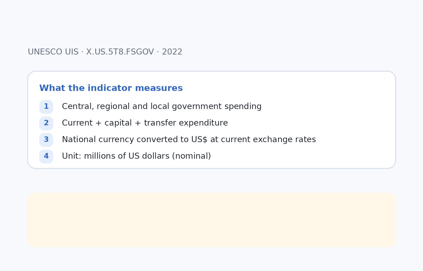
Labor-force participation among working-age people with intermediate education varies widely across economies. World Bank indicator SL.TLF.INTM.ZS compares the labor force with intermediate education with the total working-age population that has the same education level. Intermediate education covers upper-secondary or post-secondary non-tertiary education under ISCED 2011. This is therefore not a measure of how much of the entire labor force has intermediate education. It is closer to a participation measure within one education group: among working-age people with intermediate education, what share is in the labor force?
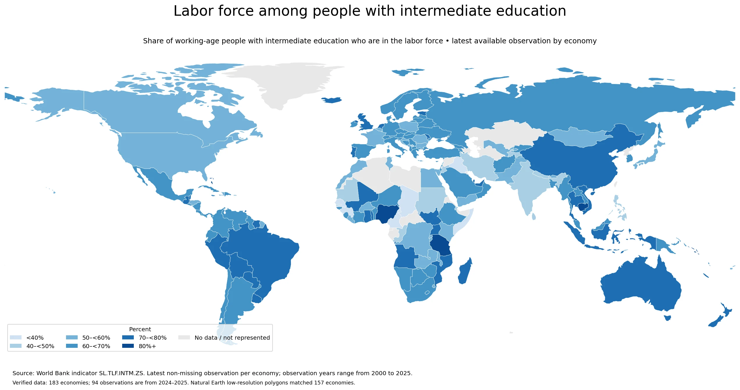
Table of Contents
What the indicator actually measures
The denominator is the working-age population with intermediate education, and the numerator is the portion of that group counted in the labor force. A value of 65% can therefore be read as roughly 65 out of every 100 working-age people with that education level being either employed or unemployed and actively participating in the labor market. People outside the labor force are not in the numerator. This distinction matters because a high value is not identical to a high employment rate: unemployed people who are seeking work can still be part of the labor force.
The indicator also does not directly measure education quality, earnings, job security, formal employment, productivity, or the match between skills and jobs. It is useful for comparing participation within an education group, but it cannot by itself show whether a labor market offers better jobs. Sex-specific, age-specific, employment, unemployment, and wage indicators are needed to explain the structure behind the headline percentage.
How the latest values are distributed across 183 economies
Across the 183 verified observations, the median is 63.72% and the mean is 62.63%. The first quartile is 56.84% and the third quartile is 70.95%, placing the middle half of economies roughly between 56.8% and 70.9%. The 60–<70% band contains 71 economies, making it the thickest part of the distribution. There are 27 economies below 50% and 7 at or above 80%. The global range is therefore broad rather than tightly clustered around one common level.
The highest value is Bahamas, The at 97.488%, while the lowest is Somalia, Fed. Rep. at 22.805%, a gap of about 74.7 percentage points. That difference should not be treated as a perfectly synchronized one-year comparison because the latest observation is not from the same year for every economy. The map is best read as a comparison of the most recent value currently available in the supplied World Bank series.
Economies with the highest shares
The upper end includes economies from several different regions. The Bahamas records 97.49%, followed by Solomon Islands at 92.85%, Tanzania at 87.59%, Cayman Islands at 85.95%, and Cambodia at 84.54%. Antigua and Barbuda and Nigeria are also above 80%. The geographic diversity of the top group is a warning against explaining the pattern with a single regional or income-level story. Participation can be shaped by sex differences, continued education, retirement, informal work, business cycles, demographic structure, and labor-market institutions.
| Economy | Latest share | Observation year |
|---|---|---|
| Bahamas, The | 97.5% | 2023 |
| Solomon Islands | 92.9% | 2013 |
| Tanzania | 87.6% | 2024 |
| Cayman Islands | 85.9% | 2015 |
| Cambodia | 84.5% | 2023 |
| Antigua and Barbuda | 83.8% | 2018 |
| Nigeria | 82.8% | 2024 |
| South Sudan | 79.9% | 2008 |
| Qatar | 79.6% | 2020 |
| Guatemala | 79.3% | 2024 |
The observation years in the top group also differ substantially. Solomon Islands is represented by a 2013 value, Cayman Islands by 2015 and Antigua and Barbuda by 2018, whereas Tanzania and Nigeria have 2024 observations. A ranking that ignores those dates would mix older and newer labor-market conditions as if they were simultaneous. For that reason, the year column is part of the interpretation rather than a minor footnote.
Economies with the lowest shares
At the lower end, the Federal Republic of Somalia is at 22.81%, Cameroon at 24.97%, Sao Tome and Principe at 29.60%, Guinea at 32.26%, and Iraq at 33.24%. Senegal and West Bank and Gaza are also below 40%. A low value means a smaller share of working-age people with intermediate education is in the labor force, but the indicator does not say why. The difference could reflect inactivity rather than unemployment, and inactivity itself can be associated with education, family care, health, retirement, discouragement, or other circumstances.
| Economy | Latest share | Observation year |
|---|---|---|
| Somalia, Fed. Rep. | 22.8% | 2022 |
| Cameroon | 25.0% | 2021 |
| Sao Tome and Principe | 29.6% | 2017 |
| Guinea | 32.3% | 2019 |
| Iraq | 33.2% | 2021 |
| Senegal | 37.7% | 2024 |
| West Bank and Gaza | 38.0% | 2025 |
| Chad | 39.3% | 2022 |
| Puerto Rico (US) | 40.2% | 2020 |
| Jordan | 40.9% | 2023 |
A low share should therefore not automatically be read as a simple shortage of jobs. Likewise, a high share does not prove that jobs are well paid or secure. The strength of the series is that it gives a compact participation measure for one education group; its limitation is that it does not separate the reasons for participation or non-participation and does not describe job quality.
Why the observation years differ
This dataset keeps the most recent non-missing observation available for each economy. Of the 183 rows, 17 are from 2025, 77 from 2024, and 18 from 2023. The 2024–2025 group contains 94 economies and the 2023–2025 group contains 112. At the other end, 32 observations predate 2020, and the oldest is China’s 2000 value. That is why a title such as “2025 world ranking” would overstate the time consistency of the source. “Latest available” is the more accurate description.
Timing matters because labor-force participation can change with recessions and recoveries, demographic shifts, expansion of education, migration, retirement patterns, and policy changes. An older observation may no longer represent current conditions. For recent policy or market analysis, economies with stale values should be checked against newer national statistics or later World Bank updates before drawing strong conclusions.
How to read the map correctly
The map is built from the 183 verified economy rows, but 157 polygons could be directly matched to the low-resolution Natural Earth country boundaries used for display. Small island economies and some territories can have a source value without a separately represented polygon in this world layer. An uncolored or absent small territory therefore should not automatically be interpreted as missing in the underlying World Bank data. The table-level economy record remains the authoritative source for the individual value.
The color bands are visualization bins, not official World Bank classifications or policy thresholds. Two economies just below and just above a break, such as 69.9% and 70.1%, are substantively very similar even though they receive different shades. For close comparisons, use the percentage value rather than the color category alone.
How to connect high and low values with labor-market structure
Three companion measures are especially useful. First, compare employment and unemployment within the same education group. A high labor-force share combined with high unemployment can mean that many people are participating but struggling to find work. Second, inspect participation by sex because the overall average can hide a large gender gap. Third, examine age-specific patterns: longer time in education among younger adults and earlier retirement among older adults can change the aggregate share even when labor demand is similar.
Education indicators also need compatible denominators. Bachelor’s attainment, upper-secondary completion, enrollment and this labor-force indicator describe different populations. A useful sequence is to first ask how large each education group is, then ask how many people within that group participate in the labor market, and finally examine employment outcomes and earnings. That separates educational attainment from the transition into work.
What the dataset can and cannot support
The data can support statements about the share of intermediate-educated working-age people who are in the labor force, the spread of the latest available observations, and the relative position of an economy within that distribution. The median, quartiles and top or bottom values provide useful context, while the observation year identifies how current each record is. These are descriptive comparisons directly supported by the series.
The data cannot, on their own, establish the effectiveness of an education policy, the quality of jobs, wage levels, productivity, or the causal effect of a labor-market institution. Cross-country differences should not be converted into causal claims without additional evidence. Used within those limits, the map and tables are a practical starting point for comparing how strongly people with intermediate education are connected to the labor force across economies.
Source and calculation basis
The source is World Bank indicator SL.TLF.INTM.ZS. The unit is percent, and the dataset uses the most recent non-missing observation for each economy. There are no missing values in the supplied 183-row extract; missing observations were not converted to zero and no values were imputed. Every map and table value on this page is calculated directly from the economy-level source data.
Frequently Asked Questions
Is this the share of the total labor force that has intermediate education?
No. The denominator is the working-age population with intermediate education, and the numerator is the portion of that same education group that is in the labor force.
Are all economy values from 2025?
No. The dataset uses the latest non-missing value for each of 183 economies. Observation years range from 2000 to 2025, and 94 rows are from 2024–2025.
Does a higher value mean a higher employment rate?
Not necessarily. The labor force can include both employed people and unemployed people who are seeking work, so employment and unemployment measures should be checked separately.
Related Articles
Green Map creates custom-edited map images using open geographic data sources such as geoBoundaries, Natural Earth, OpenStreetMap, and government open data.
These maps are edited visual materials, not raw data files, and are provided for education, documents, presentations, and graphic reference.