International tourism can be a minor export service in one economy and a central source of foreign earnings in another. The World Bank indicator ST.INT.RCPT.XP.ZS expresses international tourism receipts as a percentage of total exports of goods and services. The numerator covers spending by inbound international visitors and can include payments to national carriers for international transport. It may also include spending by same-day visitors, depending on how the underlying statistics are compiled.
The verified comparison contains 191 economies, but the observations do not all belong to one year. A total of 125 economies use 2020 values, 12 use 2019 values, and 23 use 2018 values. The remaining observations are older, with the full latest-available range running from 1996 to 2020. The map therefore shows each economy’s latest non-empty observation rather than a synchronized 2020 or current-year ranking.
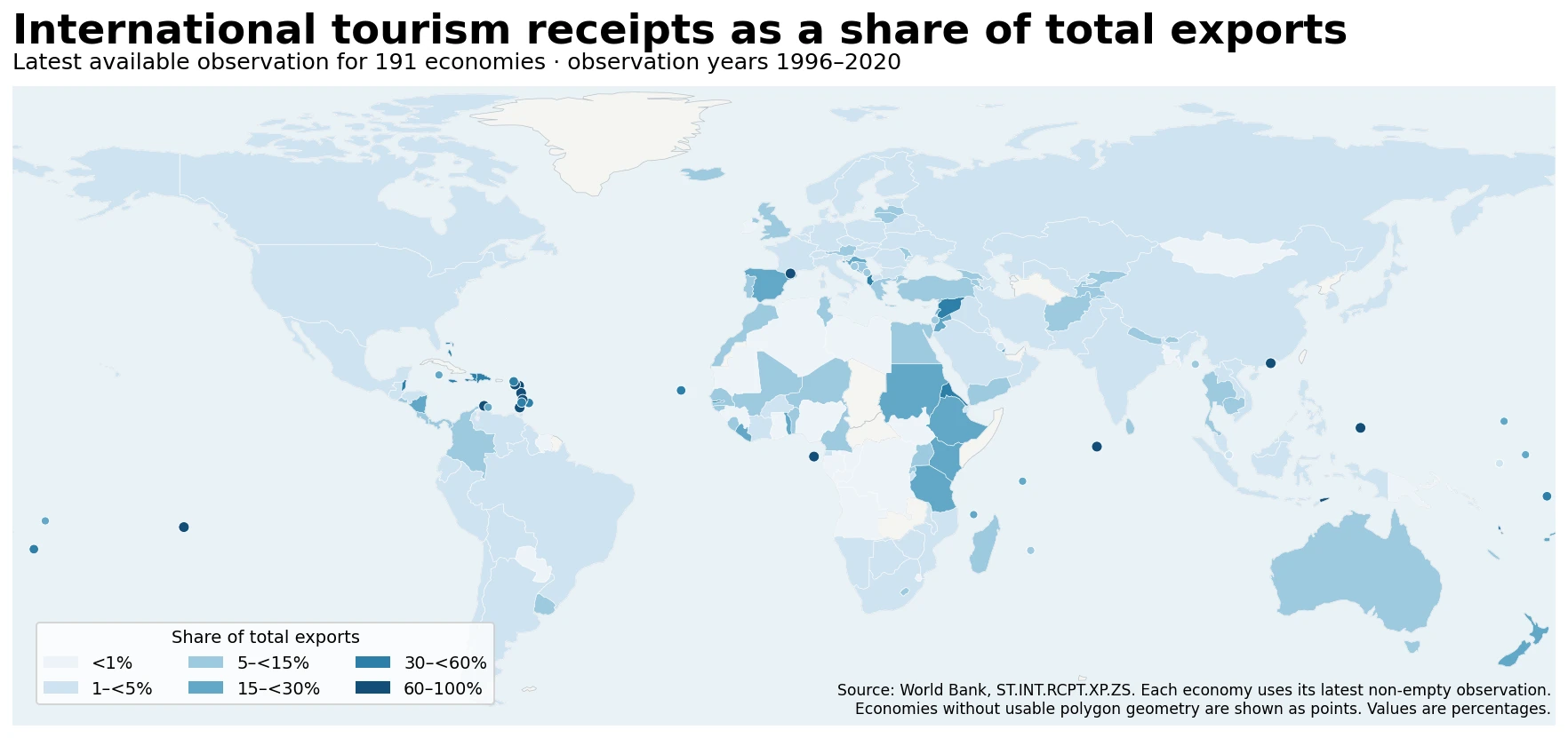
Table of Contents
What the indicator actually measures
International tourism receipts are not the same as tourism’s contribution to GDP. The World Bank definition focuses on expenditures by international inbound visitors, including certain payments connected with international transport. The statistical treatment can vary in some countries, especially for passenger transport items, so the measure should be understood as a standardized cross-country indicator with normal limits to comparability rather than a perfect accounting identity.
The denominator is total exports of goods and services. A value of 20% means that international tourism receipts were equivalent to roughly one-fifth of that economy’s total goods-and-services exports in the observation year. It does not mean tourism generated 20% of GDP, employed 20% of workers, attracted 20% of the world’s visitors, or accounted for 20% of domestic consumption.
This denominator is crucial. A country may earn a large amount from tourism in absolute dollars but still post a small percentage because manufacturing, energy, financial, transport, or other service exports are much larger. Conversely, a small island economy can record a very high percentage even when its absolute tourism receipts are modest by global standards. The indicator is therefore best read as a measure of the relative role of tourism in the external earnings structure.
Observation-year differences are the first limitation to check
Of the 191 latest available observations, 125 are dated 2020, which is about 65% of the dataset. Extending the window to 2018–2020 covers 160 economies, or about 84%. The remaining 31 economies have latest observations from 2017 or earlier, and the oldest observation is from 1996. A value from the late 1990s cannot be treated as directly current just because it is the latest non-empty value retained for that economy.
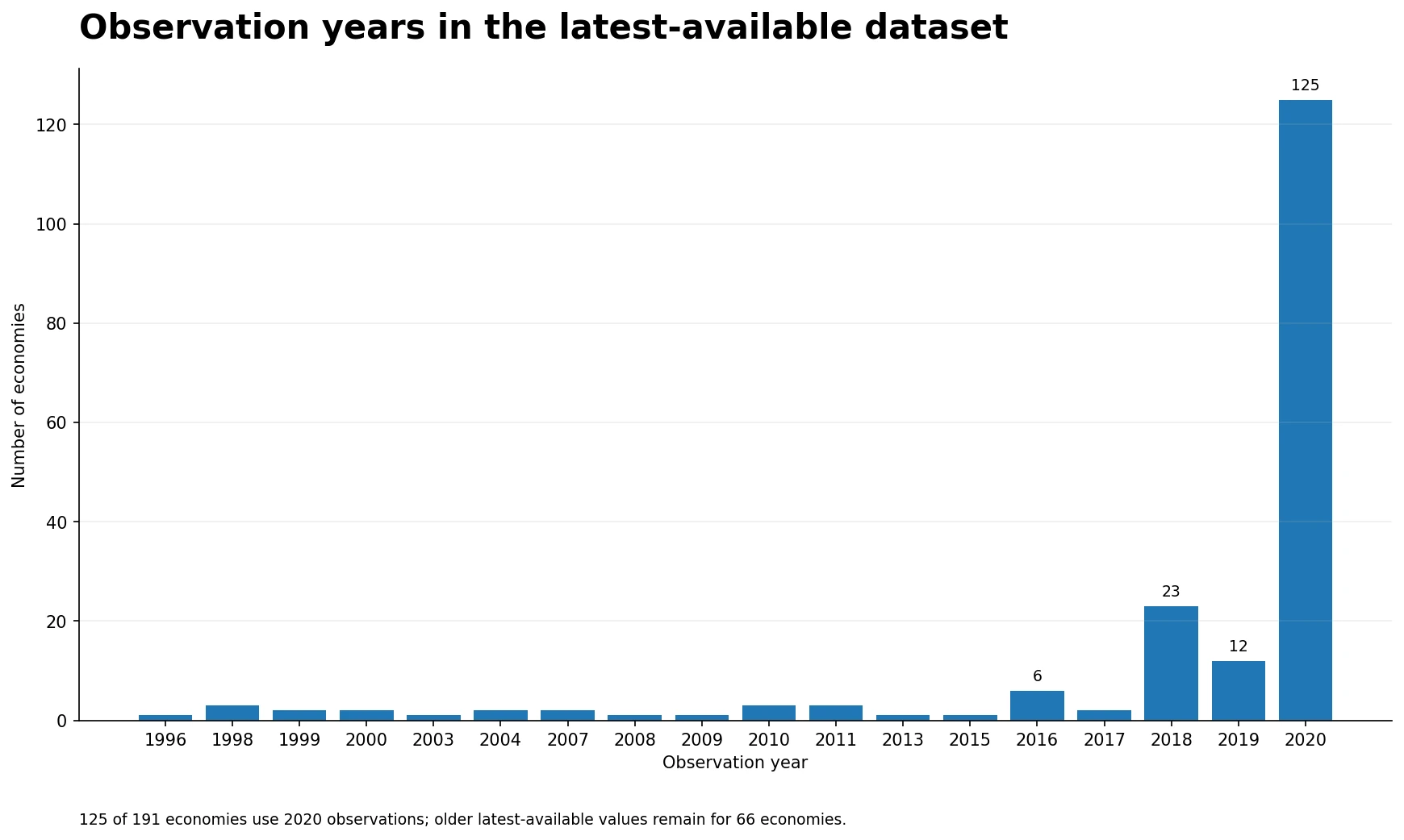
The heavy concentration in 2020 deserves additional caution because that year coincided with extraordinary restrictions on international travel. The ratio can also change for two reasons at once: tourism receipts can move, and the denominator of total goods-and-services exports can move as well. A lower percentage does not by itself quantify the decline in tourism receipts, and a higher percentage does not necessarily mean tourism receipts increased. A time-series question requires time-series data for both the numerator and the wider export context.
Where the highest latest-available shares appear
Across all 191 latest available observations, Palau records 93.5% in 2017. St. Lucia follows at 88.8% in 2018, Grenada at 88.2% in 2018, Andorra at 81.8% in 2019, and Maldives at 78.9% in 2020. Dominica, Aruba, and Sao Tome and Principe also exceed 70% in their respective latest observations. The concentration of very high values among small island and tourism-oriented economies is one of the clearest spatial patterns on the map.
| Economy | Observation year | Tourism receipts as share of total exports |
|---|---|---|
| Palau | 2017 | 93.5% |
| St. Lucia | 2018 | 88.8% |
| Grenada | 2018 | 88.2% |
| Andorra | 2019 | 81.8% |
| Maldives | 2020 | 78.9% |
| Dominica | 2018 | 75.1% |
| Aruba | 2020 | 74.6% |
| Sao Tome and Principe | 2018 | 73.2% |
The table is useful precisely because it shows why the observation year cannot be ignored. Palau’s 2017 figure and Maldives’ 2020 figure do not describe the same global conditions. The ranking should therefore not be interpreted as a current leaderboard for tourism performance. Instead, high values indicate that tourism receipts occupied a very large place in the economy’s recorded goods-and-services export structure in the year shown.
The highest shares also demonstrate why absolute size and relative dependence are different. A large diversified exporter can receive more tourism revenue in absolute terms than a small island economy while showing a much lower ratio. This indicator highlights exposure and specialization within external earnings, not the total commercial scale of a destination.
A 2020-only comparison gives a more consistent time reference
Restricting the data to economies with a 2020 observation leaves 125 cases. Their median tourism-receipts share is 3.52%, while the mean is 10.53%. The large gap between the mean and median shows a strongly right-skewed distribution: most economies are clustered at relatively low percentages, while a smaller group records very high shares.
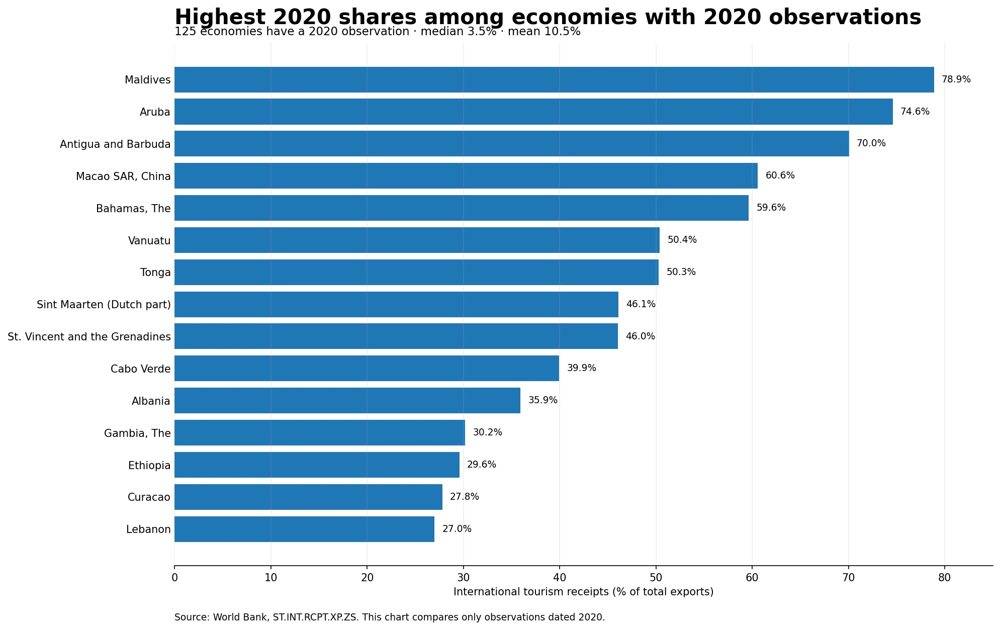
Within the 2020 subset, Maldives is highest at 78.9%, followed by Aruba at 74.6%, Antigua and Barbuda at 70.0%, Macao SAR, China at 60.6%, and The Bahamas at 59.6%. Vanuatu and Tonga are both near 50%. At the other end, Guinea is about 0.01%, Angola 0.09%, Algeria 0.20%, and Mauritania 0.23%. These differences reflect the role of tourism relative to the entire export basket, not simply the popularity of the destinations.
| Economy with 2020 observation | Tourism receipts as share of total exports |
|---|---|
| Maldives | 78.9% |
| Aruba | 74.6% |
| Antigua and Barbuda | 70.0% |
| Macao SAR, China | 60.6% |
| Bahamas, The | 59.6% |
| Vanuatu | 50.4% |
| Tonga | 50.3% |
| Sint Maarten (Dutch part) | 46.1% |
| St. Vincent and the Grenadines | 46.0% |
| Cabo Verde | 39.9% |
Seventy of the 125 economies in the 2020 subset are below 5%. Thirty-three are at or above 10%, twelve are at or above 30%, and seven are at or above 50%. This distribution makes a single global average a poor description of a ‘typical’ economy. The median, threshold counts, and the identity of the high-share economies provide a more informative picture.
Low shares do not mean tourism is unimportant
Eighteen economies in the full latest-available dataset have a share below 1%, including twelve in the 2020 subset. A very low ratio can result from small tourism receipts, but it can also result from a very large export denominator. Economies with substantial oil, mineral, manufacturing, financial, or other service exports may show a low tourism share even when tourism still matters for employment, particular regions, local businesses, or foreign-exchange earnings.
The reverse is also true. A high share can arise in an economy with a relatively narrow export base. If other exports are limited, international tourism receipts can represent a large percentage of total exports without being among the world’s largest tourism markets in absolute dollar terms. For this reason, using this percentage as a proxy for tourism market size would produce misleading conclusions.
How to read the geographic pattern
The map highlights clusters of high shares across several Caribbean economies and Pacific island economies, while other tourism-oriented islands in the Indian Ocean also stand out. Some smaller European economies show elevated values as well. By contrast, many economies whose external earnings are dominated by commodities or broad manufacturing exports appear in the lower categories. The pattern is consistent with the indicator’s denominator: diversification outside tourism tends to reduce tourism’s percentage of total exports.
Nearby economies can still differ sharply. Geography alone does not determine the ratio. Air connectivity, the scale of accommodation and visitor services, the size of domestic industry, commodity exports, financial services, transport services, and statistical coverage can all affect either the numerator or denominator. A border or shared region is therefore not enough to assume similar tourism dependence.
Small territories also matter in a global map because several of the highest values belong to geographically tiny economies. Where a reliable polygon could not be represented clearly at world scale, the map uses a point marker so that those observations are not silently dropped. The underlying comparison still retains all 191 data rows.
What the full distribution says
Across all 191 latest available observations, the median is 5.49% and the mean is 14.32%. Ninety-one economies are below 5%, while 68 are at or above 10%. Twenty-nine reach at least 30%, and 16 reach at least 50%. The difference between the mean and median again shows that a relatively small group of high-share economies pulls the average upward.
Breaking the distribution into ranges makes the skew easier to see: 18 economies are below 1%, 73 are between 1% and under 5%, 50 are between 5% and under 15%, 21 are between 15% and under 30%, 16 are between 30% and under 60%, and 13 are at 60% or above. A reader comparing one country with ‘the world’ should therefore avoid relying on the mean alone.
What to combine with this indicator
For the absolute scale of tourism earnings, use international tourism receipts in currency terms. For visitor volume, use arrivals or overnight-stay statistics. For the domestic importance of tourism, tourism value added, employment, or satellite-account measures are more appropriate where available. The receipts-to-exports ratio answers a narrower question: how large are international tourism receipts relative to the economy’s total external sales of goods and services?
A trend analysis also needs the full historical series for the same economy. The dataset used here intentionally retains one latest non-empty observation per economy, so it cannot show whether a country’s share rose or fell before or after the displayed year. This limitation is especially important because most observations are from 2020 and some are substantially older.
Bottom line
The global pattern is highly uneven. The median latest-available share is 5.49%, yet several tourism-oriented island economies exceed 60%, and a small number approach or surpass 80%. At the same time, nearly half of the 191 economies are below 5%. That spread shows how differently tourism fits into national export structures.
The safest way to use the map is as a starting point for identifying economies where tourism receipts occupy a large or small place in external earnings. For direct country comparisons, always check the observation year, the absolute level of tourism receipts, and the composition of total exports. When a common time reference matters, the 125 economies with 2020 observations provide a more internally consistent subset than the mixed-year latest-available ranking.
Frequently Asked Questions
What does international tourism receipts as a share of total exports measure?
It compares international tourism receipts with total exports of goods and services. It is not the same as tourism's share of GDP, employment, or visitor numbers.
Are all 191 observations from 2020?
No. There are 125 observations from 2020, while the full range of latest available years runs from 1996 to 2020. The percentage should always be read with its observation year.
How can countries be compared on a more consistent time basis?
Use observations from the same year. In this dataset, the 125 economies with 2020 values form a more consistent cross-section, while trend analysis requires the full time series.
Related Articles
Green Map creates custom-edited map images using open geographic data sources such as geoBoundaries, Natural Earth, OpenStreetMap, and government open data. These maps are edited visual materials, not raw data files, and are provided for education, documents, presentations, and graphic reference.