The female population share aged 25–29 shows how large a young-adult cohort is relative to the entire female population. This age group differs from child cohorts because it overlaps with the years when many people complete education, enter the labor market, move for work, and establish independent households. As a result, migration can have a much stronger influence on the percentage than it does for younger age bands. The indicator is best read as a measure of age composition, not as a direct measure of fertility, employment, or the absolute number of young women.
The World Bank indicator SP.POP.2529.FE.5Y reports a 2025 value for all 217 economies in this dataset. The median is 7.27% and the mean is 7.04%. The first quartile is 6.10% and the third quartile is 8.11%. The highest observation is the United Arab Emirates at 12.75%, while the lowest is St. Martin (French part) at 3.13%. The spread between the two is about 9.62 percentage points.
The denominator is the total female population of all ages. A country can therefore have millions of women aged 25–29 and still post a relatively modest percentage if its female population is large at other ages. A small economy can have a much higher share even with far fewer people in absolute terms. Percentages describe the shape of the age structure; counts describe the number of people.
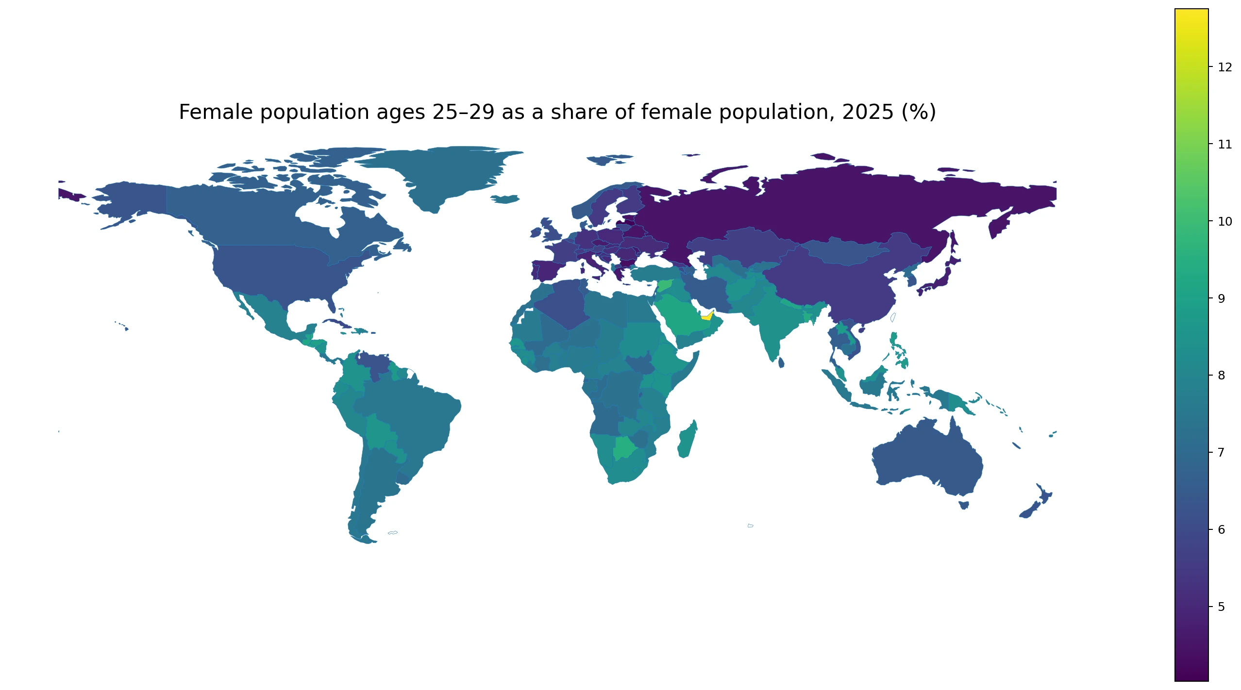
Table of Contents
The median is 7.27%, and most economies fall between about 5% and 9%
There are 21 economies below 5%, 72 from 5% to under 7%, 112 from 7% to under 9%, and 12 at 9% or more. Half of all observations lie between roughly 6.10% and 8.11%. In practical terms, the typical economy has around six to eight women aged 25–29 for every 100 females of all ages.
Unlike very young age groups, the 25–29 cohort reflects both the size of births roughly a quarter-century earlier and subsequent movement across borders and regions. Education, employment, family formation, and international migration all occur intensively in this stage of life. That makes the indicator particularly sensitive to economies that receive or lose large numbers of young adults.
| Range | Economies |
|---|---|
| Below 5% | 21 |
| 5% to under 7% | 72 |
| 7% to under 9% | 112 |
| 9% or more | 12 |
The United Arab Emirates is a clear high outlier
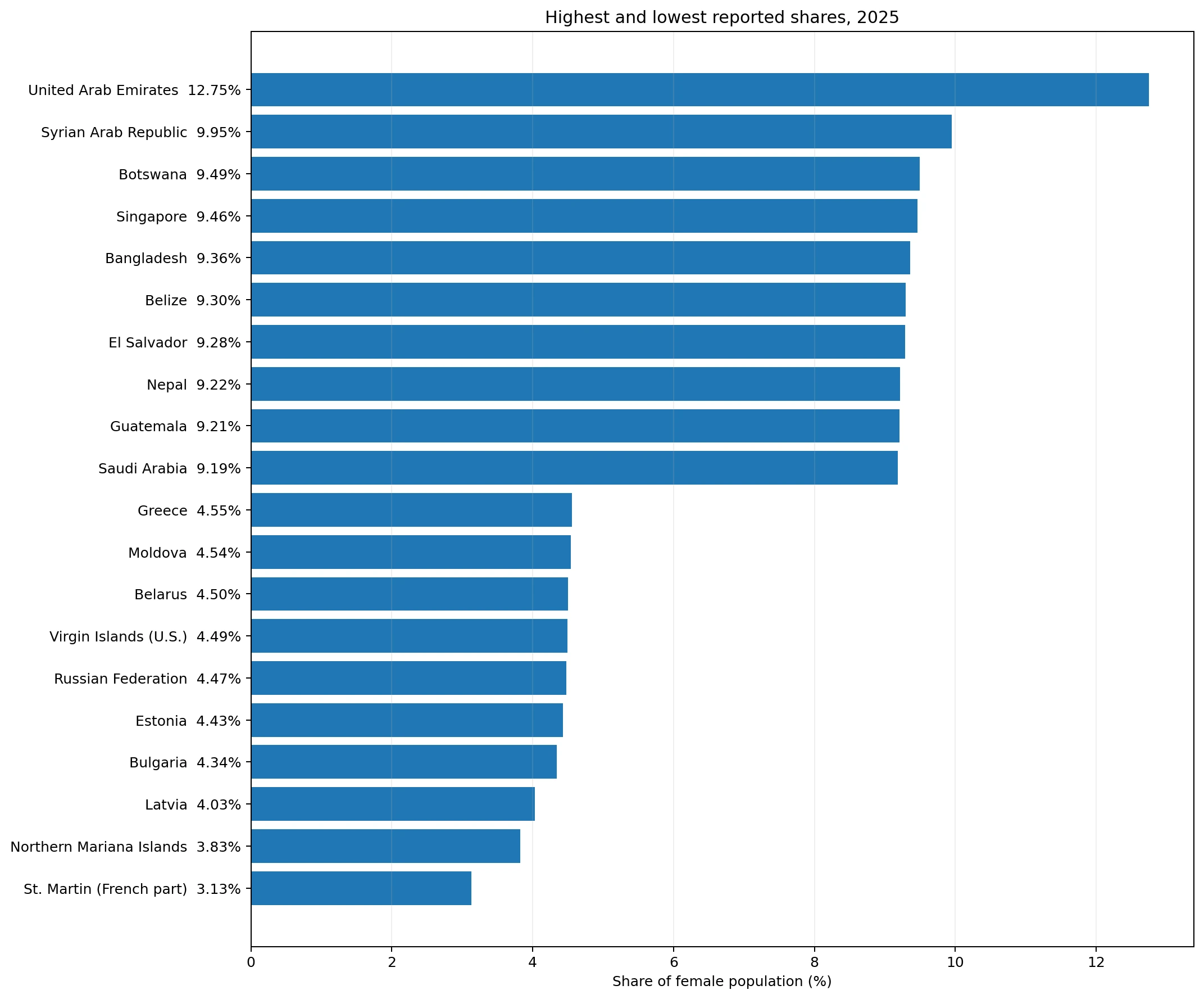
The United Arab Emirates has the highest reported share at 12.75%, about 2.81 percentage points above the Syrian Arab Republic at 9.95%. Botswana is 9.49%, Singapore 9.46%, Bangladesh 9.36%, Belize 9.30%, El Salvador 9.28%, Nepal 9.22%, Guatemala 9.21%, and Saudi Arabia 9.19%. The highest values are spread across several regions rather than forming one simple continental cluster.
The UAE stands out because young-adult migration plays a major role in the demographic structure of several Gulf economies. The indicator alone cannot quantify how much of the percentage is caused by migration, but the age group makes migration an essential part of the interpretation. A 25–29 share should therefore not be read in the same way as a 0–4 or 10–14 share, where migration generally has a smaller direct effect.
Bangladesh and Nepal are above 9% in South Asia, while Belize, El Salvador, and Guatemala reach similar values in Central America. Similar percentages can emerge from different demographic histories. The map describes where the cohort is relatively large; explaining why requires additional evidence on births, survival, and migration.
| Highest observations | Share |
|---|---|
| United Arab Emirates | 12.75% |
| Syrian Arab Republic | 9.95% |
| Botswana | 9.49% |
| Singapore | 9.46% |
| Bangladesh | 9.36% |
| Belize | 9.30% |
| El Salvador | 9.28% |
| Nepal | 9.22% |
| Guatemala | 9.21% |
| Saudi Arabia | 9.19% |
Several of the lowest shares are found in Eastern Europe and small island economies
St. Martin (French part) has the lowest value at 3.13%, followed by the Northern Mariana Islands at 3.83%. Latvia is at 4.03%, Bulgaria 4.34%, Estonia 4.43%, the Russian Federation 4.47%, the U.S. Virgin Islands 4.49%, Belarus 4.50%, Moldova 4.54%, and Greece 4.55%. The concentration of low values across several eastern European economies is visible on the map.
These values reflect cohorts born roughly 25 years earlier and the movement that occurred afterwards. In countries that experienced small birth cohorts around the turn of the century, the 25–29 group can remain relatively small today. Emigration by young adults can reduce the local share further. The indicator does not separate these effects, so the ranking should be treated as the result of several demographic processes rather than evidence of one cause.
Small island and territorial economies also require scale awareness. A modest inflow or outflow can change their age composition more visibly than it would in a country with tens of millions of residents. That is why St. Martin or the Northern Mariana Islands should not be interpreted with exactly the same demographic assumptions as large continental countries.
| Lowest observations | Share |
|---|---|
| St. Martin (French part) | 3.13% |
| Northern Mariana Islands | 3.83% |
| Latvia | 4.03% |
| Bulgaria | 4.34% |
| Estonia | 4.43% |
| Russian Federation | 4.47% |
| Virgin Islands (U.S.) | 4.49% |
| Belarus | 4.50% |
| Moldova | 4.54% |
| Greece | 4.55% |
Ages 25–29 combine cohort size with labor-market mobility
For many people, ages 25–29 overlap with entry into full-time work, job switching, graduate education, marriage, and migration to major urban centers. Economies that attract young workers can therefore build up a large 25–29 cohort even if their younger age groups are not unusually large. Economies that lose young adults can show the opposite pattern.
The indicator does not measure employment. A high percentage does not mean that a high share of women aged 25–29 are employed, nor does a low percentage imply weak labor-market participation. Employment-to-population ratios, labor-force participation, and unemployment statistics answer those questions. This measure only describes how large the age cohort is within the female population.
The same caution applies to marriage and fertility. A large 25–29 cohort tells us that the generation is relatively large, but not when women marry, whether they have children, or how many children they have. Those behaviors vary widely across societies and require separate indicators.
Neighboring economies can still have very different shares
The map shows that regional clusters are often interrupted by sharp country differences. The United Arab Emirates and Saudi Arabia are both relatively high, yet the UAE is far above the rest of the top group. In South Asia, Bangladesh and Nepal are above 9%, while neighboring economies can sit closer to the global middle. Geography matters, but it does not determine one common demographic profile.
Eastern Europe contains several low observations, including Latvia, Bulgaria, Estonia, Belarus, Moldova, and the Russian Federation. Even there, values are not identical. The spread reflects differences in cohort size, migration, and the size of older and younger female populations. A regional label is useful for spotting a cluster but not for replacing country-level data.
Central America offers another pattern: Belize, El Salvador, and Guatemala are all in the global top ten. That grouping contrasts with the low eastern European cluster and shows why the 25–29 share is not simply a proxy for national income or one stage of demographic transition.
Percentages and absolute counts answer different questions
Suppose an economy has 10 million females and a 25–29 share of 7%. That corresponds to roughly 700,000 women in the age group. Another economy with 100 million females could have a 5% share and still contain about 5 million women aged 25–29. The first has the larger relative cohort; the second has the larger absolute cohort.
This distinction matters for public services and markets. Age shares are useful for comparing population pyramids, while absolute counts are needed to estimate the number of potential workers, students, patients, or households. Rankings by percentage should never be substituted for rankings by population size.
Adjacent age groups reveal whether young-adult cohorts are getting larger or smaller
Comparing ages 20–24, 25–29, and 30–34 helps show how the relative size of young-adult cohorts changes across generations. If the 20–24 share is much lower than the 25–29 share, younger cohorts may be smaller. If it is higher, the opposite may be true. Migration complicates this comparison because young adults do not necessarily remain in the economy where they were born.
Looking further back to ages 10–14 and 15–19 can provide an early view of cohorts that will enter the 25–29 band over the next decade. However, those younger shares cannot simply be shifted forward because migration and mortality will alter the cohort before it reaches young adulthood.
The 2025 map is a snapshot, not a trend
Every value here refers to 2025. A high value does not mean that the share has recently increased, and a low value does not mean that it has declined. Establishing direction requires a time series for the same indicator. A cross-sectional map is designed to compare places at one point in time.
Composition can also change even when the number of 25–29-year-old women is nearly constant. If the total female population grows faster at other ages, the percentage falls. If older cohorts shrink, the percentage can rise. Interpreting change therefore requires both the numerator and the denominator.
Key takeaways
Across 217 economies in 2025, the female population share aged 25–29 ranges from 3.13% to 12.75%, with a median of 7.27%. The United Arab Emirates is the highest observation and is unusually far above the rest of the top group. Several low values occur in Eastern Europe and in small island or territorial economies.
The indicator should be read as an age-composition measure. It does not directly show the number of young women, employment outcomes, or fertility behavior. Its strongest use is to compare the relative size of young-adult female cohorts and then combine that view with adjacent age groups, time series, migration, and labor-market statistics.
Frequently Asked Questions
What does the female population share aged 25–29 measure?
It is the number of females aged 25–29 divided by the total female population of all ages. It is a composition measure, not an absolute count.
What is the 2025 median?
The median across the 217 reporting economies is about 7.27%.
Why is migration especially relevant for ages 25–29?
Young adults are more likely than children to move for education and work, so migration can materially change the size of this cohort in destination and origin economies.
Does a high share mean a country has more women aged 25–29 in absolute terms?
Not necessarily. A large country can have a lower percentage but a much larger number of women in the age group.
Related Articles
Green Map creates custom-edited map images using open geographic data sources such as geoBoundaries, Natural Earth, OpenStreetMap, and government open data.
These maps are edited visual materials, not raw data files, and are provided for education, documents, presentations, and graphic reference.