The share of females aged 10–14 is a compact way to compare the shape of the female age structure across countries and economies. A high value means that girls in this five-year age band make up a relatively large part of the total female population. A low value means that other age groups, including adult and older female cohorts, occupy more of the population structure. The indicator is useful for reading age composition, but it is not a direct measure of fertility, school enrollment, population growth, or the absolute number of girls.
The World Bank indicator SP.POP.1014.FE.5Y reports a 2025 value for all 217 economies in the dataset used here. The median is 8.05% and the mean is 8.24%. The first quartile is 5.71% and the third quartile is 10.81%. The highest observation is Burundi at 14.02%, while the lowest is Hong Kong SAR, China at 3.64%. That produces a spread of about 10.38 percentage points between the two extremes.
The denominator matters. This indicator divides the female population aged 10–14 by the total female population of all ages. It does not show the share of the total population aged 10–14, and it does not show the female share within the 10–14 age group. A very populous country can have a low percentage even when it has millions of girls in this age range, while a much smaller economy can have a high percentage because its population pyramid is younger.
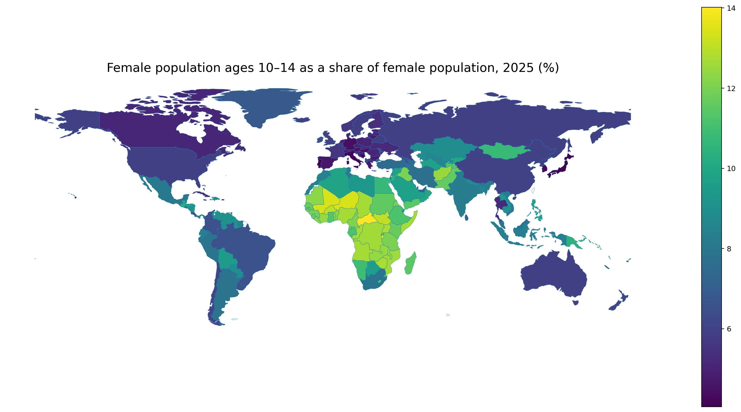
Table of Contents
The global median is 8.05%, with a wide range across economies
Sorting all 217 observations from low to high places the median at 8.05%. The mean of 8.24% is slightly higher because a substantial group of economies is above 11%. There are 29 economies below 5%, 79 from 5% to under 8%, 56 from 8% to under 11%, and 53 at 11% or more. The distribution therefore reflects broad differences in age structures rather than a single cluster of outliers.
The interquartile range runs from about 5.71% to 10.81%, so half of the reported economies fall inside that interval. A value above 10% means that more than one in ten females belongs to the 10–14 age group. A value near 5% means the group represents roughly half that share of the female population. Those differences can matter when comparing the relative size of school-age cohorts and the number of people who will move into the later teenage and young-adult age bands over the next several years.
This pattern is consistent with countries being at different stages of demographic transition, but the indicator itself does not identify the cause of any country’s value. Birth cohort size, child survival, migration, and the size of older generations can all affect the denominator and the resulting percentage. A single-year map is therefore strongest as a description of population structure, not as a causal explanation.
| Range | Economies |
|---|---|
| Below 5% | 29 |
| 5% to under 8% | 79 |
| 8% to under 11% | 56 |
| 11% or more | 53 |
Many of the highest shares are concentrated in Sub-Saharan Africa
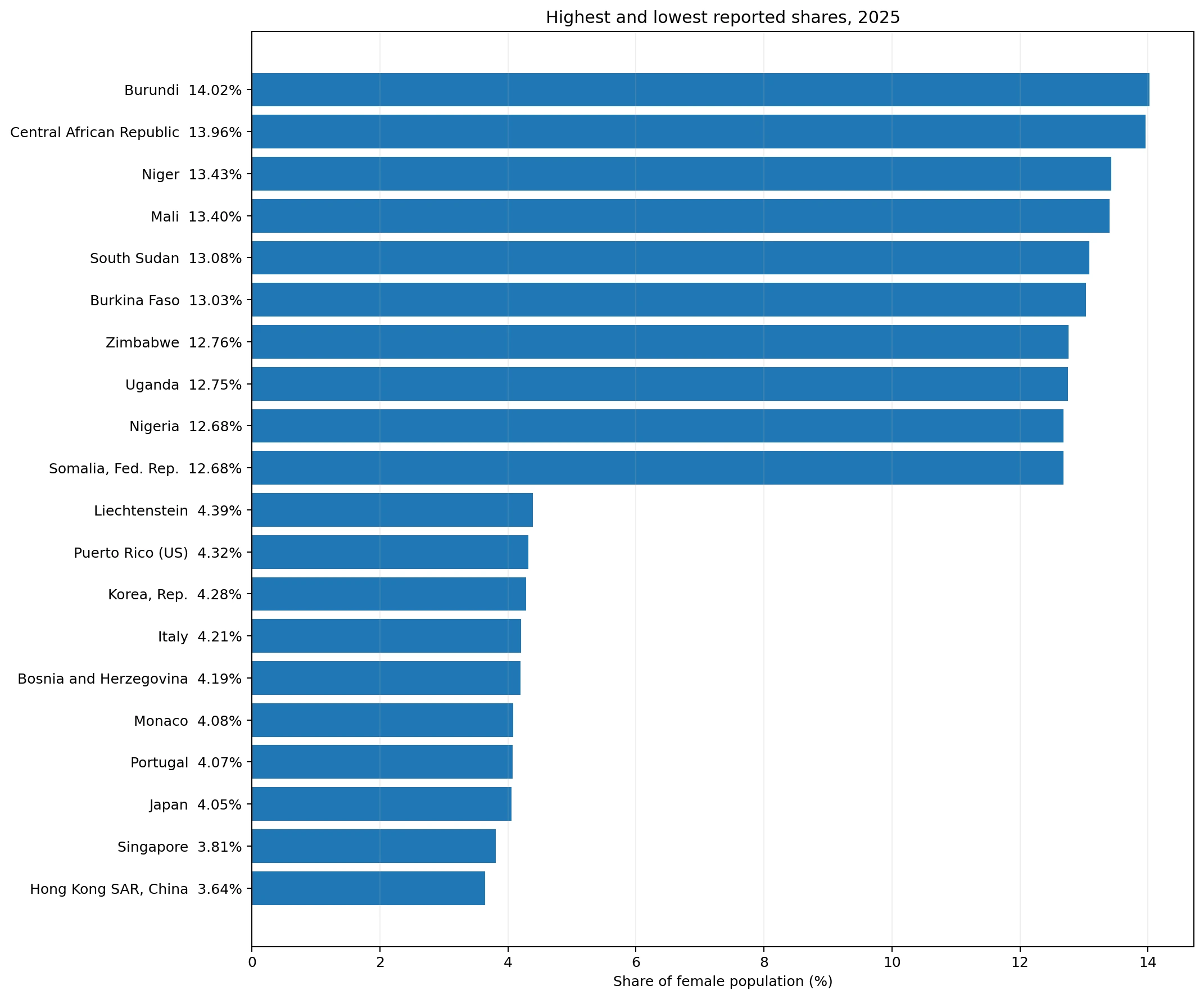
Burundi has the highest value at 14.02%. It is followed by the Central African Republic at 13.96%, Niger at 13.43%, Mali at 13.40%, South Sudan at 13.08%, and Burkina Faso at 13.03%. Zimbabwe, Uganda, Nigeria, and Somalia are also in the highest ten, all close to or above 12.7%. The geographic concentration is visible on the map, with many of the strongest values appearing across central, eastern, and western parts of Sub-Saharan Africa.
Neighboring countries are not identical. Uganda is at 12.75%, Kenya at 11.71%, and Rwanda at 11.18%, while Burundi reaches 14.02%. In West Africa, Niger and Mali are above 13%, Nigeria is 12.68%, and Ghana is 11.32%. Differences of one or two percentage points are meaningful in a composition measure because the denominator is the entire female population, not only children.
A high percentage should not automatically be translated into a claim that the population is currently growing faster. The 10–14 group reflects births roughly a decade earlier, survival into this age range, migration, and the size of every other female age group in 2025. A country can have a large 10–14 cohort even if more recent birth cohorts are already smaller. To identify a direction of change, the 0–4 and 5–9 groups and a multi-year series should also be examined.
| Highest observations | Share |
|---|---|
| Burundi | 14.02% |
| Central African Republic | 13.96% |
| Niger | 13.43% |
| Mali | 13.40% |
| South Sudan | 13.08% |
| Burkina Faso | 13.03% |
| Zimbabwe | 12.76% |
| Uganda | 12.75% |
| Nigeria | 12.68% |
| Somalia, Fed. Rep. | 12.68% |
Some of the lowest shares appear in East Asia and Europe
Hong Kong SAR, China has the lowest observation at 3.64%, followed by Singapore at 3.81%, Japan at 4.05%, Portugal at 4.07%, Monaco at 4.08%, Bosnia and Herzegovina at 4.19%, Italy at 4.21%, Puerto Rico at 4.32%, Liechtenstein at 4.39%, and Germany at 4.42%. In these economies, the 10–14 female cohort occupies less than half the share seen in the highest-ranked economies.
The same numeric outcome can arise from different demographic histories. Japan, Italy, and Portugal have long-running low-birth patterns and older population structures. Hong Kong and Singapore are dense urban economies where migration and the composition of the working-age population can also matter. Monaco and Liechtenstein have small populations, so their age structures are shaped by a different scale and migration context. The indicator shows the result of these combined forces but does not isolate their individual effects.
Large regional labels can hide important contrasts. Japan is at 4.05%, China at 6.02%, and Mongolia at 10.76%. Singapore is at 3.81%, Malaysia at 7.90%, and Indonesia at 8.34%. In Europe, Germany is 4.42%, Austria 4.57%, Spain 4.64%, while other economies sit higher. Country-level values are therefore more informative than assuming that neighboring economies share one demographic profile.
| Lowest observations | Share |
|---|---|
| Hong Kong SAR, China | 3.64% |
| Singapore | 3.81% |
| Japan | 4.05% |
| Portugal | 4.07% |
| Monaco | 4.08% |
| Bosnia and Herzegovina | 4.19% |
| Italy | 4.21% |
| Korea, Rep. | 4.28% |
| Puerto Rico (US) | 4.32% |
| Liechtenstein | 4.39% |
The map also reveals sharp differences between neighbors
The strongest spatial cluster is the broad band of high values across parts of central, eastern, and western Africa. Niger, Mali, Burkina Faso, Nigeria, Ghana, the Central African Republic, Chad, Cameroon, Burundi, Uganda, Tanzania, Kenya, and Rwanda all sit above the global median, although the levels vary considerably. The cluster is real as a descriptive pattern, but it should not be treated as evidence of one common cause across all of these countries.
East Asia shows the opposite kind of contrast. Japan and Hong Kong are among the lowest observations, China is near 6%, and Mongolia is above 10%. Southeast Asia also spans a wide range, from Singapore below 4% to Malaysia around 7.9% and Indonesia around 8.3%. Geographic proximity does not imply identical age structures because demographic change, migration, health improvements, and cohort size can move at different speeds.
The Americas are similarly mixed. The United States is 5.92%, Canada 5.11%, Mexico 8.09%, Brazil 6.52%, Argentina 7.85%, and Chile 6.10%. These values show why a world map is best used to identify broad clusters first and then paired with exact country observations for interpretation. A continent-wide average alone would flatten much of the meaningful variation.
The indicator measures composition, not the absolute number of girls
The phrase “% of female population” defines the denominator. If an economy has a value of 8%, roughly eight of every 100 females are aged 10–14. It does not mean that 8% of 10–14-year-olds are female, and it does not mean that 8% of the entire population is female and aged 10–14. Those are different demographic ratios. Keeping the denominator clear is essential when comparing countries with very different population sizes.
Absolute counts answer a different question. Education systems, vaccination programs, and health services need to know how many people are in an age group. The percentage shown here answers how large that cohort is relative to the female population structure. A large country can have a lower share but a far larger number of girls than a small country with a high share. Both measures are useful, but they should not be substituted for one another.
The five-year band also becomes more informative when it is placed beside neighboring cohorts. Comparing ages 0–4, 5–9, 10–14, and 15–19 can show whether younger cohorts are expanding or contracting relative to the group that is currently entering adolescence. The sequence does not prove why the change occurred, but it provides a clearer picture of the shape of the population pyramid than any one band alone.
The 10–14 cohort matters for education and the future youth population
In many education systems, ages 10–14 overlap with the later years of primary school and the beginning of secondary education. Economies with a high share have a relatively large school-age cohort within their female population, which may correspond to greater potential demand for classrooms, teachers, adolescent health services, and other youth-focused systems. Actual enrollment demand still depends on the education system, enrollment rates, grade repetition, and the number of children outside school.
This cohort will move into ages 15–19 and then 20–24 over the coming decade. A large cohort today can therefore signal a relatively large group approaching later adolescence and young adulthood. That does not justify a mechanical forecast because mortality and migration can change cohort size, while the denominator also evolves. The value is best used as one building block for forward-looking demographic planning rather than as a standalone projection.
At the other end of the distribution, a very small 10–14 share can be a sign that younger generations are small relative to adult and older female cohorts. If similarly low values appear across several younger age groups, the pattern can be consistent with a broader process of population aging and cohort contraction. Confirming that interpretation requires the younger bands, older bands, and total population trend as additional evidence.
A 2025 snapshot should not be mistaken for a trend
Every comparison in this article refers to 2025. A cross-sectional ranking tells us which economies have higher or lower shares in that year, but it does not tell us whether those shares are rising or falling. An economy at 10% in 2025 might have been at 11% or at 8% several years earlier. “High” and “increasing” are separate claims, and only a time series can establish the latter.
The percentage can change even when the number of 10–14-year-old females changes little. If the total female population grows rapidly at adult ages, the cohort’s share can fall. If older cohorts shrink or migration changes the working-age population, the share can rise. Composition measures always reflect both the numerator and the denominator, which is why demographic interpretation should avoid attributing movement to births alone.
The World Bank reports countries and economies, including separately reported territories. The 217 rows should therefore not be described as 217 sovereign states. Some small economies also lack independent polygons in the boundary set used for the map. Their observations remain in every summary statistic and ranking even when they are not displayed as separate map shapes.
Other indicators make the age structure easier to interpret
The first useful comparison is with adjacent five-year female age groups. If the 0–4 and 5–9 shares are lower than the 10–14 share, younger cohorts may be becoming smaller relative to the current adolescent cohort. If they are higher, younger cohorts may be relatively larger. Comparing ages 15–19 adds another step and helps show how cohort size changes as children move into later adolescence.
Second, absolute female population counts help convert structure into service scale. A 12% share in a small economy can represent fewer people than a 6% share in a very large economy. Percentages are excellent for comparing the shape of the population pyramid, while counts are necessary for planning the volume of schools, health services, and other infrastructure.
Third, fertility, mortality, migration, and urbanization indicators can provide context for the differences visible on the map. However, the dataset used here does not quantify the contribution of those factors. The geographic pattern is an outcome to be explained with additional evidence, not proof that any single factor caused the observed distribution.
Key takeaways
In 2025, the female population share aged 10–14 ranges from 3.64% to 14.02% across 217 reporting economies. The median is 8.05%. There are 53 economies at 11% or more and 29 below 5%. Many of the highest values are located in Sub-Saharan Africa, while several of the lowest values occur in East Asia and Europe.
The most important interpretation rule is that this is a share of the female population, not an absolute count. A high value does not mean an economy has the largest number of girls aged 10–14, and a low value does not by itself explain why the population structure looks older. The indicator is most useful for comparing age composition and for linking adjacent five-year cohorts into a broader view of demographic structure.
Frequently Asked Questions
What does the female population share aged 10–14 measure?
It is the number of females aged 10–14 divided by the total female population of all ages. It is not the share of the total population and not the female share within the 10–14 age group.
What is the 2025 median across reporting economies?
The median across the 217 reporting economies is about 8.05%.
Does a high share mean fertility is currently high?
Not necessarily. The 10–14 cohort reflects births roughly a decade earlier as well as survival, migration, and the size of all other female age groups.
Can this percentage be used as the number of students who need schools?
No. It describes population structure. Planning actual education demand also requires age-group counts, enrollment, school-system structure, and out-of-school population data.
Related Articles
Green Map creates custom-edited map images using open geographic data sources such as geoBoundaries, Natural Earth, OpenStreetMap, and government open data.
These maps are edited visual materials, not raw data files, and are provided for education, documents, presentations, and graphic reference.