In 2025, men ages 25–29 account for very different shares of the male population across World Bank reporting countries and economies. Among 217 observations in SP.POP.2529.MA.5Y, the United Arab Emirates is highest at 13.61%, while the French part of St. Martin is lowest at 2.99%. The global median is 7.37%, placing the typical observation near seven men ages 25–29 for every 100 males.
The denominator is important. This indicator does not mean that 7% of all residents are men ages 25–29. It means that 7% of the male population falls inside this five-year age band. Women are outside the denominator, and men ages 20–24 or 30–34 are outside the numerator. The series is therefore best read as a measure of the thickness of one male cohort within the broader male age structure.
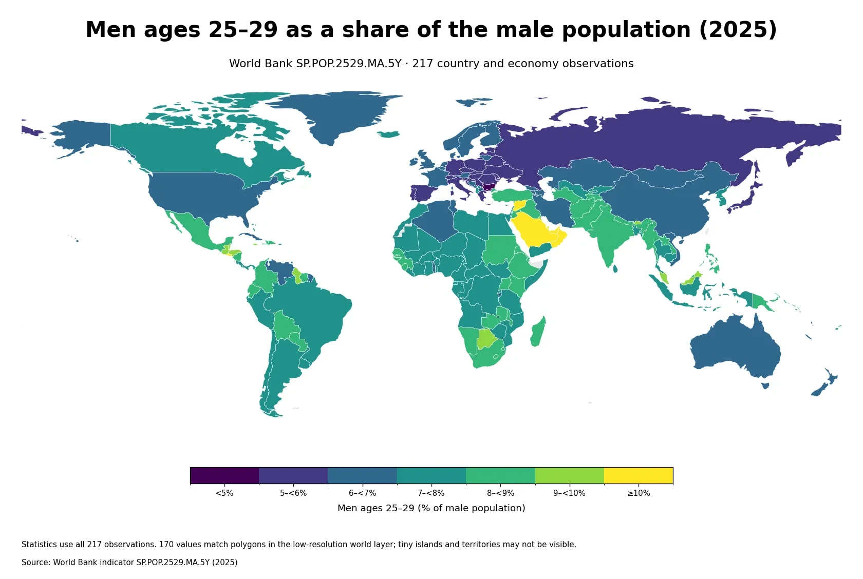
Table of Contents
The strongest high-share cluster appears in the Gulf
The most conspicuous geographic pattern is the concentration of high values around the Gulf. The United Arab Emirates leads at 13.61%, followed by Qatar at 12.27% and Oman at 11.62%. Saudi Arabia is also above 10%, while Kuwait and Bahrain are above 9%. Because several neighboring economies occupy the upper end of the distribution, the map shows a regional age-structure pattern rather than a single isolated outlier.
The indicator by itself cannot tell us why the pattern exists. A 25–29 share is jointly shaped by the size of the birth cohort, survival, international migration, and the size of every other male age group in the denominator. Age-selective labor migration can in principle alter both the numerator and denominator, but this one-year age-share series cannot quantify how much migration, fertility history, or any other mechanism explains an individual country value.
High values also appear outside the Gulf
Singapore reaches 10.95%, El Salvador 10.61%, Maldives 10.28%, and the Syrian Arab Republic 10.20%. Botswana and Belize are just above 9.5%. The upper end therefore spans very different regions, population sizes, and economic structures. A high value should not be treated as a proxy for income level, development stage, or any single demographic cause.
At the other end, the French part of St. Martin reports 2.99%, the Northern Mariana Islands 4.31%, the U.S. Virgin Islands 4.88%, and Bulgaria 4.89%. Latvia, Czechia, American Samoa, the Marshall Islands, Moldova, and Estonia cluster a little above 5%. The lower tail mixes European countries with small island territories, which again cautions against reducing the distribution to a simple continental story.
The gap between the maximum and minimum is 10.62 percentage points
The distance from the highest value to the lowest is 10.62 percentage points. The maximum is about 4.6 times the minimum. Put differently, in the highest-share economy close to one in seven males is age 25–29, while in the lowest-share economy the group represents fewer than one in thirty males.
| Top rank | Country or economy | Share | Bottom rank | Country or economy | Share |
|---|---|---|---|---|---|
| 1 | United Arab Emirates | 13.61% | 1 | St. Martin (French part) | 2.99% |
| 2 | Qatar | 12.27% | 2 | Northern Mariana Islands | 4.31% |
| 3 | Oman | 11.62% | 3 | Virgin Islands (U.S.) | 4.88% |
| 4 | Singapore | 10.95% | 4 | Bulgaria | 4.89% |
| 5 | El Salvador | 10.61% | 5 | Latvia | 5.03% |
| 6 | Saudi Arabia | 10.51% | 6 | Czechia | 5.05% |
| 7 | Maldives | 10.28% | 7 | American Samoa | 5.07% |
| 8 | Syrian Arab Republic | 10.20% | 8 | Marshall Islands | 5.10% |
| 9 | Botswana | 9.51% | 9 | Moldova | 5.14% |
| 10 | Belize | 9.51% | 10 | Estonia | 5.16% |
These rankings compare composition, not population size. A small territory with a 10% share can have far fewer men ages 25–29 than a large country with a 6% share. If the question is how many people may need education, housing, transport, or employment services, age-specific headcounts are needed alongside the percentage. The percentage is valuable because it removes much of the effect of total country size and makes age structures easier to compare.
Most observations sit between roughly 6% and 9%
The mean across all 217 observations is 7.38% and the median is 7.37%. Their similarity shows that the center of the distribution is not heavily pulled away from the typical country or economy. The first quartile is 6.41% and the third quartile is 8.30%, so the middle half of the dataset lies between about 6.41% and 8.30%.
| Share of male population | Number of economies | Share of 217 |
|---|---|---|
| Under 5% | 4 | 1.8% |
| 5% to under 6% | 33 | 15.2% |
| 6% to under 7% | 48 | 22.1% |
| 7% to under 8% | 66 | 30.4% |
| 8% to under 9% | 46 | 21.2% |
| 9% to under 10% | 12 | 5.5% |
| 10% or more | 8 | 3.7% |
The largest band is 7% to under 8%, with 66 observations (30.4%). Another 48 fall between 6% and 7%, and 46 fall between 8% and 9%. Only 8 observations are at 10% or above, while just 4 are below 5%. The distribution is therefore concentrated around the middle bands even though several upper-tail values stand out strongly on the map.
A 25–29 share reflects both cohort history and recent movement
Men ages 25–29 in 2025 were born roughly in the late 1990s. The size of those birth cohorts matters, but a cohort is not frozen at birth. Mortality and migration change its size over time, and the share also depends on how large all other male age groups have become by 2025. A relatively large birth cohort can represent a modest percentage if the rest of the male population has expanded even faster.
This age group is also close to the period when many people move for higher education, work, or family formation. Inflows of men in their twenties can enlarge the numerator directly. Inflows concentrated in older working ages can instead enlarge the denominator and reduce the 25–29 percentage. The same percentage can therefore emerge from very different demographic histories, and the cross-section does not identify which pathway applies in a particular economy.
This is not an employment or labor-force indicator
The series counts men by age, not by economic activity. Employed workers, unemployed jobseekers, students, military personnel, and people outside the labor force can all be part of the numerator if they are male and age 25–29. A 10% value does not mean that 10% of the male labor force is 25–29, nor does it say anything directly about youth unemployment, earnings, or job availability.
It is also narrower than many definitions of youth. International and national statistics may use age ranges such as 15–24 or 15–29 depending on the question. Here the band is exactly 25–29. That narrowness is useful for cohort analysis because it can reveal age-structure differences that would be hidden inside a broader youth category, but it should not be substituted for a general measure of the youth population.
Using the male population as the denominator changes the interpretation
Because the denominator includes males only, the measure is sensitive to the age composition of the male population rather than the age composition of the total population. Two economies with the same number of men ages 25–29 can have different percentages if one has many more males in other age groups. Economies with large sex-selective migration flows can therefore look different on this measure than they would on an all-population age-share indicator.
A comparison with the corresponding female series can show whether the same age band has a different weight within the female population. Even then, however, the two percentages use separate denominators. A higher male percentage does not automatically mean there are more men than women in absolute terms. Headcounts and sex ratios are required for that question.
One year cannot establish whether the cohort is growing or shrinking
The 2025 map is a cross-section. As time passes, the current 20–24 cohort moves into ages 25–29, while the current 25–29 cohort moves into ages 30–34. Rankings can therefore change as differently sized cohorts progress through the age structure. A country that is high in 2025 is not guaranteed to remain high several years later.
A trend analysis needs multiple years of the same indicator. Even then, changes in the percentage should be separated into numerator and denominator effects. The number of men ages 25–29 can increase while their percentage falls if the rest of the male population grows faster. The percentage can also rise even when the cohort headcount declines if other male age groups contract more quickly.
Statistical coverage is wider than what a world map can visibly show
The World Bank country-and-economy series includes sovereign states as well as separately reported territories and economies. The French part of St. Martin, the Northern Mariana Islands, and the U.S. Virgin Islands are examples of small places with valid observations. The 217-row dataset should therefore not be interpreted as a count of sovereign countries.
The low-resolution boundary layer used for display matches 170 of the 217 observations to visible polygons by ISO3 code. Many of the remaining observations correspond to very small islands or territories that do not appear as practical polygons at this scale. All 217 observations remain in the rankings, mean, median, quartiles, range, and distribution counts even when they are not visible as colored shapes.
Data source and calculation
The analysis uses the 2025 observations from the World Bank API series SP.POP.2529.MA.5Y. The World Bank indicator page provides the series definition and country-level time series. The unit is men ages 25–29 as a percentage of the total male population.
Aggregate regional and income-group rows are excluded. All 217 country-and-economy rows contain a 2025 value, so no missing observation is replaced with zero and no earlier year is substituted. The maximum, minimum, rankings, mean, median, quartiles, range, and band counts are calculated directly from those 217 values. The separate geographic layer is used only for visualization and does not determine which observations are included in the statistics.
Frequently Asked Questions
What does an 8% share for men ages 25–29 mean?
It means about 8 of every 100 males in that country or economy are age 25–29. It does not mean that 8% of the total population consists of men in that age group.
Does a high 25–29 male share mean a country has a large youth population?
It shows that one five-year male cohort has a relatively large weight within the male population. Broader youth population size requires additional age groups, women, and preferably absolute headcounts.
Can the 2025 value show whether the share will rise or fall?
No. A trend requires multiple years of the same indicator, and changes in the percentage should be separated from changes in the actual number of men ages 25–29.
Related Maps
Green Map creates custom-edited map images using open geographic data sources such as geoBoundaries, Natural Earth, OpenStreetMap, and government open data.
These maps are edited visual materials, not raw data files, and are provided for education, documents, presentations, and graphic reference.