World Bank indicator TM.VAL.MRCH.HI.ZS measures merchandise imports from high-income economies as a percentage of a reporting economy’s total merchandise imports. The supplied 2023 file contains 217 country-and-area rows, of which 205 have numeric observations and 12 are source-missing. Reported values range from 0.18% to 98.35%.
The indicator is about the composition of import partners, not the size of imports. A value of 80% means that roughly four-fifths of merchandise imports by value came from economies classified as high income by the World Bank. It does not say whether total imports are large relative to GDP, whether the trade balance is positive or negative, or which products dominate the import basket.
The World Bank description defines the measure as merchandise imports from high-income economies divided by total merchandise imports. The series is calculated only when at least half of the economies in the partner-country group have non-missing data. That makes the indicator useful for comparing broad trade-partner orientation while leaving country-specific partner and product details to more granular trade datasets.
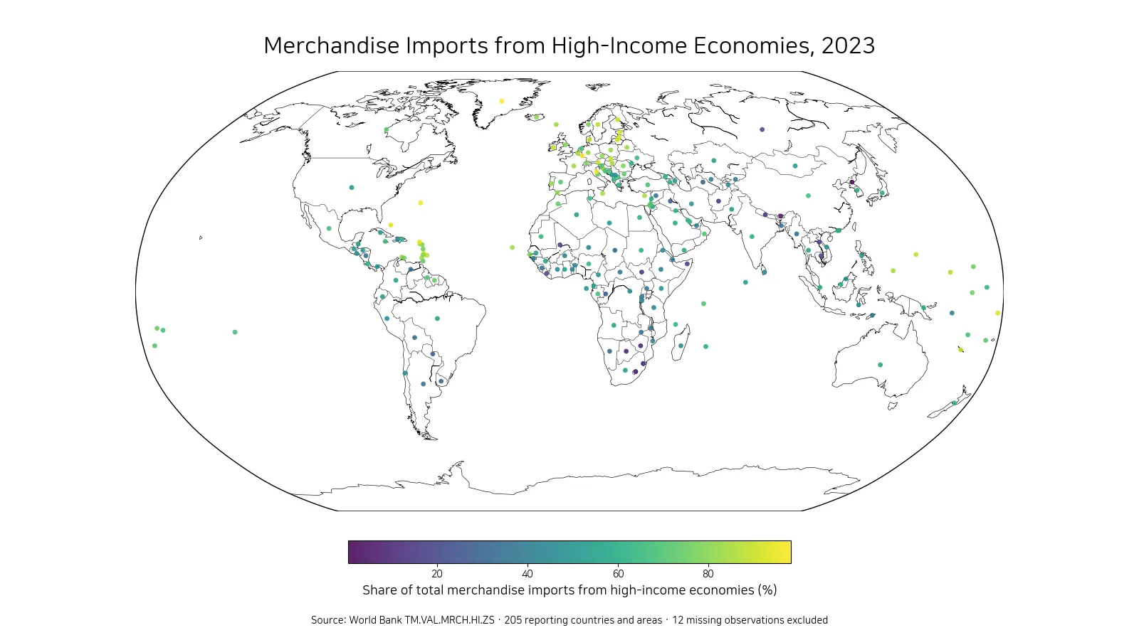
Table of Contents
The highest shares are above 90%
Greenland has the highest reported 2023 value at 98.35%. Luxembourg follows at 97.15%, Bermuda at 96.63%, Sint Maarten (Dutch part) at 95.65%, and San Marino at 95.03%. The Bahamas and Tuvalu also exceed 90%, followed by Estonia, Lithuania and Latvia.
| Rank | Country or area | Share from high-income economies |
|---|---|---|
| 1 | Greenland | 98.35% |
| 2 | Luxembourg | 97.15% |
| 3 | Bermuda | 96.63% |
| 4 | Sint Maarten (Dutch part) | 95.65% |
| 5 | San Marino | 95.03% |
| 6 | Bahamas, The | 93.54% |
| 7 | Tuvalu | 92.75% |
| 8 | Estonia | 91.94% |
| 9 | Lithuania | 90.84% |
| 10 | Latvia | 90.66% |
The upper group includes European economies as well as small island and territorial economies in the North Atlantic and Caribbean. High values can be consistent with trade networks that are strongly connected to high-income suppliers, but the indicator alone cannot identify the mechanism. Geography, transport routes, customs arrangements, historical trading relationships and industrial structure can all matter.
A share above 90% indicates strong concentration by income group, but it should not automatically be labeled a benefit or a vulnerability. High-income suppliers may provide capital goods, pharmaceuticals or intermediate inputs, while concentration may also mean that alternative supplier groups play a smaller role. Product-level and partner-level data are needed for an economic assessment.
At the low end, several economies are below 20%
The Democratic People’s Republic of Korea has the lowest reported value at 0.18%. Bhutan follows at 4.90%, Lesotho at 5.79%, Zimbabwe at 8.71%, Botswana at 9.30%, and Eswatini at 10.82%. Nepal, Afghanistan, South Sudan and Somalia are also below 20%.
| Rank | Country or area | Share from high-income economies |
|---|---|---|
| 1 | Korea, Dem. People’s Rep. | 0.18% |
| 2 | Bhutan | 4.90% |
| 3 | Lesotho | 5.79% |
| 4 | Zimbabwe | 8.71% |
| 5 | Botswana | 9.30% |
| 6 | Eswatini | 10.82% |
| 7 | Nepal | 12.63% |
| 8 | Afghanistan | 13.33% |
| 9 | South Sudan | 14.19% |
| 10 | Somalia, Fed. Rep. | 15.83% |
A low share means that a larger portion of merchandise imports comes from economies outside the World Bank high-income group. Regional trading partners, landlocked transport routes, commodity and food supply chains, and the income classifications of nearby economies can all influence the result. The indicator does not reveal which individual partner supplied the largest share.
The distance between the maximum and minimum is about 98.17 percentage points. Import-partner composition therefore differs almost completely across the two ends of the 2023 distribution.
The median across 205 reported values is 58.50%
The median is 58.50% and the simple mean is 58.25%. The first quartile is 44.25% and the third quartile is 75.22%, so half of the reported economies fall between roughly 44.25% and 75.22%.
By broad bands, 15 observations are below 25%, 55 are from 25% to under 50%, 83 are from 50% to under 75%, and 52 are 75% or higher. The 50%–75% band contains the largest number of reporting economies, but more than 50 are above 75%.
The closeness of the mean and median shows that the center of the country-level distribution is in the upper-50% range. Even so, the full range is so wide that a single central statistic cannot describe individual economies well. The map and quartiles are useful for locating each reporting area within the broader pattern.
Europe and several closely linked territories show high shares
The map shows a broad cluster of high values across Europe and several economies closely connected to high-income trade networks. Estonia, Lithuania and Latvia are all around 90%, while Luxembourg and San Marino exceed 95%. Some North Atlantic and Caribbean reporting areas also appear near the top.
Lower values appear across parts of Southern Africa and South or Central Asia. Those economies are not necessarily importing less merchandise in absolute terms. The indicator shows the income-group origin of imports, so two economies with the same import bill can have very different percentages if their supplier mix differs.
Representative geographic points are used so that small countries and territories remain visible. The markers are not ports, logistics hubs or locations of importing firms. Each point represents one economy-level percentage from the 2023 dataset.
A high share is not the same as high import dependence
One common mistake is to read this measure as an import-dependence ratio. It is not. An economy can source most of its merchandise imports from high-income partners while having a relatively small overall import bill compared with GDP. Another economy can import heavily while sourcing most goods from middle-income partners.
Import dependence requires a different denominator, such as GDP, domestic consumption or production. TM.VAL.MRCH.HI.ZS instead divides imports from a specific income group by total merchandise imports. It answers a “where do imports come from?” question rather than a “how much does the economy depend on imports?” question.
The high-income category follows the World Bank classification framework. When this indicator is compared with data from another institution, the income-group definitions should be checked because classification systems and membership can differ.
The ratio does not reveal the product mix
An economy with a high share may be importing machinery, medicines, electronics, vehicles or consumer goods from high-income suppliers. Another economy with the same percentage may have a completely different basket. The headline share therefore says nothing about which sectors are most exposed to those trading relationships.
A deeper supply-chain analysis would combine this indicator with total merchandise imports, bilateral partner shares and product-level trade data such as HS categories. Capital goods, intermediate inputs, consumer goods and raw materials can have very different economic implications even when the partner-income share is identical.
The 2023 map is best used as a screening tool. It identifies economies whose import networks are strongly oriented toward high-income partners and those whose imports are more heavily sourced from other income groups, after which bilateral and product data can provide the explanation.
Twelve missing observations remain missing
Of the 217 country-and-area rows, 205 contain numeric 2023 values and 12 are source-missing. Those 12 rows are excluded from the map, rankings and summary statistics rather than being converted to 0%.
Missing data and a genuinely low observation are not equivalent. A numeric value such as 0.18% belongs in the low end of the ranking, while a source-missing row means that no 2023 percentage is available in the supplied series. Preserving that distinction prevents false zeroes from distorting the bottom of the table.
A single year does not establish a long-term trade shift
This article is a cross-country snapshot for 2023. It cannot show whether an economy is becoming more or less reliant on high-income suppliers over time. A trend analysis would need the same World Bank indicator across multiple years under a consistent definition.
Changes can reflect exchange rates, trade policy, sanctions, supply-chain reconfiguration, shipping costs, commodity prices and changes in bilateral sourcing. If a large year-to-year movement appears, partner-level and product-level trade data are needed to distinguish the cause.
What matters most in the 2023 comparison
Three points stand out. First, the range is exceptionally wide, from 0.18% to 98.35%. Second, the median is 58.50%, meaning that imports from high-income economies account for more than half of merchandise imports in the middle reporting economy. Third, the indicator measures supplier-income-group composition rather than total import size, trade quality or economic performance.
A useful reading sequence is to use the map for spatial clusters, the high and low tables for the extremes, and the quartiles for the middle of the distribution. Bilateral partner and product data can then explain why individual economies occupy their particular positions.
Frequently Asked Questions
What does an 80% share from high-income economies mean?
It means about 80% of total merchandise imports by value came from economies classified as high income by the World Bank. It does not measure total import size or imports as a share of GDP.
Which reporting economy has the highest 2023 value?
Among the 205 numeric observations, Greenland is highest at 98.35%, followed by Luxembourg at 97.15% and Bermuda at 96.63%.
Were the 12 missing 2023 observations treated as zero?
No. Source-missing rows remain missing and are excluded from the map, rankings and summary statistics.
Related Articles
Green Map creates custom-edited map images using open geographic data sources such as geoBoundaries, Natural Earth, OpenStreetMap, and government open data.
These maps are edited visual materials, not raw data files, and are provided for education, documents, presentations, and graphic reference.