The share of boys ages 5–9 within the male population varies widely across countries and areas in 2025. Across 217 World Bank observations for SP.POP.0509.MA.5Y, the median is 7.68% and the simple mean is 8.58%. The Central African Republic has the highest reported value at 15.98%, while the Republic of Korea has the lowest at 3.48%. Even though every observation covers the same five-year age band, its weight within the male population differs by more than fourfold.
The denominator is crucial. This series is not the share of the total population that consists of boys ages 5–9. It is the share of the male population that falls within ages 5–9. Female population size therefore does not enter the denominator. The series also does not tell us how many boys ages 5–9 live in a country. A small country can have a high percentage but a small absolute child population, while a large country can have a lower percentage and still contain millions of boys in this age group.
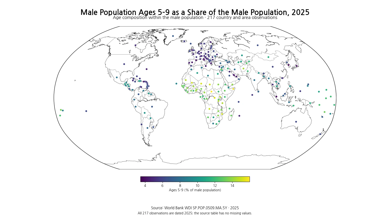
Table of Contents
High shares cluster strongly across parts of Sub-Saharan Africa
The top ten observations are the Central African Republic, Somalia, the Democratic Republic of the Congo, Niger, Mali, Mozambique, Chad, Angola, Burundi and Uganda. Every one is above 14.5%, and several exceed 15%. The geographic pattern is therefore not a set of isolated points: high values form a broad cluster across parts of Central, Eastern and Western Africa. The map indicates that the 5–9 cohort occupies a relatively large slice of the male age structure in many of these countries.
| Rank | Country or area | Ages 5–9 (% of male population) |
|---|---|---|
| 1 | Central African Republic | 15.98% |
| 2 | Somalia, Fed. Rep. | 15.69% |
| 3 | Congo, Dem. Rep. | 15.37% |
| 4 | Niger | 15.22% |
| 5 | Mali | 15.15% |
| 6 | Mozambique | 15.13% |
| 7 | Chad | 15.09% |
| 8 | Angola | 14.91% |
| 9 | Burundi | 14.70% |
| 10 | Uganda | 14.54% |
The ranking should not be converted directly into a current fertility ranking. Children who are ages 5–9 in 2025 were born several years earlier, and their current share reflects earlier birth cohort size, child survival, migration and the size and age structure of the rest of the male population. Two countries can reach similar percentages through different demographic pathways.
Low shares appear in East Asia, Southern Europe and parts of the Gulf
The lowest observations include the Republic of Korea, Andorra, Singapore, Hong Kong, Qatar, Puerto Rico, San Marino, Japan, Italy and the United Arab Emirates. This is not a single demographic group. Japan and Italy have relatively old age structures, while Qatar and the United Arab Emirates can have male populations strongly weighted toward working ages. The result is the same—a small 5–9 share—but the denominator is shaped differently.
| Rank | Country or area | Ages 5–9 (% of male population) |
|---|---|---|
| 1 | Korea, Rep. | 3.48% |
| 2 | Andorra | 3.79% |
| 3 | Singapore | 3.83% |
| 4 | Hong Kong SAR, China | 3.84% |
| 5 | Qatar | 3.86% |
| 6 | Puerto Rico (US) | 3.91% |
| 7 | San Marino | 3.96% |
| 8 | Japan | 3.98% |
| 9 | Italy | 4.04% |
| 10 | United Arab Emirates | 4.33% |
A low percentage does not mean that there are almost no children. In a country with a very large male population, a 4% share can still represent a large absolute number of boys. Conversely, a high percentage in a small country can represent a much smaller number of children. School enrollment planning, vaccine procurement and other service questions require age-specific population counts in addition to this composition measure.
The median is 7.68%, with the middle half between about 5.68% and 11.83%
Across the 217 observations, the median is 7.68%, the first quartile is 5.68%, and the third quartile is 11.83%. The middle half of country and area observations therefore lies between roughly 5.68% and 11.83%. The simple mean, 8.58%, is above the median because a sizeable group of countries has values in the 14–16% range, extending the upper tail.
This simple mean is not the share of all males in the world who are ages 5–9. Each country or area contributes one observation regardless of population size. A small territory and a country with tens of millions of males have equal weight in this average. A true global population share would require weighting each observation by the size of its male population.
Ages 5–9 reflect an earlier birth cohort than ages 0–4
The 0–4 and 5–9 age groups are both young cohorts, but they respond to demographic change at different speeds. Ages 0–4 are more directly tied to the most recent years of births. Ages 5–9 reflect births from an earlier period and show how that cohort has carried forward after early-childhood survival and migration. In a country where births have recently fallen sharply, the 5–9 group may remain thicker than the 0–4 group. Where births have recently risen, the opposite pattern can occur.
Comparing 0–4, 5–9 and 10–14 side by side is therefore more informative than reading one band in isolation. Similar widths can suggest relative stability across recent cohorts, while a steadily narrowing base may be consistent with fewer recent births. The explanation should still be checked against births, fertility, mortality and migration rather than inferred from one age-share series alone.
A high share can indicate a relatively thick school-age cohort
Ages 5–9 overlap with the early primary-school years in many education systems. A high share within the male population can therefore signal that the school-age cohort is relatively large compared with other male age groups. It does not directly measure enrollment or the number of classrooms needed, but it can help frame the scale of potential demand for schools, teachers, child health services, vaccination and nutrition programs.
The practical demand depends on absolute numbers and on where children live within the country. A national share can be moderate while some provinces or cities face rapid growth in school-age children. Conversely, a high national share in a sparsely populated country may correspond to relatively small absolute numbers. National percentages are structural indicators, not substitutes for local population counts.
Low Gulf values cannot be explained by population ageing alone
Qatar and the United Arab Emirates have low 5–9 male shares, but their demographic context differs from that of Japan or Italy. In some Gulf countries, large working-age migrant populations can expand the male denominator substantially. A relatively small share of children can therefore coexist with a sizeable number of children in absolute terms. The low ratio is partly about the shape of the male population, not only about the numerator.
This is an important reason to avoid assigning a single explanation to countries with the same color on the map. Age shares are ratios created by both the age-group population and the rest of the denominator. Similar percentages can arise from older populations, migration-heavy working-age structures, smaller recent birth cohorts, or combinations of these factors.
The African high-value cluster also should not be reduced to one cause
The Central African Republic, Somalia, the Democratic Republic of the Congo, Niger and Mali form part of a broader region with thick young cohorts, but country-specific conditions differ. Birth levels, child survival, migration, displacement, conflict and population-estimation methods can all affect age structures. The map reveals a spatial pattern; it does not by itself identify one universal cause.
Age composition also reflects demographic processes accumulated over several years. Linking a 2025 5–9 share directly to one recent policy or economic event would require a time series and additional causal evidence. The present comparison is a cross-sectional description of how age structures differ in the same year.
One 2025 observation cannot show whether the share is rising or falling
This dataset provides a 2025 snapshot. It cannot tell us whether a country’s 5–9 male share increased or decreased from the previous year. Trend analysis requires the same indicator over multiple years or comparisons with adjacent age bands. Because the denominator—the entire male population—also changes over time, a change in the percentage can result from movement in both the numerator and the rest of the population.
The absolute number of boys ages 5–9 can remain stable while the percentage falls if the male population grows rapidly. The opposite can also occur: the number of boys can fall while their percentage rises if the rest of the male population declines faster. Percentage trends and headcount trends should therefore be kept separate.
Three checks help interpret the indicator correctly
First, the unit is percent and the denominator is the male population. Second, all 217 country and area rows used here are dated 2025, and there are no source-missing values to replace or impute. Third, high and low percentages describe population structure; they do not directly measure child well-being, school quality, health status or household income. Countries with similar age shares can have very different social conditions.
World Bank WDI series SP.POP.0509.MA.5Y provides the percentage of the male population that is ages 5–9. Every ranking, quartile, summary statistic and map value in this article is calculated from the same 217 observations for 2025. The map places each country or area at a representative location so that broad clusters and geographic exceptions are visible without changing the underlying values.
Frequently Asked Questions
Is the denominator the total population?
No. The denominator is the entire male population of the country or area, and the numerator is males ages 5–9.
Does a higher percentage always mean more boys ages 5–9 in absolute numbers?
No. A small country can have a high percentage but a much smaller age-group headcount than a large country with a lower percentage.
Are any 2025 observations missing?
No. All 217 country and area observations used in this comparison are dated 2025 and the source table contains no missing values.
Related Maps
Green Map creates custom-edited map images using open geographic data sources such as geoBoundaries, Natural Earth, OpenStreetMap, and government open data.
These maps are edited visual materials, not raw data files, and are provided for education, documents, presentations, and graphic reference.