Statistics Canada’s Proximity Measures Data Viewer is an interactive map for comparing how access to jobs and everyday services varies across Canada at the dissemination block (DB) level. You can switch between measures for employment, grocery stores, pharmacies, health care, child care, primary and secondary education, public transit, neighbourhood parks, and libraries. The page also describes a composite amenity measure and provides a link to download the Proximity Measures Database.
The most important point is that the map is not a simple “distance to the nearest facility” display. Each service has its own walking or driving search range, while the colours on the map represent normalized proximity indices grouped into quintiles. Reading the measure definition and the legend together prevents a common mistake: treating a colour class as if it were a raw distance in kilometres.
A real spatial example for reading proximity patterns
The static map below is not a screenshot of the current 2021 viewer. It is an original visualization derived from Statistics Canada’s first Proximity Measures release in 2020. Bubble size represents the share of the census metropolitan area (CMA) population in each province living within a 1 km walk of a grocery store. Prince Edward Island and the territories are not plotted because that table does not provide CMA values for them.
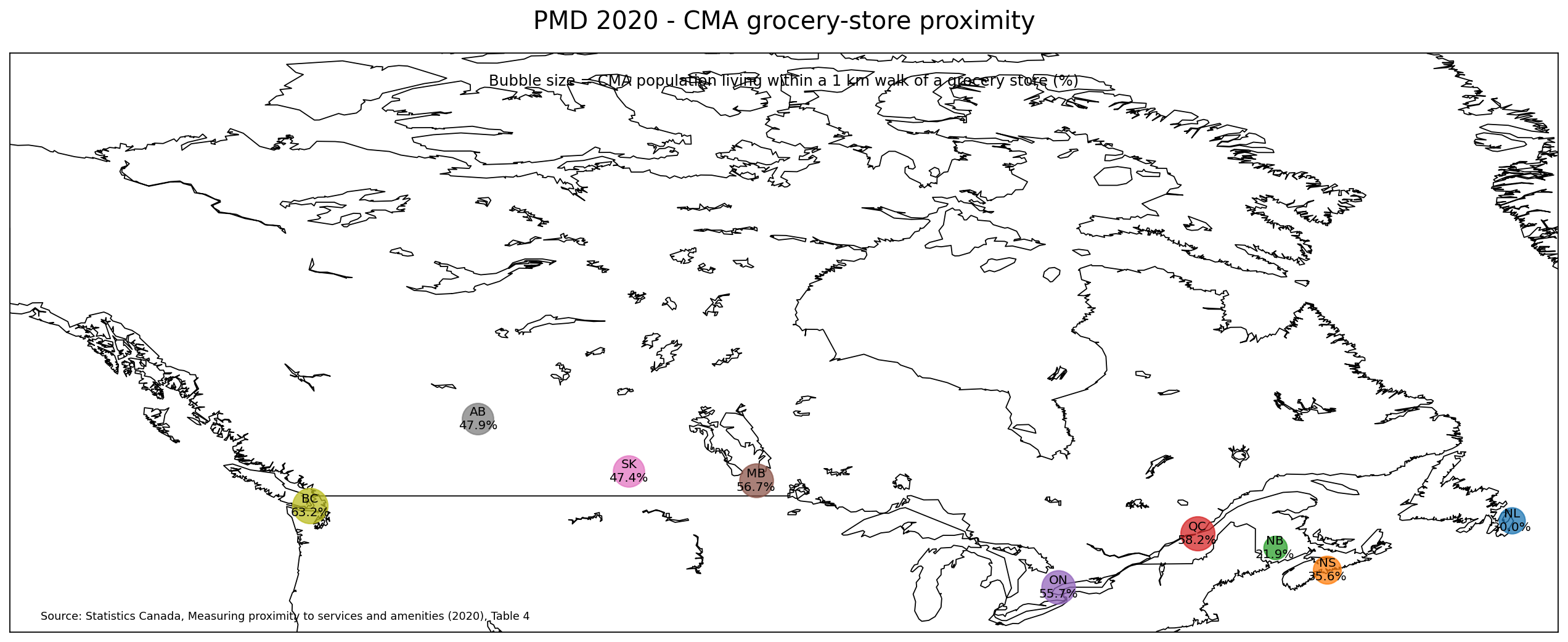
This example shows why proximity is inherently spatial. The current Proximity Measures Database 2021 uses 2021 geographies, updated input data and rescaled indices, so Statistics Canada cautions against direct comparisons with the 2020 release. For current small-area patterns, use the official viewer’s dissemination-block normalized indices and quintile legend.
What the ten proximity measures in the official viewer actually represent
Statistics Canada defines each measure around a different type of destination and, in several cases, a different travel threshold. Those thresholds are part of the calculation framework. They are not the same thing as the value shown by the colour of a dissemination block.
| Measure | Access range in the official definition | Destination or source |
|---|---|---|
| Employment | 10 km driving distance | Sources of employment |
| Grocery stores | 1 km walking distance | Grocery stores |
| Pharmacies | 1 km walking distance | Pharmacies and drug stores |
| Health care | 3 km driving distance | Health-care facilities |
| Child care | 1.5 km walking distance | Child-care facilities |
| Primary education | 1.5 km walking distance | Primary schools |
| Secondary education | 1.5 km walking distance | Secondary schools |
| Public transit | 1 km walking distance | Public transportation sources |
| Neighbourhood parks | 1 km walking distance | Neighbourhood parks |
| Libraries | 1.5 km walking distance | Libraries |
The definitions also reveal that the underlying sources differ by measure. Employment, grocery, pharmacy, health-care and child-care measures use business information tied to the Business Register and relevant industry classifications. Primary and secondary education use education-facility sources. Public transit uses a collection of GTFS sources and focuses on trips between 7:00 a.m. and 10:00 a.m. Parks combine authoritative open-data sources with OpenStreetMap, while library locations come from open and publicly available sources.
Because the service types, source datasets, and travel ranges are not identical, the ten indicators should not be interpreted as if they were ten versions of the same distance metric. A block that looks strong on grocery access may not look the same on employment or public transit, and that difference is part of what the viewer is designed to reveal.
The amenity-dense neighbourhood indicator combines eight needs
In addition to the ten individual proximity measures, the page explains an aggregate concept called an amenity dense neighbourhood. A dissemination block is included when it has access to a grocery store, pharmacy, health-care facility, child-care facility, primary school, library, public-transit stop, and a source of employment. That list uses eight of the individual proximity measures rather than all ten.
Statistics Canada also defines a high amenity density neighbourhood more narrowly. The block must first meet the amenity-dense condition and then have proximity-measure values in the top third of the distribution for each of those eight measures. This is therefore a specific rule-based indicator, not a general ranking of neighbourhood quality. It does not automatically include housing cost, crime, environmental quality, service capacity, or other dimensions of daily life.
A practical way to navigate the viewer
The viewer supports standard map interaction: click and drag to move around, and use the mouse wheel to zoom. The controls described on the official page also include full-screen mode, zoom in and out, return to the initial Canada extent, change the displayed indicator, and navigate to a census metropolitan area. A slider controls the opacity of the dissemination-block layer.
- Open the Proximity Measures Data Viewer and select one indicator before zooming into a local area.
- Scan the national pattern, then move to a census metropolitan area or zoom to the region you want to inspect.
- Read the legend before comparing blocks. The colour classes are quintiles of normalized proximity values.
- Switch to a second indicator while staying in the same area to see whether service access follows the same or a different spatial pattern.
- If you need the underlying values rather than a visual comparison, follow the Proximity Measures Database download link in the additional-information section.
The opacity control is useful when the coloured dissemination blocks obscure too much of the basemap. Lower opacity can help preserve geographic context, while higher opacity makes the relative pattern between blocks easier to see. The map is most informative when the basemap, legend, and indicator definition are used together rather than treating the colour layer as a self-explanatory result.
Why the quintile legend matters
Statistics Canada states that values assigned to dissemination blocks are normalized indices of proximity. The colour applied to each block is based on those values, and the classes are determined by quintile so that each class contains one fifth of the data. That makes the map particularly good at showing relative position within the distribution.
A quintile is not a raw distance band. For example, the grocery-store definition uses a 1 km walking distance, but the legend should not be read as five slices of the 0–1 km range. The 1 km threshold is part of how access is defined; the mapped value is a normalized index derived from the measure. The same distinction applies to the 10 km driving range for employment and the 3 km driving range for health care.
Quintiles are also relative rather than policy thresholds. Being in the highest colour class means a block falls in the upper fifth of the mapped distribution for that measure. It does not, by itself, establish that the block meets a legal service standard, offers sufficient capacity, or provides a particular travel time for every resident.
Compare services within the same place instead of searching for one “best” neighbourhood
A useful way to work with the map is to hold geography constant and change the service measure. A neighbourhood may have relatively strong public-transit proximity but weaker grocery-store proximity. Another area might be close to schools and parks while looking different on employment access. The viewer makes those contrasts visible without forcing them into one score at the start of the analysis.
Those differences can generate better follow-up questions. If public transit and employment show similar patterns in one metropolitan area, is that relationship consistent elsewhere? If pharmacy and grocery access diverge, where is the gap most visible? The viewer can help locate patterns worth investigating, but it does not establish the cause of those patterns. Land use, business location, road networks, population characteristics, and many other factors would require separate evidence.
Use the downloadable database when the map is no longer enough
The Additional information section links to the Proximity Measures Database. The map is ideal for rapid visual exploration, while the database is the better route when you need to sort values, filter a set of geographies, reproduce a comparison, or prepare a separate GIS or statistical workflow.
When combining downloaded values with another dataset, verify the geographic identifiers and levels before joining records. The viewer is explicitly described at the dissemination-block level. A table reported at a larger geography should not be merged row-for-row simply because the place names look related. If aggregation or crosswalks are required, that should be handled explicitly rather than hidden inside the map-making step.
What the viewer does not tell you
- Real-time travel time: the map shows statistical proximity indices, not current traffic, walking conditions, or turn-by-turn travel time.
- Service quality or capacity: proximity to a facility does not show appointment availability, school capacity, opening hours, price, wait time, or quality.
- Individual mobility constraints: one index cannot represent disability access, vehicle ownership, personal safety, transfer requirements, or the needs of every resident.
- Live facility status: the page shows a Date modified of September 12, 2023. It is not a real-time directory of whether each business, transit service, or facility is operating today.
- Overall neighbourhood quality: proximity is one spatial dimension. Housing affordability, income, environmental conditions, crime, and other outcomes are outside the scope of this viewer.
These limits do not make the map weak; they define what it is good at. It is a strong exploratory tool for identifying spatial differences in access. It should not be turned into a parcel-level guarantee, a real-estate valuation tool, or a final decision about whether a particular person can reach a specific service.
Record the definition and page version when you reuse a result
The official page currently displays a Date modified of September 12, 2023. That date should not be treated as the observation date for every underlying service record, but it is useful for documenting which version of the public viewer you consulted. If the project is repeated later, check whether the page, measure definitions, or downloadable database have changed.
The indicator definition should be saved alongside any exported map or analysis note. A label such as “health-care proximity” is not enough on its own when the official definition uses a 3 km driving range and specific health-care industry categories. Keeping the definition with the result makes later comparisons easier and reduces the risk of interpreting different proximity measures as equivalent.
When the viewer is especially useful
- Exploring small-area differences in access to everyday services within Canadian metropolitan areas
- Comparing several types of access—such as transit, groceries, health care, schools, parks, and employment—without changing mapping platforms
- Teaching or explaining the difference between a service-access definition and a normalized spatial index
- Finding areas worth deeper investigation before downloading the official database for a table or GIS workflow
It is a poor fit for questions such as the fastest current route to a hospital, today’s transit arrival time, whether a specific facility is open, or the legal availability of a service at an address. Those tasks require current operational or address-level sources rather than a statistical dissemination-block proximity viewer.
Frequently asked questions
Do the map colours show the actual distance to a facility?
No. The mapped values are normalized proximity indices and the colour classes are quintiles. Distances such as 1 km, 1.5 km, 3 km, or 10 km are part of the official definitions used to identify accessible destinations, not the raw value represented by the legend colour.
Which services are included?
The page defines ten measures: employment, grocery stores, pharmacies, health care, child care, primary education, secondary education, public transit, neighbourhood parks, and libraries. It also explains an amenity-dense neighbourhood indicator based on eight of those measures.
Can I jump to a metropolitan area?
Yes. The official instructions describe a control for navigating to a census metropolitan area, in addition to normal pan and zoom controls and a button that returns the view to Canada.
Can I download the underlying data?
Yes. The Additional information section links to the Proximity Measures Database, which is the appropriate next step when you need values for further analysis rather than only the visual pattern shown in the viewer.
Official source
Statistics Canada – Proximity Measures Data Viewer. The descriptions of the ten measures, the amenity-dense neighbourhood indicator, map controls, quintile legend, and database-download path in this article are based on that official product page.
Related Maps
Green Map creates custom-edited map images using open geographic data sources such as geoBoundaries, Natural Earth, OpenStreetMap, and government open data.
These maps are edited visual materials, not raw data files, and are provided for education, documents, presentations, and graphic reference.