The U.S. County Wage Level Map compares 2025 annual average weekly wages from the Bureau of Labor Statistics Quarterly Census of Employment and Wages (QCEW). It provides a consistent county-level view of covered payroll wages across the country, but the measure should not be confused with the median earnings of a typical worker. It is an employer-based average derived from total wages and annual-average covered employment.
The source slice contains 3,193 rows. Fifty of them use the BLS xx999 Unknown Or Undefined area codes. Those residual records are part of QCEW accounting totals, but they are not individual counties and cannot be mapped to a county boundary. The map and county rankings therefore use 3,143 QCEW county-level areas, while the 50 residual rows are preserved separately for auditability and national-total reconciliation.
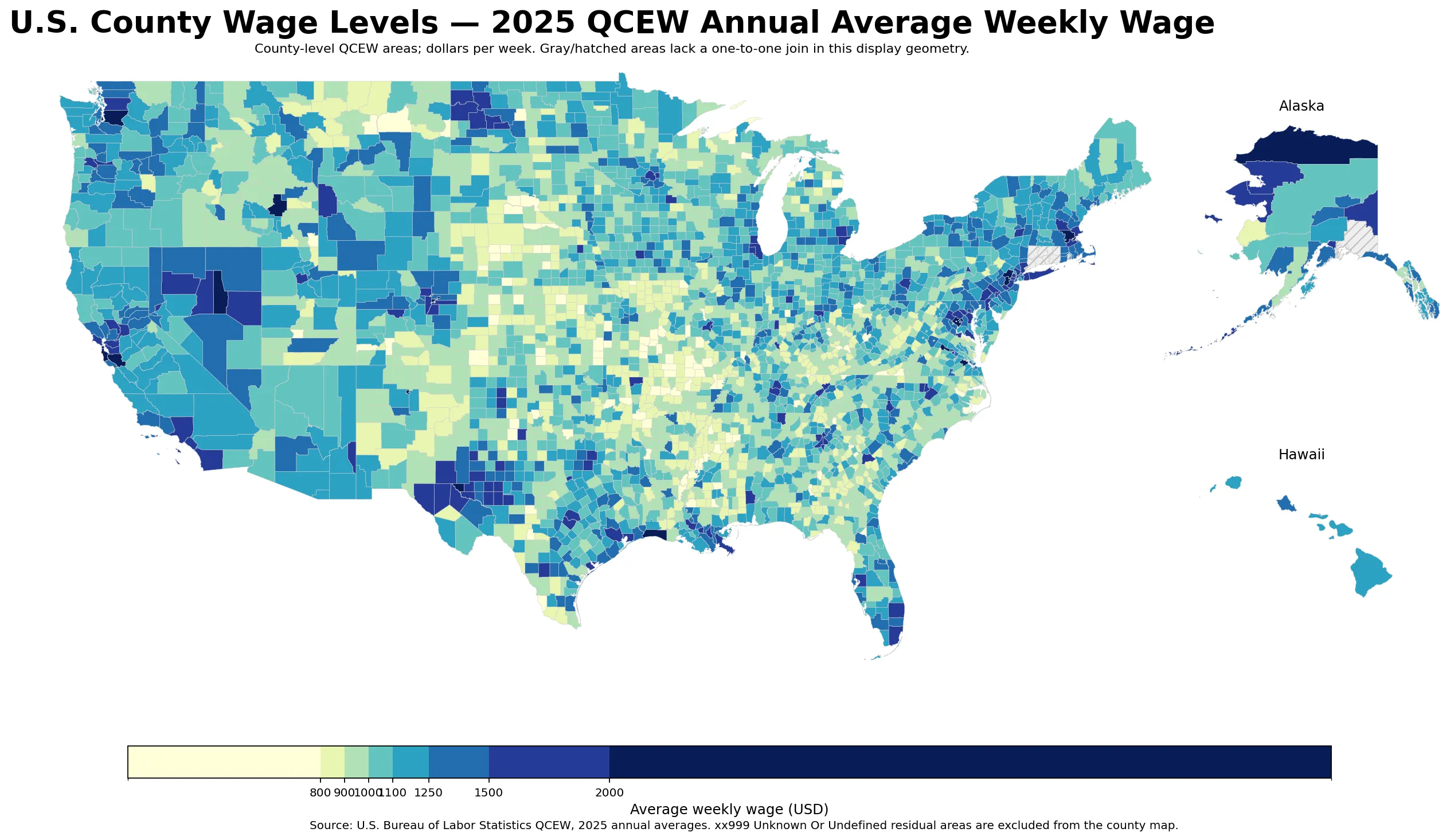
Table of Contents
What the QCEW average weekly wage actually measures
BLS calculates average annual pay by dividing total annual wages by annual average employment. Dividing that result by 52 produces the average weekly wage. The values in this package pass the same internal check: weekly wage multiplied by 52 differs from the published average annual pay only by rounding, and total annual wages divided by annual average employment closely reproduces the annual-pay field.
That arithmetic consistency does not make the measure a typical-worker paycheck. BLS cautions that average pay is influenced by the ratio of full-time to part-time workers, the mix of high- and low-paying occupations and industries, overtime and weekend schedules, bonus payments, seasonal factors, work stoppages, and labor turnover. A county can therefore post a very high average because a concentrated set of high-wage employers represents a large share of its covered payroll.
The median county-level area is $1,033 per week
Giving every mapped QCEW county-level area equal weight, the 2025 median is $1,033 per week. The 25th percentile is $936, the 75th percentile is $1,162, and the top-decile threshold is about $1,342. A total of 1,306 areas (41.6%) are below $1,000, while 157 (5.0%) are at or above $1,500.
| County-level distribution point | Average weekly wage |
|---|---|
| 10th percentile | $857 |
| 25th percentile | $936 |
| Median | $1,033 |
| 75th percentile | $1,162 |
| 90th percentile | $1,342 |
The county median should not be compared directly with the national average as though they were the same statistic. BLS reports 2025 national covered employment of 155,732,363 and annual wages of $12,259,226,899,972. Dividing wages by employment and 52 gives a national average weekly wage of about $1,514. That national figure weights every covered job, including jobs in the xx999 residual records. The county median gives one vote to a tiny rural county and one vote to a major metropolitan county.
The highest averages cluster in a few high-wage labor markets
San Mateo County, California has the highest 2025 value in the verified county-level set at $4,121 per week. Santa Clara County follows at $4,075, San Francisco County at $3,776, and New York County at $3,399. Suffolk County, Massachusetts; North Slope Borough, Alaska; King County, Washington; Western Connecticut Planning Region; Arlington County, Virginia; and the District of Columbia also appear near the top.
| County-level area | Average weekly wage | Average annual pay | Annual-average employment |
|---|---|---|---|
| San Mateo County, California | $4,121 | $214,295 | 411,346 |
| Santa Clara County, California | $4,075 | $211,900 | 1,119,582 |
| San Francisco County, California | $3,776 | $196,352 | 696,891 |
| New York County, New York | $3,399 | $176,766 | 2,487,650 |
| Suffolk County, Massachusetts | $2,658 | $138,226 | 712,462 |
| North Slope Borough, Alaska | $2,639 | $137,248 | 12,694 |
| King County, Washington | $2,632 | $136,848 | 1,436,484 |
| Western Connecticut Planning Region, Connecticut | $2,607 | $135,554 | 289,915 |
| Arlington County, Virginia | $2,521 | $131,075 | 180,735 |
| District of Columbia | $2,479 | $128,892 | 741,567 |
These are nominal payroll averages, not cost-of-living-adjusted household living standards. QCEW is workplace based, while household income is residence based. A high-wage employment center can draw commuters from surrounding counties, and a county with a large technology, finance, corporate-services, extraction, or specialized professional-services presence can have an average that is far above nearby residential areas.
The lowest averages are often in small rural labor markets
Ripley County and Worth County, Missouri are the lowest at $651 per week, followed by Keya Paha County, Nebraska at $656. Ozark County, Missouri and Jones County, South Dakota are each $671. Many of the lowest-ranked areas have only a few hundred or a few thousand annual-average covered jobs. In those places, a change in a small number of establishments or the local industry mix can have an outsized influence on the average.
| County-level area | Average weekly wage | Average annual pay | Annual-average employment |
|---|---|---|---|
| Ripley County, Missouri | $651 | $33,842 | 2,800 |
| Worth County, Missouri | $651 | $33,871 | 364 |
| Keya Paha County, Nebraska | $656 | $34,096 | 140 |
| Ozark County, Missouri | $671 | $34,868 | 1,519 |
| Jones County, South Dakota | $671 | $34,897 | 407 |
| Issaquena County, Mississippi | $693 | $36,048 | 190 |
| Menard County, Texas | $694 | $36,095 | 432 |
| Hooker County, Nebraska | $701 | $36,466 | 262 |
| Shannon County, Missouri | $702 | $36,524 | 1,600 |
| Arthur County, Nebraska | $702 | $36,526 | 80 |
Large labor markets still show a wide wage gap
To reduce the influence of very small labor markets, the supporting comparison limits the data to 376 areas with at least 75,000 annual-average covered jobs. San Mateo, Santa Clara, San Francisco, New York, Suffolk, King, Western Connecticut Planning Region, and Arlington remain near the top. At the lower end, Hidalgo, Cameron, and Webb counties in Texas, Horry County in South Carolina, and Harrison County in Mississippi remain well below the national QCEW average.
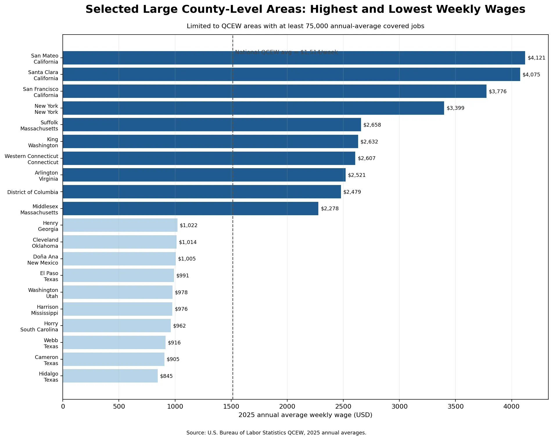
| Higher-wage large area | Average weekly wage |
|---|---|
| San Mateo County, California | $4,121 |
| Santa Clara County, California | $4,075 |
| San Francisco County, California | $3,776 |
| New York County, New York | $3,399 |
| Suffolk County, Massachusetts | $2,658 |
| King County, Washington | $2,632 |
| Lower-wage large area | Average weekly wage |
|---|---|
| Hidalgo County, Texas | $845 |
| Cameron County, Texas | $905 |
| Webb County, Texas | $916 |
| Horry County, South Carolina | $962 |
| Harrison County, Mississippi | $976 |
| Washington County, Utah | $978 |
Neighboring counties can have sharply different averages
The 2025 Census County Adjacency File confirms that San Mateo County borders Alameda, San Francisco, Santa Clara, and Santa Cruz counties. Their QCEW averages do not form a smooth gradient: San Mateo is $4,121, Santa Clara $4,075, and San Francisco $3,776, while Alameda is $1,961 and Santa Cruz is $1,349. The contrast shows why a county wage map is more informative than a broad regional label. Employer location and industry concentration can change abruptly at a county boundary.
At the bottom of the distribution, Ripley County, Missouri is $651. Its neighbors include Butler County, Missouri at $943, Carter County at $723, Oregon County at $733, Clay County, Arkansas at $824, and Randolph County, Arkansas at $803. Ripley sits within a relatively low-wage regional cluster, yet the size of the gap still varies materially from one adjacent county to another.
Hidalgo County, Texas is a useful large-market example. It has roughly 296,000 annual-average covered jobs and an average weekly wage of $845. Adjacent Cameron County is $905, Willacy County $904, and Starr County $805. Smaller neighboring Brooks and Kenedy counties are much higher at $1,274 and $1,319. The pattern makes clear that county size, population, or urbanization alone cannot explain the wage measure.
Why the 50 Unknown Or Undefined rows must stay out of the county map
When all 3,193 source rows are summed, annual-average employment and total annual wages reconcile essentially exactly to the BLS national totals. That happens because the xx999 residual records are genuine components of the QCEW accounting system. Together they contain about 5,631,324 annual-average jobs, and their wage-weighted average is roughly $2,350 per week. What they do not have is a valid individual-county boundary.
For that reason, the 3,143 mapped county-level areas are used for the choropleth and county rankings, while national comparisons use the official national totals that include the residual records. The mapped county-level rows account for about 96.4% of national annual-average covered employment. Treating xx999 as normal counties would create false map features and contaminate the county ranking.
Hawaii and Connecticut require geography-specific handling
BLS code 15009 is published as “Maui + Kalawao County, Hawaii.” General Census county geography normally separates Maui County and Kalawao County, but this QCEW series supplies one combined wage value. The statistical tables therefore preserve the BLS combined area. For display purposes, both legacy Maui and Kalawao polygons are shaded with the same 15009 value rather than inventing a separate Kalawao wage.
Connecticut is different for another reason. Beginning with current county-equivalent geography, the state uses nine planning regions rather than the former eight counties. QCEW uses the new planning-region codes for recent data. Old county boundary files do not provide a one-to-one join to those nine regions, so unmatched display geometry is left gray instead of forcing a false spatial match. The verified planning-region values remain in all statistical tables and rankings.
How to interpret the map without overreading it
- This is an average payroll wage measure, not median weekly earnings for individual workers.
- It is not adjusted for local prices, housing costs, taxes, commuting, or household size.
- Employer and industry mix can move the average even when the pay of a specific occupation does not change.
- Small counties can be especially sensitive to a few establishments, bonuses, seasonal work, or changes in covered employment.
- Use household-income or housing-cost data for household living-standard questions, and occupational wage data for specific-job pay questions.
Data sources and method
The primary source is BLS Employment and Wages, Annual Averages 2025. The mapped field is annual_avg_wkly_wage from the annual QCEW industry slice for total covered ownership and all industries at aggregation level 70, which BLS defines as County, Total Covered. Field definitions are documented in the NAICS-based annual CSV layout.
Area names and the xx999 residual designations were checked against QCEW Area Codes and Titles. Neighbor comparisons use the U.S. Census Bureau 2025 County Adjacency File. The national average is calculated from the official 2025 QCEW national employment and total-wage figures, rather than by averaging the county values.
Frequently Asked Questions
Is the QCEW average weekly wage the median paycheck of a worker?
No. It is total annual covered wages divided by annual-average covered employment and then by 52. Industry mix, full-time/part-time composition, bonuses, and other payroll factors can affect the average.
Why are only 3,143 county-level areas mapped from a 3,193-row source?
Fifty rows use BLS xx999 Unknown Or Undefined area codes. They are valid residual QCEW records and contribute to national totals, but they are not individual counties and have no county boundary for mapping or county ranking.
What was the 2025 national QCEW average weekly wage?
Using BLS national total annual wages and annual-average covered employment, the 2025 national average is about $1,514 per week. It is an employment-weighted national figure, not the simple average or median of counties.
Does a high county average weekly wage mean workers have higher living standards?
Not necessarily. The QCEW measure is a nominal workplace-based payroll average and does not adjust for local living costs, housing, taxes, commuting, household size, or hours worked.
Related Articles
- U.S. County Household Income Map: 2024 ACS Patterns Across America
- U.S. County Severe Rent Burden Map – Where Rent Takes Half of Income
- U.S. County Population Growth vs Housing Costs Map, 2019–2024
Green Map creates custom-edited map images using open geographic data sources such as geoBoundaries, Natural Earth, OpenStreetMap, and government open data. These maps are edited visual materials, not raw data files, and are provided for education, documents, presentations, and graphic reference.