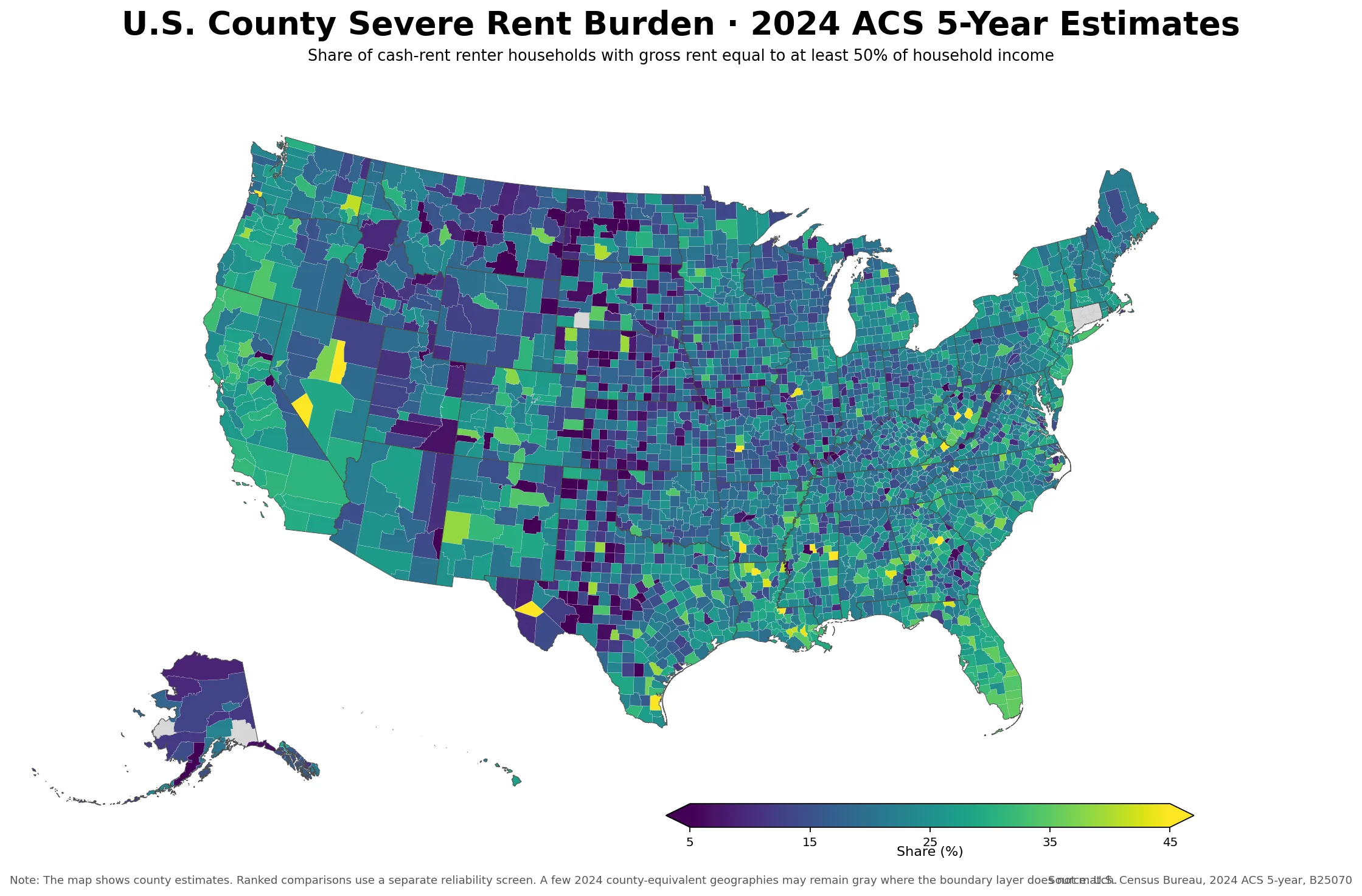
The U.S. county severe rent burden map shows the share of cash-rent renter households whose gross rent equals at least 50% of household income. It uses the U.S.
Census Bureau 2024 American Community Survey (ACS) 5-year Detailed Table B25070 and provides a calculated value for all 3,144 counties and county-equivalents in the 50 states and the District of Columbia geography set used here.
The 50% threshold is important. A conventional rent-burden measure often begins at 30% of household income, while severe rent burden focuses on households at or above one-half of income. The two measures are related but not interchangeable.
A county can have many households above 30% without having the same share above 50%, so a severe-burden map answers a narrower question than a general rent-burden map.
Adding the county numerators and denominators produces a count-weighted national share of about 25.9%. The median county is lower at 21.4%. Across the 3,144 county geographies, 296 have an estimate of at least 30%, 86 are at least 35%, and 31 are at least 40%.
Those counts show that very high severe-burden values are concentrated rather than typical, but they are far from isolated.
U.S. County Severe Rent Burden Map — WEBP Download
Table of Contents
Patterns on the U.S. County Severe Rent Burden Map
The national map does not reduce to a simple coastal-versus-interior or urban-versus-rural split. Higher values appear in several parts of the South, in selected metropolitan counties, and in individual counties across the West and Northeast.
Lower values form broader patches across parts of the Plains and Midwest, but those areas are interrupted by local highs. The result is a patchwork with both large regional tendencies and abrupt local breaks.
A county-count aggregation by state gives a useful orientation. Summing the county numerators and denominators puts Florida at about 31.3% and Louisiana at 30.0%, followed by California at 28.8%, Hawaii at 28.6%, and New York at 28.5%.
At the lower end, South Dakota is 17.7%, North Dakota 18.3%, Alaska 19.5%, Wyoming 20.3%, and Idaho 20.5%. These are recomputed summaries from county counts, not separately downloaded state estimates.
State summaries, however, hide much of the detail. A high state can contain moderate or low counties, and a lower state can contain a sharp local high.
That is why the county map matters: it shows where severe rent burden is concentrated within a state and where nearby counties diverge despite sharing the same state policy environment and broad regional economy.
How the 50% severe rent burden measure is calculated
The source is U.S. Census Bureau ACS Detailed Table B25070, “Gross Rent as a Percentage of Household Income in the Past 12 Months.” The numerator is B25070_010E, the number of cash-rent renter households in the “50.0 percent or more” category.
The denominator is B25070_001E minus B25070_011E: total cash-rent renter households minus cases where the gross-rent-to-income percentage is not computed.
The calculation is therefore 50%-or-more households ÷ (total cash-rent renter households − not computed) × 100. A county value of 35% does not mean 35% of all households in the county spend half their income on rent.
It means 35% of renter households in the defined cash-rent universe with a computable ratio fall into the 50%-or-more category.
Time period matters too. The 2024 ACS 5-year estimates combine responses collected over 60 months from 2020 through 2024. They are designed for stable geographic comparison, including smaller counties, but they are not a one-year snapshot of rents or incomes in calendar year 2024.
A sudden change late in 2024 cannot be isolated from this five-year product.
Higher and lower values among counties with larger comparison bases
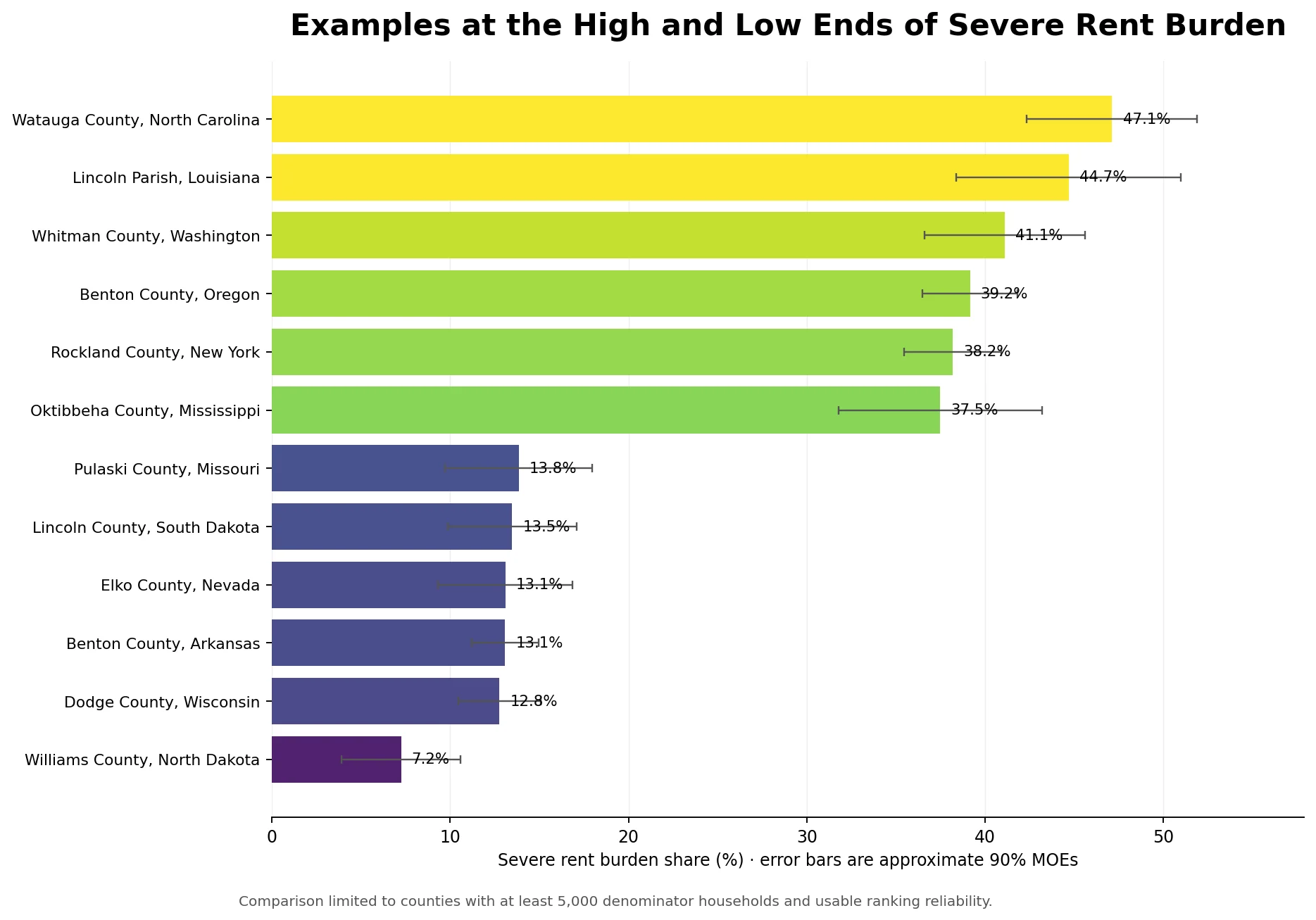
Raw rankings can be misleading when very small counties have only a few hundred cash-rent renter households. To make the comparison more stable, the table below uses counties with at least 5,000 households in the denominator and requires the supplied reliability screen to allow ranking.
There are 946 counties in this comparison group.
| Higher-burden county | 50%+ share | Approx. 90% MOE | Denominator |
|---|---|---|---|
| Watauga County, North Carolina | 47.1% | ±4.8 pp | 7,154 |
| Lincoln Parish, Louisiana | 44.7% | ±6.3 pp | 6,910 |
| Whitman County, Washington | 41.1% | ±4.5 pp | 9,006 |
| Benton County, Oregon | 39.2% | ±2.7 pp | 15,365 |
| Rockland County, New York | 38.2% | ±2.7 pp | 31,227 |
| Oktibbeha County, Mississippi | 37.5% | ±5.7 pp | 9,806 |
Watauga County, North Carolina leads that filtered group at 47.1%. Lincoln Parish, Louisiana is 44.7%, Whitman County, Washington 41.1%, and Benton County, Oregon 39.2%. Rockland County, New York is 38.2%.
The list is geographically mixed, which is another reason not to treat severe rent burden as a single-region phenomenon.
| Lower-burden county | 50%+ share | Approx. 90% MOE | Denominator |
|---|---|---|---|
| Williams County, North Dakota | 7.2% | ±3.3 pp | 6,749 |
| Dodge County, Wisconsin | 12.8% | ±2.3 pp | 9,620 |
| Benton County, Arkansas | 13.1% | ±1.9 pp | 34,431 |
| Elko County, Nevada | 13.1% | ±3.8 pp | 5,016 |
| Lincoln County, South Dakota | 13.5% | ±3.6 pp | 7,849 |
| Pulaski County, Missouri | 13.8% | ±4.1 pp | 5,700 |
Williams County, North Dakota is at 7.2% in the same filtered comparison. Dodge County, Wisconsin is 12.8%, Benton County, Arkansas 13.1%, and Elko County, Nevada 13.1%.
The distance between the higher and lower ends is therefore more than 30 percentage points even after applying a minimum denominator and a reliability screen.
Neighboring counties can differ by 20 to 30 percentage points
One of the clearest local contrasts is in northwestern North Carolina. Watauga County is 47.1%, while adjacent Caldwell County is 17.3%, a gap of about 29.8 percentage points.
Watauga is also about 29.6 points above neighboring Wilkes County at 17.5% and about 24.8 points above Ashe County at 22.3%.
Those gaps are too large to see in a state average. They also show why a county map can be more informative than a ranked list. A user can see whether a high estimate is part of a broad cluster or an abrupt local break.
The map does not, by itself, explain why the break exists. Gross rent, household income, the composition of renter households, and local housing stock can all differ across a county line.
Whitman County, Washington is another high-value example at 41.1%, while several counties elsewhere in Washington are around the low 20s. The broader lesson is that severe rent burden can vary substantially within the same state.
County-level geography helps identify where follow-up questions about income and housing costs are most useful without pretending that the map alone proves a cause.
State aggregates provide context, not a substitute for county detail
Recomputing a state share from the county numerators and denominators places Florida at 31.3%, Louisiana at 30.0%, California at 28.8%, Hawaii at 28.6%, and New York at 28.5%.
On the lower side, Idaho is 20.5%, Wyoming 20.3%, Alaska 19.5%, North Dakota 18.3%, and South Dakota 17.7%.
| State | Share from summed county counts |
|---|---|
| Florida | 31.3% |
| Louisiana | 30.0% |
| California | 28.8% |
| Hawaii | 28.6% |
| New York | 28.5% |
| Idaho | 20.5% |
| Wyoming | 20.3% |
| Alaska | 19.5% |
| North Dakota | 18.3% |
| South Dakota | 17.7% |
Those figures should be read as orientation, not as a claim that every county follows the state result. Florida has 28 counties at or above 30%, but not every Florida county is above that threshold.
Texas has 23 counties at or above 30%, yet it also has a very large number of counties overall. Counts of “high” counties are therefore influenced by how many county units a state has as well as by the burden distribution.
Why small-county extremes should not dominate the ranking
ACS estimates include sampling uncertainty. All 3,144 target county geographies have a calculated value in the statistical table, but only 2,559 pass the reliability screen for ranking. Another 459 are classified as caution, 95 as very low reliability, and 31 are zero-estimate caution cases where ranking is disabled.
This matters because tiny denominators can generate extreme point estimates. A place with only a handful of renter households can appear close to 0% or 100% while carrying a very wide margin of error.
Calling such a county “the worst in America” based only on its point estimate would overstate what the survey can support. The larger-denominator comparison above is intended to reduce that problem, not to redefine the Census measure.
For close comparisons, the margin of error is as important as the point estimate. Two counties separated by only a few percentage points may not be statistically distinct when their uncertainty intervals overlap.
The map can still show their estimates, but ranked claims should be more conservative than the color differences alone might suggest.
What severe rent burden does—and does not—measure
Severe rent burden is not a map of nominal rent. Two households can pay the same gross rent and have very different burden ratios because their incomes differ. Conversely, a high-rent county can have a lower severe-burden rate if renter incomes are also higher.
The map therefore describes the relationship between housing costs and income for the defined renter population, not the price of rental housing by itself.
It is also not a poverty-rate, eviction-rate, vacancy-rate, homelessness, or housing-supply map. Those conditions may be related to affordability, but each requires a different source and definition.
This dataset is most useful for answering a narrower question: where is the share of cash-rent renter households spending at least half their income on gross rent relatively high or low?
The distinction from a 30% rent-burden measure is especially important. A 30% threshold describes a broader population with cost pressure, while the 50% threshold isolates a more severe slice. The topic, calculation, and resulting distribution are therefore distinct even when both articles use ACS B25070 and the same county geography.
They should be compared as related metrics, not treated as the same statistic under different titles.
Source, period, and calculation
The underlying source is the U.S. Census Bureau 2024 ACS 5-year Detailed Table B25070. The period is 2020–2024. For each county, B25070_010E is used as the numerator and B25070_001E minus B25070_011E as the denominator. The result is multiplied by 100 to express the severe rent burden share as a percent.
The statistical table contains values for all 3,144 target county and county-equivalent geographies. The map boundary layer is from a different vintage, so a small number of newer county-equivalent changes do not align perfectly and may remain gray in the visualization. That is a mapping-boundary issue rather than missing ACS data.
A future update should retain the same B25070 definition and the 50% threshold so changes are comparable. Where county-equivalent boundaries have changed, geography should be reconciled before treating two releases as a direct time series. Matching names alone is not enough when the underlying statistical geography changes.
Frequently Asked Questions
What does severe rent burden at 50% or more mean?
It is the share of cash-rent renter households whose gross rent equals at least 50% of household income. Cases where the percentage cannot be computed are removed from the denominator.
Is the 2024 ACS 5-year estimate a one-year 2024 snapshot?
No. The 2024 ACS 5-year estimates pool 60 months of responses collected from 2020 through 2024, so they describe a multi-year period rather than one calendar year.
Does a high severe-burden rate mean a county has the highest rents?
Not necessarily. This measure is a rent-to-income ratio, so both gross rent and household income affect the result. Small counties can also have larger sampling error, which is why uncertainty and denominator size matter when comparing rankings.
Related Articles
For a broader affordability view, compare this severe-burden measure with a general 30%-or-more rent-burden indicator and with other housing-cost and income measures. Before combining them, check that the population universe, time period, threshold, and geographic unit are compatible.
Green Map creates custom-edited map images using open geographic data sources such as geoBoundaries, Natural Earth, OpenStreetMap, and government open data. These maps are edited visual materials, not raw data files, and are provided for education, documents, presentations, and graphic reference.