Greene County is one of the Indiana counties where the broad land-cover story cannot be reduced to a single dominant landscape. Agriculture accounts for 47.15% of the 2025 summary, but forest is close behind at 40.88%. On the map, that near balance becomes a strong west-to-east contrast: larger farm areas occupy much of the western and central part of the county, while extensive woodland covers the east. Water, wetlands, and several small developed centers interrupt that divide, including the marsh landscape around Goose Pond near Linton.
This page includes four views of the same county: current land cover, forest and farmland, impervious surface, and the 1985–2025 land-cover comparison. The original JPG versions of all four maps are available together in one ZIP download. A reader can start with the current map for the county-wide pattern, then switch to the other views to separate farm and forest, examine built surfaces, or locate cells whose broad class changed between the two comparison years.
Table of Contents
A county where farmland leads, but forest shapes almost half the map
The 2025 county summary places agriculture first at 47.15% and forest second at 40.88%. Developed land accounts for 8.64%, followed by wetlands at 1.61% and water at 1.29%. Grassland is 0.19% and shrubland 0.10%. Those numbers matter, but their locations matter just as much. The agricultural share is concentrated most visibly across the west and central-west, whereas the forest share becomes broad and continuous over much of the eastern side. The result is a county whose two largest classes have similar totals but very different shapes.
Farm areas tend to form larger blocks with many straight edges, especially in the western half. Wooded land is more irregular. In the east it spreads across large connected areas, and farther west it reappears as smaller patches and corridors around waterways and field edges. Developed land is not one continuous urban belt. Instead, red areas appear as separate clusters and narrow lines surrounded by farms or woods. That distribution is consistent with a county made up of several small cities and towns rather than one large metropolitan center.
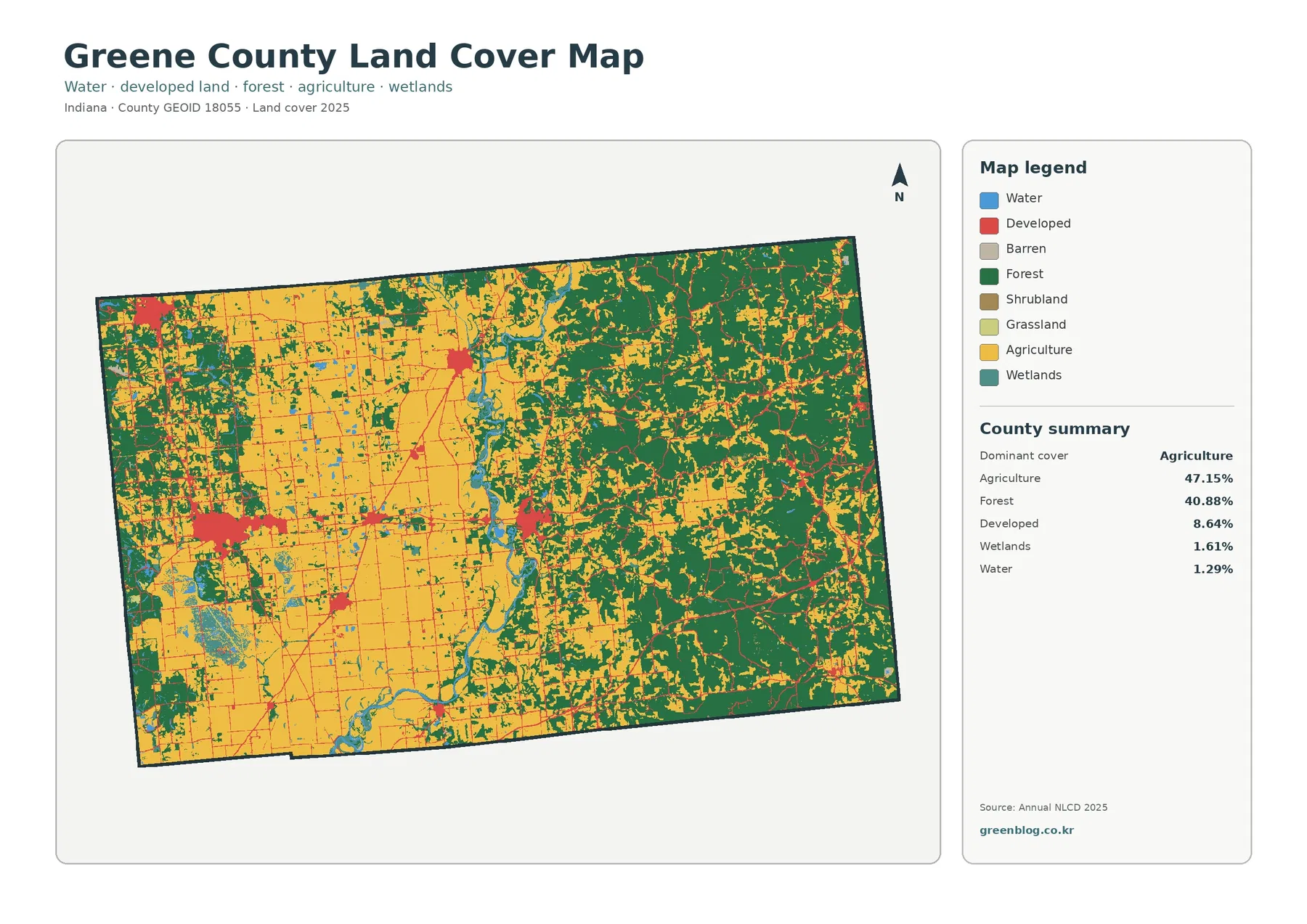
Indiana’s county information identifies Bloomfield as the county seat and lists communities including Linton, Jasonville, Worthington, Lyons, Newberry, Switz City, and Solsberry. The land-cover image does not label municipal boundaries, so the developed color should not be treated as a city-limit map. It is more useful for comparing relative built-up concentrations with the surrounding agricultural and forest cover. A compact red cluster in a field-dominated area and a narrow developed strip through wooded terrain may represent very different settlement patterns even though both use the same general developed class.
Goose Pond turns a small county-wide wetland percentage into a major local feature
Wetlands make up only 1.61% of Greene County in the 2025 summary, yet several wetland areas are easy to notice because they occur as distinct patches beside much larger farm and forest classes. The most important local example is Goose Pond Fish & Wildlife Area near Linton. Indiana DNR describes the property as roughly 9,098 acres of prairie and marsh habitat, including land associated with a major wetland-restoration effort. That local context helps explain why wetland and open-habitat colors can form a conspicuous block inside the otherwise farm-dominated western part of the county.
Goose Pond is also a useful reminder that land cover and management boundaries are different things. A satellite-based wetland class does not mean every colored cell falls inside the Fish & Wildlife Area, and the property itself contains more than one land-cover type. Prairie, shallow water, marsh, woodland, roads, and other surfaces can all occur within a managed site. To find the legal property boundary, a reader should use the DNR property map. The land-cover image is better suited to a broader question: where do wet, open, wooded, and farmed surfaces occur relative to one another?
The county also contains the White River system and other named waterways shown on official Census and Indiana DNR reference maps. In the land-cover image, winding water and wetland features are accompanied in places by forest, producing narrow natural corridors through the agricultural side of the county. Those corridors should not be read as flood-zone boundaries. A flood assessment requires elevation, stream stage, rainfall, drainage, and official hazard mapping. Here the value is visual: water, wetland, forest, and agriculture can be compared in one county-wide frame.
The forest-and-farmland view makes the east–west contrast much harder to miss
The forest-and-farmland map removes much of the visual competition from developed classes and gives more attention to vegetation and water. In Greene County, that simplification reveals the county’s strongest geographic contrast. Cropland is broad across the west and central-west, while forest occupies much larger continuous areas in the east. The middle of the county is a transition zone rather than a clean boundary, with field blocks, wooded patches, streams, and smaller settlements interlocking across short distances.
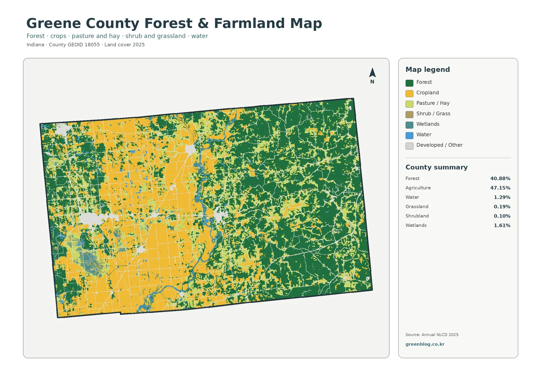
The two dominant percentages help explain why neither side should be treated as a minor exception. Agriculture at 47.15% is only 6.27 percentage points higher than forest at 40.88%. In practical terms, a map made only from county-wide statistics would miss the directional separation. The forest is not evenly sprinkled through the farm area, and the farms are not evenly scattered through the woods. The eastern side carries a much stronger wooded identity, while the west contains larger cultivated blocks broken by narrower wooded and wet corridors.
USDA’s 2022 Census of Agriculture provides a different but useful piece of context. Its Greene County profile reports 788 farms and 192,510 acres of land in farms. Those figures should not be converted directly into the 47.15% NLCD agriculture value. The Census of Agriculture measures farm operations and land associated with them, while Annual NLCD classifies the physical cover visible in raster cells. A farm can include woodland, water, buildings, or other non-cropland cover, so the two datasets answer related but different questions.
The same distinction applies to forest. A green cell says the surface was classified as forest; it does not identify ownership, timber status, public access, or zoning. Eastern Greene County can be described as extensively wooded from this map, but deciding whether a particular wooded parcel is public land, private land, protected habitat, or available for development requires separate administrative records. This map is a landscape reference, not a property-status map.
Impervious cover stays low across most of the county and spikes at settlement centers
Greene County’s mean impervious surface is 1.77%, and only 0.68% of the county falls in cells above 50% impervious. The developed land-cover share, however, is 8.64%. These values are not supposed to match. Developed land classes can include lawns, trees, exposed soil, and other surfaces that still absorb water, while roads and roofs also appear in otherwise rural settings. The impervious map asks a narrower question than the land-cover map: how much of each cell is occupied by hard surfaces such as pavement and rooftops?
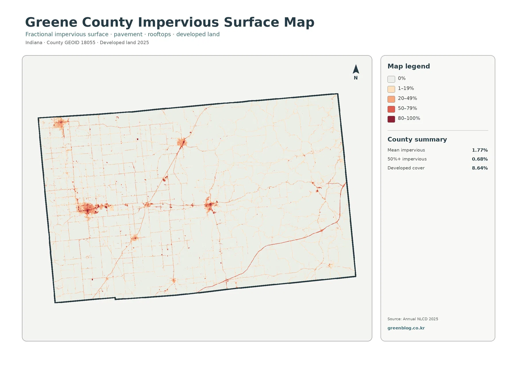
Most of the image is pale because farm fields, forest, wetlands, and other rural surfaces cover such a large area. Darker concentrations stand out in the western and central parts of the county, where the larger settlement clusters correspond broadly with places such as Linton and Bloomfield on official reference maps. Smaller points appear elsewhere, while paved routes connect them as thin lines. The map does not label those roads or municipal boundaries, so it is safer to use it for relative intensity rather than for precise transportation or jurisdictional mapping.
This view is particularly useful when the ordinary developed class feels too broad. A small town can have a recognizable developed footprint without being highly impervious across every block. Likewise, a rural highway can form a clear impervious line while the surrounding land remains agricultural or wooded. Looking at the 8.64% developed share beside the 1.77% mean impervious value shows why “developed land” and “covered by pavement or roofs” should not be treated as synonyms.
Low impervious cover also should not be used as a shortcut for flood safety. Goose Pond, river floodplains, or low-lying wet areas may have little pavement and still be strongly influenced by water. Conversely, a dark impervious cluster does not prove that a particular parcel will flood. Drainage infrastructure, topography, stream levels, rainfall, and mapped flood hazards belong to separate analyses. This image is designed to compare hard-surface concentration, not to predict flooding.
The 12.09% change figure is a class comparison, not a 40-year development rate
The 1985–2025 map compares broad land-cover classifications at two points in time. The county summary reports a total class difference of 12.09%. Within that total, 1.45% is shown as changing to developed, 1.47% as forest loss, 1.84% as agricultural loss, and 7.14% as other class difference. Wetland difference is also represented in the legend, although the preview summary does not provide a separate percentage for it. Because “other difference” is the largest listed component, the full 12.09% cannot reasonably be described as development.
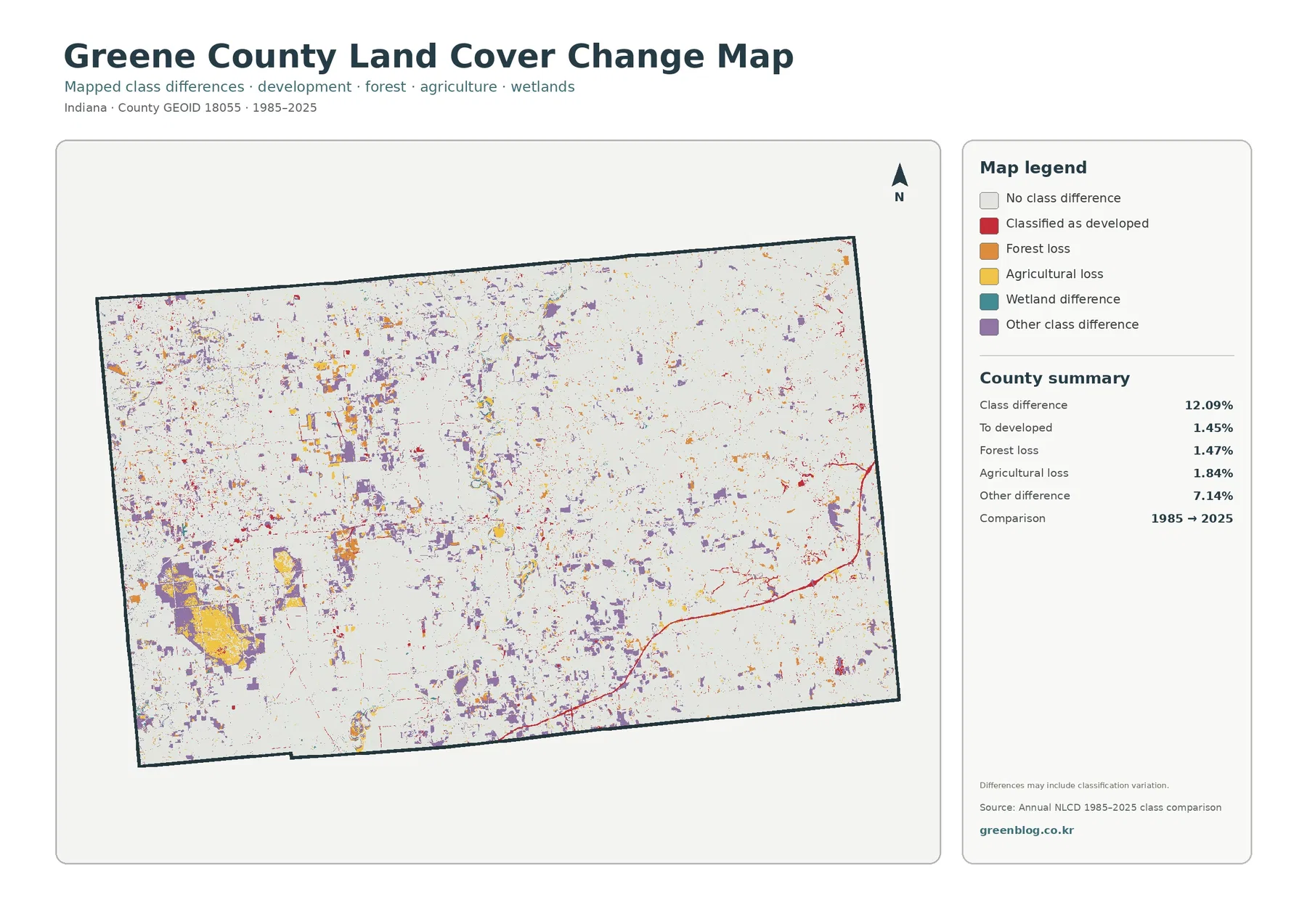
Colored change cells are scattered rather than forming a single county-wide front. In the western agricultural area, some larger patches appear among fields, while red developed-change marks become easier to see around settlement and road corridors. The forested east contains its own mix of forest-loss and other-difference cells, but large areas remain uncolored, indicating that the broad class at the comparison endpoints was the same. Reading the change image next to the current land-cover map is essential because the change colors do not tell a reader what currently covers every surrounding cell.
A 30-meter raster cell can contain more than one real-world surface. Field edges, narrow roads, stream banks, young forest, and wetland margins are especially likely to produce mixed conditions. Differences between years can therefore reflect genuine cover change, but some can also be influenced by classification variation near boundaries. The map is strongest as a screening tool for locating clusters of difference. It cannot identify the year, permit, landowner, or project responsible for a change without additional evidence.
Goose Pond provides a good example of why local history and raster change should be kept separate. Indiana DNR documents a major wetland-restoration history at the site, which is important regional context. The 1985–2025 raster map, however, is not a project timeline. A colored cell near the property should not automatically be attributed to one restoration action. The appropriate workflow is to use the map to locate a change area and then consult dated aerial imagery, management records, or other project-specific sources if the cause matters.
Using all four maps to read Linton, Bloomfield, waterways, and the wooded east
A reader can get more from the set by choosing one location and checking it across all four products. Around Linton, the current map places developed land amid a strongly agricultural western landscape and near distinctive wetland and open-habitat areas. The forest-and-farmland view makes the contrast with surrounding cropland easier to see. The impervious map isolates the hard-surface core of the settlement, and the change map highlights cells whose broad classification differs between 1985 and 2025. The four images are describing different attributes of the same place, not four versions of one legend.
Bloomfield provides a different comparison because it lies nearer the county’s transition between the farm-heavy west and the more forested east. Current land cover shows a developed cluster where agricultural and wooded areas meet. The impervious image emphasizes the compact built surface rather than the larger developed class. Moving east from that area, forest becomes much more dominant, while the change map introduces small patches of difference along roads, clearings, and forest edges. This sequence makes it easier to separate current cover from development intensity and from historical class difference.
The White River system and wetland areas can be followed in a similar way. Water and wetland classes are visible in the current map, while the forest-and-farmland product simplifies nearby land so wooded corridors and open farm blocks are easier to compare. Impervious cover largely shifts attention away from the wet corridor and toward roads and settlements. The change product then introduces a new question: where did the classification differ at the two endpoints? Keeping those questions separate prevents a blue or red feature in one map from being interpreted with another map’s legend.
Choosing the right JPG for a report, classroom, or county reference sheet
For a one-page county overview, the general land-cover map is usually the best starting point because it shows the near balance between agriculture and forest as well as the smaller developed, wetland, and water classes. A presentation about farming and woodland should switch to the forest-and-farmland view, where the east–west contrast is clearer. A discussion of town centers, roads, or runoff-related surface conditions is better served by the impervious map. Historical comparison should pair the 1985–2025 change image with the current 2025 map rather than show the change image by itself.
The downloadable ZIP contains four original JPG files, one for each map theme. Each image is 2480 by 1754 pixels. That format is convenient when a map needs to be placed in a slide, document, worksheet, or printed reference page without relying on the web-optimized image embedded in the article. Captions should keep the dates visible, especially when the current 2025 maps and the 1985–2025 comparison appear in the same document.
The files are most useful for county-scale comparison. They are not substitutes for parcel surveys, zoning maps, wetland delineations, ownership records, or construction plans. A practical workflow is to use the county map to identify a broad pattern—such as the forested east, the Linton-area wetland landscape, or a developed cluster—then move to the county GIS, DNR property maps, aerial imagery, or other specialized sources for a site-specific question.
Scale, classification, and date limits to keep in mind
Annual NLCD is designed to classify land cover consistently across large areas, which makes county comparison possible, but its raster cells generalize the ground. At the common 30-meter scale, one cell can contain a mixture of field, tree cover, a road shoulder, and a small stream. The assigned class represents the mapped classification for that cell rather than a surveyed boundary. In Greene County, the most caution is needed along the complicated transition between farms and woods and around wetland and river edges where several cover types meet over short distances.
The 2025 maps also describe a specific observation year. New construction, clearing, crop changes, or restoration after that date will not appear. The 1985–2025 product compares the endpoint classifications rather than recording every event during the forty-year period. An area shown with no class difference could still have changed in the intervening years and returned to the same broad class by 2025. A colored cell, meanwhile, may need closer inspection to determine whether it represents a substantial real-world transition or a boundary/classification effect.
Land cover should also remain separate from legal land use. Forest color does not establish public ownership or conservation status. Agricultural color does not prove that a parcel is zoned for farming. Developed color does not draw a city limit or define what a property can be used for. These maps describe the physical surface visible in the classification system. For planning, property, regulatory, or wetland-jurisdiction questions, use the appropriate official administrative source after locating the area of interest here.
Frequently Asked Questions
Why do agriculture and forest look so uneven if their county-wide shares are fairly close?
Their totals are close, but their locations are not evenly mixed. Agriculture covers 47.15% and is concentrated strongly across the west and central-west. Forest covers 40.88% and forms much larger connected areas in the east. The county-wide percentages compress those directional differences into two totals, while the map shows where each class actually dominates.
Does every wetland-colored cell near Linton belong to Goose Pond Fish & Wildlife Area?
No. The land-cover class is a satellite-based surface classification and does not follow a management or legal property boundary. Goose Pond is a major wetland and prairie complex near Linton, so it provides useful local context, but the exact Fish & Wildlife Area boundary should be checked on Indiana DNR property maps. Wetland-colored cells can also occur outside that managed property.
Does the 12.09% class difference mean that 12.09% of Greene County became developed between 1985 and 2025?
No. The 12.09% figure includes several types of class difference. Only 1.45% is summarized as changing to developed; the preview also lists 1.47% forest loss, 1.84% agricultural loss, and 7.14% other class difference, with wetland difference shown as another legend category. The map is a two-date classification comparison, not a direct development-rate statistic.
Map File Information
The ZIP contains four original JPG maps for Greene County: current land cover, forest and farmland, impervious surface/developed land, and the 1985–2025 land-cover change comparison.
- Printable Size: 2480 × 1754 px each
- File Type: ZIP containing 4 JPG files
- Intended Use: printing, classroom work, reports, presentations, and county land-cover reference
Related Maps
- Adams County Indiana Land Cover Map
- Allen County Indiana Land Cover Map
- Bartholomew County Indiana Land Cover Map
Sources and references
- MRLC Annual NLCD Data – official Annual NLCD data access
- USGS Annual NLCD Land Cover Classification – class definitions and dataset guidance
- U.S. Census Bureau TIGER/Line Shapefiles – official geographic boundary source used for county mapping
- Indiana Counties – official state reference for Greene County, its county seat, and listed communities
- Indiana DNR – Goose Pond Fish & Wildlife Area – local wetland, prairie, and restoration context near Linton
- USDA NASS 2022 Census of Agriculture – Greene County Profile – county farm and agricultural land statistics
Green Map creates custom-edited map images using open geographic data sources such as geoBoundaries, Natural Earth, OpenStreetMap, and government open data.
These maps are edited visual materials, not raw data files, and are provided for education, documents, presentations, and graphic reference.