Dearborn County is split between a heavily wooded interior and a much stronger developed edge along the east and southeast. The 2025 summary lists forest at 51.28%, agriculture at 32.89%, and developed cover at 13.91%. This Dearborn County Indiana Land Cover Map set makes that contrast easier to see by separating current cover, forest and farmland, hard surfaces, and the 1985–2025 endpoint comparison.
Four WebP previews appear with the discussion. The same four maps are also supplied as original 2480 × 1754-pixel JPG files in one ZIP near the end of the page. They work well for county profiles, lessons on forest and development, reference graphics, and presentations that need to compare the Lawrenceburg–Aurora side of the county with the quieter forest-and-farm interior.
Table of Contents
Forest fills most of the interior while the eastern edge carries the strongest built surface
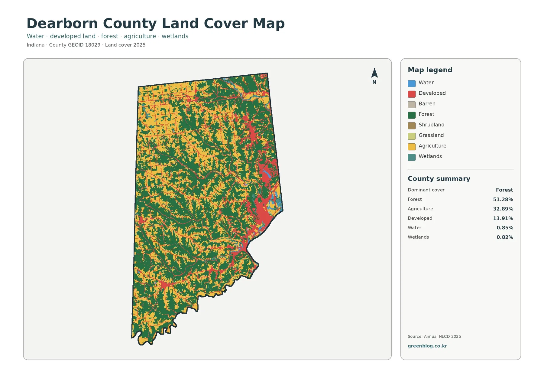
Forest is the dominant class at 51.28%, but it does not form one solid block. Dark green spreads through the center, south, and southwest and also follows many branching shapes farther north. Agriculture accounts for 32.89% and is most continuous in the northwest, where larger yellow blocks sit beside narrower wooded strips. Farther south, agricultural pieces become smaller and are interrupted more often by forest.
Developed cover reaches 13.91%, which is high enough to be a major part of the county story even though forest remains the largest class. The red surface is strongly concentrated on the eastern side instead of being evenly distributed. A large connected area occupies the east-central and southeastern edge, while another smaller concentration appears in the northeast. Scattered red pieces elsewhere are much smaller and more isolated.
Open water is 0.85% and wetlands are 0.82%. Neither class covers much of the county by area, yet the blue water along the southeast boundary is visually important because it helps explain the county outline. Wetland cells occur in smaller pieces and should not be read as open water, mapped flood zones, or legally regulated wetlands. The land-cover colors describe surface classification, not jurisdiction.
The Lawrenceburg–Greendale–Aurora side explains why a forested county can still have a clear urban edge
Dearborn County’s approved zoning map names Lawrenceburg, Greendale, and Aurora along the eastern and southeastern side. It also shows St. Leon and West Harrison in the northeast, with Dillsboro and Moores Hill farther west. Those named locations are not printed on the land-cover previews, but the largest developed concentration aligns broadly with the Lawrenceburg–Greendale–Aurora side of the county, while a separate northeastern cluster fits the St. Leon–West Harrison direction.
This comparison is useful only when the two map purposes remain separate. A zoning map records planning and legal districts. Annual NLCD classifies what the surface looked like in imagery. A residential or commercial zone can still contain trees, lawns, and open ground, and a developed land-cover cell does not tell a reader whether the site is residential, industrial, commercial, incorporated, or permitted for a particular use.
The county zoning map also labels I-74, I-275, US 50, and several state routes. Thin developed traces on the land-cover image may appear to follow roads or settlement connections, but the preview itself has no route names. It is safer to use the official road or zoning map to identify a corridor first, then return to the land-cover image to see how forest, agriculture, and developed surfaces meet around it.
The 1985–2025 layer puts eastern developed conversion beside a larger field of mixed class differences
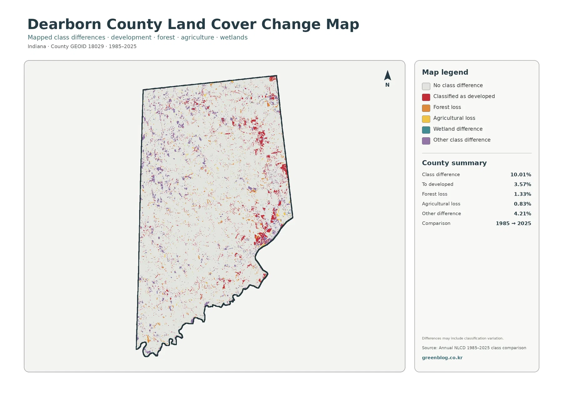
The total endpoint class difference is 10.01%. The listed components are 3.57% classified as developed, 1.33% forest loss, 0.83% agricultural loss, and 4.21% other class difference. Wetland difference is shown in the legend but does not receive a separate percentage in the summary. A residual should not be calculated and presented as an official wetland-change value.
Red developed-conversion cells are most noticeable along the eastern side, including the large southeastern urban concentration and smaller areas farther north. Some thin red traces extend away from those centers. The pattern is consistent with the fact that today’s strongest developed surfaces are also on the east, but the change layer does not identify a construction date, subdivision, road project, or cause for any individual cell.
Purple “other class difference” covers 4.21%, making it the largest listed component. It appears in scattered pieces across the northwest, west, and interior as well as in some eastern locations. That category cannot be renamed as development, forest loss, or farm loss. It simply means the 1985 and 2025 endpoint classes differed in another way, and the difference can include real surface change as well as classification variation.
Orange forest-loss and yellow agricultural-loss cells are much smaller shares of the county. Their colors do not prove logging, abandonment, grading, storm damage, or building activity. Determining what actually happened requires intermediate aerial imagery, permits, plans, and local records. The endpoint map is a screening layer for where to look, not a timeline of every event during the forty-year interval.
Frequently Asked Questions
How can Dearborn County be 51.28% forest and still have a strong urban-looking eastern edge?
The forest share is calculated across the whole county. Large wooded areas cover much of the center and south, while developed and impervious surfaces are concentrated much more heavily around the Lawrenceburg–Greendale–Aurora side and smaller northeastern centers. Countywide percentage and local concentration describe different parts of the same pattern.
Why is developed cover 13.91% when only 1.72% of the county is at least 50% impervious?
Developed land-cover classes can include lawns, trees, bare soil, and other permeable surfaces mixed with buildings and roads. The 50%-plus impervious measure counts only cells where at least half of the surface is hard material such as roofs or pavement, so it is much smaller.
Does the 10.01% 1985–2025 class difference mean that 10.01% of Dearborn County was developed?
No. Developed conversion is listed separately at 3.57%. Forest loss is 1.33%, agricultural loss is 0.83%, and other class difference is 4.21%. Wetland difference appears in the legend without its own reported percentage. The total covers all endpoint class differences, not one development category.
Forest and farmland become easier to compare when the eastern developed surface is faded back
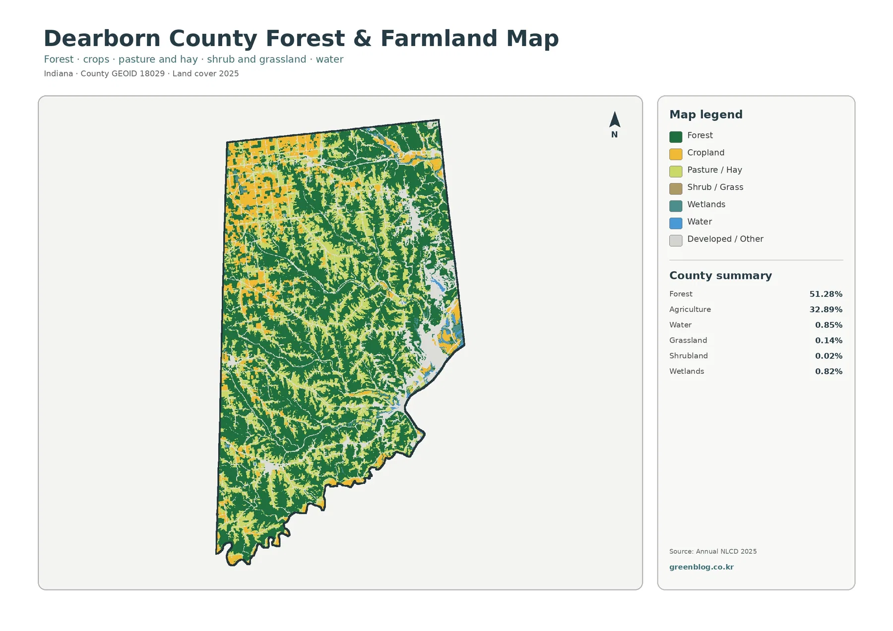
The vegetation-focused image clarifies why the northwest feels different from the central and southern parts of the county. Yellow cropland forms larger, more regular blocks in the northwest. Dark forest cuts between those fields and becomes much more continuous through the center and south. In several places the woods form long branching bands, so agricultural openings look like pockets within a broader wooded setting rather than one uninterrupted farm plain.
Grassland is 0.14% and shrubland is 0.02%, so neither is a major countywide class. Wetlands remain 0.82% and water 0.85%. Those small categories matter locally, but they should not be stretched into a countywide theme simply to add detail. The strongest story in this view is still the 51.28% forest–32.89% agriculture relationship and the way that relationship changes from the northwest to the more wooded interior.
The bright gaps on the east help the reader locate the large developed side without letting it dominate the vegetation comparison. Placing this map beside the general land-cover map is useful in a lesson or report: one image establishes the full mix of classes, while the other makes the wooded corridors and agricultural openings easier to distinguish. The two images should be compared, not described as two independent versions of the same paragraph.
Straight field edges can look like parcel boundaries, but Annual NLCD uses approximately 30-meter cells rather than cadastral lines. A cell may contain part of a crop field, a tree row, a ditch, a driveway, and a lawn but still receive one predominant class. For property, farm, or ownership questions, county parcel data and higher-resolution imagery are the appropriate next sources.
A 3.16% mean impervious value hides a much sharper east-to-west contrast
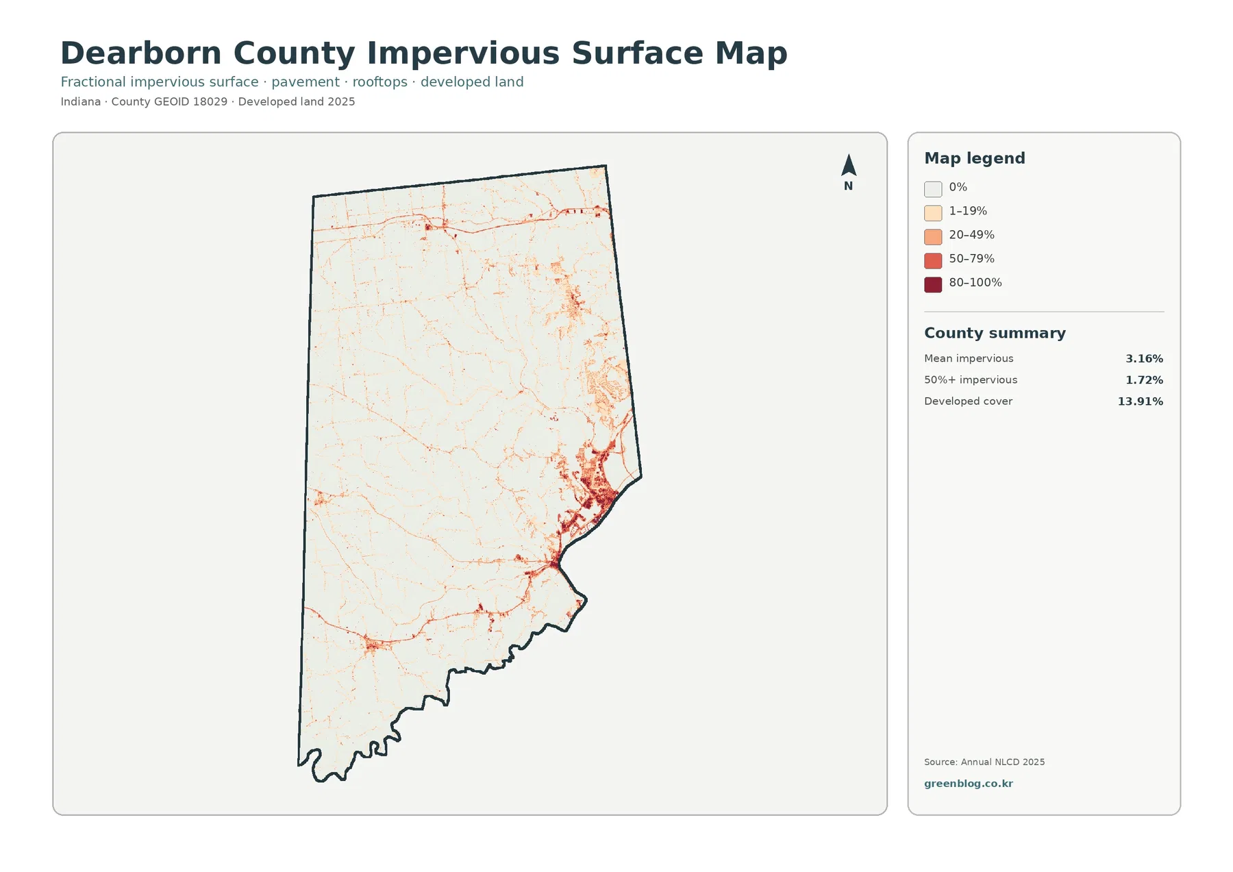
Mean impervious cover is 3.16%, and 1.72% of the county is mapped at 50% impervious or greater. Both values are well below the 13.91% developed share. Developed classes can contain lawns, trees, exposed soil, and other permeable surfaces around buildings and streets, whereas the impervious layer focuses more directly on roofs, pavement, parking areas, and similar hard materials.
The darkest tones sit along the east and southeast, especially in the broad Lawrenceburg–Greendale–Aurora side of the county. A second narrow concentration extends northward, and smaller hard-surface centers appear in the northeast and a few interior locations. Most of the center and west remains white or very pale, matching the large forest-and-farm areas on the other maps.
That distribution is more informative than the county mean by itself. A single 3.16% average combines dense urban cells with large rural areas close to zero. For a discussion of development intensity, compare the size and continuity of the dark clusters. For a discussion of the overall county, use the average only after showing where the high and low values occur.
Impervious surface can be relevant to runoff because water does not soak through pavement and rooftops as easily as it does through soil or vegetation. It does not, however, provide a flood-risk answer by itself. Rainfall, slope, soil, drainage systems, river levels, and local flood-control features also matter. The map is useful for locating hard surfaces, not for replacing a hydrologic or engineering analysis.
The southeast water edge matters even though open water is less than one percent of the county
Open water is only 0.85%, yet the blue along the southeastern boundary provides an important geographic reference. Dearborn County’s official zoning map labels that boundary as the Ohio River. The land-cover preview does not print the river name, so the official map is the source for that identification. Small blue pieces also appear near the developed east and in a few interior locations.
Wetlands are 0.82%, almost the same countywide share as open water, but the two classes describe different surfaces. Wetland cells can include vegetation and saturated ground, while the water class emphasizes exposed water. Neither class is a substitute for a flood-insurance zone, a jurisdictional wetland boundary, or a surveyed stream easement. Those questions require current regulatory and site-specific sources.
The close placement of water, developed land, and hard surfaces on the eastern side can frame useful questions for a classroom or planning discussion, but the map should not be used to claim cause and effect. A cluster near a river does not prove that development caused flooding, and a wetland color does not by itself prove legal protection. The maps show location and classification; additional data is needed for risk or regulation.
Use zoning, roads, and parcel maps for names and legal boundaries; use land cover for the surface pattern
The official county zoning map provides place names such as Lawrenceburg, Aurora, Greendale, Dillsboro, Moores Hill, St. Leon, and West Harrison, along with major highways and zoning districts. Those details are intentionally absent from the four land-cover previews. If a small red cluster or linear feature needs a name, identify it on the official map first rather than guessing from shape alone.
Land cover also should not be interpreted as land use rights. A forest cell does not mean development is prohibited, an agricultural cell does not establish an agricultural zoning district or farm ownership, and a developed cell does not identify a municipal boundary or building permit. Annual NLCD describes observed surface cover in a generalized raster framework.
The 30-meter cell size sets the practical scale. It is appropriate for county patterns, broad comparisons, and regional context. It is not precise enough for a lot line, a narrow stream, a driveway boundary, or a wetland determination. Zooming the image enlarges the pixels but does not create missing survey information, so site decisions need current local GIS, high-resolution imagery, and the relevant official records.
Choose the map that matches the question instead of asking one image to explain the whole county
For a general county profile, begin with the 2025 overview. It is the only image that shows the full relationship among forest, agriculture, development, water, and wetlands in one frame. If the topic is the wooded interior and farm openings, the forest-and-farmland map provides a cleaner comparison. If the topic is the eastern urban edge, the impervious map isolates the hard surface pattern much more clearly.
The 1985–2025 difference layer belongs after the present pattern is established. Its red, orange, yellow, teal, and purple colors are change categories, not current land-cover colors. A useful presentation can place the current map first and then ask where the endpoint differences overlap the same eastern developed side or the more rural west. That sequence keeps the legend meanings separate.
Each original JPG measures 2480 × 1754 pixels. The package does not state that the files meet an A3 high-resolution reference, so a large poster should be test-printed before final use. The WebP images on the page are convenient for quick viewing, while the JPG set is better for saving, placing into documents, or comparing side by side.
Map File Information
The ZIP contains four original JPG maps for comparing Dearborn County’s forested interior, agricultural openings, Lawrenceburg–Aurora developed edge, impervious surfaces, and 1985–2025 class differences.
- Included Files: Use only the versions confirmed in the article and supplied images
- File Type: Use the confirmed download contents
- Intended Use: Printing, education, presentations, and map-based projects
Related Maps
- Adams County Indiana Land Cover Map
- Allen County Indiana Land Cover Map
- Bartholomew County Indiana Land Cover Map
Sources and Reference Data
- MRLC Annual NLCD Data – official access point for current annual land-cover and comparison products
- USGS Annual NLCD Land Cover Classification – definitions for forest, agriculture, developed land, wetlands, water, and the raster classification framework
- U.S. Census Bureau TIGER/Line Shapefiles – official county-boundary reference for Dearborn County
- Dearborn County Approved Zoning Map – official local reference for Lawrenceburg, Aurora, Greendale, St. Leon, West Harrison, the Ohio River, major roads, and zoning districts
Green Map creates custom-edited map images using open geographic data sources such as geoBoundaries, Natural Earth, OpenStreetMap, and government open data.
These maps are edited visual materials, not raw data files, and are provided for education, documents, presentations, and graphic reference.