Stephenson County, Illinois is farm country first: agriculture accounts for 83.60% of the 2025 land-cover summary. The agricultural cover is interrupted by the large developed area around Freeport and by smaller towns and roads. Narrow wooded areas and wetlands add another set of features through parts of the county. The four maps on this page separate those features into present land cover, forest and farmland, impervious surface, and mapped class differences from 1985 to 2025.
The four original JPG maps are available together in one ZIP after the explanations. Use them to compare farm cover with developed centers and to locate wooded or wet areas. The other views show where pavement and rooftops are concentrated and where mapped classes differ between 1985 and 2025. These products describe land cover observed and classified from remote-sensing data. They are not parcel maps, ownership records, zoning maps, or proof of what can legally be built on a property.
Table of Contents
The county is mostly farmland, but the minority classes shape the map
The 2025 county summary is dominated by agriculture at 83.60%. Developed land makes up 9.16%, forest 5.45%, wetlands 1.42%, and water 0.19%. Grassland is only 0.03%, while shrubland rounds to 0.00% in the map summary. Those numbers explain why yellow agricultural cover fills most of the first map, but the smaller categories are not evenly scattered. They form very different shapes, which makes location as important as percentage when you are trying to understand the county.
Large farm blocks extend across nearly every part of Stephenson County. Developed land appears as compact clusters connected by thin road lines, while forest and wetlands are more irregular and often curve through the field pattern. The most prominent developed concentration is in the south-central part of the county around Freeport. Smaller developed centers appear elsewhere, but they occupy much less space than the surrounding agricultural land. Looking at those contrasts first gives a more useful picture than reading the percentages alone.
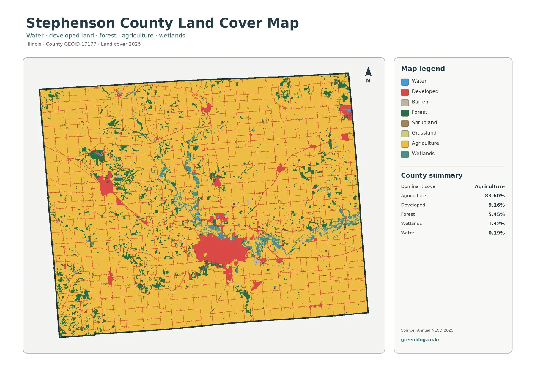
The developed category needs a little care when you read it. It can include more than dense buildings and commercial blocks. Lower-density residential areas, roads, lawns, trees, and other surfaces can occur within mapped developed classes, so a red area should not automatically be treated as a fully paved urban surface. That distinction becomes much clearer when the land-cover map is compared with the impervious-surface map later on the page.
Freeport stands out when developed land is separated from impervious surface
Freeport forms the largest developed concentration visible in the county. On the general land-cover map, the city and nearby development create a broad red area within the surrounding farm landscape. On the impervious map, the same general area contains the county’s strongest concentrations of pavement, rooftops, parking areas, and other surfaces that do not readily absorb water. The two maps therefore describe related features, but they do not measure the same thing.
Stephenson County has a mean impervious value of 2.34%, and 1.17% of the county is mapped with impervious cover above 50%. Those figures are much lower than the 9.16% developed-land share. A developed class may still contain lawns, trees, open ground, and other permeable surfaces, while the impervious layer measures the fraction of each cell occupied by hard surfaces. This is why a residential edge can appear as developed land without being shown as a continuous block of high impervious cover.
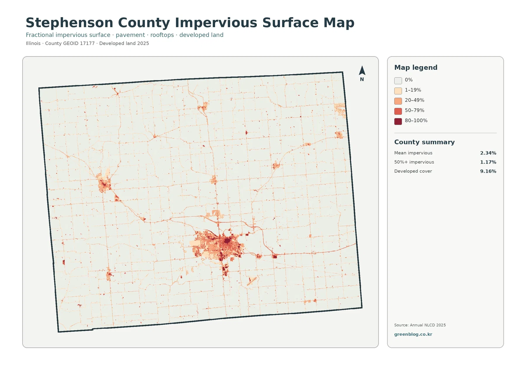
Outside the larger centers, most of the county remains very light on the impervious map. Roads form narrow lines through agricultural areas, and intersections or small settlements create isolated pockets with higher values. The map is useful for showing where hard surfaces are concentrated, but it should not be used as a population map. A highly paved commercial or industrial site may have few residents, while a lower-density residential area can have many people and still contain substantial vegetation and open ground.
Forest cover is small in percentage but easy to trace through the fields
Removing most developed detail from the forest-and-farmland view makes the 5.45% forest share easier to locate. Rather than forming one large woodland block, forest appears in many narrow, irregular patches. Several wooded areas follow curving routes through the agricultural matrix, especially through central and southern portions of the county, with additional patches toward the west and north. Their outlines contrast with the straighter edges of cropped fields.
Agriculture remains the dominant cover at 83.60%, so the map is still overwhelmingly a farmland map. The value of this version is that it shows where nonfarm natural cover interrupts the field pattern. Some wooded sections occur near wetland or water cells, while others appear as isolated groves or larger patches away from obvious blue water. The map supports a comparison of where these features occur together, but it does not establish why a particular woodland remained or how it has been managed.
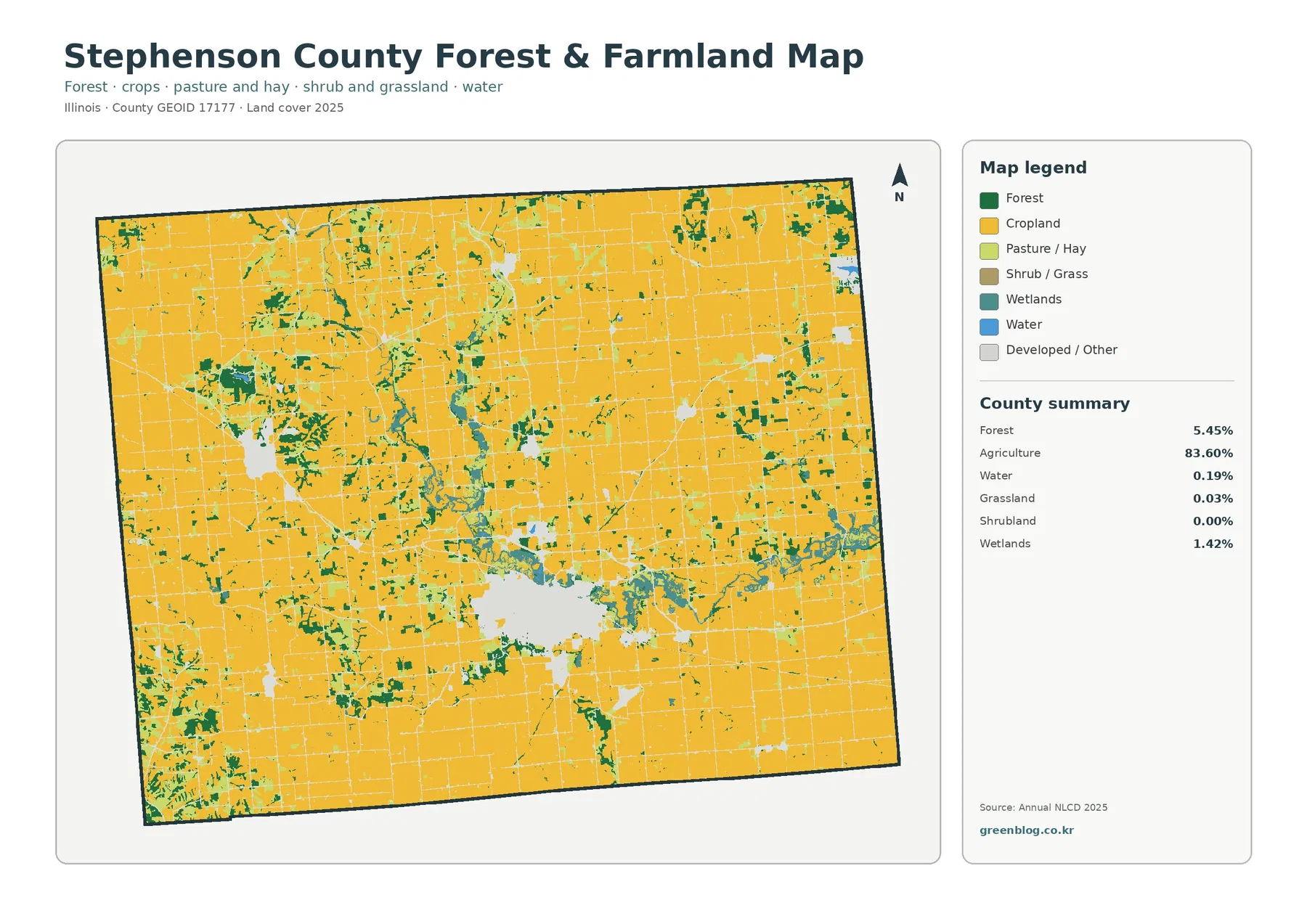
Wetlands account for 1.42% and water for 0.19% in the county summary. Their small totals do not mean they are invisible. Teal wetland cells can be followed along several drainage areas, where they sometimes sit next to forest cover. Water is limited in area and does not form a dominant lake feature. For watershed education or a simple environmental comparison, compare where wetland, water, and forest appear together. The countywide percentages alone do not describe those local relationships.
The 1985–2025 map separates long-term class differences from the present-day picture
The change map compares the mapped classes in 1985 and 2025. Class differences cover 11.16% of Stephenson County in the summary. Areas classified as developed account for 1.38%, forest loss 0.26%, agricultural loss 0.65%, and other class differences 8.79%. The large “other difference” share is important because it prevents a simple interpretation that all 11.16% represents new development or a direct loss of farmland.
Gray areas indicate no mapped class difference. Red marks areas classified as developed, orange marks forest loss, and yellow marks agricultural loss. Teal indicates wetland difference, while purple represents other class differences. Purple cells are scattered widely across the county. Red changes are more concentrated around Freeport and several smaller developed locations, with additional linear or isolated features near roads. Forest and agricultural losses occur in smaller amounts and are less extensive than the broad field of other differences.
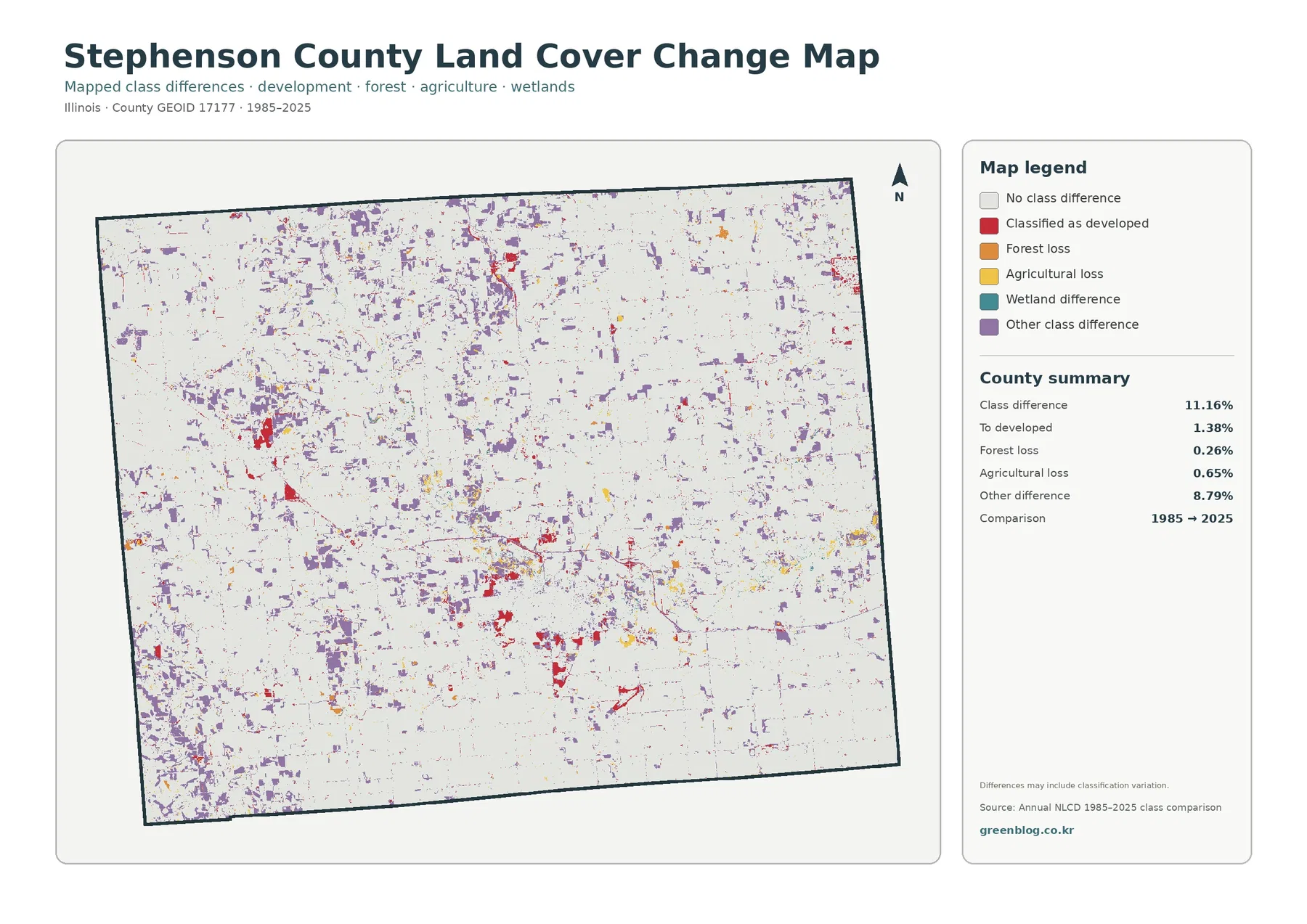
A class-difference map is best treated as a screening tool, not as proof that every colored cell underwent a physical land-use conversion. Differences between source imagery, classification decisions, mixed pixels, and the treatment of small features can all contribute to the result. If a specific farm, woodland, or developed site matters to a project, compare intermediate Annual NLCD years, aerial imagery, and local records before assigning a date or cause to the change.
The raster data are useful at county scale, not for parcel boundaries
Annual NLCD land cover is distributed as raster data, meaning the landscape is divided into regular grid cells and each cell receives a class or a fractional value. The land-cover products commonly use a 30-meter grid. A single cell can therefore contain part of a field, a road shoulder, trees, and a building at the same time. The classification summarizes that cell rather than drawing a surveyed boundary around every feature.
That generalization matters in an agricultural county. Narrow wooded strips, small ponds, field-edge vegetation, and rural roads can be close to the size of a cell or smaller. Their mapped edges may look blockier or more simplified than they do on recent aerial photography. Use these maps for countywide patterns, comparisons, education, and preliminary review. For property lines, construction decisions, zoning, drainage design, or legal questions, use the appropriate parcel, survey, engineering, or regulatory source instead.
The download includes all four original JPG maps
The ZIP contains the Stephenson County land-cover map, forest-and-farmland map, impervious-surface map, and 1985–2025 land-cover-change map as separate JPG files. Because they use the same county boundary, the files are convenient for side-by-side comparisons in a report, class handout, or presentation. The images on this page are WebP versions for online viewing; use the download when you need the original JPG map files together.
Keep the legend with the image whenever possible. Agriculture, developed land, forest, wetlands, and water use one set of colors on the general map, while the change map uses colors for types of class difference rather than current cover. The impervious map is different again because its colors represent percentages of hard surface. Treating those legends as part of the map prevents a reader from carrying the meaning of one color into the wrong product.
Frequently Asked Questions
Does 83.60% agriculture mean 83.60% of Stephenson County is legally zoned farmland?
No. The 83.60% figure is the share classified as agricultural cover in the 2025 land-cover map. It describes the observed surface classification, not zoning, ownership, tax status, or a parcel’s permitted use. Legal land-use questions require county zoning and parcel information rather than an NLCD land-cover class.
Why is developed land 9.16% while mean impervious cover is only 2.34%?
The two layers measure different things. A developed class can include houses, roads, lawns, trees, and other open surfaces within a developed setting. Impervious cover measures the fraction occupied by hard surfaces such as pavement and rooftops. A place can therefore be classified as developed while still having a relatively low percentage of impervious surface.
Can the 11.16% class difference from 1985 to 2025 be used as the county’s exact land-change rate?
It should not be treated as an exact physical conversion rate. The total includes 8.79% labeled as other class difference in addition to 1.38% to developed, 0.26% forest loss, and 0.65% agricultural loss. Classification variation and mixed pixels can contribute to the comparison. Use the map to identify areas for closer review, then check intermediate data, aerial imagery, and local records if a precise change history is needed.
Sources and Reference Material
The percentages and map observations on this page come from the supplied Annual NLCD 2025 maps and the supplied 1985–2025 class comparison. MRLC and USGS provide the national data and classification documentation, while Census TIGER/Line offers an official source for geographic boundaries. Stephenson County Building & Zoning is listed separately because zoning and legal development rules should not be inferred from a land-cover map.
- MRLC Annual NLCD Data – national land-cover and impervious-surface data
- USGS Annual NLCD Land Cover Classification – definitions and interpretation of land-cover classes
- U.S. Census Bureau TIGER/Line Shapefiles – official geographic boundary data
- Stephenson County Building & Zoning – official zoning and building information that should be kept separate from land-cover classification
- Stephenson County General Information – official county context for Freeport, transportation, and local government
Map File Information
Download the four original JPG maps for comparing Stephenson County agriculture, forest, developed land, impervious surface, and mapped long-term class differences.
- Included Files: Land cover map, forest and farmland map, impervious surface map, land cover change map
- File Type: ZIP with 4 JPG maps
- Intended Use: Map comparison, classroom materials, reports, agriculture and environmental context, development and change review
Related Maps
- Adams County Illinois Land Cover Map
- Alexander County Illinois Land Cover Map
- Bond County Illinois Land Cover Map
Green Map creates custom-edited map images using open geographic data sources such as geoBoundaries, Natural Earth, OpenStreetMap, and government open data.
These maps are edited visual materials, not raw data files, and are provided for education, documents, presentations, and graphic reference.