Wetlands lead Tattnall County’s supplied 2025 land-cover summary at 30.30%, but this is not a county where one class overwhelms everything else. Agriculture accounts for 24.46% and forest for 23.97%, so the map is built around a three-way mix of wet ground, working land, and woods. Developed cover is 7.76%, and it appears as a handful of compact centers connected by thin linear traces rather than as one continuous urban area.
Four views are provided for the same county: current land cover, forest and farmland, impervious/developed surface, and 1985–2025 class differences. The page uses WebP previews for quick viewing, while the four original JPG maps are packaged in one download. Together they are useful for separating broad wetland and agricultural patterns from hard-surface development and for showing why a large class-change percentage is not the same thing as a large increase in developed land.
Table of Contents
Wetlands rank first in 2025, while agriculture and forest are almost equal in countywide share
The current land-cover summary lists wetlands at 30.30%, agriculture at 24.46%, and forest at 23.97%. Developed cover is 7.76% and shrubland 6.32%. The forest-and-farmland panel also reports grassland at 5.81% and open water at 1.05%. Barren land appears in the legend but does not receive its own percentage in the supplied summary, so no residual percentage has been assigned to that class.
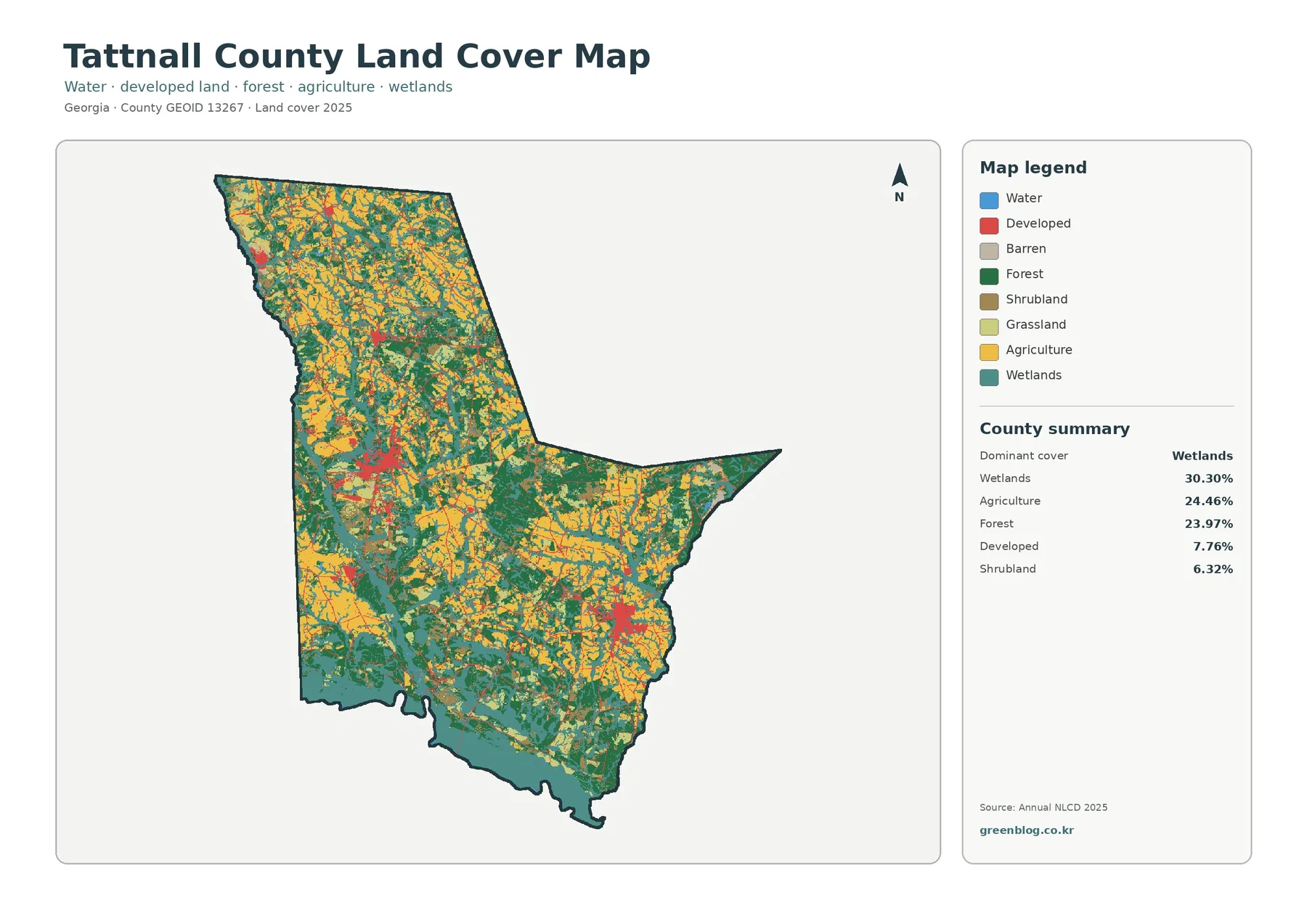
The map’s most distinctive feature is the amount of teal. A broad wetland belt follows much of the irregular southern edge, and another long wetland zone appears along the northwest side. Additional wetland branches and patches extend into the interior. Yellow agricultural areas are widespread through central, northern, and eastern parts of the county, while dark-green forest fills many spaces between them and forms larger blocks in several locations. The result is much more mixed than the summary percentages alone suggest.
A Georgia Department of Community Affairs planning document provides useful geographic context: the Ohoopee River forms Tattnall County’s northwest boundary and the Altamaha River forms its southern boundary. That description helps explain why the strongest wetland patterns occur along those sides of the county. The land-cover colors should still not be treated as legal river corridors, flood zones, or regulatory wetland boundaries. They classify surface cover, while those other questions require data created specifically for navigation, regulation, or flood management.
| 2025 map summary | Share |
|---|---|
| Wetlands | 30.30% |
| Agriculture | 24.46% |
| Forest | 23.97% |
| Developed | 7.76% |
| Shrubland | 6.32% |
| Grassland | 5.81% |
| Water | 1.05% |
Land cover is also different from land use. A forest-classified cell may be privately owned, zoned for another use, or part of a parcel with several surface types. Agriculture-colored cells do not establish farm ownership or zoning. Developed cells can contain lawns, trees, soil, and other permeable surfaces in addition to buildings and pavement. These maps work well for county-scale comparison, but parcel, zoning, ownership, permitting, and regulatory questions need the official records designed for those purposes.
The river-edge wetland pattern is a defining part of the county, not just a small background class
Because wetlands occupy 30.30% of the supplied summary, they deserve more attention than a brief legend note. Along the south, the wetland color forms a wide and nearly continuous band in places, with additional patches extending northward into the county. The northwest boundary has another conspicuous wetland corridor. Interior wetland areas then break up agriculture and forest rather than remaining confined to the outer edge. This distribution is one reason the county cannot be described accurately as simply agricultural or forested.
The Ohoopee and Altamaha context is especially useful when the map is used in a watershed or environmental lesson. A reader can see that wetland cover is associated with broad river-edge landscapes, yet the map also makes clear that wet ground appears away from the two boundary rivers. For regulatory work, this is only a starting point. A mapped wetland class from remotely sensed land cover does not determine jurisdictional status, building restrictions, public access, or FEMA flood risk.
Open water is only 1.05% in the forest-and-farmland summary, far below the 30.30% wetland share. The two classes should therefore remain separate in captions and presentations. Blue represents open water, while teal represents wetland cover. Combining them into one “water area” figure would erase a major distinction in the map and would make the county’s dominant class look different from the supplied classification.
Agriculture covers 24.46%, but the map cannot identify onion fields, poultry operations, or individual farms
The forest-and-farmland view makes the agricultural pattern easier to follow. Yellow fields and agricultural blocks are spread widely through the county, especially across central, northern, and eastern sections, but they are repeatedly interrupted by forest, wetland, shrub, and grass cover. Forest is nearly the same countywide share at 23.97%, yet its shapes tend to form different blocks and connecting strips. Seeing the two classes side by side is more informative than describing each only by its percentage.
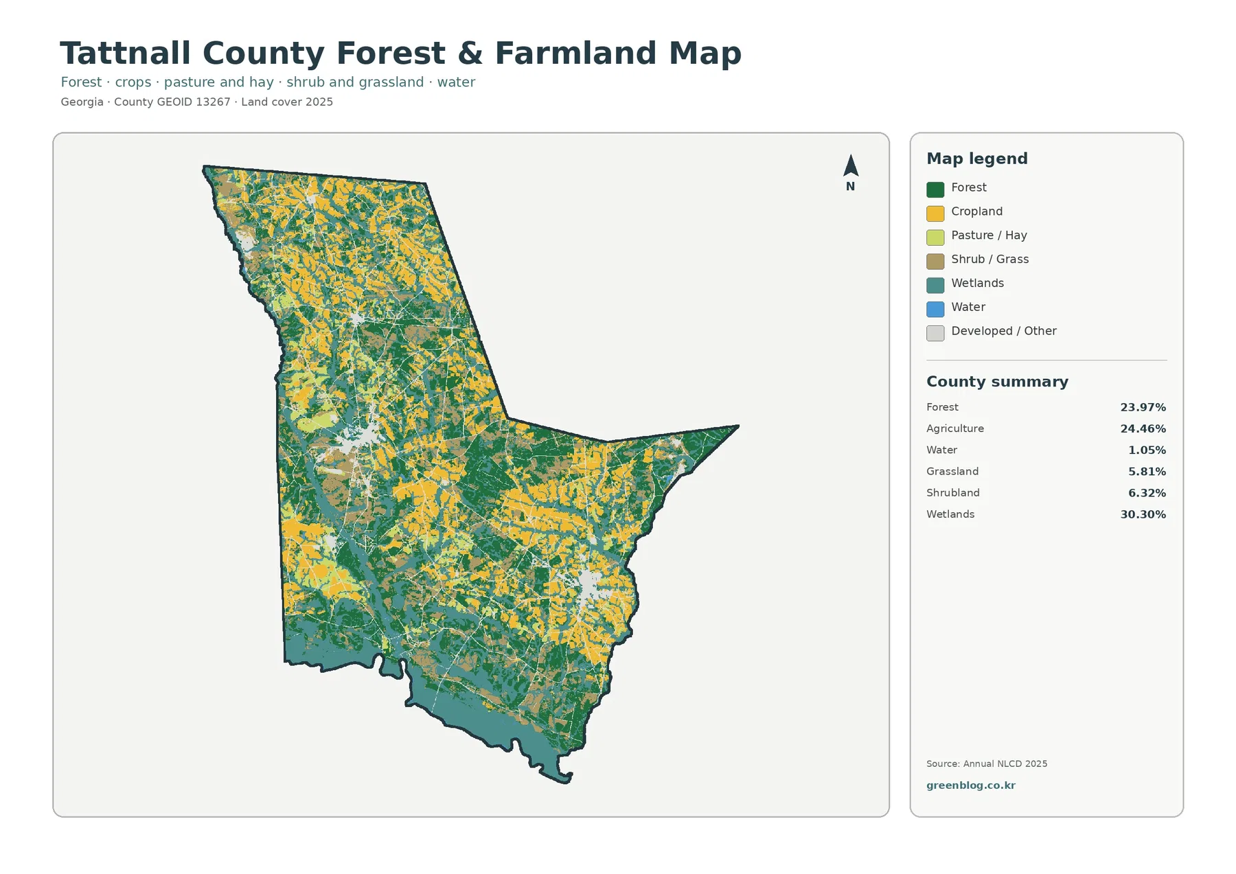
Local agricultural context makes this map unusually useful. UGA Extension describes Tattnall County as one of Georgia’s largest agricultural counties, located in the center of Vidalia onion country, and reports that it is the state’s largest onion-producing county. That information explains why agriculture matters locally, but it does not turn every yellow pixel into an onion field. Annual NLCD does not identify crop species, farm operators, field boundaries, or production value.
The distinction matters because a land-cover map and an agricultural economy report answer different questions. The map shows where the surface is classified broadly as agriculture; UGA’s information describes production and commodities. A presentation can use both, but the two datasets should not be merged as though they measured the same thing. If the goal is to identify a specific crop, an individual farm, or a management practice, crop-specific statistics, parcel information, or field-level data are needed.
Grassland at 5.81% and shrubland at 6.32% are also visible components of the open landscape. They should not automatically be relabeled as farmland simply because they are not forest. Managed pasture, hay, early regrowth, shrub cover, and other open vegetation can appear in different classes. The county-scale map is best for locating broad patterns and contrasts; it is not detailed enough to determine how every open patch is being managed on the ground.
Developed cover is 7.76%, but mean impervious surface is only 1.53%
The impervious map separates the idea of “developed land” from the fraction of the ground that is actually sealed by pavement or rooftops. Tattnall County has 7.76% developed cover in the land-cover summary, while mean impervious surface is 1.53%. Only 0.40% of the county falls in cells with at least 50% impervious surface. That gap is expected because low-density developed cells can include large amounts of grass, trees, yards, and other permeable ground.
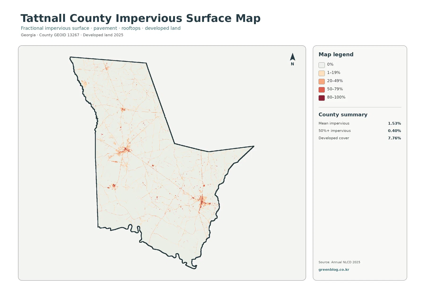
Most of the impervious map is very light. The strongest clusters occur in a west-central area and in the southeastern portion, with smaller concentrations elsewhere. Thin orange and red traces extend outward along linear routes and connect scattered built areas. The image does not label roads or municipalities, so those traces should not be assigned to a specific highway by name from this map alone. A road layer is the appropriate companion when exact transportation routes matter.
Georgia DCA’s comprehensive-plan page treats Tattnall County together with Cobbtown, Collins, Glennville, Manassas, and Reidsville. Those place names are valuable when the impervious map is paired with an administrative map, but they are not labels printed on the supplied image. For that reason, the colored clusters here are described by their position rather than declared to be exact municipal boundaries. Overlaying city limits and roads would allow a much more precise discussion of which built cluster belongs to which community.
The 1.53% mean should not be read as though every point in the county has the same impervious fraction. Forest, wetlands, and agricultural areas contain many cells near zero, while roads, parking lots, commercial sites, and denser residential areas can reach much higher classes. A county mean compresses all of that variation into one number. When runoff or surface sealing is the question, the color distribution is more informative than the mean alone.
A 29.15% 1985–2025 class difference does not mean 29.15% of Tattnall County became developed
The change map compares endpoint classes in 1985 and 2025. The summary reports 29.15% total class difference, but only 2.30% is classified as change to developed. Forest loss is 9.10%, agricultural loss 5.49%, and other class difference 10.97%. Wetland difference appears in the legend but no separate percentage is printed in the summary, so no leftover value has been calculated and labeled as wetland change.
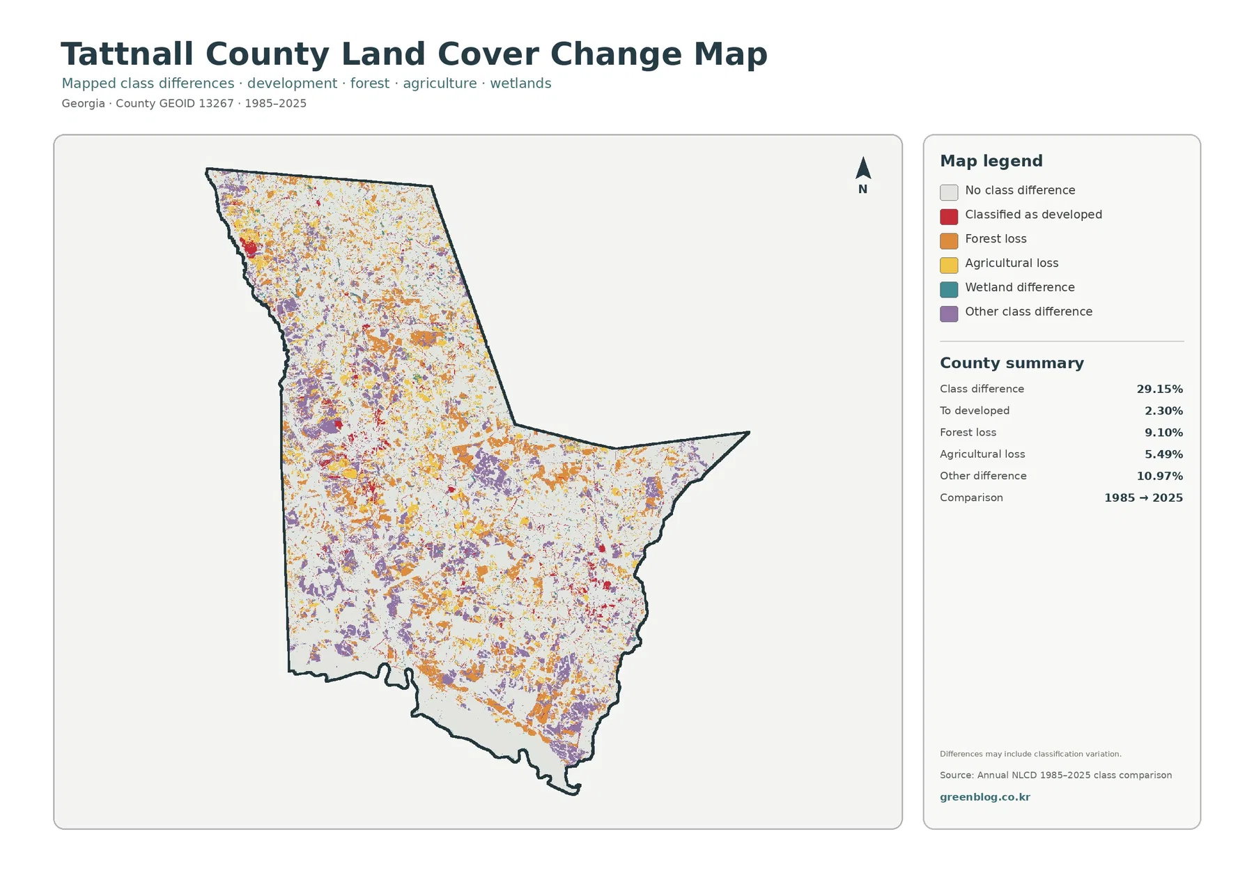
Orange forest-loss and purple other-difference patches are spread through many parts of the county, while red change-to-developed areas form a smaller share of the mapped differences. White areas show no class difference between the two endpoints. The visual pattern reinforces the summary: there has been substantial classification change, but the change is not synonymous with urban growth. Presenting the 29.15% number without the 2.30% developed-change figure would give a misleading impression of the county.
Forest loss at 9.10% should also be interpreted cautiously. A class change between two years can reflect actual clearing, harvest and regrowth cycles, agricultural transitions, development, storm impacts, or classification variation. The map itself warns that differences may include classification variation. Establishing the cause at a specific location would require intermediate Annual NLCD years, aerial photography, forestry records, or other local evidence.
The same warning applies to the 5.49% agricultural-loss category. It does not say that farm income, onion production, or the agricultural economy declined by 5.49%. It means that cells classified as agriculture at one endpoint are represented differently at the other endpoint under the map’s change rules. This distinction is particularly important in Tattnall County because agriculture is economically significant according to UGA Extension.
Named communities and river corridors become more useful when these maps are paired with administrative reference layers
Public sources identify Reidsville, Glennville, Collins, Cobbtown, and Manassas in Tattnall County, and UGA Extension’s county office is located in Reidsville. Those names provide orientation for readers who know the county, but the land-cover images themselves do not print municipal labels. If a report needs to say that a specific developed cluster falls inside a particular city, the land-cover layer should be paired with an official municipal boundary or road map rather than relying on visual guesswork.
The same principle applies to the Ohoopee and Altamaha rivers. Their broad relationship to the county boundary is supported by state planning material, but this four-map package is not a hydrography set. It can show how wetland and water classes relate to the county outline; it cannot replace a named river layer for navigation, setback measurement, public-access research, or legal corridor interpretation. Combining the correct layers produces a stronger explanation than forcing one map to answer every geographic question.
Choose the map by the question: overall cover, rural land, hard surface, or long-term change
Start with the current land-cover map when the goal is to understand the county as a whole. It immediately shows why wetlands are the leading class and why agriculture and forest need to be discussed together. Use the forest-and-farmland view when the focus is working land and vegetation, especially when adding Tattnall County’s agricultural context from UGA Extension. The simplified colors make it easier to see how field areas, forest, grass/shrub cover, wetlands, and water fit together.
Use the impervious layer when the question shifts from broad development to pavement and rooftops. The contrast between 7.76% developed cover and 1.53% mean impervious surface is one of the clearest lessons in the set. Use the change map only when comparing 1985 with 2025, and keep the 29.15% total class difference separate from the 2.30% change-to-developed value. The four maps work best as complementary views, not as interchangeable versions of the same statistic.
For a classroom or watershed presentation, the current map and forest-and-farmland map can establish the large wetland, agricultural, and forest pattern first. The impervious map can then show how relatively little of the county is heavily sealed by hard surface. The change map belongs last, after readers understand that its colors describe endpoint class differences rather than the current surface alone. That sequence helps prevent similar colors from being mistaken for the same concept.
The download includes four 2480×1754 JPG maps with the legends and summaries intact
The on-page previews are 1800-pixel WebP images. The ZIP contains four original JPGs: current land cover, forest and farmland, impervious/developed land, and 1985–2025 land-cover change. The asset manifest records each JPG at 2480×1754 pixels. A consistent county outline and similar map layout make the set convenient for side-by-side use in documents, presentations, classes, and county reference material.
The asset manifest does not mark the JPGs as meeting an A3 high-resolution reference. They are appropriate for screen viewing and many ordinary documents, but large-format printing should be tested before final use. Thin impervious lines, small wetland cells, and fine change patches can look more generalized or pixelated when enlarged well beyond the source dimensions.
Keep the legend and summary panel when possible. Red means current developed cover on the land-cover map, but red on the change map means locations classified as changing to developed. Removing the legend can make those two different ideas look identical. The map year and the 1985–2025 comparison label are equally important when figures are cropped for a slide or report.
Raster scale, mixed pixels, and observation year limit how precisely the maps can be read
Annual NLCD uses raster cells at roughly 30-meter scale to generalize surface conditions. One cell can contain trees, a narrow road, grass, bare soil, and part of a building, yet the map must represent that mixed area with a class or value. That is why county-scale patterns are meaningful while a single tiny patch should not be treated as a surveyed boundary or proof that every square meter inside the cell has the same cover.
The current land-cover and impervious summaries are labeled 2025, and the change map compares 1985 with 2025. Construction, harvest, regrowth, crop rotation, flood impacts, storm damage, or other changes after the observation period are not shown. For decisions that depend on present site conditions, recent aerial imagery, local parcel records, road and hydrography layers, and field inspection should be added.
Land cover should also remain separate from zoning and legal status. A wooded parcel can be zoned for residential or another use, an agriculture-colored area can cross several properties, and a wetland-classified pixel does not establish a jurisdictional wetland boundary. These maps are designed to show broad surface patterns and differences. Ownership, access, permits, setbacks, taxes, and development rights require the corresponding official records.
Frequently Asked Questions
What is the largest 2025 land-cover class in Tattnall County?
Wetlands are the largest supplied class at 30.30%. Agriculture is 24.46% and forest 23.97%, followed by developed cover at 7.76%, shrubland at 6.32%, grassland at 5.81%, and open water at 1.05%.
Does the agriculture color identify Vidalia onion fields?
No. UGA Extension describes Tattnall County as a major Vidalia onion-producing county, but the Annual NLCD agriculture class does not identify crop species or individual farm boundaries. Crop-specific mapping requires a different dataset.
Does 29.15% class difference mean 29.15% of the county became developed?
No. Only 2.30% is summarized as change to developed. Forest loss is 9.10%, agricultural loss 5.49%, and other class difference 10.97%, and the map notes that classification variation may be included.
Map File Information
The four original Tattnall County JPG maps are packaged in one ZIP: current land cover, forest and farmland, impervious/developed land, and 1985–2025 land-cover change.
- Printable Size: 2480×1754 pixels each
Related Maps
- Appling County Georgia Land Cover Map
- Atkinson County Georgia Land Cover Map
- Bacon County Georgia Land Cover Map
Sources and references
- MRLC Annual NLCD Data – Official access point for Annual NLCD land-cover and related products used for the supplied 2025 mapping.
- USGS Annual NLCD Land Cover Classification – Official explanation of Annual NLCD classes including forest, developed land, agriculture, and wetlands.
- U.S. Census Bureau TIGER/Line Shapefiles – Official source for county boundaries and other geographic reference layers.
- UGA Extension Tattnall County Agriculture & Natural Resources – County-level agriculture and natural-resource information, including Tattnall’s role in Vidalia onion production.
- Georgia DCA Tattnall County Comprehensive Plan – State planning page for Tattnall County and Cobbtown, Collins, Glennville, Manassas, and Reidsville.
- Tattnall County Comprehensive Plan 2005 Update – Planning document describing the Ohoopee River on the northwest boundary and the Altamaha River on the southern boundary.
Green Map creates custom-edited map images using open geographic data sources such as geoBoundaries, Natural Earth, OpenStreetMap, and government open data.
These maps are edited visual materials, not raw data files, and are provided for education, documents, presentations, and graphic reference.